Tag: Source callout

  • COVID source callout: South Carolina

    COVID source callout: South Carolina

    It is not uncommon, as we increasingly realize that COVID-19 is not going away any time soon, for state public health departments to give their websites makeovers. Hastily-compiled pages and PDF reports have given way to complex dashboards, complete with interactive charts and color-coding.

    These revamps can be helpful for users who would rather click through a menu than scroll through a report. But from a data collection perspective, it’s often challenging to go from a document or single page (where I could easily hit Ctrl+F to find a value) to a dashboard which requires clicking and searching through numerous popups.

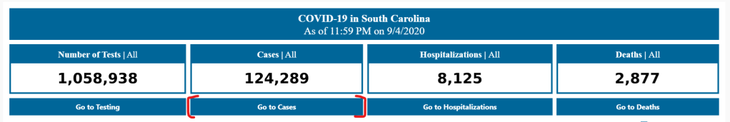
    The most recent state to go through such a revision is South Carolina. In late August, the state released a new dashboard, called the County-Level Dashboard, and reorganized much of its information on COVID-19 demographics and other metrics.

    In fact, when I first looked at South Carolina’s revised pages, I could not find any demographic data at all. This information used to be reported on a page marked “Demographic Data by Case”; now, that page goes to a dashboard on cases in South Carolina’s long-term care facilities. It wasn’t until I read through the public health department’s new Navigation Manual that I realized demographic data are now integrated on the county dashboard. If I click, for example, “Go to cases,” I’m brought to a page reporting case rates by county, age, race, ethnicity, and gender.

    Demographic data ahoy! Via the South Carolina County Dashboard, September 6.

    To South Carolina’s credit, these new pages report demographic data in whole numbers, a more precise format than the percents of total cases and deaths released by many other states (and by SC itself before this reorganization). I also appreciate the addition of a Navigation Manual—such detailed instructions can help make a dashboard more accessible.

    But I would advise any designers of state dashboard revamps to consider how to label figures more clearly from the get-go, so that journalists and state residents alike aren’t confused.

  • COVID source callout: New Jersey

    COVID source callout: New Jersey

    New Jersey reports COVID-19 demographic data in three different places.

    First: there are confirmed case summary reports, released in PDF form. These reports include pie charts that break down COVID-19 cases, deaths, and hospitalizations according to race and ethnicity, age group, and gender. A case summary report was last released on July 30.

    Second: there is a “demographics” tab on New Jersey’s dashboard, which includes tables on COVID-19 deaths by race and ethnicity, age group, and underlying conditions. This tab currently lags the main dashboard significantly; the tables add up to about 11,000 deaths, while New Jersey has reported about 1,600 deaths total.

    And third: there is a “case and mortality summaries” tab on the dashboard, which replicates the format of the old PDF reports with some confusing navigation. (Two rows of tabs at the top, and another row of tabs at the bottom? Who designed this? Who hurt them?)

  • Source callout: New Mexico

    Source callout: New Mexico

    New Mexico reports COVID-19 death demographics in a way that makes me suspect they have it out for us at the COVID Racial Data Tracker specifically.

    The state occasionally includes race and ethnicity information for deaths in its Modeling Updates, released once a week. I say “occasionally” because there is no rhyme or reason to when this key demographic information makes it into the update. And there is also no rhyme or reason to how these data are presented:

    This chart is from the Modeling Update released on June 9. Yes, you’re reading it right: those are percentages, expressed in a line chart. Some of the points don’t even have data labels.

    New Mexico’s newest Modeling Update, released this past Tuesday, has shown a slight improvement in the state’s data presentation: the percentages are now expressed in bar charts, and total deaths for each racial group are included below the graph. (See page 20 of the PDF.) Still, in order to present a complete picture of how COVID-19 is impacting minorities in New Mexico, the state must release these data regularly and include precise figures.

  • COVID Source Callout: Florida

    Analyzing COVID-19 data in Florida is like wading through a swamp with rocks in your backpack while wearing a hazmat suit and being shouted at by a hundred people who all think they can go faster than you.

    There are so many problems with Florida’s data, that when Rebecca Glassman and Olivier Lacan, another CTP volunteer, tried to draft a short blog post about what was wrong, they ended up writing about 3,000 words. Florida reports a test positivity rate without publishing the underlying numbers for their calculation, making it impossible for researchers to check the figures. Florida doesn’t report probable cases and deaths, which is recommended by the CDC. Florida is mixing its PCR and antigen test results (and likely including both in its test positivity rate. Florida fails to alert people using its COVID-19 website and dashboard when the state faces data issues. Florida literally fired a scientist at its public health department who refused to manipulate the state’s data.

    But hey, at least their daily PDF reports are under 1,000 pages now.

  • COVID source callout: West Virginia

    I have issues with West Virginia’s race data.

    First, West Virginia insists on reporting COVID-19 cases assigned to racial categories which do not exist. Two weeks ago, this was a category labeled, “Asian; Black or African American; White.” Last week, this was a category labeled, “Native Hawaiian or Other Pacific Islander; White.” The categories are particularly curious because WV usually only reports their cases according to three race categories: White, Black, and Other.

    (These extra categories have since disappeared from WV’s COVID Dashboard.)

    Relatedly, WV’s race data for cases is listed in a rather unintuitive location on the state’s dashboard: on a page labeled “County Summary.” If you did not look closely, you would think they weren’t reporting demographic data at all.

    And finally: WV used to report demographic information for deaths due to COVID-19 which occurred in the state. This information has not been reported since May 20. Sure, WV’s outbreak has been relatively small (with a total of 5,887 cases and 103 deaths as of July 26), but this is no excuse for failing to report the impacts of this outbreak on marginalized communities. According to CRDT figures, Black West Virginians make up 4% of the state’s population, but comprise 8% of its COVID-19 cases. To present a complete picture, the state should report death counts as well as the impacts of COVID-19 on other racial groups.