New Jersey reports COVID-19 demographic data in three different places.
First: there are confirmed case summary reports, released in PDF form. These reports include pie charts that break down COVID-19 cases, deaths, and hospitalizations according to race and ethnicity, age group, and gender. A case summary report was last released on July 30.
Second: there is a “demographics” tab on New Jersey’s dashboard, which includes tables on COVID-19 deaths by race and ethnicity, age group, and underlying conditions. This tab currently lags the main dashboard significantly; the tables add up to about 11,000 deaths, while New Jersey has reported about 1,600 deaths total.
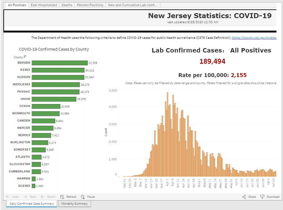
And third: there is a “case and mortality summaries” tab on the dashboard, which replicates the format of the old PDF reports with some confusing navigation. (Two rows of tabs at the top, and another row of tabs at the bottom? Who designed this? Who hurt them?)

Leave a comment