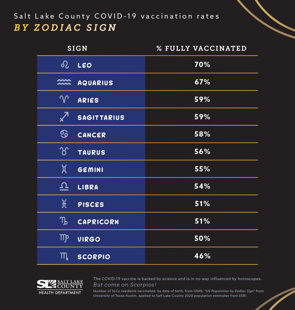
The post drew a lot of attention in the COVID-19 data world, including with readers of the COVID-19 Data Dispatch. (Shout-out to the reader who sent me some bonus analysis of vaccinations by Zodiac element!) Unfortunately, additional research into the Salt Lake County Health Department’s data has shown me that the agency’s analysis might not be particularly robust—and I feel it is my journalistic duty to share this with you.
Here’s the deal. In order to calculate vaccination rates by Zodiac sign, you need two things: vaccinations organized by birthday (your numerator), and the overall population organized by birthday (your denominator). Health departments can easily access the numerator, as it is standard for people to provide their birthdays along with other basic demographic information when they get vaccinated.
But the denominator is trickier. The average U.S. public health department doesn’t have access to the birthdays of every resident in its jurisdiction; some information might be available from a large hospital system or primary care network, but it wouldn’t be comprehensive. So, for an analysis like the Salt Lake County agency’s, a researcher needs to find a substitute.
In this case, the researchers used estimates of Zodiac sign representation in the entire U.S. population, apparently calculated in 2012. Not only are these numbers based on birthdays across the entire country (which could be pretty different from the birthdays in one Utah county!), they’re almost ten years old. There’s a lot of distance between these estimates and vaccination numbers among a 2021 Salt Lake City population.
The public health workers acknowledged that their analysis is “not super scientific” in interviews with the Salt Lake Tribune. Still, the widely-shared Twitter post itself could do with a few more caveats, in my opinion.
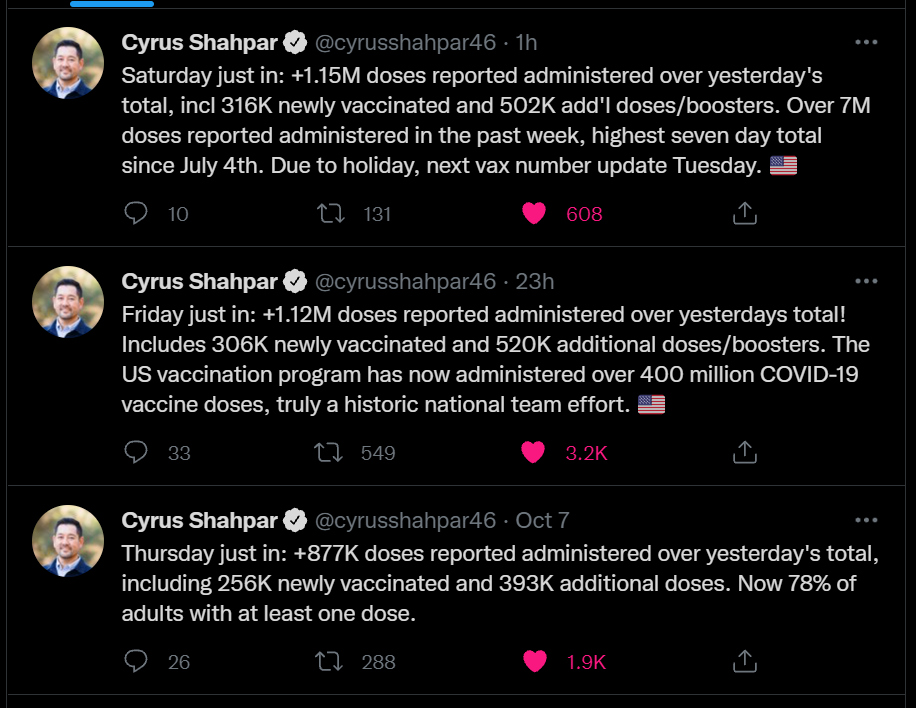
It’s now been almost two months since the CDC approved third vaccine doses for patients with weakened immune systems—and over two weeks since the agency approved third Pfizer doses for patients with increased breakthrough case risk. Since August 13, the CDC’s dashboard says, about 7.3 million Americans have received a third dose.
As I mentioned in today’s National Numbers post, these booster shots are obfuscating the country’s vaccination trends. Over one million people have been vaccinated every day for the past week, but roughly half of those people were getting their booster shots.
One might think I am sourcing that daily booster shot number from the CDC dashboard, but no: it comes, as many key COVID-19 data updates do these days, from the Twitter account of White House COVID-19 Data Director Cyrus Shahpar. The CDC has yet to add any booster shot data to its dashboard beyond a total count of doses administered.
Much as I appreciate Shahpar’s daily updates, I would like to see the agency add those daily booster shot counts to its dashboard. And why stop there? The CDC should also provide information on the demographics of those getting booster shots, such as age and race/ethnicity, as well as geographic trends.
Notably, the New York Times has added a booster shot trendline to its vaccination dashboard; see the chart titled “New reported people vaccinated.” As I noted last week, 15 states have added booster shots to their vaccine dashboards and reports as well, including three states that are reporting demographic breakdowns. The CDC is behind the data reporting curve, as usual.
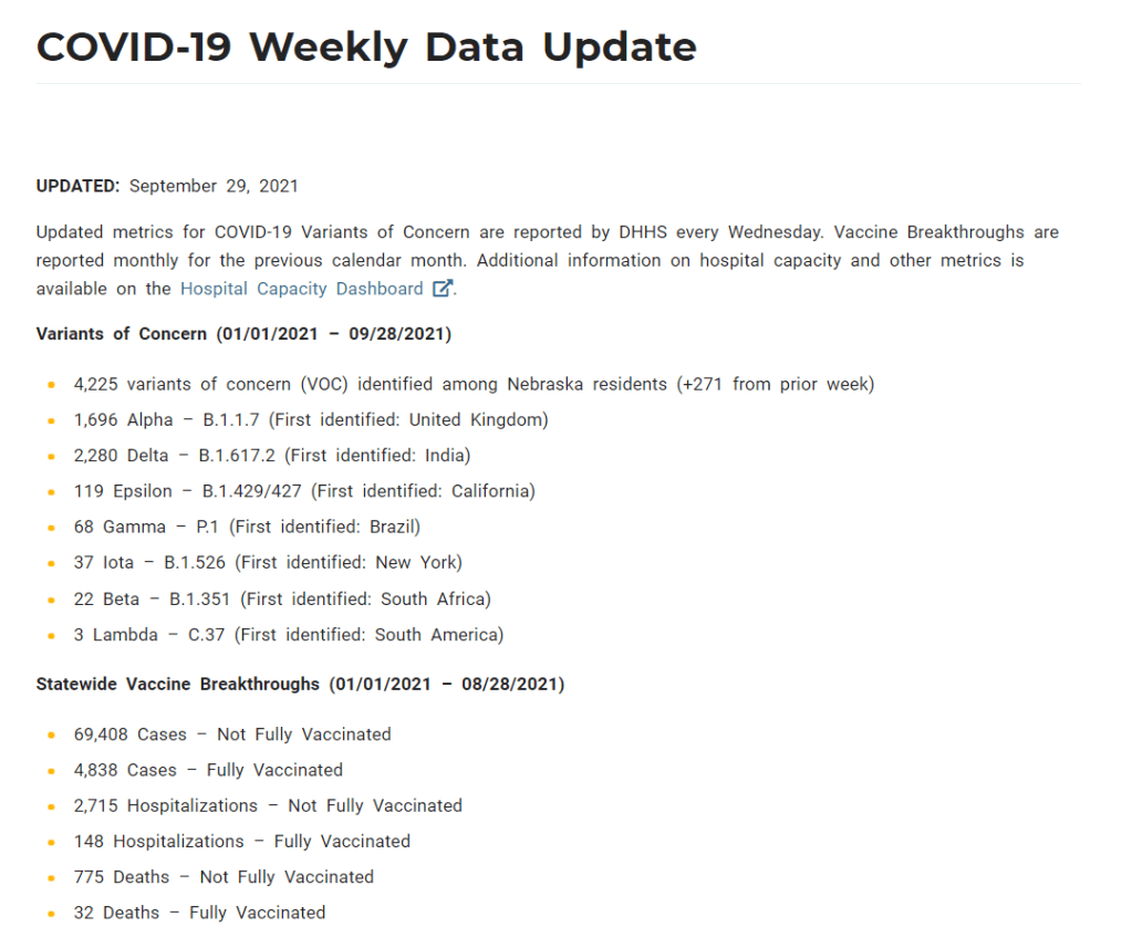
On June 30, Nebraska’s public health department discontinued its COVID-19 dashboard. The dashboard had provided daily updates for cases, deaths, vaccinations, and other metrics. After June 30, it was replaced with a stripped-down “Weekly Data Update,” providing a few major metrics, such as the cases reported and vaccine doses administered in the past week. This update is posted every Wednesday.
When I checked on Nebraska yesterday for an update of my vaccine annotations page, I was shocked to find that the state’s Weekly Update has been pared down even further. It now includes just two metrics: variants of concern and vaccine breakthroughs. Nebraska’s health department is reporting: 1) the total cases identified as variants of concern in the state, and 2) total cases, hospitalizations, and deaths split by “fully vaccinated” and “not fully vaccinated.”
This is literally the entire report. Screenshot taken on October 3.
Compared to the detailed dashboard this state used to produce, this weekly update is incredibly sparse. It reminds me of a state COVID-19 data page from the early days of the pandemic—like, March 2020. If any local journalists from Nebraska are reading: I am so sorry.
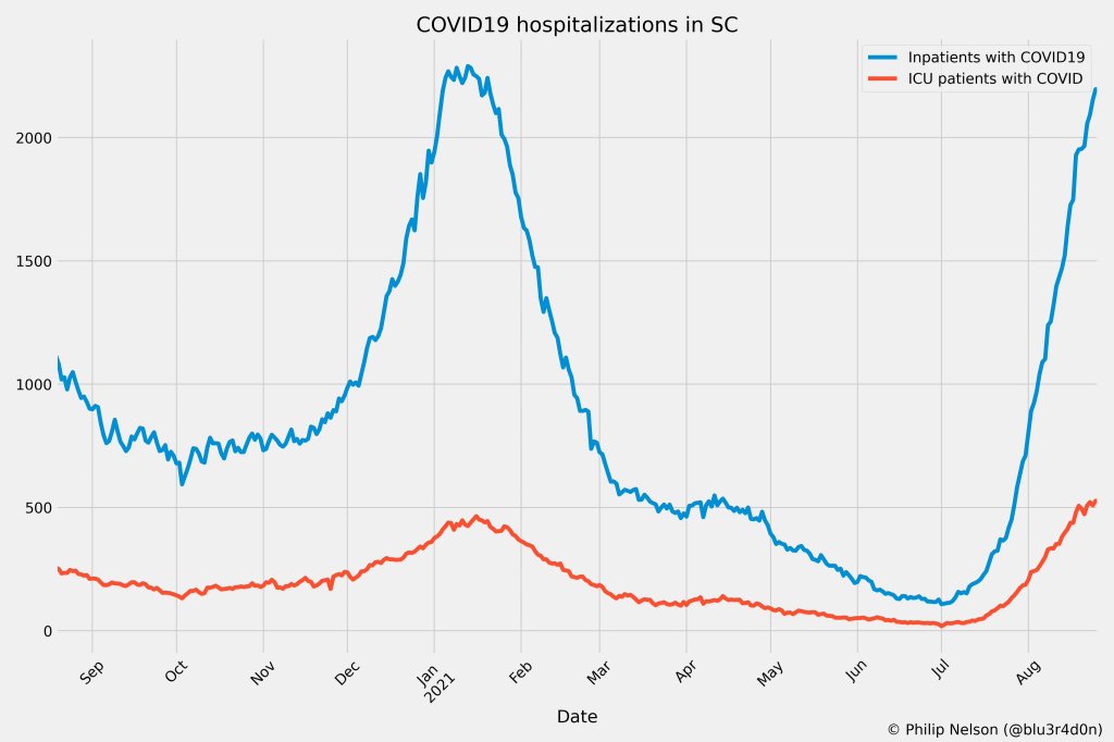
If you post in the COVID-19 data Twitter-sphere, you’re likely familiar with Philip Nelson, a computer science student at Winthrop University—and an expert in navigating and sharing data from the state of South Carolina. Philip posts regular South Carolina updates including the state’s case counts, hospitalizations, test positivity, and other major figures, and contributes to discussions about data analysis and accessibility.
I invited Philip to contribute a post this week after reading his Tweets about his ongoing challenges in accessing his state’s hospitalization data. Basically, after Philip publicized a backend data service that enabled users to see daily COVID-19 patient numbers by individual South Carolina hospital, the state restricted this service’s use—essentially making the data impossible for outside researchers to analyze.
To me, his story speaks to broader issues with state COVID-19 data, such as: agencies adding or removing data without explanation, a lack of clear data documentation, failure to advertise data sources to the public, and mismatches between state and federal data sources. These issues are, of course, tied to the systematic underfunding of state and local public health departments across the country, making them unequipped to respond to the pandemic.
South Carolina seems to be particularly arduous to deal with, however, as Philip describes below.
I’ve been collecting and visualizing South Carolina-related COVID-19 data since April 2020. I’m a computer science major at Winthrop University, so naturally I like to automate things, but collecting and aggregating data from constantly-changing data sources proved to be far more difficult than I anticipated.
At the beginning of the pandemic, I had barely opened Excel and had never used the Python library pandas, but I knew how to program and I was interested in tracking COVID-19 data. So, in early March 2020, I watched very closely as the South Carolina Department of Health and Environmental Control (DHEC) reported new cases.
During the early days of the pandemic, DHEC provided a single chart on their website with their numbers of negative and positive tests; I created a small spreadsheet tracking these cases. After a few days, DHEC transitioned to a dashboard that shared county level data.
On March 23, I noticed an issue with the new dashboard. Apparently, someone had misconfigured authentication on something in the backend. (When data sources are put behind authentication, anyone outside of the organization providing that source loses access.) The issue was quickly fixed and I carried on with my manual entry, but this was not the last time I’d have to think about authentication.
Initially, I manually entered the number of cases and deaths that DHEC reported. I thought I might be able to use the New York Times’ COVID-19 dataset, but after comparing it to the DHEC’s data, I decided that I’d have to continue my own manual entry.
South Carolina’s REST API
In August 2020, I encountered some other programmers on Twitter who had discovered a REST API on DHEC’s website. REST is a standard for APIs that make it easier for developers to use services on the web. In this case, I was able to make simple requests to the server and receive data as a response. After starting a database fundamentals course during the fall 2020 semester, I figured out how to query the service: I could use the data in the API to get cases and deaths for each county by day.
This API gave me the ability to automate all of my update processes. By further exploring the ArcGIS REST API website, I realized that DHEC had other data services available. In addition to county-level data, the agency also provided an API for cases by ZIP code. I used these data to create custom zip code level graphs upon request, and another person I encountered built a ZIP code map of cases.
During August 2020, the CDC stopped reporting hospitalization data and the federal government shifted to using data collected by the Department of Health and Human Services (HHS) and Teletracking. DHEC provided a geoservice for hospitalizations, based off of data provided to DHEC by Teletracking on behalf of the HHS. I did some exploration of the hospitalization REST API and found that the data in this API was facility-level (individual hospitals), updated daily. I aggregated the numbers in the API based on the report date in order to provide data for my hospitalization graph. At the time, I didn’t know that the federal government does not provide daily facility level data to the public.
In October 2020, DHEC put their ZIP code-level API behind authentication. I voiced my displeasure publicly. In late December 2020, DHEC put the API that contained county level cases and deaths behind authentication. At this point, I began to get frustrated with DHEC for putting things behind authentication without warning, but I kind-of gave up on getting the deaths data out of an API. Thankfully, DHEC still provided an API for confirmed cases, so I switched my scripts to scrape death data from PDFs provided by DHEC each day. I didn’t like using the PDFs because they did not capture deaths that were retroactively moved from one date to another, unlike the API.
I ran my daily updates until early June 2021, when DHEC changed their reporting format to a weekday-only schedule. I assumed that we’d seen the last wave of the pandemic and that, thanks to readily available vaccines, we had relegated the virus to a containable state. Unfortunately, that was not the case — and by mid-July, I had resumed my daily updates.
Hospitalization data issues
In August 2021, people in my Twitter circle became interested in pediatric data. I decided to return to exploring the hospitalization API because I knew it had pediatric-related attributes. It was during that exploration that I realized I had access to daily facility-level data that the federal government was not providing to the public; the federal government provides weekly facility-level data. My first reaction was to build a Tableau dashboard that let people look at the numbers of adults and pediatric patients with COVID19 at the facility level in South Carolina over time.
After posting that dashboard on Twitter, I kept hearing that people wanted a replacement for DHEC’s hospitalization dashboard which, at the time, only updated on Tuesdays. So, I made a similar dashboard that provided more information and allowed users to filter down to specific days and individual hospitals, then I tweeted it at DHEC. Admittedly, this probably wasn’t the smartest move.
I kept exploring the hospitalization data and found that it contained COVID-19-related emergency department visits by day, another data point provided weekly by HHS. After plotting out the total number of visits each day and reading the criteria for this data point, I decided I needed to make another dashboard for this. A day after I posted the dashboard to Twitter, DHEC put the API I was using behind authentication, again I tweeted my frustration.
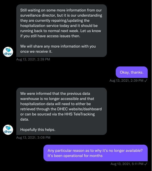
A little while later, DHEC messaged me on Twitter and told me that they were doing repairs to the API. I was later informed that the API was no longer accessible, and that I would have to use DHEC’s dashboard or HHS data. The agency’s dashboard does not allow data downloads, making it difficult for programmers to use it as a source for original analysis and visualization.
I asked for information on why the API was no longer operational; DHEC responded that they had overhauled their hospitalization dashboard, resulting in changes to how they ingest data from the federal government. This response did not make it clear why DHEC needed to put authentication on the daily facility-level hospitalization data.
Twitter conversation between Philip and the South Carolina DHEC, shared by Philip.
Meanwhile, DHEC’s hospital utilization dashboard has started updating daily again. But after examining several days’ worth of data, I cannot figure out how the numbers on DHEC’s dashboard correlate to HHS data. I’ve tried matching columns from a range dates to the data displayed, but haven’t been able to find a date where the numbers are equal. DHEC says the data is sourced from HHS’ TeleTracking system on their dashboard, but it’s not immediately clear to me why the numbers do not match. I’ve asked DHEC for an explanation, but haven’t received a response.
Lack of transparency from DHEC
I’ve recently started to get familiar with the process of using FOIA requests. In the past week, I got answers on requests that I submitted to DHEC for probable cases by county per day. This data is publicly accessible (but not downloadable) via a Tableau dashboard, but there is over 500 days’ worth of data for 46 counties. The data DHEC gave to me through the FOI process are heavily suppressed and, in my opinion, not usable.
This has been quite a journey for me, especially in learning how to communicate and collect data. It’s also been a lesson in how government agencies don’t always do what we want them to with data. I’ve learned that sometimes government agencies don’t always explain (or publicize) the data they provide, and so the job of finding and understanding the data is left to the people who know how to pull the data from these sources.
It’s also been eye-opening to understand that sometimes, I’m not going to be able to get answers on why a state-level agency is publishing data that doesn’t match a federal agency’s data. Most of all, it’s been a reminder that we always need to press government-operated public health agencies to be as transparent as possible with public health data.
We’ve noted in recent months that several states have scaled down their COVID-19 reporting: states are providing fewer metrics, updating their dashboards less frequently, or both. For example, Florida switched from a dashboard and daily PDF reports to weekly reports with much less information.
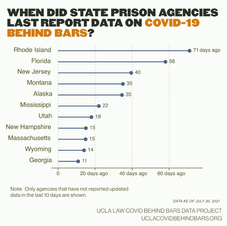
According to the UCLA COVID Behind Bars data project, these changes are also hitting state carceral agencies—responsible for reporting COVID-19 cases in prisons and jails—right as Delta causes new outbreaks in these facilities.
Four agencies have stopped reporting these data altogether: state agencies in Florida, Georgia, and Massachusetts along with the Texas Commission on Jail Standards. Several other states haven’t updated their public data in over a month, including Rhode Island, New Jersey, Montana, and Alaska.
“Carceral agencies are responsible for the care of those in their custody, and, at a bare minimum, these agencies must track and report on COVID-19 cases and deaths in their facilities, regardless of the number of cases,” researchers from the UCLA project wrote in a recent blog post. “The fact that many are no longer doing so, or are doing so less frequently, is especially concerning given that the Delta variant is circulating rapidly around the country.”
The UCLA researchers say that these data reductions come as new outbreaks hit prisons in Delta hotspots: “Prisons in Texas and Missouri, for example, have seen a 500% increase in the number of active cases over the month of July.” Many prison residents and staffers are not vaccinated, leaving them vulnerable to the variant.
Right now, we need more information on COVID-19 in these facilities, not less.
Screenshot of the now-downsized vaccine incentives page.
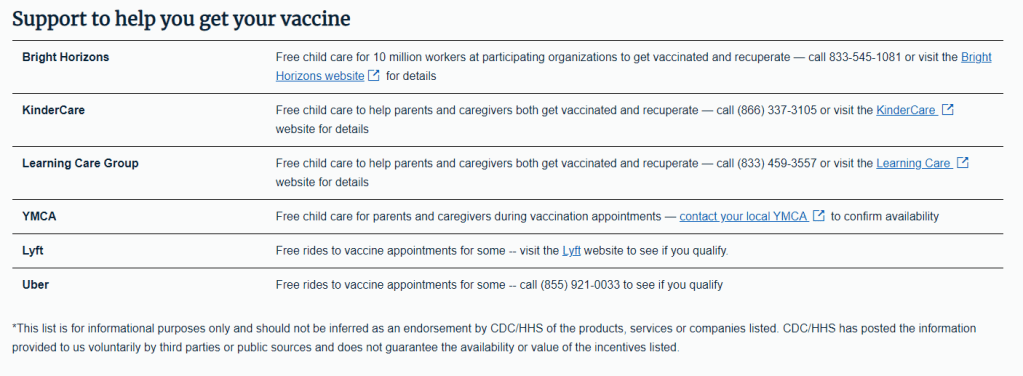
In the June 6 issue, one of our featured sources was a page from the federal government’s vaccine.gov site, providing an extensive list of rewards for Americans who got their shots—ranging from free Krispy Kreme donuts to a United Airlines sweepstakes.
Now, however, that same page only offers a small list of support options for Americans who may need assistance in making their appointments. These include childcare support and free rides from Uber and Lyft; still valuable information, but a huge change from the previous page.
What happened to the big list? A new note at the bottom of the page offers a clue: “This list is for informational purposes only and should not be inferred as an endorsement by CDC/HHS of the products, services or companies listed.”
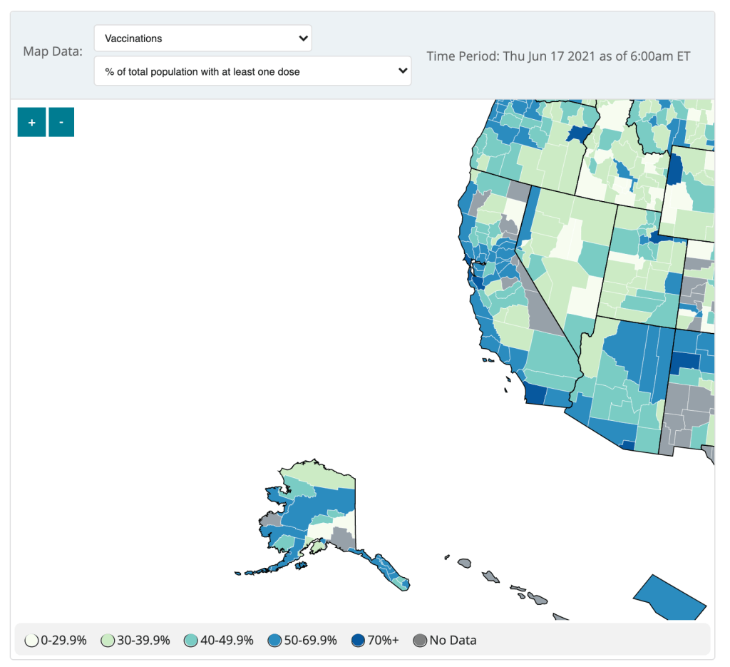
The CDC updated the County View page of its COVID Data Tracker this week, now allowing users to see vaccination coverage maps reflecting the population that has received at least one dose. (Previously, only fully vaccinated coverage maps were available.)
The map does paint a stark picture of vaccination disparities in the U.S., with the Northeast and West coast notably darker blue than parts of the South and Midwest. However, the CDC’s UI leaves much to be desired.
Try hitting the plus icon to zoom in, for example. You’ll land somewhere in the Pacific Ocean, with no way of dragging the map to an actual populated area. Then, when you zoom out, you stay in the Pacific, and the U.S. map gets even smaller.
The CDC zooms you into the Pacific.
The best way to actually zoom in, I’ve found, is by clicking on an individual county or selecting a region with the drop-down menus above the map. Not exactly intuitive, CDC!
(Thank you to my friend/CDD reader Charlotte for suggesting this callout.)
The Florida public health agency is stalling daily updates to its COVID-19 dashboard, cases, and vaccine reports. Instead, the department will post weekly reports on Fridays, the Miami Herald reports.
The new reports will only include Florida residents, discounting any non-residents who become infected in the state. Florida is also no longer publishing reports on COVID-19 in schools, long-term care facilities, and prisons. Instead, the weekly reports will include more vaccination data.
When asked about the reason for this change, the Miami Herald reports, the health department cited high vaccination numbers for Florida residents and a low test positivity rate. But that doesn’t mean the pandemic is over—especially for the state’s minority residents, who have been vaccinated at a lower rate than white Floridians.
I will be watching with trepidation to see if any other states follow Florida’s lead in the coming weeks.
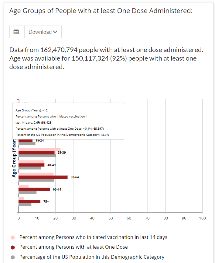
Screenshot of the CDC’s vaccine dashboard, showing about 65,000 first dose vaccinations for children under age 12.
When I sent out last week’s issue, the CDC’s Vaccination Demographics page was grouping newly eligible 12 to 15-year-olds in with 16 to 17-year-olds. Now, the agency’s age reporting has diversified a bit: you can find separate vaccination numbers for children ages 16 to 17, 12 to 15, and under 12.
Wait… under 12?
That’s right. The CDC reports that about 65,000 children under age 12 have received at least one vaccine dose as of May 22, even though this age group is not yet eligible for any of the vaccines on the market.
Where did this number come from? The CDC’s page doesn’t offer any explanations, but possibilities may include:
Pfizer and Moderna are currently running clinical trials for the under-12 population, and children in these trials may have been entered into vaccination records.
Errors in the data pipeline—maybe some kids in the 12 to 15 age group were logged as under 12 instead, or some birthdays were input incorrectly.
But the Pfizer and Moderna trials have enrolled only 12,000 under-12 participants total. That leaves over 50,000 vaccinations that we can’t explain—it’s a pretty big number to attribute to data errors.
For the past year, nonprofit news organization The Marshall Project has tracked COVID-19 cases in prisons, in collaboration with The Associated Press. The tracking effort has primarily focused on compiling numbers from state and federal prison bureaus, through a weekly tally that compares total cases reported by these agencies to their previous totals.
This week, though, the Federal Bureau of Prisons started excluding a lot of prisoners from their count. The bureau is removing cases of any prisoner who gets released from their overall COVID-19 case total—and they aren’t reporting any data on those formerly incarcerated individuals who tested positive while in prison.
For more detail, see this thread from The Marshall Project’s Twitter account:
This week, new COVID-19 cases in prisons were near the lowest of the pandemic in @marshallproj and @AP’s data. But we noticed that @officialFBOP has been removing cases from their totals. So now we can’t accurately count how many cases there have been. https://t.co/qeOZKfSQuD
“We continue to pursue this information about the number of prisoners who have been sickened in federal prisons,” The Marshall Project writes. “But until the Bureau of Prisons provides it, we are unable to record their total.”
The Federal Bureau of Prisons has reported more COVID-19 cases than any other prison system in the country (at least 49,000 to date), so this new data practice may become a major data gap. I know journalists at The Marshall Project will continue extensive coverage of the BOP, though, as they have for the past year. (For more on their tracker of COVID-19 in the prison system, see the recording and recap of our second Diving into COVID-19 Data workshop.)


