- COVID-19 diverse sources: NPR journalists from the organization’s Source of the Week project have compiled this database of COVID-19 experts from diverse backgrounds. The database is divided into 13 major categories, including virology, disease origin, health policy, racial/ethnic health disparities, and more. I know I’ll be using this database in my own reporting!
- School Survey Dashboard from the Institute of Education Statistics: As part of the Biden Administration’s commitment to reopening K-12 schools across the country, the federal government is now collecting data on how students are receiving education—and releasing those data on a monthly basis. This dashboard draws from surveys of a nationally represented sample including 7,000 rural, suburban, and urban schools, focusing on fourth-graders and eighth-graders. We don’t have data on COVID-19 cases, tests, or enrollment numbers, and several major states are missing, but this is a good start! For more on these data, read Lauren Camera in U.S. News.
- Counties with High COVID-19 Incidence and Relatively Large Racial and Ethnic Minority Populations (CDC MMWR): The CDC continues adding to the overwhelming body of evidence pointing to disproportionately high COVID-19 impacts for people of color in the U.S. This report, released last Wednesday, identified counties across the U.S. that had both large minority populations and high COVID-19 case counts (relative to their populations) between April and December 2020. Different racial/ethnic groups have had different trajectories, but by mid-December, almost all counties in the U.S. had high case numbers thanks to the overwhelming winter surge.
- PreventCOVIDU study examines vaccine effectiveness in college students: At the White House COVID-19 briefing this Friday, Dr. Fauci described a new clinical trial that kicked off this past week. 12,000 college students, age 18-26, at 22 universities across the country, will be followed over the 5 months. Half of the students are receiving Moderna vaccine doses now, while the other half will serve as a control group (and get vaccinated later). All students will get tested daily—and, in a unique move for vaccine studies, about 25,000 of these students’ close contacts will also get tested daily. The study is designed to determine if the Moderna vaccine prevents coronavirus infection and transmission. See the list of participating universities at the link.
Tag: race & ethnicity data
-
Featured sources, March 28
-
New, more local data from the CDC
The CDC made two major updates to its COVID-19 data this week.
First: On Tuesday, the agency published a new dataset with more granular information on COVID-19 cases. Like previous case surveillance datasets, this new source compiles cases shared with the CDC, along with anonymized information on their symptoms, underlying medical conditions, race/ethnicity, and other variables. The new dataset is notable because it includes detailed geographic data, going down to the county level.
After months of no state-by-state demographic data from the federal government, we now have county-by-county demographic data. This is a pretty big deal! It’s also a pretty big dataset; it includes about 22 million cases (out of a total 30 million U.S. cases to date).
Of those 22 million cases, race is available for about 13 million cases (58%) and ethnicity is available for about 10 million cases (47%). The dataset will be updated monthly, so we may see better completion with further updates. I haven’t had time to do much detailed analysis of the new dataset yet (hell, I haven’t even managed to get it to load on my computer), but I’m excited to dive into it for future issues.
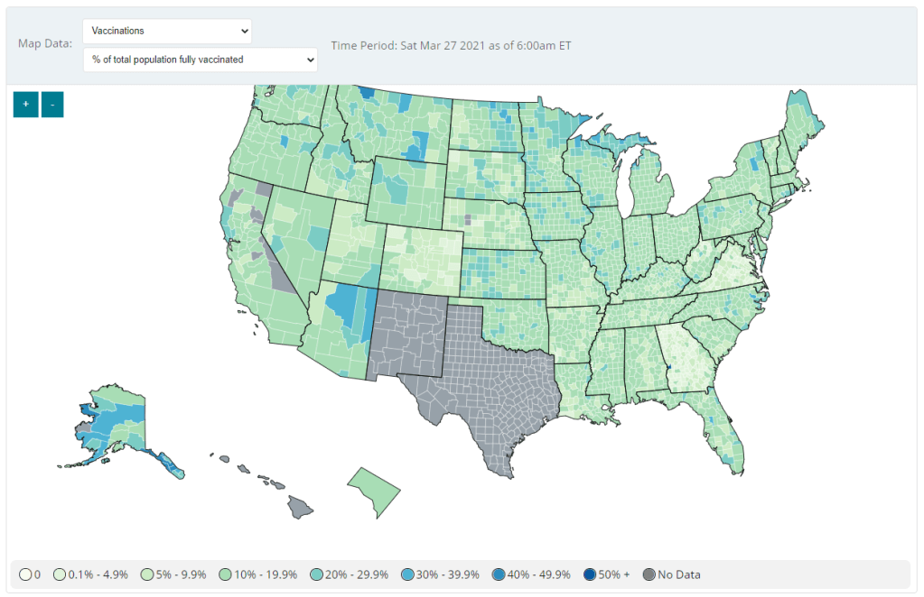
Second: Vaccination data at the county level are now available on the CDC’s COVID Data Tracker, as of Friday. No, not in the vaccinations section—you need to go to the County View section, then select “Vaccinations” in the dropdown menu. Click on a specific county (or select it using dropdown menus), and you’ll be able to see data for that county.

County-level vaccination data from the CDC. Screenshot taken on March 27. At the moment, only three data points are available: total fully vaccinated population, fully vaccinated population over age 18, and fully vaccinated population over age 65. Also, data are missing for Texas, New Mexico, and select other counties. Still, this a great start for more standardized vaccination data at the national level. (Can we get more demographic data next?)
These county-level vaccination data aren’t downloadable directly from the CDC’s tracker, but the COVID Tracking Project is archiving the data at the Project’s public GitHub. The New York TImes has also built an interactive map with the data, which you can find on their vaccine tracker.
It’s worth noting that I found out about both of these updates via tweets from the White House COVID-19 Data Director, Cyrus Shahpar. I’m on both the CDC’s press list and the White House press list, and I watch nearly every White House COVID-19 press briefing, so it seems a little odd that I’m getting the news from Twitter.
(Not that I don’t love Cyrus’ daily tweets! I just wonder about the PR strategy here. Also, Cyrus, if you’re reading this, that interview request I sent back in January still stands.)
-
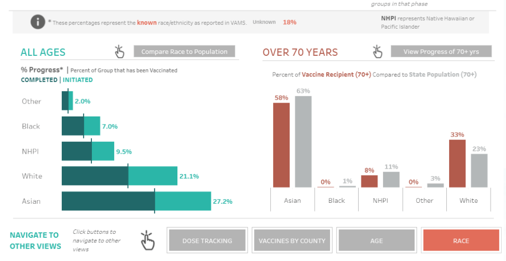
COVID source shout-out: Hawaii
Hawaii is the latest state to add vaccinations by race to its dashboard. I am a fan of both the state’s green-and-orange color choices and its handy finger-pointing icon, instructing users to hover over each bar in order to compare vaccination numbers to Hawaii’s demographics.

Screenshot from Hawaii’s vaccination dashboard, taken on March 20. We’re now down to just four states that haven’t yet reported this crucial metric: Montana, New Hampshire, South Dakota, and Wyoming.
-
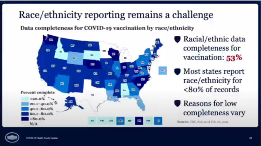
COVID source callout: CDC race/ethnicity data
In the White House COVID-19 briefing this past Monday, equity task force director Dr. Marcella Nunez-Smith showed, for one fleeting minute, a slide on completeness of state-by-state data on vaccinations by race and ethnicity. The slide pointed out that racial/ethnic data was only available for 53% of vaccinations, and most states report these data for fewer than 80% of records.
Still, though, this slide demonstrated that the CDC does have access to these crucial data. As we’ve discussed in past issues, while many states (45 plus DC) are now reporting vaccinations by race/ethnicity, huge inconsistencies in state reporting practices make these data difficult to compare. It is properly the job of the CDC to standardize these data and make them public.
The CDC is actually under scrutiny right now from the HHS inspector general for failing to collect and report complete COVID-19 race/ethnicity data. You can read POLITICO for more detail here; suffice it to say, I’m excited to see the results of this investigation.
Also, while we’re at it, let’s publicly shame the five states that are not yet reporting vaccinations by race/ethnicity on their own dashboards. Get it together, Hawaii, Montana, New Hampshire, South Dakota, and Wyoming!
-
COVID source callout: Age brackets
As of yesterday, 45 states and D.C. are reporting vaccinations by race and ethnicity. (See the CDD’s full annotations here.) This is great—with five more states, we’ll have national coverage. But the lack of standardization in how states report these figures leaves much to be desired.
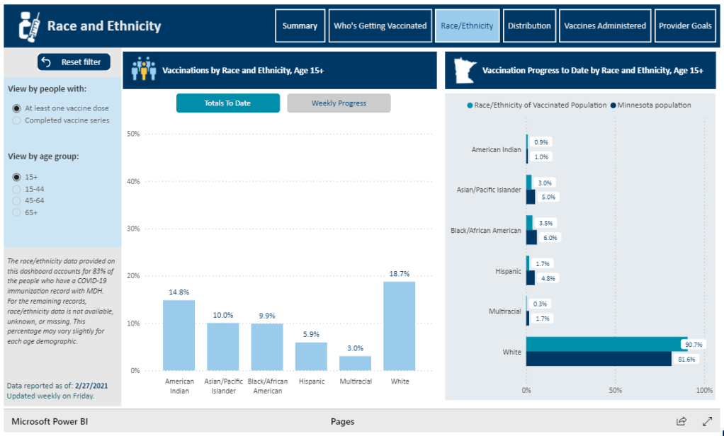
One of the newest states to start reporting race/ethnicity vaccination data is Minnesota. At a glance, the Race/Ethnicity tab of the state’s vaccine data dashboard looks comprehensive: it includes demographic data stratified by age, as well as a bar chart that compares the population that’s been vaccinated to Minnesota’s population overall.

Race/Ethnicity tab on Minnesota’s vaccine dashboard, showing percent comparisons. But a closer examination shows that the age groups reported on this Race/Ethnicity tab (15-44, 45-64, 65+) don’t match the age groups used to report vaccinations by age on a different tab (16-17, 18-49, 50-64, 65+). So if a journalist or researcher were trying to analyze Minnesota’s vaccine demographics, they wouldn’t be able to derive whole numbers from these percentages.
This is one small example of a common issue across state vaccine demographic reporting—and demographic reporting in general. When categories don’t match, it’s difficult to make comparisons, and age brackets are particularly heinous. We need the CDC to start providing vaccine demographics by state, like, last December.
-
Diving into COVID-19 data #1: Workshop recap
Our first workshop happened this week!
Drew Armstrong, Bloomberg News‘s senior editor for health care, talked about his work on the publication’s Vaccine Tracker; and Arielle Levin Becker, director of communications and strategic initiatives for the Connecticut Health Foundation, discussed how to navigate COVID-19 race and ethnicity data. Thank you to everyone who attended—we had a great turnout!
For those who couldn’t make it live, you can watch the recording of the session below. You can also check out the slides here. I’m also sharing a brief recap of the workshop in today’s issue.
In next Wednesday’s workshop, we’ll discuss engaging COVID-19 data providers, featuring Liz Essley Whyte (Center for Public Integrity), Tom Meagher (The Marshall Project), and Erica Hensley (independent reporter from Mississippi). If you aren’t registered for the series yet, you can sign up here.
The Bloomberg Vaccine Tracker
In his presentation, Drew Armstrong provided a behind-the-scenes look at Bloomberg’s tracker and shared some advice on analyzing vaccine data more broadly.
“We attempt to capture every vaccine dose that’s reported for COVID-19, every single day, around the world,” he said. In addition to the tracker’s daily updates on vaccine doses distributed and administered, the site also includes information on vaccine contracts between companies and countries—allowing a window into future distribution.
All of the data on the tracker comes from public sources, largely national and state public health departments that share figures via their own dashboards, press conferences, and social media. Like other aspects of pandemic data, these figures can be pretty messy. Every country, and even every state, may have its own definition of an “administered dose” or a “vaccinated individual”—and these definitions are evolving as the rollout progresses.
Armstrong provided one example: Tennessee reports “number of people with 1 dose only” vs. “2 doses,” and moves people from the first category to the second after they receive that second dose. Maryland, on the other hand, reports total people who have received one and two doses; both totals are always growing. It’s difficult to make apples-to-apples comparisons when every jurisdiction is doing something different. If you can, Armstrong said, actually get on the phone with your local official and make sure you understand precisely what the terms on their vaccine reports mean. When the Johnson & Johnson vaccine (which only requires one dose) starts rolling out, this definitional landscape will only get more complicated.
As a result of this messy data landscape, figures for the Bloomberg Vaccine Tracker are compiled manually by a huge team, including reporters from every bureau of the publication. “You have to really get your hands dirty with this data to understand it,” Armstrong said.
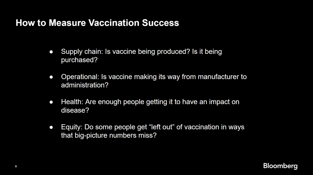
Armstrong also provided four ways for reporters to measure vaccination success. I’m including his slide here because I think it provides a good look at the multifaceted nature of vaccine data analysis and communication; your state might be vaccinating residents at a quick pace, but if the most vulnerable members of your community have been left out, you can’t fully call that rollout a success.

Slide from Drew Armstrong’s talk discussing the Bloomberg Vaccine Tracker. On the equity front: Armstrong announced that the Bloomberg tracker now includes a demographic vertical. This tracker currently includes data from 27 states and two cities which are reporting vaccinations by race and/or ethnicity—you can check it out here. Bloomberg’s team is planning to update this tracker weekly, adding more states as their data become available.
Armstrong emphasized that he and his colleagues want their tracker to be a resource for other journalists, civic engagement, and other public health communication. “All of our DMs are open,” he said. (Or you can send feedback to the team through a public form.)
He also noted that reporting on these data—or even @-ing your governor on Twitter and asking them why the numbers aren’t better—is a useful way of actually making the data better. By letting public officials know that we’re looking at these numbers and noticing the gaps, we can put the pressure on for changes to be made.
Analyzing sources of race and ethnicity data
In her presentation, Arielle Levin Becker shared some strategies and resources for navigating a new data source—with a focus on demographic data.
“Data is incredibly important—and easy to misuse,” she said at the start of her talk. Vetting a source properly, she explained, can help you understand both how to properly use this source and how to address its limitations in your reporting.
Vetting questions to consider:
- Who’s compiling this source?
- Who’s funding it?
- How transparent are they about their methods? Can you identify how it was compiled, or even track the chain of their methodology?
- Do they disclose the limitations of the data?
Similarly to Armstrong, Levin Becker recommended reaching out to a source directly when you have questions. People who compile public data are often “very welcoming” about explaining their work, she said, and may be excited to help you better use their data.
Once you get to the analysis stage, Levin Becker suggested asking another round of questions, such as, “Do the numbers in this source match other numbers from similar sources?” and “How could I explain these numbers in plain English?” One particularly important question, she said, is: “What’s the denominator?” Does this analysis apply to everyone in a state or to a particular subset, like the over-65 population? As we’ve discussed before, denominators can be a particular challenge for COVID-19 school data—without enrollment numbers or clear data definitions, case numbers associated with schools are difficult to interpret.
Levin Becker honed in on age adjustment, a process that’s commonly used in health data analysis to compare outcomes for different populations. It’s kind-of a complicated statistical process, she said, but the basic idea is, you weight your data by the age distribution of a population. White populations tend to skew older than Black and Hispanic/Latino populations, for example; to compare these groups in a more equivalent way, a researcher might calculate what their disease rates would be if the different populations had the same age distribution.
Before the state of Connecticut started age-adjusting its COVID-19 death rates, Levin Becker said, the public health department was boasting that Hispanic/Latino residents of the state were less likely to die from the disease than white residents. But after doing an age adjustment, the state revealed that residents of color were actually at higher risk.

Slide from Arielle Levin Becker’s talk, showing how age adjustment can reveal health disparities. Chart is from the CT health department. “The median age for a non-Hispanic white resident is 47 years,” Levin Becker said. “For a non-Hispanic Black resident, the median age is 34 years, and for a Hispanic resident, it’s 29 years.”
To put COVID-19 race and ethnicity data in context, Levin Becker recommended looking at other health data—particularly on preexisting conditions that might constitute higher risks for severe COVID-19. The Kaiser Family Foundation, Behavioral Risk Factor Surveillance System, and CDC life expectancy data by ZIP code are three sources she suggested reporters dig into.
Finally, of course, there are many instances in which the lack of data is the story. There’s been a big focus on race and ethnicity data for COVID-19 vaccinations, but we’re also still missing data on other pandemic impacts. For example, the federal government and the vast majority of states don’t report COVID-19 tests by race and ethnicity. In a lot of cases, Levin Becker said, healthcare providers simply aren’t required to record the race and ethnicity of their patients—“it hasn’t been prioritized in health systems.”
When the COVID-19 pandemic is no longer an imminent crisis, she said, “keep poking at the questions of what’s being collected and how it’s used.” Continued advocacy by journalists and other communicators can keep the pressure on to improve our race and ethnicity healthcare data—and use it to reveal the disparities that must be fixed.
Related resources
A few links shared in the chat during this session:
-
Next in vaccination data demands: More hyperlocal data

Demographic data released by the CDC; figures as of Feb. 14. The CDC continues to improve its vaccination reporting. The agency is now regularly reporting demographic data on its dashboard—including race, ethnicity, age, and sex. You can see counts for both U.S. residents who have received one and two doses. Like the rest of the CDC’s dashboard, the agency is updating these figures every day.
Advocates for greater equity in the vaccine rollout have pushed for such a data release for weeks. Meanwhile, more states than ever before are publishing their own demographic data: as of yesterday, we’re up to 33 states reporting race and/or ethnicity of vaccinated residents, 36 reporting age, and 32 reporting sex/gender.
But when it comes to tracking who’s getting vaccinated in America, we still have a long way to go. Now that demographic data are becoming more available at the federal and state levels, equity advocates are pushing for more local data—vaccinations by county, by town, by ZIP code.
New York City data reporter Ann Choi, for example, pointed out on Friday that this city has lagged behind cities such as Chicago and D.C. in releasing ZIP code-level vaccination data, which would allow researchers and journalists to see precisely which neighborhoods are getting more shots. And NYC ZIP codes are precise—I’m literally moving two blocks, but my ZIP code is changing.
(P.S. Ann will be speaking at the third workshop in the Diving into COVID-19 data series, on March 3, about her work at THE CITY!)
The Biden administration will soon start sending doses directly to Community Vaccination Centers, sites operated in partnership with existing community health clinics in an attempt to capitalize on existing connections that these clinics have in their neighborhoods. In order to judge the success of these clinics, we need data about their communities. Local data, demographic data, occupation data… the more complete picture that we can get, the better.
With more local data, we can do more stories like these:
- Across The South COVID-19 Vaccine Sites Missing From Black And Hispanic Neighborhoods (NPR)
- At This Early Stage of the COVID-19 Vaccine Roll-Out, Most Older Adults Have Not Yet Been Vaccinated As Supply Remains Limited (KFF)
- Covid-19 vaccination rates follow the money in states with the biggest wealth gaps, analysis shows (STAT)
Related posts
- Sources and updates, November 12Sources and updates for the week of November 12 include new vaccination data, a rapid test receiving FDA approval, treatment guidelines, and more.
- How is the CDC tracking the latest round of COVID-19 vaccines?Following the end of the federal public health emergency in May, the CDC has lost its authority to collect vaccination data from all state and local health agencies that keep immunization records. As a result, the CDC is no longer providing comprehensive vaccination numbers on its COVID-19 dashboards. But we still have some information about this year’s vaccination campaign, thanks to continued CDC efforts as well as reporting by other health agencies and research organizations.
- Sources and updates, October 8Sources and updates for the week of October 8 include new papers about booster shot uptake, at-home tests, and Long COVID symptoms.
- COVID source shout-out: Novavax’s booster is now availableThis week, the FDA authorized Novavax’s updated COVID-19 vaccine. Here’s why some people are excited to get Novavax’s vaccine this fall, as opposed to Pfizer’s or Moderna’s.
-
Federal data updates, Feb. 7
Since our main stories this week focused on NYC, here are a couple of updates from the federal public health agencies.
- CDC releases demographic vaccination data: This past Monday, the CDC published a MMWR report on characteristics of Americans vaccinated during the first month of our vaccine rollout, December 14 to January 14. Race/ethnicity data are missing for almost half of the vaccinations recorded here, but the existing data show white Americans getting vaccinated at higher rates than Black and Hispanic/Latino Americans.
- CDC vaccination dashboard now includes time series: As of Thursday, the CDC’s COVID Data Tracker now includes a page called “Vaccination Trends,” which shows daily counts of total doses administered, people receiving 1 dose, and people receiving 2 doses. The doses are assigned to the date they’re administered, not the date they’re reported, so they may not match time series on other dashboards. Time series aren’t yet available for individual states.
- KFF reports COVID-19 vaccinations by race/ethnicity: The Kaiser Family Foundation’s “State COVID-19 Data and Policy Actions” tracker now includes a dashboard with vaccinations by race/ethnicity, including data from 23 states as of Feb. 1. KFF says the data will be updated on a regular basis.
- U.S. Department of Education surveying COVID-19’s impact for students: On Friday, the Department of Education announced that the Institute of Education Sciences would collect “vital data on the impact of COVID-19 on students and the status of in-person learning.” Data gathered in the survey will include the share of America’s schools that are open in-person vs. remote, enrollment by various demographic metrics, attendance rates, and information on the logistics of in-person and remote instruction. Notably, the survey does not promise to collect data on COVID-19 cases, hospitalizations, and deaths associated with K-12 schools.
- At-home tests are coming: This week, the White House announced that the new administration has contracted with diagnostic company Ellume and six other suppliers to produce tens of millions of at-home tests by the end of the summer. Ellume’s test is an antigen test, and, though the other test suppliers haven’t yet been announced, we can assume they also make antigen or rapid nucleic acid amplification tests; neither test type is currently reported by the federal government. If these tests do become a significant part of America’s COVID-19 response—and some experts are skeptical that this will happen—a major change in test reporting practices will be needed.
-
Access barriers lead to vaccination disparity in NYC
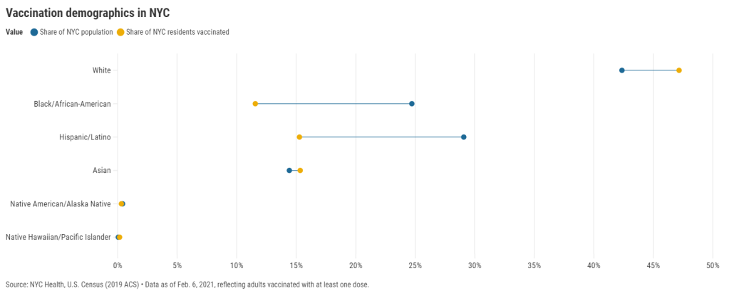
27 states are now reporting race and ethnicity data for their vaccinations. This week, New York joined that number. New York City also started reporting these data last Sunday, as we noted in that day’s issue. Despite promises from city and state leadership to prioritize equity in the vaccine rollout, the numbers so far are showing white New Yorkers getting vaccinated at much higher rates than their Black and Hispanic/Latino neighbors.
Here’s one way of visualizing the disparity: Black New Yorkers make up 25% of NYC’s population, but only 12% of those vaccinated. Latino New Yorkers make up 29% of the population, but only 15% of those vaccinated.
Here’s another way of visualizing the disparity: about 4.6% of white NYC residents have been vaccinated, compared to 2.2% of Latino New Yorkers and only 2% of Black New Yorkers. White New Yorkers are getting vaccinated twice as fast as their neighbors. This is particularly striking when you consider that Black and Latino New Yorkers disproportionately make up our essential workers—they constitute the majority of grocery workers, public transit workers, healthcare workers, childcare workers, and cleaning services workers, according to a March 2020 report by the NYC Comptroller’s office.
(Note: Asian American and Pacific Islanders make up a disproportionately large share of healthcare workers and Pacific Islanders have been particularly hard-hit by the pandemic; these two factors may help explain the high rate of vaccinations in the NYC Pacific Islander community.)
As someone who lived in NYC during the height of the city’s spring surge, I’ve seen how hard the pandemic has hit my neighbors of color. Sirens screamed through my north Brooklyn neighborhood at all hours, and hundreds of requests for aid came into my local mutual aid group. About 7,400 Black New Yorkers and 8,000 Latino New Yorkers have died of COVID-19 since the pandemic hit this city. In any version of an equitable vaccine rollout, these communities should be first in line.
So, what’s happening? Why are vaccinations for Black and Brown New Yorkers lagging? The answer is a combination of poor planning and poor access. The city didn’t set up appropriate systems to tell its most vulnerable communities about the vaccines or help them set up appointments. As a result, those NYC residents who have the time, know-how, and internet access to navigate a complex system are snapping up appointments—and you can guess which residents those are.
“What we’re going through now with the vaccine rollout reminds me of what we were going through at the beginning of the pandemic,” said Dr. Uché Blackstock, emergency physician and founder of the organization Advancing Health Equity, at a webinar with City Councilmember Mark Levine this past week. She described how she struggled to get enough tests and PPE to care for her patients—many of whom were Black and Latino essential workers—last spring.
Now, there’s both a supply gap and an information gap. In one example now infamous in the city, a vaccination site in Washington Heights (home to NYC’s Little Dominican Republic) was primarily catering to white patients from other parts of the city, the suburbs, and even New Jersey. Josefa Velasquez, a reporter at THE CITY who exposed the problems at this site, described how the vaccination center was ill-equipped to serve the population in its neighborhood:
At the door, most people entering appeared to be white and unfamiliar with the neighborhood. Some asked security guards where they could find parking. Nylon Longchamp handbags and Burberry scarves stood out.
Outside of the site, run by NewYork-Presbyterian Hospital near its Washington Heights medical center complex, Olga encountered another language barrier: None of the handful of guides and security guards outside directing people spoke Spanish.
Velasquez herself actually helped translate for some of the seniors trying to get vaccinated. After her reporting brought the vaccination center’s problems to light, the center limited all new appointments to NYC residents and reserved 60% of slots for Washington Heights residents. But the story is still indicative of larger issues: NYC data show that 23% of vaccinations in the city have gone to non-residents, and a significant majority of those non-residents are white.
Even when appointments are reserved for New Yorkers, barriers to vaccine access remain. Just this week, Yankee stadium opened as a vaccination site with all doses reserved for residents of the Bronx. Councilmember Levine posted on Friday that thousands of these appointments were still open, unreserved—while appointments elsewhere in the city get snapped up in minutes.
A reply to Levine’s Tweet reveals one reason: Bronx residents can’t access these Yankee stadium appointments through the NYC vaccination website, because this clinic is run by a network of private physicians. The city website is confusing enough already for many New Yorkers—and now that website doesn’t even encompass all available appointments.
Some residents of the Bronx also associate the stadium with invasions of their community:
At the same webinar that I cited earlier, Councilmember Levine announced a redesign of the official NYC vaccine appointment scheduler. The site’s design has been simplified and made more accessible. On the homepage, for example, users are provided with four options: Schedule First Dose, Schedule Second Dose, Reschedule Appointment, Cancel Appointment. But users still have to navigate through a checklist and input a lot of personal information in tiny boxes. And, while NYC does have a vaccine hotline, it “hasn’t been adequately staffed,” according to Levine—nor is there adequate translation.
In an ideal world, Dr. Blackstock suggests that doctors should call all their patients proactively to offer vaccine appointments. Community health workers should go door-to-door. Vaccination centers should be set up in every low-income housing development. NYC clearly dedicated nor the advance planning time nor the funding to such proactive measures. But the least we can do should be setting up an easy-to-use website and phone line, right?
(We also need more data on vaccinations by occupations, preexisting health conditions, and ZIP codes—but that’s a topic for another issue.)
Related posts
- Sources and updates, November 12Sources and updates for the week of November 12 include new vaccination data, a rapid test receiving FDA approval, treatment guidelines, and more.
- How is the CDC tracking the latest round of COVID-19 vaccines?Following the end of the federal public health emergency in May, the CDC has lost its authority to collect vaccination data from all state and local health agencies that keep immunization records. As a result, the CDC is no longer providing comprehensive vaccination numbers on its COVID-19 dashboards. But we still have some information about this year’s vaccination campaign, thanks to continued CDC efforts as well as reporting by other health agencies and research organizations.
- Sources and updates, October 8Sources and updates for the week of October 8 include new papers about booster shot uptake, at-home tests, and Long COVID symptoms.
- COVID source shout-out: Novavax’s booster is now availableThis week, the FDA authorized Novavax’s updated COVID-19 vaccine. Here’s why some people are excited to get Novavax’s vaccine this fall, as opposed to Pfizer’s or Moderna’s.
- Sources and updates, November 12
-

Vaccinations so far are perpetuating existing inequity
Two weeks ago, I wrote that only 19 states were reporting vaccinations by race and/or ethnicity. This demographic information is key to evaluating the vaccine rollout: both government officials and watchdogs should be able to see how well this process is serving vulnerable populations. Without good data, we can’t see the true picture—making it harder to advocate for a more equitable system.
Demographic vaccine data has improved since then, but not by much. The federal government is still not reporting these data on a national level. 23 states are reporting some form of vaccinations by race and ethnicity—but the data are difficult to standardize, as every state is reporting slightly different demographic categories. Several states are reporting in percentages, rather than whole numbers, which makes the data less precise.
And a lack of federal standards for these data means it’s easy for states to change things up: Indiana, which started reporting vaccinations by race/ethnicity early in January, is now only reporting vaccinations by age and gender. New York City also reported demographic data for vaccinations in December, then removed the figures after disparities were revealed, according to Gothamist. (NYC’s demographic data are back, as of this morning, but they still show white residents getting vaccinated at disproportionately high rates compared to the city’s population.)
(For more detail on which states these are and how to navigate their vaccination data, see the COVID-19 Data Dispatch’s annotations.)
Meanwhile, the data we have so far continue to show significant disparities. In 23 states with available data, white Americans are being vaccinated at higher rates than Black Americans, a recent analysis by Kaiser Health News’ Hannah Recht and Lauren Weber found. This analysis followed a similar study that I cited two weeks ago—Recht and Weber write that “disparities haven’t significantly changed” with two more weeks and several more states reporting.
In all but six of the states Recht and Weber analysed, white residents had been vaccinated at double (or more) the rate of Black residents. In Pennsylvania, this rate rises to 4.2 times. Indiana reported white residents vaccinated at 2.6 times the rate of Black residents—before the state took these data off its dashboard. Polling from the Kaiser Family Foundation continues to show that Black Americans are more hesitant; 42% of those surveyed said they want to “wait and see” how the vaccines are working for others before getting a shot.
This vaccination news builds on the continued, deep strain that COVID-19 has placed on Black communities. Alice Goldfarb provided an update this week in an analysis post for the COVID Tracking Project. While the piece maps out disparities in COVID-19 cases for Black, Hispanic or Latino, and Indigenous populations in every state, Goldfarb also provides a stark comparison for the toll this pandemic has taken:
More Black Americans have died of COVID-19 since the pandemic began than there are names on the Vietnam Memorial. More Black or Latinx people have died than the number of people commemorated on the AIDS Memorial Quilt.
The urgency of fixing our vaccine system is clear. And politicians are starting to take note: Massachusetts Representative Ayanna Pressley and Senators Elizabeth Warren and Edward Markey called for better demographic data in a letter to the Department of Health and Human Services this week. They urged the department to better work with states, local public health departments, and labs to collect more data and publish it publicly.
In a statement to the Associated Press, Pressley says:
That which gets measured gets done, and the first step towards ensuring we are able to effectively address these disparities and direct lifesaving resources to our hardest-hit communities is for our government to collect and publish anonymized demographic data, including race and ethnicity, of vaccine recipients.
White Massachusetts residents are getting vaccinated at 1.4 times the rate of Black residents, according to KHN.
Dr. Marcella Nunez-Smith, the chair of Biden’s new COVID-19 equity task force, similarly discussed the need for better data and equitable vaccination at briefings this week. She mentioned leveraging existing data sources, removing barriers to vaccination in underserved communities, sharing ideas between states, and generally making vaccines more accessible, along with a vaccine communications campaign. But she didn’t go into many specifics.
The federal government may be able to make vaccine distribution more equitable, if it can provide the funding that state and local public health departments—along with health clinics, community centers, churches, and so many other possible vaccine providers—need right now. But one thing it can do is require race and ethnicity data, and make it standardized. We need that, like, a month ago.
More vaccination data updates
There were a couple of great features this week on problems with America’s vaccine data system(s), as well as updates to major sources. Here are the highlights:
- STAT’s Nicholas St. Fleur wrote about the struggle to find a vaccine appointment, highlighting a viral Twitter thread from intensive care physician Dr. Arghavan Salles. Convoluted online systems are simply not working for seniors and many other vulnerable populations.
- In another STAT piece, Mario Aguilar described vaccination data challenges in Utah as a microcosm of similar issues across the country. Even within this single state, he writes, some counties with robust IT already in place were able to adapt their tech for COVID-19 vaccination, while in others, exhausted healthcare workers must enter every data point by hand.
- KHN’s Rachana Pradhan and Fred Schulte describe how a lack of standards for race and ethnicity data collection have led some states to leave this field optional, while others aren’t tracking it at all. Similar problems persist for occupation data, which should be crucial when we’re supposedly prioritizing essential workers for earlier vaccination!
- Cat Ferguson at MIT Technology Review gives the full picture of Vaccine Administration Management System, or VAMS, a brand-new vaccine data system that the CDC commissioned for COVID-19 vaccination—and that is completely failing to do its job. Most states in the country have chosen not to use this free system, as it is difficult to use, arbitrarily cancels appointments, and confuses patients.
- A team from POLITICO laid out Biden’s journey to locate 20 million vaccine doses. The White House briefings were “short on details,” these authors claim, because behind the scenes, the Biden team was still struggling to get their hands on basic information that should’ve been communicated during the transition. Once doses are delivered to states, the state public health systems are fully responsible for tracking these doses until they are officially recorded as “administered”; this makes it difficult for the federal government to track the overall vaccine rollout.
- KFF has a new dashboard for its COVID-19 Vaccine Monitor, which is tracking public opinions of and responses to vaccines. The organization is also running a dashboard of state COVID-19 vaccine priorities, which makes it easy to compare strategies across states.
- Vaccine Finder, a tool developed at Boston Children’s Hospital which makes it easy for Americans to find vaccine providers in their communities, is partnering with Google Maps to “bring wider awareness and access to COVID-19 vaccines,” according to John Brownstein, Chief Innovation Officer at the hospital.
Related posts
- Sources and updates, November 12Sources and updates for the week of November 12 include new vaccination data, a rapid test receiving FDA approval, treatment guidelines, and more.
- How is the CDC tracking the latest round of COVID-19 vaccines?Following the end of the federal public health emergency in May, the CDC has lost its authority to collect vaccination data from all state and local health agencies that keep immunization records. As a result, the CDC is no longer providing comprehensive vaccination numbers on its COVID-19 dashboards. But we still have some information about this year’s vaccination campaign, thanks to continued CDC efforts as well as reporting by other health agencies and research organizations.
- Sources and updates, October 8Sources and updates for the week of October 8 include new papers about booster shot uptake, at-home tests, and Long COVID symptoms.
- COVID source shout-out: Novavax’s booster is now availableThis week, the FDA authorized Novavax’s updated COVID-19 vaccine. Here’s why some people are excited to get Novavax’s vaccine this fall, as opposed to Pfizer’s or Moderna’s.

