Tag: race & ethnicity data

  • Yes, we still need better data on COVID-19 and race: An interview with Dr. Debra Furr-Holden

    Yes, we still need better data on COVID-19 and race: An interview with Dr. Debra Furr-Holden

    I recently had the opportunity to discuss data equity with Dr. Debra Furr-Holden, a public health expert at Michigan State University. Dr. Furr-Holden is the university’s Associate Dean for Public Health Integration and Director of the Flint Center for Health Equity Solutions, a health research center focused on Flint, Michigan, where she is based.

    At one of my National Science-Health-Environment Reporting Fellowship training sessions, Dr. Furr-Holden spoke about the Flint water crisis and other health equity issues. Her comments made me think about continued issues in COVID-19 data collection and reporting, so I asked her to discuss COVID-19 data further in an interview for the CDD.

    We talked about the ongoing challenges of collecting and reporting COVID-19 race data, how data gaps fuel vaccine hesitancy, the equity challenges inherent in vaccine mandates, and more.

    The interview below has been lightly edited and condensed for clarity.


    Betsy Ladyzhets: First, I’m curious about your backstory, how you got involved in doing this kind of [health equity] work.

    Dr. Debra Furr-Holden: I think it probably was born out of my own lived experience. My dad died at 37, of a complication from hypertension. My mom died at 56 of an asthma attack.

    It wasn’t until I went to college that I realized that my peers had very different experiences. I went to college with no living grandparents and one living parent, and I just assumed everybody had relatives with, you know, amputated limbs and with diabetes and heart disease. And I realized that’s not the case.

    As I networked with the very small cohort of African-American students in my class, I noticed despite our socioeconomic backgrounds—because I came from sort of more humble beginnings than some of my Black and brown peers—I was like, Oh, [these health conditions are] over-represented in black and brown people.

    BL: How has that informed the work that you’ve been doing with COVID? I saw that you’ve been advocating for better vaccine access and stuff like that?.

    DFH: What I’ve realized is, a lot of what we do around disparities, we do to people, and for people, and on their behalf. But the populations most affected very rarely have a voice, and the solutions that get created and implemented and employed—and we saw it with COVID, we’re seeing it now.

    The President has made a national declaration, give everybody $100 for the newly vaccinated. And that doesn’t make sense to a lot of people. People who are having trouble paying for their hypertension medication or their other things are now being told, we’ll give you $100 to get this COVID vaccine. When earlier in the pandemic, those same people couldn’t get access to a COVID test.

    BL: And in some cases, probably still can’t get access to a COVID test.

    DFH: Yeah. And I’ve just realized, like, my own lived experience that is ongoing still informs my work, but it elevated my authentic and deep appreciation for how important the voice of community and affected populations is in the work. It’s not just about the data. It’s not just about the science… You can only glean but so much from a data table. You need more wind underneath that. And that wind is the voice of community, and the voice of the people that you’re trying to impact and serve.

    So, the big gap to me in our work around how to bridge this gap among the unvaccinated is: we are quantifying who is unvaccinated, but we’re not asking the question of, what is needed to bridge that gap for you to get the vaccine? Instead, I think we’ve got a lot of well-meaning people who are coming up with solutions, but those solutions are not mapping onto people’s concerns. And it’s not moving the needle.

    In Ohio, they offered this big lottery, it did not cause a big boom in vaccination. Same thing is happening in Michigan right now. It did not rapidly accelerate the pace of newly vaccinated people. And because my work is so community engaged, when I talk to people and they tell me the reasons underneath [their vaccination choice], it’s not about the money.

    I call the money the carrot. We’ve tried to dangle the carrot in front of people. That didn’t produce much. Now we’re using the stick.

    BL: The mandates.

    DFH: The mandates, yeah. That will likely produce more [vaccination] than the carrot did, because people will have their hands forced. But that will likely elevate resentment and give way to—any negative consequences or outcomes that come from people being forced into vaccination will likely only further fuel their mistrust of the healthcare system, and our government overall. I just feel like the solutions are not being informed by the people that we’re trying to get on board.

    BL: Yeah. What kind of information do we need to actually inform better solutions, do you think? 

    DFH: We need to hear from the very large and diverse pool of unvaccinated people. Because there’s no one solution here.

    Now, I do believe fundamentally, as a public health professional, I think of public health big population-level interventions that make health choices easy. So things like fluoride in drinking water. We don’t [remember] the time when the cavities and dental cavities were contributing to all of this excess death and morbidity. Why, because we got fluoride in drinking water. So it’s just a non-starter for us now. Same thing for standardized childhood immunizations, which were transformative for eradicating diseases that took millions of lives before we not only developed those vaccines, but made them a part of the standard immunization protocol for children.

    We’ve now got to do the work to figure out how to implement and integrate these COVID protections into our system of care, and have them be more normative. I think all of the mistakes around how the whole pandemic has been handled in the US—how the resources, not just the vaccine, but other resources, like payroll protection, enhanced unemployment, support for essential workers.

    You know, we weren’t providing PPE to essential workers in the beginning. We had national leaders saying you don’t have to wear a mask. All of these things now conflict with, “Oh, we care so much, and everybody has to get vaccinated. Everybody needs to take one for the team.” People just aren’t buying into that.

    BL: They think there’s something else going on, I guess. So, I know, when we were closer to the start of the vaccine rollout, like earlier in 2021, I saw a lot of press attention on the lack of demographic data on vaccinations. A couple of my colleagues at the COVID Tracking Project wrote an article in The Atlantic and there was other kind-of big name publication stuff. But now we still don’t have good data. And it seems like no one is really drawing attention to that. I’m wondering if you have any thoughts on this, and if there’s anything we can do to continue that pressure, because we still do need this information.

    DFH: Yeah, it’s unfortunate, because I always say a lack of data continues to fuel the debate. And the lack of quality data around COVID resources is only fueling the problem. It is an unnecessary and unacceptable omission for providers to administer COVID tests and not collect basic demographic data on the people that they’re testing. It dampens our ability to quantify who is most impacted and what should be the targets of our outreach, engagement, and intervention efforts. And it’s unnecessary and unacceptable.

    In Michigan, the system that we use is called MICR… It would take a programmer about eight seconds to make race, and ZIP code, and gender, and age category a required field to be entered. And we just simply haven’t done it. And so as a result, it’s hard for us to quantify the extent of a problem.

    Because, remember, COVID cases are only a function of COVID testing. You can only get identified as a COVID case as a function of having a COVID test. If you’re in a household, and there’s a known case in the household, and all of the other [household] members display classic COVID symptoms, if they don’t get a test, they don’t get counted anywhere. So we know that we’ve greatly underestimated the extent of the problem.

    BL: When I asked you about this at the SHERF session, you mentioned that there’s a provision in the CARES Act that requires providers to do this [data collection]. Can you talk more about that? And what we can do to actually have some accountability there?

    DFH: Yes. There is a provision in the CARES Act that all COVID testing providers have to collect these core demographic variables. And then there was follow up guidance that was issued. And when the new administration took office, they haven’t enforced that [guidance].

    So COVID testing providers continue to receive these resources to provide COVID testing, with no quality assurance or quality control, to ensure that they’re actually collecting and entering that demographic data. It then shifts the responsibility to backfill that information to local health departments and other providers, to try to link insurance records or electronic health records. Or even worse to do outreach and contact tracing and actually contact cases, by phone or by email to try to backfill that information. When there are so many other competing demands, it’s an unfair and undue burden to place on an already overstressed segment of our healthcare system. 

    What it’s akin to is gums without teeth. We have the law, but there’s no enforcement or compliance checks to ensure that that law is being honored. And I think a simple solution is compliance checks. We need compliance checks, and we need enforcement.

    BL: Do you have any thoughts on other stories that we should be telling? Like, what should I tell my journalist friends to cover around COVID and health equity?

    DFH: One thing is probably already on your radar, which is the fact that we’re not doing systematic genetic sequencing on current strains of COVID. So it’s hard to estimate, you know—people keep talking about the Delta variant, but we have thousands of variants of SARS-CoV-2 now. And we just don’t have a good system for genomic surveillance to understand them.

    And the CDC a few weeks ago said, we’re just going to stop doing the genomic sequencing on any kind of systematic level and reporting. It’s a problem, because with breakthrough cases, and

    the vaccinated now showing up in hospitals and emerging data saying that even if you’re vaccinated, you can still spread and transmit… I just had a conversation with somebody who works in our building who said, I don’t want to get vaccinated, because if I get COVID, I want to have symptoms, so I’ll know, so I can protect my nine-year-old who’s got asthma. Like, I want to know. A lot of people now feel like the vaccine increases the chances of them being an asymptomatic carrier.

    We just really have to collect data. Instead of mandating shots in arms, we should be mandating the data so that we have better information and can do more credible and transparent information dissemination to communities.

    BL: Yeah, so that we can actually answer people’s questions on these things.

    DFH: Yeah.

    BL: I was also wondering if you had any recommendations, either of good stories that do a good job of covering these issues we’ve been talking about, or data sources or resources that myself and other journalists in this space should be paying attention to.

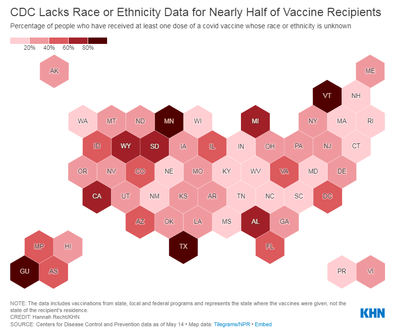
    DFH: We should be putting the press on the CDC to collect and compile the data. Like, the data on cases, all of that data should be disaggregated by race. And the percentage of cases with unknown race or unknown gender or unknown geography should also be reported. Because I don’t know if people notice this, but a lot of times [the CDC is] presenting data only on cases with complete information. But the missing information points to something important as well.

    BL: I think it’s something like they have maybe 50% or 60% of cases with known race. But where’s that other share of cases? [Editor’s note: It’s 63%, as of August 14.]

    DFH: The assumption is that the distribution of these variables in the unknown is similar to that of the known. But it is a major assumption. And it’s not an assumption that we should be making.

    BL: I see. Yeah. Anything else [you’d recommend as a story idea]?

    DFH: I do like this carrot stick analogy. The carrot is not working, the dangling the big incentive is not working. The stick will likely work. If you tell people, “You can’t get on a plane, if you’re unvaccinated,” there will be a lot of people who are unvaccinated right now who will get vaccinated because they’ll not want to lose the opportunity to travel.

    Think about the media. If you are chasing a story, or if you’ve got to be on site for something… If you’re in New York and you’ve got a story in California, you’re not going to drive to California, you will likely get off the fence and get vaccinated.

    I feel like a larger problem is, we have to engage experts in the work to make sure that we’re not furthering inequity [with mandates]. Because if we use, now, the stick, and start to mandate it…. [Michigan State University] has now mandated vaccination for all faculty, staff and students who want to return to campus by September 7. I know that that will likely produce greater increases in vaccination than did the incentives of cash payments, or lotteries or other things.

    But we have to keep an eye toward equity, and make sure—what if there’s disproportionality and then who does that impact? Are we going to see an increase in Black and brown people, or people with disabilities, or people with chronic health conditions, losing their jobs, or dropping out of school, or some of these other things? There just needs to be more thoughtfulness to how we apply these policy interventions to make sure that it’s not furthering inequity.

    BL: Have you seen any examples of where that’s been done successfully?

    DFH: No, because it’s all just coming out now.

    BL: I know there are some places, like in New York, they’re giving you an option, saying, “You can get vaccinated or you have to be tested once a week.” Is that effective? Or does that still fit into what you’re talking about?

    DFH: I think we’re gonna figure that out. And if that’s the case, then again, we gotta deal with the access issue, and people need to have fair and equitable access—and affordable access—to COVID testing.

    BL: Yeah, totally. And the last kind of big question I had for you: one thing I think a lot about as a journalist who is still rather early-career and has been covering COVID very intensely is that this is probably just the beginning of us dealing with major public health crises. You know, continued climate disasters and all that stuff.

    And I’m wondering how you think about preparing for the next COVID, or the next whatever it’s going to be. What lessons do we take from these past couple of years?

    DFH: Well, I think we’ve learned there is a business case for preparedness, and a business case for equity. Our lack of preparation for this pandemic will have cost our country tremendously. There’s going to be tremendous financial toll. So, there’s a business case to be made for preparedness.

    We learned that with the Flint water crisis. Not having the million-dollar investment in the water treatment system, not spending the 150 bucks a day on anticorrosives, those things will have cost us hundreds of millions of dollars to now replace and repair the whole water infrastructure system and pay settlements from the Flint water crisis.

    And then there’s also a business case for equity. Not doing a better job of equitably rolling out the vaccine early on caused a lot of people who were a “yes” to sort of say, “why bother?” And now many of them are a “no.” These are people who earlier on [were amenable], but then all these reports come out and get sensationalized by the media of side effects and blood clots and heart inflammation. And so a lot of people who were in line, trying to move through the line to get vaccinated are now an absolute “no.”

    That’s going to cost us as well, because we have fallen well short of that 70% goal. And new vaccinations are moving at a snail’s pace. So I think what we’ve learned—and we’ll really know, the impact of it in the next few years—is not being prepared and not practicing equity will have a tremendous financial toll on the country.

  • A new tracker highlights the racial disparities—and the missing data—in America’s COVID-19 outbreaks

    A new tracker highlights the racial disparities—and the missing data—in America’s COVID-19 outbreaks

    Screenshot of the Health Equity Tracker showing which states are missing race and ethnicity data for COVID-19 cases.

    Two weeks ago, a major new COVID-19 data source came on the scene: the Health Equity Tracker, developed by the Satcher Health Leadership Institute at Morehouse School of Medicine.

    This tracker incorporates data from the CDC, the Census, and other sources to provide comprehensive information on which communities have been hit hardest by COVID-19—and why they are more vulnerable. Notably, it is currently the only place where you can find COVID-19 race/ethnicity case data at the county level.

    I featured this tracker in the CDD the week it launched, but I wanted to dig more into this unique, highly valuable resource. A couple of days ago, I got to do that by talking to Josh Zarrabi, senior software engineer at the Satcher Health Leadership Institute—and a fellow former volunteer with yours truly at the COVID Tracking Project.

    Zarrabi has only been working on the Health Equity Tracker for a couple of months, but he was able to share many insights into how the tracker was designed and how journalists and researchers might use it to look for stories. We talked about the challenges of obtaining good health data broken out by race/ethnicity, communicating data gaps, and more.

    The interview below has been lightly edited and condensed for clarity.


    Betsy Ladyzhets: Give me the backstory on the Health Equity Tracker, like how it got started, how the different stakeholders got involved.

    Josh Zarrabi: At the beginning of the pandemic, the Satcher Health Leadership Institute at Morehouse School of Medicine saw the lack of good COVID data in the country, and especially the lack of racial data. The COVID Tracking Project kind-of tried to solve that as well with the Racial Data Tracker

    Morehouse wanted to do something similar. And so they applied for a Google.org grant… After about nine months, the tracker just got released. It went through a couple of different iterations, but what it is now is, it’s a general health equity tracker, so it tracks a couple of different determinants of health. And it really has a focus on equity between races and amplifying marginalized races as much as possible.

    Probably the most innovative thing it does is, it shows COVID rates by race down to the county level. We think that’s relatively hard to find anywhere else. (Editor’s note: It is basically impossible to find anywhere else.)  So that’s probably like the main feature that it has that people care about, but it does track other health metrics. We also have poverty, health insurance, and we try to track diabetes and COPD, but there’s not great data on that, unfortunately, in the United States. We’re planning to add more metrics in the future.

    BL: How does this project build on the COVID Racial Data Tracker? And I know, like APM has a tracker for COVID deaths by race. And there are a couple other similar projects. So what is this one doing that is taking it to the next level?

    JZ: A couple of things. We’re using the CDC restricted dataset. Basically what the dataset looks like is, it’s like a very large CSV file where every single line is an individual COVID case. So we’re able to break it down basically however we want. So we were able to break that down to the county level, state level and national level.

    And what we do is we allow you to compare that [COVID rates] to rates of poverty, and rates of health insurance in different counties. We think that’s pretty innovative, and we’re gonna allow you to compare it to other things in the future. So that’s one thing that we do. And I mean, the second thing that I would say is like, probably makes us stand out the most I would say is our real focus on racial equity, and showing where the data gaps are and how that affects health equity. So what you’ll notice, if you go to our website, we very prominently display the amount of unknown… 

    BL: Yeah, I was gonna ask you about that, because I know the COVID Racial Data Project had similar unknown displays. Why is it so important to be highlighting those unknowns? And what do you want people to really be taking away from those red flag notes?

    JZ: We really try to do our best to display the data in context as much as possible. First of all, the most important thing, I think, is just showing the high percentage of unknown race and ethnicity of COVID cases in the United States. For something like 40% of cases, we don’t know the race and ethnicity of the person who had COVID.

    We want people to really think about that when they look at, for example, you’ll notice that it looks like Black Americans are affected to the exact level of their population. Black Americans look like 12% of the population and 11% of cases. But we don’t know the race of 40% of people who have COVID. And so we really wanted people to think about that when they look at these numbers. And it’s the same for American Indian/Alaskan Native populations. It doesn’t look like they’re that heavily affected in the United States. But that’s why we allow you to break down into the county level, where race is not being reported. And so we really want people to look and say, like, oh, wow, like in Atlanta, 60% of cases are not being counted for race and ethnicity.

    We’re not doing any extrapolation. We’re not multiplying, we’re not like trying to guess the races of unknowns, or anything like that. We really want people to think about that, when they’re saying like, oh, wow, it looks like Native American people are not really heavily affected by COVID. It’s like, no, we just don’t know. We don’t know their races, or those people are just not being reported properly by the health agencies.

    And if you look at places that have high percentages of Black Americans and high percentages of American Indian/Alaskan Natives, you’ll see that those places are the same places that are not reporting the race and ethnicity of the people who had COVID.

    We had a team of about 20 health equity experts advising us throughout the entire project. That’s where those red flags that you see come from. It’s explaining, for example, if you look into deaths for Native American and Alaska Natives, there’s an article about how a lot of American Indian/Alaskan Native people who died are not, are improperly categorized racially, and they’re often categorized as white. And so we have that kind of stuff to really try to put the numbers in context.

    We were only able to do that, because we had this large team of racial equity experts and health equity experts advising us throughout the entire time. And so we really had diverse representation on the project as we were building it, and people who really knew what they were talking about.

    BL: What can public health agencies and also researchers and journalists do to push for better data in this area?

    JZ: The good thing is we are seeing [data completion] get better over time. And so we’ve seen, for example, the percentage of race and ethnicity for cases improved from about 50% to about 60% over the last couple of months.

    And, I mean, really, all you can do is—it’s really a thing that goes down to the county level. So, everybody’s just got to call their county representatives. I’d be like, hey, could you please report the race and ethnicity of the county’s COVID cases to the CDC? Unfortunately, a lot of that work might be too late, because [data were submitted months ago]. But we have seen it get better. And so we’re hoping that, you know, these health agencies are able to do the work and really, like, properly report these cases to the CDC… 

    BL: ‘Cause a lot of it comes from the case identification point, where if you’re not asking on your testing form, what race are you, then you just might not have that information. Or you might be, like, guessing and getting it wrong or something, right?

    JZ:  Yeah, there’s guessing. There’s two different categories of unknown cases—there’s unknown and there’s missing. The vast majority of these cases have filled out unknown [in the line file], which means that the person who’s filling out the data form literally puts “unknown” as the race. We don’t really know exactly what that means in every case. But it could be they didn’t ask, it could be the person didn’t feel comfortable saying it, just said, “I don’t want to tell you my race.” Or it could just be that they just didn’t make an effort to figure out what their race is.

    (Editor’s note: For more on the difficulties of collecting COVID-19 race data, I recommend this article by Caroline Chen at ProPublica.)

    BL: Do you have a sense of how that 60% known cases compares to what the COVID Racial Data Tracker had in compiling from the states?

    JZ: Yeah, I think the COVID Racial Data Tracker was a bit higher [in how many cases had known race/ethnicity]. But the thing is, as far as I understand, the COVID Racial Data Tracker was using aggregate numbers.

    BL: We were looking at the states and then kind-of like, synthesizing their data to the best of our ability, which was pretty challenging because every state had slightly different race and ethnicity categories. There were some states that had almost no unknown cases, but there were some where almost all cases or almost all deaths were unknown. New York, I don’t know if they ever started reporting COVID cases by race.

    JZ: They do to the CDC, I don’t think they report—

    BL: They don’t report it on their own, state public health site.

    JZ: Let me actually check that… Yeah, so New York is not great. They have a 60% unknown rate. [Race and ethnicity is only reported to the CDC for 40% of cases.] Not great. Actually, New York City is pretty good. But the rest of New York State is not doing a good job reporting the race and ethnicity of cases.

    BL: Because I’ve gotten tested here, I know that New York City is good about collecting that [race and ethnicity] from everybody.

    JZ: I was one of those cases in New York City, actually. When [I got called by a contact tracer], I was kind of chatting with them about this. They asked me about my race—I actually became a probable case for COVID, like, the day after I started this job. And [NYC Health] called me, they were like, “What’s your race?” I was like, “Oh, that’s kind of funny, I just started working on this racial data project.” And—this is totally anecdotal. But she told me, most people just refuse to report their race. 

    And then for deaths… 40% of COVID deaths in New York state, they don’t know the race, which is not great. New York is not good compared to the rest of the states. It’s one of the worst states for unknowns.

    BL: Could you tell me more about the process of getting the [restricted] case surveillance data from the CDC and how you’ve been using that?

    JZ: The process of getting it’s not that hard. You just apply, and then they give you access to a GitHub repo, and then you can just use it. Using the data itself is pretty hard because the data files are so large. We were lucky enough to have a team of Google engineers working on this project, they wrote a bunch of Python scripts that analyze the data and aggregate it in a way that the CDC isn’t doing.

    The reason why they restrict the use is because it’s line-by-line data. [Each line is a case.] And the CDC does suppress some of the data because they think it would make those cases identifiable. Still, you’re not allowed to just, like, release the data into the wild, because they want to know who else has track of it. So, we wrote some Python to aggregate the data, in exactly the way you see on the website. We aggregate it to the amount of cases, deaths and hospitalizations per county, per race, essentially. 

    The CDC has been extremely helpful, like, we’ve had a couple of meetings with them. We think we were one of the heaviest users of the data at the beginning, because we pointed out a couple of problems with the data that they actually fixed. So, that’s cool.

    BL: That’s good to hear that they were responsive.

    JZ: Yeah, definitely. We meet with them every couple of weeks. They’re really good partners in this.

    BL: And they update that [case surveillance] dataset once a month?

    JZ: They started doing it every two weeks now. Every other Monday, they update the dataset.

    BL: Could you talk more about the feature of the tracker that lets you compare COVID to other health conditions and insurance rates? I thought that was really unique and worth highlighting.

    JZ: We wanted to really provide the [COVID] numbers in context. And so that’s one way that we thought that we could do that and really show how… These numbers don’t happen, like a high rate of COVID for race doesn’t happen in a vacuum. There are political determinants of health.

    For example, you’ll see everywhere that Hispanic Americans are just by far the most impacted by COVID case-wise. In California especially. And we provide those numbers in context—Hispanic Americans are also much less likely to be insured than white Americans, for example, and much more likely to be in poverty. And, you know, it’s not a crazy surprise that they would also be more likely to have contracted COVID at some point.

    [The comparison feature] was a way that we thought, we would just allow people to really view numbers in context and get a better understanding of what the political situation is on the ground with where these high numbers are happening.

    BL: What are the next conditions that you want to add to the tracker?

    JZ: I want to be careful, because we can’t make any promises. But we’re talking about adding smoking rates, maybe. [The challenge is] where we can find data that we can aggregate correctly.

    BL: Right. Are you looking specifically for data that’s county level as opposed to state level?

    JZ: Hopefully… It depends. I was pretty surprised by the lack of quality in, for example, COPD and diabetes data, where like, if you look at [the dataset], like it’s state level—but in most states, there’s not a statistical significance for most races.

    BL: Wow.

    JZ: For example, we use the BRFSS survey. [The Behavioral Risk Factor Surveillance System.] It’s a CDC survey. And as far as we can tell, it’s the gold standard for diabetes [data] in the country.

    And if you look at, say, diabetes, for most states… There’s only, like, four states where Asian people are statistically significant in the survey to make any sort of guess about how many people have diabetes, which is pretty atrocious. But that [data source] is the best we could do, you know. Ideally, we would like to find places that do go down to the county level, but it’s hard.

    For as paltry as the COVID data is, it’s much better than—as far as I’ve seen, like, the fact that there’s like a line-by-line database that the CDC provides, that you can really make all these breakdowns of, is a huge step ahead [compared to other health data]. I’m not like a data expert on this kind of stuff, I’ve just been working on this project for two and a half months. But as far as I’ve seen, that’s what the situation is.

    BL: Yeah, I mean, that kind of lines up with what I have seen as well. And I bet a lot of it is a case where, like, a journalist could FOIA [the data] from a county or from a state. But that’s not the same as getting something that is comprehensive, line-by-line, from the CDC.

    JZ: And we [the Satcher institute] don’t want to be a data collection agency, like the COVID Tracking Project or the New York Times is. I mean, we want this to be a sustainable project. And the COVID Tracking Project was not a sustainable project.

    BL: Yeah, totally. I was there doing the [data entry] shifts twice a week, that’s not something we could have done forever.

    JZ: Yeah, I was there, too. I always think, like, the COVID Tracking Project could only exist when there’s an army of unemployed people who are too afraid to leave their house.

    BL: And volunteers who were like, yeah, sure, I’ll do this on my evenings and weekends.

    JZ: Who, you know, you don’t want to leave, you’re too afraid to go, like talk to people. You want to stay home in front of your computer all day, and feel useful.

    I’m sure you could find all the diabetes data by going to county and state health department websites, but it’s too much work. So we really want everything to come from federal sources, basically, that’s our goal.

    BL: How are you finding that people have used the tracker so far? Like, do you know of any research projects that folks are doing?

    JZ: We released it a couple weeks ago, and we haven’t really heard of any yet… But we hope people are looking at it. And we have a couple of meetings lined up with some interesting research groups and stuff like that. So hopefully, they’ll like it.

    BL: Are there any specific statistics or comparisons or anything else you found in working on it that you would want to see explored further? Are there any stories that you want to see come out of it?

    JZ: The high rates of unknown data in a lot of places, that really needs to be looked into. Because it’s just hard to make any conclusions about what’s going on if—I mean, in some states like New York, over 50% of cases are unknown. That’s a huge problem. And that’s definitely something that needs to be looked into, like, why that’s happening. And if there’s anything that can be done to change that [unknown rate.] The reason why I do think that it can get better is because the COVID Tracking Project racial data had higher completeness rates. And so they [the states] probably do know the races of people who got sick, but they’re just not reporting it for whatever reason.

    And for me, something that’s really stuck out was the extremely high rates of COVID for Hispanic and Latino people, especially in California. If you look at them and compare them to white rates, it’s, like, the exact opposite pattern. So it kind of does look like Hispanic and Latino people were kind-of shielding white people from getting COVID, if you compare the numbers. That’s something I would look into, too, like, why that happened.

    (Editor’s note: This story from The Mercury News goes into how the Bay Area’s COVID-19 response heightened disparities for the region’s Hispanic/Latino population.)

    BL: And another question along the same lines, is there a specific function or aspect of the tracker that you would encourage people to check out?

    JZ: The unknowns. Just, like, look into your county and see what percentage of cases in your county have reported race and ethnicity at all. I think you can really see how good of a job your county has done at reporting that data. I know I was kind-of shocked by that rate for the county like I grew up in, like, I know that they have the resources to [report more data], but they’re just not doing a very good job.

    BL: How would you say this experience with tracking COVID cases might impact the world of public health data going forward, specifically health equity data, and how do you see the tracker project playing a role in that?

    JZ: We really want this project to show the importance of tracking racial health data down to the county level or even lower than that. County is the best we can do right now, but we’d love to see city level or something like that. And again, I kind-of said this before—as much as was missing for the COVID data, it’s still better than the data that there is for most other diseases and other determinants of health. So we would like to see, like, more things able to be filled out on the tracker. We would like to be able to get more granular on more different determinants of health, so that we can see, for example, how poverty impacts health, or a lack of health insurance, or how diabetes and COVID are related down to the county level. You can’t really do that right now… 

    We want people to see that, A, there’s a lot of data missing. But B, even with the data that we have, we can see that there’s like a huge problem. And so we would like to be able to fill out the data more to really get a better picture of what’s going on. If we can see there’s a problem, we can make better policy to help and make these disparities not as stark.

  • Featured sources, June 6

    • COVID-19 Vaccine Incentives: So many companies are now offering rewards to inspire vaccinations in their customers and employees, it might be hard to keep track. Luckily, the federal government is keeping track for you; this page on Vaccines.gov provides a comprehensive list. (I am particularly excited about the United Airlines “Your Shot to Fly” Sweepstakes.) (H/T Chelsea Cirruzzo.)
    • Health Equity Data (from the CDC): The CDC has reorganized its COVID Data Tracker to include a new dashboard section specifically focused on health equity. The section includes demographic trends for cases, deaths, and vaccinations, with breakdowns for race and ethnicity, urban/rural status, disabilities, incarcerated people, and more.
    • Community health center vaccinations (from KFF): A new brief from the Kaiser Family Foundation demonstrates the value of community health centers in vaccinating vulnerable populations. From January through May, people of color made up nearly two-thirds of those receiving their first doses at these centers, KFF reports.
    • Dr. Fauci’s emails: This week, the federal government put out one of its most vital information releases of the pandemic thus far: a trove of Dr. Anthony Fauci’s emails. The emails, requested by journalists at BuzzFeed and the Washington Post via public records requests, cover hundreds of messages sent to or from the esteemed infectious disease expert in the early months of the pandemic. BuzzFeed has published about 3,200 emails in raw, unfiltered form, and you can read recaps of the emails at both BuzzFeed and WaPo.

  • Featured sources, May 30

    • Cases and deaths among healthcare workers: A new addition to the CDC COVID Data Tracker this week: a tab reporting cases and deaths in doctors, nurses, and other healthcare personnel. The CDC is reporting both totals and new cases/deaths by week, though the data here likely represent only a fraction of the true counts of healthcare workers infected during the pandemic. Notably, the total death toll is only about 1,600—less than half of the healthcare worker deaths reported by The Guardian and KHN’s “Lost on the Frontline” project.
    • Health Equity Tracker: When the COVID Tracking Project (including the COVID Racial Data Tracker) ceased data collection in March, it became much more difficult to compare COVID-19 case counts by race and ethnicity across states. A new project from the Morehouse School of Medicine fills that gap—and does much more. The Tracker incorporates data from the CDC, the Census, and other sources to provide comprehensive information on which communities have been hardest hit by the COVID-19 pandemic. Read more about it in this STAT article.
    • Coronavirus variant lineages: I came across this source a few days ago while researching variant lineages, prompted by a question on Twitter. Phylogenetic Assignment of Named Global Outbreak Lineages (or PANGO Lineages, for short) is a software tool developed by a lab in the U.K. that allows users to submit and analyze coronavirus sequences. The specific page I’ve linked here provides a comprehensive, searchable list of all the coronavirus variants that scientists have identified. Very useful if you need to search up an older or less-well-known variant.
    • Unemployment Insurance Data Explorer: This tool from progressive think tank The Century Foundation allows users to explore, visualize, and download data on unemployment insurance distributed during the pandemic. The tool includes data broken out by state and goes back in time to 1971—valuable for historical analysis.

  • The CDC needs to release state-by-state data on who’s getting vaccinated

    The CDC needs to release state-by-state data on who’s getting vaccinated

    For months, I’ve been calling on the CDC to release state-by-state demographic data on who is getting vaccinated. While the vast majority of states report this information themselves, the state data are completely unstandardized—making it difficult to perform comprehensive analyses or compare one state to another.

    “The vaccine data that individual states are publishing replicate the patchwork nature of the other state-level COVID-19 data our teams have been compiling,” COVID Tracking Project leaders Alice Goldfarb and Erin Kissane wrote in The Atlantic in January.

    While many more states are reporting vaccination demographics now than in January—Montana and Wyoming are the only two states that now fail to report vaccinations by race—the data continue to be patchwork and hard to analyze.

    Bloomberg has devoted a small team to analyzing and presenting these data in the publication’s U.S. Vaccine Demographics Tracker. But Bloomberg isn’t making their underlying data public, so other journalists and researchers are unable to build on this work. And really, it shouldn’t be on journalists to standardize from a fragmented state-by-state landscape—it should be the work of the CDC.

    That’s why I was thrilled when, this week, we finally got that data from the CDC. Well… sort-of.

    A team from KHN received CDC state-by-state demographic vaccination data via a public records request. This team—which includes Hannah Recht, Rachana Pradhan, and Lauren Weber—analyzed the CDC’s data and made their work public on GitHub.

    The data indicate that, despite promises from the White House to prioritize vulnerable communities in the vaccination campaign, a lot of inequities persist: “KHN’s analysis shows that only 22% of Black Americans have gotten a shot, and Black rates still trail those of whites in almost every state.”

    !function(){“use strict”;window.addEventListener(“message”,(function(a){if(void 0!==a.data[“datawrapper-height”])for(var e in a.data[“datawrapper-height”]){var t=document.getElementById(“datawrapper-chart-“+e)||document.querySelector(“iframe[src*=’”+e+”‘]”);t&&(t.style.height=a.data[“datawrapper-height”][e]+”px”)}}))}();

    In some states, white residents have been vaccinated at almost twice the rate of Black residents. In Iowa, for example, 15% of the Black population has received at least one dose—compared with 37% of the white population. Other states with high disparities include Florida, New Hampshire, Maine, Wisconsin, New Jersey, New York, Hawaii, and Connecticut.

    Hispanic/Latino vaccination rates also lag behind the rates for white residents in some states, but the disparities are not as drastic as those for the Black population. Nationwide, 22% of Black Americans have received at least one dose, compared to 33% of white Americans.

    Both Native Americans and Asian Americans have higher vaccination rates than the white population. Many tribes, in particular, have made dedicated efforts to promote vaccination.

    And another hopeful caveat: vaccination rates for minorities have improved in recent weeks as the rate for white Americans goes down. In the last two weeks, about half of first doses administered in the U.S. have gone to people of color. This includes about 24% of doses going to Hispanic/Latino Americans, 10% going to Black Americans, and 8% going to Asian Americans.

    The day after KHN’s analysis was published, Victoria Knight (another KHN reporter) asked CDC Director Dr. Rochelle Walensky whether the agency would add state-level race and ethnicity vaccination data to its dashboard.

    “We have been updating our website,” Dr. Walensky said in response. “I can’t say that it’s daily; I believe that it’s weekly.”

    And yet as of Sunday morning, May 23, state-by-state demographic data are nowhere to be found on the CDC’s site.

    Knight also asked what the CDC is doing to address the high number of vaccinations for which demographic details are unknown. Race/ethnicity data are missing for about 44% of vaccinated Americans, meaning that true disparities may be even starker.

    !function(){“use strict”;window.addEventListener(“message”,(function(a){if(void 0!==a.data[“datawrapper-height”])for(var e in a.data[“datawrapper-height”]){var t=document.getElementById(“datawrapper-chart-“+e)||document.querySelector(“iframe[src*=’”+e+”‘]”);t&&(t.style.height=a.data[“datawrapper-height”][e]+”px”)}}))}();

    In some states, that unknown percentage is much higher than 44%. Eight states “either refuse to provide race and ethnicity details to the CDC or are missing that information for more than 60% of people vaccinated,” according to KHN. These states are excluded from KHN’s analysis as a result: they are Alabama, California, Michigan, Minnesota, South Dakota, Texas, Vermont and Wyoming.

    Dr. Walensky told reporters the CDC is working with state and local public health departments to improve demographic reporting, but didn’t provide specifics.

    In order to continue improving vaccination rates for minority communities, the CDC needs to actually make all of the agency’s data public. If state-by-state demographic data were easily available, researchers and reporters like me could more easily identify both the success stories and the disappointments—and help the states that are lagging catch up. 

    As Hannah Recht put it on Twitter: “we should not have to keep FOIAing for CDC state-level data that they could just put online if they wanted to.”

    More vaccine reporting

    • Sources and updates, November 12
      Sources and updates for the week of November 12 include new vaccination data, a rapid test receiving FDA approval, treatment guidelines, and more.
    • How is the CDC tracking the latest round of COVID-19 vaccines?
      Following the end of the federal public health emergency in May, the CDC has lost its authority to collect vaccination data from all state and local health agencies that keep immunization records. As a result, the CDC is no longer providing comprehensive vaccination numbers on its COVID-19 dashboards. But we still have some information about this year’s vaccination campaign, thanks to continued CDC efforts as well as reporting by other health agencies and research organizations.
    • Sources and updates, October 8
      Sources and updates for the week of October 8 include new papers about booster shot uptake, at-home tests, and Long COVID symptoms.
    • COVID source shout-out: Novavax’s booster is now available
      This week, the FDA authorized Novavax’s updated COVID-19 vaccine. Here’s why some people are excited to get Novavax’s vaccine this fall, as opposed to Pfizer’s or Moderna’s.
    • COVID-19 vaccine issues: Stories from COVID-19 Data Dispatch readers across the U.S.
      Last week, I asked you, COVID-19 Data Dispatch readers, to send me your stories of challenges you experienced when trying to get this fall’s COVID-19 vaccines. I received 35 responses from readers across the country, demonstrating issues with insurance coverage, pharmacy logistics, and more.
  • Source updates, May 16

    Two more important CDC data updates for this week:

    • Vaccine demographics, for the past 14 days and over time: This week, the CDC added a new category to its Vaccine Demographics page. Previously, the page allowed users to compare overall first dose and fully vaccinated rates for different race/ethnicity, age, and sex groups; now, you can also make those comparisons specifically for vaccinations in the last two weeks. For a time series view, check out the Vaccine Demographic Trends page, which shows vaccination rates over time—now available for race/ethnicity, sex, and age. The race/ethnicity view clearly shows that White and Asian Americans are getting vaccinated at higher rates than other groups.
    • Variant tracker “Nowcast”: Loyal CDD readers will already know that I love to drag the CDC for reporting their variant data with an enormous lag; often the most recent figures on the agency’s Variant Proportions page are a month old. Well, maybe somebody on their team is reading, because this week, the CDC added a new option to its variant dashboard that addresses this issue. Selecting “Nowcast On” (below the variant color bars) allows you to view prevalence estimates for the current week, in addition to the agency’s most recent week of data collection. A note below the dashboard explains that the “Nowcast” figures are based on modeling estimates that extrapolate from known proportions. For example, B.1.1.7 is known to cause 66% of U.S. cases as of April 24, but the “Nowcast” estimate puts it at 72% of cases as of May 8. This is actually pretty useful, thanks CDC!

  • Five more things, May 9

    I couldn’t decide which of these news items to focus on for a short post this week, so I wrote blurbs for all five. This title and format are inspired by Rob Meyer’s Weekly Planet newsletter.

    1. HHS added vaccinations to its facility-level hospitalization dataset: Last week, I discussed the HHS’s addition of COVID-19 patient admissions by age to its state-level hospitalization dataset. This week, the HHS followed that up with new fields in its facility-level dataset, reflecting vaccinations among hospital staff and patients. You can find the dataset here and read more about the new fields in the FAQ here (starting on page 14). It’s crucial to note that these are optional fields, meaning hospitals can submit their other COVID-19 numbers without any vaccination reporting. Only about 3,200 of the total 5,000 facilities in the HHS dataset have opted in—so don’t sum these numbers to draw conclusions about your state or county. Still, this is the most detailed occupational data I’ve seen for the U.S. thus far.
    2. A new IHME analysis suggests the global COVID-19 death toll may be double reported counts: 3.3 million people have died from COVID-19 worldwide as of May 8, according to the World Health Organization. But a new modeling study from the University of Washington’s Institute for Health Metrics and Evaluation (IHME) suggests that the actual death number is 6.9 million. Under-testing and overburdened healthcare systems may contribute to reporting systems missing COVID-19 deaths, though the reasons—and the undercount’s magnitude—are different in each country. In the U.S., IHME estimates about 900,000 deaths, while the CDC counts 562,000. Read STAT’s Helen Branswell for more context on this study.
    3. The NYT published a dangerous misrepresentation of vaccine hesitancy (then quietly corrected it): A New York Times story on herd immunity garnered a lot of attention (and Twitter debate) earlier this week. One specific aspect of the story stuck out to some COVID-19 data experts, though: a U.S. map entitled, “Uneven Willingness to Get Vaccinated Could Affect Herd Immunity.” The map, based on HHS estimates, claims to display vaccine confidence at the county level. But the estimates are really more reflective of state averages, and moreover, the NYT originally double-counted the people who are strongly opposed to vaccines, leading to a map that made the U.S. look much more hesitant than it actually is. Biologist Carl Bergstrom has a thread detailing the issue, including original and corrected versions of the map.
    4. We still need better demographic data: A poignant article in The Atlantic from Ibram  Kendi calls attention to gaps in COVID-19 data collection that continue to loom large, more than a year into the pandemic. The story primarily discusses race and ethnicity data, citing the COVID Racial Data Tracker (which I worked on), but Kendi also highlights other underreported populations. For example: “The only available COVID-19 data on undocumented immigrants come from Immigration and Customs Enforcement detention centers.”
    5. NIH college student trial is having a hard time recruiting: If you, like me, have been curious about how that big NIH trial to study vaccine effectiveness in college students has progressed since it was announced last March, I recommend this story from U.S. News reporter Chelsea Cirruzzo. The study aimed to recruit 12,000 students at a select number of colleges, but because the vaccine rollout has progressed faster than expected, researchers are having a hard time finding not-yet-vaccinated students to enroll. (1,000 are enrolled so far.) Now, students at all higher ed institutions can join.

  • Featured sources, April 18

    • Two important CDC MMWRs: This week, the CDC published Morbidity and Mortality Weekly Reports on racial and ethnic disparities in COVID-19 hospitalizations and emergency department visits. The reports continue to hammer home this pandemic’s disproportionate impact on non-white Americans. In all major regions of the country, Hispanic/Latino COVID-19 patients were more likely to be hospitalized than those of other ethnicities; and in 13 states with ED visit data, Hispanic/Latino, Black, and Indigenous patients experienced the highest rates of hospital visits for the disease.
    • Searching for COVID-19: This interactive series of data visualizations allows users to explore top COVID-19-related Google search queries since January 20, 2020. The charts focus on “How to __” and “What is/are __” questions, such as, “how to make hand sanitizer?” You can also sort by country and U.S. state. The project is a collaboration between research and design firm Schema Design, Google News, and Axios.
    • CDD vaccination data annotations: This is your friendly reminder that we maintain a set of annotations on U.S. national and state COVID-19 vaccination data sources, updated weekly on Saturdays. Montana and Wyoming continue to be our last two holdout states not yet reporting demographic data for their vaccinated residents.

  • New study reveals disparities in COVID-19 mortality by sex and race

    New study reveals disparities in COVID-19 mortality by sex and race

    Black men have the highest COVID-19 death rate, but Black women die at higher rates than white or Asian men. Via the GenderSci Lab.

    We’ve spent a lot of time in the COVID-19 Data Dispatch discussing how the COVID-19 pandemic has disproportionately impacted racial and ethnic minorities in the U.S., along with gaps and problems in the available data on this issue. (You can find past coverage here.)

    A new study from the GenderSci Lab at Harvard sheds light on a more underreported side of the issue: how race and sex intersect in COVID-19 death rates. The lab has been tracking gender/sex and COVID-19 since April 2020, compiling data from states through a similar methodology to what the COVID Tracking Project did. And, similarly to the COVID Tracking Project, the GenderSci Lab faces challenges in producing a standardized dataset from 50 states that each have their own data definitions and reporting practices.

    One of those challenges: very few states report COVID-19 data by both sex and other demographic factors, such as age and race/ethnicity. Such intersectional data are useful because they can provide more detailed information on who is most at risk from the disease, which may be tied to comorbidities and other social determinants of health.

    For their recent study, GenderSci Lab researchers Tamara Rushovich et al. used data from the only two states that provide COVID-19 mortality data on sex, race, and age: Georgia and Michigan. The patterns they found in both states complicate the well-known trend that men are more likely to die of COVID-19 than women.

    Black men have the highest death rate overall in Georgia and Michigan, significantly higher than white men. In Michigan, 254 out of every 100,000 Black men have died, compared to 39 out of every 100,000 white men. But the data also show that Black men and women both have significantly higher death rates compared with white and Asian men.

    As the GenderSci Lab researchers note in a Twitter thread sharing this study, these data demonstrate that the sex difference in COVID-19 deaths is driven by comorbidities and social factors, not by some intrinsic, biological difference between men and women that makes men more vulnerable. Men may be less likely to wear masks or adhere to social distancing precautions, for example, and Black Americans are disproportionately represented in essential jobs and in incarcerated populations.

    The researchers say that more data on this topic are needed (hello, other 48 states!) as well as more intersectional analysis:

    Editor’s note, April 11, 6 PM: My friend (and CDD reader) Charlotte Minsky, who works on the COVID Racial Data Tracker, has pointed out that three states in addition to the two used in the GenderSci Lab’s analysis report COVID-19 mortality data by sex and race. Georgia and Michigan are the only two states to report by sex, race, and age; the researchers used age stratifications to calculate age-adjusted mortality rates. I’ve edited the post for clarification.

  • Hey CDC, when dashboard?

    Hey CDC, when dashboard?

    As dedicated CDD readers may remember, one of President Biden’s big COVID-19 promises was the creation of a “Nationwide Pandemic Dashboard” that would be a central hub for all the information Americans needed to see how the pandemic was progressing in their communities.

    The Biden administration sees the CDC’s COVID Data Tracker as that dashboard and plans to continue improving it as time goes on, White House COVID-19 Data Director Cyrus Shahpar said in an interview with The Center for Public Integrity last month. But a new report from the Government Accountability Office suggests that the CDC’s tracker has a long way to go before it becomes the centralized system that Americans need.

    The Government Accountability Office, or GAO, is a federal watchdog agency that evaluates other federal agencies on behalf of Congress. Its full report, released last Wednesday, is over 500 pages of problems and recommendations, ranging from the Emergency Use Authorization process to health care for veterans.

    But, as COVID Tracking Project leader Erin Kissane pointed out on Twitter, there are some real data bangers starting in the appendix:

    Here are a few of those data bangers:

    • Recommending that the federal government provides more comprehensive data on who gets a COVID-19 vaccine. The GAO specifically wants to see more data on race and ethnicity, so that the public can gauge how well vaccination efforts are reaching more vulnerable demographic groups. The agency also notes the challenge of finding occupational data on vaccinations, something we’ve bemoaned before at the CDD.
    • Calling out the lack of public awareness for federal data. Some experts the GAO interviewed noted that “the public may be more aware of non-federal sources of data on COVID-19 indicators (e.g., the COVID Tracking Project, Johns Hopkins) than sources from the federal government,” in part because those non-federal sources started providing public data earlier in 2020. The federal agencies need to step up their communications game.
    • Stating the need for central access to federal data. The GAO describes how the HHS lacks a central, public-facing COVID-19 data website, while the CDC’s COVID Data Tracker fails to provide access to the full suite of information available from the HHS. Specific missing data pages include COVID-19 health indicators and vaccine adverse events.

    Overall, the GAO says, the agency recommends that “HHS make its different sources of publicly available COVID-19 data accessible from a centralized location on the internet.” One would think this is a pretty straightforward recommendation to follow, but HHS reportedly “neither agreed nor disagreed” with the assessment.

    While there’s a lot more to dig into from this report, it is only part of a long evaluation process to improve federal data collection and reporting. The new report is part of a GAO effort that started last March, reports POLITICO’s Sarah Owermohle:

    The latest report is part of nearly yearlong effort by GAO to track the federal pandemic response after a directive in the March 2020 CARES Act. The watchdog first called on CDC to “completely and consistently collect demographic data” including comprehensive results on long-term health outcomes across race and ethnicity, in September. It later criticized the government’s lack of “consistent and complete COVID-19 data” in a January report.

    I, for one, am excited to see what the GAO does next—and how the federal public health agencies respond.