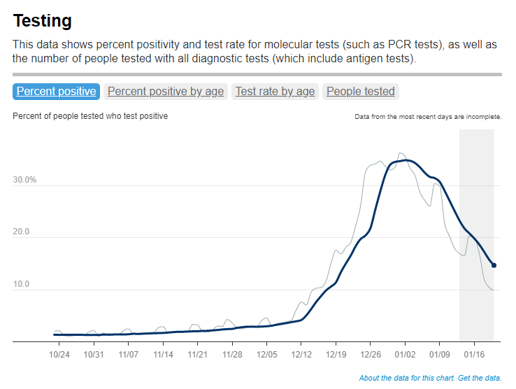
Test positivity trends for New York City, calculated and reported by the city health agency. Chart retrieved on January 23.
I’ve recently been getting a lot of questions about test positivity rates, both from COVID-19 Data Dispatch readers and from friends outside this project, which reminded me of just how confusing this pandemic metric can be. So, here’s a brief FAQ post about test positivity; if you have more questions, shoot me an email!
What is a test positivity rate?
A test positivity rate is calculated through simple division: the number of positive tests counted in a particular region or setting during a particular period of time, over the number of total tests (positive and negative) conducted during that same period.
Where do test positivity rates come from?
While the test positivity rate calculation may seem simple, matching together the right numbers for that numerator and denominator can get pretty tricky. This is because, at the federal level as well as at most state and local health departments, positive tests and total tests are reported through different systems.
Positive tests—also known, more simply, as cases—are prioritized for reporting. This is because public health departments need to know how many cases they are currently dealing with for contact tracing, potential hospital utilization in the coming weeks, and other crucial health system reasons. If a health department is pressed for time during a surge or coming back from a holiday break, it will analyze and report out case data before going through total test data. Similarly, many labs report their positive tests to health agencies separately from (and earlier than) total tests.
As a result, simply dividing the new cases reported on a particular day over the new tests reported that day often won’t give you an accurate test positivity figure. Instead, the data analysts that calculate these rates typically match up the dates that tests were conducted. So, instead of dividing “all cases reported on Tuesday” over “all tests reported on Tuesday,” you’d divide “all tests conducted on Tuesday that returned positive results” over “total tests conducted on Tuesday.” This calculation provides a more accurate picture of test positivity.
Also, different states and localities might report tests using different units, like “tests conducted,” “people tested,” and “testing encounters”—making it difficult to compare test positivity rates across states. This was a larger problem earlier in the pandemic; I recommend reading this excellent COVID Tracking Project analysis post for more info on the issue.
How do you know a test positivity figure is reliable?
As I explained in a recent post about the John Hopkins University (JHU) dashboard, the test positivity rates that appear on national dashboards often are not reliable because they fail to take these timing issues into account. A dashboard like JHU’s, which automatically scrapes data from state health agencies, does not have the backend information about the dates tests were conducted needed to calculate accurate positivity rates.
JHU recently changed its test positivity calculations to better address differing testing units across states. Still, as the team behind this dashboard explains in a blog post, a lack of standardization across how states report their testing data makes it difficult to calculate positivity rates that can be accurately compared between jurisdictions.
For that reason, I tend to trust test positivity rates calculated by individual state and local health agencies over those calculated by large, aggregating dashboards. For example, the NYC health department reports its own test positivity rate and does so with a three-day lag, in order to allow time for matching testing dates to case dates.
In addition, I would be wary of test positivity rates that are calculated for a longer period than one or two weeks. Test positivity, as a metric, is meant to be an indicator of the current situation in a state, region, or a specific setting like a university campus; when reported for a longer period (like a month) or cumulatively, this metric doesn’t tell you anything useful.
If you’re looking for a national test positivity rate source, the HHS’s Community Profile Reports include these figures for states, counties, metro areas—albeit with some reporting delays and gaps in certain states.
Test positivity can help us understand whether an area is doing enough tests to find its COVID-19 infections. The metric is widely used by local, state, and federal agencies to roughly gauge how well disease mitigation efforts are going. Put simply, when test positivity is high, it’s likely that not enough tests are being done and that most tests that are done are performed on symptomatic people. Both of these factors—insufficient testing and only testing people who feel sick—make it very likely that many cases are going undetected.
What would we consider a “high” test positivity rate? The CDC threshold here is over 10%; such a positivity rate means that one in ten tests conducted are returning positive results, indicating a lot of symptomatic people are getting tested for COVID-19 and a lot of cases are going undetected. A region with a positivity rate over 10% should step up its testing efforts and encourage asymptomatic people to get tested for surveillance purposes.
On the other end of the spectrum, 3% and 5% are commonly used as thresholds for low test positivity. The specific number might depend on an institution’s testing capacity; at a business that regularly tests all of its workers and is already looking for asymptomatic cases, a test positivity over 2% might already be cause for concern.
Generally, though, if this number is under 5%, it’s a good indicator that the region or setting has high enough test capacity to identify asymptomatic cases—and the majority of cases are being caught.
We keep learning about this dangerous variant as it spreads through the U.S. and the world. A few major updates from this week:
Omicron is spreading rapidly in the U.S. Last Tuesday, the CDC announced that Omicron had gone from causing 0.4% of new COVID-19 cases nationwide in the week ending December 4, to 2.9% of cases in the week ending December 11. That’s a seven-fold increase over the course of a week; the variant appears to be doubling every two to three days, based on data from the U.K. We can assume that it will be the dominant variant in the U.S. by the end of December, if not sooner.
U.K. data provides information on just how fast Omicron can spread. The U.K.’s comprehensive genomic surveillance system, combined with its unified national public health system, allows British researchers to analyze their country’s Omicron cases in high detail. According to the latest briefing from the U.K. Health Security Agency (summarized by Meaghan Kall): risk of reinfection with Omicron is three to four times higher than with Delta; risk of household transmission with Omicron is two to three times higher than with Delta; and the variant is doubling every two days—or even every 1.5 days, in some parts of the U.K.
New research from Hong Kong provides insight into why Omicron spreads so fast. Preliminary data from a Hong Kong University research team suggests that, within 24 hours of an Omicron infection, the virus “multiplied about 70 times faster inside respiratory-tract tissue than the Delta variant,” reports Megan Molteni at STAT News. More virus in the respiratory tract means more virus getting out into the air, Molteni explains. At the same time, the variant seems to be worse at multiplying within lung tissue, which may contribute to milder disease. While the Hong Kong study has yet to be peer reviewed, this finding aligns with reports of superspreading events among fully vaccinated people.
Skepticism about “Omicron being mild” continues despite more reports. Early this week, the largest health insurance company in South Africa posted results of a study examining the country’s Omicron wave. The study found that risk of hospitalization was 29% lower for Omicron patients than it had been during the country’s spring 2020 COVID-19 surge. While this finding follows other reports out of South Africa, experts are still skeptical: in part because it can take weeks for a coronavirus infection to progress to hospitalization, and in part because South Africa’s population has a lot of prior immunity from past surges and vaccinations. Also, a “milder” variant that’s more transmissible can still lead to significantly more hospitalizations.
We’re getting more evidence that vaccination protects against severe disease from Omicron. Basically: two shots are good, three shots are better. “Though these data are preliminary, they suggest that getting a booster will help protect people already vaccinated from breakthrough or possible severe infections with Omicron during the winter months,” writes NIH Director Dr. Francis Collins in a recent blog post summarizing both laboratory and real-world studies. If you’re eligible for a booster and haven’t yet gotten it, now is a great time.
But: We don’t know how well vaccines protect against Long COVID from an Omicron infection. As many experts continue to say that Omicron cases are mild for those who are vaccinated, the Long COVID experts and advocates I follow have pointed out that a mild breakthrough case can still lead to this prolonged condition. “Omicron is a huge individual threat,” wrote Long COVID researcher Hannah Davis on Twitter recently. “A 15-30% chance of being disabled for at least a year, but likely for the rest of your life, is a bigger threat than most of us ever faced ever before the pandemic.”
Omicron *is* a huge individual threat. A 15-30% chance of being disabled for at least a year, but likely for the rest of your life, is a bigger threat than most of us ever faced *ever* before the pandemic. #LongCovidhttps://t.co/bDpM9GTlBy
New York City is an Omicron hotspot in the U.S. As I noted in today’s National Numbers post, this variant has clearly hit NYC, as seen in record case numbers and felt in long lines for testing throughout the city. According to CDC estimates, Omicron was causing about 13% of new cases reported in New York and New Jersey in the week ending December 11. One week later, knowing how fast Omicron has outcompeted Delta in the U.K. and elsewhere, we can assume that it’s now causing the majority of cases in this region.
Other U.S. states and regions may be behind in their Omicron sequencing, so assume it’s spreading in your area even if it hasn’t been officially identified yet. As I’ve written before, genomic surveillance in the U.S. is geographically very spotty. NYC is a clear hotspot, but it’s also a city with a lot of sequencing infrastructure. In other parts of the country, Omicron may not have been formally identified yet—but that doesn’t mean it isn’t spreading. Take Orlando, Florida as an example: wastewater sampling in the surrounding county found that Omicron was completely dominating the community this week, according to AP, even though “practically no cases of clinical infection” have been reported.
Good news: South Africa’s case numbers are now trending down. As of yesterday, COVID-19 case numbers in Gauteng, the center of South Africa’s COVID-19 outbreak, as well as in other parts of the country, seem to be turning around. Computational biologist Trevor Bedford offered some potential explanations in an interview with New York Magazine: limited testing capacity and milder disease may lead to underreporting of COVID-19 cases in South Africa; less of the population may be susceptible due to prior immunity; and the variant may spread so fast that it can quickly burn through social networks and other avenues of transmission. We’ll need to see whether South Africa’s decline holds, and whether we see similar patterns in other Omicron hotspots.
The U.S. is not prepared for an Omicron surge. If you haven’t yet, take some time today to read Ed Yong’s latest feature in The Atlantic, which discusses how the U.S. has failed to learn from past COVID-19 outbreaks and prepare for the Omicron surge that has already arrived. “Rather than trying to beat the coronavirus one booster at a time, the country needs to do what it has always needed to do—build systems and enact policies that protect the health of entire communities, especially the most vulnerable ones,” Yong writes.
Omicron has altered the trajectory of the pandemic. Another piece to take time for today is this article in Science by Kai Kupferschmidt, discussing the “really, really tough winter” that scientists now see coming. Kupferschmidt explains that, even if many Omicron cases are mild, the variant is still spreading fast enough that it could land a lot of people in the hospital. In addition, the variant “may bring other, unpleasant evolutionary surprises” if future coronavirus variants evolve out of Omicron, Kupferschmidt writes.
This is one of the most confusing times of the pandemic, w/ a firehose of new Omicron data (lots of fab work on #medtwitter putting it into context). In this (long) 🧵, I'll offer my take on how the new information is changing my thinking & behavior.(1/25)
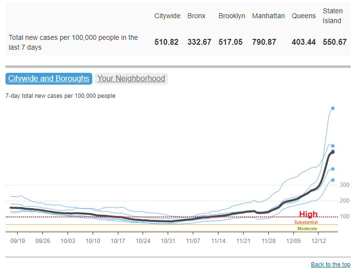
COVID-19 cases have increased sharply in New York City in the past week, to over 500 new cases for every 100,000 people city-wide. Chart via NYC Health, retrieved December 19.
In the past week (December 11 through 17), the U.S. reported about 860,000 new cases, according to the CDC. This amounts to:
An average of 122,000 new cases each day
261 total new cases for every 100,000 Americans
2%more new cases than last week (December 4-10)
Last week, America also saw:
55,000 new COVID-19 patients admitted to hospitals (17 for every 100,000 people)
8,300 new COVID-19 deaths (2.5 for every 100,000 people)
2.9% of new cases are Omicron-caused (as of December 11)
An average of 1.6 million vaccinations per day (including booster shots; per Bloomberg)
The Omicron surge has arrived in the U.S. While national COVID-19 cases are not significantly up from last week to this week, last week’s bump in the numbers from delayed Thanksgiving reporting has been replaced with a true increase, thanks to the combined pressures of both Delta and Omicron.
Hospitalizations are also increasing, with about 60,000 Americans hospitalized with COVID-19 nationwide as of December 15—a 9% increase from the previous week. The number of Americans dying from COVID-19 each day is increasing as well, now at about 1,200 deaths a day.
To be fair, the case rates reported in NYC this week are probably lower than the true case rates during spring 2020, as testing wasn’t widely available during the city’s first COVID-19 surge. But on a personal level, this city’s current Omicron surge is undeniable: testing lines stretch around the block, and everyone from my old college friends to my local City Council representative is reporting a breakthrough case. I personally have yet to catch “the Media Variant,” but I’m rapid testing frequently and avoiding indoor activities as I prepare to visit my parents for Christmas.
the more I hear about friends/acquaintances/nyc media people/etc getting breakthrough covid cases, the more I'm assuming that, like, every other one of these cases is omicron pic.twitter.com/mSonuhdrHm
Omicron was causing 13% of new COVID-19 cases in New York and New Jersey in the week ending December 11. By today, it’s likely causing the majority of new cases. But the NYC region isn’t the only part of the country seeing rapid case increases: Hawaii, Florida, Connecticut, Maine, and D.C. have all reported more than a 30% increase in cases from the previous week to this one, according to the latest Community Profile Report. Rhode Island, New Hampshire, Maine, and other Northern states have the highest cases per capita.
Vaccines, particularly booster shots, can protect against this dangerous variant (more on that later in this issue). While 61% of Americans are fully vaccinated, according to the CDC, less than 30% have received booster doses. This includes about 53% of Americans over 65, even though seniors were one of the first groups become eligible for boosters—and are among those most in need of this additional protection.
Boost every adult, especially high risk
Use lots of rapid tests
Encourage masks in high-risk public indoor spaces
Use test and stay to keep kids, workers safe in school/work
And be prepared for a complicated and disruptive January
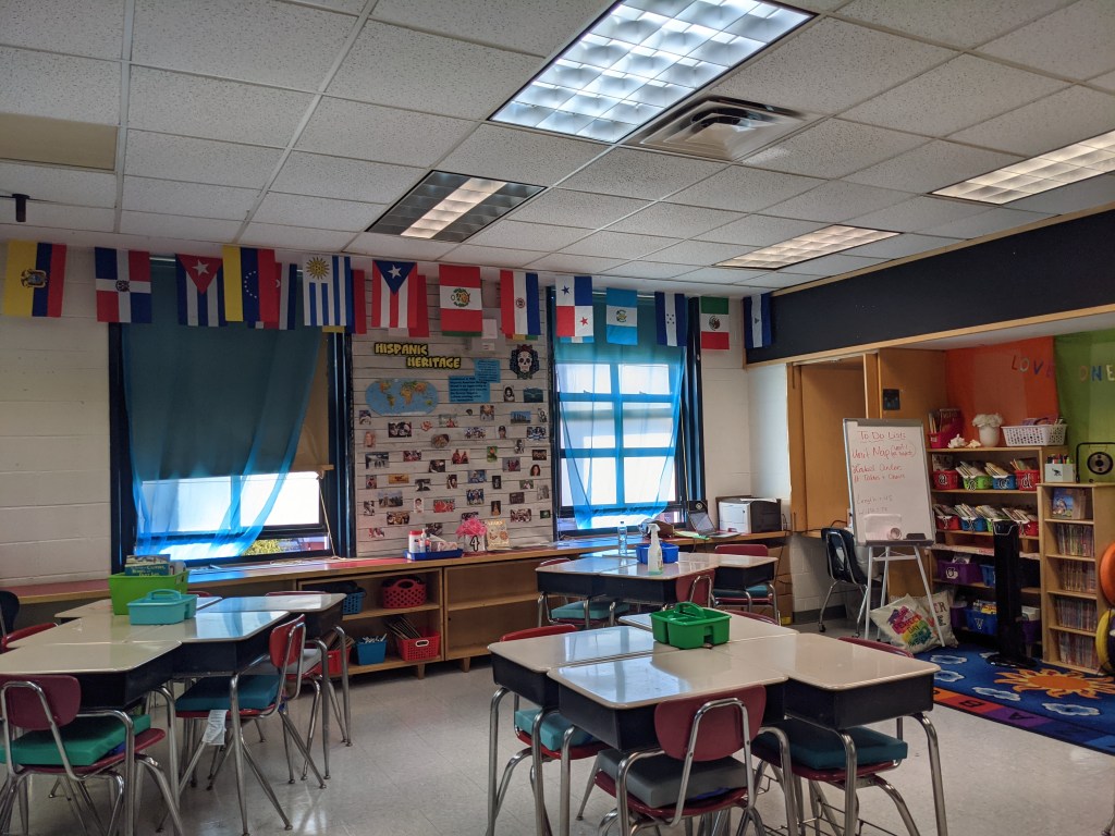
A fouth-grade classroom at P.S. 705, set up with desks in small clusters, windows open, and improved mechanical ventilation for fall 2021. Photo taken by Betsy Ladyzhets (COVID-19 Data Dispatch).
On the morning of Aug. 26, parents from Brooklyn Arts & Science Elementary School (or P.S. 705) flocked to the school for an open house ahead of the fall 2021 semester. Parents climbed up a flight of stairs — designated P.S. 705-only — to the second floor of a building in Crown Heights, Brooklyn. They walked down squeaky-clean hallways, toured classrooms with desks carefully spaced three feet apart, and heard the whir of newly-installed fans and portable ventilation units.
The event was live-streamed for those who couldn’t make it in person. About 100 parents attended the open house events online and in-person, Principal Valerie Macey estimated, representing around one-third of the school’s 308 students.
The school had already done “a lot of communication,” Macey said — so parents were familiar with safety protocols going into the open house, and questions focused on more typical school concerns such as homework policy. This past communication included weekly town hall meetings, virtual office hours, and individual calls to families.
P.S. 705 went above and beyond New York City school reopening guidance, with a particular reliance on the city’s surveillance testing program. This elementary school had 55% in-person enrollment by the end of the 2020-2021 school year, above the city’s average of about 40%, and made it through the year with just 11 total cases — and zero closures.
P.S. 705 is the subject of the final profile in the COVID-19 Data Dispatch’s “Opening” series. Alongside four other school communities, we selected it because the majority of the school’s students returned to in-person learning during the 2020-2021 school year — and city officials identified COVID-19 cases in under 5% of the student population. (According to the CDC, about 5% of school-aged children in the U.S. contracted COVID-19 between the start of the pandemic and early August 2021.)
As the other four school communities in this project are rural districts — following a trend in our data analysis, which primarily identified rural areas — we felt it was important to include a city school in the project. We additionally wanted to highlight New York State’s surveillance testing program, as it’s one of the few school testing programs with public data available. Plus, the COVID-19 Data Dispatch was able to visit this school in person, as this reporter (Betsy Ladyzhets) is based in Brooklyn.
Demographics for Brooklyn, New York1 Census population estimates, July 2019
Population: 2.6 million
Race: 36.8% white, 33.8% Black, 18.9% Hispanic/Latino, 12.7% Asian, 2.7% Two or more races, 0.9% Native American
Education: 82.4% have high school degree, 37.5% have bachelor’s degree
Income: $60,200 is median household income, 17.7% in poverty
Computer: 87.5% have a computer, 80.0% have broadband internet
Free lunch: 67.8% of students receive free or reduced-price lunch2
In-person enrollment: 55% at end of the school year
Total cases, 2020-2021 school year: 11 cases (8 among students, 3 among staff)
1We chose to include borough-level statistics here because the P.S. 705 school district does not clearly align with a specific ZIP code or another smaller geographic area within Brooklyn. 2Source: National Center for Education Statistics
Extensive parent communication
New York City, which has the largest public school district in the U.S., faced challenges with maintaining parent trust during the pandemic. In fall 2020, the city started offering hybrid learning, with cohorts of students returning to classrooms for two or three days a week. But only one in four students actually returned to classrooms by early November, according to the New York Times. In spring 2021, many schools were able to offer five days a week in-person, but most students still stayed home. Parents criticized NYC leaders for confusing communication; teachers protested unsafe conditions at their school buildings; and some staff, like those working with special education students, claimed the city’s plan left them behind.
At P.S. 705, more students returned to in-person learning (55%) than the city average (40%). School administrators made it a priority to provide parents with information and make themselves available for questions. This frequent communication was a major reason why parents felt safe sending their children back to classrooms, representatives from the Parent-Teacher Association (PTA) said in a group interview with administrators and other school staff.
Town halls — livestreamed to parents — are one hallmark of P.S. 705’s communication. After initial school-wide meetings, administrators devised a schedule in which the weekly town halls alternated between grade levels, in order to focus on concerns for specific age groups.
Takiesha Robinson, the PTA president, recalled that these meetings were well-attended; Principal Macey estimated that 30 to 40 parents typically joined the grade-specific events, accounting for the majority of the school’s 40 to 50 students in a grade. “The town halls [were] a very good open forum to let the parents know that you [the administrators] are listening, you do care, you are here,” she said. When parents provided feedback on something they felt wasn’t working, administrators responded quickly, Robinson said.
In addition to the town halls, P.S. 705 administrators staffed a “virtual main office” where parents could enter and ask additional questions. Each morning, administrators logged onto a virtual meeting which stayed live throughout the day. “Parents could come in and ask any questions when they needed,” said Melissa Graham, P.S. 705’s parent coordinator.
School staff also reached out to families proactively when they identified a potential need for support, such as after a student missed class. This school is located on the border of Crown Heights and Prospect Heights, both neighborhoods that were hard-hit by the pandemic: in the school’s ZIP code and in a neighboring ZIP code where families live, one out of every 11 people was diagnosed with COVID-19, according to NYC data.
At P.S. 705 itself, 41% of students are Black and 32% are Hispanic or Latino, two groups that saw disproportionately high COVID-19 hospitalizations and deaths in Brooklyn. Principal Macey explained that the staff wanted to know when students lost loved ones or went through other COVID-related struggles.
“The staff and administration went above and beyond to reach out to those families,” said Alison Gilles, PTA secretary. “[The pandemic] definitely hit our community really hard. But 705 is just the kind-of place where it is a ‘wrap your arms around the whole family’ kind-of a school.”
Surveillance testing
At P.S. 705, students get swabbed in the school auditorium. Students wait in socially-distanced seats before returning to class. Photo taken by Betsy Ladyzhets (COVID-19 Data Dispatch).
P.S. 705 utilized NYC’s COVID-19 testing program to identify cases before they turned into outbreaks. Starting in October 2020, the NYC Department of Education (DOE) required all schools open for in-person learning to test 20% of their on-site students and staff once a month. In December, as the winter COVID-19 surge grew, this requirement was increased to once a week.
Through partnerships between the city DOE and PCR testing labs, students and staff could get tested right at their school buildings, with results available in two to three days. At P.S. 705, students were tested in the school auditorium, one grade at a time: students filed in at one side of the room, got swabbed one by one, then waited in socially-distanced seats to return to class.
For this school, the city’s 20% requirement shook out to about 45 people. But P.S. 705 “over-volunteered for the testing,” according to DOE spokesperson Nathaniel Styer. Administrators realized that testing was a great tool to keep their classrooms safe and encouraged staff and students to get swabbed even when it wasn’t required.
“There were a lot of people apprehensive, initially, about being tested,” said Principal Macey. So, she, along with Graham (the parent coordinator) and Assistant Principal Kristen Pelekanakis, routinely got tested first so that students and staff could see how easy the process was. During the week of January 20, 2021, for example, over 150 staffers and students were tested—out of about 200 total people in the building.
!function(){“use strict”;window.addEventListener(“message”,(function(e){if(void 0!==e.data[“datawrapper-height”]){var t=document.querySelectorAll(“iframe”);for(var a in e.data[“datawrapper-height”])for(var r=0;r<t.length;r++){if(t[r].contentWindow===e.source)t[r].style.height=e.data["datawrapper-height"][a]+"px"}}}))}();
Just as young students got used to masks in Oregon, the Brooklyn students got used to swabs. Graham recalled: “I would come into the classroom with a clipboard, and I would have kids being like, ‘Take me! Take me! I’m getting tested this week!’”
In fact, Pelekanakis said that she and other administrators wished testing capacity was higher, so that they could test even more students. The majority of the school’s active cases were caught through random testing, she said; those students were asymptomatic and, she believed, likely wouldn’t have been identified as infected if not for P.S. 705 testing above their required level. The school saw a total of eight student cases and three staff cases all year — comprising just under 5% of the onsite students and staff.
The city’s testing requirement has become less stringent for fall 2021. Now, only 10% of unvaccinated students will be tested every other week, and students must opt in to the program rather than requiring testing for all. According to Principal Macey, all the students who attended in-person classes in spring 2021 had opted into the fall testing program as of early September; she plans on heavily promoting the program to the students who were remote last year through upcoming town halls and other communication.
Macey and the other staffers — who must be vaccinated with at least one dose by the end of September, per a city-wide mandate — aren’t required to participate in testing this fall. But Macey still intends to serve as an example for her students: “I’ll test, just because I want my kids to see,” she said.
Returning to one school community
NYC is heading into the fall 2021 semester with no remote option. At P.S. 705, this means more than 100 students who learned remotely for the entire 2020-2021 school year will be coming back to classrooms. Administrators are preparing with more parent communication (weekly town hall meetings and the late-August open house), while the DOE updates their building’s ventilation system.
In addition to an upgraded mechanical ventilation system, P.S. 705 is utilizing open windows, fans, and portable air filtration units. The building also saw extensive cleaning this summer: Principal Macey wanted to see her face “shining in the floor” by the first day of class. Photos taken by Betsy Ladyzhets (COVID-19 Data Dispatch).
The COVID-19 Data Dispatch (CDD) visited P.S. 705 on Sept. 3, just ten days before classrooms open for the new school year. At that time, Principal Macey said the school just finished an overhaul of its HVAC system, updating ventilation throughout the building. The school also had external filtration units, fans, and windows open for additional airflow. In classrooms, desks are spaced three feet apart — down from six feet last year. And custodians are making the building look like new: During the CDD’s visit, Principal Macey told a custodian that she wants to see her face “shining in the floor” by the first day of school.
Summer renovations at P.S. 705 were extensive, according to reporting at Gothamist: In mid-August, “the building that houses Brooklyn Arts and Science Elementary School reported that all 40 of its classrooms were under repair.” At the time of publishing, just one classroom is still marked under repair by the DOE, while three rooms (two staff offices and a bathroom) have no mechanical ventilation.
At the Sept. 3 visit, administrators and teachers told the CDD that they were optimistic about the new school year. “The kids are really good with [keeping] their masks on,” said fourth-grade teacher Denise Garcia. She felt that, with similar protocols in place, the school could continue to have low case counts like the previous year.
This year’s first day of school will be far from typical. Principal Macey has planned for a big celebration, including outdoor activities, a literal red carpet, photo opportunities, and a moment of silence for loved ones lost in the pandemic.
“It can’t just be, ‘go inside, wash your hands,’” she said. “We have to get that space to just reconnect.” With continued communication and acknowledgement of the pandemic’s hardships, she intends to lead her school back into “one school community.”
The COVID-19 Data Dispatch’s “Opening” series is available for other publications to republish, free of charge. If you or your outlet is interested in publishing any part of this series, please contact betsy@coviddatadispatch.com.
Our final Diving into COVID-19 data workshop happened this week!
Ann Choi and Will Welch, two data reporters at THE CITY (a local, nonprofit newsroom in NYC) discussed making COVID-19 numbers accessible and meaningful for New Yorkers. Júlia Ledur, a graphics reporter at the Washington Post and former data visualization lead at the COVID Tracking Project, walked us through several visualization projects. And Christie Aschwanden, a freelance science journalist, discussed communicating uncertainty in COVID-19 reporting. Thank you to everyone who attended!
For those who couldn’t make it live, you can watch the recording of the session below. You can also check out the slides here. I’m also sharing a brief recap of the workshop below.
Making NYC data accessible
Ann Choi and Will Welch shared a few strategies they used to communicate COVID-19 data for a NYC audience.
First, Ann Choi walked through a few examples of THE CITY’s written articles, going from early uncertainty during a time of limited government guidance to a present focus on who is getting vaccinated.
One early story compares two socioeconomically similar neighborhoods in Queens, Flushing and Corona, which had different pandemic responses. For example, Flushing residents, many of whom are East Asian immigrants, did not need to be told to wear masks because they had past experience with these public health measures. Choi said she was inspired to do this comparison by thinking about how New York City measures up against Seoul, South Korea, where she has relatives. The cities have similarly-sized populations, though Seoul is much more dense; yet NYC has had over 29,000 COVID-19 deaths while Seoul has had fewer than 400.
A January story on vaccination rates emphasizes the “if”s by extrapolating out from NYC’s data. “If city residents were getting vaccinated at the statewide average,” Choi and Welch wrote, over 100,000 more city residents would already have gotten a shot. This tangible comparison emphasizes how the city is lagging behind.
A story on the Washington Heights Armory drew attention to vaccination disparities in the city. THE CITY reporter Josefa Velasquez went to this site and did what Choi called “very old-school data reporting,” talking to a sample of people waiting in line. Despite the vaccination site being touted by the governor as an example of a vaccination site in a predominantly Hispanic/Latino neighborhood, the majority of those Velasquez spoke to were white suburbanites. After this story was published, appointments at the Armory were restricted to prioritize NYC residents.
Other vaccination stories Choi’s worked on have drawn further distinctions between which neighborhoods were most impacted by the pandemic—and which neighborhoods are getting the most shots. ZIP code data released by the city allowed her to drill down into local patterns and find both examples of inequity and examples of how communities fought against it.
Will Welch then discussed THE CITY’s COVID-19 tracker, Coronavirus in New York City. It’s updated on a daily basis through a combination of scraping and hand data collection; the tracker includes data on cases, deaths, test positivity, vaccinations, and more.
“Our first iteration of this tracker was taking the data from the city and trying to put it into a more accessible format,” Welch said. City Hall emailed data out to reporters starting in mid-March, before developing a public dashboard.
Later in the spring, NYC began publishing data on a public GitHub, allowing Welch and Choi to evolve their tracker beyond simply making numbers easier to find. One example of complexity built into the tracker: NYC was one of the first jurisdictions to distinguish “confirmed” deaths (associated with positive tests) and “probable” deaths (associated with death certificates). At first, daily updates of these numbers led to confusion as probable deaths would sometimes be reassigned as “confirmed.” But when the city published a full time series on deaths, THE CITY was able to make their own time series graphic, showing the long-term arc of the pandemic.
Informed by watching this time series, Welch put together a graphic to show how early counts of COVID-19 fatalities in NYC by date of death are often incomplete. Deaths may be retroactively assigned to an earlier date of death after they were reported, which put some summer dates that Governor Cuomo bragged had seen “no new deaths” into a different light.
Welch additionally discussed how the tracker switched, in the summer, from relying on city data to relying on state data for testing numbers. State data were being used to calculate reopening indicators, and THE CITY wanted their tracker to display the information that was having the greatest impact on people’s lives. The publication also fought for the release of ZIP code level data, which were used for specific local policy restrictions starting in the fall.
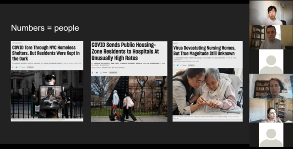
Pandemic impact on New Yorkers’ lives has been an enduring theme for THE CITY’s coverage over the past year. This ranges from mapping the test positivity numbers behind restrictions to highlighting the share of NYC residents that have gotten at least one dose of a vaccine. But one particularly notable project is Missing Them, a searchable memorial of New Yorkers whose lives have been lost to COVID-19. The memorial has compiled nearly 1,000 names so far, though this is less than 5% of the total number of lives lost.
“Behind every number, behind every case, there is a vulnerable person whose life was cut short,” Choi said. She expressed hope that reporters will take lessons from covering COVID-19 to other public health crises, and remember to tell the stories behind each data point.
Visualizing COVID-19 data
Júlia Ledur talked through several of her COVID-19 visualizations projects, including both graphics at the COVID Tracking Project and the Washington Post. She shared how her approach to visualizing these data has changed as the data have become increasingly complicated, now that we’re contending with many test types, vaccinations, and more.
Early COVID Tracking Project data, collected and visualized in March 2020.
A few examples:
An early graphic (above) from March 2020, calling attention to data gaps in the CDC’s reporting. The agency had reported far fewer COVID-19 tests than the COVID Tracking Project had compiled from states at that time.
A scrollytelling explainer that calls attention to just how complicated test positivity can get, by showing how this metric gets calculated.
Another test positivity post, this one focusing on inconsistencies between the state. This post uses a fictional character called Bob to show how Bob’s testing experience might be counted in three different ways.
Graphics explaining test per positive, another metric which may be used to show complications in COVID-19 testing—though, as Ledur said, this metric did not end up taking off in the same way that test positivity did.
Trading cards and other graphics exploring different test types, to accompany an explainer on how the tests compare. Ledur worked with CTP Science Communication lead Jessica Malaty Rivera to ensure her graphics were accurately representing the science of each test while keeping readers engaged.
Ledur also shared a few of her best practices for visualizing COVID-19 data:
Be clear about what you’re showing and what you’re not showing. Include clear labels, methodology, and specific notes on what you aren’t including.
Don’t avoid uncertainty. Instead, highlight it. Tell your audience what’s going on.
Add notes and/or annotations with caveats explaining data anomalies.
Put the data in context. Show how one point in time compares to others, or how one place compares to others.
Check your science. Work with those who have the right expertise to make sure your work is correctly reflecting the issue.
Have empathy. Put yourself in the shoes of your reader; think about what questions you might have, how you can answer them, and where you can’t answer them.
“You have an idea of what it’s like to be affected by this, because you certainly are,” Ledur said. Leaning into this experience as you communicate data, remembering how the numbers make you feel, will make your reporting better.
Addressing uncertainty
“This pandemic has been a time when the process of science has been on public display,” Christie Aschwanden said to start her talk. She called this period an incredible, but overwhelming opportunity to convey the process of science in an accurate way.
And forefront in the process of science is the idea of uncertainty. We might think numbers are neutral, Aschwanden said—“we measured this and therefore it’s true”—but in fact, they are subject to biases which must be communicated along with the numbers.
These biases are why political statements such as “we follow the science” may be harmful. “Science is a method of understanding, it’s not an answer,” Aschwanden said; we should prepare people to see how a number or a conclusion may change, so that when it inevitably does change, they don’t feel betrayed.
One high-profile example of this trend is mask-wearing. Public health experts such as Dr. Anthony Fauci said in early spring 2020 that masks were not necessary for the general public. This statement reflected scientific knowledge at the time—but when this knowledge changed as the virus’ tendency to spread through air became better understood, many Americans held up the change as evidence of a conspiracy.
This trend also occurs with medical treatments. Convalescent plasma, one COVID-19 treatment, held promise early on but has not seen benefits in more recent randomized control trials. It’s important to communicate the uncertainties and shortcomings of provisional studies, so that people don’t put all their hopes into a treatment that later is shown to be less viable.
“We need to get from this magic wand idea about science,” Aschwanden said. Science is not a singular path towards truth; it’s a “process of uncertainty reduction.” Pointing out and discussing the uncertainty, whether that’s through annotations on a chart or caveats in a news story, will help readers understand how decisions may change based on new evidence.
Here are Aschwanden’s tips for discussing scientific data with the public:
Emphasize that uncertainty is okay (a feature, not a bug)
Explain that knowledge is provisional
Promote openness to new evidence, even as we become more certain
Beware motivated reasoning and cognitive biases
Convey that data aren’t neutral
One article that effectively follows these guidelines is a story Aschwanden wrote in the fall for Scientific American. She walks readers through the data on COVID-19 deaths in order to debunk the rumor that death counts are inflated by doctors. The story uses three lines of evidence to explain that there’s a lot of uncertainty about the precise number of COVID-19 deaths, but that there’s not much uncertainty about the magnitude of these deaths. Aschwanden encourages any reporters working on COVID-19 coverage to join a free listserv run by the National Association of Science Writers, which she moderates. To join the list, send an email to nasw-COVID19mods@nasw.org with your name, email, and publication(s) that you are covering COVID-19 for, either on staff or freelance.
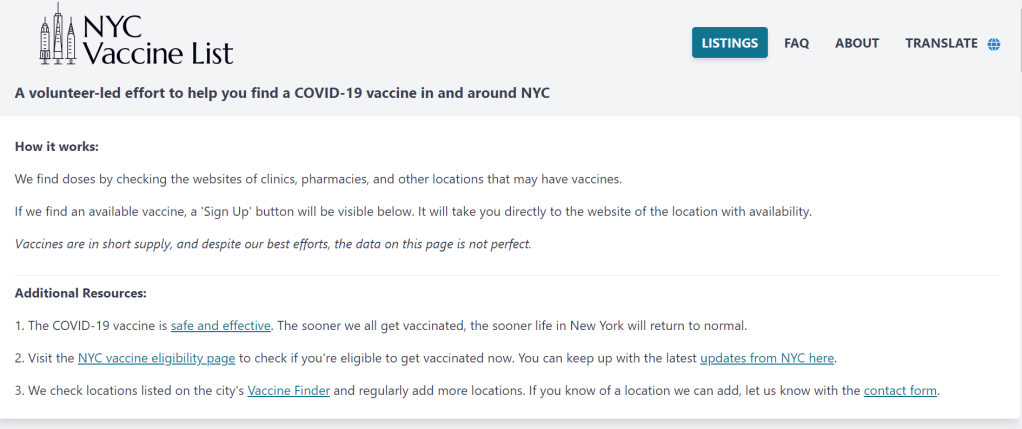
When faced with entrenched disparities and a local government that doesn’t want to confront them, it can be difficult for singular individuals to step in and fill gaps. But the founders of NYC Vaccine List knew they could fill one specific gap: they built a better website for finding vaccination appointments.
The NYC Vaccine List website is simple—simpler than the official city site. Just go to the homepage, scroll past the instructions, and you’ll find a list of vaccine locations. For each location, the site clearly marks available appointments or, where this information can’t be automatically pulled in, provides a link to the location’s website and a note from the last NYC Vaccine List volunteer who checked it. When I checked it at about midnight this morning, Yankee Stadium appointments (for Bronx residents only) were at the top of the list.
I talked to Dan Benamy and Michael Kuznetsov, two of the founders of this project, over email last week; they told me more about how the NYC Vaccine List website works and their efforts to improve its functionality for all New Yorkers. This interview has been lightly edited and condensed for clarity.
Betsy Ladyzhets: I know the basics of the project’s methodology—you’re scraping the websites of different vaccination sites and compiling all the info in one place. But I’d like to know more about what running this site actually looks like on a day-to-day basis. What parts of the project are manual vs. automated? Are there regular hours that you work on updates?
NYC Vaccine List: The project is managed through a Discord chat server, which makes it possible for volunteers to communicate about certain topics in a group chat, as well as one-on-one when needed. Various responsibilities have been parcelled out to different volunteers based on their ability to help in different areas: maintaining the crawlers, calling to verify information that cannot be crawled, and reaching out to local organizations and press to help spread the word about the project. There are no fixed hours—as this is an all-volunteer effort, we fit this work in between our responsibilities to work and family. This means that it’s not that unusual for there to be work done well into the early hours of the morning!
BL: I saw on Twitter that you’re working on providing translations to make the site accessible in languages other than English. How is that going so far? Have you noticed any changes in the people using the site thanks to this change?
NYC VL: As of this week, the site can be translated on-demand using the “Language” button in the upper right hand corner of the site. We use the Google Translate widget, which is the same technology used by NYC.gov. The Google Translate widget is provided free-of-charge to COVID-related efforts. Our volunteers have reached out to friends and family to validate the translations, and received positive feedback that the translations make the site easier to use for a non-English speaker.
BL: So far, white New Yorkers are getting vaccinated at disproportionately high rates while Black and Latino New Yorkers are getting vaccinated at disproportionately low rates. What can the city do to make vaccination appointments more accessible for these groups? What role do you see your project playing in addressing this issue?
NYC VL: The social and epidemiological questions that come along with a mass vaccination effort are complex, and although we have volunteers that have experience in this realm, our organization is not in a position to make recommendations to the city. We hope to increase access to the vaccine by removing the burden of navigating dozens of websites and waiting for hours on hold in order to find a vaccine.
We have two simultaneous efforts that strive to make the site more equitable to all residents: First, we’ve prioritized technical fixes that make the site usable for non-English speakers, those with slow internet, those that cannot easily travel across the city, and those relying on screen-readers. Second, we’ve reached out to organizations around the city that directly work with underserved communities. In that outreach, we’ve made sure that the organizations are aware of our site, as well as that they have a direct line of communication back to us in case there is a way to improve the site for their communities and constituents.
BL: The city revamped its own vaccine portal recently; the updated site at least appears to be easier to use. Has this update impacted your project?
NYC VL: The new site is a big step in the right direction, and we’re thrilled to see it because it means more New Yorkers can easily find an appointment. First and foremost, the site should be usable for New Yorkers that visit it directly. Any challenges that we encounter while trying to visit it automatically are secondary, so we don’t have any gripes related to how the page is coded. We’re continuing our efforts to build a site that encompasses all available vaccine locations and appointments available to New Yorkers, which the new site does not yet do, and remain hopeful that the city will continue to make progress in this domain.
BL: What are your future plans for the project? Do you see yourselves keeping this going through future phases of vaccination?
NYC VL: At this point, we haven’t made future plans for the project. We’re energized by the short-term impact we’ve been able to make, and are hopeful that our project won’t be needed for much longer.
BL: What has been your favorite story so far of someone using the website to find an appointment?
NYC VL: We have a new favorite story every day, but one that came in a few minutes ago is top of mind: “Thank you. Thank you. Thank you. A lung transplant makes me a high-risk individual but the ways things are set up, my doctors could not help me get the vaccine. … NYC Vaccine List might literally be my lifesaver. I got my first shot yesterday, Feb. 3, after I spotted an opening on your site at 1:20 a.m. that morning. Thank you. Thank you. Thank you.”
Following the end of the federal public health emergency in May, the CDC has lost its authority to collect vaccination data from all state and local health agencies that keep immunization records. As a result, the CDC is no longer providing comprehensive vaccination numbers on its COVID-19 dashboards. But we still have some information about this year’s vaccination campaign, thanks to continued CDC efforts as well as reporting by other health agencies and research organizations.
This week, the FDA authorized Novavax’s updated COVID-19 vaccine. Here’s why some people are excited to get Novavax’s vaccine this fall, as opposed to Pfizer’s or Moderna’s.
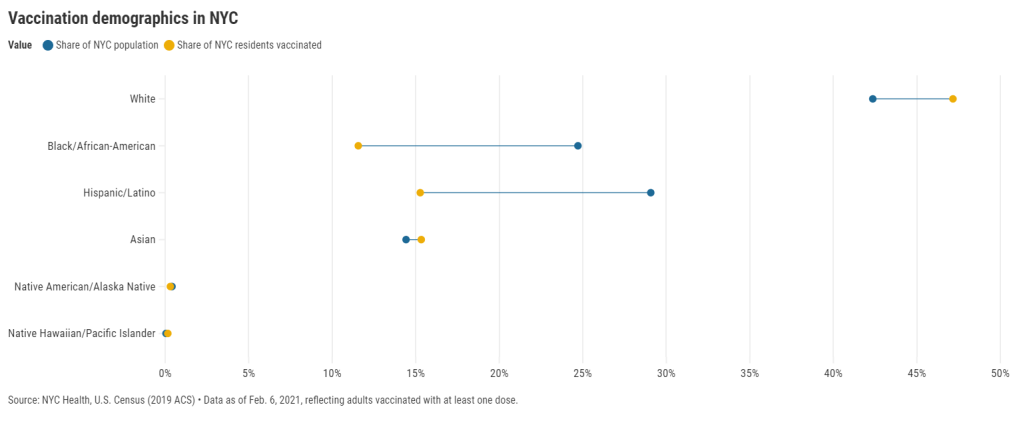
27 states are now reporting race and ethnicity data for their vaccinations. This week, New York joined that number. New York City also started reporting these data last Sunday, as we noted in that day’s issue. Despite promises from city and state leadership to prioritize equity in the vaccine rollout, the numbers so far are showing white New Yorkers getting vaccinated at much higher rates than their Black and Hispanic/Latino neighbors.
Here’s one way of visualizing the disparity: Black New Yorkers make up 25% of NYC’s population, but only 12% of those vaccinated. Latino New Yorkers make up 29% of the population, but only 15% of those vaccinated.
Here’s another way of visualizing the disparity: about 4.6% of white NYC residents have been vaccinated, compared to 2.2% of Latino New Yorkers and only 2% of Black New Yorkers. White New Yorkers are getting vaccinated twice as fast as their neighbors. This is particularly striking when you consider that Black and Latino New Yorkers disproportionately make up our essential workers—they constitute the majority of grocery workers, public transit workers, healthcare workers, childcare workers, and cleaning services workers, according to a March 2020 report by the NYC Comptroller’s office.
As someone who lived in NYC during the height of the city’s spring surge, I’ve seen how hard the pandemic has hit my neighbors of color. Sirens screamed through my north Brooklyn neighborhood at all hours, and hundreds of requests for aid came into my local mutual aid group. About 7,400 Black New Yorkers and 8,000 Latino New Yorkers have died of COVID-19 since the pandemic hit this city. In any version of an equitable vaccine rollout, these communities should be first in line.
So, what’s happening? Why are vaccinations for Black and Brown New Yorkers lagging? The answer is a combination of poor planning and poor access. The city didn’t set up appropriate systems to tell its most vulnerable communities about the vaccines or help them set up appointments. As a result, those NYC residents who have the time, know-how, and internet access to navigate a complex system are snapping up appointments—and you can guess which residents those are.
“What we’re going through now with the vaccine rollout reminds me of what we were going through at the beginning of the pandemic,” said Dr. Uché Blackstock, emergency physician and founder of the organization Advancing Health Equity, at a webinar with City Councilmember Mark Levine this past week. She described how she struggled to get enough tests and PPE to care for her patients—many of whom were Black and Latino essential workers—last spring.
Now, there’s both a supply gap and an information gap. In one example now infamous in the city, a vaccination site in Washington Heights (home to NYC’s Little Dominican Republic) was primarily catering to white patients from other parts of the city, the suburbs, and even New Jersey. Josefa Velasquez, a reporter at THE CITY who exposed the problems at this site, described how the vaccination center was ill-equipped to serve the population in its neighborhood:
At the door, most people entering appeared to be white and unfamiliar with the neighborhood. Some asked security guards where they could find parking. Nylon Longchamp handbags and Burberry scarves stood out.
Outside of the site, run by NewYork-Presbyterian Hospital near its Washington Heights medical center complex, Olga encountered another language barrier: None of the handful of guides and security guards outside directing people spoke Spanish.
Velasquez herself actually helped translate for some of the seniors trying to get vaccinated. After her reporting brought the vaccination center’s problems to light, the center limited all new appointments to NYC residents and reserved 60% of slots for Washington Heights residents. But the story is still indicative of larger issues: NYC data show that 23% of vaccinations in the city have gone to non-residents, and a significant majority of those non-residents are white.
Even when appointments are reserved for New Yorkers, barriers to vaccine access remain. Just this week, Yankee stadium opened as a vaccination site with all doses reserved for residents of the Bronx. Councilmember Levine posted on Friday that thousands of these appointments were still open, unreserved—while appointments elsewhere in the city get snapped up in minutes.
A reply to Levine’s Tweet reveals one reason: Bronx residents can’t access these Yankee stadium appointments through the NYC vaccination website, because this clinic is run by a network of private physicians. The city website is confusing enough already for many New Yorkers—and now that website doesn’t even encompass all available appointments.
Some residents of the Bronx also associate the stadium with invasions of their community:
I live in the shadow of the stadium and this is the first time in my life that the stadium has fulfilled its promise of being a community center after Pres. Carrion and Diaz shoved the multitude of community services it was supposed to offer residents of 10452 down our throats https://t.co/LJUK2D1Svj
— “naked to the world” plays softly in the backgrnd (@elliottraylassi) February 6, 2021
At the same webinar that I cited earlier, Councilmember Levine announced a redesign of the official NYC vaccine appointment scheduler. The site’s design has been simplified and made more accessible. On the homepage, for example, users are provided with four options: Schedule First Dose, Schedule Second Dose, Reschedule Appointment, Cancel Appointment. But users still have to navigate through a checklist and input a lot of personal information in tiny boxes. And, while NYC does have a vaccine hotline, it “hasn’t been adequately staffed,” according to Levine—nor is there adequate translation.
In an ideal world, Dr. Blackstock suggests that doctors should call all their patients proactively to offer vaccine appointments. Community health workers should go door-to-door. Vaccination centers should be set up in every low-income housing development. NYC clearly dedicated nor the advance planning time nor the funding to such proactive measures. But the least we can do should be setting up an easy-to-use website and phone line, right?
(We also need more data on vaccinations by occupations, preexisting health conditions, and ZIP codes—but that’s a topic for another issue.)
Following the end of the federal public health emergency in May, the CDC has lost its authority to collect vaccination data from all state and local health agencies that keep immunization records. As a result, the CDC is no longer providing comprehensive vaccination numbers on its COVID-19 dashboards. But we still have some information about this year’s vaccination campaign, thanks to continued CDC efforts as well as reporting by other health agencies and research organizations.
This week, the FDA authorized Novavax’s updated COVID-19 vaccine. Here’s why some people are excited to get Novavax’s vaccine this fall, as opposed to Pfizer’s or Moderna’s.