
I’ve recently been getting a lot of questions about test positivity rates, both from COVID-19 Data Dispatch readers and from friends outside this project, which reminded me of just how confusing this pandemic metric can be. So, here’s a brief FAQ post about test positivity; if you have more questions, shoot me an email!
What is a test positivity rate?
A test positivity rate is calculated through simple division: the number of positive tests counted in a particular region or setting during a particular period of time, over the number of total tests (positive and negative) conducted during that same period.
Where do test positivity rates come from?
While the test positivity rate calculation may seem simple, matching together the right numbers for that numerator and denominator can get pretty tricky. This is because, at the federal level as well as at most state and local health departments, positive tests and total tests are reported through different systems.
Positive tests—also known, more simply, as cases—are prioritized for reporting. This is because public health departments need to know how many cases they are currently dealing with for contact tracing, potential hospital utilization in the coming weeks, and other crucial health system reasons. If a health department is pressed for time during a surge or coming back from a holiday break, it will analyze and report out case data before going through total test data. Similarly, many labs report their positive tests to health agencies separately from (and earlier than) total tests.
As a result, simply dividing the new cases reported on a particular day over the new tests reported that day often won’t give you an accurate test positivity figure. Instead, the data analysts that calculate these rates typically match up the dates that tests were conducted. So, instead of dividing “all cases reported on Tuesday” over “all tests reported on Tuesday,” you’d divide “all tests conducted on Tuesday that returned positive results” over “total tests conducted on Tuesday.” This calculation provides a more accurate picture of test positivity.
Also, different states and localities might report tests using different units, like “tests conducted,” “people tested,” and “testing encounters”—making it difficult to compare test positivity rates across states. This was a larger problem earlier in the pandemic; I recommend reading this excellent COVID Tracking Project analysis post for more info on the issue.
How do you know a test positivity figure is reliable?
As I explained in a recent post about the John Hopkins University (JHU) dashboard, the test positivity rates that appear on national dashboards often are not reliable because they fail to take these timing issues into account. A dashboard like JHU’s, which automatically scrapes data from state health agencies, does not have the backend information about the dates tests were conducted needed to calculate accurate positivity rates.
JHU recently changed its test positivity calculations to better address differing testing units across states. Still, as the team behind this dashboard explains in a blog post, a lack of standardization across how states report their testing data makes it difficult to calculate positivity rates that can be accurately compared between jurisdictions.
For that reason, I tend to trust test positivity rates calculated by individual state and local health agencies over those calculated by large, aggregating dashboards. For example, the NYC health department reports its own test positivity rate and does so with a three-day lag, in order to allow time for matching testing dates to case dates.
In addition, I would be wary of test positivity rates that are calculated for a longer period than one or two weeks. Test positivity, as a metric, is meant to be an indicator of the current situation in a state, region, or a specific setting like a university campus; when reported for a longer period (like a month) or cumulatively, this metric doesn’t tell you anything useful.
If you’re looking for a national test positivity rate source, the HHS’s Community Profile Reports include these figures for states, counties, metro areas—albeit with some reporting delays and gaps in certain states.
How do you interpret test positivity rate data?
I find this explanation from the COVID Tracking Project very helpful:
Test positivity can help us understand whether an area is doing enough tests to find its COVID-19 infections. The metric is widely used by local, state, and federal agencies to roughly gauge how well disease mitigation efforts are going. Put simply, when test positivity is high, it’s likely that not enough tests are being done and that most tests that are done are performed on symptomatic people. Both of these factors—insufficient testing and only testing people who feel sick—make it very likely that many cases are going undetected.
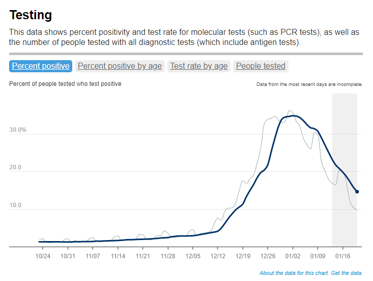
What would we consider a “high” test positivity rate? The CDC threshold here is over 10%; such a positivity rate means that one in ten tests conducted are returning positive results, indicating a lot of symptomatic people are getting tested for COVID-19 and a lot of cases are going undetected. A region with a positivity rate over 10% should step up its testing efforts and encourage asymptomatic people to get tested for surveillance purposes.
On the other end of the spectrum, 3% and 5% are commonly used as thresholds for low test positivity. The specific number might depend on an institution’s testing capacity; at a business that regularly tests all of its workers and is already looking for asymptomatic cases, a test positivity over 2% might already be cause for concern.
Generally, though, if this number is under 5%, it’s a good indicator that the region or setting has high enough test capacity to identify asymptomatic cases—and the majority of cases are being caught.

Leave a comment