- Coronavirus variant data from USA TODAY: The CDC doesn’t publish a time series of its counts of COVID-19 cases caused by variants. So, USA TODAY journalists have set up a program to scrape these data whenever the CDC publishes an update and store the data in a CSV, including variant counts for every U.S. state. The time series goes back to early January.
- Documenting COVID-19: This repository is one of several great resources brought to my attention during this past week’s NICAR conference. It’s a database of documents related to the pandemic, obtained through state open-records laws and the Freedom of Information Act (FOIA). 246 records are available as of February 26.
- VaccinateCA API: California readers, this one’s for you. The community-driven project VaccinateCA, aimed at helping Californians get vaccinated, has made its underlying data available for researchers. The API includes data on vaccination sites and their availability across the state.
Tag: Featured sources
-
Featured sources, March 7
-
Global.health has gone public—what’s actually in the database?
Last week, we included Global.health in our featured sources section. The initiative aims to document 10 million plus cases in one source. Instead of just listing numbers of positive cases and deaths, they collect individual cases and gather information about said case. What was their age range? Gender? When did symptoms develop? The dataset has room for more than 40 variables aside from just “tested positive.” While there are lots of dashboards and tracking sources, none collect detailed data about (anonymized!) individual cases.
Collecting data like this is critical for understanding how epidemics spread, and an open repository could help researchers determine what the actual infection rate is or divine more information about lasting immunity. The set has been available to researchers for a while, but now it’s been released to the public. It might seem strange to release it now as it looks like cases are finally sustainably declining, but we’re still going to have to track COVID-19 even as everyone gets vaccinated. As one of the founders, Samuel Scarpino says, “COVID-19 is gonna become rare. It will fall back into the milieu of things that cause respiratory illness. As a result, we’re going to need higher-fidelity systems that are capturing lots of information and informing rapid public health response, identifying new variants and capturing information on their spread.”
Since the data are now public,let’s take a look at what’s possible with this source.
The first thing I discovered is that, predictably, the full dataset is just too big for Excel to open. I recently switched computers and I’m pretty sure this file was the death knell for my old one. You’re gonna need to either stick with their website or use something like Python or R to really sink your teeth in. Even just the website slowed down my new computer a lot, so beware. Elderly computers should probably be spared.
Still, the website is very well designed and easy to navigate. You can have your data two ways: as a table with, at time of writing, more than 200,000 pages, or as a map where you can click on the country or region you want to look at, which will then direct you to a much smaller table. (All roads lead to tables, but the map function does make it a lot easier to navigate.)
The country map is fairly self-explanatory—a deeper shade of blue means more cases— but the regional map also just looks very cool:

Regional map. You can of course zoom in to your region of choice. My one quibble with the display is that I wish you could rotate your field of view, as sometimes the region behind a particularly tall spike can literally be overshadowed and thus be a little harder to access.
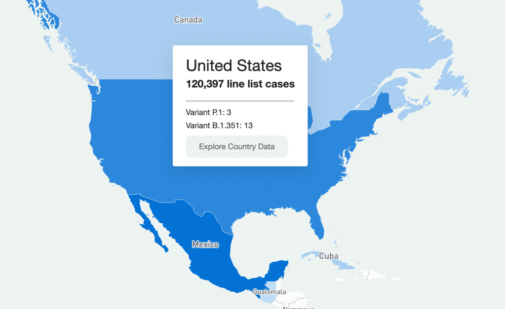
Going through every part of this giant resource would take days, so I’m going to be focusing on the United States data. Here’s what I got when I clicked on it on the map:

U.S. map. It should be understood that this is a sample of the U.S. data (same presumably goes for data in other countries.) Because this is line-list data, it’s supposed to be very granular—recent travel history, when a case became symptomatic, and so on. Data at this level of detail just aren’t available or possible to get for every case in the country (and even less so for the rest of the world.) So that should be remembered when working with this dataset. It’s extremely comprehensive, but not all-encompassing. (That being said, it is strange that there are P.1 cases recorded, but no B.1.1.7, which is much more common here.)
So how granular are the data? When you’re directed to the table for that country, the table on the website has columns for:
- Case Identification Number
- Confirmation date (I assume this is confirmation that yes, this person is infected)
- “Admin 1, Admin 2, and Admin 3” (short for “administrative areas” – for example, for a U.S. patient, 1 would be country, 2 would be state, and 3 would be county)
- Country
- Latitude and longitude (I assume of the hospital or of the lab where the case was identified)
- Age
- Gender
- Outcome
- Hospitalization date/period
- Symptom onset
- URL for the source
Which is indeed pretty granular! It should be noted, however, that there are a lot of blank spots in the database. It has the capacity to be extremely comprehensive, but don’t go in expecting every single line item to have every detail. I’m not sure if this is going to improve as records are updated, but I suppose we’ll see.
What can you do with these data? I loaded the full dataset into R to mess around with the data a bit. The disclaimer here is that I am by no means an R wizard. Another fair warning is that R will take a hot second to load everything up, but when you load up the full dataset there are a ton more columns for more data categories, like preexisting conditions. (That one seems important, why is it not on the more accessible website?)
I found that making some frequency tables was a good way to assess just how complete the data was for certain variables. Here’s a frequency table I made with the outcome values:
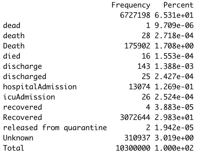
Frequency table. The first thing I notice is just how many lines have a blank value for the outcome. (65% of them.) Again, a lot of these data are incomplete. The second thing is that there are a ton of synonyms for the same thing. A capitalization change will shunt a number to a completely different category, making it a little annoying to compile results, so you’ll have to tinker with it a little bit to make a clear graphic/graph/etc. The bar graph R spit out for this was unreadable because of all the categories.
I tried another one for the gender demographics and the bar graph was actually readable this time. As expected, the percentage of lines with no data available was lower this time (19%) but still sizable.

Bar graph showing gender availability. As I should have expected, I got a gigantic table when I tried it for ethnicity. But 75.49% of the lines were blank. 99.6568% were blank for occupation, which I was inspired to look at because occupational data are similarly barren for vaccination data as well. Somewhat predictably, and just as a check, cases by country had much fewer blank cells.Overall this is a really interesting resource, but there are a lot of blank spots that keep it from being the god of all datasets. I think asking any source to be 100% complete is a tall order given the circumstances, and this is still the only source out there of its kind and of its scale. I look forward to checking in again and seeing if those blank cells drop in number.
-
Goodnight, COVID Tracking Project

The COVID Tracking Project’s homepage on March 7, 2021. A couple of hours after I send today’s newsletter, I will do my final shift of data entry work on the COVID Tracking Project’s Testing and Outcomes dataset. Then, later in the evening, I will do my final shift on the COVID Racial Data Tracker. And then I will probably spend another hour or two bothering my fellow volunteers on Slack because I don’t want it to be over quite yet.
In case you aren’t fully embroiled in the COVID-19 data world, here’s some context. Last spring, a few journalists and other data-watchers realized that the U.S.’s national public health agencies weren’t doing a very good job of reporting COVID-19 tests. Alexis Madrigal and Rob Meyer (of The Atlantic) compiled their own count from state public health agencies. Jeff Hammerbacher (of Related Sciences) had independently compiled his own count, also from state agencies. And, as the About page on the website goes: “The two efforts came together March 7 and made a call for volunteers, our managing editor, Erin Kissane joined up, and the COVID Tracking Project was born.”
Now, one year after that formal beginning of the Project’s test-counting efforts, the team is ending data collection work. Erin Kissane and Alexis Madrigal provided some background for that decision in a blog published on February 1. I recommend reading the piece in full, if you haven’t yet, but the TL;DR is that a. this data collection work should be done by federal public health agencies, not a motley group of researchers and volunteers, and b. the federal agencies have greatly improved their own data collection and reporting efforts in recent months.
The Project’s core Testing and Outcomes dataset formally ceases updates today, along with the Racial Data Tracker and Long-Term Care Data Tracker. But the Project has provided a lot of documentation and guidance for data users who want to keep tracking the pandemic, along with analysis that will be useful for months (if not years) to come. The rest of this post shares the highlights from those resources, along with a few personal reflections.
Where to find your COVID-19 data now
So, you’re a journalist who’s relied on the COVID Tracking Project’s tweets to illuminate pandemic trends for the past year. Or you’re a researcher who’s linked the Project’s API to your own tracking dashboard. Or you’re a concerned reader who’s checked up on your state regularly, watching the time series charts and annotations. Where do you go for your data now?
Through a series of analysis posts and webinars over the past few weeks, Project staff have made their recommendation clear: go to the federal government. In recent months, the CDC and the HHS have built up data collection practices and public dashboards that make these data easier to work with.
Here are a few highlights:
- For daily updates at all geographic levels, use the Community Profile Reports. After months of private updates sent from the White House COVID-19 task force to governors, the data behind these in-depth reports were made public in December. The PDF reports themselves were made public in January, after Biden took office. The reports include detailed data on cases, deaths, tests, and hospitalizations for states, counties, and metropolitan areas. I’ve written more about the reports here.
- For weekly updates, use the COVID Data Tracker Weekly Review. As I mentioned in a National Numbers post two weeks ago: the CDC is doing weekly updates now! These updates include reports on the national trends for cases, deaths, hospitalizations, vaccinations, and SARS-CoV-2 variants. They may be drier than CTP blog posts, but they’re full of data. You can also sign up to receive the updates as a newsletter, sent every Friday afternoon—the CDC has really moved into the 21st-century media landscape.
- For state-specific updates, use the State Profile Reports. Similarly to the Community Profile Reports, these documents provide many major state-level metrics in one place, along with local data and color-coding to show areas of concern. They’re released weekly, and can be downloaded either state-by-state or in one massive federal doc.
- For case and deaths data, use the CDC’s state-by-state dataset. This dataset compiles figures reported by states, territories, and other jurisdictions. It matches up pretty closely to CTP’s data, though there are some differences due to definitions that don’t match and other discrepancies; here’s an analysis post on cases, and here’s a post on deaths. You can also see these data in the CDC’s COVID Data Tracker and reports.
- For testing data, use the HHS PCR testing time series. This dataset includes results of PCR tests from over 1,000 labs, hospitals, and other testing locations. Unlike CTP, the federal government can mandate how states report their tests, so this dataset is standardized in a way that the Project’s couldn’t be. Kara Schechtman has written more about where federal testing data come from and how to use them here. The HHS isn’t (yet) publishing comprehensive data on antibody or antigen tests, as these test types are even more difficult to standardize.
- For hospitalization data, use the HHS hospitalization dataset. I’ve reported extensively on this dataset, as has CTP. After a rocky start in the summer, the HHS has shown that it can compile a lot of data points from a lot of hospitals, get them standardized, and make them public. HHS data for current hospitalizations are “usually within a few percentage points” of corresponding data reported by states themselves, says a recent CTP post on the subject. Find the state-level time series here and the facility-level dataset here.
- For long-term care data, use the CMS nursing home dataset. The Centers for Medicare & Medicaid Services are responsible for overseeing all federally-funded nursing homes. Since last spring, this responsibility has included tracking COVID-19 in those nursing homes—including cases and deaths among residents and staff, along with equipment, testing availability, and other information. The CMS dataset accounts for fewer overall cases than CTP’s long-term care dataset because nursing homes only account for one type of long-term care facility. But, like any federal dataset, it’s more standardized and more detailed. Here’s an analysis post with more info.
- For race and ethnicity data, there are a couple of options. The CDC’s COVID Data Tracker includes national figures on total cases and deaths by race and ethnicity—at least, for the 52% of cases and 74% of cases where demographic information is available. More detailed information (such as state-by-state data) is available on deaths by race and ethnicity via the CDC’s National Center for Health Statistics. A blog post with more information on substitutes for the COVID Racial Data Tracker is forthcoming.
The COVID Tracking Project’s federal data webinars concluded this past Thursday with a session on race and ethnicity and long-term care facilities. Slides and recordings from these sessions haven’t been publicly posted yet, but you can look out for them on the Project’s website.
Also, for the more technical data nerds among you: COVID Act Now has written up a Covid Tracking Migration Guide for users of the CTP API, and the Johns Hopkins Coronavirus Resource Center announced that it will begin providing state testing data.Analysis and update posts to re-read
It took a lot of self control for me to not just link every single CTP article in here. But I’ll give you just a few of my favorites, listed in no particular order.
- Test Positivity in the US Is a Mess (Oct. 8): This piece was one of my “20 best COVID-19 data stories of 2020.” To repeat what I wrote then: “Out of the many informative blog posts produced by the COVID Tracking Project since last spring, this is the one I’ve shared most widely. Project Lead Erin Kissane and Science Communication Lead Jessica Malaty Rivera clearly explain how COVID-19 test positivity—what should be a simple metric, the share of tests conducted in a given region that return a positive result—can be calculated in several different ways.”
- Daily COVID-19 Data Is About to Get Weird (Nov. 24): I probably linked to this piece in newsletters once a week from the end of November until early January. Erin Kissane clearly explains the patterns around holiday data and how to interpret them—an explanation that continues to prove useful, as we saw a kind-of holiday reporting pattern take place after winter storms hit the South.
- State-Level Vaccine Demographic Data is Messy and Incomplete—We Need Federal Data, Now (Jan. 15): While CTP did not compile state data on vaccinations, the Project has kept an eye on how states are reporting these crucial new data, with a focus on race and ethnicity. This post shares a set of annotations about race and ethnicity vaccination reporting and calls attention to how messy that reporting is so far. There have been some improvements since this was published, but… we still need better federal data.
- The “Good” Metric Is Pretty Bad: Why It’s Hard to Count the People Who Have Recovered from COVID-19 (Jan. 13): The “recovered” number that many states publish is even more inconsistent than other metrics. Some states use hospital discharges to calculate this number, while others simply re-categorize cases as “recovered” if a worse outcome hasn’t occurred in a designated timeframe. All definitions exclude long haulers, who face symptoms months after getting sick.
- Counting COVID-19 Tests: How States Do It, How We Do It, and What’s Changing (Aug. 13): You know how the federal testing dataset is more standardized than what CTP can do? This is because there are three (3!) different units for COVID-19 test reporting, and every state does something slightly different. Kara Schechtman gets into all of the weeds here.
- What We’ve Learned About the HHS’s Hospitalization Data (Dec. 4): I love this post because it says, in no uncertain terms, look, we did all this analysis, and we’re telling you, you can trust the HHS hospitalization data now. It’s an early indication of CTP recognizing increased transparency from the federal agency, weeks before the facility-level dataset would be released.
- Florida’s COVID-19 Data: What We Know, What’s Wrong, and What’s Missing (July 8): This one is essentially a feature-length, detailed, clearly written callout post for the state of Florida. Many of the issues described in this post have now been resolved, but one of the most important developments occurred just days after it was published: Florida started publishing a count of current COVID-19 patients.
- The State of State Antigen Test Reporting (Oct. 19): I co-wrote this one with Quang Nguyen. The post explains what we know about antigen tests, those useful-for-surveillance-but-pesky-for-data rapid tests, and calls attention to potential underreporting.
- Releasing our Annotations on COVID-19 State Data Definitions (March 5): Okay, this one is just me telling you to go look at CTP’s state data annotations. If this isn’t the most extensive Airtable ever published, then I don’t know what is.
What the COVID Tracking Project gave me
I joined the COVID Tracking Project as a volunteer in early April, 2020. I actually searched back through my calendar to find exactly when I did a data entry training—it was Thursday, April 2.
At the time, I wanted to better understand the numbers I kept seeing, in tweets and news stories and Cuomo’s powerpoints. But more than that, I wanted to do something. I sat, cooped up in my little Brooklyn apartment, listening to the endless sirens screaming by. I ran to the park and wanted to yell at every person I saw walking without a mask. I donated to mutual aid funds, but even that felt empty, almost impersonal.
The Project put out a call for volunteers, and I thought, okay, data entry. I can do data entry. I can do spreadsheets. I know spreadsheets.
Well, I know spreadsheets much better now, almost a year later. I know how to navigate through a state dashboard, find all its data definitions, and puzzle through its update time. But beyond all the technical stuff, volunteering for CTP gave me a sense of purpose and community. No matter how tired or angry the world made me feel, I knew that, for a few hours a week, I’d be contributing to something bigger than myself. My work played a small part in making data accessible, bringing information to a wider audience.
Much ink has been spilled about how mutual aid groups have helped neighbors find each other, especially during that period of spring 2020 when everything seemed so bleak. I have seen the Project as another form of mutual aid. I’ve given countless hours to CTP over the past year in the form of data entry shifts, analysis, writing, and custom emojis—but those hours have also been given back to me, in everything from Tableau tricks to playlist recommendations. My fellow volunteers, the vast majority of whom I’ve never met in person, are my neighbors. We live in the same spreadsheets and Slack channels; we see the world in the same way.
I am beginning to understand how journalism, or something like journalism, can work when it is led by a community. By community, I mean: a group of people united in one mission. And by mission, I mean: bringing information to the public. Accessibility and accountability are common buzzwords right now, I think, but CTP approaches the truth of these principles, whether it’s by doing shifts through Christmas or by writing out detailed process notes on how to navigate Wyoming’s dashboard(s).
I know why the Project’s data collection efforts are ending. The federal government can compile—and is compiling—data on a far more detailed and standardized level than a group of researchers and volunteers ever could. But I am grateful to have been part of this beautiful thing, so much bigger than myself. It is the bar by which I will measure every organization I join from here on out.
If you’ve ever read the About page on the COVID-19 Data Dispatch website, you may have noticed a disclaimer stating that, while I volunteer for CTP, this publication is an entirely separate project that reflects my own reporting and explanations. This is true; I’m careful to keep this project distinct. But of course, the COVID-19 Data Dispatch has been influenced by what I’ve learned volunteering for CTP. I have attempted to carry forward those values, accessibility and accountability. I’ll keep carrying them forward. Feedback is always welcome.
To all my neighbors in the CTP Slack: thank you. And to everyone who has followed the data: there is work still to be done.
More federal data posts
-
Featured sources and federal data updates, Feb. 28
We’re sneaking a few more federal updates into the source section this week.
- CDC changed their methodology for state vaccination counts: Last Saturday, February 20, the CDC made two major changes to how it reports vaccination data. First, instead of simply reporting doses administered by federal agencies (the Department of Defense, Indian Health Services, etc.) as fully separate counts, the agency started reporting these doses in the states where they were administered. Second, the CDC started reporting vaccinations in the state where someone is counted as a resident, rather than where they received the shot. Both of these changes make state-reported counts and CDC-reported counts less directly comparable, since states typically don’t track federal agency doses and count doses based on where they were administered. You can read more about these changes on Bloomberg’s vaccine tracker methodology and analysis blog; Bloomberg is now using CDC data only to update its U.S. data.
- VaccineFinder is open for COVID-19 vaccines: As of Wednesday, Americans can use this national tool to find COVID-19 vaccine appointments. Just put in your ZIP code and select a radius (1 mile, 10 miles, 50 miles, etc.), and the tool will show you providers nearby. For each provider, the tool provides contact information—and, crucially, whether this location actually has vaccines in stock. Unlike many other federal dashboards, VaccineFinder isn’t a new tool; it was developed during the H1N1 flu outbreak in 2009. STAT’s Katie Palmer provides more history and context on the site here.
- Government Accountability Office may push for more data centralization: The Government Accountability Office (or GAO), a watchdog agency that does auditing and evaluations for Congress, has been investigating the federal government’s COVID-19 data collection—and is finding this collection “inconsistent and confusing,” according to a report by POLITICO’s Erin Banco. While the GAO’s report won’t be finalized and made public until March, the agency is expected to recommend that data should be more standardized. It could call for the CDC to make changes to its data collection on cases, deaths, and vaccines similar to how the HHS revamped collection for testing and hospitalization data in summer 2020. CDC officials are wary of these potential changes; it’ll definitely be a big data story to follow this spring.
- Global.health is ready for research: Back in January, I wrote about Global.health, a data science initiative aiming to bring anonymized case data to researchers on a global scale. The initiative’s COVID-19 dataset is now online, including over 10 million individual case records from dozens of countries. 10 million case records! Including demographic and outcomes data! If you’d like to better understand why this dataset is a pretty big deal, read this article in Nature or this one in STAT. I plan on digging into the dataset next week, and may devote more space to it in a future issue.
- NIH COVID-19 treatment guidelines: In one of the White House COVID-19 press briefings this week, Dr. Fauci referenced this National Institutes of Health (NIH) website intended to provide both physicians and researchers with the latest guidance on how to treat COVID-19 patients. The website acts as a living medical document, featuring an interactive table of contents and a text search tool. Follow @NIHCOVIDTxGuide on Twitter for updates.
- Burbio’s K-12 School Opening Tracker: Burbio, a digital platform for community events, is actively monitoring over 1,200 school districts to determine which schools are currently using virtual, in-person, and hybrid models. The sample size includes the 200 largest districts in the U.S. and other districts with a mix of sizes and geographies, in order to reflect local decision-making across the U.S. See more methodology details here.
- COVID-19’s impact on LGBTQ+ communities: The Journalist’s Resource at Harvard Kennedy School has compiled a list of recent research on how the coronavirus pandemic impacted LGBTQ+ Americans. In many cases, the pandemic furthered disproportionate poverty and poor health outcomes in this community; they shouldn’t be ignored in COVID-19 coverage.
- The Accountability Project: A repository of public data run by the Investigative Reporting Workshop, the Accountability Project reached 1 billion records last week. The Project includes several COVID-19-related datasets, including a dataset of Paycheck Protection Program loans and data on hospitals and nursing homes.
-
Featured sources, Feb. 21
- Bloomberg’s COVID-19 Vaccine Tracker: We’ve featured Bloomberg’s tracker in the CDD before (in fact, you can read Drew Armstrong’s walkthrough of the dashboard here), but it’s worth highlighting that the Bloomberg team made two major updates this week. First, they added a demographic vertical, which includes race and ethnicity data for the U.S. overall and for 27 states that are reporting these data. This vertical will be updated weekly. Second, the team made all of their data available on GitHub! I, for one, am quite excited to dig through the historical figures.
- CoVariants: This new resource from virus tracker Dr. Emma Hodcroft provides an overview of SARS-CoV-2 variants and mutations. You can explore how variants have spread across different parts of the world through brightly colored charts. The resource is powered by GISAID, Nextstrain, and other sequencing data; follow Dr. Hodcroft on Twitter for regular updates.
- The Next Phase of Vaccine Distribution: High-Risk Medical Conditions (from KFF): The latest analysis brief from the Kaiser Family Foundation looks at how individuals with high-risk medical conditions are being prioritized for vaccine distribution in each state. KFF researchers compared each state’s prioritization plans to the CDC’s list of conditions that “are at increased risk” or “may be at an increased risk” for severe illness due to COVID-19; the analysis reflects information available as of February 16.
- First Month of COVID-19 Vaccine Safety Monitoring (CDC MMWR): This past Friday, the CDC released a Morbidity and Mortality Weekly Report with data from the first month of safety monitoring, using the agency’s Vaccine Adverse Event Reporting System (or VAERS). Out of the 13.8 million vaccine doses administered during this period, about 7,000 adverse events were reported—and only 640 were classified as serious. Check the full report for figures on common side effects and enrollment in the CDC’s new v-safe monitoring program.
-
Featured sources, Feb. 14
- COVID-19 Federal Datasets webinar: This past week, the health data research organization CareSet hosted a webinar walking the audience through the HHS’s Community Profile Reports and other facets of federal COVID-19 data reporting. The session featured Kevin Duvall from HHS and Amy Gleason from the U.S. Digital Services. If you use (or are interested in using) the Community Profile Reports, I highly recommend watching the recording; Duvall and Gleason provided great context on how the HHS stepped up its data collection this year.
- Subnational COVID-19 vaccination data: Barcelona-based data scientist Lucas Rodés-Guirao has compiled vaccination data at subnational levels (or, states and regions) for 20 different countries. The dataset includes the U.S. as well nations in Europe and South America; it’s sourced from public data released by national public health agencies.
- Anti-Asian Hate Incidents: Stop AAPI Hate, a national coalition documenting anti-Asian hate and discrimination during the COVID-19 pandemic, has released a new report with data on 2020 incidents. According to the report, Stop AAPI Hate has received 2,800 firsthand accounts of anti-Asian hate from 47 states and D.C. since the organization started collecting reports in mid-March.
-
Federal data updates, Feb. 7
Since our main stories this week focused on NYC, here are a couple of updates from the federal public health agencies.
- CDC releases demographic vaccination data: This past Monday, the CDC published a MMWR report on characteristics of Americans vaccinated during the first month of our vaccine rollout, December 14 to January 14. Race/ethnicity data are missing for almost half of the vaccinations recorded here, but the existing data show white Americans getting vaccinated at higher rates than Black and Hispanic/Latino Americans.
- CDC vaccination dashboard now includes time series: As of Thursday, the CDC’s COVID Data Tracker now includes a page called “Vaccination Trends,” which shows daily counts of total doses administered, people receiving 1 dose, and people receiving 2 doses. The doses are assigned to the date they’re administered, not the date they’re reported, so they may not match time series on other dashboards. Time series aren’t yet available for individual states.
- KFF reports COVID-19 vaccinations by race/ethnicity: The Kaiser Family Foundation’s “State COVID-19 Data and Policy Actions” tracker now includes a dashboard with vaccinations by race/ethnicity, including data from 23 states as of Feb. 1. KFF says the data will be updated on a regular basis.
- U.S. Department of Education surveying COVID-19’s impact for students: On Friday, the Department of Education announced that the Institute of Education Sciences would collect “vital data on the impact of COVID-19 on students and the status of in-person learning.” Data gathered in the survey will include the share of America’s schools that are open in-person vs. remote, enrollment by various demographic metrics, attendance rates, and information on the logistics of in-person and remote instruction. Notably, the survey does not promise to collect data on COVID-19 cases, hospitalizations, and deaths associated with K-12 schools.
- At-home tests are coming: This week, the White House announced that the new administration has contracted with diagnostic company Ellume and six other suppliers to produce tens of millions of at-home tests by the end of the summer. Ellume’s test is an antigen test, and, though the other test suppliers haven’t yet been announced, we can assume they also make antigen or rapid nucleic acid amplification tests; neither test type is currently reported by the federal government. If these tests do become a significant part of America’s COVID-19 response—and some experts are skeptical that this will happen—a major change in test reporting practices will be needed.
-
Featured sources, Jan. 31
- COVID-19 Neuro Databank: The National Institutes of Health has started a new database to keep track of neurological symptoms associated with COVID-19. The database will be fully anonymized, and it’ll be accessible for scientists who want to better understand neurological complications with the disease. For more information, see this press release from the NIH.
- Covid Performance Index: How do different countries rank in their management of the pandemic? This index, from think tank the Lowy Institute, attempts to answer that question by comparing infection rates, death rates, and testing for 98 countries with available data. New Zealand, Vietnam, and Taiwan are at the top of the list; the U.S. ranks #94.
- COVAX Global Supply Forecast: Another global data source is this report from COVAX, an initiative from the World Health Organization and Gavi, the Coalition for Epidemic Preparedness. The report provides summaries of the global vaccine supply, including both existing contracts and those under negotiation.
- OpenSky COVID-19 Flight Dataset: Martin Strohmeier, a computer scientist at Oxford University, and other collaborators have compiled a dataset of flight data related to the COVID-19 pandemic. According to a blog post published in late December, Strohmeier plans to update the dataset once a month.
-
Featured sources, Jan. 24
We have two featured sources this week, both related to vaccination data:
- US COVID-19 Vaccination Tracking: This is a new vaccination dashboard focused on demographics, developed by researchers at Georgetown University’s Bansal Lab. The dashboard compiles data on vaccination by race, ethnicity, sex, and gender from state reporting. Users can also hover over counties to see what share of the county’s population has been vaccinated, based on county or state data. Here’s a Twitter thread from lead researcher Shweta Bansal on the dashboard’s methodology and findings so far.
- COVIDcast vaccination survey results: I’ve featured COVIDcast, a project by the Delphi Group at Carnegie Mellon University, before. The project’s dashboard interactive maps for a variety of COVID-19 indicators ranging from movement trends to antigen tests. But I’m featuring the source again this week because recently, the Delphi Group collected survey data on vaccine acceptance. You can download the data and compare vaccine hesitancy across counties; read more about the release in MIT Technology Review.
-
Featured sources, Jan. 17
These sources, along with all sources from past issues, are listed here.
- 6-month consequences of COVID-19 in patients discharged from hospital (Huang et al., The Lancet): I don’t usually feature scientific papers here, but this new study is important. It’s the biggest paper so far on COVID-19 long haulers, those patients who struggle with the disease for months after their diagnosis (or after not getting a diagnosis at all). This study followed about 1,700 patients over 6 months.
- Global.health COVID-19 dataset: Global.health describes itself as a “global data repository and visualization platform that enables open access to real-time epidemiological anonymized line list data.” Its COVID-19 dataset—which promises information on 5 million anonymized cases—is not yet published, but is definitely a source to look out for.
- COVID-19 survey of Medicare beneficiaries: This week, the Centers for Medicare & Medicaid Services published results of a survey of Medicare beneficiaries, focused on their experiences with COVID-19. The data include American seniors’ perceptions of vaccines, perceptions of COVID-19 safety, care experiences, and more.
