No new COVID-19 data sources caught my eye this week, so I dug into the archives for a couple of old favorites.
Household Pulse Survey by the U.S. Census(featured on 8/16/20): Starting at the end of April 2020, the U.S. Census has run a survey program to collect data on how the COVID-19 pandemic impacted the lives of American residents. The survey results include questions on education, employment, food security, health, and housing. The Census has now conducted three phases of this survey, going through April 2021.
Searchable database of federal COVID-19 purchases(featured on 12/13/20): Since March 2020, ProPublica has tracked where federal government spending on the pandemic is going. The database represents $38 billion, 17,734 government contracts, and 8,070 individual vendors as of May 7. Data can be sorted by spending categories, vendor types, and contract sizes.
COVID-19 diverse sources(featured on 3/28/21): NPR journalists from the organization’s Source of the Week project have compiled this database of COVID-19 experts from diverse backgrounds. The database is divided into 13 major categories, including virology, disease origin, health policy, racial/ethnic health disparities, and more.
HHS celebrity tracker(featured on 11/1/20): In late October, POLITICO’s Dan Diamond released an HHS document called the “PSA Celebrity Tracker,” which health officials were using to determine which of America’s favorite people may be useful in an ad campaign encouraging the nation to be less negative about COVID-19. (Here’s more context from POLITICO on the tracker.)
AHCJ resource on COVID-19 vaccine results: The Association for Health Care Journalists has added a section to its Medical Studies repository for studies on how well COVID-19 vaccines protect against infection. Tara Haelle, AHCJ’s medical core topic leader, compiled the studies; “The list is not necessarily exhaustive, but it includes the studies I was able to track down so far,” she writes in a blog post about this update.
Colleges requiring COVID-19 vaccinations (Chronicle): A growing number of colleges and universities are aiming to protect their students, professors, and staff by requiring COVID-19 vaccinations for those coming to campus next fall. The Chronicle of Higher Education has identified 190 such institutions as of April 30, and is continually updating its list. (Note: You need to sign up with a free account to view the page.)
Post-COVID Care Centers: Post-COVID Care Centers, or PCCCs, are clinics where long COVID patients can receive treatment. They’re staffed by a growing group of multidisciplinary doctors and medical researchers seeking to understand this prolonged condition. The long COVID advocacy network Survivor Corps has compiled this database of PCCCs by state; 17 out of 50 states don’t yet have any such centers. (H/t Chelsea Cirruzzo, who has a great Twitter thread covering the recent House Energy & Commerce health committee hearing on long COVID.)
Excess deaths in the U.S. (Kieran Healy): Kieran Healy, sociology professor at Duke University, recently updated his chart gallery on excess deaths in the U.S. during 2020, using CDC data. All states saw significantly higher death rates in 2020 compared to 2015-2019 (except for North Carolina, which has incomplete data due to reporting delays). New York City has the highest death rate by far at over 30%.
RTI COVID-19 Data Insights Tool: This new data tool from RTI International provides county-level COVID-19 insights. The tool uses publicly available case data from Johns Hopkins and other sources to estimate infection risk, share of the population with some degree of immunity, and other metrics. You need to provide a name and email in order to access the tool.
Two important CDC MMWRs: This week, the CDC published Morbidity and Mortality Weekly Reports on racial and ethnic disparities in COVID-19 hospitalizations and emergency department visits. The reports continue to hammer home this pandemic’s disproportionate impact on non-white Americans. In all major regions of the country, Hispanic/Latino COVID-19 patients were more likely to be hospitalized than those of other ethnicities; and in 13 states with ED visit data, Hispanic/Latino, Black, and Indigenous patients experienced the highest rates of hospital visits for the disease.
Searching for COVID-19: This interactive series of data visualizations allows users to explore top COVID-19-related Google search queries since January 20, 2020. The charts focus on “How to __” and “What is/are __” questions, such as, “how to make hand sanitizer?” You can also sort by country and U.S. state. The project is a collaboration between research and design firm Schema Design, Google News, and Axios.
CDD vaccination data annotations: This is your friendly reminder that we maintain a set of annotations on U.S. national and state COVID-19 vaccination data sources, updated weekly on Saturdays. Montana and Wyoming continue to be our last two holdout states not yet reporting demographic data for their vaccinated residents.
Lost on the frontline: This database from Kaiser Health News and The Guardian honors American healthcare workers who died during the COVID-19 pandemic. We featured this source when it was launched back in August 2020. At that time, 167 workers were included in the interactive database; now, you can read the profiles of hundreds more. 3,607 deaths have been recorded in total. KHN and The Guardian closed their joint investigation this week, and public health leaders and policymakers are now calling on the federal government to continue this crucial work.
State COVID-19 Hospitalization Data Annotations, by the COVID Tracking Project: This week, the COVID Tracking Project released a snapshot of extensive research into how U.S. states are reporting their currently hospitalized COVID-19 patients. The research has informed comparisons between Project data and federal data which demonstrated the quality of the HHS hospitalization dataset. You can access these annotations, along with information on cases, tests, and deaths, at the Project’s Data Annotations page.
Food Insecurity in the United States: Nonprofit hunger relief organization Feeding America has compiled and mapped data showing how the pandemic has impacted food insecurity in the U.S. You can search for a specific state, county, or local food bank to see food-insecure population estimates, average meal costs, food stamp program eligibility, and more.
Vaccination data update: Two more states are now reporting vaccinations by race/ethnicity. New Hampshire has reported the figures in one of the state’s recent daily updates, which include vaccination data on a weekly basis. And South Dakota has added race/ethnicity to the vaccines tab of its dashboard. As always, you can find detailed annotations on state and national vaccine data sources (updated yesterday) on the COVID Data Dispatch website.
KFF COVID-19 Vaccine Monitor: The Kaiser Family Foundation released the latest update for their Vaccine Monitor, an ongoing survey project to track public attitudes and experiences with COVID-19 vaccines. In this update, published this past Tuesday, KFF reports that 62% of those surveyed say they’ve already gotten a shot or plan to do so as soon as possible, while 17% want to “wait and see” how the rollout goes. That “wait and see” share is down from previous reports.
CDC Provisional Mortality Data for 2020: This past Wednesday, the CDC released death counts for 2020. As we’ve discussed before, mortality data tend to be reported with a lag compared to other types of public health numbers due to the complex processes involved with tallying up death certificates. About 3.3 million deaths occurred overall in 2020, according to these new data; this was a 16% increase from 2019. COVID was the third leading cause of death that year, accounting for 345,000 lives lost.
Federal COVID-19 Chart Gallery: Peter Walker, former data visualization co-lead for the COVID Tracking Project, has put together a new Tableau gallery using data from the CDC COVID Tracker and HHS Protect. The gallery includes many chart formats that CTP fans may recognize, such as national views, four-pane views, and regional comparisons. More charts are coming!
Pfizer COVID-19 Clinical Trials: An interactive, searchable map from Pfizer lets you look up vaccine trials around the world. For each trial, you can see the location, the trial’s phase, who’s eligible to join, and a link out to more information on ClinicalTrials.gov. Trials are happening in the U.S., the U.K., Spain, and Japan.
mRNA sequence for the Moderna vaccine: A group of scientists at Stanford used small amounts of Moderna vaccine left after all doses were extracted from vials to sequence the mRNA in that vaccine, then posted the sequence publicly on GitHub. The full sequence takes up two pages. You can read more about the scientists’ work and their decision to post the sequence in Motherboard.
Pulse of the Purchaser 2021 Report: This new report from the National Alliance of Healthcare Purchaser Coalitions examines how employer attitudes to healthcare have shifted during the COVID-19 pandemic. The report presents results from a survey of 151 major employers, representing diverse industries and sizes; it includes attitudes towards COVID-19 vaccines, telehealth, equity, and other healthcare topics.
If the U.S. does see a fourth surge this spring, one of the main culprits will be variants. Three months after the first B.1.1.7-caused case was detected in this country, that variant now causes about one third of new COVID-19 cases nationwide. The B.1.1.7 variant, first detected in the U.K., spreads more readily and may pose a higher risk of hospitalization and death.
Meanwhile, other variants have taken root. There’s the variant that originated in California, B.1.427/B.1.429, which now accounts for over half of cases in the state. There’s the variant that originated in New York City, B.1.526, which is quickly spreading in New York and likely in neighboring states. And there’s the variant that originated in Brazil, P.1; this variant has only been identified about 200 times in the U.S. so far, but it’s wreaking havoc in Brazil and some worry that it may be only a matter of time before we see it spread here.
The thing about viral variants—especially those more-transmissible variants—is, they’re like tribbles. They might seem innocuous at first, but if left to multiply, they’ll soon take over your starship, eat all your food, and bury you in the hallway. (If you didn’t get that reference, watch this clip and then get back to me.) The only way to stop the spread is to first, identify where they are, and then use the same tried-and-true COVID-19 prevention measures to cut off their lineages. Or, as Dr. McCoy puts it: “We quit feeding them, they stop breeding.”
In the U.S., that first part—identify where the variants are—is tripping us up. The CDC has stepped up its sequencing efforts in a big way over the past few months, going from 3,000 a week in early January to 10,000 a week by the end of March. But data on the results of these efforts are scarce and uneven, with some states doing far more sequencing than others. New York City, for example, has numerous labs frantically “hunting down variants,” while many less-resourced states have sequenced less than half a percent of their cases. And the CDC itself publishes data with gaping holes and lags that make the numbers difficult to interpret.
The CDC has three places you can find data on variants and genomic sequencing; each one poses its own challenges.
First, there’s the original variant data tracker, “US COVID-19 Cases Caused by Variants.” This page reports sheer numbers of cases caused by three variants of concern: B.1.1.7 (U.K. variant), B.1.351 (South Africa variant), and P.1 (Brazil variant). It’s updated three times a week, on Tuesdays, Thursdays, and Sundays—the most frequent schedule of any CDC variant data.
But the sheer numbers of cases reported lack context. What does it mean to say, for example, the U.S. has about 12,500 B.1.1.7 cases, and 1,200 of them are in Michigan? It’s tricky to explain the significance of these numbers when we don’t know much sequencing Michigan is doing compared to other states.
This dataset is also missing some pretty concerning variants: both the B.1.526 (New York) and B.1.427/B.1.429 (California) variants are absent from the map and state-by-state table. According to other sources, these variants are spreading pretty rapidly in their respective parts of the country, so there should be case numbers reported to the CDC—it’s unclear why the CDC hasn’t yet made those numbers public.
(To the CDC’s credit, the California variant was recently reclassified as a “variant of concern,” and Dr. Walensky said at a press briefing this week that the New York variant is under serious investigation to get that same reclassification bump. But that seems to be a long process, as it hasn’t happened weeks after the variant emerged.)
Second, there’s the variant proportions tracker, which reports what it sounds like: percentages, representing the share of COVID-19 cases that CDC researchers estimate are caused by different coronavirus variants. The page includes both national estimates and state-by-state estimates for a pretty limited number of states that have submitted enough sequences to pass the CDC’s threshold.
I wrote about this page when it was posted two weeks ago, calling out the stale nature of these data and the lack of geographic diversity. There’s been one update since then, but only to the national variant proportions estimates; those numbers are now as of March 13 instead of February 27. The state numbers are still as of February 27, now over a month old.
Note that Michigan—the one state everyone’s watching, the state that has reported over 1,000 B.1.1.7 cases alone—is not included in the table. How are we supposed to use these estimates when they so clearly do not reflect the current state of the pandemic?
!function(){“use strict”;window.addEventListener(“message”,(function(a){if(void 0!==a.data[“datawrapper-height”])for(var e in a.data[“datawrapper-height”]){var t=document.getElementById(“datawrapper-chart-“+e)||document.querySelector(“iframe[src*=’”+e+”‘]”);t&&(t.style.height=a.data[“datawrapper-height”][e]+”px”)}}))}();
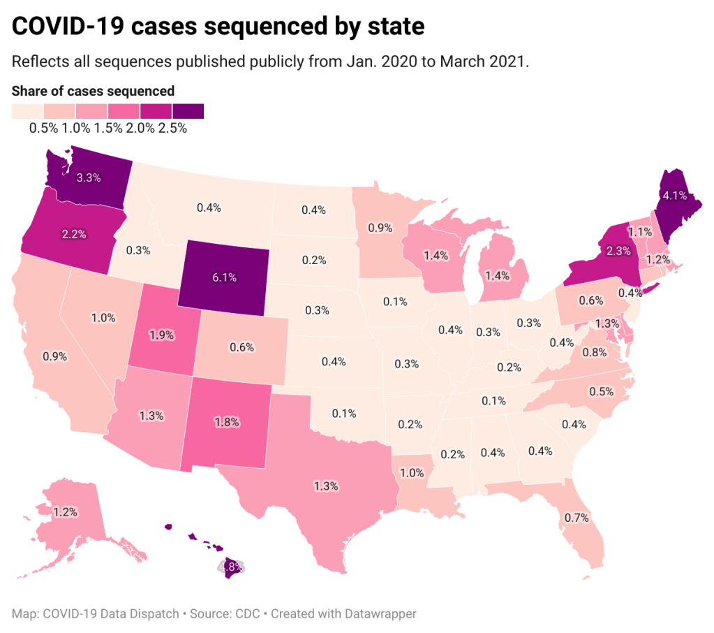
A third variant-adjacent data page, added to the overall CDC COVID Data Tracker this past week, provides a bit more context. This page provides data on published SARS-CoV-2 sequences provided by the CDC, state and local public health departments, and other laboratory partners. You can see the sheer number of sequenced cases grow by week and compare state efforts.
It’s pretty clear that some states are doing more sequencing than others. States with major scientific capacity—Washington, Oregon, New York, D.C.—are near the top. Some states with smaller populations are also on top of the sequencing game: Wyoming, Hawaii, Maine. But 32 states have sequenced fewer than 1% of their cases in total, and 21 have sequenced fewer than 0.5%. That’s definitely not enough sequences for the states to be able to find pockets of new variants, isolate those transmission chains, and stop the breeding.
!function(){“use strict”;window.addEventListener(“message”,(function(a){if(void 0!==a.data[“datawrapper-height”])for(var e in a.data[“datawrapper-height”]){var t=document.getElementById(“datawrapper-chart-“+e)||document.querySelector(“iframe[src*=’”+e+”‘]”);t&&(t.style.height=a.data[“datawrapper-height”][e]+”px”)}}))}();
Chart captions state that the state-by-state maps represent cases sequenced “from January 2020 to the present,” while a note at the bottom says, “Numbers will be updated every Sunday by 7 PM.” So are the charts up to date as of today, April 4, or are they up to date as of last Sunday, March 28? (Note, I put simply “March 2021” on my own chart with these data.)
Obviously, the lack of date clarity is annoying. But it’s also problematic that these are cumulative numbers—reflecting all the cases sequenced during more than a year of the pandemic. Imagine trying to make analytical conclusions about COVID-19 spread based on cumulative case numbers! It would simply be irresponsible. But for sequencing, these data are all we have.
So, if anyone from the CDC is reading this, here’s my wishlist for variant data:
One singular page, with all the relevant data. You have a COVID Data Tracker, why not simply make a “Variants” section and embed everything there?
Regular updates, coordinated between the different metrics. One month is way too much of a lag for state-by-state prevalence estimates.
Weekly numbers for states. Let us see how variants are spreading state-by-state, as well as how states are ramping up their sequencing efforts.
More clear, consistent labeling. Explain that the sheer case numbers are undercounts, explain where the prevalence estimates come from, and generally make these pages more readable for users who aren’t computational biologists.
And if you’d like to see more variant case numbers, here are a couple of other sources I like:
Coronavirus Variant Tracker by Axios, providing estimated prevalence for four variants of concern and two variants of interest, along with a varants FAQ and other contextual writing.
Nextstrain, an open-source genome data project. This repository was tracking pathogens long before COVID-19 hit, and it is a hub for sequence data and other related resources.
The U.S. has blown past its current sequencing goal (7,000 cases per week), but is aiming to ramp up to 25,000—and has invested accordingly. I hope that, in addition to ramping up all the technology and internal communications needed for this effort, the CDC also improves its public data. The virus is multiplying; there’s no time to waste.
COVID-19 diverse sources: NPR journalists from the organization’s Source of the Week project have compiled this database of COVID-19 experts from diverse backgrounds. The database is divided into 13 major categories, including virology, disease origin, health policy, racial/ethnic health disparities, and more. I know I’ll be using this database in my own reporting!
School Survey Dashboard from the Institute of Education Statistics: As part of the Biden Administration’s commitment to reopening K-12 schools across the country, the federal government is now collecting data on how students are receiving education—and releasing those data on a monthly basis. This dashboard draws from surveys of a nationally represented sample including 7,000 rural, suburban, and urban schools, focusing on fourth-graders and eighth-graders. We don’t have data on COVID-19 cases, tests, or enrollment numbers, and several major states are missing, but this is a good start! For more on these data, read Lauren Camera in U.S. News.
Counties with High COVID-19 Incidence and Relatively Large Racial and Ethnic Minority Populations (CDC MMWR): The CDC continues adding to the overwhelming body of evidence pointing to disproportionately high COVID-19 impacts for people of color in the U.S. This report, released last Wednesday, identified counties across the U.S. that had both large minority populations and high COVID-19 case counts (relative to their populations) between April and December 2020. Different racial/ethnic groups have had different trajectories, but by mid-December, almost all counties in the U.S. had high case numbers thanks to the overwhelming winter surge.
PreventCOVIDU study examines vaccine effectiveness in college students: At the White House COVID-19 briefing this Friday, Dr. Fauci described a new clinical trial that kicked off this past week. 12,000 college students, age 18-26, at 22 universities across the country, will be followed over the 5 months. Half of the students are receiving Moderna vaccine doses now, while the other half will serve as a control group (and get vaccinated later). All students will get tested daily—and, in a unique move for vaccine studies, about 25,000 of these students’ close contacts will also get tested daily. The study is designed to determine if the Moderna vaccine prevents coronavirus infection and transmission. See the list of participating universities at the link.
Data Reporting & Quality Scorecard from the UCLA Law COVID-19 Behind Bars Data Project: The researchers and volunteers at UCLA have been tracking COVID-19 in prisons, jails, and other detention facilities since March 2020. This new scorecard, described on the project’s blog, reflects the quality of data available from state correctional agencies, the Federal Bureau of Prisons, Immigrations and Customs Enforcement, and other government sources. No state or federal institution on the list scores an A; the vast majority score Fs.
Yelp Data Reveals Pandemic’s Impact on Local Economies: The public review site Yelp recently published results of an analysis tying listings on the site to trends in business openings and closings. It’s actually pretty interesting—almost 500,000 small businesses have actually opened in the past year, including about 76,000 restaurant and food businesses. (On a lighter note, here’s one of my favorite posts I ghost-wrote during my tenure at the Columbia news site Bwog. It’s a collection of very good Yelp reviews people have left about the university.)
Helix COVID-19 Surveillance Dashboard: Helix, a population genomics company, is one of the leading private partners in the CDC’s effort to ramp up SARS-CoV-2 sequencing efforts in the U.S. The company is reporting B.1.1.7 cases identified in select states, along with data on a mutation called S gene target failure (or SGTF) that scientists have found to be a major identification point in distinguishing B.1.1.7 from other strains.
COVID-19 related deaths by occupation, England and Wales: This is another source that I used for my Pop Sci story. The U.S. doesn’t publish any data connecting COVID-19 cases or deaths to occupations, but the U.K. data falls along similar lines to what we’d expect to see here: essential workers have been hit hardest. Men in “elementary occupations,” a class of jobs that require some physical labor, and women in service and leisure occupations have the highest death rates.
The Impact of the COVID-19 Pandemic on LGBT People: This brief from the Kaiser Family Foundation addresses a key data gap in the U.S.; the national public health agencies and most states do not publish any data on how the pandemic has specifically hit the LGBTQ+ community. KFF surveys found that a larger share of LGBTQ+ adults have experienced job loss and negative health impacts in the past year, compared to non-LGBTQ+ adults.