- CDC updates its variant classifications: This one is more of an update than a new source. On Thursday, the CDC updated the list of coronavirus variants that the agency’s scientists are watching. This list now includes three categories: Variants of Concern (or VOCs, which pose a significant threat to the U.S.), Variants of Interest (which may be concerning, but aren’t yet enough of a threat to be VOCs), and Variants Being Monitored (which were previously concerning, but now are circulating at very low levels in the U.S.). Notably, Delta is now the CDC’s only VOC; all other variants are Variants Being Monitored.
- COVID-19 School Data Hub: Emily Oster, one of the leading (and most controversial) researchers on COVID-19 cases in K-12 schools, has a new schools dashboard. The dashboard currently provides data from the 2020-2021 school year, including schools’ learning modes (in-person, hybrid, virtual) and case counts. Of course, data are only available for about half of states. You can read more about the dashboard in this Substack post from Oster.
- Influenza Encyclopedia, 1918-1919: In today’s National Numbers section, I noted that the U.S. has now reported more deaths from COVID-19 than it did from the Spanish flu. If you’d like to dig more into that past pandemic, you can find statistics, historical documents, photographs, and more from 50 U.S. cities at this online encyclopedia, produced by the University of Michigan Center for the History of Medicine.
Tag: Emily Oster
-
Featured sources, September 26
-
Opening: Five school districts that kept their communities safe
It’s impossible to overstate how controversial school reopening has become in the U.S. this past year. After a spring of universal Zoom school, the country diverged: some administrators, parents, and scientists were determined to get kids back in classrooms, while others prioritized COVID-19 safety above all else.
Reopening debates have dominated headlines. In August 2020, images of maskless crowds in Georgia’s Cherokee County School District went viral on social media — and the school quarantined hundreds of students just one week after the semester started. That same month In New York City, teachers brought handmade coffins and a guillotine to a protest against Mayor Bill de Blasio’s reopening plan. Chicago’s schools remained closed through the fall, and the teachers union narrowly avoided a strike during reopening negotiations in early 2021. And districts like Brookline, a liberal Massachusetts suburb, saw parents who are health experts feud with teachers over social distancing, vaccinations, and more.
The divided communities made the news — but not all U.S. schools were fighting grounds. In fact, many districts managed to bring the majority of their students back into classrooms without breeding a dreaded COVID-19 outbreak.
Here, at the COVID-19 Data Dispatch, we’re sharing stories from five such communities. The series will be published in installments: one profile a week for the next five weeks, followed by a conclusion with overall insights and lessons for fall 2021.
This project fits into a school of reporting called “solutions journalism.” Rather than focusing on uncovering society’s problems, this type of journalism seeks to identify and uplift responses to these problems. In other words, instead of asking, “Why was it so hard to reopen schools in the U.S?”, the CDD is asking, “Which schools did reopen, and what made them successful?” The Solutions Journalism Network — which, as you may guess from the name, is a nonprofit that supports solutions journalism — provided the CDD with a grant to pursue this project, as well as trainings and other guidance.
Identifying districts that reopened
Before introducing you to the five districts that we profiled, let’s talk methodology, also known as how these districts were selected for the project. As we’ve discussed at length here at the CDD, there’s a lack of good data on COVID-19 cases in schools. The country is approaching a fourth pandemic semester, but the federal government still does not provide comprehensive information on how many students are attending public school in person or how many of them have contracted the virus. And while the majority of states provide some data on this topic, these data are scattered and unstandardized — and some states have even gotten worse at their reporting since the 2020-2021 school year ended.
So, to identify success stories for this project, we relied on two main sources. First, we used a database which tracks in-person attendance change at school districts across the country, covering approximately 94% of districts across 98% of U.S. counties. These data come from SafeGraph, a company that aggregates location data from cell phones; this database was also used in a March 2021 Nature paper on disparities in school closures. Using the SafeGraph data, we could see which districts had high in-person traffic numbers in spring 2021 compared to shutdowns during spring 2020, indicating that the majority of students returned.
It’s important to establish here that the aim of this data analysis was not to identify the districts that had the biggest in-person comebacks or to do any kind of comprehensive ranking. Instead, we looked for outliers: districts that had a larger attendance change than the schools around them.
This geography-based method was important because the 2020-2021 school year looked very different from one state to the next. For example, in New York City, just over one-third of public school families attended school in-person before June 2021, per the New York Times. Meanwhile, in Texas, the majority of schools had at least 70% of students back in-person by spring 2021, according to data from the state department of health.
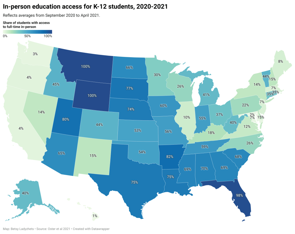
!function(){“use strict”;window.addEventListener(“message”,(function(e){if(void 0!==e.data[“datawrapper-height”]){var t=document.querySelectorAll(“iframe”);for(var a in e.data[“datawrapper-height”])for(var r=0;r<t.length;r++){if(t[r].contentWindow===e.source)t[r].style.height=e.data["datawrapper-height"][a]+"px"}}}))}();You can see the variation in the map above, based on a study published in the Centers for Disease Control and Prevention’s Morbidity and Mortality Weekly Report earlier this summer. According to this analysis, every single student in Montana and Wyoming had access to in-person learning five days a week, between September 2020 and April 2021, while in Maryland, just 2.3% of students had that access during the same period.
Comparing COVID-19 case numbers
After using the SafeGraph dataset to identify outliers in a given state, we used data from state public health departments to identify districts’ COVID-19 case numbers. This step restricted the analysis to states that provided a.) COVID-19 case data by individual district and b.) data for the entire school year. Few states meet both of these criteria. It’s no coincidence that New York and Texas — also the only two states providing in-person enrollment numbers — are both represented among the five focus districts of this project.
You can find more information on state K-12 data reporting at the CDD’s annotations page here.
!function(){“use strict”;window.addEventListener(“message”,(function(e){if(void 0!==e.data[“datawrapper-height”]){var t=document.querySelectorAll(“iframe”);for(var a in e.data[“datawrapper-height”])for(var r=0;r<t.length;r++){if(t[r].contentWindow===e.source)t[r].style.height=e.data["datawrapper-height"][a]+"px"}}}))}(); !function(){“use strict”;window.addEventListener(“message”,(function(e){if(void 0!==e.data[“datawrapper-height”]){var t=document.querySelectorAll(“iframe”);for(var a in e.data[“datawrapper-height”])for(var r=0;r<t.length;r++){if(t[r].contentWindow===e.source)t[r].style.height=e.data["datawrapper-height"][a]+"px"}}}))}();Over the next few weeks, you’ll learn about how schools from rural Indiana to New York City faced the challenge of bringing kids back to classrooms while keeping their communities safe. Some took advantage of novel COVID-19 technologies, such as tests and ventilation updates. But others utilized less technical strategies such as personalized communication with parents and close collaboration with local public health officials.
As the Delta variant intensifies reopening challenges for this coming fall, the stories of these five communities tell us that virus cases can be kept down during in-person learning if administrators, teachers, and families all work together.
These schools are:
- Scott County School District 1 in Austin, Indiana
- Garrett County Public Schools in Garrett County, Maryland
- Andrews Independent School District in Andrews, Texas
- Brooklyn Arts and Science Elementary School in Brooklyn, New York
- Port Orford-Langlois School District 2CJ in Curry County, Oregon
The COVID-19 Data Dispatch’s “Opening” series is available for other publications to republish, free of charge. If you or your outlet is interested in publishing any part of this series, please contact betsy@coviddatadispatch.com.
Past K-12 schools reporting
- COVID-19 school data remain sporadicOn November 18, New York City mayor Bill de Blasio announced that the city’s schools would close until further notice. The NYC schools discrepancy is indicative of an American education system that is still not collecting adequate data on how COVID-19 is impacting classrooms—much less using these data in a consistent manner.
-
K-12 school updates, March 21
Four items from this week, in the real of COVID-19 and schools:
- New funding for school testing: As part of the Biden administration’s massive round of funding for school reopenings, $10 billion is specifically devoted to “COVID-19 screening testing for K-12 teachers, staff, and students in schools.” The Department of Education press release does not specify how schools will be required to report the results of these federally-funded tests, if at all. The data gap continues. (This page does list fund allocations for each state, though.)
- New paper (and database) on disparities due to school closures: This paper in Nature Human Behavior caught my attention this week. Two researchers from the Columbia University Center on Poverty and Social Policy used anonymized cell phone data to compile a database tracking attendance changes at over 100,000 U.S. schools during the pandemic. Their results: school closures are more common in schools where more students have lower math scores, are students of color, have experienced homelessness, or are eligible for free/reduced-price lunches. The data are publicly available here.
- New CDC guidance on schools: This past Friday, the CDC updated its guidance on operating schools during COVID-19 to half its previous physical distance requirement: instead of learning from six feet apart, students may now take it to only three feet. This change will allow for some schools to increase their capacity, bringing more students back into the classroom at once. The guidance is said to be based on updated research, though some critics have questioned why the scientific guidance appears to follow a political priority.
- New round of (Twitter) controversy: This week, The Atlantic published an article by economist Emily Oster with the headline, “Your Unvaccinated Kid Is Like a Vaccinated Grandma.” The piece quickly drew criticism from epidemiologists and other COVID-19 commentators, pointing out that the story has an ill-formed headline and pullquote, at best—and makes dangerously misleading comparisons, at worst. Here’s a thread that details major issues with the piece and another thread specifically on distortion of data. There is still a lot we don’t know about how COVID-19 impacts children, and the continued lack of K-12 schools data isn’t helping; as a result, I’m wary of supporting any broad conclusion like Oster’s, much as I may want to go visit my young cousins this summer.
-
School data with denominators

The COVID-19 School Response Dashboard has surveyed nearly 1,000 individual schools and districts on their enrollments, case counts, and COVID-19 mitigation strategies. Screenshot retrieved on October 3. The data sources on COVID-19 in U.S. K-12 schools vary widely, but most of them have one thing in common: they only report case counts.
Texas rescinded school data this past week due to errors. Florida recently began publishing school reports—which list out cases by individual school while failing to provide cumulative totals. But a larger problem for these states and others is that, when case numbers are reported in isolation, there is no way to compare outbreaks at different locations.
Imagine, for example, that you only knew that Wisconsin had seen 18,000 cases in the past week, while Texas had seen 28,000. You would assume that Texas is currently in more dire straights, with more people infected. But adjust for population—divide those case numbers by the populations of both states—and you find that Texas has an infection rate of about 95 people per 100,000 Texans, while Wisconsin has a rate of about 303 people per 100,000, over three times higher. Texas is slowly recovering from its summer outbreak, while Wisconsin is an outbreak site of major national concern.
In the case of school data, enrollment numbers are the key to these comparisons. Knowing how many students are infected in your district may be useful, but unless you know how many students are actually going into school buildings on a regular basis, it is difficult to translate the case numbers into actionable conclusions. The majority of states which report school COVID-19 data do not report such numbers, and even those that do may have incomplete data. New York’s dashboard, for example, currently reports 0 staff members in the New York City school district, which opened for in-person instruction last week.
Volunteer datasets similarly focus on case numbers. The National Education Association School and Campus COVID-19 Reporting Site, built from the crowdsourced spreadsheet of Kansas high school teacher Alisha Morris, compiles case counts from news outlets and volunteer reports. The COVID Monitor, a school dashboard produced by Rebekah Jones’ Florida COVID Action project, combines news and volunteer reporting with state-reported numbers. Both of these efforts are incredibly comprehensive in documenting where COVID-19 is impacting students and teachers, but without enrollment numbers for the schools, it is difficult to use the data for meaningful comparison.
Even the New York Times focuses on case counts. The Times’ review of school COVID-19 cases found extremely scattered public reporting, but the paper failed to include any denominators—not even the county case counts which this paper has been tracking since early in the pandemic. Alexander Russo, columnist at education journal Phi Delta Kappan and friend of this newsletter, recently commented on how such cases-only reporting may paint a misleading picture of the pandemic’s impact.
Clearly, we need denominators for our case counts. And a new dataset is out to provide this crucial metric. Emily Oster, Professor of Economics and Public Policy at Brown University, collaborated with software company Qualtrics and several national education associations to build a COVID-19 school dashboard which focuses on case rates, not counts.
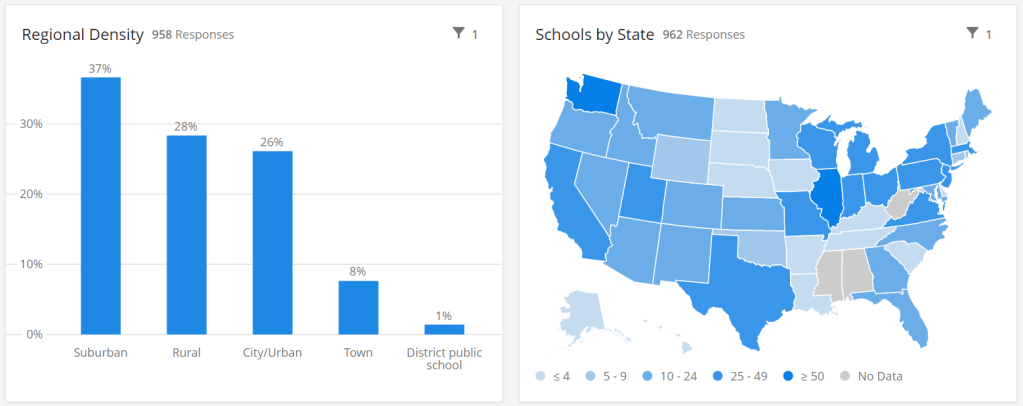
This project sources data by directly surveying schools every two weeks, rather than relying on sporadic news and volunteer reports. And it includes information about school reopening plans and mitigation strategies, such as whether masks, increased ventilation, and symptom screenings are in use. As of the dataset’s most recent update (for the two-week period of September 14 to 27), 962 schools in 47 states are included. These schools report an average student infection rate (confirmed and suspected cases) of 0.62% and an average staff infection rate of 0.72%; both rates are up from 0.51% and 0.5%, respectively, in the previous two weeks. For more initial findings, see this NPR feature on the dashboard, published on September 23.
I spoke to Oster this past Tuesday, only four days after the dashboard’s public release. She explained more detail about the project’s methodology and her future plans for tracking COVID-19 in schools. (This interview has been lightly edited and condensed for clarity.)
Interview
Betsy Ladyzhets: What is your background in data and education reporting? What have you been working on during the COVID-19 pandemic that led you to this dashboard?
Emily Oster: I am, by training, an economist, so I have a lot of background in data analysis and some in data collection. But most of my work, virtually all of my work has been on health, not on education. I have written a couple of books on pregnancy and parenting, so I have this audience of parents. And during the pandemic, I was writing a lot about kids and COVID. And then that led me to be interested in issues around schools, and putting together this team to do the data collection for the dashboard.
BL: Who else is on the team?
EO: The partnership—the primary people who are doing the work and analysis—is Qualtrics, which is a tech company. And then, there are a number of educational association groups. The School Superintendents Association, the National Association of Elementary School Principals, the National Association of Secondary School Principals, that was the initial core team. Then, we’ve got a lot of distribution help from the charter school alliance, from a bunch of the independent schools associations. A lot of different educational groups have done distribution work.
BL: How did you develop partnerships with these different education groups?
EO: I had expressed in some public forum that I thought there should be more of this data collection, and someone from Qualtrics reached out and said, “We think there should be more of this, too. Maybe we can help.” And around this time, I was connected with a woman at the school superintendents association, who also said, “I think we should do this, maybe we can help.” Those were the two key pieces, and it came together from there.
BL: Yeah, it’s good to have—it seems like a very useful partnership, that you have the tech expertise but also the people who are actually interacting with teachers and students.
EO: Yeah. I think our biggest get for the dashboard, and what is potentially useful about it, is that we start at the school level. We know what the schools are doing. We’re in direct contact with them.
BL: I know from poking around the dashboard and reading the NPR article that the way you’re gathering data is with that direct interface, surveying schools. Why did you choose this method as opposed to looking at news articles or compiling data from public sources?
EO: It was really important for us to understand the context around school reopening before we asked about the COVID cases. We really wanted to know: how many kids do you have in school, are they actually in school or are they virtual, what kind of enrollment do you have? And also, what are you doing as mitigation? To come, ultimately, to understand what’s happening with cases, we really need to start by understanding, like, are you wearing masks? Are you distancing? Are you doing all of these things? So then, if we do see cases, we can go back and look and say okay, can we make any conclusions about which of these precautions are helping.
In particular, these enrollment numbers give us the ability to say something about not just cases, but rates. To be able to say, this is the share of people that are infected. Which I think is a very important number, and arguably more important for decision-making, than counts.
BL: Yeah, I was going to ask about that. Your dashboard, unlike a couple of other school COVID data projects, actually has denominators, so that you can compare case rates.
EO: That’s our thing. That’s our whole pitch. We have denominators.
BL: Why is it so important to have denominators?
EO: I think the importance of denominators is, it tells you something about the actual risk of encountering someone with COVID… If you’re going to send your kid off to school, and if you’re going to send your kid to a school of 1,200 people, I think it is useful to understand—are there likely to be 100 kids in the building with COVID? Is there likely to be one kid in the building with COVID?
And similarly, thinking about the risk to your kid, if your kid is going to be in the building for two weeks, what’s the average experience? Is there a ten percent chance they’re going to get the coronavirus over these two weeks? Is there a one percent chance? I think that that is the thing we should be making decisions on. We really need those denominators to get the rate.
BL: Absolutely. Could you tell me more about how the surveys work? What questions you’re asking, and how often you’re collecting data?
EO: There’s two different avenues for data collection… First, if you’re an individual school, then the way we’re collecting the data is that you enroll in a baseline survey on Qualtrics. We ask you about your enrollment, your opening model, what share of your kids are in person, how many staff you have, are they in person. And then, if you have in-person instruction, we ask you about masking and distancing, what you’re doing on those conventions. And then we ask maybe one or two demographic questions, like are you doing free or reduced-price lunch, or financial aid if it’s a private school.
That [initial survey] is followed up every other week with a survey that is very short. It’s basically, how many confirmed and suspected cases do you have in students and staff, and then [we ask schools to] confirm their in-person enrollment, just to see if there have been large changes in the opening model.
And then, on the district side, we’re asking all the same questions, but—in the case of the districts, there are a number where [superintendents] have said, “We’d like to enroll our entire school district in your thing, and we’re going to give you all of our data.” When we do that, we’re actually collecting the data internally in Excel. We send them an Excel sheet with their schools, they fill out that same information [as in the school survey], and then we come back again biweekly and ask them those same questions. It’s the same information, it’s just that rather than making them go through 25 versions of the same Qualtrics survey, we have it all in one.
BL: What mechanisms do you have in place for flagging errors? I know that’s a concern with this kind of manual back and forth.
EO: On the district side, there’s a cleaning procedure. When the surveys in, obviously we don’t change them, but we look them over. If there’s something that’s wrong, like the number of COVID cases is greater than the number of people, or they’ve reported three billion students enrolled, we go back to the district and ask, “Can you look at this?”
Then, on the individual school side, there’s a bunch of validation built into the Qualtrics survey operation. And we have some procedures which we’re working on ramping up which are going to do a little bit of hand lookup, just to make sure that we’re getting valid data.
BL: What is your sample of schools like so far? Is there a particular area, like any states or types of schools that you have more complete data so far, or any areas where you’re prioritizing in trying to get them to take the surveys?
EO: We’re an equal opportunity prioritizer. We’ll take anybody. There are a few states where we have better representation of private schools, because [private school associations are involved in roll-out]. We have more schools in Washington than elsewhere.
Particularly on the public school side, we’re very concerned about enrolling entire districts. That’s the easiest thing for us, it’s the most robust. It is also—we think it provides the most service to the district. And so we are spending a lot of time doing outreach to states and to districts, trying to get people to encourage their districts to enroll.
BL: Another thing I’m curious about is testing. Just yesterday, the Trump administration announced that they’re going to deploy 150 million rapid antigen tests around the country, once they’re made by Abbott, and they’re going to focus on getting those tests to students and teachers. Is testing something that you’re thinking about tracking?
EO: Yeah. We ask [the schools], are you doing any routine testing of anybody, and most them say they’re not. But I think it would be very interesting to incorporate. Part of my hope for this project is that, over time, as we get more people enrolled and we get more of a rhythm of reaching people routinely, that there will be questions we can add. We’ll potentially get to a place where we’ll say, “Okay, now, a bunch of districts are doing testing, let’s put that in.” And we’ll try to figure out, how common is that, and who’s doing it.
BL: There are also states that are reporting COVID data in schools. I know New York has a dashboard, that’s pretty extensive, while other states report numbers by county or district or just overall. Is your project doing anything with those public data, or with other volunteer projects that track COVID in schools?
EO: Not at the moment. I think that we are eager to—there are a number of states that have very good dashboards, and our goal, one of the things we are working on is, how can we basically pull that in? One of the issues is that most of those dashboards just report cases, and so in order to pull them into what we’re doing, we need to go behind this and say, okay, we need to go behind and actually figure out what the initial enrollments were.
BL: Which states do you think are doing the best job so far?
EO: I mean, New York’s is pretty good. Tennessee has a pretty good dashboard. South Carolina. There’s a few.
BL: I know New York is one—I think it’s the only one that has both testing numbers and enrollment numbers. (Editor’s note: I checked; this is true.)
EO: Exactly.
BL: Last question: how do you expect the dashboard to be utilized in future research, and are you seeing any applications of it so far?
EO: No, it’s literally been, like, four days. My guess is that we will see more—we’ll see some usage by districts, as they try to think about opening, that’s the first use case. Just districts that are opening, trying to think about what’s the right thing to do. My guess is that, in the long run, maybe we’ll see some research with this. That isn’t the goal of the project, but we’ll see.
BL The focus is on helping districts compare to each other.
EO: Exactly, yeah.
Analysis
I’m excited about this dashboard. First of all, it can’t be overstated: denominators are huge. Knowing that the estimated infection rate of K-12 students in the U.S. is under one percent is so much more useful from a decision-making standpoint than the actual number of cases.
Second, the school survey model is a novel method with advantages for one specific group: the very schools included in this dataset. This dashboard is not particularly useful for me, a COVID-19 journalist, right now; its sample size is small, and the data are not currently available for download by outside users. (Oster told me that she is planning to set up a validation feature, so that she and other partners on this project can track how their data are being used.) But the school administrators who fill out the project’s biweekly surveys will be able to see COVID-19 trends for their students and staff, compared to trends at other schools across the country. They are essentially getting free consulting on their school reopening plans.
I have one major concern, however. As Oster explained in our interview, the dashboard currently includes an abundance of private and charter schools in its sample, due to partnerships with private and charter school associations.
According to Education Week, public schools made up 70% of American schools in 2017-2018. In Oster’s dashboard, these schools are 67% of the sample size, while private, charter, and religious schools make up the rest of the sample. At a glance, this seems fairly representative of the country’s school demographics. However, the average public school has far more students than the average private school; without seeing the actual enrollment numbers of the schools included in this dashboard, it is difficult to determine how balanced the dashboard’s sample truly is.
In addition, the dataset’s sample so far shows a bias for suburban schools. The schools surveyed are 37% suburban, 28% rural, 26% urban, and 8% town. Suburban school districts tend to receive more funding than urban districts, and suburban districts are historically sites of school segregation. Finally, this dataset so far heavily represents private schools in Washington, with 106 schools, over 10% of the sample, coming from this state. West Virginia, Alabama, and Mississippi, all more rural states which rank in the bottom ten in U.S. News & World Report’s education rankings, are so far not represented at all.
A recent New Yorker article by Alec MacGillis draws attention to the low-income students of color who may be left behind in this era of remote learning. Students whose parents and guardians need to continue working outside the home, or otherwise do not have the resources to support kids with an array of Zoom links and homework platforms, may lose a year of education if their schools don’t reopen—and yet these students and their families are more vulnerable to COVID-19 if they do go back in person.
The schools which serve low-income minority communities are likely to need this dashboard more than any others. And yet these very schools may be left out of data collection, as their principals and superintendents may not have the bandwidth to fill out even the simplest survey. Extra effort could be needed to ensure that crucial schools are not left behind. The COVID-19 School Response Dashboard, and other future school data sources, must prioritize diversity in their data collection if they are to be truly complete.
-
COVID-19 K-12 data continue to be patchwork
Since I reviewed COVID-19 data in public school systems last week, a few things have changed:
- Alisha Morris’ crowd-sourced spreadsheet of COVID-19 cases, closures, and other reopening plan changes in K-12 schools has leveled up, thanks to collaboration with the National Education Association. Concerned students, parents, and teachers can now explore the data and report cases on a new NEA-run website. This NPR article explains more of the project’s background and findings.
- Brown University and national education organizations are working together to track school pandemic responses. Their findings, planned to be released in a dashboard this September, will include: enrollment, poverty level, internet access, COVID-19 cases, and district opening status.
- Duval County Public Schools, a district in Florida, was barred from reporting school-related COVID-19 cases by the county’s public health department. According to the Florida Times-Union, the county stated that the school district could not publish “school specific data related to COVID-19” without the state health department’s permission.
- Meanwhile, in Kentucky: this state’s COVID-19 dashboard now includes both a K-12 school public health report and a college and university public health report. Both reports, published daily, include active cases, deaths, and other statistics.
