- COVID-19 Cutback Tracker: Researchers at the Tow Center for Digital Journalism at Columbia University have tracked layoffs, furloughs, closures, and other cutbacks to journalistic outlets since March 2020. Findings from the project were released this past Wednesday in a new tracker.
- We Rate Covid Dashboards: Two weeks ago, I analyzed college and university COVID-19 dashboards for my newsletter. This project from public health experts at Yale and Harvard, meanwhile, goes much further: the researchers have developed a rating scheme based on available metrics, legibility, update schedules, and more, and rated over 100 dashboards so far.
- GenderSci Lab’s US Gender/Sex Covid-19 Data Tracker: The GenderSci Lab, an interdisciplinary research project, is tracking COVID-19 by gender by compiling information from state reports. The tracker includes case counts, death counts, and mortality rates.
- COVIDcast: This dashboard, by the Delphi Group at Carnegie Mellon University, features interactive maps for a variety of COVID-19 indicators, including movement trends, doctors’ visits , and even test positivity based on antigen tests.
- 2019 baby name popularity: Okay, this one isn’t COVID-19 related. But as Stacker’s resident baby names expert, I feel obligated to inform my readers that, last week, the Social Security Administration finally released its counts of how many babies were given which names in 2019. (The annual update is usually released in March, but was delayed this year due to COVID-19 concerns.) Olivia has beat out Emma for the number one-ranked baby girl name, after Emma’s five years at the top. Personally, I always get a kick out of scrolling through the long tails to see what unique and creative names parents are using.
Tag: college dashboards
-
Featured sources, Sept. 13
-
School data update, Sept. 6
Since last week’s issue, four more forms of official state reporting on COVID-19 in schools have come to my attention:
- New Hampshire is publishing school-associated case data, including active cases, recovered cases, and outbreak status (not clearly defined) on a page of the state’s dashboard, updated daily.
- Mississippi is publishing a weekly report on cases, quarantines, and outbreaks among students, teachers, and staff, aggregated by county. So far, the state has released reports on the weeks ending August 21 and August 28.
- Hawaii’s state Department of Education is publishing a page on COVID-19 in the school district, updated weekly. (Did you know that the entire state of Hawaii is comprised of one school district?)
- New York is launching a public dashboard on COVID-19 in schools; this dashboard will be available starting on September 9. So far, the page states that, “New York school districts will be required to provide the Department of Health with daily data on the number of people who have tested positive for COVID-19 beginning Tuesday, September 8th.” Last week, Mayor Bill de Blasio announced that classes in New York City would be delayed by two weeks to allow for more extensive safety precautions.
In addition, the nonprofit civic data initiative USAFacts has compiled a dataset of reopening plans in America’s 225 largest public school districts. The dataset classifies reopening plans as online, hybrid, in-person, or other, with information as of August 17.
Meanwhile, on the higher education front:
- Education reporter (and friend of this newsletter!) Benjy Renton has launched a dashboard keeping track of COVID-19 outbreaks on college and university campuses. The dashboard organizes outbreaks according to their alert level, based on new cases in the past week.
- I am continuing to monitor the COVID-19 metrics reported by college and university dashboards in my comparison spreadsheet. I haven’t had the chance to expand this analysis much in the past week, but it continues to be an ongoing project.
-
How are colleges and universities reporting COVID-19 data?

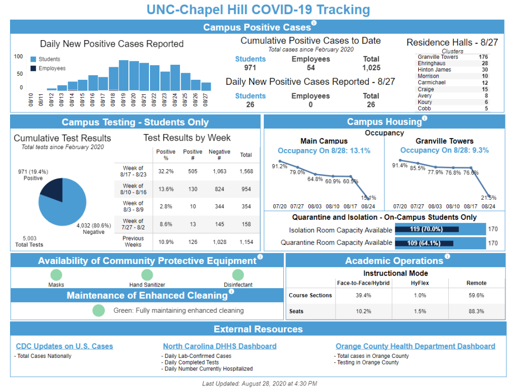
Screenshot of UNC-Chapel Hill’s COVID-19 dashboard. The school has made headlines in the past two weeks for facing outbreaks almost immediately upon students’ return to campus. Across the country—and despite the warnings of numerous faculty members and public health leaders—colleges are reopening. Freshmen are returning to campus eager to meet their classmates, and upperclassmen are returning eager to see friends after months in their hometowns.
Most college students will certainly do their best to wear masks, socially distance, and meet outdoors wherever possible. But it is inevitable that COVID-19 will hit campuses, and when it does, school leaders need to be prepared: not only with testing and tracing systems and room for students to self-isolate, but also with a robust data system that can let their communities know exactly what’s going on.
For this issue, I surveyed the COVID-19 dashboards of 50 higher education institutions across the country. This analysis expands upon the work of Andy Thomason, an education journalist at the Chronicle of Higher Education who has been compiling dashboards on Twitter for the past two weeks:
The 50 dashboards I examined include public and private schools in 26 states. The most heavily represented states are North Carolina (nine schools) and Massachusetts (4 schools). I plan on expanding this analysis to include all 82 schools currently on Andy Thomason’s list, as well as any other dashboards that I can find, but 50 seemed like a solid number to discuss for today’s issue.
Rather than attempting to count the number of COVID-19 cases occurring at colleges and universities, I chose to focus on how schools are reporting: what COVID-19 metrics are they making public, and how often are these metrics updated? (If you’d like to see sheer case numbers, I recommend this dashboard by the New York Times, which includes counts from both public sources and additional NYT reporting.)
Here’s the spreadsheet with my work. I encourage you to check it out for yourself, especially if you attend or have friends or family attending one of the schools on the list. But I’ll include some summary statistics here because, yeah, you’re probably skimming through this on Monday morning and have about 900 other things to do.
- 41 schools report some form of cumulative COVID-19 cases that have occurred on campus, usually since the beginning of August. Most of these (29) separate out student and faculty/staff cases.
- 24 schools report COVID-19 cases per day. 20 of these separate out student and faculty/staff daily cases.
- 18 schools report active COVID-19 cases. Definitions for “active” vary, from cases identified in the past 14 days to all cases minus those which reportedly no longer need to isolate thanks to a negative test.
- No schools report COVID-19 deaths. Thankfully, no school yet needs to.
- 29 schools report cumulative COVID-19 tests. The majority of these (21) do not specify whether their test counts are reported in specimens, people, or some other unit.
- No schools report antibody or antigen tests.
- 23 schools report some form of test positivity. 4 schools report daily figures, 11 report weekly figures, and 8 others report some form of cumulative figure. (Test positivity over a range greater than 14 days is not particularly useful, as this metric is used to track testing capacity over time.)
- 19 schools report counts of students and/or staff currently undergoing quarantine or isolation.
- 19 schools update their dashboards daily, 6 update Monday through Friday, 15 update on a twice- or three times-weekly schedule, and 7 do not clearly state how often updates are made.
And here are a couple of examples of notable dashboards:
- Roger Williams University: This dashboard focuses on testing. It’s the only dashboard in my initial analysis to report tests in both “tests administered” (specimens) and “total participants” (people). It also comprehensively reports test wait times, which few schools are tracking.
- University of Nevada at Reno: This school has less of a “dashboard” and more of a series of COVID-19 reports. Click into a given month to find one-line statements about new cases, sorted by day. No overall statistics are reported.
- University of Wisconsin at Madison: This dashboard includes charts and a table that show total tests, positive tests, and percent positive by day. I’m a fan of the dashboard’s Data Notes section, which clearly defines all the dashboard’s terms and encourages users to reach out with questions.
- University of Connecticut: UConn has five campus across the state, and each one gets its own section in this dashboard. The organization is very clean; it’s easy to navigate and compare campuses.
- University of North Carolina at Chapel Hill: UNC-Chapel Hill gets a shout-out for being the only dashboard I analyzed to report COVID-19 cases by residence hall. The university’s overall COVID-19 response may have been a clusterfuck, but at least their dashboard gives students information to help them manage it.
