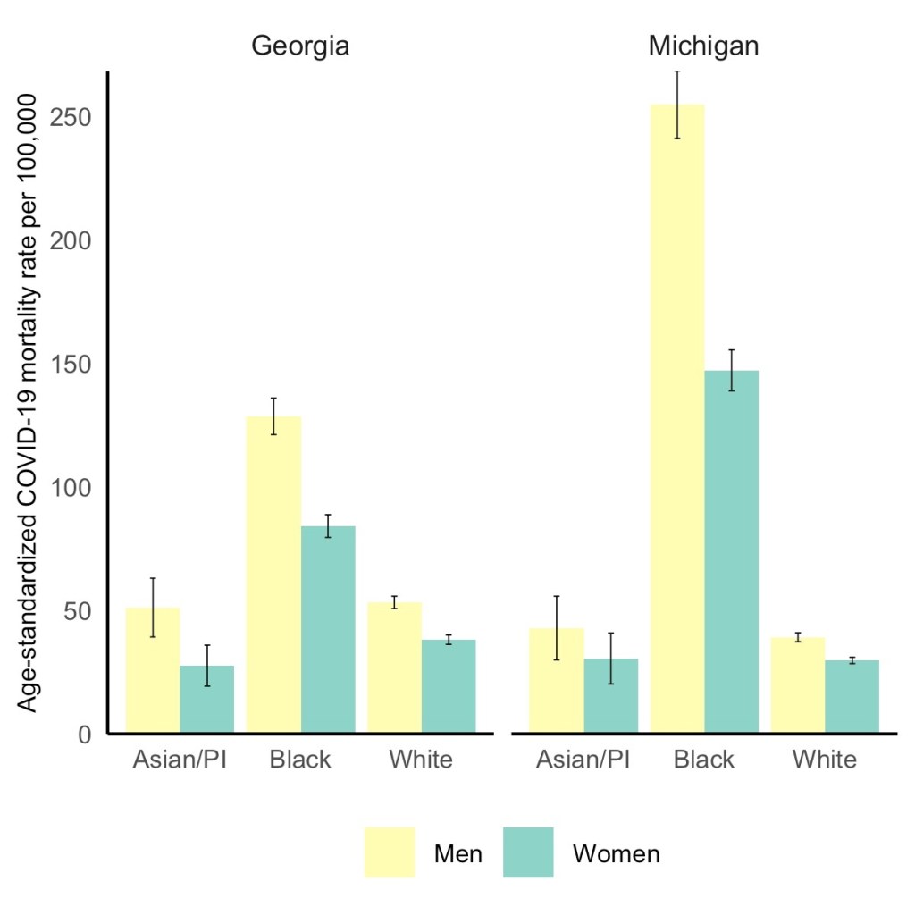
Black men have the highest COVID-19 death rate, but Black women die at higher rates than white or Asian men. Via the GenderSci Lab.
We’ve spent a lot of time in the COVID-19 Data Dispatch discussing how the COVID-19 pandemic has disproportionately impacted racial and ethnic minorities in the U.S., along with gaps and problems in the available data on this issue. (You can find past coverage here.)
A new study from the GenderSci Lab at Harvard sheds light on a more underreported side of the issue: how race and sex intersect in COVID-19 death rates. The lab has been tracking gender/sex and COVID-19 since April 2020, compiling data from states through a similar methodology to what the COVID Tracking Project did. And, similarly to the COVID Tracking Project, the GenderSci Lab faces challenges in producing a standardized dataset from 50 states that each have their own data definitions and reporting practices.
One of those challenges: very few states report COVID-19 data by both sex and other demographic factors, such as age and race/ethnicity. Such intersectional data are useful because they can provide more detailed information on who is most at risk from the disease, which may be tied to comorbidities and other social determinants of health.
For their recent study, GenderSci Lab researchers Tamara Rushovich et al. used data from the only two states that provide COVID-19 mortality data on sex, race, and age: Georgia and Michigan. The patterns they found in both states complicate the well-known trend that men are more likely to die of COVID-19 than women.
Black men have the highest death rate overall in Georgia and Michigan, significantly higher than white men. In Michigan, 254 out of every 100,000 Black men have died, compared to 39 out of every 100,000 white men. But the data also show that Black men and women both have significantly higher death rates compared with white and Asian men.
As the GenderSci Lab researchers note in a Twitter thread sharing this study, these data demonstrate that the sex difference in COVID-19 deaths is driven by comorbidities and social factors, not by some intrinsic, biological difference between men and women that makes men more vulnerable. Men may be less likely to wear masks or adhere to social distancing precautions, for example, and Black Americans are disproportionately represented in essential jobs and in incarcerated populations.
The researchers say that more data on this topic are needed (hello, other 48 states!) as well as more intersectional analysis:
There is an urgent need to understand why some men (often Black, Indig., and Latino) are so vulnerable to COVID, but we must recognize that many women (Black, Indig., and Latina) are much more vulnerable to COVID than many men (especially white men). @BlackFeministHS
Editor’s note, April 11, 6 PM: My friend (and CDD reader) Charlotte Minsky, who works on the COVID Racial Data Tracker, has pointed out that three states in addition to the two used in the GenderSci Lab’s analysis report COVID-19 mortality data by sex and race. Georgia and Michigan are the only two states to report by sex, race, and age; the researchers used age stratifications to calculate age-adjusted mortality rates. I’ve edited the post for clarification.
AstraZeneca still isn’t out of the woods yet. In fact, the woods seem to be just getting deeper, and now I’m fairly certain it’s not me jinxing things.
Last time we covered AstraZeneca’s blood clot woes, the European Medicines Agency (EMA) had said in a March 18 press conference that “[t]he committee… concluded that the vaccine is not associated with an increase in the overall risk of thromboembolic events or blood clots.” (Thrombosis just means blood clotting.)
But this week, authorities had enough data to posit a possible connection between blood clots known as cerebral venous sinus thrombosis (CVST) and the Oxford-AstraZeneca vaccine. The EMA has now advised, as of April 7, that “that unusual blood clots with low blood platelets should be listed as very rare side effects of Vaxzevria (formerly COVID-19 Vaccine AstraZeneca).” They are still recommending its use given the gravity of the COVID-19 pandemic, but it’s another blow to the vaccine that held much of the world’s hopes in inoculating the entire population. A mechanism by which the vaccine is causing these thromboses has not been discovered.
As of April 4, there had been 222 cases of abnormal thromboses in Britain and the European Economic Area after receiving the Oxford-AstraZeneca vaccine, according to the New York Times. This is out of about 34 million people being vaccinated, and they estimated that the frequency was about 1 in 100,000. In total, the EMA committee looked at “62 cases of cerebral venous sinus thrombosis and 24 cases of splanchnic vein thrombosis reported in the EU drug safety database (EudraVigilance) as of 22 March 2021, 18 of which were fatal.”
This made us wonder how this compares to the early reports of anaphylaxis (serious allergic reactions) in recipients of the Pfizer-BioNTech and Moderna mRNA vaccines. According to an early report from the CDC, there were 21 cases out of 1,893,360 Pfizer-BioNTech first doses, for a frequency of 11.1 cases per million, or about 1 in 90,000. A later JAMA paper reported updated rates of about 4.7 cases per million doses for Pfizer-BioNTech and 2.5 cases per million for Moderna. To make the scales easier to compare, this works out to about 1 in 213,000 and 1 in 400,000, respectively.
Comparing 1 in 213,000 and 1 in 400,000 cases of anaphylaxis to 1 in 100,000 cases of serious blood clots, it makes sense why some authorities are starting to hit the brakes on the AstraZeneca vaccine. No deaths were reported with the anaphylaxis reactions, but out of the sample of thromboses that the EMA examined, 18 people died. Not only are the numbers worse, but anaphylaxis reactions can also be easier to prepare for. In that early CDC report, 71% of anaphylaxis reactions occurred within 15 minutes of vaccination. For this reason, vaccine clinics monitor you for about 15 minutes (mine sure did). That’s harder to do with blood clots, which take much longer than 15 minutes to manifest and can’t be treated with an EpiPen on the spot.
Again, this is definitely a blow for what’s still a very effective vaccine. But taking these precautions is how faith in vaccines is earned and kept. We hold vaccines to a high standard for a reason.
Following the end of the federal public health emergency in May, the CDC has lost its authority to collect vaccination data from all state and local health agencies that keep immunization records. As a result, the CDC is no longer providing comprehensive vaccination numbers on its COVID-19 dashboards. But we still have some information about this year’s vaccination campaign, thanks to continued CDC efforts as well as reporting by other health agencies and research organizations.
This week, the FDA authorized Novavax’s updated COVID-19 vaccine. Here’s why some people are excited to get Novavax’s vaccine this fall, as opposed to Pfizer’s or Moderna’s.
This past Tuesday, April 6, the Centers for Disease Control and Prevention put out a press release that I found heartening, yet confusing.
“Nearly 80 percent of teachers, school staff, and childcare workers receive at least one shot of COVID-19 vaccine,” the release proclaims. These vaccinations include “more than 2 million” people in these professions who received doses through the federal retail pharmacy program and “5-6 million” vaccinated through state programs, all of whom received shots before the end of March.
This CDC release is exciting because occupational data—or, figures tying vaccination counts to the jobs of those who got vaccinated—have been few and far between. As I wrote last month, state and local health departments have been unprepared to track this type of data; even getting states to report the race and ethnicity of their vaccinated residents has been a struggle.
While you may need to be a teacher or fit another essential worker category in order to get vaccinated in your state, your provider may require you to show some proof of eligibility without recording that eligibility status anywhere. Meanwhile, school districts and local public health departments might be wary of surveying their local teachers to see who’s been vaccinated. Madeline Will explains the issue in EdWeek:
Yet many vaccination sites do not collect or report occupation data, and many districts are not tracking vaccination rates themselves. Some district leaders say they’re wary of asking employees if they’ve gotten vaccinated because they don’t want to run afoul of any privacy laws, although the U.S. Equal Employment Opportunity Commission has said that employers can ask whether employees have gotten a COVID-19 vaccine.
This brings us to the question: how did the CDC get its 80% figure? The agency’s press release is frustratingly unspecific; it’s all of 282 words long, with just one paragraph devoted to what a data journalist like myself would call the methodology, or the explanation of where the data come from.
Here’s that explanation:
CDC, in collaboration with the Administration for Children and Families, the Department of Education, and our non-federal partners, conducted surveys of Pre-K-12 teachers, school staff, and childcare workers at the end of March. CDC received almost 13,000 responses from education staff and nearly 40,000 responses from childcare workers. The responses closely matched available national race/ethnicity and demographic data on this specific workforce.
Let’s unpack this. The CDC worked with two other federal agencies to conduct a survey of this high-priority occupation group, including 13,000 school staff and 40,000 childcare workers. The agency then extrapolated the results of this 53,000-person survey to estimate that 80% of Americans in these occupations have been vaccinated overall. While the CDC doesn’t provide any detail on how workers were chosen for the survey, the press release notes that responses match demographic data for this workforce, indicating that agency researchers did collect race, ethnicity, and other demographic information for those they surveyed.
So, here’s my big question: is the CDC planning to release more detailed results from this survey? And if not… why?
As we’ve noted in past CDD issues, teacher vaccination can go a long way towards inspiring confidence in school reopening programs, in school staff and parents alike. And that confidence is needed right now: February results of the Department of Education’s school COVID-19 survey, released last week, demonstrate that even though the majority of U.S. schools are now offering in-person instruction, only about one-third of students are learning in the classroom full-time. (More on those findings via AP’s Collin Binkley.)
If the CDC released results of this vaccination survey for individual states and demographic groups, local public health and school district leadership may be able to see how their populations compare and respond accordingly. If, say, Texas is vaccinating fewer teachers than New York, Governor Greg Abbott can make a speech telling his state to step it up.
And those states where a higher share of teachers have been vaccinated can use the information to inform school opening plans. The CDC’s press release doesn’t specify what share of that 80% vaccinated represents partially versus fully vaccinated school and childcare workers (which would also be useful data!), but even a workforce that was partially vaccinated at the end of March may be ready for in-person work by the end of April.
All this is to say: show your work, CDC! Give us more detailed data!
It’s also important to note, though, that while teachers are in the spotlight, they aren’t the only occupation for whom vaccination data should be a priority. Many staff in long-term care facilities have been unwilling to get vaccinated even though it would be a highly protective measure for the seniors they care for, Liz Essley Whyte wrote in late March at The Center for Public Integrity.
The federal program that partnered with pharmacy chains to get LTC residents and staff vaccinated is now winding down, Whyte reports, even though some states still have a lot of LTC workers left who need shots. In seven states and D.C., less than a third of staff are vaccinated.
Whyte writes:
Low vaccination rates among staff at these facilities mean that workers continue to have greater risk of contracting COVID-19 themselves or passing the virus to their patients, including residents who can’t be inoculated for medical reasons. Low staff uptake can also complicate nursing homes’ attempt to reopen their doors to visitors like Caldwell, who are striving for some sense of normalcy.
The Centers for Medicare & Medicaid Services are hoping to improve data on this issue. This agency proposed a new rule this week that would require nursing homes to tell the CDC how many of their health care workers are vaccinated against COVID-19, POLITICO reported on Friday. This rule would enable the CMS to identify specific facilities that are faring poorly and take appropriate action. And, if such data are made public, it would be easier for both reporters and families of nursing home residents to push for more LTC worker vaccinations.
Still, privacy concerns continue to be a barrier for more detailed vaccination data of all types. Some of the big pharmacy chains that are administering huge shares of shots are requiring vaccine recipients to share their emails or phone numbers when they register for an appointment—then saving that data to use for future marketing. Getting patient contact information is an easy way to ensure people actually show up for their appointments, but when it’s a private company collecting your phone number instead of your public health department, it’s understandable that people might be a bit concerned about giving any information away.
More detailed data standards, along with communication between governments and vaccine providers, could have saved the U.S. from the patchwork of vaccination data we’re now facing. But instead, here we are. Asking the CDC to please send out a longer press release. Maybe with a state-by-state data table included.
37,400 new COVID-19 patients admitted to hospitals (11.4 for every 100,000 people)
5,000 new COVID-19 deaths (1.5 for every 100,000 people)
An average of 3.1 million vaccinations per day (per Bloomberg)
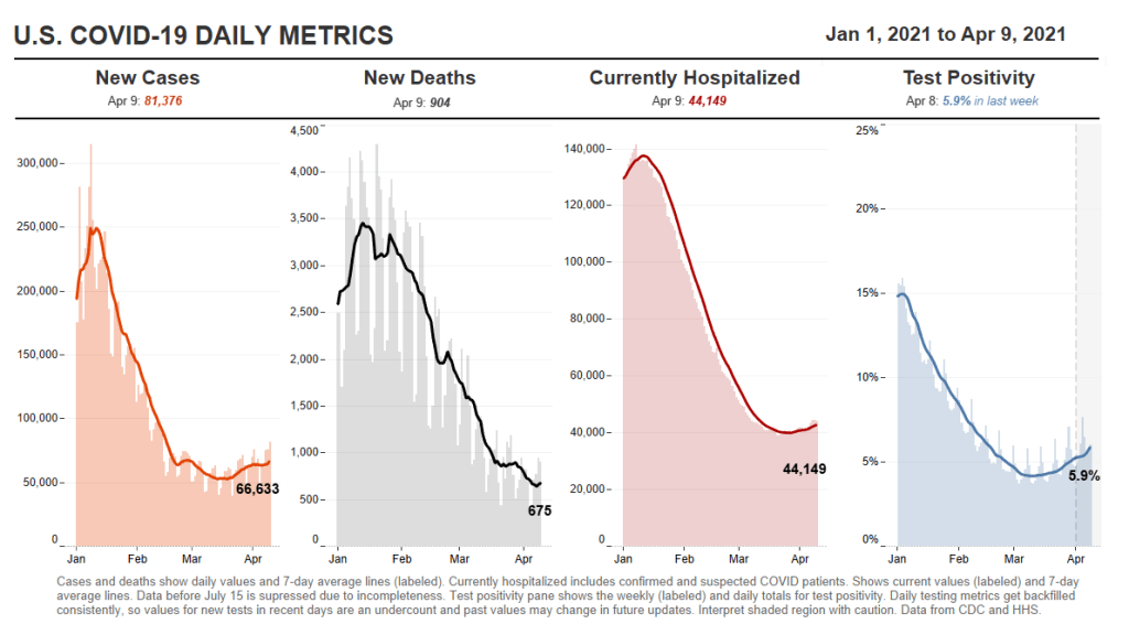
This is the fourth week in a row of case increases in the U.S. While this week’s jump is lower (we went from 57,000 new daily cases two weeks ago, to 63,000 last week, to 64,000 this week), the level where we’ve landed is still reason for concern. Our case numbers now are comparable to last July, when the summer surge was threatening hospital systems in the South and West.
Five states now account for almost half of our new cases, Dr. Katelyn Jetelina notes in her newsletter Your Local Epidemiologist. Those states are Michigan, New York, New Jersey, Florida, and Pennsylvania. “These states also happen to have some of the highest B.1.1.7 levels reported by the CDC,” Jetelina writes. “Is this a coincidence? Probably not.”
CDC data on coronavirus variants are reported with a significant time lag, as I discussed in detail last week. Still, the most recent update of the agency’s Variant Proportions page (now reflecting data as of March 13) tells us that B.1.1.7 accounts for at least 39% of cases in Michigan, 35% of cases in Tennessee, and 35% of cases in Florida. B.1.1.7 accounts for at least 20% of cases in five other states; it is now the most common variant in the country, CDC Director Dr. Rochelle Walensky said in a press briefing last week.
Vaccinations are of course continuing—more than one in three Americans has now had a shot, and one in five is fully vaccinated—but we can’t get complacent. This week’s seven-day average is barely above last week’s (both about 3 million), and as more states open up their eligibility to all adults, we’re seeing access issues and vaccine hesitancy prevent all shots from getting used.
Also, as Dr. Eric Topol pointed out on Twitter, the federal government is refusing to send surplus vaccine supply to Michigan despite pleas from Michigan leaders and public health experts to support this hotspot state in its time of crisis.
This week, New York Governor Andrew Cuomo announced two major expansions for vaccine eligibility. State residents age 30 and older became eligible starting on March 30, and residents age 16 and older became eligible starting on April 6.
The announcement inspired a surge in “very online” people booking appointments, Twitter comedy, and speculation about what else we might be able to push the increasingly scandal-embroiled Governor Cuomo to do (legalize weed, apparently!).
But most importantly, it allowed two of my favorite vaccine communicators to get their shots: Drew Armstrong, lead data wrangler for the Bloomberg Vaccine Tracker, and Huge Ma, computer engineer behind the TurboVax Twitter account, which shares available vaccine appointments in New York City.
If you’d like to learn more about Bloomberg’s tracker, check out the recording and recap of our first Diving into COVID-19 data workshop, at which Armstrong was a featured speaker. And if you’d like to learn more about TurboVax, check out this recent (and rather horny) profile in The Cut. Ma has been using his platform to spread awareness about anti-Asian racism and raise money for Welcome to Chinatown, an initiative to support Chinatown businesses. It’s a pretty cool organization; I recommend checking it out and donating if you can, especially if you (like me) used the TurboVax account to find your vaccine appointment.
Vaccination data update: Two more states are now reporting vaccinations by race/ethnicity. New Hampshire has reported the figures in one of the state’s recent daily updates, which include vaccination data on a weekly basis. And South Dakota has added race/ethnicity to the vaccines tab of its dashboard. As always, you can find detailed annotations on state and national vaccine data sources (updated yesterday) on the COVID Data Dispatch website.
KFF COVID-19 Vaccine Monitor: The Kaiser Family Foundation released the latest update for their Vaccine Monitor, an ongoing survey project to track public attitudes and experiences with COVID-19 vaccines. In this update, published this past Tuesday, KFF reports that 62% of those surveyed say they’ve already gotten a shot or plan to do so as soon as possible, while 17% want to “wait and see” how the rollout goes. That “wait and see” share is down from previous reports.
CDC Provisional Mortality Data for 2020: This past Wednesday, the CDC released death counts for 2020. As we’ve discussed before, mortality data tend to be reported with a lag compared to other types of public health numbers due to the complex processes involved with tallying up death certificates. About 3.3 million deaths occurred overall in 2020, according to these new data; this was a 16% increase from 2019. COVID was the third leading cause of death that year, accounting for 345,000 lives lost.
Federal COVID-19 Chart Gallery: Peter Walker, former data visualization co-lead for the COVID Tracking Project, has put together a new Tableau gallery using data from the CDC COVID Tracker and HHS Protect. The gallery includes many chart formats that CTP fans may recognize, such as national views, four-pane views, and regional comparisons. More charts are coming!
Pfizer COVID-19 Clinical Trials: An interactive, searchable map from Pfizer lets you look up vaccine trials around the world. For each trial, you can see the location, the trial’s phase, who’s eligible to join, and a link out to more information on ClinicalTrials.gov. Trials are happening in the U.S., the U.K., Spain, and Japan.
mRNA sequence for the Moderna vaccine: A group of scientists at Stanford used small amounts of Moderna vaccine left after all doses were extracted from vials to sequence the mRNA in that vaccine, then posted the sequence publicly on GitHub. The full sequence takes up two pages. You can read more about the scientists’ work and their decision to post the sequence in Motherboard.
Pulse of the Purchaser 2021 Report: This new report from the National Alliance of Healthcare Purchaser Coalitions examines how employer attitudes to healthcare have shifted during the COVID-19 pandemic. The report presents results from a survey of 151 major employers, representing diverse industries and sizes; it includes attitudes towards COVID-19 vaccines, telehealth, equity, and other healthcare topics.
As dedicated CDD readers may remember, one of President Biden’s big COVID-19 promises was the creation of a “Nationwide Pandemic Dashboard” that would be a central hub for all the information Americans needed to see how the pandemic was progressing in their communities.
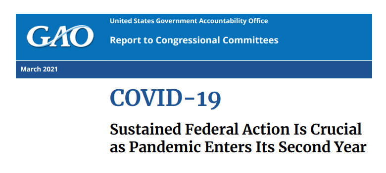
The Biden administration sees the CDC’s COVID Data Tracker as that dashboard and plans to continue improving it as time goes on, White House COVID-19 Data Director Cyrus Shahpar said in an interview with The Center for Public Integrity last month. But a new report from the Government Accountability Office suggests that the CDC’s tracker has a long way to go before it becomes the centralized system that Americans need.
The Government Accountability Office, or GAO, is a federal watchdog agency that evaluates other federal agencies on behalf of Congress. Its full report, released last Wednesday, is over 500 pages of problems and recommendations, ranging from the Emergency Use Authorization process to health care for veterans.
But, as COVID Tracking Project leader Erin Kissane pointed out on Twitter, there are some real data bangers starting in the appendix:
Recommending that the federal government provides more comprehensive data on who gets a COVID-19 vaccine. The GAO specifically wants to see more data on race and ethnicity, so that the public can gauge how well vaccination efforts are reaching more vulnerable demographic groups. The agency also notes the challenge of finding occupational data on vaccinations, something we’ve bemoaned before at the CDD.
Calling out the lack of public awareness for federal data. Some experts the GAO interviewed noted that “the public may be more aware of non-federal sources of data on COVID-19 indicators (e.g., the COVID Tracking Project, Johns Hopkins) than sources from the federal government,” in part because those non-federal sources started providing public data earlier in 2020. The federal agencies need to step up their communications game.
Stating the need for central access to federal data. The GAO describes how the HHS lacks a central, public-facing COVID-19 data website, while the CDC’s COVID Data Tracker fails to provide access to the full suite of information available from the HHS. Specific missing data pages include COVID-19 health indicators and vaccine adverse events.
Overall, the GAO says, the agency recommends that “HHS make its different sources of publicly available COVID-19 data accessible from a centralized location on the internet.” One would think this is a pretty straightforward recommendation to follow, but HHS reportedly “neither agreed nor disagreed” with the assessment.
While there’s a lot more to dig into from this report, it is only part of a long evaluation process to improve federal data collection and reporting. The new report is part of a GAO effort that started last March, reports POLITICO’s Sarah Owermohle:
The latest report is part of nearly yearlong effort by GAO to track the federal pandemic response after a directive in the March 2020 CARES Act. The watchdog first called on CDC to “completely and consistently collect demographic data” including comprehensive results on long-term health outcomes across race and ethnicity, in September. It later criticized the government’s lack of “consistent and complete COVID-19 data” in a January report.
I, for one, am excited to see what the GAO does next—and how the federal public health agencies respond.
Good news for people with kids: this week, Pfizer and BioNTech released results for their trial involving adolescents aged 12-15. In the trial, no participants who received the vaccine contracted symptomatic COVID-19 out of a total of 2,260 participants, marking an efficacy rate of 100%. (Remember in December the efficacy rate was 95% for adults.) 18 participants in the placebo group did get symptomatic COVID-19. Additionally, Dr. Fauci said in the April 2 White House COVID-19 briefing that, by the end of the year, there should be enough data to safely vaccinate children of any age.
The results are, obviously, fantastic. But there was a wrinkle in reporting said results; one that pointed to the dangers of communicating science via press release. Originally, as Dr. Natalie Dean pointed out on Twitter, there was some confusion over whether there were no cases in the vaccinated group at all, or whether there were just no symptomatic cases:
Second sentence should be no symptomatic cases or no infections?
This is pretty important as infections in this group tend to be asymptomatic. Apoorva Mandavilli, who broke the Pfizer story for the New York Times, clarified that she had been told that there were in fact no infections:
Basically, someone at Pfizer messed up and incorrectly said that there had been no infections in the vaccine group at all when they really meant that there were no symptomatic infections. It doesn’t look like they regularly tested participants who had gotten the vaccine vs participants who got the placebo. This sounds like splitting hairs, but precision matters when communicating the results of highly anticipated trials. “No infections” and “no symptomatic cases” are different results. It’s a blow to Pfizer’s credibility in their press releases, and it was probably at least really annoying for Mandavilli.
In the meantime, Johnson & Johnson has also begun a trial in adolescents, so hopefully whoever is running PR for them saw this Twitter thread (or is reading this article 👀) and will know to be more careful than the Pfizer guy was.
But for now, we can rejoice in what is still very promising data. You get a Pfizer! And you get a Pfizer! How about a Pfizer for the little one? EVERYBODY GETS A PFIZER! (Well, when it gets actually authorized for that age group.)
Following the end of the federal public health emergency in May, the CDC has lost its authority to collect vaccination data from all state and local health agencies that keep immunization records. As a result, the CDC is no longer providing comprehensive vaccination numbers on its COVID-19 dashboards. But we still have some information about this year’s vaccination campaign, thanks to continued CDC efforts as well as reporting by other health agencies and research organizations.
This week, the FDA authorized Novavax’s updated COVID-19 vaccine. Here’s why some people are excited to get Novavax’s vaccine this fall, as opposed to Pfizer’s or Moderna’s.
If the U.S. does see a fourth surge this spring, one of the main culprits will be variants. Three months after the first B.1.1.7-caused case was detected in this country, that variant now causes about one third of new COVID-19 cases nationwide. The B.1.1.7 variant, first detected in the U.K., spreads more readily and may pose a higher risk of hospitalization and death.
Meanwhile, other variants have taken root. There’s the variant that originated in California, B.1.427/B.1.429, which now accounts for over half of cases in the state. There’s the variant that originated in New York City, B.1.526, which is quickly spreading in New York and likely in neighboring states. And there’s the variant that originated in Brazil, P.1; this variant has only been identified about 200 times in the U.S. so far, but it’s wreaking havoc in Brazil and some worry that it may be only a matter of time before we see it spread here.
The thing about viral variants—especially those more-transmissible variants—is, they’re like tribbles. They might seem innocuous at first, but if left to multiply, they’ll soon take over your starship, eat all your food, and bury you in the hallway. (If you didn’t get that reference, watch this clip and then get back to me.) The only way to stop the spread is to first, identify where they are, and then use the same tried-and-true COVID-19 prevention measures to cut off their lineages. Or, as Dr. McCoy puts it: “We quit feeding them, they stop breeding.”
In the U.S., that first part—identify where the variants are—is tripping us up. The CDC has stepped up its sequencing efforts in a big way over the past few months, going from 3,000 a week in early January to 10,000 a week by the end of March. But data on the results of these efforts are scarce and uneven, with some states doing far more sequencing than others. New York City, for example, has numerous labs frantically “hunting down variants,” while many less-resourced states have sequenced less than half a percent of their cases. And the CDC itself publishes data with gaping holes and lags that make the numbers difficult to interpret.
The CDC has three places you can find data on variants and genomic sequencing; each one poses its own challenges.
First, there’s the original variant data tracker, “US COVID-19 Cases Caused by Variants.” This page reports sheer numbers of cases caused by three variants of concern: B.1.1.7 (U.K. variant), B.1.351 (South Africa variant), and P.1 (Brazil variant). It’s updated three times a week, on Tuesdays, Thursdays, and Sundays—the most frequent schedule of any CDC variant data.
But the sheer numbers of cases reported lack context. What does it mean to say, for example, the U.S. has about 12,500 B.1.1.7 cases, and 1,200 of them are in Michigan? It’s tricky to explain the significance of these numbers when we don’t know much sequencing Michigan is doing compared to other states.
This dataset is also missing some pretty concerning variants: both the B.1.526 (New York) and B.1.427/B.1.429 (California) variants are absent from the map and state-by-state table. According to other sources, these variants are spreading pretty rapidly in their respective parts of the country, so there should be case numbers reported to the CDC—it’s unclear why the CDC hasn’t yet made those numbers public.
(To the CDC’s credit, the California variant was recently reclassified as a “variant of concern,” and Dr. Walensky said at a press briefing this week that the New York variant is under serious investigation to get that same reclassification bump. But that seems to be a long process, as it hasn’t happened weeks after the variant emerged.)
Second, there’s the variant proportions tracker, which reports what it sounds like: percentages, representing the share of COVID-19 cases that CDC researchers estimate are caused by different coronavirus variants. The page includes both national estimates and state-by-state estimates for a pretty limited number of states that have submitted enough sequences to pass the CDC’s threshold.
I wrote about this page when it was posted two weeks ago, calling out the stale nature of these data and the lack of geographic diversity. There’s been one update since then, but only to the national variant proportions estimates; those numbers are now as of March 13 instead of February 27. The state numbers are still as of February 27, now over a month old.
Note that Michigan—the one state everyone’s watching, the state that has reported over 1,000 B.1.1.7 cases alone—is not included in the table. How are we supposed to use these estimates when they so clearly do not reflect the current state of the pandemic?
!function(){“use strict”;window.addEventListener(“message”,(function(a){if(void 0!==a.data[“datawrapper-height”])for(var e in a.data[“datawrapper-height”]){var t=document.getElementById(“datawrapper-chart-“+e)||document.querySelector(“iframe[src*=’”+e+”‘]”);t&&(t.style.height=a.data[“datawrapper-height”][e]+”px”)}}))}();
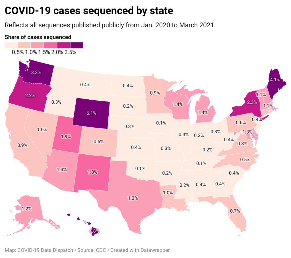
A third variant-adjacent data page, added to the overall CDC COVID Data Tracker this past week, provides a bit more context. This page provides data on published SARS-CoV-2 sequences provided by the CDC, state and local public health departments, and other laboratory partners. You can see the sheer number of sequenced cases grow by week and compare state efforts.
It’s pretty clear that some states are doing more sequencing than others. States with major scientific capacity—Washington, Oregon, New York, D.C.—are near the top. Some states with smaller populations are also on top of the sequencing game: Wyoming, Hawaii, Maine. But 32 states have sequenced fewer than 1% of their cases in total, and 21 have sequenced fewer than 0.5%. That’s definitely not enough sequences for the states to be able to find pockets of new variants, isolate those transmission chains, and stop the breeding.
!function(){“use strict”;window.addEventListener(“message”,(function(a){if(void 0!==a.data[“datawrapper-height”])for(var e in a.data[“datawrapper-height”]){var t=document.getElementById(“datawrapper-chart-“+e)||document.querySelector(“iframe[src*=’”+e+”‘]”);t&&(t.style.height=a.data[“datawrapper-height”][e]+”px”)}}))}();
Chart captions state that the state-by-state maps represent cases sequenced “from January 2020 to the present,” while a note at the bottom says, “Numbers will be updated every Sunday by 7 PM.” So are the charts up to date as of today, April 4, or are they up to date as of last Sunday, March 28? (Note, I put simply “March 2021” on my own chart with these data.)
Obviously, the lack of date clarity is annoying. But it’s also problematic that these are cumulative numbers—reflecting all the cases sequenced during more than a year of the pandemic. Imagine trying to make analytical conclusions about COVID-19 spread based on cumulative case numbers! It would simply be irresponsible. But for sequencing, these data are all we have.
So, if anyone from the CDC is reading this, here’s my wishlist for variant data:
One singular page, with all the relevant data. You have a COVID Data Tracker, why not simply make a “Variants” section and embed everything there?
Regular updates, coordinated between the different metrics. One month is way too much of a lag for state-by-state prevalence estimates.
Weekly numbers for states. Let us see how variants are spreading state-by-state, as well as how states are ramping up their sequencing efforts.
More clear, consistent labeling. Explain that the sheer case numbers are undercounts, explain where the prevalence estimates come from, and generally make these pages more readable for users who aren’t computational biologists.
And if you’d like to see more variant case numbers, here are a couple of other sources I like:
Coronavirus Variant Tracker by Axios, providing estimated prevalence for four variants of concern and two variants of interest, along with a varants FAQ and other contextual writing.
Nextstrain, an open-source genome data project. This repository was tracking pathogens long before COVID-19 hit, and it is a hub for sequence data and other related resources.
The U.S. has blown past its current sequencing goal (7,000 cases per week), but is aiming to ramp up to 25,000—and has invested accordingly. I hope that, in addition to ramping up all the technology and internal communications needed for this effort, the CDC also improves its public data. The virus is multiplying; there’s no time to waste.
34,600 new COVID-19 patients admitted to hospitals (10.6 for every 100,000 people)
6,200 new COVID-19 deaths (1.9 for every 100,000 people)
An average of 3 million vaccinations per day (per Bloomberg)
“I’m gonna pause here, I’m gonna lose the script, and I’m gonna reflect on the recurring feeling I have of impending doom.”
You’ve probably seen headlines with this quotation, something CDC Director Dr. Rochelle Walensky said at the White House COVID-19 briefing on Monday before launching into an impassioned plea to “just hold on a little while longer.” Still, I recommend watching the full video, if you haven’t yet. I watched it live, and was struck by Dr. Walensky’s drive to avoid any more people sent to the hospital with COVID-19, any more unnecessary deaths.
The pandemic’s current state puts public health leaders like Dr. Walensky in a challenging position. New cases continue to rise, with states like Michigan, New York, New Jersey, and other parts of the northeast seeing more concerning spikes. While a 60,000-cases-per-day average may seem small compared to the numbers we saw this winter, it’s comparable to the summer surge that devastated much of the country. And our still-improving genomic surveillance system is finding more and more cases caused by variants.
Yet at the same time, millions of people are getting vaccinated—a new record was set just yesterday, with 4 million doses reported in one day. The weekly average is now at 3 million new doses each day. Not four days after that briefing when Dr. Walensky warned of impending doom, the CDC put out a travel guidance that many took as a license to book post-vaccination plane tickets. (It’s not, though by the way some have described it, you could be forgiven for thinking that way.)
Those who’ve been vaccinated may find it hard to believe another surge is coming. But we can’t let down our guard yet! About three in ten Americans have received at least one vaccine dose—that’s far from herd immunity.