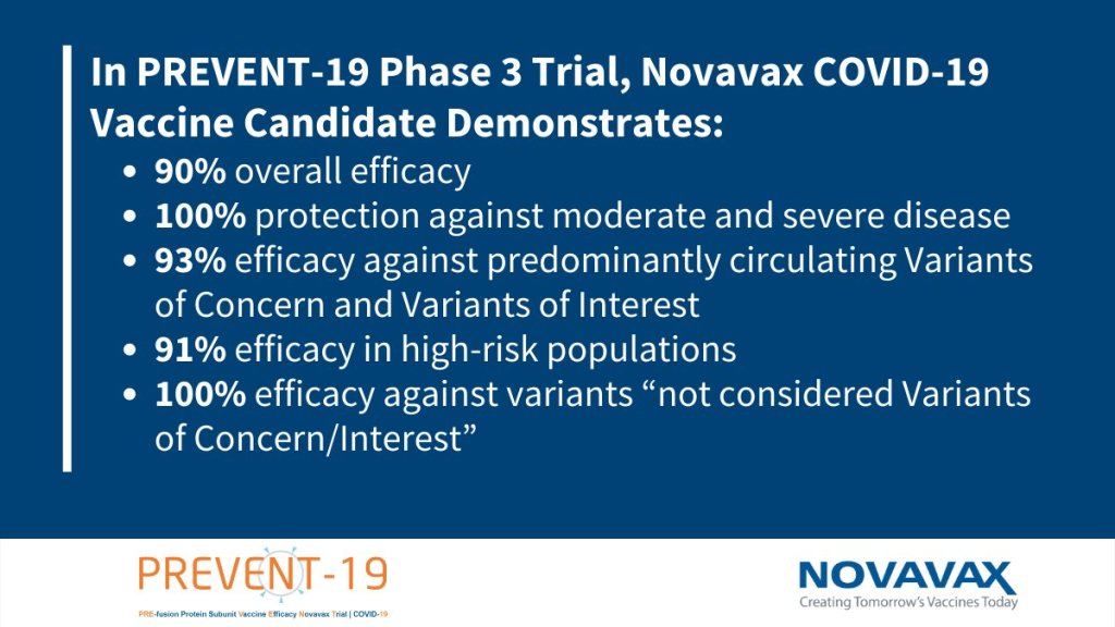
The COVID-19 news world saw a return of Monday-morning vaccine results this week. Novavax, a small biotech company based in Maryland, announced that its vaccine demonstrated 90% overall efficacy and 100% protection against moderate and severe COVID-19 disease.
These results come from a trial conducted in the U.S. and Mexico between January and April this year, at a time when the Alpha (or B.1.1.7) variant was becoming dominant here. Among almost 30,000 trial participants, 77 cases were observed: 63 in the placebo group and 14 in the vaccine group, for an efficacy of 90.4%. All of the moderate and severe cases (ten moderate, four severe) were observed in the placebo group.
Novavax even sequenced samples from 54 out of the 77 cases. The majority of those sequenced cases were variants of concern or variants of interest; Novavax’s vaccine demonstrated 93.2% efficacy against variants of concern/interest and 100% efficacy against non-concerning variants. This finding aligns with other vaccine studies suggesting that the COVID-19 vaccines developed on older versions of the virus still work well against variants, especially at protecting against severe disease and death.
This new vaccine uses a coronavirus protein—a different method from both Moderna/Pfizer (mRNA vaccines) and AstraZeneca/Johnson & Johnson (adenovirus vaccines). It’s given in two doses, three weeks apart. It had far fewer side effects than other COVID-19 vaccines, with small numbers of participants reporting sore arms and fatigue.
The Novavax vaccine is also comparatively easier to transport and store than other viruses; it can be stored at refrigerated temperatures. While it’s unlikely to be used in the U.S., it could be critical for vaccine rollouts in other parts of the world.
It’s unclear what the market in the US will look like in late 2020, but there is enormous global need. Efficacy against variants not widely circulating during the trial is also unclear. A Phase 2b trial in South Africa showed some drop, but with a wide confidence interval.
— Natalie E. Dean, PhD (@nataliexdean) June 14, 2021
Following the end of the federal public health emergency in May, the CDC has lost its authority to collect vaccination data from all state and local health agencies that keep immunization records. As a result, the CDC is no longer providing comprehensive vaccination numbers on its COVID-19 dashboards. But we still have some information about this year’s vaccination campaign, thanks to continued CDC efforts as well as reporting by other health agencies and research organizations.
This week, the FDA authorized Novavax’s updated COVID-19 vaccine. Here’s why some people are excited to get Novavax’s vaccine this fall, as opposed to Pfizer’s or Moderna’s.
Last week, I asked you, COVID-19 Data Dispatch readers, to send me your stories of challenges you experienced when trying to get this fall’s COVID-19 vaccines. I received 35 responses from readers across the country, demonstrating issues with insurance coverage, pharmacy logistics, and more.
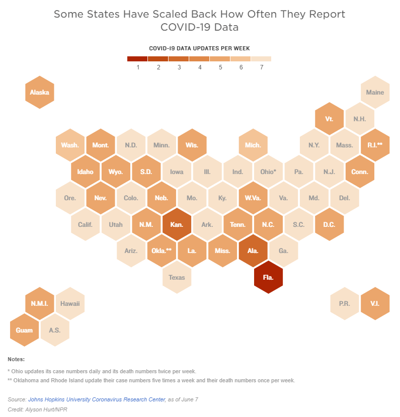
Two weeks ago, I reported that Florida had made a big change to its COVID-19 data reporting: the state switched from daily updates to weekly updates. Previously, Florida had maintained a dashboard and released detailed PDF reports each day; now, the state releases PDF reports once a week on Fridays.
Other states are making similar changes. Only about half of states update their COVID-19 data every day, NPR reported last week. Florida is the only state to cut back to only one update a week, but several others now skip updating on weekends or otherwise reduce their reporting load.
It’s important to note, however, that these changes are not all new. There have always been states that skipped updating—or published limited updates—on weekends, going back to spring 2020. And, for a long time, Kansas was the least-frequent-reporting state: for many months, it’s only published updates on Mondays, Wednesdays, and Fridays. More states started skipping weekends earlier in 2021, though, at the same time as many state public health agencies were spinning up vaccination dashboards in addition to their existing COVID-19 reporting systems.
When states do not update their data every day, journalists and researchers are less able to precisely track COVID-19 developments and identify trends. John Hopkins’ Beth Blauer compared this challenge to viewing a photo in low resolution instead of high resolution: it’s harder to see a pattern when you’re not getting as much detail.
Even for those states that do publish updates every day, though, there are still challenges inherent in interpreting data that naturally fluctuate over the course of a week. New York might update its COVID-19 data every day, for example, but some test sites in New York are closed on weekends—leading to natural dips in testing and case numbers on those days, followed by higher numbers in the middle of the week. COVID Tracking Project volunteer Hannah Hoffman has written about this phenomenon in detail.
Still, even as states start to skip days or make their reporting less precise, the CDC and HHS continue to update their national COVID-19 datasets daily. There are admittedly many discrepancies between federal and state data—in large part because of the lack of federal leadership early in the pandemic—but the federal data are now highly standardized and reliable at a level that would be incredibly difficult to get from states. This is why I personally choose to use the CDC’s dashboard for COVID-19 Data Dispatch weekly updates, rather than JHU or another source that aggregates from states.
It’s also important to acknowledge that state public health agencies have been chronically underfunded for decades before the pandemic hit—and daily data updates have been a huge timesuck for many of these agencies. If scaling down COVID-19 dashboard updates frees up some personnel and resources for a state like Alabama or South Dakota to redirect into vaccination programs, that, to me, seems worthwhile.
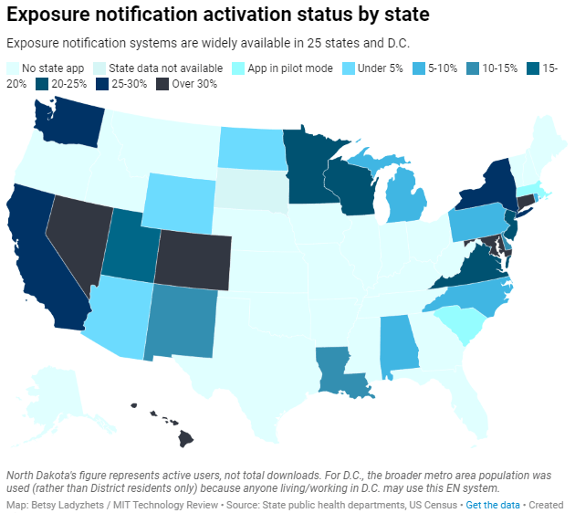
Exposure notification systems are availalbe in 25 states and D.C.
This week, I have a new feature out in MIT Technology Review. It’s an investigation into the usage rates and public opinion of exposure notification apps—those Bluetooth-enabled systems that promised to function as a method of digital contact tracing. You can read the story here; and for the CDD this week, I wanted to provide kind-of an extended methodology behind the piece.
The inspiration for this feature came from my conversation with Jenny Wanger, which was published in the CDD back in March. Wanger is the Director of Programs at Linux Foundation of Public Health, a software development network that has worked on exposure notification systems. We discussed the privacy-first design of this technology, as well as how difficult it has been to evaluate how well the apps are working.
That conversation got me thinking: someone should actually try to collect comprehensive data on how many Americans are using exposure notifications. The federal government doesn’t provide any data on this topic, and most of the states that have exposure notification systems available don’t publicly report data, either. But, I thought, there might be other ways to gather some estimates.
When I talked to Lindsay Muscato, an editor at Technology Review’s Pandemic Technology Project (and a longtime CDD reader!), a few weeks later, she agreed that such an investigation would be valuable. The Pandemic Technology Project has done a lot of reporting on exposure notification apps, but hadn’t yet pursued the kind of novel data collection project I was envisioning.
The project started with a hypothesis: that exposure notification systems are underutilized in the U.S. due to a lack of trust in governments and in new technology.
Initially, I planned to use app reviews from the Google Play and Apple stores as the main data source for the story. The two online stores provide download estimates, which I intended to use as a proxy for app usage rates—along with ratings and reviews that I could use as a proxy for public opinion. (Shout-out to machine learning engineer Venelin Valkov, who has put together a great tutorial on scraping and analyzing app store reviews with Python.)
But an interview early in the reporting process caused me to change my data collection plans. I talked to two exposure notification experts at the New Jersey public health agency, who told me that the app download count I saw on the state’s COVID-19 dashboard was actually a significant underrepresentation of the state residents who had exposure notifications enabled on their smartphones.
This data disconnect was due to something called Exposure Notification Express, or ENX. ENX is an upgrade to the digital contact tracing system, released by Apple and Google last September, that made it easier for states to develop new apps. The upgrade also built exposure notifications directly into the iPhone operating system, allowing millions of people to opt into the notifications without downloading a new app.
In short, I couldn’t use app downloads as a proxy for usage rates. I also couldn’t use Apple app store reviews, because the majority of iPhone users were using ENX rather than downloading a new app. Many state apps are listed on the Google Play store but not on the Apple store, for this reason.
I still used Google Play reviews for the public opinion piece of my story. But to determine usage rates, I developed a new plan: reach out to every state public health agency with an exposure notification system and ask for their opt-in numbers. This involved a lot of calling and emailing, including multiple rounds of follow-up for some states.
The vast majority of state public health agencies to whom I reached out did actually get back to me. (Which I appreciate, considering how busy these agencies are!) The only one that didn’t respond was South Dakota; I assumed this state likely had a low number of residents opted into exposure notifications because South Dakota shares an app with two other low-activation states, North Dakota and Wyoming.
Based on my compilation of state data, 13 states have over 15% of their populations opted into exposure notifications as of early May—passing a benchmark that modeling studies suggest can have an impact on a community’s case numbers.
(I used the U.S. Census 2019 Population Estimates to calculate these opt-in rates. I chose to base these rates on overall population numbers, not numbers of adults or smartphone users, because that 15% benchmark I mentioned refers to the overall population.)
This is a smaller number than the engineers who developed this technology may have hoped for. But it does mean these 13 states—representing about one-third of the U.S. population in total—are seeing some degree of case mitigation thanks to exposure notifications. Not bad, for an all-new technology.
I was also impressed by the five states that reported over 30% of their populations had opted into the notifications: Hawaii, Connecticut, Maryland, Colorado, and Nevada. Hawaii had the highest rate by far at about 46%.
For anyone who would like to build on my work, I’m happy to share the underlying data that I collected from state public health agencies. It’s important to note, however, that the comparisons I’m making here are imperfect. Here’s a paragraph from the story that I’d like to highlight:
Comparing states isn’t perfect, though, because there are no federal standards guiding how states collect or report the data—and some may make very different choices to others. For example, while DC reports an “exposure notification opt-in” number on its Reopening Metrics page, this number is actually higher than its residential population. A representative of DC Health explained that the opt-in number includes tourists and people who work in DC, even if they reside elsewhere. For our purposes, we looked at DC’s activation rate as a share of the surrounding metropolitan area’s population (including parts of nearby Maryland, Virginia, and West Virginia).
So, did my research support my hypothesis, that exposure notification systems are underutilized in the U.S. due to a lack of trust? Somewhat. I definitely found that the technology has failed to live up to its potential, and the app reviews that I read indicated that many Americans did not trust the technology—or simply failed to understand its role in COVID-19 prevention.
At the same time, however, I found that some states have seen significant shares of their populations opting into the new technology. Plus, the app reviews showed that a lot of people not only trusted the technology—they bought in enough to advocate for it. The majority of states actually had more five-star ratings than any other category, and a lot of those reviewers tried to combat the mistrust they saw elsewhere in the comment section with explanations and endorsements. This is a job that should’ve been done by public health agencies themselves, of course, but the positive reviews may indicate a promising future for this technology.
In the story’s conclusion, I argue that exposure notification technology is still in its trial run here in the U.S. State public health agencies had limited budgets, limited resources, and limited capacity for trust-building. As a result, they focused simply on getting as many people to opt into the technology as possible—rather than any kind of comprehensive data collection or analysis.
“The ultimate goal [of exposure notifications] is for more folks to know they’ve been exposed,” says Hanna Sherrill, an Eagleton Science and Politics Fellow at Rutgers University who worked with the New Jersey public health agency on its exposure notifications system. “Hopefully some of them will take the advice to quarantine, and then they will stop the spread from there. Even if there’s one or two people who do that, that’s a good thing from our perspective.”
Other state public health staffers who responded to Technology Review’s data requests echoed her sentiment—and their attitudes suggest that digital contact tracing in the US may still be in its trial run. We have 26 different prototypes, tested in 26 different communities, and we’re still trying to understand the results.
“In the US, the existing apps and tools have never hit the level of adoption necessary for them to be useful,” Sabeti says. But such success may not be out of reach for future public health crises.
I’m hopeful that, with more investment into this technology, public health agencies can build on the prototypes and develop community trust—before we see another pandemic.
I plan to keep reporting on this topic (including investigation into Google and Apple’s role in the technology, which a couple of readers have pointed out was lacking in the Technology Review piece). If you have further questions or story ideas, don’t hesitate to reach out.
The majority of states do not collect or report detailed information on how their residents became infected with COVID-19. This type of information would come from contact tracing, in which public health workers call up COVID-19 patients to ask about their activities and close contacts. Contact tracing has been notoriously lacking in the U.S. due to limited resources and cultural pushback.
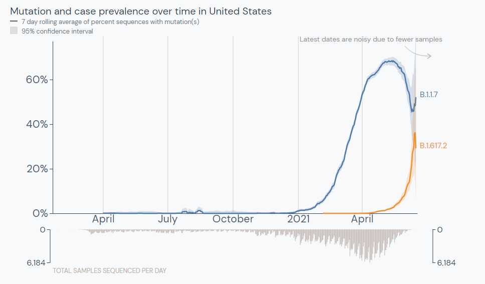
The Delta variant is outcompeting the Alpha variant in the U.S. Source: outbreak.info
In the past week (June 11 through 17), the U.S. reported about 80,000 new cases, according to the CDC. This amounts to:
An average of 11,000 new cases each day
24 total new cases for every 100,000 Americans
19% fewer new cases than last week (June 5-11)
Last week, America also saw:
13,800 new COVID-19 patients admitted to hospitals (4.2 for every 100,000 people)
2,000 new COVID-19 deaths (0.6 for every 100,000 people)
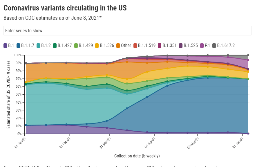
66% of new cases in the country now Alpha-caused (as of June 5)
10% of new cases now Delta-caused (as of June 5)
An average of 1.3 million vaccinations per day (per Bloomberg)
Data note: The CDC skipped an update on Friday in honor of Juneteenth, so this update is a day off from our usual schedule (reflecting a Friday-Thursday week instead of a Saturday-Friday week).
The CDC updated its variant prevalence estimates this week, reporting that the variant makes up 10% of U.S. cases as of June 5. This aligns with other estimates I cited last week, and suggests that the variant is spreading here at a truly rapid pace—its prevalence multiplied by four times in two weeks, according to CDC data.
That means Delta could be the dominant variant in the U.S. within a month, if not sooner. Vaccinated Americans are well-protected against this variant, but those who are unvaccinated need to get their shots—and soon.
Vaccinations have picked up a bit this week, per Bloomberg. In the past week, we’ve seen 1.3 million shots administered a day. Still, researchers have estimated that the U.S. is likely to fall short of Biden’s 70%-by-July-4 goal. Disparities persist in the rollout as well.
Meanwhile, national case numbers continue to drop (though not as dramatically as the drops a few weeks ago), while hospitalization and death numbers remain low. Notably, the vast majority of COVID-19 patients currently in hospitals are unvaccinated.
When New York Governor Cuomo set off fireworks on Tuesday to celebrate the state’s full reopening, my girlfriend and I went up to our building’s roof to watch—only to be unable to see the show. We later realized that the fireworks were set off in New York Harbor, visible mostly to lower Manhattan (but not the outer boroughs, which have felt the brunt of COVID-19). It felt like an apt metaphor for the current state of the pandemic.
Since early January, the COVID-19 Data Dispatch has maintained a page of detailed annotations on all the major sources for vaccination data in the U.S. This includes government sources (the CDC, all 50 states, and D.C.), along with a few notable news publications and independent dashboards. I’ve updated the page weekly, usually checking every data source on Saturday or Sunday to look for any changes or additions.
When I started maintaining these annotations, I saw major changes each week. States were bringing new dashboards online, adding more local geographies, adding more demographic data. I enjoyed watching the development and looking out for new features—almost a year of COVID Tracking Project data entry shifts had trained me for this nerdy practice.
Now, however, most U.S. vaccination dashboards (and many international ones) are relatively stable. All the states and independent vaccine trackers have figured out what they’re doing, and they’re not really making changes. I rarely see new features, and when I do, they’re usually minor adjustments to a dashboard’s organization or terminology.
As a result, I’m adjusting my schedule. The CDD vaccinations page will now update every other week instead of weekly. I will be doing an update later today after sending this issue, then the following update will come in two weeks, on June 27.
I’m still going to look out for demographic vaccine data from the last two states not providing this information (Montana and Wyoming) and for any states that cut back their updating schedule (as Florida did last week). But I am expecting these biweekly updates to be more cursory than exciting going forward.
COVID-19 Vaccine Rollout across US Congressional Districts: This dashboard, from the Harvard Center for Population and Development Studies, breaks down the U.S. vaccine rollout by a geography I haven’t yet seen: Congressional districts. The interactive maps highlight the partisan nature of this vaccine rollout—as POLITICO reporters pointed out in an article citing the tracker, “All but one of the 39 congressional districts where at least 60 percent of residents have received a coronavirus shot are represented by Democrats.”
Vaccination time series from the CDC: The CDC’s vaccine dashboard doesn’t allow users to download time series data (i.e. vaccinations by day), but now, you can find this information on the agency’s data portal. The dataset includes county-level vaccine administrations and coverage rates going back to December 13, 2020.
Methodology changes for Bloomberg’s COVID-19 Vaccine Tracker: Bloomberg’s vaccine tracker is one of the most widely cited in the U.S., and for good reason—it’s incredibly comprehensive, compiling data from every country with an active vaccine rollout (and, in the early weeks of the rollout, from every U.S. state). After months of collecting data by hand, the Bloomberg team is now starting to automate their data collection, Health Editor Drew Armstrong announced this week. Many countries and the WHO are now providing stable enough data sources that such a change is possible.
Fiscal accountability for COVID-19 responses: The International Budget Partnership, a global nonprofit working to improve government budgets, has produced a report and interactive website analyzing accountability measures that international governments have—and have not—implemented as part of emergency COVID-19 responses. Notably, out of 120 countries surveyed, none have “substantive” accountability and only four have “adequate” accountability. (H/t Data Is Plural.)
COVID-19 risk levels for kid-related activities: This one isn’t a data source, per se, but I thought readers might find it helpful. A team of epidemiologists, immunologists, and public health scientists—including Katelyn Jetelina of Your Local Epidemiologist—compiled this detailed guide for families with unvaccinated children. The guide aims to help parents and families navigate their risk levels this summer.
Editor’s note: Sarah Braner originally titled this post, “So long, farewell, I kinda hope this newsletter isn’t as necessary in the nearish future but also I hope we meet again.” While this is a very good title, I didn’t want anyone to see it and think that I, Betsy, am ending the publication (which I am not). Sarah has been an invaluable help these past few months—staying on top of COVID-19 data news, brainstorming post ideas, working on the K-12 data annotations, and more. I’m excited to watch her kill it at CNN and beyond!
This will be my last week writing for the CDD. I’m so incredibly grateful to everyone who has read my posts, to Betsy for literallyeverything, and to Dr. Ashish Jha for being the only one allowed to tweet from here on out. (Honorable mention to AstraZeneca for giving me an excuse to put a Simpsons meme in the newsletter.)
If you, for some reason, want to read more of my work this summer, you can catch me pumping out some Content for CNN Health after I figure out how their Slack channel works. When the school year starts up, I’ll be resuming my work as Bwog’s Science Editor with hopefully much less COVID-19 to write about. If my hopes pan out, I will fill that void by writing a weird amount of posts about Barnard laundry.
The Delta variant (also known as B.1.617.2) was first identified in India earlier this spring. It’s now known to spread more easily than any other variant found so far and evade immunity from a prior COVID-19 infection. Scientists are also investigating the variant’s potential to more easily cause severe disease—as well as links to a “black fungus” that has become a secondary epidemic in India.
Harvard epidemiologist William Hanage called the variant “really, really anxiety-inducing,” STAT’s Andrew Joseph reports. (If you’d like to read more on the biology of this variant, Joseph’s article provides a useful overview.)
The Delta variant was first identified in the U.S. in April. It’s making up a small fraction of new cases at the moment, but is spreading rapidly: from an estimated 1.3% of cases on May 8, to 2.5% of cases on May 22, to 6.1% of cases on June 5. The June 5 estimate comes from CDC’s Nowcast predictions, which extrapolate from the most recent available sequencing data (typically reported with a lag of two weeks or more.)
The share of cases caused by this variant appears to be doubling every two weeks, which means that Delta could become the dominant variant here this summer. Some data suggest that domination could happen within a month—a dashboard run by the testing company Helix puts Delta at 10% of new cases as of May 31, suggesting an even faster transmission rate for the variant.
Helix scientist Alexandre Bolze wrote on Twitter that Delta could become dominant “next week or next 2 weeks” based on these trends.
Other variant trends also support Delta’s dominance. This variant, along with Gamma (or P.1, the variant first identified in Brazil), appears to be outcompeting other variants of concern in the U.S. Alpha (or B.1.1.7) has now plateaued at around 70% of U.S. cases, according to CDC data. The variants found in California and New York, both of which made up more than 10% of new cases earlier in the spring, are now declining.
While the CDC is not yet publishing data on Delta’s prevalence in individual states, we can assume that state-by-state variant trends—especially in those states where Delta cases were first identified—are reflecting the variant’s rise on a national level.
Many experts are now looking at Delta’s spread in the U.K. as a portent for its spread here. The variant has become dominant in the U.K., thoroughly outcompeting Alpha, and is driving a new surge—even though over half of the British population has received at least one vaccine dose. In fact, the U.K. has delayed its full reopening plans by a month due to this case resurgence.
The COVID-19 vaccines currently in use in both the U.K. and the U.S. do work well against Delta, especially the Pfizer and Moderna vaccines—and especially after a full two-dose regimen is complete. But anyone not yet vaccinated is highly vulnerable to this variant. In the U.K., the current case surge is driven by young adults and teenagers who aren’t yet eligible for vaccination.
As physician and public health expert Vin Gupta put it: “Being unvaccinated on June 9, 2021 is much more risky to your own wellbeing than being unvaccinated on June 9, 2020.” And the longer one waits, the riskier this condition becomes.
The Delta variant should serve both as an additional reason for those in wealthy nations who aren’t yet vaccinated to get their shots—and a reason for wealthy nations to share doses with the rest of the world.
Screenshot of the Health Equity Tracker showing which states are missing race and ethnicity data for COVID-19 cases.
Two weeks ago, a major new COVID-19 data source came on the scene: the Health Equity Tracker, developed by the Satcher Health Leadership Institute at Morehouse School of Medicine.
This tracker incorporates data from the CDC, the Census, and other sources to provide comprehensive information on which communities have been hit hardest by COVID-19—and why they are more vulnerable. Notably, it is currently the only place where you can find COVID-19 race/ethnicity case data at the county level.
I featured this tracker in the CDD the week it launched, but I wanted to dig more into this unique, highly valuable resource. A couple of days ago, I got to do that by talking to Josh Zarrabi, senior software engineer at the Satcher Health Leadership Institute—and a fellow former volunteer with yours truly at the COVID Tracking Project.
Zarrabi has only been working on the Health Equity Tracker for a couple of months, but he was able to share many insights into how the tracker was designed and how journalists and researchers might use it to look for stories. We talked about the challenges of obtaining good health data broken out by race/ethnicity, communicating data gaps, and more.
The interview below has been lightly edited and condensed for clarity.
Betsy Ladyzhets:Give me the backstory on the Health Equity Tracker, like how it got started, how the different stakeholders got involved.
Josh Zarrabi: At the beginning of the pandemic, the Satcher Health Leadership Institute at Morehouse School of Medicine saw the lack of good COVID data in the country, and especially the lack of racial data. The COVID Tracking Project kind-of tried to solve that as well with the Racial Data Tracker.
Morehouse wanted to do something similar. And so they applied for a Google.org grant… After about nine months, the tracker just got released. It went through a couple of different iterations, but what it is now is, it’s a general health equity tracker, so it tracks a couple of different determinants of health. And it really has a focus on equity between races and amplifying marginalized races as much as possible.
Probably the most innovative thing it does is, it shows COVID rates by race down to the county level. We think that’s relatively hard to find anywhere else. (Editor’s note: It is basically impossible to find anywhere else.) So that’s probably like the main feature that it has that people care about, but it does track other health metrics. We also have poverty, health insurance, and we try to track diabetes and COPD, but there’s not great data on that, unfortunately, in the United States. We’re planning to add more metrics in the future.
BL: How does this project build on the COVID Racial Data Tracker? And I know, like APM has a tracker for COVID deaths by race. And there are a couple other similar projects. So what is this one doing that is taking it to the next level?
JZ: A couple of things. We’re using the CDC restricted dataset. Basically what the dataset looks like is, it’s like a very large CSV file where every single line is an individual COVID case. So we’re able to break it down basically however we want. So we were able to break that down to the county level, state level and national level.
And what we do is we allow you to compare that [COVID rates] to rates of poverty, and rates of health insurance in different counties. We think that’s pretty innovative, and we’re gonna allow you to compare it to other things in the future. So that’s one thing that we do. And I mean, the second thing that I would say is like, probably makes us stand out the most I would say is our real focus on racial equity, and showing where the data gaps are and how that affects health equity. So what you’ll notice, if you go to our website, we very prominently display the amount of unknown…
BL: Yeah, I was gonna ask you about that, because I know the COVID Racial Data Project had similar unknown displays. Why is it so important to be highlighting those unknowns? And what do you want people to really be taking away from those red flag notes?
JZ: We really try to do our best to display the data in context as much as possible. First of all, the most important thing, I think, is just showing the high percentage of unknown race and ethnicity of COVID cases in the United States. For something like 40% of cases, we don’t know the race and ethnicity of the person who had COVID.
We want people to really think about that when they look at, for example, you’ll notice that it looks like Black Americans are affected to the exact level of their population. Black Americans look like 12% of the population and 11% of cases. But we don’t know the race of 40% of people who have COVID. And so we really wanted people to think about that when they look at these numbers. And it’s the same for American Indian/Alaskan Native populations. It doesn’t look like they’re that heavily affected in the United States. But that’s why we allow you to break down into the county level, where race is not being reported. And so we really want people to look and say, like, oh, wow, like in Atlanta, 60% of cases are not being counted for race and ethnicity.
We’re not doing any extrapolation. We’re not multiplying, we’re not like trying to guess the races of unknowns, or anything like that. We really want people to think about that, when they’re saying like, oh, wow, it looks like Native American people are not really heavily affected by COVID. It’s like, no, we just don’t know. We don’t know their races, or those people are just not being reported properly by the health agencies.
And if you look at places that have high percentages of Black Americans and high percentages of American Indian/Alaskan Natives, you’ll see that those places are the same places that are not reporting the race and ethnicity of the people who had COVID.
We had a team of about 20 health equity experts advising us throughout the entire project. That’s where those red flags that you see come from. It’s explaining, for example, if you look into deaths for Native American and Alaska Natives, there’s an article about how a lot of American Indian/Alaskan Native people who died are not, are improperly categorized racially, and they’re often categorized as white. And so we have that kind of stuff to really try to put the numbers in context.
We were only able to do that, because we had this large team of racial equity experts and health equity experts advising us throughout the entire time. And so we really had diverse representation on the project as we were building it, and people who really knew what they were talking about.
BL: What can public health agencies and also researchers and journalists do to push for better data in this area?
JZ: The good thing is we are seeing [data completion] get better over time. And so we’ve seen, for example, the percentage of race and ethnicity for cases improved from about 50% to about 60% over the last couple of months.
And, I mean, really, all you can do is—it’s really a thing that goes down to the county level. So, everybody’s just got to call their county representatives. I’d be like, hey, could you please report the race and ethnicity of the county’s COVID cases to the CDC? Unfortunately, a lot of that work might be too late, because [data were submitted months ago]. But we have seen it get better. And so we’re hoping that, you know, these health agencies are able to do the work and really, like, properly report these cases to the CDC…
BL: ‘Cause a lot of it comes from the case identification point, where if you’re not asking on your testing form, what race are you, then you just might not have that information. Or you might be, like, guessing and getting it wrong or something, right?
JZ: Yeah, there’s guessing. There’s two different categories of unknown cases—there’s unknown and there’s missing. The vast majority of these cases have filled out unknown [in the line file], which means that the person who’s filling out the data form literally puts “unknown” as the race. We don’t really know exactly what that means in every case. But it could be they didn’t ask, it could be the person didn’t feel comfortable saying it, just said, “I don’t want to tell you my race.” Or it could just be that they just didn’t make an effort to figure out what their race is.
BL: Do you have a sense of how that 60% known cases compares to what the COVID Racial Data Tracker had in compiling from the states?
JZ: Yeah, I think the COVID Racial Data Tracker was a bit higher [in how many cases had known race/ethnicity]. But the thing is, as far as I understand, the COVID Racial Data Tracker was using aggregate numbers.
BL: We were looking at the states and then kind-of like, synthesizing their data to the best of our ability, which was pretty challenging because every state had slightly different race and ethnicity categories. There were some states that had almost no unknown cases, but there were some where almost all cases or almost all deaths were unknown. New York, I don’t know if they ever started reporting COVID cases by race.
JZ: They do to the CDC, I don’t think they report—
BL: They don’t report it on their own, state public health site.
JZ: Let me actually check that… Yeah, so New York is not great. They have a 60% unknown rate. [Race and ethnicity is only reported to the CDC for 40% of cases.] Not great. Actually, New York City is pretty good. But the rest of New York State is not doing a good job reporting the race and ethnicity of cases.
BL: Because I’ve gotten tested here, I know that New York City is good about collecting that [race and ethnicity] from everybody.
JZ: I was one of those cases in New York City, actually. When [I got called by a contact tracer], I was kind of chatting with them about this. They asked me about my race—I actually became a probable case for COVID, like, the day after I started this job. And [NYC Health] called me, they were like, “What’s your race?” I was like, “Oh, that’s kind of funny, I just started working on this racial data project.” And—this is totally anecdotal. But she told me, most people just refuse to report their race.
And then for deaths… 40% of COVID deaths in New York state, they don’t know the race, which is not great. New York is not good compared to the rest of the states. It’s one of the worst states for unknowns.
JZ: The process of getting it’s not that hard. You just apply, and then they give you access to a GitHub repo, and then you can just use it. Using the data itself is pretty hard because the data files are so large. We were lucky enough to have a team of Google engineers working on this project, they wrote a bunch of Python scripts that analyze the data and aggregate it in a way that the CDC isn’t doing.
The reason why they restrict the use is because it’s line-by-line data. [Each line is a case.] And the CDC does suppress some of the data because they think it would make those cases identifiable. Still, you’re not allowed to just, like, release the data into the wild, because they want to know who else has track of it. So, we wrote some Python to aggregate the data, in exactly the way you see on the website. We aggregate it to the amount of cases, deaths and hospitalizations per county, per race, essentially.
The CDC has been extremely helpful, like, we’ve had a couple of meetings with them. We think we were one of the heaviest users of the data at the beginning, because we pointed out a couple of problems with the data that they actually fixed. So, that’s cool.
BL: That’s good to hear that they were responsive.
JZ: Yeah, definitely. We meet with them every couple of weeks. They’re really good partners in this.
BL: And they update that [case surveillance] dataset once a month?
JZ: They started doing it every two weeks now. Every other Monday, they update the dataset.
BL: Could you talk more about the feature of the tracker that lets you compare COVID to other health conditions and insurance rates? I thought that was really unique and worth highlighting.
JZ: We wanted to really provide the [COVID] numbers in context. And so that’s one way that we thought that we could do that and really show how… These numbers don’t happen, like a high rate of COVID for race doesn’t happen in a vacuum. There are political determinants of health.
For example, you’ll see everywhere that Hispanic Americans are just by far the most impacted by COVID case-wise. In California especially. And we provide those numbers in context—Hispanic Americans are also much less likely to be insured than white Americans, for example, and much more likely to be in poverty. And, you know, it’s not a crazy surprise that they would also be more likely to have contracted COVID at some point.
[The comparison feature] was a way that we thought, we would just allow people to really view numbers in context and get a better understanding of what the political situation is on the ground with where these high numbers are happening.
BL: What are the next conditions that you want to add to the tracker?
JZ: I want to be careful, because we can’t make any promises. But we’re talking about adding smoking rates, maybe. [The challenge is] where we can find data that we can aggregate correctly.
BL: Right. Are you looking specifically for data that’s county level as opposed to state level?
JZ: Hopefully… It depends. I was pretty surprised by the lack of quality in, for example, COPD and diabetes data, where like, if you look at [the dataset], like it’s state level—but in most states, there’s not a statistical significance for most races.
BL: Wow.
JZ: For example, we use the BRFSS survey. [The Behavioral Risk Factor Surveillance System.] It’s a CDC survey. And as far as we can tell, it’s the gold standard for diabetes [data] in the country.
And if you look at, say, diabetes, for most states… There’s only, like, four states where Asian people are statistically significant in the survey to make any sort of guess about how many people have diabetes, which is pretty atrocious. But that [data source] is the best we could do, you know. Ideally, we would like to find places that do go down to the county level, but it’s hard.
For as paltry as the COVID data is, it’s much better than—as far as I’ve seen, like, the fact that there’s like a line-by-line database that the CDC provides, that you can really make all these breakdowns of, is a huge step ahead [compared to other health data]. I’m not like a data expert on this kind of stuff, I’ve just been working on this project for two and a half months. But as far as I’ve seen, that’s what the situation is.
BL: Yeah, I mean, that kind of lines up with what I have seen as well. And I bet a lot of it is a case where, like, a journalist could FOIA [the data] from a county or from a state. But that’s not the same as getting something that is comprehensive, line-by-line, from the CDC.
JZ: And we [the Satcher institute] don’t want to be a data collection agency, like the COVID Tracking Project or the New York Times is. I mean, we want this to be a sustainable project. And the COVID Tracking Project was not a sustainable project.
BL: Yeah, totally. I was there doing the [data entry] shifts twice a week, that’s not something we could have done forever.
JZ: Yeah, I was there, too. I always think, like, the COVID Tracking Project could only exist when there’s an army of unemployed people who are too afraid to leave their house.
BL: And volunteers who were like, yeah, sure, I’ll do this on my evenings and weekends.
JZ: Who, you know, you don’t want to leave, you’re too afraid to go, like talk to people. You want to stay home in front of your computer all day, and feel useful.
I’m sure you could find all the diabetes data by going to county and state health department websites, but it’s too much work. So we really want everything to come from federal sources, basically, that’s our goal.
BL: How are you finding that people have used the tracker so far? Like, do you know of any research projects that folks are doing?
JZ: We released it a couple weeks ago, and we haven’t really heard of any yet… But we hope people are looking at it. And we have a couple of meetings lined up with some interesting research groups and stuff like that. So hopefully, they’ll like it.
BL: Are there any specific statistics or comparisons or anything else you found in working on it that you would want to see explored further? Are there any stories that you want to see come out of it?
JZ: The high rates of unknown data in a lot of places, that really needs to be looked into. Because it’s just hard to make any conclusions about what’s going on if—I mean, in some states like New York, over 50% of cases are unknown. That’s a huge problem. And that’s definitely something that needs to be looked into, like, why that’s happening. And if there’s anything that can be done to change that [unknown rate.] The reason why I do think that it can get better is because the COVID Tracking Project racial data had higher completeness rates. And so they [the states] probably do know the races of people who got sick, but they’re just not reporting it for whatever reason.
And for me, something that’s really stuck out was the extremely high rates of COVID for Hispanic and Latino people, especially in California. If you look at them and compare them to white rates, it’s, like, the exact opposite pattern. So it kind of does look like Hispanic and Latino people were kind-of shielding white people from getting COVID, if you compare the numbers. That’s something I would look into, too, like, why that happened.
(Editor’s note: This story from The Mercury News goes into how the Bay Area’s COVID-19 response heightened disparities for the region’s Hispanic/Latino population.)
BL: And another question along the same lines, is there a specific function or aspect of the tracker that you would encourage people to check out?
JZ: The unknowns. Just, like, look into your county and see what percentage of cases in your county have reported race and ethnicity at all. I think you can really see how good of a job your county has done at reporting that data. I know I was kind-of shocked by that rate for the county like I grew up in, like, I know that they have the resources to [report more data], but they’re just not doing a very good job.
BL: How would you say this experience with tracking COVID cases might impact the world of public health data going forward, specifically health equity data, and how do you see the tracker project playing a role in that?
JZ: We really want this project to show the importance of tracking racial health data down to the county level or even lower than that. County is the best we can do right now, but we’d love to see city level or something like that. And again, I kind-of said this before—as much as was missing for the COVID data, it’s still better than the data that there is for most other diseases and other determinants of health. So we would like to see, like, more things able to be filled out on the tracker. We would like to be able to get more granular on more different determinants of health, so that we can see, for example, how poverty impacts health, or a lack of health insurance, or how diabetes and COVID are related down to the county level. You can’t really do that right now…
We want people to see that, A, there’s a lot of data missing. But B, even with the data that we have, we can see that there’s like a huge problem. And so we would like to be able to fill out the data more to really get a better picture of what’s going on. If we can see there’s a problem, we can make better policy to help and make these disparities not as stark.
Vaccines are protecting many communities in the U.S., but those not yet vaccinated remain vulnerable. Posted on Twitter by Cyrus Shahpar.
In the past week (June 5 through 11), the U.S. reported about 98,000 new cases, according to the CDC. This amounts to:
An average of 14,000 new cases each day
30 total new cases for every 100,000 Americans
6% fewer new cases than last week (May 29-June 4)
Last week, America also saw:
15,700 new COVID-19 patients admitted to hospitals (4.8 for every 100,000 people)
2,400 new COVID-19 deaths (0.7 for every 100,000 people)
69% of new cases in the country now Alpha-caused (as of June 5)
6% of new cases now Delta-caused (as of June 5)
An average of 1.1 million vaccinations per day (per Bloomberg)
After several weeks of sharp declines, new COVID-19 cases in the U.S. now appear to be in a plateau. There are a few factors likely influencing this shift.
First, the nation’s public health agencies (and data reporting systems) are making up for the reporting lags caused by Memorial Day weekend. As we’ve discussed in the CDD before, holidays always lead to low case numbers immediately after, followed by slight bumps in the following week.
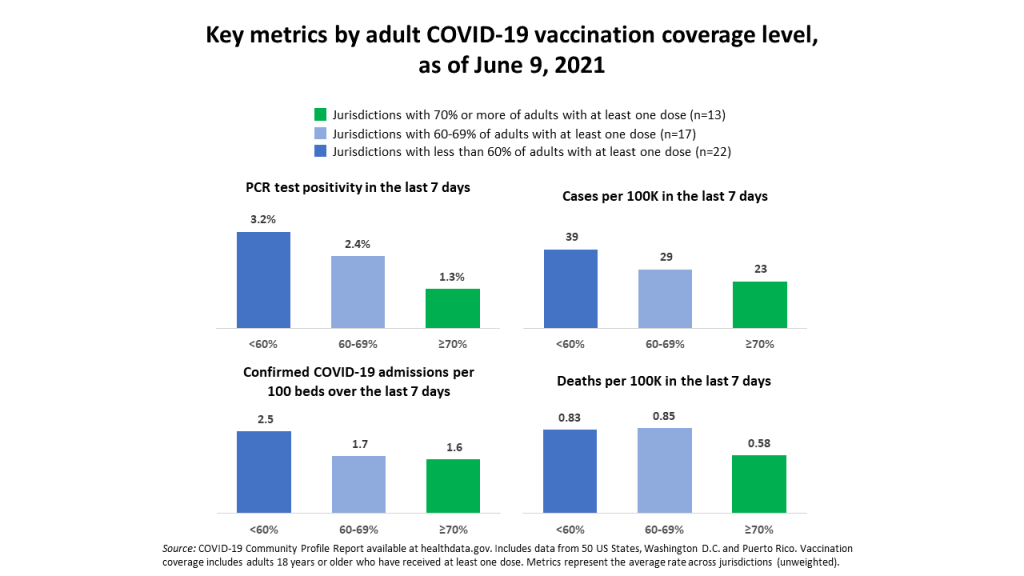
Second, vaccinations are still progressing at a slow pace—and the unvaccinated remain vulnerable. Jurisdictions with fewer vaccinated adults are seeing more cases, more hospital admissions, and higher PCR test positivity, as Cyrus Shahpar, the White House COVID-19 Director, pointed out on Twitter this week.
Third, the Delta variant (a.k.a. B.1.617.2, a.k.a. the variant first discovered in India) is rapidly spreading in the U.S.—making the unvaccinated even more vulnerable. (More on that later in the issue.)
Still, the vaccines are protecting many of the most vulnerable, leading to continued low hospitalization and death numbers. Total confirmed and suspected COVID-19 hospitalizations for the country are below 20,000 for the first time since HHS started tracking this metric.
Meanwhile, the U.S. is responding to global vaccination needs by pledging to send 500 million doses abroad by the end of 2022. Many of those doses won’t go out until next year, and the world does need faster distribution in order to prevent further variant evolution. But it’s a decent start.