Blog

  • National numbers, July 18

    National numbers, July 18

    Image
    COVID-19 risk levels by state in May and July. Data from Covid Act Now, posted on Twitter by Eric Topol.

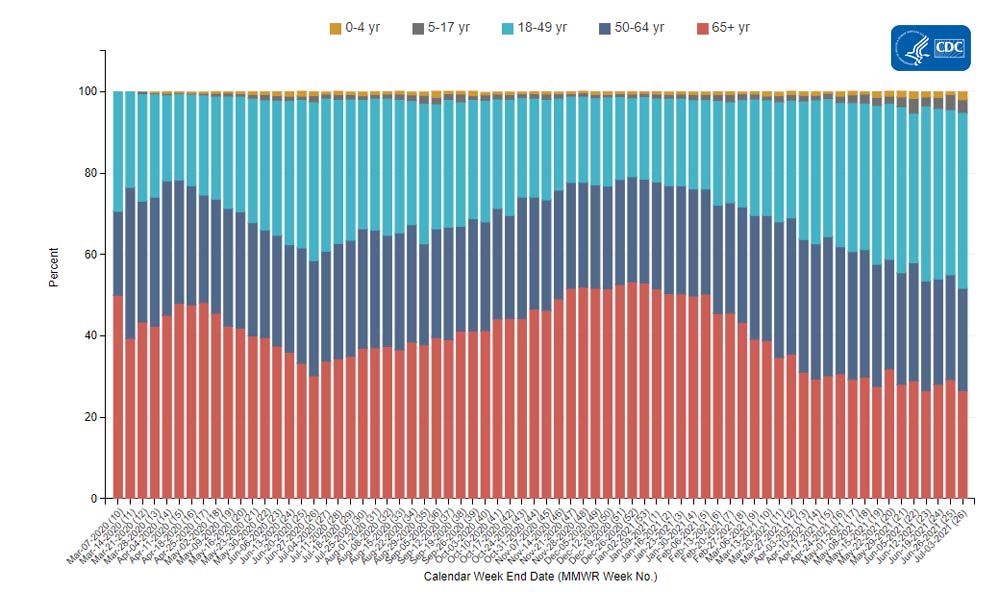
    In the past week (July 10 through 16), the U.S. reported about 184,000 new cases, according to the CDC. This amounts to:

    • An average of 26,300 new cases each day
    • 56 total new cases for every 100,000 Americans
    • 69% more new cases than last week (July 3-9)

    Last week, America also saw:

    • 19,600 new COVID-19 patients admitted to hospitals (6.0 for every 100,000 people)
    • 1,500 new COVID-19 deaths (0.5 for every 100,000 people)
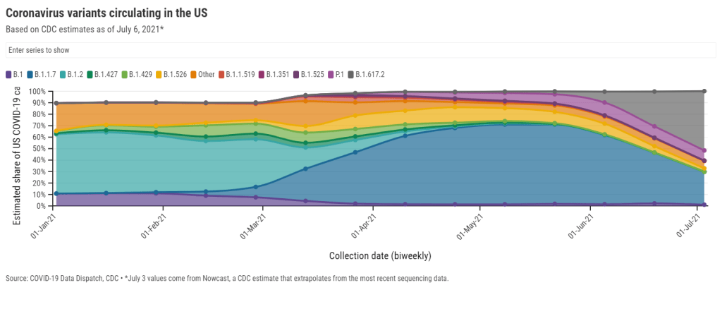
    • 58% of new cases now Delta-caused (as of July 3)
    • An average of 500,000 vaccinations per day (per Bloomberg)

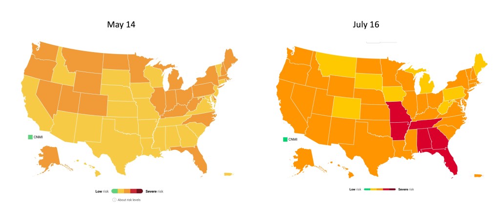
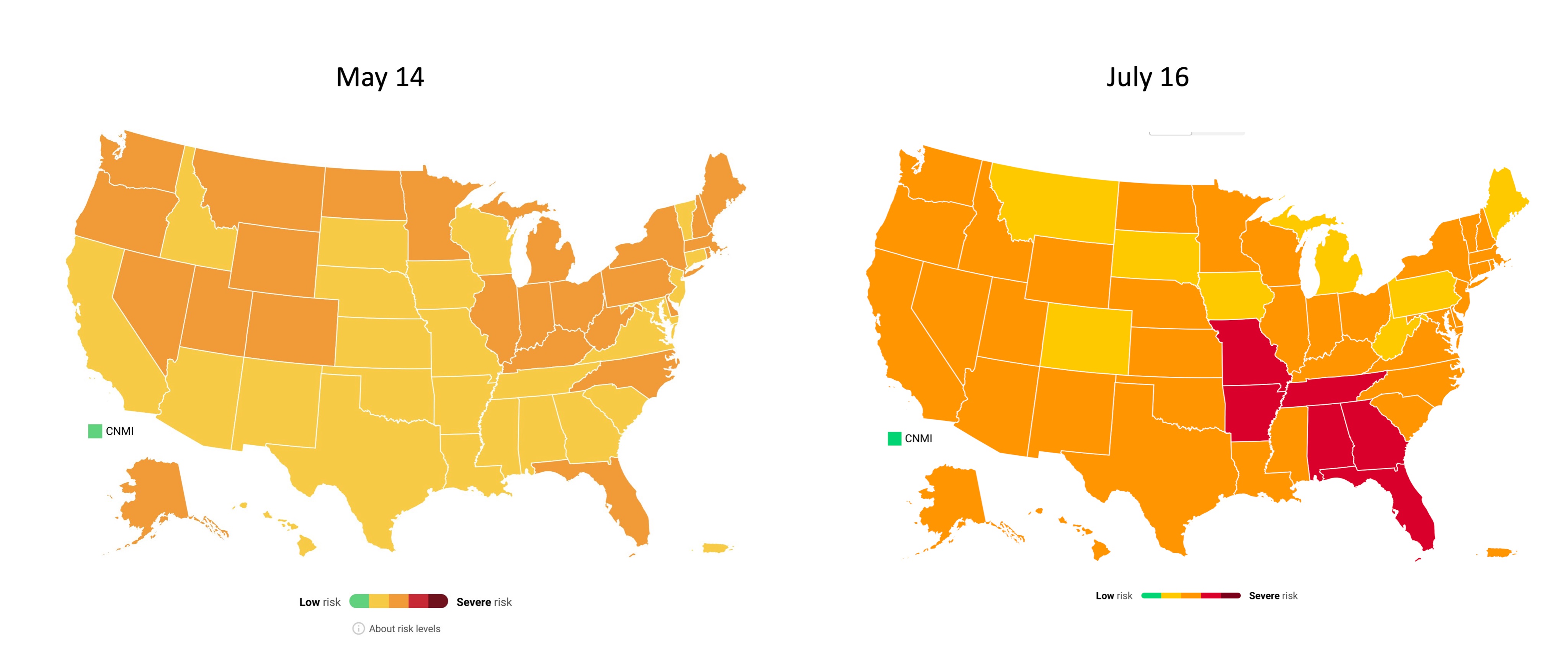
    Cases have been rising for a couple of weeks now, but we’re now seeing the sharpest increase since fall 2020. Between July 9 and July 16, we went from an average of 15,000 new cases a day to an average of 26,000 new cases a day.

    Hospitalizations and deaths are also increasing. We’re now seeing about 26% more new COVID-19 patients in hospitals every day and 36% more new deaths—it’s the first time that deaths have increased since the winter.

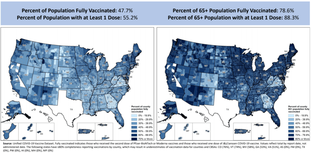
    “There is a clear message that is coming through: this is becoming a pandemic of the unvaccinated,” CDC Director Dr. Rochelle Walensky said at a press briefing on Friday. As I’ve continually emphasized in recent issues, states and counties with lower vaccination rates are more vulnerable to the Delta variant.

    Missouri continues to be a hotspot, as does Arkansas, with other states in the Midwest and South also seeing major surges. Florida is of particular concern: one in five U.S. cases in the last week were reported in this state, and Florida has seen a 109% case increase from the first to the second week of July.

    The under-vaccinated hotspots are more likely to see hospitals become overwhelmed with COVID-19 patients (see: this great data visualization by Conor Kelly). But even areas with high vaccination rates are seeing Delta take over. In New York City, Delta now causes 69% of new cases—and case numbers have doubled in the past two weeks. In San Francisco, where a full three-quarters of the eligible population is fully vaccinated, cases and test positivity rates have jumped in July.

    Despite the clear dangers of Delta, millions of Americans still refuse to get vaccinated. As Ed Yong put it in a recent piece on Missouri’s surge: “Vaccines were meant to be the end of the pandemic. If people don’t get them, the actual end will look more like Springfield’s present: a succession of COVID-19 waves that will break unevenly across the country until everyone has either been vaccinated or infected.”

  • COVID source callout: Vaccine incentives

    COVID source callout: Vaccine incentives

    Screenshot of the now-downsized vaccine incentives page.

    In the June 6 issue, one of our featured sources was a page from the federal government’s vaccine.gov site, providing an extensive list of rewards for Americans who got their shots—ranging from free Krispy Kreme donuts to a United Airlines sweepstakes.

    Now, however, that same page only offers a small list of support options for Americans who may need assistance in making their appointments. These include childcare support and free rides from Uber and Lyft; still valuable information, but a huge change from the previous page.

    What happened to the big list? A new note at the bottom of the page offers a clue: “This list is for informational purposes only and should not be inferred as an endorsement by CDC/HHS of the products, services or companies listed.”

    It seems the federal government can’t appear to endorse free donuts. Alternatively, maybe a lot of deals expired when the U.S. failed to meet Biden’s July 4 goal… or when evidence began suggesting that maybe these incentives aren’t really inspiring too many vaccinations.

    I’ve reached out to the CDC asking for a comment on this change, and will provide an update if I hear back.

  • Featured sources, July 11

    • COVID-19 Vaccination Equity: A new page of the CDC’s COVID Data Tracker allows users to compare a county’s vaccination rate to its vulnerability, using the CDC Social Vulnerability Index—unless that county is in Texas or Hawaii. For more on the Social Vulnerability Index, see this CDD post. The interactive map employs a unique two-tone color scheme, about which my girlfriend (who has graphic design expertise) said, “The purple loses me a little.”
    • US COVID-19 Vaccination Tracking: If you’d like to scroll through a county-level vaccine dashboard that actually includes Texas, researchers from the Bansal Lab at Georgetown University have you covered. This dashboard includes data from state public health departments to supplement the CDC’s incomplete reporting. The Bansal Lab researchers also recently published a new analysis, identifying clusters of under-vaccinated counties that are likely to seed outbreaks; I wrote about this analysis for the Daily Mail.
    • The human genetic architecture of COVID-19: Since spring 2020, an international group of geneticists have worked to analyze DNA from COVID-19 patients. A major manuscript on these efforts was accepted to Nature and posted online last week (it’s still going through edits); see the supplementary information section for extensive genetic data. And for more backstory on the project, see this article by STAT’s Megan Molteni.
    • Nebraska’s COVID-19 dashboard: Is the latest to get discontinued, as part of the trend in states cutting down on their COVID-19 reporting (even though the pandemic is far from over). Unlike Florida, which recently switched from a dashboard to weekly reports, Nebraska is not promising any regular reporting schedule. A note on the public health agency’s website reads: “The State of Nebraska COVID-19 Dashboard is no longer available as of June 30, 2021. Any future updates regarding coronavirus will be provided in news releases and through other means.”

  • What’s up with Texas’ county-level vaccination data?

    What’s up with Texas’ county-level vaccination data?

    Vaccination rates by county, included in the July 8 HHS Community Profile report. Note the missing data for Texas.

    Anyone who’s tried to work with the federal government’s vaccination data has noticed this issue: there’s a Texas-shaped hole in the numbers.

    While the CDC and HHS report vaccination data for counties and metropolitan areas in the vast majority of states, data are missing for the entire state of Texas. Data are also incomplete for several other states, including Colorado, Nebraska, and Virginia.

    What’s up with Texas? A reporter friend recently asked me this question, inspiring me to look into the issue. There’s limited information directly on the CDC dashboard; a vague note in the Community Profile Reports simply notes that several states have “ ≤80% completeness reporting vaccinations by county,” including Texas at 0%—implying that the states, rather than the federal agency, is at fault.

    A great article by Houston Chronicle reporter Kirkland An dives into the precise issue. An cites a CDC page on county-level vaccination data reporting, which says that, “Texas provides data that are aggregated at the state level and cannot be stratified by county.” (I later realized that this page is linked in incredibly tiny text at the very bottom of the CDC’s dashboard—classic.) 

    Why is Texas providing state-level data? The answer, it turns out, lies with a unique state law:

    When asked about the lack of data, Douglas Loveday, a press officer with the Texas Department of State Health Services (DSHS), said, “State statute prevents us from sharing person-level immunization data.”

    Texas Health and Safety Code Sec. 161.0073 states that DSHS “may not release registry information to any individual or entity without the consent of the individual or the individual’s legally authorized representative.” There are exceptions to the rule, specifically reporting “non-identifying summary statistics.” But reporting individual records to the CDC, even if they have been stripped of identifying information, is not one of the exceptions granted by the code.

    In other words: almost every other state submits anonymous, line-level vaccination data to the CDC. Each line in the dataset represents one vaccinated individual, including their county of residence and other demographic information. The CDC aggregates this line-level information into the county-level statistics published on its dashboard. But Texas is prohibited from sending this type of individual data outside of the state without individual consent, so Texas is missing from the CDC data.

    Texas’ health agency does compile its own county-level vaccination data, which are available on the Texas COVID-19 vaccine dashboard. But most public health researchers (and journalists like yours truly) rely on the CDC’s standardized, national datasets—leaving Texas out of many important analyses on the vaccine rollout. 

    An reports that Texas’s agency does send the CDC aggregated county-level data; it’s just organized by vaccine provider, instead of by county of residence for vaccine recipients. The national agency is working with Texas to switch to county-of-residence reporting so that the state may appear in national datasets without breaking state law. Hopefully, that Texas-sized hole in the data may be filled soon.

    (It’s unclear whether similar efforts are underway for a Hawaii-sized hole in the same dataset; the CDC currently reports that Hawaii “does not provide CDC with county-of-residence information.”)

  • CDC says schools should reopen, but will data improve?

    CDC says schools should reopen, but will data improve?

    The CDC’s updated guidance focuses on testing, but makes no mention of reporting the results of said testing.

    The CDC made a major announcement this Friday: the agency updated its recommendations for COVID-19 safety in K-12 schools.

    The new recommendations prioritize getting kids into classrooms, even when schools aren’t able to implement all prevention strategies. They also prioritize vaccination; the CDC says that all teachers and students over age 12 should get vaccinated, and those individuals who get their shots don’t need to wear masks at school.

    This guidance adds to growing evidence that the majority of America’s K-12 schools will be fully open in the fall. Some areas that were bastions of remote learning—like New York City, where I live—will no longer allow that option.

    But there’s a big problem with this trend: we still do not have good data on COVID-19 in schools. I’ve written about this issue extensively; over a year into the pandemic, there’s still no federal dataset on cases that have arisen in COVID-19 schools, and state reporting is incredibly fragmented. If this situation continues into next fall, we will be ill-equipped to understand which safety measures are working best in a fully reopened America—and to protect the young children who are not yet eligible for vaccination. 

    Throughout the 2020-2021 school year, the COVID-19 Data Dispatch has maintained a set of annotations on school COVID-19 data. I updated these annotations yesterday after a couple of months’ hiatus. I found that, in some locations, reporting is even worse than it was in the spring.

    Here are a few highlights:

    • A number of states have paused their K-12 COVID-19 reporting for the summer, as schools are on break. These states include Alabama, Connecticut, Idaho, Louisiana, Mississippi, the Dakotas, Tennessee, Washington, and West Virginia.
    • A couple of other states (Maine, Montana) appear to have paused this reporting, but did not include clear language on their dashboard to back this up.
    • South Carolina and Delaware both stopped reporting for the summer, with notes on their dashboards indicating that the state health departments have not yet decided whether to resume reporting in the fall. Delaware’s note is particularly ominous.
    • Florida stopped providing regular school COVID-19 reports in early June, when the state discontinued its dashboard and switched to providing a single weekly report for all state data.
    • Both Arkansas and Iowa discontinued their school COVID-19 pages during the spring, with no indication that reporting will resume in the future.

    Another major update to the CDC’s guidance, from my perspective, was a new emphasis on screening tests. The CDC now recommends regular COVID-19 tests for unvaccinated students and teachers, and for those taking part in school athletics and other higher-risk activities.

    I was glad to see this update because my reporting on rapid tests—including an upcoming piece on rapid testing in schools—has led me to believe that this type of testing is a key strategy for avoiding school outbreaks. But it’s another area where good data are lacking right now. New York continues to be the only state reporting school testing numbers; and from the looks of other state dashboards, they don’t appear prepared to track these key data at a systematic level.

    Delta is increasingly hitting younger populations, including children not old enough to be vaccinated. The CDC’s guidance encourages schools to bring these kids into classrooms, but it puts a lot of pressure onto individual districts at a time when they need more support, as Dr. Katelyn Jetelina points out in a recent Your Local Epidemiologist post.

    The guidance also says literally nothing about data collection and reporting. I worry that, if we don’t get better data infrastructure in place for schools, we could miss Delta outbreaks this fall.

    Also: this feels like a good time to announce that I’m currently working on a big project covering school reopening. I’m identifying and profiling districts that successfully brought their students back into classrooms, supported with a grant from the Solutions Journalism Network. The stories will be published here in the COVID-19 Data Dispatch starting in August.

    As always, if you have questions or want to collaborate, let me know at betsy@coviddatadispatch.com

    More K-12 reporting

    • COVID-19 school data remain sporadic
      On November 18, New York City mayor Bill de Blasio announced that the city’s schools would close until further notice. The NYC schools discrepancy is indicative of an American education system that is still not collecting adequate data on how COVID-19 is impacting classrooms—much less using these data in a consistent manner.
  • The Delta variant is taking over the world

    The Delta variant is taking over the world

    The Delta variant is now dominant in the U.S., but our high vaccination rates still put us in a much better position than the rest of the world—which is facing the super-contagious variant largely unprotected.

    Let’s look at how the U.S.’s situation compares:

    U.S.: Delta now causes 52% of new cases, according to the latest Nowcast estimate from the CDC. (This estimate is pegged to July 3, so we can assume the true number is higher now.) It has outcompeted other concerning variants here, including Alpha/B.1.1.7 (now at 29%), Gamma/P.1 (now at 9%), and the New York City and California variants (all well under 5%). And Delta has taken hold in unvaccinated parts of the country, especially the Midwest and Mountain West.

    Israel and the U.K.: Both of these countries—lauded for their successful vaccination campaigns—are seeing Delta spikes. Research from Israel has shown that, while the mRNA vaccines are still very good at protecting against Delta-caused severe COVID-19, these vaccines are not as effective against Delta-caused infection. As a result, public health experts who previously said that 70% vaccination could confer herd immunity are now calling for higher goals.

    Japan: The Tokyo Olympics will no longer allow spectators after Japan declared a state of emergency. The country is seeing another spike in infections connected to the Delta variant, and just over a quarter of the population has received a dose of a COVID-19 vaccine. I argued in a recent CDD issue that, if spectators are allowed, the Olympics could turn into a superspreading event.

    Australia: Several major cities are on lockdown in the face of a new, Delta-caused surge following a party where every single unvaccinated attendee was infected. Unlike other large countries that faced significant outbreaks, Australia has successfully used lockdowns to keep COVID-19 out: the country has under 1,000 deaths total. But the lockdown strategy has diminished incentives for Australians to get vaccinated; under 5% of the population has received a shot. Will lockdowns work against Delta, or does Australia need more shots now?

    India: Delta was first identified in India, tied to a massive surge in the country earlier this spring. Now, India has also become the site of a Delta mutation, unofficially called “Delta Plus.” This new variant has an extra spike protein mutation; it may be even more transmissible and even better at invading people’s immune systems than the original Delta, though scientists are still investigating. India continues to see tens of thousands of new cases every day.

    Africa: Across this continent, countries are seeing their highest case numbers yet; more than 20 countries are experiencing third waves. Most African countries have fewer genetic sequencing resources than the U.S. and other wealthier nations, but the data we do have are shocking: former CDC Director Dr. Tom Frieden reported that, in Uganda, Delta was detected in 97% of case samples. Meanwhile, vaccine delivery to these countries is behind schedule—Nature reports that many people in African countries and other low-income nations will not get their shots until 2023

    South America: This continent is also under-vaccinated, and is facing threats from Delta as well as Lambda, a variant detected in Peru last year. While Lambda is not as fast-spreading as other variants, it has become the dominant variant in Peru and has been identified in at least 29 other countries. Peru has the highest COVID-19 death rate in the world, and scientists are concerned that Lambda may be more fatal than other variants. Studies on this variant are currently underway.

    In short: basically every region of the world right now is seeing COVID-19 spikes caused by Delta. More than 20 countries are experiencing exponential case growth, according to the WHO:

    We’ve already seen more COVID-19 deaths worldwide so far in 2021 than in the entirety of 2020. Without more widespread vaccination, treatments, and testing, the numbers will only get worse.

    More international reporting

    • National numbers, July 11

      National numbers, July 11

      COVID-19 hospitalizations by age, via the CDC. Adults between ages 18 and 49 now make up over 40% of these patients.

      In the past week (July 3 through 9), the U.S. reported about 104,000 new cases, according to the CDC. This amounts to:

      • An average of 14,900 new cases each day
      • 32 total new cases for every 100,000 Americans
      • 16% more new cases than last week (June 26-July 2)

      Last week, America also saw:

      • 14,300 new COVID-19 patients admitted to hospitals (4.3 for every 100,000 people)
      • 1,100 new COVID-19 deaths (0.3 for every 100,000 people)
      • 52% of new cases now Delta-caused (as of July 3)
      • An average of 500,000 vaccinations per day (per Bloomberg)

      The Delta variant is now officially causing more than half of new cases in the U.S., per the CDC’s Nowcast estimates. This super-transmissible variant has contributed to rising cases in under-vaccinated parts of the country.

      Cases are now up 16% from last week—and there may be more cases that were delayed in reporting due to the July 4 holiday. Missouri continues to be a hotspot, with 127 cases per 100,000 people in the last week; Arkansas is close behind, at 123 cases per 100,000. Both states have under 40% of their populations fully vaccinated.

      Hospitalizations are also rising. We’re up to 2,000 admissions a day; this is far from the country’s peak in January (over 16,000 admissions a day), but is concerning after months of decreases. Like cases, hospitalizations are rising more in the South and West.

      Numerous studies have shown that the vast majority of COVID-19 patients now in U.S. hospitals are unvaccinated. These patients are also younger, on average, than those hospitalized in earlier stages of the pandemic. Adults between ages 18 and 49 now make up over 40% of COVID-19 hospitalizations, according to the CDC; those over 65 only make up 27% of hospitalizations.

      Meanwhile, vaccinations continue to slow. The U.S. administered an average of only 500,000 shots a day last week, per Bloomberg, and surveys indicate that many remaining unvaccinated Americans are unlikely to be convinced. Two changes that might be able to turn the tide, according to the Kaiser Family Foundation: full FDA approval for a vaccine and more vaccination encouragement (or mandates) from employers.

    • COVID source callout: Community Profile Report updates

      COVID source callout: Community Profile Report updates

      In recent weeks, several states have cut back on their COVID-19 data reporting frequency. Though, as I wrote on June 20, this isn’t a new phenomenon—some states have always skipped updating their data on weekends—the trend signifies that U.S. public health agencies are reallocating time and resources from their COVID-19 dashboards to other programs.

      One major federal data source has recently made a similar change. The Community Profile Reports, those extensive PDF reports and Excel files that contain everything from vaccination coverage to hospital capacity, are now published on Tuesdays and Fridays only. (Previously, these reports were posted every day.)

      Now, a lot of the data that one can find in the Community Profile Reports are also available from other sources—the CDC COVID Data Tracker, the CDC’s data portal, HHS Protect, etc. The main draw of these reports is that they compile so much info in one place, including data for counties and metro areas. I can understand why the HHS data team may want to cut down on their update schedule to free up resources for other projects. (More variant data, maybe?)

      But what really annoys me is, someone at the HHS appears to have… shuffled the order of download links on the Community Profile Report page? That “Attachments” section with all of the PDFs and Excel files going back to December used to be in chronological order, with the most recent files at the top. Now, the order is completely random.

      I shouldn’t have to Cntrl+F to the middle of the page to find the most recent report. Come on.

      Seriously, what is the order here?

    • Featured sources, July 4

      No new COVID-19 data sources caught my eye this week, so here are a couple of favorites from the archives.

      • Post-COVID Care Centers (featured on 5/2/21): Post-COVID Care Centers, or PCCCs, are clinics where long COVID patients can receive treatment. They’re staffed by a growing group of multidisciplinary doctors and medical researchers seeking to understand this prolonged condition. The long COVID advocacy network Survivor Corps has compiled this database of PCCCs by state; as of July 3, eight states still do not have any such centers.
      • The CoronaVirusFacts Alliance Database (featured on 8/2/20): Since the start of the pandemic, Poynter’s International Fact-Checking Network has connected fact-checkers in over 70 countries working to correct COVID-19 misinformation. The results of these fact-checkers’ work are compiled in a database, which you can search by country, fact rating, and topic.
      • COVID-19 diverse sources (featured on 3/28/21): NPR journalists from the organization’s Source of the Week project have compiled this database of COVID-19 experts from diverse backgrounds. The database is divided into 13 major categories, including virology, disease origin, health policy, racial/ethnic health disparities, and more.

    • Video: The future of exposure notifications

      Video: The future of exposure notifications

      Discussing my exposure notifications reporting at the webinar!

      This week, I had the opportunity to participate in a webinar about the future of exposure notifications, the digital contact tracing systems used in about half of U.S. states. The webinar was hosted by PathCheck Foundation, a global nonprofit that works on public health technology—including exposure notification apps.

      I talked about my recent feature in MIT Technology Review, which investigated usage rates and public opinion around exposure notification technology. Other panelists included Jeremy Hall, project manager of Hawaii’s exposure notification system, Sam Zimmerman, director of exposure notification programs at PathCheck, and Ramesh Raskar, technology professor at MIT and PathCheck founder.

      It was a great session, with discussion ranging from the challenges of implementing exposure notification technology in the U.S. to the ways this technology may be used for future infectious disease outbreaks. With a year of work under their belts, Zimmerman and Raskar brought insider perspectives to the challenges that I had seen from the outside in my reporting. For example, Raskar discussed how Massachusetts’ own exposure notification app is still in a trial run even though PathCheck approached the state public health agency offering to provide that technology in summer 2020.

      I was also excited to hear from Hall on how Hawaii’s public health agency promoted exposure notification technology in their state. At the time I collected data for my Technology Review piece, Hawaii had about 650,000 people in the state’s exposure notification system, including those who downloaded the app and those who turned on the EN Express option in their iPhone settings. That represented 46% of the state’s population—a larger share than any other state.

      Since I did my data collection, Hawaii has added an additional 250,000 users, I learned from Hall. This includes both Hawaii residents and tourists; tourists with iPhones get push notifications encouraging them to opt into EN Express when they enter the state. Hawaii has also worked with county public health departments and local organizations to publicize its exposure notification system. I think the state could be a model for other public health institutions working to implement exposure notification technology.

      If you’d like to watch the webinar, it was recorded and is available at this link—you’ll just need to put in a name and email. The conversation starts about one minute in.

      More on contact tracing

      • We need better contact tracing data
        The majority of states do not collect or report detailed information on how their residents became infected with COVID-19. This type of information would come from contact tracing, in which public health workers call up COVID-19 patients to ask about their activities and close contacts. Contact tracing has been notoriously lacking in the U.S. due to limited resources and cultural pushback.