More good vaccine news this week: Novavax, the current candidate using a recombinant protein method, released results from trials in the United Kingdom and South Africa, and they look good. Here’s the breakdown:
100% effective against hospitalization and death across all regions tested
96.4% effective against symptomatic disease in the “original strain”
86.3% effective against symptomatic B.1.1.7
48.6% effective against symptomatic Covid-19 in South Africa (where B.1.351 is the predominant strain)
It should be noted that the UK trial was a full phase 3, while the South African trial was a smaller phase 2b trial—so we have less information for South Africa. There’s also currently a 30,000-person trial happening in the United States and Mexico which should shed more light on what this vaccine can do. But for now, these results are super encouraging.
As of this past Monday, K-12 teachers in every state are now eligible for vaccination. Teachers were already prioritized in most of the country, but Biden directed the remaining states to adjust their priority lists last week. The federal government also pulled teachers into the federal pharmacy program, previously used for long-term care facilities.
This is great news, of course—teachers should get vaccinated ASAP so that they can safely return to their classrooms, allowing schools to reopen in person with much lower risk. Vaccinations have become a stipulation for reopening, in fact, in some states like Oregon, even though the CDC has said this should not be a requirement.
But there’s one big problem: we have no idea how many teachers have actually been inoculated. Sarah wrote about why we need occupational data on vaccinations a few weeks ago:
For example, NYC has included “in-person college instructors” in eligibility for the vaccine since January 11. Wouldn’t it be nice to know just how many in-person professors have gotten vaccinated? It’d sure be helpful if Barnard ever decides to do in-person classes again. Or what about taxi drivers? Again in NYC, because that’s where I live, they became eligible for vaccination on February 2. From a personal standpoint, I’d like to know if I could send my taxi driver to the hospital if my mask slips.
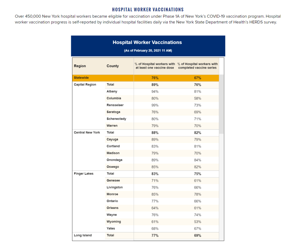
The data situation hasn’t improved since February. New York’s report of vaccine coverage among state hospital workers is still the closest thing we have to occupation reporting. A recent article from EdWeek sheds some light on the issue, citing privacy concerns and a lack of data from vaccine administration sites themselves:
Some state agencies and districts have said privacy concerns prevent them from tracking or publishing teacher vaccination data. Others say vaccine administration sites are not tracking recipients’ occupations and they are not in position to survey employees themselves.
It appears that state and local public health departments were even less prepared to track occupations of vaccine patients than they were to track those patients’ race and ethnicity. But without these numbers, it may take even longer for students to return to classrooms, as evidenced by this quote from Megan Collins, co-director of the Johns Hopkins Consortium for School-Based Health Solutions:
“We’re seeing a substantial disconnect. There are states not prioritizing teachers for vaccine that are fully open for in-person instruction, and others that are prioritizing teachers for vaccines, but aren’t open at all,” Collins said. “If states are going to use teacher vaccinations as a part of the process for safely returning to classrooms, it’s very important then to be able to communicate that information so people know that teachers are actually getting vaccines.”
Biden’s administration has also given schools more money for testing, allocating $650 million in grants to help public schools get access to tests, testing supplies, and logistical assistance. But of course, school testing isn’t being tracked either. New York continues to be the only state that reports detailed data in this area; see our K-12 school data annotations for more info.
On November 18, New York City mayor Bill de Blasio announced that the city’s schools would close until further notice. The NYC schools discrepancy is indicative of an American education system that is still not collecting adequate data on how COVID-19 is impacting classrooms—much less using these data in a consistent manner.
The Johnson & Johnson vaccine has fully dropped—not just in the arms of millions of Americans, but also on state vaccine dashboards. When I updated the CDD’s vaccination data annotations yesterday, I noticed that several states had switched from labeling their shots as “first dose” and “second dose” to labeling them as “first dose” and “completed series,” or something similar. Since the J&J vaccine is only one dose, a single shot from this manufacturer could launch you right into that “completed series” category.
However you label them, the U.S. is now vaccinating about 2.5 million people per day. One in four adults has received at least their first shot. And we crossed the 100-million dose mark on Friday, far earlier than President Biden’s 100-day goal. Meanwhile, cases, deaths, and hospitalizations continue to decline.
These numbers have inspired some guarded optimism, at least on the part of the federal government. On Thursday, Biden announced that he’s directing all states, tribes, and territories to make all adults eligible for vaccination by May 1. Alaska became the first state to reach that milestone this week.
Of course, there’s a big difference between making people eligible and actually getting shots in arms. But vaccine hesitancy is reportedly dropping, as Americans see their family members and friends safely get inoculated. One new poll from NPR/PBS NewsHour/Marist shows that 73% of Black people and 70% of white people said they’re either planning to get vaccinated or have received a shot already.
Variants also continue to be a concern (see Sarah’s section later in this issue). But it’s hard to argue with the fact that millions of our family members, friends, and neighbors are now protected from COVID-19, with more people getting vaccinated every day.
Yesterday, the FDA gave the Janssen—did you know it’s pronounced yahn-sen? I didn’t—vaccine Emergency Use Authorization, allowing it to join the likes of Pfizer and Moderna in the exclusive club of vaccines that may now be distributed in the U.S. Welcome, Janssen. (As a total coincidence I’m wearing my shirt that just says “Vaccines!” on it as I write this.) But the addition of a new vaccine in circulation also brings data reporting questions with few easy answers.
I got to hear the VRBPAC (Vaccines and Related Biological Products Advisory Committee) hold music for the first time on Friday. As I am a full-time student, I couldn’t watch the entire meeting; thus, a lot of this coverage is aided by Helen Branswell and Matthew Herper’s liveblog on STAT News—thank you guys for saving me hours of video to sift through.
The gist of the meeting is that of course it passed the committee vote. I’m pretty sure no one expected it wouldn’t. Katelyn Jetelina, who runs the Your Local Epidemiologist newsletter, certainly didn’t, especially because we knew beforehand that it was 100% effective in preventing hospitalizations and deaths.
However, I did find it interesting that the vote was unanimous—which I wasn’t expecting, given the pattern established by Pfizer and Moderna beforehand. Pfizer passed with 17 pro and 4 against (and 1 abstention); they did not explain their votes in that meeting but authorization for kids aged 16-17 was a sticking point. Moderna passed with 20 pro and 1 abstention; the question—“Based on the totality of scientific evidence available, do the benefits of the Moderna Covid-19 vaccine outweigh its risks for use in individuals 18 years of age and older?”—was worded too broadly, and the abstainer would have preferred to target authorization to high risk populations).
So what changed? Herper noted in the liveblog that the unanimous vote doesn’t necessarily mean this is a better vaccine than Pfizer or Moderna. It was more about panelists’ increased faith in the EUA process. Pfizer and Moderna have been EUA’d for a while and, per Patrick Moore of the University of Pittsburgh, “things are looking good.” Agreed! Now if we could just get it into more deltoids…
But we’re not here for deltoids, we’re here for data. The J&J presentation basically reiterated what we knew with some key statistics: The big Phase 3 study enrolled more than 44,000 participants globally. Across the entire study, the protection efficacy against severe disease was 85%, and that’s including the U.S. and South Africa (important because of variant prevalence in the latter country). No one who got the vaccine was hospitalized or died due to COVID-19. The efficacy against moderate to severe disease was 72% in the US, and 66% across all countries studied. These numbers were similar across ages, comorbidity statuses, sexes, races, and ethnicities. In short: it works.
There is a lack of data in people aged 75 or older. Only 755 people (3.8% of all participants) in this age group received the vaccine in the ENSEMBLE trial, and the FDA noted that it’s hard to interpret such low numbers. As Branswell says in the STAT liveblog, the trial didn’t prove that the vaccine works in older individuals. However, the VRBPAC committee barely touched on this. Either way, it’s been approved for adults 18 and over, and there’s nothing in the recent communications that indicates adults 60 and over aren’t advised to get it.
There are data questions beyond the VRBPAC committee meeting, though. Most vaccination dashboards are set up for a two-dose vaccine; they document how many people have gotten both shots and how many people have gotten just the first. So we don’t really know what’s going to happen when the Janssen vaccine becomes available—will that number factor into “people who have only gotten one dose?” Personally, I think the dashboards are going to have to change to “people who have partially completed dosing regimen” and “people who have completed the dosing regimen,” but knowing the states, it’ll likely be more complicated than that. Drew Armstrong, who runs Bloomberg’s Vaccine Tracker, mentioned in our CDD workshop last week that his team is already calling public health departments in order to discern how their reporting will change.
The question of how the dashboards will change gets more complicated when one considers a sticking point that actually was brought up in the committee meeting: just how many doses Janssen will eventually recommend. This particular petition was for a single dose vaccine. But Janssen has also been testing a two-dose regimen. Dr. Paul Offit, a member of the committee and a vaccine researcher, brought this up and raised a very important question: what if the two-dose regimen works better? What happens then? How is that going to be communicated to the public? How is that going to show up in the dashboards?
It’s tricky. The response, for now, is that the two-dose trial is still double-blinded, and that right now we’re concerned with granting EUA to a single-dose vaccine. The possibility was raised that the two-dose regimen might be what Janssen presents for true-blue FDA authorization. But we’re not there yet.
However, to go back to our dashboard question, let’s entertain for a minute that Janssen sees that the two-dose regimen works demonstrably better than the single-dose regimen. I find it hard to believe that this will come before the single-dose vaccines have started to be administered—and documented in dashboards. What happens to the dashboards then? Even if we assume it’s changed by then to “completed vaccine regimen” vs “partially completed vaccine regimen,” does that mean everyone who got the Janssen vaccine before – and would be counted under “completed regimen”—would have to be moved to “partially completed regimen?”
The ending sentiment seemed to be that the two-dose questions are a bridge we should cross when we get to it. While I sort of agree, I do think it’s worth considering now when it comes to data ramifications. States should be thinking about how they’re going to document this so we’re not blindsided if Janssen and the FDA decide that you need two shots for maximum COVID protection. We have enough data problems as it is, why add more?
Following the end of the federal public health emergency in May, the CDC has lost its authority to collect vaccination data from all state and local health agencies that keep immunization records. As a result, the CDC is no longer providing comprehensive vaccination numbers on its COVID-19 dashboards. But we still have some information about this year’s vaccination campaign, thanks to continued CDC efforts as well as reporting by other health agencies and research organizations.
This week, the FDA authorized Novavax’s updated COVID-19 vaccine. Here’s why some people are excited to get Novavax’s vaccine this fall, as opposed to Pfizer’s or Moderna’s.
I was having a truly lovely evening, hot chocolate in hand, paging through the New York State vaccination dashboard until I realized one glaring absence: Why is there no occupational data for who is getting vaccinated?
This isn’t just a problem with the New York state dashboard. According to our updated annotations on state vaccination data sources, not a single one reports out vaccination by occupation. I suppose I shouldn’t ask for so much—only 36 states report vaccination by race and ethnicity, which I thought was the bare minimum—but I’m used to getting disappointment at this point.
Nihilism aside, here’s why that’s weird. Pretty much everyone is considering one’s occupation into whether they’re eligible for the vaccine or not—hell, that’s how this whole thing started after all. But now that we’ve moved beyond just health care workers getting vaccinated, the data hasn’t kept up.
For example, NYC has included “in-person college instructors” in eligibility for the vaccine since January 11. Wouldn’t it be nice to know just how many in-person professors have gotten vaccinated? It’d sure be helpful if Barnard ever decides to do in-person classes again. Or what about taxi drivers? Again in NYC, because that’s where I live, they became eligible for vaccination on February 2. From a personal standpoint, I’d like to know if I could send my taxi driver to the hospital if my mask slips.
To be fair, we are seeing some occupation-adjacent data. First, a few sources group vaccinations by where the shots were given, like Massachusetts, or by provider type, like Utah. These include shots given in correctional facilities. While it’s not as good as just stating outright which occupations people getting vaccinated have, it could be used as a proxy for something similar. Additionally, New York tracks hospital worker vaccinations, but they don’t differentiate between physicians and other staff. Finally, long-term care facilities are going through a different program, so data for LTC employees usually gets its own category in a lot of states, like in New York again.
But we shouldn’t be satisfied with proxies and incomplete data; I’ve realized my worth since drafting the title for this segment. I—no, we—deserve better. This is critical for understanding vaccine equity and how close we are to restoring “normalcy.” If we don’t know how many taxi drivers or how many college instructors are getting vaccinated, it’s going to be a lot harder to have conversations about when it’s safe to ride in a taxi or attend in-person classes. It’s going to be a lot harder to have conversations about which taxi drivers or which instructors are able to get vaccinated. It’s also important to see just how well pushing taxi drivers to the front of the line works in actually getting them vaccinated. We’ve lifted one barrier, but are there others that we’re missing?
It’s entirely possible that healthcare providers just aren’t used to collecting this kind of data. But it’s still necessary, and right now, it’s just another example of flying blind when we really shouldn’t be.
Following the end of the federal public health emergency in May, the CDC has lost its authority to collect vaccination data from all state and local health agencies that keep immunization records. As a result, the CDC is no longer providing comprehensive vaccination numbers on its COVID-19 dashboards. But we still have some information about this year’s vaccination campaign, thanks to continued CDC efforts as well as reporting by other health agencies and research organizations.
This week, the FDA authorized Novavax’s updated COVID-19 vaccine. Here’s why some people are excited to get Novavax’s vaccine this fall, as opposed to Pfizer’s or Moderna’s.
Drew Armstrong, Bloomberg News‘s senior editor for health care, talked about his work on the publication’s Vaccine Tracker; and Arielle Levin Becker, director of communications and strategic initiatives for the Connecticut Health Foundation, discussed how to navigate COVID-19 race and ethnicity data. Thank you to everyone who attended—we had a great turnout!
For those who couldn’t make it live, you can watch the recording of the session below. You can also check out the slides here. I’m also sharing a brief recap of the workshop in today’s issue.
In next Wednesday’s workshop, we’ll discuss engaging COVID-19 data providers, featuring Liz Essley Whyte (Center for Public Integrity), Tom Meagher (The Marshall Project), and Erica Hensley (independent reporter from Mississippi). If you aren’t registered for the series yet, you can sign up here.
The Bloomberg Vaccine Tracker
In his presentation, Drew Armstrong provided a behind-the-scenes look at Bloomberg’s tracker and shared some advice on analyzing vaccine data more broadly.
“We attempt to capture every vaccine dose that’s reported for COVID-19, every single day, around the world,” he said. In addition to the tracker’s daily updates on vaccine doses distributed and administered, the site also includes information on vaccine contracts between companies and countries—allowing a window into future distribution.
All of the data on the tracker comes from public sources, largely national and state public health departments that share figures via their own dashboards, press conferences, and social media. Like other aspects of pandemic data, these figures can be pretty messy. Every country, and even every state, may have its own definition of an “administered dose” or a “vaccinated individual”—and these definitions are evolving as the rollout progresses.
Armstrong provided one example: Tennessee reports “number of people with 1 dose only” vs. “2 doses,” and moves people from the first category to the second after they receive that second dose. Maryland, on the other hand, reports total people who have received one and two doses; both totals are always growing. It’s difficult to make apples-to-apples comparisons when every jurisdiction is doing something different. If you can, Armstrong said, actually get on the phone with your local official and make sure you understand precisely what the terms on their vaccine reports mean. When the Johnson & Johnson vaccine (which only requires one dose) starts rolling out, this definitional landscape will only get more complicated.
As a result of this messy data landscape, figures for the Bloomberg Vaccine Tracker are compiled manually by a huge team, including reporters from every bureau of the publication. “You have to really get your hands dirty with this data to understand it,” Armstrong said.
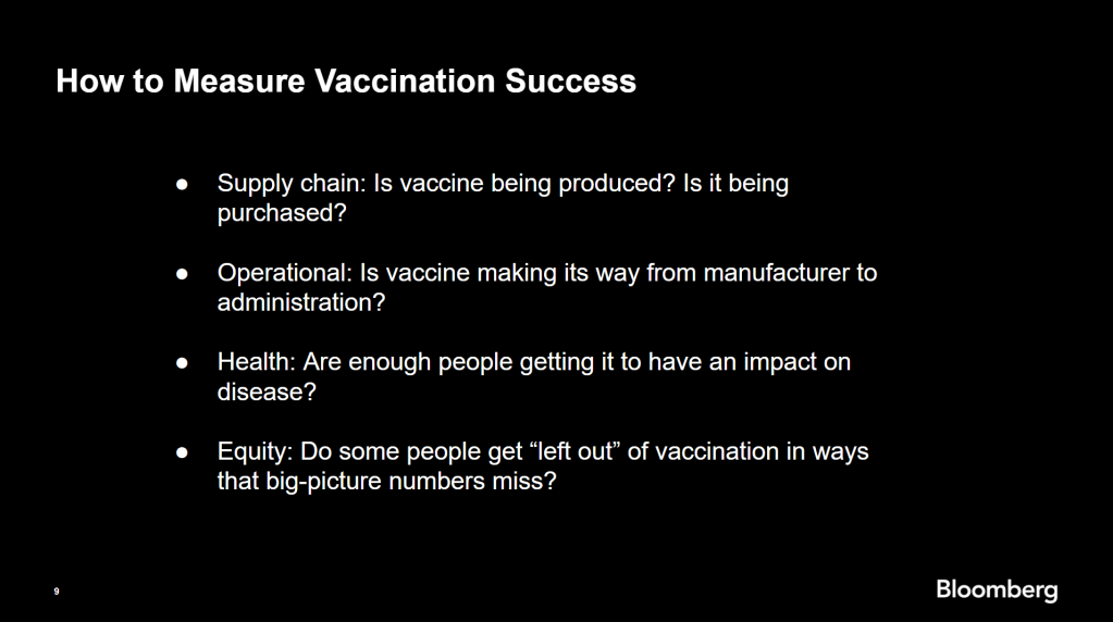
Armstrong also provided four ways for reporters to measure vaccination success. I’m including his slide here because I think it provides a good look at the multifaceted nature of vaccine data analysis and communication; your state might be vaccinating residents at a quick pace, but if the most vulnerable members of your community have been left out, you can’t fully call that rollout a success.
Slide from Drew Armstrong’s talk discussing the Bloomberg Vaccine Tracker.
On the equity front: Armstrong announced that the Bloomberg tracker now includes a demographic vertical. This tracker currently includes data from 27 states and two cities which are reporting vaccinations by race and/or ethnicity—you can check it out here. Bloomberg’s team is planning to update this tracker weekly, adding more states as their data become available.
Armstrong emphasized that he and his colleagues want their tracker to be a resource for other journalists, civic engagement, and other public health communication. “All of our DMs are open,” he said. (Or you can send feedback to the team through a public form.)
He also noted that reporting on these data—or even @-ing your governor on Twitter and asking them why the numbers aren’t better—is a useful way of actually making the data better. By letting public officials know that we’re looking at these numbers and noticing the gaps, we can put the pressure on for changes to be made.
Analyzing sources of race and ethnicity data
In her presentation, Arielle Levin Becker shared some strategies and resources for navigating a new data source—with a focus on demographic data.
“Data is incredibly important—and easy to misuse,” she said at the start of her talk. Vetting a source properly, she explained, can help you understand both how to properly use this source and how to address its limitations in your reporting.
Vetting questions to consider:
Who’s compiling this source?
Who’s funding it?
How transparent are they about their methods? Can you identify how it was compiled, or even track the chain of their methodology?
Do they disclose the limitations of the data?
Similarly to Armstrong, Levin Becker recommended reaching out to a source directly when you have questions. People who compile public data are often “very welcoming” about explaining their work, she said, and may be excited to help you better use their data.
Once you get to the analysis stage, Levin Becker suggested asking another round of questions, such as, “Do the numbers in this source match other numbers from similar sources?” and “How could I explain these numbers in plain English?” One particularly important question, she said, is: “What’s the denominator?” Does this analysis apply to everyone in a state or to a particular subset, like the over-65 population? As we’ve discussed before, denominators can be a particular challenge for COVID-19 school data—without enrollment numbers or clear data definitions, case numbers associated with schools are difficult to interpret.
Levin Becker honed in on age adjustment, a process that’s commonly used in health data analysis to compare outcomes for different populations. It’s kind-of a complicated statistical process, she said, but the basic idea is, you weight your data by the age distribution of a population. White populations tend to skew older than Black and Hispanic/Latino populations, for example; to compare these groups in a more equivalent way, a researcher might calculate what their disease rates would be if the different populations had the same age distribution.
Before the state of Connecticut started age-adjusting its COVID-19 death rates, Levin Becker said, the public health department was boasting that Hispanic/Latino residents of the state were less likely to die from the disease than white residents. But after doing an age adjustment, the state revealed that residents of color were actually at higher risk.
Slide from Arielle Levin Becker’s talk, showing how age adjustment can reveal health disparities. Chart is from the CT health department.
“The median age for a non-Hispanic white resident is 47 years,” Levin Becker said. “For a non-Hispanic Black resident, the median age is 34 years, and for a Hispanic resident, it’s 29 years.”
Finally, of course, there are many instances in which the lack of data is the story. There’s been a big focus on race and ethnicity data for COVID-19 vaccinations, but we’re also still missing data on other pandemic impacts. For example, the federal government and the vast majority of states don’t report COVID-19 tests by race and ethnicity. In a lot of cases, Levin Becker said, healthcare providers simply aren’t required to record the race and ethnicity of their patients—“it hasn’t been prioritized in health systems.”
When the COVID-19 pandemic is no longer an imminent crisis, she said, “keep poking at the questions of what’s being collected and how it’s used.” Continued advocacy by journalists and other communicators can keep the pressure on to improve our race and ethnicity healthcare data—and use it to reveal the disparities that must be fixed.
Related resources
A few links shared in the chat during this session:
I wrote a tipsheet on covering COVID-19 vaccines for The Open Notebook. If you aren’t familiar with it, The Open Notebook is a nonprofit publication that acts as a living manual for science, health, and environmental writers by providing them with tools, resources, and behind-the-scenes looks into how stars in the field do their work.
My new piece provides tools and resources specifically for writers on the vaccine beat—both those who have been covering the pandemic for months and those who are now incorporating vaccine news into other aspects of their reporting. It’s kind-of sequel to a tipsheet that Scientific American EIC Laura Helmuth wrote back in March, when the pandemic was first exploding into the historic news story it is now. I interviewed several experienced COVID-19 reporters, and gathered their advice on navigating all the complications of vaccine communication. I also compiled a list of resources on COVID-19 vaccines (including a few data sources which COVID-19 Data Dispatch readers will recognize).
While the tipsheet is geared towards journalists, much of the advice I gathered also applies more broadly to anyone simply talking about vaccines—whether you’re walking your dad through his vaccination appointment or navigating a friend’s mistrust of the medical system.
Here are a couple of tips that I found particularly valuable. If they resonate with you, too—or if you have other suggestions to share—please let me know! You can reply to this email, leave a comment on the CDD website, or hit us up on Twitter.
Put your numbers in context. When explaining the results of a vaccine trial or discussing dose administration numbers, pick your figures carefully and compare them to something a reader will understand. The best comparison is usually a human one: What does the number mean for an individual person and their community? One example that freelance journalist Maryn McKenna offers: If you’re saying that Operation Warp Speed has contracted 185 million vaccine doses, remind readers that there are about 255 million adults over 18 in the U.S., and the current vaccines on the market require two doses each.
Get specific about immunity. One challenge of explaining how vaccines work, Sarah Zhang says, is conveying the different levels of immunity that they provide. “Biologically, immunity is not all or nothing,” she explains. Tell your readers what it means to be protected from symptoms, from infection, from transmission, from mild versus severe illness, from one variant more than another.
Assign responsibility precisely. Since everyone is watching the vaccine rollout, Drew Armstrong says, journalists can “assume that there’s a deep interest in real and specific problems.” In other words: dig into the details. When you talk to a politician or public health official in your region, tell them exactly what the gap is in your knowledge, and demand that they give you specific answers. Such reporting can allow reporters to identify root problems rather than, say, allowing the governor of New York and the mayor of New York City to blame each other when doses in the city run out.
Remember that some vaccine mistrust is reasonable. Nicholas St. Fleur and McKenna note that some groups that have been hit hardest by COVID-19, such as racial minorities and low-income communities, are also likely to have bad experiences with the U.S. medical system—in many cases, bad experiences that took place during the pandemic itself. “If you’re going to bring up the statistics [on hesitancy], then make sure your next sentence brings up the history,” St. Fleur says. This history includes the oft-cited Tuskegee Syphilis Study, yes, but it also includes the lives of people in the U.S. who have been unable to access the testing and treatment they needed in the past year due to racism that is still systemic in the healthcare system.
Stay calm and keep your work in perspective. Just as vaccination—and the COVID-19 pandemic at large—is a deeply personal topic for many readers, it is a personal topic for many writers. But as communicators of science and health knowledge, we must remember the broader purpose of our work. We can’t let our own emotions drive our reporting. “The facts can be scary and dramatic enough—you don’t need to do more than that,” Armstrong says. André Biernath echoes that sentiment: “Breathe deeply, before you write something that could have a huge impact on public health.”
The CDC continues to improve its vaccination reporting. The agency is now regularly reporting demographic data on its dashboard—including race, ethnicity, age, and sex. You can see counts for both U.S. residents who have received one and two doses. Like the rest of the CDC’s dashboard, the agency is updating these figures every day.
But when it comes to tracking who’s getting vaccinated in America, we still have a long way to go. Now that demographic data are becoming more available at the federal and state levels, equity advocates are pushing for more local data—vaccinations by county, by town, by ZIP code.
New York City data reporter Ann Choi, for example, pointed out on Friday that this city has lagged behind cities such as Chicago and D.C. in releasing ZIP code-level vaccination data, which would allow researchers and journalists to see precisely which neighborhoods are getting more shots. And NYC ZIP codes are precise—I’m literally moving two blocks, but my ZIP code is changing.
Reminder @NYCMayor still has not released vaccination rate at ZIP code level, keeping New Yorkers in the dark. NYC once again lags behind major cities in publishing public health data. https://t.co/m93m4d8JbU
(P.S. Ann will be speaking at the third workshop in the Diving into COVID-19 data series, on March 3, about her work at THE CITY!)
The Biden administration will soon start sending doses directly to Community Vaccination Centers, sites operated in partnership with existing community health clinics in an attempt to capitalize on existing connections that these clinics have in their neighborhoods. In order to judge the success of these clinics, we need data about their communities. Local data, demographic data, occupation data… the more complete picture that we can get, the better.
With more local data, we can do more stories like these:
Following the end of the federal public health emergency in May, the CDC has lost its authority to collect vaccination data from all state and local health agencies that keep immunization records. As a result, the CDC is no longer providing comprehensive vaccination numbers on its COVID-19 dashboards. But we still have some information about this year’s vaccination campaign, thanks to continued CDC efforts as well as reporting by other health agencies and research organizations.
This week, the FDA authorized Novavax’s updated COVID-19 vaccine. Here’s why some people are excited to get Novavax’s vaccine this fall, as opposed to Pfizer’s or Moderna’s.
Since our main stories this week focused on NYC, here are a couple of updates from the federal public health agencies.
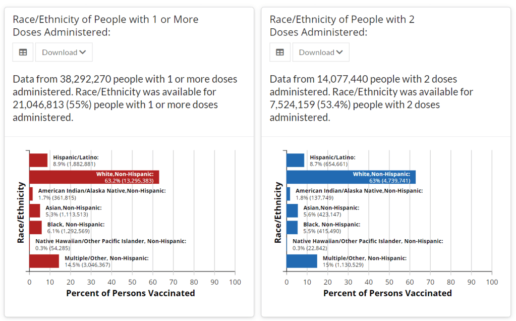
CDC releases demographic vaccination data: This past Monday, the CDC published a MMWR report on characteristics of Americans vaccinated during the first month of our vaccine rollout, December 14 to January 14. Race/ethnicity data are missing for almost half of the vaccinations recorded here, but the existing data show white Americans getting vaccinated at higher rates than Black and Hispanic/Latino Americans.
CDC vaccination dashboard now includes time series: As of Thursday, the CDC’s COVID Data Tracker now includes a page called “Vaccination Trends,” which shows daily counts of total doses administered, people receiving 1 dose, and people receiving 2 doses. The doses are assigned to the date they’re administered, not the date they’re reported, so they may not match time series on other dashboards. Time series aren’t yet available for individual states.
U.S. Department of Education surveying COVID-19’s impact for students: On Friday, the Department of Education announced that the Institute of Education Sciences would collect “vital data on the impact of COVID-19 on students and the status of in-person learning.” Data gathered in the survey will include the share of America’s schools that are open in-person vs. remote, enrollment by various demographic metrics, attendance rates, and information on the logistics of in-person and remote instruction. Notably, the survey does not promise to collect data on COVID-19 cases, hospitalizations, and deaths associated with K-12 schools.
At-home tests are coming: This week, the White House announced that the new administration has contracted with diagnostic company Ellume and six other suppliers to produce tens of millions of at-home tests by the end of the summer. Ellume’s test is an antigen test, and, though the other test suppliers haven’t yet been announced, we can assume they also make antigen or rapid nucleic acid amplification tests; neither test type is currently reported by the federal government. If these tests do become a significant part of America’s COVID-19 response—and some experts are skeptical that this will happen—a major change in test reporting practices will be needed.
Last week, Janssen, a pharmaceutical division owned by megacorp Johnson & Johnson, released results for its phase 3 ENSEMBLE study. The Janssen vaccine uses an adenovirus vector (a modified common cold virus that delivers the DNA necessary to make the coronavirus spike protein), can be stored at normal fridge temperatures, and only requires one dose. Here’s a table of the raw numbers from Dr. Akiko Iwasaki of Yale:
A single-shot J&J Janssen COVID19 vaccine phase 3 results summarized in one table. Great news! Imagine being 💯 protected from death 28 days after a single shot, and 💯 protected from severe disease after 49 days – against all variants. https://t.co/gGCcDbMglrpic.twitter.com/gPCDgG8oNJ
At first glance it does look like it’s “less effective” than the mRNA vaccines from Moderna and Pfizer. But, when you look at the severe disease, there’s a 100% decrease in deaths. No one who got the J&J vaccine died of coronavirus, no matter where they lived— including people who definitely were diagnosed with the South African B.1.351 variant. Here’s how that compares with the Moderna, AstraZeneca, Pfizer, and Novavax vaccines, per Dr. Ashish Jha of Brown:
Am often asked about different vaccines and their efficacy
Each trials tracks, reports efficacy differently
Currently, we have preliminary results for Novavax and J&J
But what numbers matter? What should you look for?
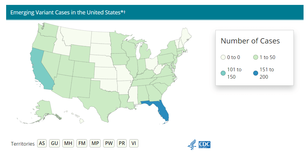
Nobody who got any of the vaccine candidates was hospitalized or died from COVID-19. That’s huge, especially as variants continue to spread across the U.S. (Here’s the updated CDC variant tracker.)
J&J’s numbers are especially promising when it comes to variant strains. Moderna and Pfizer released their results before the B.1.1.7 (U.K.) or B.1.351. (S.A.) variants reached their current notoriety, which makes J&J’s overall efficacy numbers look worse by comparison. But the fact that no one who got the J&J vaccine was hospitalized no matter which variant they were infectedwith is a cause for optimism. (B.1.351 is the variant raising alarms for possibly being able to circumvent a vaccine’s protection due to a helpful mutation called E484K. A Brazilian variant, P1, also has this mutation, though there’s not a lot of research on vaccine efficacy for this particular mutant.)
It also means that vaccination needs to step up. While it may seem counterintuitive to step up vaccinations against variants that can supposedly circumvent them, it’s important to note that there still was a significant decrease in COVID-19 cases in vaccinated patients from South Africa. A 57% drop compared with the 95% prevalence of the B.1.351 still suggests that vaccination can prevent these cases, and thus can seriously slow the spread of the variant.
What does all of this mean for COVID-19 rates? We can infer a few things. For starters, when vaccines are distributed to the general public around April or May, we may see hospitalization rates and death rates drop more than positive test rates. Positive test rates should obviously drop too, but they’ll probably stay at least a little higher than hospitalizations and death rates for a while.
Second, it means that we really need to ramp up sequencing efforts in the U.S.. We need more data to tell us just how well these vaccines can protect against the spreading variants, but we can’t collect that data if we don’t know which strain of SARS-CoV-2 someone gets. We here at the CDD have covered sequencing efforts – or lack thereof – before, but the rollout has still been painfully slow. CDC Director Rochelle Walensky stressed that “we should be treating every case as if it’s a variant during this pandemic right now,” during the January 29 White House coronavirus press briefing. But the6,000 sequences per week she’s pushing for as of the February 1 briefing should have been the benchmark months ago. We’re still largely flying blind until we can get our act together.
Some states in particular may be flying blinder than others. As Caroline Chen wrote in ProPublica yesterday, governors of New York, Michigan, Massachusetts, California, and Idaho are planning to relax more restrictions, including those on indoor dining. Such a plan is probably the perfect way to ensure these variants spread, so much that even Chen was surprised at how pessimistic the outlook was when she asked 10 scientists for the piece.
The B.1.1.7 variant is expected to become the dominant strain in the U.S. by March, according to the CDC. And on top of that, the B.1.1.7 variant seems to have picked up that helpful E484K mutation in some cases as well. Per Angela Rasmussen of Georgetown University, if these governors don’t realize how much they’re about to screw everything up, “the worst could be yet to come.” God help us.