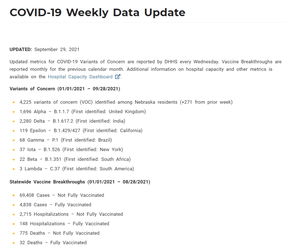
On June 30, Nebraska’s public health department discontinued its COVID-19 dashboard. The dashboard had provided daily updates for cases, deaths, vaccinations, and other metrics. After June 30, it was replaced with a stripped-down “Weekly Data Update,” providing a few major metrics, such as the cases reported and vaccine doses administered in the past week. This update is posted every Wednesday.
When I checked on Nebraska yesterday for an update of my vaccine annotations page, I was shocked to find that the state’s Weekly Update has been pared down even further. It now includes just two metrics: variants of concern and vaccine breakthroughs. Nebraska’s health department is reporting: 1) the total cases identified as variants of concern in the state, and 2) total cases, hospitalizations, and deaths split by “fully vaccinated” and “not fully vaccinated.”
This is literally the entire report. Screenshot taken on October 3.
Compared to the detailed dashboard this state used to produce, this weekly update is incredibly sparse. It reminds me of a state COVID-19 data page from the early days of the pandemic—like, March 2020. If any local journalists from Nebraska are reading: I am so sorry.
State vaccination reporting: Yesterday, I updated the COVID-19 Data Dispatch page detailing how every state is tracking vaccination. Notably, 15 states now include counts of third doses (or “additional doses,” or “booster shots”) in their vaccine dashboards and reports. A couple of those states (Colorado, Mississippi, New Jersey) are even reporting demographic breakdowns of the residents that have received third doses. I expect that more states will add these metrics to their vaccine reports in the coming weeks.
COVID-19 cases and deaths, urban vs. rural counties: A new report from the RUPRI Center for Rural Health Policy Analysis at the University of Iowa demonstrates the disproportionate impact that COVID-19 is now having on rural communities. The rate of COVID-19 deaths in rural areas is now twice what it is in urban areas. For context about and data visualizations sourcing this report, see this KHN article by Lauren Weber.
School District Operational Status: Research organization MCH Strategic Data has compiled detailed data on the operational status of school districts across the country—fully in-person, fully remote, or hybrid. The dashboard also includes information on school mask policies and summary data by state. (H/t Your Local Epidemiologist.)
State-level analysis of charter school trends: The National Alliance for Public Charter Schools analyzed changes to school enrollment in every state during the 2020-2021 school year, focusing on drops in district public school enrollment and rises in charter school enrollment. Oklahoma had the highest charter school gain, with a whopping 78% enrollment increase.
This week, we have a couple of source updates and a couple of additional data news items.
Pediatric data from the CDC: In a rather timely update, the CDC has added a pediatric data tab to its COVID Data Tracker dashboard. The new page links to all the data on COVID-19 and kids that the agency has available: including multisystem inflammatory syndrome in children (MIS-C), demographic data for vaccinations and hospitalizations, and COVID-19 outcomes during pregnancy.
Additional vaccine doses (also CDC): The CDC recently added an important new field to the vaccination page of its dashboard: people who received an additional vaccine dose. This includes about 1.3 million people as of September 4. The count started on August 13, when the CDC’s vaccine advisory committee endorsed additional shots for immunocompromised Americans—though the CDC’s dashboard doesn’t distinguish between those additional dose recipients who are and are not immunocompromised, according to their “about the data” page.
More states pull back on COVID-19 reporting: Here at the CDD, we love to call out states that stop reporting key COVID-19 data points or make that reporting less frequent. A new article from KHN’s Andy Miller speaks to this trend, which has continued in recent weeks despite the Delta surge. The article specifically calls out government websites in Georgia, which stopped updating public data on COVID-19 in prisons and long-term care facilities “just as the dangerous Delta variant was taking hold,” Miller reports.
New study provides rigorous evidence that masks work: On Wednesday, authors of a randomized control trial study—the gold standard of scientific research—shared their findings in a preprint. The study investigated mask use by providing different levels of free mask supplies and promotion to different villages in Bangladesh. Villages that received the masks and learned about their use had fewer COVID-19 cases, with the villages that received surgical masks (as opposed to cloth masks) seeing the biggest impact. This study is a pretty big deal, with one commenter calling it “arguably the most important single piece of epidemiological research of the entire pandemic.” For more context, see this Washington Post article.
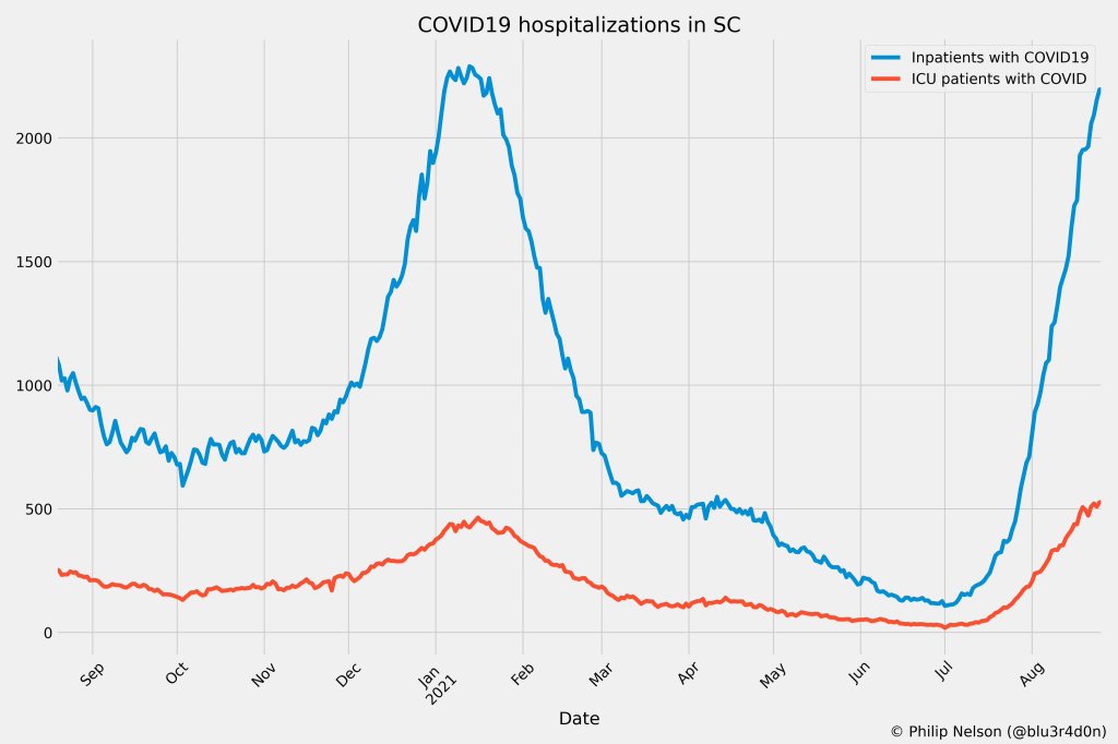
If you post in the COVID-19 data Twitter-sphere, you’re likely familiar with Philip Nelson, a computer science student at Winthrop University—and an expert in navigating and sharing data from the state of South Carolina. Philip posts regular South Carolina updates including the state’s case counts, hospitalizations, test positivity, and other major figures, and contributes to discussions about data analysis and accessibility.
I invited Philip to contribute a post this week after reading his Tweets about his ongoing challenges in accessing his state’s hospitalization data. Basically, after Philip publicized a backend data service that enabled users to see daily COVID-19 patient numbers by individual South Carolina hospital, the state restricted this service’s use—essentially making the data impossible for outside researchers to analyze.
To me, his story speaks to broader issues with state COVID-19 data, such as: agencies adding or removing data without explanation, a lack of clear data documentation, failure to advertise data sources to the public, and mismatches between state and federal data sources. These issues are, of course, tied to the systematic underfunding of state and local public health departments across the country, making them unequipped to respond to the pandemic.
South Carolina seems to be particularly arduous to deal with, however, as Philip describes below.
I’ve been collecting and visualizing South Carolina-related COVID-19 data since April 2020. I’m a computer science major at Winthrop University, so naturally I like to automate things, but collecting and aggregating data from constantly-changing data sources proved to be far more difficult than I anticipated.
At the beginning of the pandemic, I had barely opened Excel and had never used the Python library pandas, but I knew how to program and I was interested in tracking COVID-19 data. So, in early March 2020, I watched very closely as the South Carolina Department of Health and Environmental Control (DHEC) reported new cases.
During the early days of the pandemic, DHEC provided a single chart on their website with their numbers of negative and positive tests; I created a small spreadsheet tracking these cases. After a few days, DHEC transitioned to a dashboard that shared county level data.
On March 23, I noticed an issue with the new dashboard. Apparently, someone had misconfigured authentication on something in the backend. (When data sources are put behind authentication, anyone outside of the organization providing that source loses access.) The issue was quickly fixed and I carried on with my manual entry, but this was not the last time I’d have to think about authentication.
Initially, I manually entered the number of cases and deaths that DHEC reported. I thought I might be able to use the New York Times’ COVID-19 dataset, but after comparing it to the DHEC’s data, I decided that I’d have to continue my own manual entry.
South Carolina’s REST API
In August 2020, I encountered some other programmers on Twitter who had discovered a REST API on DHEC’s website. REST is a standard for APIs that make it easier for developers to use services on the web. In this case, I was able to make simple requests to the server and receive data as a response. After starting a database fundamentals course during the fall 2020 semester, I figured out how to query the service: I could use the data in the API to get cases and deaths for each county by day.
This API gave me the ability to automate all of my update processes. By further exploring the ArcGIS REST API website, I realized that DHEC had other data services available. In addition to county-level data, the agency also provided an API for cases by ZIP code. I used these data to create custom zip code level graphs upon request, and another person I encountered built a ZIP code map of cases.
During August 2020, the CDC stopped reporting hospitalization data and the federal government shifted to using data collected by the Department of Health and Human Services (HHS) and Teletracking. DHEC provided a geoservice for hospitalizations, based off of data provided to DHEC by Teletracking on behalf of the HHS. I did some exploration of the hospitalization REST API and found that the data in this API was facility-level (individual hospitals), updated daily. I aggregated the numbers in the API based on the report date in order to provide data for my hospitalization graph. At the time, I didn’t know that the federal government does not provide daily facility level data to the public.
In October 2020, DHEC put their ZIP code-level API behind authentication. I voiced my displeasure publicly. In late December 2020, DHEC put the API that contained county level cases and deaths behind authentication. At this point, I began to get frustrated with DHEC for putting things behind authentication without warning, but I kind-of gave up on getting the deaths data out of an API. Thankfully, DHEC still provided an API for confirmed cases, so I switched my scripts to scrape death data from PDFs provided by DHEC each day. I didn’t like using the PDFs because they did not capture deaths that were retroactively moved from one date to another, unlike the API.
I ran my daily updates until early June 2021, when DHEC changed their reporting format to a weekday-only schedule. I assumed that we’d seen the last wave of the pandemic and that, thanks to readily available vaccines, we had relegated the virus to a containable state. Unfortunately, that was not the case — and by mid-July, I had resumed my daily updates.
Hospitalization data issues
In August 2021, people in my Twitter circle became interested in pediatric data. I decided to return to exploring the hospitalization API because I knew it had pediatric-related attributes. It was during that exploration that I realized I had access to daily facility-level data that the federal government was not providing to the public; the federal government provides weekly facility-level data. My first reaction was to build a Tableau dashboard that let people look at the numbers of adults and pediatric patients with COVID19 at the facility level in South Carolina over time.
After posting that dashboard on Twitter, I kept hearing that people wanted a replacement for DHEC’s hospitalization dashboard which, at the time, only updated on Tuesdays. So, I made a similar dashboard that provided more information and allowed users to filter down to specific days and individual hospitals, then I tweeted it at DHEC. Admittedly, this probably wasn’t the smartest move.
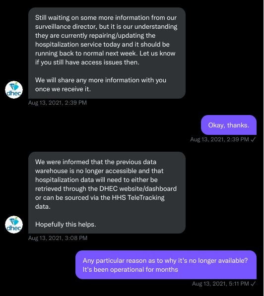
I kept exploring the hospitalization data and found that it contained COVID-19-related emergency department visits by day, another data point provided weekly by HHS. After plotting out the total number of visits each day and reading the criteria for this data point, I decided I needed to make another dashboard for this. A day after I posted the dashboard to Twitter, DHEC put the API I was using behind authentication, again I tweeted my frustration.
A little while later, DHEC messaged me on Twitter and told me that they were doing repairs to the API. I was later informed that the API was no longer accessible, and that I would have to use DHEC’s dashboard or HHS data. The agency’s dashboard does not allow data downloads, making it difficult for programmers to use it as a source for original analysis and visualization.
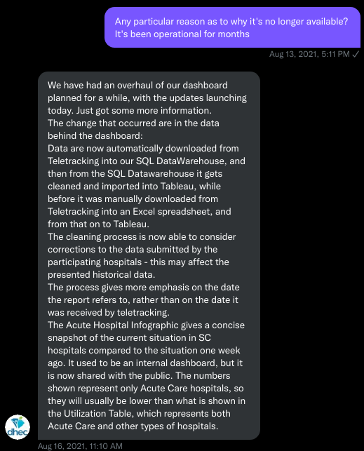
I asked for information on why the API was no longer operational; DHEC responded that they had overhauled their hospitalization dashboard, resulting in changes to how they ingest data from the federal government. This response did not make it clear why DHEC needed to put authentication on the daily facility-level hospitalization data.
Twitter conversation between Philip and the South Carolina DHEC, shared by Philip.
Meanwhile, DHEC’s hospital utilization dashboard has started updating daily again. But after examining several days’ worth of data, I cannot figure out how the numbers on DHEC’s dashboard correlate to HHS data. I’ve tried matching columns from a range dates to the data displayed, but haven’t been able to find a date where the numbers are equal. DHEC says the data is sourced from HHS’ TeleTracking system on their dashboard, but it’s not immediately clear to me why the numbers do not match. I’ve asked DHEC for an explanation, but haven’t received a response.
Lack of transparency from DHEC
I’ve recently started to get familiar with the process of using FOIA requests. In the past week, I got answers on requests that I submitted to DHEC for probable cases by county per day. This data is publicly accessible (but not downloadable) via a Tableau dashboard, but there is over 500 days’ worth of data for 46 counties. The data DHEC gave to me through the FOI process are heavily suppressed and, in my opinion, not usable.
This has been quite a journey for me, especially in learning how to communicate and collect data. It’s also been a lesson in how government agencies don’t always do what we want them to with data. I’ve learned that sometimes government agencies don’t always explain (or publicize) the data they provide, and so the job of finding and understanding the data is left to the people who know how to pull the data from these sources.
It’s also been eye-opening to understand that sometimes, I’m not going to be able to get answers on why a state-level agency is publishing data that doesn’t match a federal agency’s data. Most of all, it’s been a reminder that we always need to press government-operated public health agencies to be as transparent as possible with public health data.
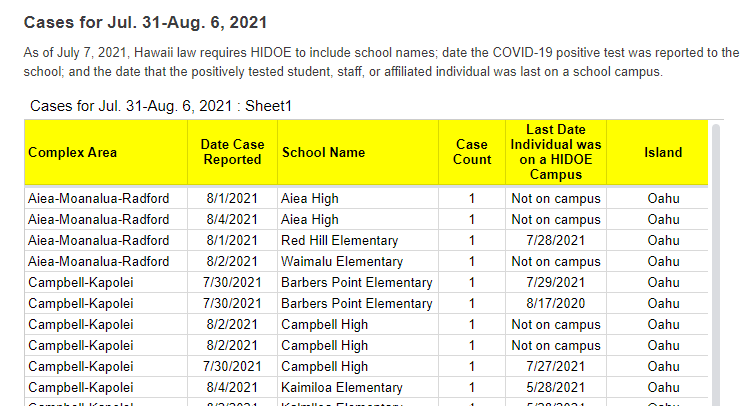
A snippet of Hawaii’s new-and-improved school COVID-19 case reporting. Screenshot taken on August 8.
As noted in our “Opening” project intro, many states have paused their school COVID-19 case reporting for the summer—and a few have stopped reporting school cases entirely. Hawaii appears to be an exception: this state actually improved its reporting for the new school year.
Where the state previously just reported total cases for each island (or county) of Hawaii, it’s now reporting cases by individual school. Hawaii also reports the date a case was reported and the last date that the COVID-positive individual was on campus.
It’s still not perfect; ideally, Hawaii would also give us in-person enrollment or other numbers to contextualize these cases. But it’s a big improvement, useful for both Hawaii public school families and researchers like yours truly. Thanks Hawaii!
It’s impossible to overstate how controversial school reopening has become in the U.S. this past year. After a spring of universal Zoom school, the country diverged: some administrators, parents, and scientists were determined to get kids back in classrooms, while others prioritized COVID-19 safety above all else.
Reopening debates have dominated headlines. In August 2020, images of maskless crowds in Georgia’s Cherokee County School District went viral on social media — and the school quarantined hundreds of students just one week after the semester started. That same month In New York City, teachers brought handmade coffins and a guillotine to a protest against Mayor Bill de Blasio’s reopening plan. Chicago’s schools remained closed through the fall, and the teachers union narrowly avoided a strike during reopening negotiations in early 2021. And districts like Brookline, a liberal Massachusetts suburb, saw parents who are health experts feud with teachers over social distancing, vaccinations, and more.
The divided communities made the news — but not all U.S. schools were fighting grounds. In fact, many districts managed to bring the majority of their students back into classrooms without breeding a dreaded COVID-19 outbreak.
Here, at the COVID-19 Data Dispatch, we’re sharing stories from five such communities. The series will be published in installments: one profile a week for the next five weeks, followed by a conclusion with overall insights and lessons for fall 2021.
This project fits into a school of reporting called “solutions journalism.” Rather than focusing on uncovering society’s problems, this type of journalism seeks to identify and uplift responses to these problems. In other words, instead of asking, “Why was it so hard to reopen schools in the U.S?”, the CDD is asking, “Which schools did reopen, and what made them successful?”The Solutions Journalism Network — which, as you may guess from the name, is a nonprofit that supports solutions journalism — provided the CDD with a grant to pursue this project, as well as trainings and other guidance.
Identifying districts that reopened
Before introducing you to the five districts that we profiled, let’s talk methodology, also known as how these districts were selected for the project. As we’ve discussed at length here at the CDD, there’s a lack of good data on COVID-19 cases in schools. The country is approaching a fourth pandemic semester, but the federal government still does not provide comprehensive information on how many students are attending public school in person or how many of them have contracted the virus. And while the majority of states provide some data on this topic, these data are scattered and unstandardized — and some states have even gotten worse at their reporting since the 2020-2021 school year ended.
So, to identify success stories for this project, we relied on two main sources. First, we used a database which tracks in-person attendance change at school districts across the country, covering approximately 94% of districts across 98% of U.S. counties. These data come from SafeGraph, a company that aggregates location data from cell phones; this database was also used in a March 2021 Nature paper on disparities in school closures. Using the SafeGraph data, we could see which districts had high in-person traffic numbers in spring 2021 compared to shutdowns during spring 2020, indicating that the majority of students returned.
It’s important to establish here that the aim of this data analysis was not to identify the districts that had the biggest in-person comebacks or to do any kind of comprehensive ranking. Instead, we looked for outliers: districts that had a larger attendance change than the schools around them.
This geography-based method was important because the 2020-2021 school year looked very different from one state to the next. For example, in New York City, just over one-third of public school families attended school in-person before June 2021, per the New York Times. Meanwhile, in Texas, the majority of schools had at least 70% of students back in-person by spring 2021, according to data from the state department of health.
!function(){“use strict”;window.addEventListener(“message”,(function(e){if(void 0!==e.data[“datawrapper-height”]){var t=document.querySelectorAll(“iframe”);for(var a in e.data[“datawrapper-height”])for(var r=0;r<t.length;r++){if(t[r].contentWindow===e.source)t[r].style.height=e.data["datawrapper-height"][a]+"px"}}}))}();
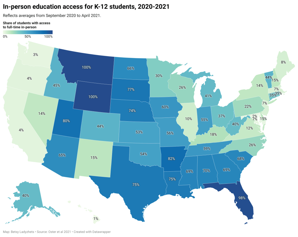
You can see the variation in the map above, based on a study published in the Centers for Disease Control and Prevention’s Morbidity and Mortality Weekly Report earlier this summer. According to this analysis, every single student in Montana and Wyoming had access to in-person learning five days a week, between September 2020 and April 2021, while in Maryland, just 2.3% of students had that access during the same period.
Comparing COVID-19 case numbers
After using the SafeGraph dataset to identify outliers in a given state, we used data from state public health departments to identify districts’ COVID-19 case numbers. This step restricted the analysis to states that provided a.) COVID-19 case data by individual district and b.) data for the entire school year. Few states meet both of these criteria. It’s no coincidence that New York and Texas — also the only two states providing in-person enrollment numbers — are both represented among the five focus districts of this project.
!function(){“use strict”;window.addEventListener(“message”,(function(e){if(void 0!==e.data[“datawrapper-height”]){var t=document.querySelectorAll(“iframe”);for(var a in e.data[“datawrapper-height”])for(var r=0;r<t.length;r++){if(t[r].contentWindow===e.source)t[r].style.height=e.data["datawrapper-height"][a]+"px"}}}))}();
!function(){“use strict”;window.addEventListener(“message”,(function(e){if(void 0!==e.data[“datawrapper-height”]){var t=document.querySelectorAll(“iframe”);for(var a in e.data[“datawrapper-height”])for(var r=0;r<t.length;r++){if(t[r].contentWindow===e.source)t[r].style.height=e.data["datawrapper-height"][a]+"px"}}}))}();
Over the next few weeks, you’ll learn about how schools from rural Indiana to New York City faced the challenge of bringing kids back to classrooms while keeping their communities safe. Some took advantage of novel COVID-19 technologies, such as tests and ventilation updates. But others utilized less technical strategies such as personalized communication with parents and close collaboration with local public health officials.
As the Delta variant intensifies reopening challenges for this coming fall, the stories of these five communities tell us that virus cases can be kept down during in-person learning if administrators, teachers, and families all work together.
These schools are:
Scott County School District 1 in Austin, Indiana
Garrett County Public Schools in Garrett County, Maryland
Andrews Independent School District in Andrews, Texas
Brooklyn Arts and Science Elementary School in Brooklyn, New York
Port Orford-Langlois School District 2CJ in Curry County, Oregon
The COVID-19 Data Dispatch’s “Opening” series is available for other publications to republish, free of charge. If you or your outlet is interested in publishing any part of this series, please contact betsy@coviddatadispatch.com.
On November 18, New York City mayor Bill de Blasio announced that the city’s schools would close until further notice. The NYC schools discrepancy is indicative of an American education system that is still not collecting adequate data on how COVID-19 is impacting classrooms—much less using these data in a consistent manner.
Vaccination rates by county, included in the July 8 HHS Community Profile report. Note the missing data for Texas.
Anyone who’s tried to work with the federal government’s vaccination data has noticed this issue: there’s a Texas-shaped hole in the numbers.
While the CDC and HHS report vaccination data for counties and metropolitan areas in the vast majority of states, data are missing for the entire state of Texas. Data are also incomplete for several other states, including Colorado, Nebraska, and Virginia.
What’s up with Texas? A reporter friend recently asked me this question, inspiring me to look into the issue. There’s limited information directly on the CDC dashboard; a vague note in the Community Profile Reports simply notes that several states have “ ≤80% completeness reporting vaccinations by county,” including Texas at 0%—implying that the states, rather than the federal agency, is at fault.
A great article by Houston Chronicle reporter Kirkland An dives into the precise issue. An cites a CDC page on county-level vaccination data reporting, which says that, “Texas provides data that are aggregated at the state level and cannot be stratified by county.” (I later realized that this page is linked in incredibly tiny text at the very bottom of the CDC’s dashboard—classic.)
Why is Texas providing state-level data? The answer, it turns out, lies with a unique state law:
When asked about the lack of data, Douglas Loveday, a press officer with the Texas Department of State Health Services (DSHS), said, “State statute prevents us from sharing person-level immunization data.”
Texas Health and Safety Code Sec. 161.0073 states that DSHS “may not release registry information to any individual or entity without the consent of the individual or the individual’s legally authorized representative.” There are exceptions to the rule, specifically reporting “non-identifying summary statistics.” But reporting individual records to the CDC, even if they have been stripped of identifying information, is not one of the exceptions granted by the code.
In other words: almost every other state submits anonymous, line-level vaccination data to the CDC. Each line in the dataset represents one vaccinated individual, including their county of residence and other demographic information. The CDC aggregates this line-level information into the county-level statistics published on its dashboard. But Texas is prohibited from sending this type of individual data outside of the state without individual consent, so Texas is missing from the CDC data.
Texas’ health agency does compile its own county-level vaccination data, which are available on the Texas COVID-19 vaccine dashboard. But most public health researchers (and journalists like yours truly) rely on the CDC’s standardized, national datasets—leaving Texas out of many important analyses on the vaccine rollout.
An reports that Texas’s agency does send the CDC aggregated county-level data; it’s just organized by vaccine provider, instead of by county of residence for vaccine recipients. The national agency is working with Texas to switch to county-of-residence reporting so that the state may appear in national datasets without breaking state law. Hopefully, that Texas-sized hole in the data may be filled soon.
(It’s unclear whether similar efforts are underway for a Hawaii-sized hole in the same dataset; the CDC currently reports that Hawaii “does not provide CDC with county-of-residence information.”)
The new recommendations prioritize getting kids into classrooms, even when schools aren’t able to implement all prevention strategies. They also prioritize vaccination; the CDC says that all teachers and students over age 12 should get vaccinated, and those individuals who get their shots don’t need to wear masks at school.
This guidance adds to growing evidence that the majority of America’s K-12 schools will be fully open in the fall. Some areas that were bastions of remote learning—like New York City, where I live—will no longer allow that option.
But there’s a big problem with this trend: we still do not have good data on COVID-19 in schools. I’ve written about this issue extensively; over a year into the pandemic, there’s still no federal dataset on cases that have arisen in COVID-19 schools, and state reporting is incredibly fragmented. If this situation continues into next fall, we will be ill-equipped to understand which safety measures are working best in a fully reopened America—and to protect the young children who are not yet eligible for vaccination.
Throughout the 2020-2021 school year, the COVID-19 Data Dispatch has maintained a set of annotations on school COVID-19 data. I updated these annotations yesterday after a couple of months’ hiatus. I found that, in some locations, reporting is even worse than it was in the spring.
Here are a few highlights:
A number of states have paused their K-12 COVID-19 reporting for the summer, as schools are on break. These states include Alabama, Connecticut, Idaho, Louisiana, Mississippi, the Dakotas, Tennessee, Washington, and West Virginia.
A couple of other states (Maine, Montana) appear to have paused this reporting, but did not include clear language on their dashboard to back this up.
South Carolina and Delaware both stopped reporting for the summer, with notes on their dashboards indicating that the state health departments have not yet decided whether to resume reporting in the fall. Delaware’s note is particularly ominous.
Florida stopped providing regular school COVID-19 reports in early June, when the state discontinued its dashboard and switched to providing a single weekly report for all state data.
Both Arkansas and Iowa discontinued their school COVID-19 pages during the spring, with no indication that reporting will resume in the future.
Another major update to the CDC’s guidance, from my perspective, was a new emphasis on screening tests. The CDC now recommends regular COVID-19 tests for unvaccinated students and teachers, and for those taking part in school athletics and other higher-risk activities.
I was glad to see this update because my reporting on rapid tests—including an upcoming piece on rapid testing in schools—has led me to believe that this type of testing is a key strategy for avoiding school outbreaks. But it’s another area where good data are lacking right now. New York continues to be the only state reporting school testing numbers; and from the looks of other state dashboards, they don’t appear prepared to track these key data at a systematic level.
Delta is increasingly hitting younger populations, including children not old enough to be vaccinated. The CDC’s guidance encourages schools to bring these kids into classrooms, but it puts a lot of pressure onto individual districts at a time when they need more support, as Dr. Katelyn Jetelina points out in a recent Your Local Epidemiologist post.
The guidance also says literally nothing about data collection and reporting. I worry that, if we don’t get better data infrastructure in place for schools, we could miss Delta outbreaks this fall.
Also: this feels like a good time to announce that I’m currently working on a big project covering school reopening. I’m identifying and profiling districts that successfully brought their students back into classrooms, supported with a grant from the Solutions Journalism Network. The stories will be published here in the COVID-19 Data Dispatch starting in August.
On November 18, New York City mayor Bill de Blasio announced that the city’s schools would close until further notice. The NYC schools discrepancy is indicative of an American education system that is still not collecting adequate data on how COVID-19 is impacting classrooms—much less using these data in a consistent manner.
Washington is one of the states reporting high levels of detail about breakthrough cases. Screenshot via June 23 report.
For the past few months, we’ve been watching the vaccines and variants race in real time. With every new case, the coronavirus has the opportunity to mutate—and many scientists agree that it will inevitably mutate into a viral variant capable of outsmarting our current vaccines.
How will we know when that happens? Through genomic surveillance, examining the structure of coronavirus lineages that arise in the U.S. and globally. While epidemiologists may consider any new outbreak a possible source of new variants, one key way to monitor the virus/variant race is by analyzing breakthrough cases—those infections that occur after someone has been fully vaccinated.
In May, the CDC changed how it tracks breakthrough cases: the agency now only investigates and reports those breakthrough cases that result in hospitalizations or deaths. I wrote about this in May, but a new analysis from COVID Tracking Project alums and the Rockefeller Foundation provides more detail on the situation.
A couple of highlights from this new analysis:
15 states regularly report some degree of information about vaccine breakthroughs, some including hospitalizations and deaths.
Six states report sequencing results identifying viral lineages of their breakthrough cases: Nebraska, Arkansas, Alaska, Montana, Oregon, and Washington.
Washington and Oregon are unique in providing limited demographic data about their breakthrough cases.
Several more states have reported breakthrough cases in isolated press briefings or media reports, rather than including this vital information in regular reports or on dashboards.
When the CDC stopped reporting breakthrough infections that did not result in severe disease, the number of breakthrough cases reported dropped dramatically.
We need more data collection and reporting about these cases, on both state and federal levels. Better coordination between healthcare facilities, laboratories, and public health agencies would help.
Vaccine breakthrough cases are kind-of a data black box right now. We don’t know exactly how many are happening, where they are, or—most importantly—which variants they’re tied to. The Rockefeller Foundation is working to increase global collaboration for genomic sequencing and data sharing via a new Pandemic Prevention Institute.
Luckily, there is a lot we do know from another side of the vaccine/variant race: vaccine studies have consistently brought good news about how well our current vaccines work against variants. The mRNA vaccines in particular are highly effective, especially after one has completed a two-dose regimen. If you’d like more details, watch Dr. Anthony Fauci in Thursday’s White House COVID-19 briefing, starting about 14 minutes in.
New research, out this week, confirmed that even the one-shot Johnson & Johnson vaccine works well against the Delta variant. The company reported that, after a patient receives this vaccine, blood antibody levels are high enough to beat off an infection from Delta. In other words, people who got the J&J shot do not need to rush to get a booster shot from an mRNA vaccine (a recent debate topic among some experts).
Again, we’ll need more genomic surveillance to carefully watch for the variant that inevitably does beat our vaccines. But for now, the vaccinated are safe from variants—and getting vaccinated remains the top protection for those who aren’t yet.
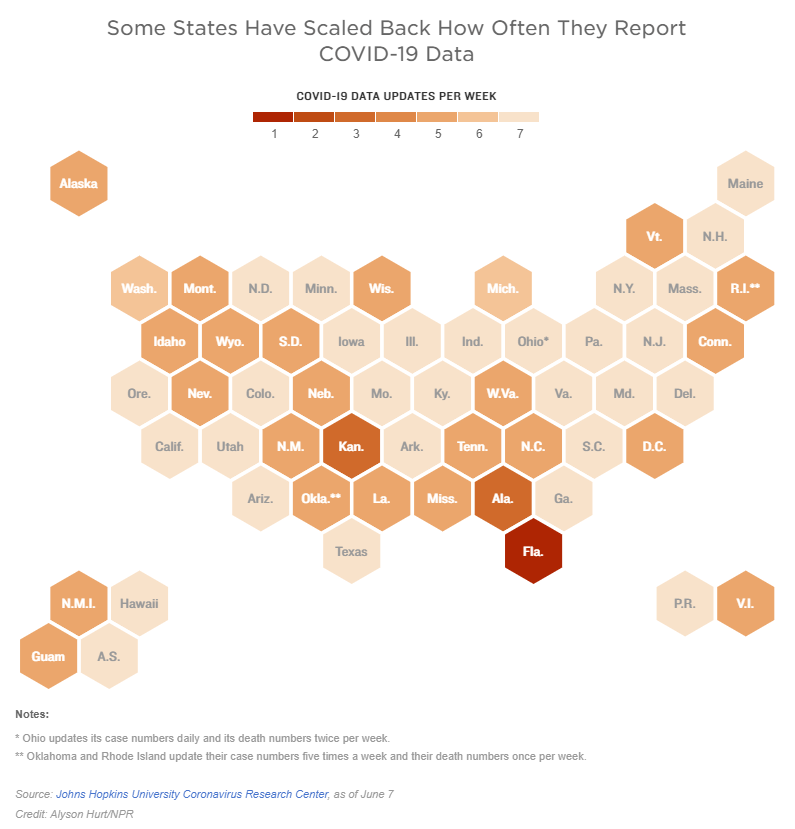
Two weeks ago, I reported that Florida had made a big change to its COVID-19 data reporting: the state switched from daily updates to weekly updates. Previously, Florida had maintained a dashboard and released detailed PDF reports each day; now, the state releases PDF reports once a week on Fridays.
Other states are making similar changes. Only about half of states update their COVID-19 data every day, NPR reported last week. Florida is the only state to cut back to only one update a week, but several others now skip updating on weekends or otherwise reduce their reporting load.
It’s important to note, however, that these changes are not all new. There have always been states that skipped updating—or published limited updates—on weekends, going back to spring 2020. And, for a long time, Kansas was the least-frequent-reporting state: for many months, it’s only published updates on Mondays, Wednesdays, and Fridays. More states started skipping weekends earlier in 2021, though, at the same time as many state public health agencies were spinning up vaccination dashboards in addition to their existing COVID-19 reporting systems.
When states do not update their data every day, journalists and researchers are less able to precisely track COVID-19 developments and identify trends. John Hopkins’ Beth Blauer compared this challenge to viewing a photo in low resolution instead of high resolution: it’s harder to see a pattern when you’re not getting as much detail.
Even for those states that do publish updates every day, though, there are still challenges inherent in interpreting data that naturally fluctuate over the course of a week. New York might update its COVID-19 data every day, for example, but some test sites in New York are closed on weekends—leading to natural dips in testing and case numbers on those days, followed by higher numbers in the middle of the week. COVID Tracking Project volunteer Hannah Hoffman has written about this phenomenon in detail.
Still, even as states start to skip days or make their reporting less precise, the CDC and HHS continue to update their national COVID-19 datasets daily. There are admittedly many discrepancies between federal and state data—in large part because of the lack of federal leadership early in the pandemic—but the federal data are now highly standardized and reliable at a level that would be incredibly difficult to get from states. This is why I personally choose to use the CDC’s dashboard for COVID-19 Data Dispatch weekly updates, rather than JHU or another source that aggregates from states.
It’s also important to acknowledge that state public health agencies have been chronically underfunded for decades before the pandemic hit—and daily data updates have been a huge timesuck for many of these agencies. If scaling down COVID-19 dashboard updates frees up some personnel and resources for a state like Alabama or South Dakota to redirect into vaccination programs, that, to me, seems worthwhile.


