Category: State data

  • Tips for following COVID-19 trends this winter

    Tips for following COVID-19 trends this winter

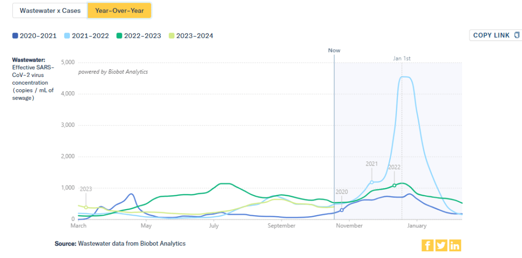
    This chart from Biobot Analytics shows that current coronavirus levels in wastewater (the light green line) have followed a similar pattern to fall 2021 (light blue).

    The U.S. is heading into our first winter since the end of the federal public health emergency for COVID-19. Those of us still following COVID-19 trends might need to change which data sources we use to track the disease this winter, and how we think about trends.

    The pandemic certainly hasn’t ended: COVID-19 still leads to hundreds of hospitalizations and deaths each day, not to mention millions with Long COVID. Since the U.S. government ended its emergency response to this disease, we now have significantly less information—but not zero information—about how it’s spreading.

    To recap the key changes to COVID-19 data following the emergency’s end (see this post from May for more details):

    • The CDC is no longer collecting case data, as it lost authority to require reporting from PCR testing labs.
    • Following the CDC’s lead, many state and local health departments have also stopped tracking COVID-19 cases.
    • The CDC is still tracking COVID-19 hospitalizations, though these data are more delayed and less comprehensive following the PHE’s end.
    • Death reporting is also more delayed and less comprehensive.
    • The CDC is using networks of testing labs and healthcare centers (like the National Respiratory and Enteric Virus Surveillance System) to estimate COVID-19 trends, similar to its strategies for tracking flu and RSV.
    • To track variants, the CDC is relying on a mix of continued PCR samples, wastewater testing, and travel surveillance.
    • Vaccinations are no longer reported directly to the CDC, leading the agency to track the 2023-24 vaccines through other means.

    In short, we lost a few of the primary data sources that people have used to follow COVID-19 over the last three years. But there’s still a lot of data available, primarily from wastewater surveillance, the CDC’s sentinel networks, and local health agencies.

    Here are my tips for tracking COVID-19 this winter.

    Look at multiple sources for your community.

    Following COVID-19 in your city or state used to be easy: you could just look at case numbers. Now, with that metric unavailable in many places, I would recommend having two or three go-to data sources that you check in tandem. Don’t be certain about a trend (like a new surge) until you’ve seen it in multiple sources at once. These sources might be local wastewater pages, local health department pages, and regional trends from the CDC.

    For example, when I want to check on COVID-19 spread in New York City (where I live), I look at:

    Wastewater is the best early indicator.

    It’s pretty universally acknowledged among epidemiologists and public health experts at this point in the pandemic that, without case data, wastewater surveillance is now our best way to spot new changes in COVID-19 spread. When a new surge occurs, coronavirus levels in wastewater tend to go up days or weeks before other metrics, like hospitalizations.

    So, as you track COVID-19 for your community, I would highly recommend that one of your top sources is a wastewater surveillance dashboard.

    Test positivity is still helpful for trends.

    Test positivity—the rate of COVID-19 tests that returned positive results—was a popular indicator early in the pandemic, with policy decisions like whether students could attend school in-person tied to this metric. While test positivity numbers are less available now, people are still getting tested for COVID-19: these tests mostly occur in healthcare settings among people who present with COVID-like symptoms or had recent exposures to the virus.

    I still find test positivity to be a helpful metric for watching trends in COVID-19 spread. When the positivity rate goes up, more people are getting COVID-19; and when the rate goes over 10%, that’s a decent indicator that the disease is spreading in significant magnitudes.

    Two places to find test positivity data:

    Acknowledge data delays, especially around holidays.

    Many COVID-19 dashboards used to update on a daily basis. Now, we get weekly updates from most health agencies—and even less frequency in some places. With these update schedules, all data are inevitably delayed by at least a few days. So, when you look at a dashboard, it’s important to keep the update schedule in mind and ask yourself how a trend might have continued following the most recent data available.

    Data delays become particularly prominent after holidays: remember, public health officials take days off just like the rest of us. Holiday reporting delays often lead to appearances of low COVID-19 during the immediate week of a holiday, followed by appearances of higher COVID-19 in the weeks after as cases (and other metrics) are retroactively reported. The weeks around Christmas and New Year’s are particularly bad, as most people take both of those holidays off.

    Compare current trends to past surges and lulls.

    With interpreting COVID-19 data, context is everything. Spread of the virus is usually either rising or falling; comparing current numbers to historical data can help you understand the magnitude of those recent patterns. Is your community seeing as much COVID-19 as it has at past times commonly recognized as surges? Or are you in more of a lull between waves?

    One helpful tool that I often use for such context is a chart on Biobot’s COVID-19 dashboard that provides year-over-year comparisons between coronavirus levels in wastewater in the U.S. Right now, for example, you can see that current viral levels have followed a similar trendline to what we observed in the fall 2021 Delta surge (before Omicron appeared), but lower than this time last year (when different BA variants were spreading quickly).

    The original Omicron surge in winter 2021-22 is often a popular point for these comparisons, as pundits love to assure us that a new variant won’t cause as intense a wave as we saw with Omicron’s first appearance. While this can be reassuring, I think it’s important to not just look at the highest peaks for comparison. The summer/fall of Delta in 2021 wasn’t a great time either, and we’re on track to repeat it right now even if no wildly competitive new variants appear.

    Keep an eye on variants.

    As we watch for a likely COVID-19 surge this winter, viral variants could have an impact on how much the virus is able to spread during our holiday travel and gatherings. You can keep an eye on variant development through a couple of CDC data pages:

    • The CDC’s variant proportions, which estimate levels of different variants based on PCR testing;
    • Variant patterns from wastewater, which the CDC and local health departments track from select sewage testing sites (many state and local wastewater dashboards include these data as well);
    • Travel-based genomic surveillance, a CDC program in which international travelers can opt into PCR testing as they return to U.S. airports, contributing to the agency’s understanding of variants circulating globally.

    If you have further data tracking questions or suggestions, please reach out via email or in the comments below.
  • Sources & updates, June 25

    • Commonwealth Fund releases 2023 state health scorecard: This week, health research organization the Commonwealth Fund published its 2023 rankings of state health systems. These rankings are an extensive data source for anyone seeking to better understand the decentralized health system in the U.S., and may be particularly useful for local reporters looking for data on how their state compares to others. In the 2023 rankings, the researchers have added new metrics related to care and health outcomes for women, mothers, and infants. This year’s data also highlight preventable deaths from COVID-19 and other causes, and state efforts to take people off of Medicaid following the pandemic emergency’s end.
    • New advisory about Long COVID and mental health: The U.S. Substance Abuse and Mental Health Services Administration (SAMHSA), a federal health agency under the overall Department of Health and Human Services (HHS), published a detailed advisory explaining the mental health implications of Long COVID. This advisory is directed at primary care doctors who may be seeing Long COVID among their patients, as well as others in the medical community who may benefit from the information. SAMHSA highlights that mental health symptoms may result from a coronavirus infection itself as well as from the stress and social isolation that long-haulers experience. For more on this topic, check out this article I wrote last year.
    • Rapid test accuracy can vary widely: A common question that I’ve received from readers in the last few months has been, “How accurate are rapid tests with newer variants?” A new study, published last week in the journal Microbiology Spectrum, offers some insight. The researchers (a team at CalTech) found that rapid tests still work to detect the coronavirus, but their accuracy varies based on viral load and specimen type. Tests that involved swabbing the patient’s throat (along with their nose) were significantly more accurate than nose swabs alone. Tests conducted later in the course of a patients’ infection, when they had higher viral loads, were also more accurate, though some patients never tested positive on rapid tests despite testing positive on PCR. My takeaway here: swabbing your throat and testing multiple times help improve accuracy, but the best option is always to get a PCR if you can.
    • CDC and state agencies track reinfections: Another new study, published this week in the CDC’s Morbidity and Mortality Weekly Report, examines coronavirus reinfections in the era of Omicron. Researchers at the CDC and 18 state and local health departments collaborated to track reinfections from September 2021 through December 2022, finding that these infections went up significantly when Omicron arrived in late 2021. The median time between infections ranged from 269 to 411 days, the researchers found, suggesting that Americans may expect to be sick with COVID-19 once or twice a year while our Omicron baseline persists. 
    • COVID-19 risk and air pollution exposure: One more study I wanted to highlight this week: researchers at Hasselt University in Belgium tracked the air pollution exposures of about 330 COVID-19 patients at hospitals in Belgium. Patients who were exposed to worse air pollution prior to their admission experienced more severe COVID-19 outcomes, including longer hospitalization and admission to the ICU. This paper provides further confirmation that poor air quality and COVID-19 can be compounding health problems for many people.
    • Data problems persist with non-COVID vaccines: The CDC’s vaccine advisory committee met this week to discuss two new RSV vaccine candidates, recently approved by the FDA for seniors. While the CDC committee did vote to recommend these vaccines, I was struck by discussion (in Helen Branswell’s coverage for STAT) that the experts said they did not have sufficient data to make a truly informed decision. I’ve written a lot about data issues for COVID-19 vaccines; the same decentralized health system problems that make it hard to track COVID-19 vaccine effectiveness also apply to products for other diseases.

  • Sources and updates, June 4

    • Medicaid coverage losses by state: KFF Health News published a story this week sharing new data on the Americans who lost Medicaid coverage due to the end of a COVID-19 policy that prevented states from kicking people off the insurance during earlier stages of the pandemic. More than 600,000 people in 14 states have lost coverage since April 1, according to reporter Hannah Recht’s analysis. That represents about 36% of the people whose Medicaid eligibility was up for review in these states, though the number is much higher in some states (about 80% in Oklahoma). Recht also published the underlying data from her analysis for other reporters to use.
    • Library of Congress COVID-19 history project: The Library of Congress has announced a new project to collect COVID-19 oral history stories, partnering with the StoryCorps interview archive. Congress has provided funding for the COVID-19 project, which will provide grants to researchers working to document the experiences of specific groups. This project is focusing on frontline workers and the survivors of people who died from COVID-19, but other Americans are welcome to share their stories through the StoryCorps website.
    • Children often cause household COVID-19 spread: Researchers at Boston Children’s Hospital and Kinsa, a health tech company, used data from smart thermometers to track how the coronavirus spreads inside households. Among about 39,000 instances of household transmission, a child was the initial case 70% of the time. The study suggests that children are major drivers of disease spread, especially during the school year; it also demonstrates the potential utility of smart thermometer data. (For more about Kinsa, see this post from last fall.)
    • Disproportionate COVID-19 impacts within a city: Another study that caught my attention this week: researchers at the University of Texas at Austin and collaborators evaluated how severe COVID-19 impacts differed by ZIP code within the city of Austin. Their analysis found that ZIP codes with more vulnerable populations (based on the CDC’s Social Vulnerability Index) had higher rates of COVID-19 cases, but were less likely to have their cases reported. When limited surveillance data are available, the researchers suggest, health agencies should direct resources to more vulnerable communities.
    • Assessing who’s not connected to public sewers: One commonly-cited limitation of wastewater surveillance data is that about one in five U.S. households aren’t connected to public sewers. A new preprint from scientists at Harvard University and Biobot Analytics looks at this issue in more detail, using publicly available datasets describing sewer connectivity. The researchers found that, overall, some demographic groups (such as Native Americans, wealthier people in rural areas, etc.) are less likely to be connected to public sewers, as are some regions (such as Alaska and Navajo Nation). But public datasets have many gaps and biases, making it challenging to thoroughly assess this problem. Lead author QinQin Yu has a Twitter thread with more details.

  • Ending emergencies will lead to renewed health equity issues

    Ending emergencies will lead to renewed health equity issues

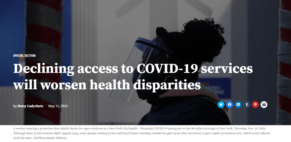
    The header image from a story I recently had published in Amsterdam News about declining access to COVID-19 services.

    Last week, I gave you an overview of the changes coming with the end of the federal public health emergency (PHE), highlighting some shifts in publicly available COVID-19 services and data. This week, I’d like to focus on the health equity implications of the PHE’s end.

    COVID-19 led the U.S. healthcare system to do something unprecedented: make key health services freely available to all Americans. Of course, this only applied to a few specific COVID-related items—vaccines, tests, Paxlovid—and people still had to jump through a lot of hoops to get them. But it’s still a big deal, compared to how fractured our healthcare is for everything else.

    The PHE allowed the U.S. to make those COVID-19 services free by giving the federal government authority to buy them in bulk. The federal government also provided funding to help get those vaccines, tests, and treatments to people, through programs like mass vaccination sites and mobile Paxlovid delivery. Through these programs, healthcare and public health workers got the resources to be creative about breaking down access barriers.

    Now that the emergency is ending, those extra supplies and resources are going away. COVID-19 is going to be treated like any other disease. And as a result, people who are already vulnerable to other health issues will become more at risk for COVID-19.

    I wrote about this health equity problem in a recent story for Amsterdam News, a local paper in New York City that serves the city’s Black community. The story talks about how COVID-19 services in NYC are changing with the end of the PHE, and who will be most impacted by those changes. It’s part of a larger series in the paper covering the PHE’s end.

    Most of the story is NYC-specific, but I wanted to share a few paragraphs that I think will resonate more widely:

    Jasmin Smith, a former contact tracer who lives in Brooklyn, worries that diminished public resources will contribute to increased COVID-19 spread and make it harder for people with existing health conditions to participate in common activities, like taking the subway or going to the grocery store.

    COVID-19 safety measures “make the world more open to people like myself who are COVID-conscious and people who might be immunocomprmised, disabled, chronically ill,” Smith said. “When those things go away, your world becomes smaller and smaller.”

    The ending federal public health emergency has also contributed to widespread confusion and anxiety about COVID-19 services, [said Dr. Wafaa El-Sadr, a professor of epidemiology and global health at Columbia University’s Mailman School of Public Health]. “People have so many questions about this transition,” she said, and local leaders could do more to answer these questions for New Yorkers.

    The near future of COVID-19 care in the U.S. could reflect existing health disparities for other endemic diseases, like the seasonal flu and HIV/AIDS, [said Steven Thrasher, a professor at Northwestern University and author of the book, The Viral Underclass]. For example, people with insurance and a primary care physician are more likely to get their annual flu shots, he said, while those without are more likely to face severe outcomes from the disease.

    After May 11, COVID-19 outcomes are likely to fall along similar lines. “More people have died of AIDS after there were HIV medications,” Thrasher said. “More people have died of COVID when there were vaccines in this country than before.”

    For more news and commentary on COVID-19 emergencies ending, I recommend:

  • COVID source callout: Montana ends its dashboard

    Last week, I wrote about the Iowa health department’s move to end COVID-19 case reporting requirements for labs, and in turn stop reporting these data to the CDC. Well, Montana just became the next state to follow this trend.

    The state’s public health agency announced that it will stop updating its COVID-19 dashboard on May 5, the week before the federal public health emergency ends, in a note on the dashboard and a statement to local media outlets.

    Unlike Iowa, Montana will continue reporting COVID-19 numbers to the CDC; so residents of that state will still be able to find information on the CDC’s dashboard. But the discontinuation of Monatana’s own dashboard shows how the state is taking resources out of pandemic response and treating COVID-19 as an endemic virus—even though it’s not.

  • COVID source callout: Iowa ends COVID-19 case reporting

    As of April 1, Iowa’s state health department is no longer requiring public health laboratories to report positive COVID-19 test results—and no longer reporting statewide data to the CDC. This decision, announced in late February, is part of a growing trend away from relying on case data as people use at-home tests instead of PCR tests.

    Iowa’s health department “will continue to review and analyze COVID-19 and other health data from several sources,” including hospitalization metrics and syndromic surveillance, according to the agency. It’s essentially treating COVID-19 similarly to the flu and other common respiratory viruses.

    As a result of this change, Iowa is now no longer reporting COVID-19 case data to the CDC, the national agency said in this week’s data update. National, regional, state, and county-level CDC data exclude the state of Iowa, starting on April 1.

    This move seems like a natural extension of the state health reporting changes that we’ve seen across the country since last spring. I wouldn’t be surprised if more state health departments similarly stop reporting every COVID-19 case when the federal health emergency ends in May. Unfortuantely, this will become another driver of increasingly-less-reliable COVID-19 data in the U.S.

  • Sources and updates, March 26

    • Paxlovid may lower risk of Long COVID: Taking paxlovid in the acute phase of a COVID-19 case may lower a patient’s risk of long-term symptoms by about 25%, according to a paper published this week in JAMA Internal Medicine. The paper, which summarizes an analysis of health records in the Veterans Affairs database, was originally posted as a preprint in the fall; lead author Ziyad Al-Aly and his colleagues at the St. Louis VA did more number-crunching during the peer review process. Several clinical trials (including one just announced at Yale this week) will test paxlovid as a potential treatment for Long COVID, with a longer course than people typically take during the acute disease.
    • Estimating true vaccination rates in the U.S.: A new report from the COVID States Project, a group of academic researchers focused on connections between social behaviors and COVID-19 spread, provides estimates of vaccination rates by state in the U.S. The researchers compared vaccination data from the CDC to polling sources, including the Kaiser Family Foundation and original polling conducted by the COVID States Project. They found that CDC data often diverged from survey data, suggesting that the public health agency’s information has errors due to the CDC’s inability to connect disparate immunization records from different states. (In other words, if someone got their primary series in one state and a booster in another, they might show up twice in the CDC’s data.)
    • Comparing COVID-19 outcomes by state: Another report looking at state-by-state data: researchers at the University of Washington’s Institute for Health Metrics and Evaluation compared COVID-19 death rates to state actions on COVID-19. The researchers found that states with higher poverty, more income inequality, higher Black and Hispanic/Latino populations, and less access to healthcare faced higher COVID-19 rates. States where more people voted for Trump in 2020 also saw more COVID-19. These patterns “seem to reflect the release of public health mandates” in more Republican states, journalist Amy Maxmen wrote in a Twitter thread summarizing the study.
    • COVID-19 origins docs, raccoon dog analysis: Federal intelligence documents about investigations into the coronavirus’ origins will be declassified in the coming months, as required by a new law that President Biden signed this week. The law specifically requires that the Director of National Intelligence release “all information relating to potential links between China’s Wuhan Institute of Virology and COVID-19.” This information will first go to Congress, and then may become public. Meanwhile, there’s been some controversy about a recent analysis of viral samples at the Huanan Seafood Wholesale Market in Wuhan: news about this analysis was shared in the media before a scientific report was completed, and some researchers who worked on the analysis had their access to sequence repository GISAID revoked. This article in Science Magazine has more details on the situation.
    • Increased Candida auris spread during the pandemic: C. auris is a pathogenic fungus that has developed resistance to multiple common drugs, and that can pose a serious threat to human health. (Yes, a fungus similar to the one that causes a pandemic in “The Last of Us”—though C. auris doesn’t turn people into zombies.) The fungus has spread more widely during the pandemic according to a recent CDC report, with a 44% increase in cases from 2019 to 2021. Other types of anti-microbial resistance have been on the rise as well, as COVID-19 led to less rigorous monitoring and heightened antibiotic use in many hospitals. More recent CDC data on the fungus are available here.

  • COVID-19 is inspiring improvements to surveillance for other common viruses

    COVID-19 is inspiring improvements to surveillance for other common viruses

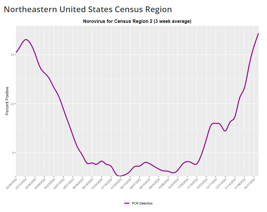
    The CDC provides norovirus test positivity data from a select number of labs that report test results for this virus. Due to limited reporting, data are only available at the regional level.

    This week, I have a new story out in Gothamist and WNYC (New York City’s public radio station) about norovirus, a nasty stomach bug that appears to be spreading a lot in the U.S. right now. The story shares some NYC-specific norovirus information, but it also talks more broadly about why it’s difficult to find precise data on this virus despite its major implications for public health.

    Reporting this story led me to reflect on how COVID-19 has revealed cracks in the country’s infrastructure for tracking a lot of common pathogens. I’ve written previously about how the U.S. public health system monitored COVID-19 more comprehensively than any other disease in history; the scale of testing, contact tracing, and innovation into new surveillance technologies went far beyond the previous standards. Now, people who’ve gotten used to detailed data on COVID-19 have been surprised to find out that such data aren’t available for other common pathogens, like the flu or norovirus.

    It might feel disappointing to realize how little we actually know about the impacts of endemic diseases. But I choose to see this as an opportunity: as COVID-19 revealed gaps in public health surveillance, it inspired development in potential avenues to close those gaps. Wastewater surveillance is one big example, along with the rise of at-home tests and self-reporting mechanisms, better connectivity between health systems, mobility data, exposure notifications, and more.

    Norovirus is a good example of this trend. Here are a few main findings from my story:

    • Norovirus is a leading cause of gastrointestinal disease in the U.S., and is estimated to cause billions of dollars in healthcare and indirect societal costs every year.
    • People who become infected with norovirus are often hesitant to seek medical care, because the symptoms are disgusting and embarrassing. Think projectile vomit, paired with intense diarrhea.
    • Even when patients do seek medical care, norovirus tests are not widely available, and there isn’t a ton of incentive for doctors to ask for them. Testing usually requires a stool sample, which patients are often hesitant to do, one expert told me.
    • The virus is not a “reportable illness” for the CDC, meaning that health agencies and individual doctors aren’t required to report norovirus cases to a national monitoring system. (So even when a patient tests positive for norovirus, that result might not actually go to a health agency.)
    • The CDC does require health agencies and providers to report norovirus outbreaks (i.e. two or more cases from the same source), but national outbreak estimates are considered to be a vast undercount of true numbers.
    • Even in NYC, where the city’s health agency does require reporting of norovirus cases, there’s no recent public data from test results or outbreaks. (The latest data is from 2020.)

    As I explained in an interview for WNYC’s All Things Considered, the lack of a national reporting requirement and other challenges with tracking norovirus are linked:

    It seems like the lack of a requirement and the difficulty of tracking kind-of play into each other, where it’s not required because it’s hard to track—but it’s also hard to track because it’s not required.

    The lack of detailed data on pathogens like norovirus can be frustrating on an individual level, for health-conscious people who might want to know what’s spreading in their community so that they can take appropriate precautions. (For norovirus, precautions primarily include rigorous handwashing—hand sanitizer doesn’t work against it—along with cleaning surfaces and care around food.)

    These data gaps can also be a challenge for public officials, as more detailed information about where exactly a virus is spreading or who’s getting sick could inform specific public health responses. For example, if the NYC health department knew which neighborhoods were seeing the most norovirus, they could direct handwashing PSAs to those areas. In addition, scientists who are developing norovirus vaccines could use better data to estimate the value of those products, and determine who would most benefit.

    So, how do we improve surveillance for norovirus and other viruses like it? Here are a few options I found in my reporting:

    • Wastewater surveillance, of course. The WastewaterSCAN project is already tracking norovirus along with coronavirus and several other common viruses; its data from this winter has aligned with other sources showing a national norovirus surge, one of the project’s principal investigators told me.
    • Better surveillance based on people’s symptoms. The Kinsa HealthWeather project offers one example; it aggregates anonymous information from smart thermometers and a symptom-tracking app to provide detailed data on respiratory illnesses and stomach bugs.
    • At-home tests, if they’re paired with a mechanism for people to report their results to a local public health agency. Even without a reporting mechanism, at-home tests could help curb outbreaks by helping people recognize their illness when they might be asymptomatic.
    • Simply increasing awareness and access to the tests that we already have. If more people go to the doctor for gastrointestinal symptoms and more doctors test for norovirus, our existing data would get more comprehensive.

    Are there other options I’ve missed? Is there another pathogen that might be a good example of common surveillance issues? Reach out and let me know.

  • Where to find wastewater data for your community

    Where to find wastewater data for your community

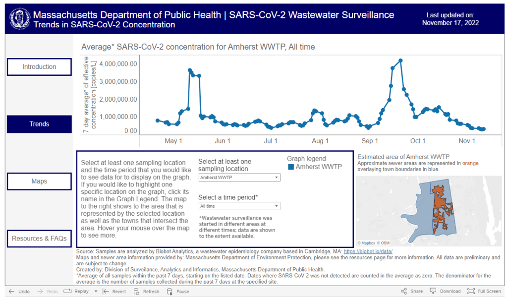
    The Massachusetts Department of Public Health is one of the latest state agencies to set up a public wastewater dashboard.

    As we head into the holidays with limited COVID-19 testing and undercounted case numbers, wastewater surveillance is the best way to evaluate how much the virus is spreading in your region. And it’s now available in more places than ever, thanks to the many research groups and public health agencies setting up sewage testing.

    To help you find wastewater surveillance in your area, I recently updated my COVID-19 Data Dispatch resource page about U.S. wastewater dashboards. The page includes links to and notes about national, state, and a few local dashboards.

    Let’s review the options. First, there are now three national dashboards with U.S. wastewater data, each covering a different set of locations.

    • The CDC’s National Wastewater Surveillance System is the biggest, including more than 1,000 sites from almost every state, though some states have far better coverage than others. Click on an individual site to see coronavirus trends for that location.
    • Biobot Analytics is the biggest private company doing wastewater surveillance; it provides analysis for hundreds of sites in the CDC NWSS network as well as its own, separate network. Biobot’s national and regional data (which include NWSS sites) are particularly helpful for large-scale trends.
    • WastewaterSCAN is a project that started from an academic partnership between Stanford University, Emory University, the University of Michigan, and communities in California. It’s since expanded to include sites in about 20 states, and participating sewersheds are tested for monkeypox, flu, and RSV in addition to the coronavirus.

    Second, 21 states currently have their own wastewater dashboards or reporting systems. If this is available in your area, I highly recommend looking at your local dashboard in addition to the national options. State and local dashboards tend to include more detailed and/or more frequently updated data, and are often tailored to their community’s needs more closely.

    These are the states with wastewater dashboards; see the resource page for links and more info:

    • California, Colorado, Georgia, Hawaii, Idaho, Indiana, Maine, Maryland, Massachusetts, Michigan, Minnesota, Missouri, Nebraska, New York State, North Carolina, Ohio, Oklahoma, Oregon, Utah, West Virginia, Wisconsin.

    Wastewater trends do not correspond directly to infection trends, because people sick with COVID-19 might shed the virus at different rates (based on where they are in their infection, variants, and other factors). Some researchers are working to better understand the correlation between wastewater trends and cases, but for now, the sewage data are best understood as a broad indicator of risk—not a precise estimate of how many people in your community are sick.

    For tips on interpreting wastewater data, I recommend looking at past COVID-19 Data Dispatch posts on this topic, as well as this FAQ from the People’s CDC.

    More wastewater data

  • Tips for interpreting COVID-19 data while the CDD goes on hiatus

    Tips for interpreting COVID-19 data while the CDD goes on hiatus

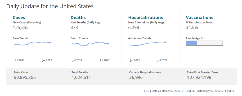
    How do you find and interpret COVID-19 data during this largely-ignored surge? Here are some tips. Chart via the CDC, with data as of July 29.

    On July 26, 2020, I sent out the first COVID-19 Data Dispatch newsletter. In the two years since that day, I have sent newsletters (and published blog posts) every Sunday, with no breaks. I’ve posted from vacations, over holidays, and on days when I was exhausted or approaching burnout.

    While this schedule has felt punishing at times, I’m proud of it. The coronavirus doesn’t care about holiday schedules, after all, and I enjoy maintaining regular updates for the readers relying on this publication as a key source of COVID-19 news. (Also, not many writers can say they’re more consistent than the CDC.)

    But even I have to admit that two years without breaks is a long time. When I’m scrambling to send out an issue every Sunday, it’s difficult to reflect on key questions, like, “Is my current posting format meeting readers’ needs?” and, “What does helpful COVID-19 coverage look like right now?” I wouldn’t call myself burned out, but at a few points in the last few months, I have felt like I’m operating on autopilot: writing around 3,000 words every weekend because it’s my routine, without evaluating how I might improve that routine.

    This is a rather longwinded way of announcing that I’m about to take a break from the COVID-19 Data Dispatch. August 2022 will be a brief hiatus: over the next four weeks, I won’t write any newsletters or blog posts. I’m also taking this month off of freelancing and working fewer hours at my part-time job, making it basically the longest vacation I’ve had since graduating college.

    I plan to use this time to reflect on this project’s future, including potential format and content changes that might make it easier for me to maintain long-term. I’m also going to reflect on some potential CDD side projects—more resources, events, even a podcast idea?—that I haven’t had the bandwidth to pursue while producing weekly issues.

    Readers: if you have any feedback for me, please reach out! I would love to hear from you about the topics and formats you’d find helpful at this point in the pandemic.

    I also wanted to share some tips for keeping track of COVID-19 data while this publication is on a break, as I’m very aware that we are still in an active surge across the country. (This post is also responding to a reader question that I received from a fellow data reporter last week, after I announced this upcoming break in the newsletter.)

    Look at multiple data sources or metrics.

    COVID-19 case data, once our best window into the virus’ spread, are becoming much less reliable thanks to a decline in PCR testing. Other singular metrics have their own flaws: hospitalization numbers often lump together patients admitted for severe COVID-19 symptoms with those who tested positive while admitted for other reasons; wastewater data are unevenly reported across the country and can be hard to interpret; death data lag significantly behind transmission trends, and so on.

    As a result, it’s important to check a few different metrics rather than relying on just one. For example, you might notice that my “National numbers” posts these days typically cite cases, hospital admissions, and wastewater together to identify national trends.

    Similarly, if I were trying to identify what’s going on in New York City, where I live, I would likely look at: case and test positivity data from the city health department, cases in public schools (which include positive at-home test results) compiled by the department of education, and wastewater data from Biobot, focusing on the northeast region and counties in the greater NYC area.

    In May, I wrote a post listing datasets that I’d recommend looking at during the Omicron subvariant surge. Much of that advice still holds true, two months later. Here’s the summary (though you should check out the full post, if you haven’t read it):

    • Case rates are still useful, if we acknowledge that they are undercounts.
    • Hospitalization rates are useful, particularly new hospital admissions.
    • The CDC’s old transmission level guidance is still actually pretty helpful for guiding health policies, especially for vulnerable populations.
    • Look at wastewater surveillance, if it’s available in your area.
    • The COVID Cast dashboard, from Carnegie Mellon University’s Delphi Group, is another helpful source.

    Look at multi-week trends.

    Just as you don’t want to rely on a single metric, you shouldn’t look at only one week of data. (Looking at just one or two days at a time is an even worse idea.) This has always been a good rule for interpreting COVID-19 numbers, but it’s even more true now, as many public health departments have fewer resources devoted to tracking COVID-19—and may take more time to compile data for a given day or week.

    For example, the New York City health department’s daily updates to its COVID-19 dashboard frequently include changes to case numbers for prior days, in addition to new data for the past day. Experts call this “backdating”: in a data update on a Friday, new cases might be dated back to other days earlier in the week, changing broader trends.

    Keep in mind data reporting schedules.

    You especially need to be wary of backdating when there’s a holiday or some other interruption in reporting. For this reason, it’s important to keep track of reporting schedules: know when a health department is and is not updating their data, and interpret the data accordingly.

    The biggest example of this is that most state and local health departments—and the CDC itself—are no longer updating COVID-19 data on weekends. In most places, every Saturday and Sunday is now essentially a mini-holiday, with numbers from those days incorporated into backdated updates on Mondays. (And then edited in further backdated updates on later weekdays.)

    When I volunteered at the COVID Tracking Project, we regularly observed lower COVID-19 numbers on weekends, followed by increases towards the middle of the week when states “caught up” on cases that they didn’t report over the weekend. You can read more about this trend here; I suspect it has only become more pronounced as more places take weekends off.

    Acknowledge uncertainty in the data.

    This is the most important recommendation I can give you. Every COVID-19 number you see comes with a margin of error. Sometimes, we can approximate that margin of error: for example, we can estimate how far official COVID-19 death statistics might be off by looking at excess deaths. Sometimes, we really can’t: estimates of how far official case numbers might be off range from a factor of three to a factor of thirty.

    As a result, it’s often helpful to look at trends in the data, rather than trying to approximate exactly how many people in your town or county have COVID-19 right now. Is transmission trending up or down? Are you at high risk of encountering the coronavirus if you go to a large gathering? These questions can still be answered, but the answers will never be as precise as we’d like.

    Follow leaders from your local healthcare system.

    To augment official data sources, I often find it helpful to see what people in healthcare settings are saying about COVID-19 trends. Experts like Dr. Craig Spencer (who works in an ER in NYC) and Dr. Bob Wachter (who leads the University of California San Francisco’s department of medicine) frequently share updates about what they’re seeing in their practices. This kind of anecdotal evidence can help back up trends in case or hospitalization data.

    In a similar vein, you can look to essential workers in your community, like teachers and food service workers, as early indicators for transmission trends. If NYC teachers and parents are talking about more cases in their schools, for example, I know COVID-19 spread is increasing—because schools are often sources for transmission in the broader community.

    Keep your goals in mind.

    As you monitor COVID-19 numbers, it’s important to remember why this information is valuable. What are you using the numbers for? Are you making choices about when to put a mask on, or when to rapid test before a gathering? Are there high-risk people in your family or your broader social network whom you’re trying to protect? Or, if you’re a journalist, what questions are you trying to help your readers answer?

    Keeping track of COVID-19 data and news can feel like a large burden, especially when it seems like so many people have entirely forgotten about the pandemic. I always find it helpful to remember why I do this: to stay informed about this ongoing health crisis, and to keep others in my community safe.