Category: Source spotlight

  • COVID source callout: Maine

    COVID source callout: Maine

    I visited Maine this week, so it seems fitting to evaluate the state’s COVID-19 dashboard on my way home.

    Screenshot of Maine’s dashboard. Look at how clean this is!

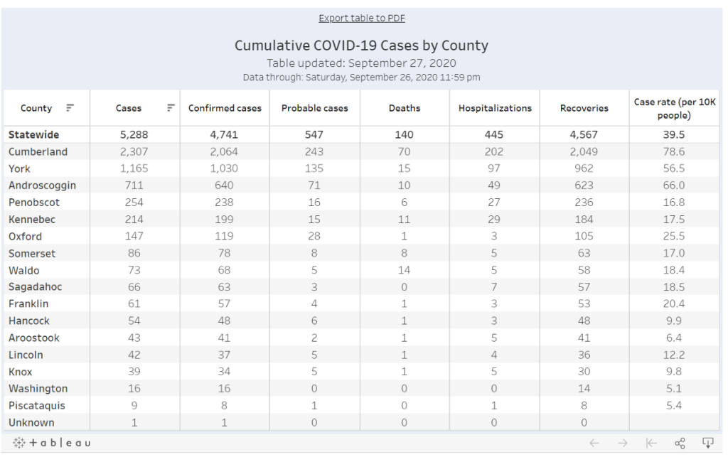
    Maine was actually one of my favorite state dashboards for a while. Everything is on one page. A summary section at the top makes it easy to see all the most important numbers, and then there’s a tabbed panel with mini-pages on trends and demographic data. It’s all fairly easy to navigate, and although there was a period of a few weeks where Maine’s demographic data tab never loaded for me, I never held that against the state. Maine has a clear data timestamp, and it was also one of the first states to properly separate out PCR and antibody testing numbers.

    Now, however, Maine is lumping PCR and antigen tests. This means that counts of these two test are being combined in a single figure. Both PCR and antigen tests are diagnostic, but they have differing sensitivities and serve different purposes, and should be reported separately; to combine them may lead to inaccurate test positivity calculations and other issues. I expect this type of misleading reporting from, say, Florida or Rhode Island, but not from Maine. Be better, Maine!

  • COVID source callout: Utah

    Utah was one of the first states to begin reporting antigen tests back in early August. The state is also one of only three to report an antigen testing time series, rather than simply the total number of tests conducted. However, the format in which Utah presents these data is… challenging.

    Rather than reporting daily antigen test counts—or daily PCR test counts, for that matter—in a table or downloadable spreadsheet, Utah requires users to hover over an interactive chart in an extremely precise fashion. Interactive charts are useful for visualizing data, but far from ideal for accessibility.

    Hot tip for anyone interacting with this chart: you can make your life easier by clicking “Compare data on hover,” toggling the chart to show all four of its daily data points at once. (Sad story: I did not learn this strategy until I’d already spent an hour carefully zooming in and around the chart to record all of Utah’s antigen test numbers.)

    In related news: keep an eye out for a COVID Tracking Project blog post on antigen testing, likely to be published in the coming week.

  • COVID source callout: Texas

    Someday, I will write a parody stage play called “Waiting for Texas.” It will feature a squadron of diligent COVID Tracking Project volunteers, eagerly refreshing Texas’ COVID-19 dashboard, wondering if today, maybe, will be the day that the site updates by its promised time of 4 PM Central (5 PM Eastern).

    This past weekend, I was not so lucky. Texas’ data came late enough on Saturday that the Project decided to publish its daily update without this state. How late did it come? 6:30 PM Central, or 7:30 PM Eastern. I understand the procrastination, Texas (see: the sending time of this newsletter today), but a little heads up might be nice next time.

  • COVID source callout: South Carolina

    COVID source callout: South Carolina

    It is not uncommon, as we increasingly realize that COVID-19 is not going away any time soon, for state public health departments to give their websites makeovers. Hastily-compiled pages and PDF reports have given way to complex dashboards, complete with interactive charts and color-coding.

    These revamps can be helpful for users who would rather click through a menu than scroll through a report. But from a data collection perspective, it’s often challenging to go from a document or single page (where I could easily hit Ctrl+F to find a value) to a dashboard which requires clicking and searching through numerous popups.

    The most recent state to go through such a revision is South Carolina. In late August, the state released a new dashboard, called the County-Level Dashboard, and reorganized much of its information on COVID-19 demographics and other metrics.

    In fact, when I first looked at South Carolina’s revised pages, I could not find any demographic data at all. This information used to be reported on a page marked “Demographic Data by Case”; now, that page goes to a dashboard on cases in South Carolina’s long-term care facilities. It wasn’t until I read through the public health department’s new Navigation Manual that I realized demographic data are now integrated on the county dashboard. If I click, for example, “Go to cases,” I’m brought to a page reporting case rates by county, age, race, ethnicity, and gender.

    Demographic data ahoy! Via the South Carolina County Dashboard, September 6.

    To South Carolina’s credit, these new pages report demographic data in whole numbers, a more precise format than the percents of total cases and deaths released by many other states (and by SC itself before this reorganization). I also appreciate the addition of a Navigation Manual—such detailed instructions can help make a dashboard more accessible.

    But I would advise any designers of state dashboard revamps to consider how to label figures more clearly from the get-go, so that journalists and state residents alike aren’t confused.

  • COVID source callout: New Jersey

    COVID source callout: New Jersey

    New Jersey reports COVID-19 demographic data in three different places.

    First: there are confirmed case summary reports, released in PDF form. These reports include pie charts that break down COVID-19 cases, deaths, and hospitalizations according to race and ethnicity, age group, and gender. A case summary report was last released on July 30.

    Second: there is a “demographics” tab on New Jersey’s dashboard, which includes tables on COVID-19 deaths by race and ethnicity, age group, and underlying conditions. This tab currently lags the main dashboard significantly; the tables add up to about 11,000 deaths, while New Jersey has reported about 1,600 deaths total.

    And third: there is a “case and mortality summaries” tab on the dashboard, which replicates the format of the old PDF reports with some confusing navigation. (Two rows of tabs at the top, and another row of tabs at the bottom? Who designed this? Who hurt them?)

  • Source callout: New Mexico

    Source callout: New Mexico

    New Mexico reports COVID-19 death demographics in a way that makes me suspect they have it out for us at the COVID Racial Data Tracker specifically.

    The state occasionally includes race and ethnicity information for deaths in its Modeling Updates, released once a week. I say “occasionally” because there is no rhyme or reason to when this key demographic information makes it into the update. And there is also no rhyme or reason to how these data are presented:

    This chart is from the Modeling Update released on June 9. Yes, you’re reading it right: those are percentages, expressed in a line chart. Some of the points don’t even have data labels.

    New Mexico’s newest Modeling Update, released this past Tuesday, has shown a slight improvement in the state’s data presentation: the percentages are now expressed in bar charts, and total deaths for each racial group are included below the graph. (See page 20 of the PDF.) Still, in order to present a complete picture of how COVID-19 is impacting minorities in New Mexico, the state must release these data regularly and include precise figures.

  • COVID Source Callout: Florida

    Analyzing COVID-19 data in Florida is like wading through a swamp with rocks in your backpack while wearing a hazmat suit and being shouted at by a hundred people who all think they can go faster than you.

    There are so many problems with Florida’s data, that when Rebecca Glassman and Olivier Lacan, another CTP volunteer, tried to draft a short blog post about what was wrong, they ended up writing about 3,000 words. Florida reports a test positivity rate without publishing the underlying numbers for their calculation, making it impossible for researchers to check the figures. Florida doesn’t report probable cases and deaths, which is recommended by the CDC. Florida is mixing its PCR and antigen test results (and likely including both in its test positivity rate. Florida fails to alert people using its COVID-19 website and dashboard when the state faces data issues. Florida literally fired a scientist at its public health department who refused to manipulate the state’s data.

    But hey, at least their daily PDF reports are under 1,000 pages now.

  • COVID source callout: West Virginia

    I have issues with West Virginia’s race data.

    First, West Virginia insists on reporting COVID-19 cases assigned to racial categories which do not exist. Two weeks ago, this was a category labeled, “Asian; Black or African American; White.” Last week, this was a category labeled, “Native Hawaiian or Other Pacific Islander; White.” The categories are particularly curious because WV usually only reports their cases according to three race categories: White, Black, and Other.

    (These extra categories have since disappeared from WV’s COVID Dashboard.)

    Relatedly, WV’s race data for cases is listed in a rather unintuitive location on the state’s dashboard: on a page labeled “County Summary.” If you did not look closely, you would think they weren’t reporting demographic data at all.

    And finally: WV used to report demographic information for deaths due to COVID-19 which occurred in the state. This information has not been reported since May 20. Sure, WV’s outbreak has been relatively small (with a total of 5,887 cases and 103 deaths as of July 26), but this is no excuse for failing to report the impacts of this outbreak on marginalized communities. According to CRDT figures, Black West Virginians make up 4% of the state’s population, but comprise 8% of its COVID-19 cases. To present a complete picture, the state should report death counts as well as the impacts of COVID-19 on other racial groups.