This week, I updated the COVID-19 Data Dispatch page detailing how every state is (or isn’t) reporting COVID-19 cases in schools. I was glad to see that several states have resumed data reporting on this important topic after a summer break, though some haven’t resumed yet. (Looking at you, New York.)
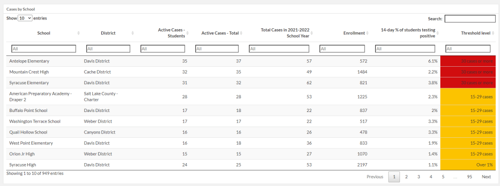
I want to give a special shout-out to Utah, which has expanded its K-12 data since spring 2021. This state is now the fourth to report in-person enrollment in schools (after New York, Texas, and Delaware). Utah is also reporting school-specific test positivity rates, providing the share of students who have tested positive in the past two weeks.
It’s not surprising that Utah would expand its school data reporting, because this state is currently pioneering a program called Test to Stay. Schools are required to offer testing to all students when an outbreak occurs, in partnership with their local health departments.
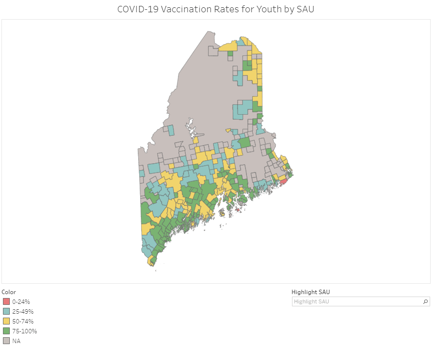
Vaccination rates in Maine’s school administrative units (SAUs). Screenshot taken on September 18.
At this point in America’s vaccine rollout, almost every state has a detailed dashboard. (Nebraska and Florida used to have detailed dashboards, before taking those sites down earlier this summer in a growing trend of states reducing their COVID-19 reporting.)
This dashboard is incredibly useful; individual school districts can compare their vaccination rates to those of their neighbors, while anyone doing state-level research can get a quick overview of where districts stand. As of September 18, just two districts have under 25% of their teens vaccinated (Cutler Public Schools and MSAD 76), while a few districts have vaccination rates over 95%.
Maine’s Division of Disease Surveillance intends to update these data “about every two weeks,” according to the agency’s website.
In April 2020, Leah Douglas started tracking COVID-19 outbreaks at meatpacking plants, food processing facilities, and farms. Douglas is a reporter at the Food & Environment Reporting Network (FERN); she shared her findings through an interactive dashboard on the FERN website while also writing stories to illuminate the numbers.
On September 2, Douglas announced that the project is shutting down—after counting almost 100,000 COVID-19 cases and 466 deaths among workers in the U.S. food system.
“Initially, I imagined the project would produce a one-time visualization of the spread of the virus at food manufacturing plants last spring,” Douglas writes in a post announcing the project’s end. “But it quickly became clear that the scope of worker illness, and the lack of information disclosure from companies and public health authorities, necessitated deeper investigation.”
Douglas explains that, while the project was challenged from the start by a lack of data from food companies and public health agencies alike, data have become even scarcer in recent months. “There likely hasn’t been another surge like the one witnessed at meatpacking plants in the spring of 2020, but data constraints mean that the true toll of the pandemic on food system workers is unknown,” she says.
Douglas’ project was cited by major news outlets, appeared on TV shows, used by research organizations, and utilized by policymakers to draw attention to COVID-19 outbreaks in the food system. It was also listed as one of the COVID-19 Data Dispatch’s best COVID-19 data stories of 2020.
Here at the CDD, we thank Leah Douglas for her months of hard work on this incredibly important issue—and wish her the best in her new position at Reuters.
If you post in the COVID-19 data Twitter-sphere, you’re likely familiar with Philip Nelson, a computer science student at Winthrop University—and an expert in navigating and sharing data from the state of South Carolina. Philip posts regular South Carolina updates including the state’s case counts, hospitalizations, test positivity, and other major figures, and contributes to discussions about data analysis and accessibility.
I invited Philip to contribute a post this week after reading his Tweets about his ongoing challenges in accessing his state’s hospitalization data. Basically, after Philip publicized a backend data service that enabled users to see daily COVID-19 patient numbers by individual South Carolina hospital, the state restricted this service’s use—essentially making the data impossible for outside researchers to analyze.
To me, his story speaks to broader issues with state COVID-19 data, such as: agencies adding or removing data without explanation, a lack of clear data documentation, failure to advertise data sources to the public, and mismatches between state and federal data sources. These issues are, of course, tied to the systematic underfunding of state and local public health departments across the country, making them unequipped to respond to the pandemic.
South Carolina seems to be particularly arduous to deal with, however, as Philip describes below.
I’ve been collecting and visualizing South Carolina-related COVID-19 data since April 2020. I’m a computer science major at Winthrop University, so naturally I like to automate things, but collecting and aggregating data from constantly-changing data sources proved to be far more difficult than I anticipated.
At the beginning of the pandemic, I had barely opened Excel and had never used the Python library pandas, but I knew how to program and I was interested in tracking COVID-19 data. So, in early March 2020, I watched very closely as the South Carolina Department of Health and Environmental Control (DHEC) reported new cases.
During the early days of the pandemic, DHEC provided a single chart on their website with their numbers of negative and positive tests; I created a small spreadsheet tracking these cases. After a few days, DHEC transitioned to a dashboard that shared county level data.
On March 23, I noticed an issue with the new dashboard. Apparently, someone had misconfigured authentication on something in the backend. (When data sources are put behind authentication, anyone outside of the organization providing that source loses access.) The issue was quickly fixed and I carried on with my manual entry, but this was not the last time I’d have to think about authentication.
Initially, I manually entered the number of cases and deaths that DHEC reported. I thought I might be able to use the New York Times’ COVID-19 dataset, but after comparing it to the DHEC’s data, I decided that I’d have to continue my own manual entry.
South Carolina’s REST API
In August 2020, I encountered some other programmers on Twitter who had discovered a REST API on DHEC’s website. REST is a standard for APIs that make it easier for developers to use services on the web. In this case, I was able to make simple requests to the server and receive data as a response. After starting a database fundamentals course during the fall 2020 semester, I figured out how to query the service: I could use the data in the API to get cases and deaths for each county by day.
This API gave me the ability to automate all of my update processes. By further exploring the ArcGIS REST API website, I realized that DHEC had other data services available. In addition to county-level data, the agency also provided an API for cases by ZIP code. I used these data to create custom zip code level graphs upon request, and another person I encountered built a ZIP code map of cases.
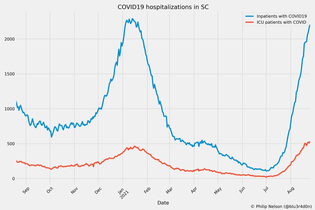
During August 2020, the CDC stopped reporting hospitalization data and the federal government shifted to using data collected by the Department of Health and Human Services (HHS) and Teletracking. DHEC provided a geoservice for hospitalizations, based off of data provided to DHEC by Teletracking on behalf of the HHS. I did some exploration of the hospitalization REST API and found that the data in this API was facility-level (individual hospitals), updated daily. I aggregated the numbers in the API based on the report date in order to provide data for my hospitalization graph. At the time, I didn’t know that the federal government does not provide daily facility level data to the public.
In October 2020, DHEC put their ZIP code-level API behind authentication. I voiced my displeasure publicly. In late December 2020, DHEC put the API that contained county level cases and deaths behind authentication. At this point, I began to get frustrated with DHEC for putting things behind authentication without warning, but I kind-of gave up on getting the deaths data out of an API. Thankfully, DHEC still provided an API for confirmed cases, so I switched my scripts to scrape death data from PDFs provided by DHEC each day. I didn’t like using the PDFs because they did not capture deaths that were retroactively moved from one date to another, unlike the API.
I ran my daily updates until early June 2021, when DHEC changed their reporting format to a weekday-only schedule. I assumed that we’d seen the last wave of the pandemic and that, thanks to readily available vaccines, we had relegated the virus to a containable state. Unfortunately, that was not the case — and by mid-July, I had resumed my daily updates.
Hospitalization data issues
In August 2021, people in my Twitter circle became interested in pediatric data. I decided to return to exploring the hospitalization API because I knew it had pediatric-related attributes. It was during that exploration that I realized I had access to daily facility-level data that the federal government was not providing to the public; the federal government provides weekly facility-level data. My first reaction was to build a Tableau dashboard that let people look at the numbers of adults and pediatric patients with COVID19 at the facility level in South Carolina over time.
After posting that dashboard on Twitter, I kept hearing that people wanted a replacement for DHEC’s hospitalization dashboard which, at the time, only updated on Tuesdays. So, I made a similar dashboard that provided more information and allowed users to filter down to specific days and individual hospitals, then I tweeted it at DHEC. Admittedly, this probably wasn’t the smartest move.
I kept exploring the hospitalization data and found that it contained COVID-19-related emergency department visits by day, another data point provided weekly by HHS. After plotting out the total number of visits each day and reading the criteria for this data point, I decided I needed to make another dashboard for this. A day after I posted the dashboard to Twitter, DHEC put the API I was using behind authentication, again I tweeted my frustration.
A little while later, DHEC messaged me on Twitter and told me that they were doing repairs to the API. I was later informed that the API was no longer accessible, and that I would have to use DHEC’s dashboard or HHS data. The agency’s dashboard does not allow data downloads, making it difficult for programmers to use it as a source for original analysis and visualization.
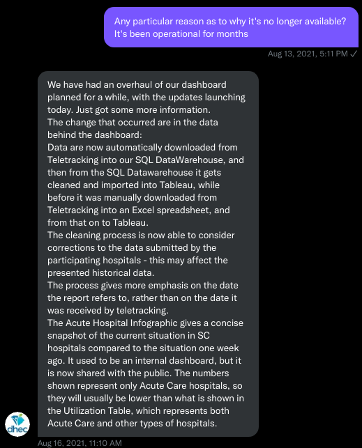
I asked for information on why the API was no longer operational; DHEC responded that they had overhauled their hospitalization dashboard, resulting in changes to how they ingest data from the federal government. This response did not make it clear why DHEC needed to put authentication on the daily facility-level hospitalization data.
Twitter conversation between Philip and the South Carolina DHEC, shared by Philip.
Meanwhile, DHEC’s hospital utilization dashboard has started updating daily again. But after examining several days’ worth of data, I cannot figure out how the numbers on DHEC’s dashboard correlate to HHS data. I’ve tried matching columns from a range dates to the data displayed, but haven’t been able to find a date where the numbers are equal. DHEC says the data is sourced from HHS’ TeleTracking system on their dashboard, but it’s not immediately clear to me why the numbers do not match. I’ve asked DHEC for an explanation, but haven’t received a response.
Lack of transparency from DHEC
I’ve recently started to get familiar with the process of using FOIA requests. In the past week, I got answers on requests that I submitted to DHEC for probable cases by county per day. This data is publicly accessible (but not downloadable) via a Tableau dashboard, but there is over 500 days’ worth of data for 46 counties. The data DHEC gave to me through the FOI process are heavily suppressed and, in my opinion, not usable.
This has been quite a journey for me, especially in learning how to communicate and collect data. It’s also been a lesson in how government agencies don’t always do what we want them to with data. I’ve learned that sometimes government agencies don’t always explain (or publicize) the data they provide, and so the job of finding and understanding the data is left to the people who know how to pull the data from these sources.
It’s also been eye-opening to understand that sometimes, I’m not going to be able to get answers on why a state-level agency is publishing data that doesn’t match a federal agency’s data. Most of all, it’s been a reminder that we always need to press government-operated public health agencies to be as transparent as possible with public health data.
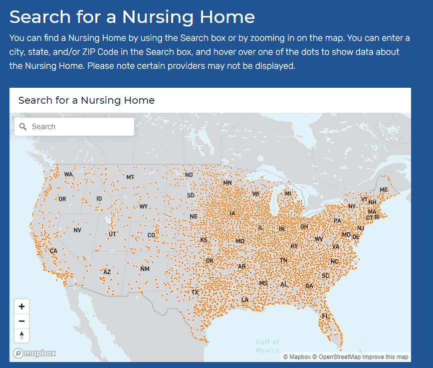
Among many other responsibilities, CMS oversees the nation’s nursing homes—providing funding, monitoring quality standards, and more. As a result, CMS has tracked COVID-19 cases and deaths in nursing homes throughout the pandemic, along with tracking how well nursing homes adhere to standards such as PPE use and regular testing.
The agency’s public data COVID-19 in nursing homes used to be displayed as a very basic page with links out to spreadsheet downloads. In fact, back in September 2020, I called out the website for its poor data accessibility, explaining that the site was set up in a manner challenging for screenreaders.
Now, the site includes a customized data explorer, easy-to-read overarching statistics, and an API that developers can use to readily access nursing home data. Perhaps most useful for the average reader (and for local journalists) is a data visualization section. Users can search an interactive map for nursing homes in their area, then view those facilities’ COVID-19 stats. The section also includes maps displaying nursing home COVID-19 cases, deaths, and vaccinations by state.
In short, CMS’s COVID-19 data are now both easier to access (from the journalist’s or researcher’s perspective) and easier to explore right on the agency’s website. Thank you, CMS developers!
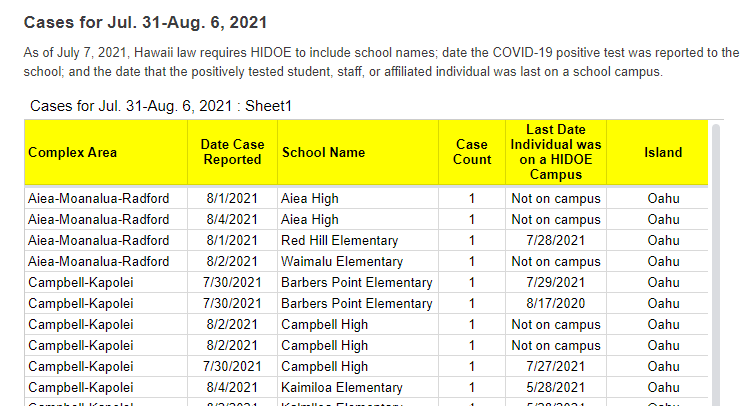
A snippet of Hawaii’s new-and-improved school COVID-19 case reporting. Screenshot taken on August 8.
As noted in our “Opening” project intro, many states have paused their school COVID-19 case reporting for the summer—and a few have stopped reporting school cases entirely. Hawaii appears to be an exception: this state actually improved its reporting for the new school year.
Where the state previously just reported total cases for each island (or county) of Hawaii, it’s now reporting cases by individual school. Hawaii also reports the date a case was reported and the last date that the COVID-positive individual was on campus.
It’s still not perfect; ideally, Hawaii would also give us in-person enrollment or other numbers to contextualize these cases. But it’s a big improvement, useful for both Hawaii public school families and researchers like yours truly. Thanks Hawaii!
We’ve noted in recent months that several states have scaled down their COVID-19 reporting: states are providing fewer metrics, updating their dashboards less frequently, or both. For example, Florida switched from a dashboard and daily PDF reports to weekly reports with much less information.
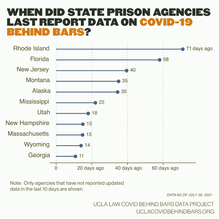
According to the UCLA COVID Behind Bars data project, these changes are also hitting state carceral agencies—responsible for reporting COVID-19 cases in prisons and jails—right as Delta causes new outbreaks in these facilities.
Four agencies have stopped reporting these data altogether: state agencies in Florida, Georgia, and Massachusetts along with the Texas Commission on Jail Standards. Several other states haven’t updated their public data in over a month, including Rhode Island, New Jersey, Montana, and Alaska.
“Carceral agencies are responsible for the care of those in their custody, and, at a bare minimum, these agencies must track and report on COVID-19 cases and deaths in their facilities, regardless of the number of cases,” researchers from the UCLA project wrote in a recent blog post. “The fact that many are no longer doing so, or are doing so less frequently, is especially concerning given that the Delta variant is circulating rapidly around the country.”
The UCLA researchers say that these data reductions come as new outbreaks hit prisons in Delta hotspots: “Prisons in Texas and Missouri, for example, have seen a 500% increase in the number of active cases over the month of July.” Many prison residents and staffers are not vaccinated, leaving them vulnerable to the variant.
Right now, we need more information on COVID-19 in these facilities, not less.
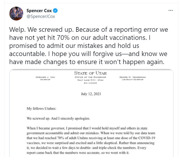
Utah hasn’t hit 70% adult vaccinations yet—but a recent data error led state officials to erroneously announce the benchmark had been hit. Spencer Cox, Utah’s governor, posted an apology on Twitter that drew attention for his commitment to transparency and accountability.
Welp. We screwed up. Because of a reporting error we have not yet hit 70% on our adult vaccinations. I promised to admit our mistakes and hold us accountable. I hope you will forgive us—and know we have made changes to ensure it won’t happen again. pic.twitter.com/NZK8A8gabt
“My fellow Utahns,” the statement opens, “We screwed up. And I sincerely apologize.” Cox goes on to explain the data error, affirm the state health agency’s commitment to accurate numbers, and emphasize the need for easily-accessible vaccinations.
The data error arose from the challenge of matching state and federal data. In Utah, like in every other state, a small number of vaccine doses are administered under the federal government’s purview via the federal-pharmacy chain partnership, the Department of Defense, Indian Health Services, and other agencies. When Utah officials added the federal doses to state numbers, they initially found that 70% of adults had received at least one shot—the true number is just over 67%, Cox said.
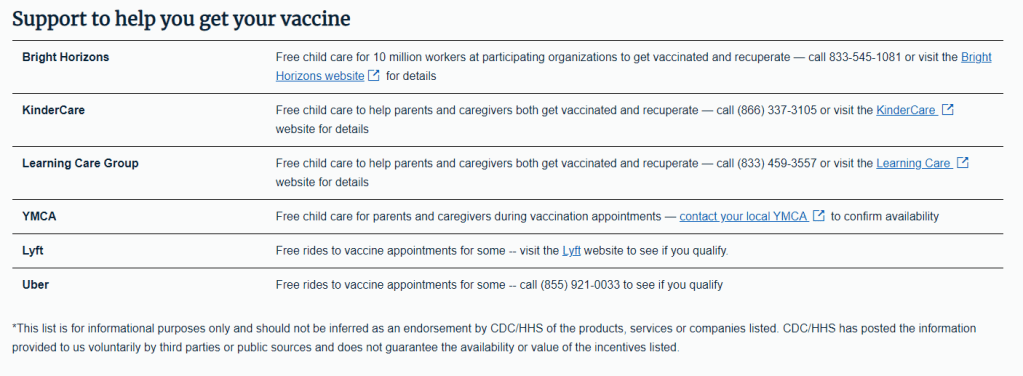
Also, while poking around Utah’s COVID-19 website to better understand the data error, I found that the state has some great vaccine promotions going. These include the option to request a free mobile vaccination clinic in your community and this truly incredible “Vaccine Mythbusters” video. With the help of these initiatives, Utah is sure to hit 70% soon.
Screenshot of the now-downsized vaccine incentives page.
In the June 6 issue, one of our featured sources was a page from the federal government’s vaccine.gov site, providing an extensive list of rewards for Americans who got their shots—ranging from free Krispy Kreme donuts to a United Airlines sweepstakes.
Now, however, that same page only offers a small list of support options for Americans who may need assistance in making their appointments. These include childcare support and free rides from Uber and Lyft; still valuable information, but a huge change from the previous page.
What happened to the big list? A new note at the bottom of the page offers a clue: “This list is for informational purposes only and should not be inferred as an endorsement by CDC/HHS of the products, services or companies listed.”
In recent weeks, several states have cut back on their COVID-19 data reporting frequency. Though, as I wrote on June 20, this isn’t a new phenomenon—some states have always skipped updating their data on weekends—the trend signifies that U.S. public health agencies are reallocating time and resources from their COVID-19 dashboards to other programs.
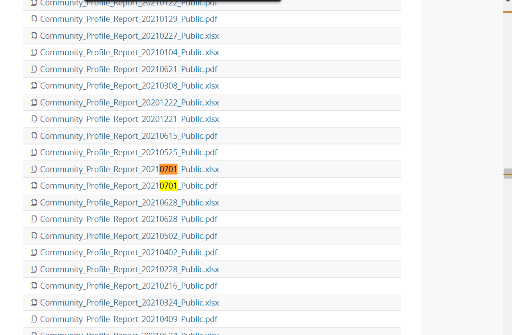
One major federal data source has recently made a similar change. The Community Profile Reports, those extensive PDF reports and Excel files that contain everything from vaccination coverage to hospital capacity, are now published on Tuesdays and Fridays only. (Previously, these reports were posted every day.)
Now, a lot of the data that one can find in the Community Profile Reports are also available from other sources—the CDC COVID Data Tracker, the CDC’s data portal, HHS Protect, etc. The main draw of these reports is that they compile so much info in one place, including data for counties and metro areas. I can understand why the HHS data team may want to cut down on their update schedule to free up resources for other projects. (More variant data, maybe?)
But what really annoys me is, someone at the HHS appears to have… shuffled the order of download links on the Community Profile Report page? That “Attachments” section with all of the PDFs and Excel files going back to December used to be in chronological order, with the most recent files at the top. Now, the order is completely random.
I shouldn’t have to Cntrl+F to the middle of the page to find the most recent report. Come on.


