The CDC’s new COVID-19 dashboard suggests that the national situation is totally fine, because hospitalizations are low. But is that correct?
On Thursday, the CDC revamped its COVID-19 dashboard in response to changing data availability with the end of the federal public health emergency. (For more details on the data changes, see my post from last week.) The new dashboard downplays continued COVID-19 risk across the U.S.
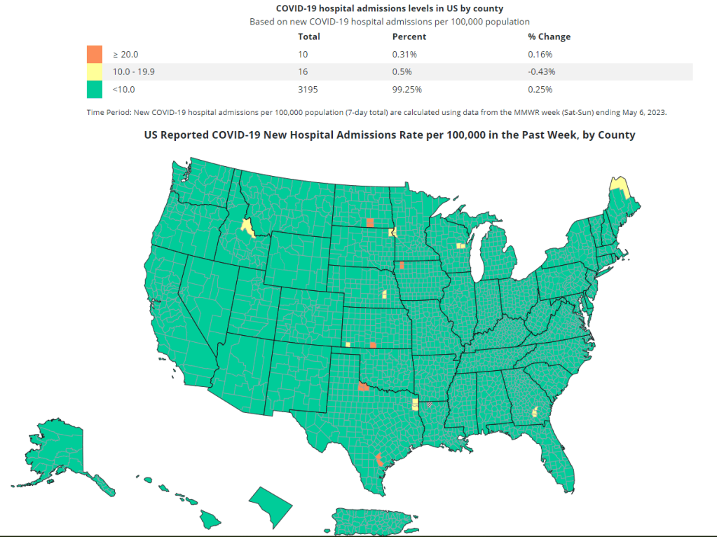
Overall, the new dashboard makes it clear that case counts are no longer available, since testing labs and state/local heath agencies aren’t sending those results to the CDC anymore. You can’t find case counts or trends on the homepage, at the top of the dashboard, or in a county-level map.
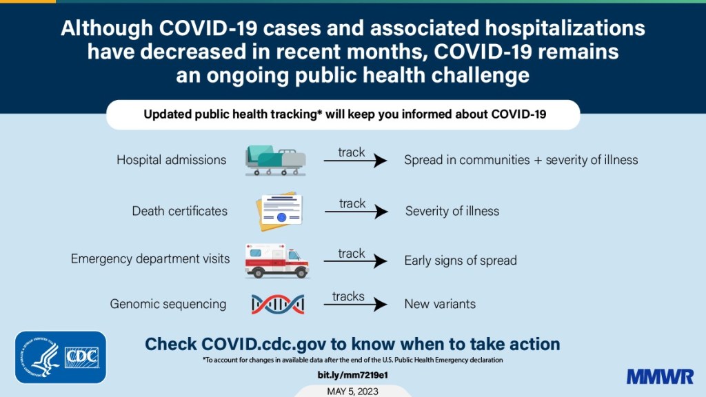
Instead, the CDC is now displaying data that shows some of COVID-19’s severe impacts— hospitalizations and deaths—without making it clear how widely the virus is still spreading. Its key metrics are new hospital admissions, currently-hospitalized patients, emergency room visits, and the percentage of recent deaths attributed to COVID-19. You can find these numbers at national and state levels in a revamped “trends” page, and at county levels in a “maps” page.
The “maps” page with county-level data has essentially replaced the CDC’s prior Community Level and Transmission Level page, where users were previously able to find COVID-19 case rates and test positivity rates by county. In fact, as of May 13, the URL to this maps page is still labeled as “cases” when you click into it from the main dashboard.
While these changes might be logical (given that case numbers are no longer available), I think the CDC’s design choices here are worth highlighting. By prioritizing hospitalizations and deaths, the CDC implicitly tells users of this dashboard that the virus should no longer be a concern for you unless you’re part of a fairly small minority of Americans at high risk of those severe outcomes.
But is that actually true, that COVID-19 is no longer a concern unless you’re going to go to the hospital? I personally wouldn’t agree. I’d prefer not to be out sick for a week or two, if I can avoid it. And I’d definitely like to avoid any long-term symptoms—or the long-term risks of heart problems, lung problems, diabetes, etc. that may come after a coronavirus infection.
These outcomes still persist after a mild COVID-19 case. But the current CDC data presentation makes it hard to see those potential outcomes, or your risk of getting that mild COVID-19 case. The agency still has some data that can help answer these questions (wastewater surveillance, variant surveillance, Long COVID survey results, etc.) but those numbers aren’t prioritized to the same degree as hospitalizations and deaths.
I’m sure the CDC data scientists behind this new dashboard are doing the best they can with the information they have available. Still, in this one journalist’s opinion, they could’ve done more to make it clear how dangerous—and how widely prevalent—COVID-19 still is.
With the end of the Public Health Emergency, the CDC has removed the COVID transmission map from their website.
For other dashboards that continue to provide updates, see my list from a few weeks ago. I also recommend looking at your state and local public health agencies to see what they’re doing in response to the PHE’s end.
We’re now less than one week out from May 11, when the federal public health emergency (or PHE) for COVID-19 will end. While this change doesn’t actually signify that COVID-19 is no longer worth worrying about, it marks a major shift in how U.S. governments will respond to the ongoing pandemic, including how the disease is tracked and what public services are available.
I’ve been writing about this a lot in the last couple of months, cataloging different aspects of the federal emergency’s end. But I thought it might be helpful for readers if I compiled all the key information in one place. This post also includes a few new insights about how COVID-19 surveillance will change after May 11, citing the latest CDC reports.
What will change overall when the PHE ends?
The ending of the PHE will lead to COVID-19 tests, treatments, vaccines, and data becoming less widely available across the U.S. It may also have broader implications for healthcare, with telehealth policies shifting, people getting kicked off of Medicaid, and other changes.
Free COVID-19 vaccines, tests, and treatments will run out after the federal government’s supplies are exhausted. (Health experts project that this will likely happen sometime in fall 2023.) At that point, these services will get more expensive and harder to access as they transition to private healthcare markets.
We will have fewer COVID-19 metrics (and less complete data) to rely on as the CDC and other public health agencies change their surveillance practices. More on this below.
Manyvaccination requirements are being lifted. This applies to federal government mandates as well as many from state/local governments and individual businesses.
The FDA will phase out its Emergency Use Authorizations (EUAs) for COVID-19 products, encouraging manufacturers to apply for full approval. (This doesn’t mean we’ll suddenly stop being able to buy at-home tests—there’s going to be a long transition process.)
Healthcare worker shortages may get worse. During the pandemic emergency, some shifts to work requirements allowed facilities to hire more people, more easily; as these policies are phased out, some places may lose those workers.
Millions of people will lose access to Medicaid. A federal rule tied to the PHE forbade states from kicking people off this public insurance program during the pandemic, leading to record coverage. Now, states are reevaluating who is eligible. (This process actually started in April, before the official PHE end.)
Telehealth options may become less available. As with healthcare hiring, policies during the PHE made it easier for doctors to provide virtual care options, like video-call appointments and remote prescriptions. Some of these COVID-era rules will be rolled back, while others may become permanent.
People with Long COVID will be further left behind, as the PHE’s end leads many people to distance themselves even more from the pandemic—even though long-haulers desperately need support. This will also affect people who are at high risk for COVID-19 and continue to take safety precautions.
Pandemic research and response efforts may be neglected. Lee referenced the “panic and neglect” cycle for public health funding: a pattern in which governments provide resources when a crisis happens, but then fail to follow through during less dire periods. The PHE’s end will likely lead us (further) into the “neglect” part of this cycle.
A lot of the information isn’t new, such as the phasing out of Community Level metrics for counties (which I covered last week). But it’s helpful to have all the details in one place. Here are a few things that stuck out to me:
Hospital admissions will be the CDC’s primary metric for tracking trends in COVID-19 spread rather than cases. While more reliable than case counts, hospitalizations are a lagging metric—it takes typically days (or weeks) after infections go up for the increase to show up at hospitals, since people don’t seek medical care immediately. The CDC will recieve reports from hospitals at a weekly cadence, rather than daily, after May 11, likely increasing this lag and making it harder for health officials to spot new surges.
National case counts will no longer be available as PCR labs will no longer be required to report their data to the CDC. PCR test totals and test positivity rates will also disappear for the same reason, as will the Community Levels that were determined partially by cases. The CDC will also stop reporting real(ish)-time counts of COVID-associated deaths, relying instead on death certificates.
Deaths will be the primary metric for tracking how hard COVID-19 is hitting the U.S. The CDC will get this information from death certificates via the National Vital Statistics System. While deaths are reported with a significant lag (at least two weeks), the agency has made a lot of progress on modernizing this reporting system during the pandemic. (See this December 2021 post for more details.)
The CDC will utilize sentinel networks and electronic health records to gain more information about COVID-19 spread. This includes the National Respiratory and Enteric Virus Surveillance System, a network of about 450 laboratories that submit testing data to the CDC (previously established for other endemic diseases like RSV and norovirus). It also includes the National Syndromic Surveillance Program, a network of 6,300 hospitals that submit patient data to the agency.
Variant surveillancewill continue, using a combination of PCR samples and wastewater data. The CDC’s access to PCR swab samples will be seriously diminished after May 11, so it will have to work with public health labs to develop national estimates from the available samples. Wastewater will help fill in these gaps; a few wastewater testing sites already send the CDC variant data. And the CDC will continue offering tests to international travelers entering the country, for a window into global variant patterns.
The CDC will continue tracking vaccinations, vaccine effectiveness, and vaccine safety. Vaccinations are generally tracked at the state level (every state health agency, and several large cities, have their own immunization data systems), but state agencies have established data sharing agreements with the CDC that are set to continue past May 11. The CDC will keep using its established systems for evaluating how well the vaccines work and tracking potential safety issues as well.
Long COVID notably is not mentioned in the CDC’s reports. The agency hasn’t put much focus on tracking long-term symptoms during the first three years of the pandemic, and it appears this will continue—even though Long COVID is a severe outcome of COVID-19, just like hospitalization or death. A lack of focus on tracking Long COVID will make it easier for the CDC and other institutions to keep minimizing this condition.
On May 11, the CDC plans to relaunch its COVID-19 tracker to incorporate all of these changes. The MMWR on surveillance changes includes a list of major pages that will shift or be discontinued at this time.
Overall, the CDC will start tracking COVID-19 similar to the way it tracks other endemic diseases. Rather than attempting to count every case, it will focus on certain severe outcomes (i.e., hospitalizations and deaths) and extrapolate national patterns from a subset of healthcare facilities with easier-to-manage data practices. The main exception, I think, will be a focus on tracking potential new variants, since the coronavirus is mutating faster and more aggressively than other viruses like the flu.
What should I do to prepare for May 11?
If you’ve read this far, you’re probably concerned about how all these shifts will impact your ability to stay safe from COVID-19. Unfortunately, the CDC, like many other public agencies, is basically leaving Americans to fend for themselves with relatively little information or guidance.
But a lot of information sources (like this publication) are going to continue. Here are a few things I recommend doing this week as the PHE ends:
Look at your state and local public health agencies to see how they’re responding to the federal shift. Some COVID-19 dashboards are getting discontinued, but many are sticking around; your local agency will likely have information that’s more tailored to you than what the CDC can offer.
Stock up on at-home tests and masks. This is your last week to order free at-home/rapid tests from your insurance company if you have private insurance. It’s also a good time to buy tests and masks; many distributors are having sales right now.
Figure out where you might get a PCR test and/or Paxlovid if needed. These services will be harder to access after May 11; if you do some logistical legwork now, you may be more prepared for when you or someone close to you gets sick. The People’s CDC has some information and links about this.
Contact your insurance company to find out how their COVID-19 coverage policies are changing, if you have private insurance. Folks on Medicare and Medicaid: this Kaiser Family Foundation article has more details about changes for you.
Ask people in your community how you can help. This is a confusing and isolating time for many Americans, especially people at higher risk for COVID-19. Reaching out to others and offering some info or resources (maybe even sharing this post!) could potentially go a long way.
That was a lot of information packed into one post. If you have questions about the ending PHE (or if I missed any important details), please email me or leave a comment below—and I’ll try to answer in next week’s issue.
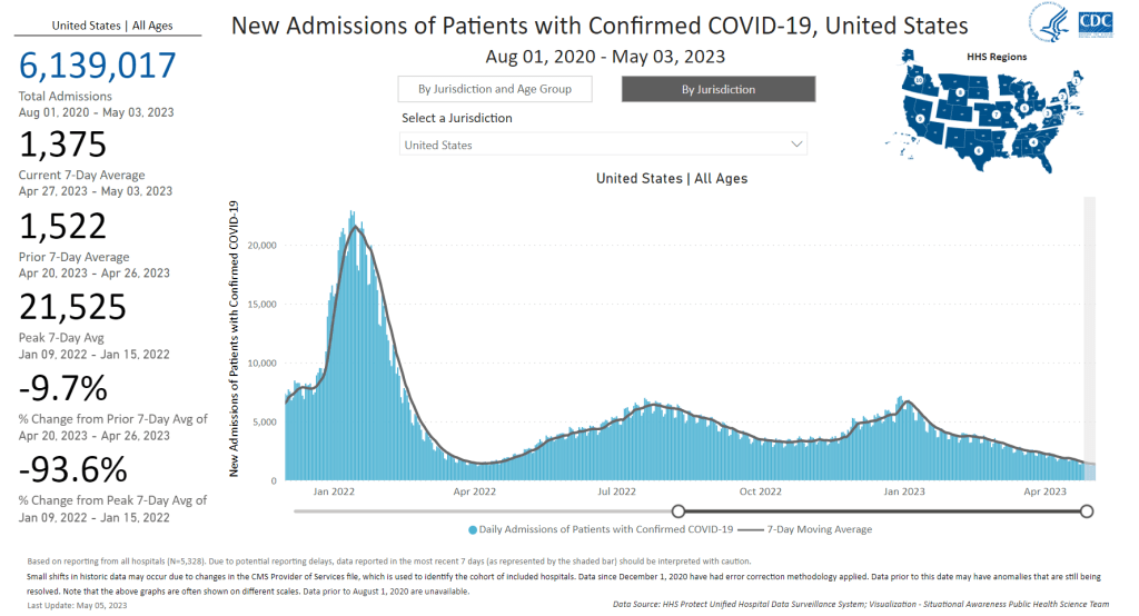
New hospital admission for COVID-19 continue to drop, though they are at higher levels than we’ve seen in past lulls. Chart from the CDC dashboard.
In the past week (April 27 through May 3), the U.S. officially reported about 77,000 new COVID-19 cases, according to the CDC. This amounts to:
An average of 11,000 new cases each day
14% fewer new cases than last week (April 20-26)
In the past week, the U.S. also reported about 10,000 new COVID-19 patients admitted to hospitals. This amounts to:
An average of 1,400 new admissions each day
2.9 total admissions for every 100,000 Americans
10% fewer new admissions than last week
Additionally, the U.S. reported:
1,100 new COVID-19 deaths (150 per day)
67% of new cases are caused by Omicron XBB.1.5; 13% by XBB.1.9; 13% by XBB.1.16 (as of May 6)
An average of 60,000 vaccinations per day
The national COVID-19 plateau persists. Cases, new hospitalizations, and wastewater surveillance all indicate slight declines (but persistent disease spread) across the country. New variants are on the rise, but have yet to noticeably change these trends.
New COVID-19 cases declined by about 14% last week compared to the week prior, while hospital admissions declined by 10%. While the case numbers might seem low (just 11,000 reported each day), they are a drastic undercount of true infections, as we can see by comparing total new cases to new hospitalizations.
This week, the CDC’s reported cases were about eight times the number of new hospital admissions reported by the agency. While this time last year, new cases were 30 times new hospital admissions. In other words, as case reporting gets less accurate, we are still tracking cases with severe sypmtoms (i.e. those that require hospitalization), but missing many of the mild or asymptomatic cases—that could still lead to detrimental outcomes, like Long COVID.
Wastewater surveillance—which provides population-level data regardless of how many people are getting PCR tests or otherwise seeking healthcare—suggests that the U.S. has been at an overall plateau of COVID-19 spread, but a higher one than we’ve experienced in past lulls (such as in spring 2021, when people were receiving their first vaccine doses).
Biobot’s national wastewater data shows fairly steady transmission for the last month. The company’s regional data shows a similar picture; the West Coast has slightly higher coronavirus levels than the other three major regions, but is on a decline. A few counties in California and other West states have seen increases recently, but it’s not a sustained pattern across the board.
Newer versions of the Omicron variant are competing with XBB.1.5, but the transition is happening slowly. XBB.1.5 still caused about two-thirds of new cases in the U.S. last week, according to CDC estimates, while XBB.1.16 and XBB.1.9 both caused about 13% of new cases.
It’s currently hard to say if the country will face a real surge from XBB.1.16 and XBB.1.9. XBB.1.16 has wreaked some havoc internationally, but it may be similar enough to the variants now circulating in the U.S. that it won’t make a huge dent. Or, if we do see an increase in cases, it could be more like a “mini-wave” of largely-mild infections than a surge that really strains the healthcare system.
This “mini-wave” idea has been covered by a few news outlets recently, including Natureand the Atlantic. It’s certainly promising that the U.S. hasn’t had a real surge since the winter holidays, now almost six months ago—but we have to remember that any new cases, no matter how low the numbers are, can lead to potential severe symptoms and long-term illness. I, for one, am not letting up my guard on safety.
A lot of healthcare organizations have ended mask mandates in recent months, many of them citing guidance changes at state or local levels to no longer require this level of precaution. Some of this stems back to a CDC policy change last fall; the agency recommended that healthcare settings only need universal masking when COVID-19 spread is high.
Now, this is likely another case of the CDC—and potentially quite a few other health agencies—making recommendations that are, in fact, very dangerous. There’s plenty of evidence to support that mask mandates should continue in healthcare settings, to protect vulnerable patients from COVID-19 and many other illnesses.
Let’s go over some key points:
Hospital-acquired COVID-19 infections: Since the start of the pandemic, people who go to the hospital for issues other than COVID-19 have contracted the virus while there. The HHS tracks these cases, and their data show that this is a continued problem: even as new COVID-19 admissions in hospitals have declined in 2023, hospital-acquired infections have continued to be an issue, with hundreds of these cases reported each day in recent months. Universal masking reduces these infections.
Wastewater surveillance in hospitals: Another way to track COVID-19 in healthcare settings is through targeted wastewater surveillance, taking samples from a particular facility’s sewage. A few hospital systems are doing this, such as NYC’s public system (Health + Hospitals). While there are limited public data from these programs, researchers who run them have said that the results show consistent COVID-19 spread; masks help mitigate this transmission.
Healthcare facility outbreaks: After lifting a mask mandate, hospitals and other healthcare facilities may have COVID-19 outbreaks among patients and staff—both putting vulnerable patients at risk and exacerbating staffing shortages. One hospital in the Bay Area recently reinstated a mask mandate after such an outbreak, according to local paper the San Francisco Chronicle.
Patients hesitant to visit: Many patients at higher risk for severe COVID-19 may become wary of routine doctors’ visits or procedures if their clinics stop requiring masks. This is a sentiment I’ve seen frequently on social media over the last few months, as higher-risk people push for healthcare organizations to keep their mask mandates.
Harming long-term outcomes: Any already-vulnerable person who gets COVID-19 at a healthcare facility is likely to face long-term symptoms from the virus, potentially complicating their existing chronic conditions. This fact contributes to individual patients’ wariness, and it can also lead to complications for potential treatments or research studies. For example, a Stanford study testing Paxlovid for Long COVID has recently stopped requiring its staff to mask, according to patient reports; participants have pointed out that this could harm the study’s results.
If you’re interested in getting involved with advocacy in this area, I recommend checking out Mandate Masks US and connected organizations. These groups are pushing for masks to remain in healthcare through social media campaigns, petitions, contacting politicians, and even some in-person protests.
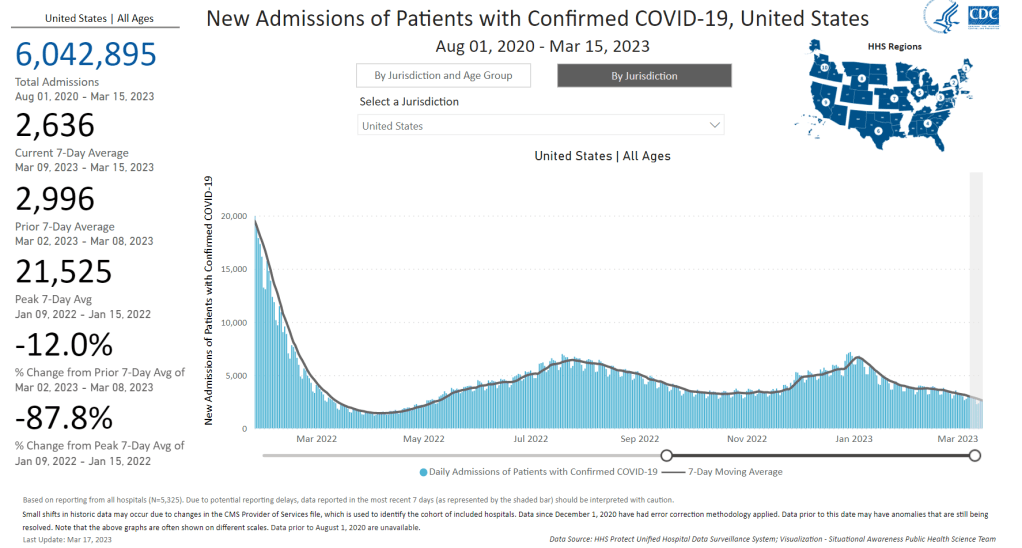
New hospital admissions have fallen significantly from their recent peak in January, but are still much higher than at this time last year. Chart from the CDC.
In the past week (March 9 through 15), the U.S. officially reported about 150,000 new COVID-19 cases, according to the CDC. This amounts to:
An average of 21,000 new cases each day
46 total new cases for every 100,000 Americans
20% fewer new cases than last week (March 2-8)
In the past week, the U.S. also reported about 19,000 new COVID-19 patients admitted to hospitals. This amounts to:
An average of 2,800 new admissions each day
5.9 total admissions for every 100,000 Americans
10% fewer new admissions than last week
Additionally, the U.S. reported:
1,700 new COVID-19 deaths (240 per day)
90% of new cases are caused by Omicron XBB.1.5; 2% by XBB.1.5.1; 0.5% by CH.1.1 (as of March 18)
An average of 40,000 vaccinations per day
The trend continues: COVID-19 spread is still on the decline across the U.S., but it’s a slow decline. These updates are getting pretty repetitive to write, as we’ve been seeing this pattern since late January—which, honestly, I’m taking as a good sign.
Last week, I noted that the drop in official COVID-19 cases (reported to the CDC) was exaggerated slightly because of data delays; three states didn’t report cases in the week ending March 8. This week, the same thing happened for three different states: Texas, Arkansas, and Indiana. We’ll likely continue to see reporting issues like this, as state and local health departments put fewer resources into tracking COVID-19.
Even so, the official case data, hospital admissions, and wastewater surveillance all point to continued decreases in coronavirus transmission. National hospital admissions dropped by about 12% this week compared to the week prior. But there are still a lot of Americans getting severe COVID-19 symptoms, with more than 3,000 people newly hospitalized each week for the last month.
Wastewater surveillance data from Biobot suggest that coronavirus spread is getting lower, but it’s still at much higher levels nationally than we saw at this time in 2021 and 2022. Regionally, the Midwest now has slightly more virus circulating than other parts of the country, but all four major regions are seeing slow declines or plateaus.
In other good news: flu activity is still low nationally, according to the CDC’s flu surveillance. Experts had worried we might see a second flu surge, driven by a different strain of the influenza virus, after the initial surge died down in January. But so far, that hasn’t happened. Almost every state reported moderate or low levels of influenza-like activity in the week ending March 11.
XBB.1.5 continues to be the dominant coronavirus lineage in the U.S., causing an estimated 90% of cases nationwide in the week ending March 18. XBB.1.5.1, a descendant of XBB.1.5, is growing slowly (it caused an estimated 2% of cases nationwide this week) and doesn’t seem to be very competitive yet. The CDC also has yet to break out XBB.1.9 or XBB.1.16, other subvariants that mutated from XBB.
Yesterday, I spoke about wastewater surveillance at New York City School of Data, a civic conference that’s part of the city’s Open Data Week. While the conference wasn’t focused on health or science topics, the organizers required masks and checked attendees’ vaccinations. I also brought my CO2 monitor to the event, and found ventilation was generally good in the session rooms. This conference was a nice reminder that some organizations are still following the data and science on COVID-19 precautions.
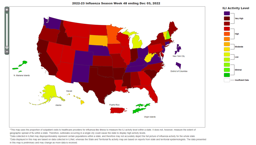
The CDC’s influenza-like illness map shows that the vast majority of the country is facing either high or very high levels of respiratory disease.
In the past week (December 1 through 7), the U.S. reported about 460,000 new COVID-19 cases, according to the CDC. This amounts to:
An average of 66,000 new cases each day
140 total new cases for every 100,000 Americans
50% more new cases than last week (November 24-30)
In the past week, the U.S. also reported about 34,000 new COVID-19 patients admitted to hospitals. This amounts to:
An average of 4,800 new admissions each day
10.3 total admissions for every 100,000 Americans
14% more new admissions than last week
Additionally, the U.S. reported:
3,000 new COVID-19 deaths (430 per day)
68% of new cases are caused by Omicron BQ.1 and BQ.1.1; 6% by BF.7; 4% by BN.1; 5% by XBB (as of December 10)
An average of 300,000 vaccinations per day
It’s now undeniable that Thanksgiving led to a jump in COVID-19 spread: officially-reported cases went up 50% this past week compared to the week of the holiday, following the trend that we first saw in wastewater data. Hospital admissions for COVID-19 also continue to go up.
As always, it’s important to remember that official case counts are significantly underreported, due to dwindling access to (and interest in) PCR testing. So, the CDC’s estimate of 66,000 new COVID-19 cases each day likely amounts to over a million actual new infections each day. And that’s adding to the surges of flu, RSV, and other respiratory viruses already going strong.
“Levels of flu-like illness, which includes people going to the doctor with a fever and a cough or sore throat, are at either high or very high levels in 47 jurisdictions,” CDC Director Dr. Rochelle Walensky said at a media briefing last Monday. That “flu-like illness” metric, shown on the CDC’s flu dashboard, is primarily used as an estimate of flu cases, but in our era of under-testing it likely includes COVID-19 and other viruses with similar symptoms.
Dr. Walensky said that current hospitalizations for flu are the highest they’ve been in a decade for this time of year, indicating that the U.S. is having a bad flu season earlier in the winter than usual. According to Inside Medicine, flu hospitalizations actually overtook COVID-19 hospitalizations for the first time in the pandemic recently; though this trend could reverse as COVID-19 spreads more.
The flu surge could peak and give us a milder January, or it could continue to go up from here—it’s currently hard to say. Flu vaccination rates have been low this year, which doesn’t help. CDC officials highlighted the benefits of both the flu vaccine and the updated COVID-19 booster shots at their briefing on Monday.
Those updated COVID-19 boosters offer better protection against Omicron infection than prior vaccines, as real-world data has demonstrated. That should include protection against BQ.1 and BQ.1.1, the descendants of Omicron BA.5 that are currently causing the majority of cases in the U.S.—about 68% of new cases in the week ending December 10, per the CDC. XBB, the BA.2 subvariant that led to surges in Asian countries, is on the rise.
Last week, wastewater data from Biobot showed a steep increase in COVID-19 spread. This week, the company’s dashboard suggests that this surge may have already peaked in some parts of the country. Was Thanksgiving the start of a major winter wave, or was it more of a holiday blip? Future weeks of data will help answer this.
COVID-19 is still a public health emergency. At the moment, this is true according to both the general definition of this term and official declarations by the federal government. But the latter could change in the coming months, likely leading to more fragmentation in U.S. COVID-19 data.
A reader recently asked me about the federal government’s ability to compile and report COVID-19 data, using our new anonymous Google form. They asked: “Will the CDC at some point stop reporting COVID data even though it may still be circulating, or is it a required, reportable disease?”
It’s difficult to predict what the CDC will do, as we’ve seen in the agency’s many twists and turns throughout the pandemic. That said, my best guess here is that the CDC will always provide COVID-19 data in some form; but the agency could be severely limited in data collection and reporting based on the disease’s federal status.
The CDC’s authority
One crucial thing to understand here is that the CDC does not actually have much power over state and local public health departments. It can issue guidance, request data, distribute funding, and so forth, but it isn’t able to require data collection in many circumstances.
Outside of a public health emergency, CDC has no authority to require states to share data. And even in an emergency, for example, if you look on the COVID Data Tracker, there are systems that have half the states or some of the states. That’s because those were the ones that were willing to share. And that is a very big handicap of doing good modeling and good tracking… Everything you’re trying to measure, for any decision, is better if you measure it in all the states.
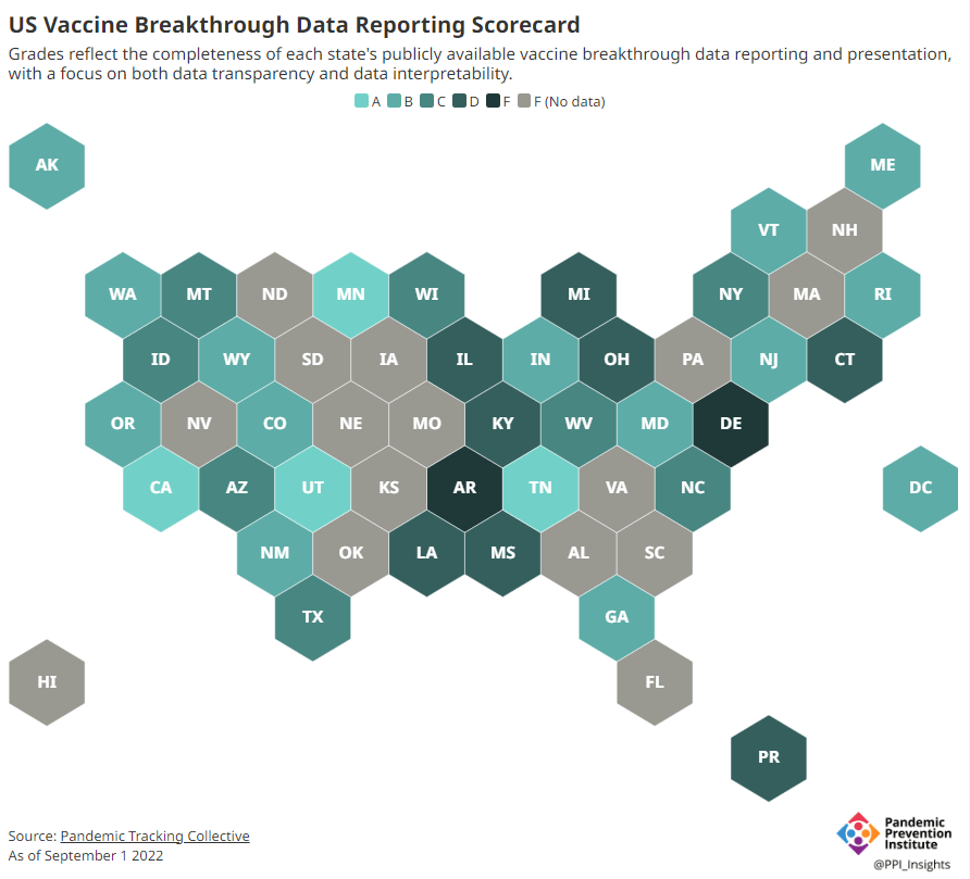
Consider breakthrough cases as one example. According to the Pandemic Prevention Institute’s scorecard for breakthrough data reporting, about half of U.S. states have D or F grades, meaning that they are reporting zero or very limited data on post-vaccination COVID-19 cases. The number of states with failing grades has increased in recent months, as states reduce their COVID-19 data resources. As a result, federal agencies have an incomplete picture of vaccine effectiveness.
Wastewater data is another example. While the CDC is able to compile data from all state and local public health departments with their own wastewater surveillance systems—and can pay Biobot to expand the surveillance network—the agency has no ability to actually require states to track COVID-19 through sewage. This lack of authority contributes to the CDC’s wastewater map still showing many empty spaces in states like Alabama and North Dakota.
During the COVID-19 pandemic, the federal emergency was specifically used to require data collection from state health departments and individual hospitals, POLITICO reported in May. According to POLITICO, the required data includes sources that have become key to our country’s ability to track the pandemic, such as:
PCR test results from state and local health departments;
Hospital capacity information from individual healthcare facilities;
COVID-19 patients admitted to hospitals;
COVID-19 cases, deaths, and vaccination status in nursing homes.
The federal COVID-19 public health emergency is formally controlled by HHS Secretary Xavier Becerra. Becerra most recently renewed the emergency in July, with an expiration date in October. Health experts anticipate that it will be renewed again in October, because HHS has promised to give states a 60-day warning before the emergency expires and there’s been no warning for this fall. That leaves us with a new potential expiration date in January 2023.
CDC officials are seeking to permanently expand the agency’s authority to include this data collection—with a particular priority on hospitalization data. But that hasn’t happened yet, to the best of my knowledge. So, what might happen to our data when the federal emergency ends?
Most likely, metrics that the CDC currently requires from states will become voluntary. As we see right now with breakthrough cases and wastewater data, some states will probably continue reporting while others will not. Our federal data will become much more piecemeal, a patchwork of reporting for important sources such as hospitalizations and lab test results.
It’s important to note here that many states have already ended their own public health emergencies, following a trend that I covered back in February. Many of these states are now devoting fewer resources to free tests, contact tracing, case investigations, public data dashboards, and other data-related efforts than they were in prior phases of the pandemic. New York was the latest state to make such a declaration, with Governor Kathy Hochul letting her emergency powers expire last week.
How the flu gets tracked
COVID-minimizing officials and pundits love to compare “endemic” COVID-19 to the flu. This isn’t a great comparison for many reasons, but I do think it’s helpful to look at how flu is currently tracked in the U.S. in order to get a sense of how COVID-19 may be tracked in the future.
The U.S. does not count every flu case; that kind of precise tracking on a large scale was actually a new innovation for COVID-19. Instead, the CDC relies on surveillance networks that estimate national flu cases based on targeted tracking.
There are about 400 labs nationwide (including public health labs in all 50 states) participating in flu surveillance via the World Health Organization’s global program, processing flu tests and sequencing cases to track viral variants. Meanwhile, about 3,000 outpatient healthcare providers in the U.S. Outpatient Influenza-like Illness Surveillance Network provide the CDC with flu-related electronic health records. You can read more about both surveillance programs here.
The CDC reports data from these surveillance programs on a dashboard called FluView. As you can see, the CDC provides estimates about flu activity by state and by different demographic groups, but the data may not be very granular (eg. no estimates by county or metro area) and are provided with significant time delays.
Other diseases are tracked similarly. For example, the CDC will track new outbreaks of foodborne illnesses like E. coli when they arise but does not attempt to log every infection. When researchers seek to understand the burden of different diseases, they often use hospital or insurance records rather than government data.
One metric that I’d expect to remain unchanged when the COVID-19 emergency ends is deaths: the CDC’s National Center for Health Statistics (NCHS) comprehensively tracks all deaths through its death certificate system. But even provisional data from NCHS are reported with a delay of several weeks, with complete data unavailable for at least a year.
Epidemiologists I’ve interviewed say that we should be inspired by COVID-19 to improve surveillance for other diseases, rather than allowing COVID-19 to fall into the flu model. Wastewater data could help with this; a lot of wastewater researchers (including those at Biobot) are already working on tracking flu and other diseases. But to truly improve surveillance, we need more sustained investment in public health at all levels—and more data collection authority for the CDC and HHS.
In last week’s issue, I mentioned that I am thinking more about preparedness: how the U.S. can improve our capacity to respond to public health threats, future COVID-19 surges and beyond. This mindset shift was brought on, in part, by a recent story I worked on at the Documenting COVID-19 project: examining the vulnerabilities in Idaho’s hospitals as a case study of the U.S.’s decentralized healthcare system.
Last summer and fall, Idaho was completely overrun by the Delta variant. State leaders implemented crisis standards of care, a practice allowing hospitals to conserve their limited resources when they are becoming overwhelmed. All hospitals in Idaho were in crisis standards for weeks, with the northern Panhandle region remaining in this crisis mode for over 100 days.
During this time, Idaho hospitals sent out 6,300 patient transfers in the span of four months. With Audrey Dutton, my reporting partner at the Idaho Capital Sun (a nonprofit newsroom covering Idaho state government), I analyzed data from the Idaho health department that showed where these patients were transferred, as well as how the crisis period compared to previous months.
This map shows all patient transfers out of Idaho hospitals between April and November 2021. Chart by Betsy Ladyzhets, published in the Idaho Capital Sun and MuckRock.
Here are the major findings from our story (borrowing some text from my Twitter thread, linked above):
More than one in three transfers went to hospitals in neighboring states, with the highest numbers going to eastern Washington.
Transfers went as far as Seattle, Salt Lake City, San Francisco, Billings, and even Phoenix. Many of these trips required air ambulances, due to Idaho’s mountainous geography.
These transfers strained Washington hospitals. Dr. Dave Chen, chief medical officer at MultiCare Deaconess Hospital in Spokane—one Washington hospital that took on a lot of Idaho patients—told me that smaller, rural facilities in his area are all “competing for the same beds and resources,” whether these facilities are based in Washington or Idaho.
Workers at facilities in the northern Idaho region, which remained in crisis standards for over 100 days, described doubling patients up in ambulances, traveling for hours to find free beds, and taking EMS staff away from their normal duties for long trips.
Idaho is particularly vulnerable to transfer challenges: it has a lot of small rural hospitals without many ICU beds or specialized equipment, combined with geography that often requires an air ambulance rather than driving.
This story has implications beyond Idaho, as it shows the impact of America’s fractured health system. In our system, when hospitals in one state are in crisis, they cannot easily communicate with other hospitals that might be able to help them out—whether “communicating” means calling up hospital administrators to ask about free beds or sharing data about patient numbers and resources.
This is not just a COVID-19 problem. Consider what happens when a wildfire, hurricane, or other natural disaster hits. When hospitals in one area become overwhelmed, they should be able to easily reach out to other facilities—but our system makes this incredibly difficult.
One potential solution to this issue may be centralized transfer centers, which field calls from hospitals that need to send out their patients. Washington started such a transfer center during the pandemic, to great success: Dr. Steve Mitchell, who helps run the center, told me that it facilitated more than 3,500 patient transfers, mostly between summer 2021 and early 2022.
But there’s a kicker: Washington’s transfer center is funded by the state health department, and therefore it can only answer calls from Washington hospitals. If an Idaho hospital wants to transfer a patient into Washington, it has to call various Washington hospitals directly until finding a bed for that patient—a much more time- and resource-intensive process.
Look at how siloed our current system is! This is ridiculous! Clearly, we need transfer centers with regional—or even national—reach, coordinated by a national health agency. We also need more data sharing between hospitals, and better communication between facilities and EMS providers.
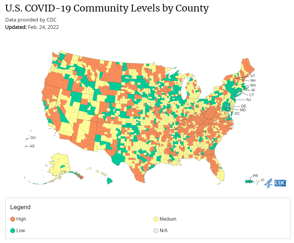
Under the new CDC guidance, about 70% of Americans live in counties where they can go unmasked in public. Chart via CDC.gov.
This past Friday, the CDC announced a major shift to its guidance for determining COVID-19 safety measures based on county-level community metrics. The new guidance is intended to replace COVID-19 thresholds that the agency developed last summer, during the Delta wave; here, the CDC is promoting a shift from using cases and test positivity for local decision-making to using metrics tied directly to the healthcare system.
This shift away from cases isn’t new: state health departments have been moving in this direction recently, as I wrote last week. Similarly, the CDC’s recommendation for when Americans should feel safe in taking off their masks aligns with recent guidance changes from state leaders.
The new guidance is essentially a lot more lenient when it comes to mask removal. Overnight, the U.S. goes from under 5% of counties in “low” or “moderate” transmission (under the old guidance) to over 60% of counties, representing 70% of the population, in a “low” or “medium” COVID-19 community level.
🚨🚨 the CDC has updated its guidance on using county-level COVID-19 metrics to drive recommended safety measures.
with the new guidance, we go from 82% of U.S. counties in "high" transmission (on the left) to only 37% of counties in high transmission (on the right). pic.twitter.com/Xz1Xj6FHDN
This shift will embolden more states, local health departments, and individual organizations to lift safety measures and change how they track COVID-19. In this post, I’ll unpack why I believe the CDC made certain choices with this new guidance, what critiques I’m seeing from public health experts, and some recommendations for thinking about your COVID-19 risk during this highly confusing pandemic era.
Rationale for the CDC’s new guidance
With this new framework, the CDC is essentially telling Americans to watch hospitalization numbers—not case numbers—as the most important metric to inform how hard COVID-19 is hitting their community. One piece of their logic is, I suspect, that case numbers are less reliable in this pandemic era than they have been since March 2020.
That lack of reliability largely stems from the rise of at-home rapid antigen tests, which gained popularity during the Omicron surge and are now largely unconstrained by supply issues. (For example: iHealth Labs, one major at-home test provider, now allows shoppers to buy up to 50 test kits per person, up from a limit of 10 during Omicron’s peak.)
Unlike PCR test results, which are systematically processed in labs and reported to public health agencies, at-home test results typically do not travel beyond a patient’s trash can. And while a few local jurisdictions (like D.C.) have given residents options to self-report their antigen tests, the majority have opted not to take on this challenge. As a result, current case numbers for almost everywhere in the U.S. are not very reflective of actual infections in the community.
In previous pandemic eras, researchers could use PCR test positivity as an indicator of how reliable case numbers might be for a particular jurisdiction: higher test positivity usually means that more cases are going unreported. But in the era of widespread rapid tests, test positivity is also less reliable, because rapid tests aren’t accounted for in the test positivity calculations either.
Case numbers do still have some utility, because people who have COVID-19 symptoms or need a test result to travel will continue seeking out PCR tests. The CDC guidance reflects this by keeping cases as one factor of its COVID-19 community level calculation. But cases are no longer the star of the show here.
Instead, the CDC is focusing on hospitalizations: specifically, new COVID-19 admissions per 100,000 people and the share of inpatient beds occupied by COVID-19 patients. New hospital admissions are a more reliable—and more timely—metric than the total number of patients hospitalized with COVID-19, because admissions reflect only the people coming in with symptoms that recently started, not the people who have been hospitalized for days or weeks.
The share of inpatient beds occupied by COVID-19 patients, meanwhile, reflects the strain that this disease is currently putting on a hospital system. The CDC is choosing to include all COVID-19 patients here, not only those who are hospitalized for COVID-specific symptoms (the correct choice, in my view). Agency director Dr. Rochelle Walensky gave a good explanation for this at a media briefing on Friday:
We are considering anybody in a hospital bed with COVID, regardless of the reason for admission, and the reason that we landed there is multifold. First, many jurisdictions can’t differentiate, so that was important for us to recognize and realize. Second, whether or not a patient is admitted with COVID or for COVID, they increase the hospital capacity and they’re resource intensive. They require an isolation bed. They require PPE. They probably require a higher staff ratio. And so they are more resource intensive and they do take a COVID bed potentially from someone else.
Interestingly, as well, as we have less and less COVID in certain communities, the amount of people who are coming into the hospital with COVID will necessarily decrease. We will not have as many people walking around asymptomatically because there will just be less disease out there. So increasingly, as we have less disease in the community, we anticipate that more of the people who are coming into the hospital are going to be coming in because of COVID.
And then finally, as we have even less disease in the community, we anticipate that not every hospital is going to screen every patient for COVID as they walk in the door, especially if we have less and less disease in the community. And when that happens, we won’t actually be able to differentiate. In fact, people who are coming in, who are tested will necessarily be coming in for COVID. So for all of those reasons, comprehensively, we decided to stay with anybody coming in with a COVID diagnosis.
Also, a note on wastewater: I’ve seen some commentators express surprise that the CDC didn’t include wastewater in its new guidance, as this sewage surveillance can be a useful leading indicator for COVID-19 that’s more reliable than cases. The problem here is, wastewater surveillance is not available in much of the country—just look at all the empty space on this map. To use wastewater for decisionmaking, a county or state needs to have enough wastewater collection sites actually collecting these data, and most states are not there yet.
Critiques of the new guidance
While hospitalizations are a more reliable COVID-19 metric than cases, especially in our rapid testing era, they come with a few major issues. First, hospitalizations are a lagging indicator, meaning that they start to rise a couple of weeks after a new surge has started. If we rely on hospitalizations as a signal to put mask requirements or other safety measures in place, those changes will come weeks delayed.
As Boston University epidemiologist Dr. Ellie Murray put it in a recent Twitter thread: “Using lagging indicators like hospitalizations could be okay for turning *off* precautions IF we are sure that no new surge has begun. But that means we need leading indicators, like infection surveillance to guide turning *on* precautions.”
The CDC seems to have forgotten the basics of infectious disease in making these new risk categories.
People infected with SARS-CoV-2 can transmit for days before they show symptoms, and for a week or more before they develop “severe disease”.
Another issue with relying heavily on this lagging indicator is, new COVID-19 safety measures may come too late to protect essential workers, children in schools, and others who face high risk of coronavirus exposure. “These high exposure populations get COVID first and most,” writes health policy expert Julia Raifman.
In other words, by the time case and hospitalization rates are high enough for a community to institute new safety measures under this new CDC guidance, those high-risk people are likely to be the ones already in the hospital. Raifman points to data from the U.S. Census’ Household Pulse Survey, showing that low-income workers were most likely to miss work for COVID-19 throughout last year.
Beyond this lagging indicator issue, another challenge with relying on hospitalizations is that, for many Americans, the hospitals that they might go to if they come down with severe COVID-19 are not located in their county. Plenty of counties, particularly in rural areas, don’t have hospitals! To deal with this, the CDC is actually using regional hospitalization figures, compiling statistics from multiple counties that rely on the same healthcare facilities.
University of South Florida epidemiologist Jason Salemi lays out this calculation in an excellent Twitter thread, linked below. While it makes sense that the CDC would need to use regional instead of local figures here, the agency is being pretty misleading by labeling this new guidance as county-level metrics when really, the metrics are not that localized.
The numerator is based on WHERE PEOPLE ARE ADMITTED.
The denominator is based on WHERE PEOPLE LIVE.
If you just look at FL, there are many counties that either do not report hospitalizations (NO HOSPITAL) or reported 0 in the past 7d.
There are more equity concerns embedded in the new CDC guidance as well. For counties with “low” or “medium” community COVID-19 levels, the CDC recommends that most Americans do not need to wear masks in public. But people who are immunocompromised or at high risk for severe disease should “talk to a healthcare provider” about the potential need to wear a mask indoors, stock up on rapid tests, or consider COVID-19 treatments.
For one thing, telling people, “talk to your doctor” is not a great public health strategy when one in four Americans do not have a primary care physician, and one in ten do not even have health insurance! For another thing, one-way masking among immunocompromised and otherwise high-risk people is also not a great strategy, because masks protect the people around a mask-wearer more than they protect the mask-wearer themselves. (I recommend this recent Slate piece on one-way masking for more on this topic.)
Many of my colleagues on here have eloquently explained their concerns with the new CDC guidelines, so I’ll just add that any guidelines that include “Talk with your provider.” when 25% of Americans don’t have a PCP and 10% are uninsured is inherently problematic.
It is also pretty unclear how the CDC landed on a case threshold for “low transmission” that is much higher in this new guidance than in the old guidance, as Dr. Katelyn Jetelina points out in a recent Your Local Epidemiologist post. If anything, honestly, I would expect that the CDC needs to lower its case threshold, given that current case numbers are not accounting for millions of rapid tests done across the country.
Finally, the new CDC guidance completely fails to account for Long COVID. Of course, it would be very difficult for the CDC to do this, since the U.S. basically isn’t tracking Long COVID in any comprehensive way. Still, overly focusing this new guidance on hospitalizations essentially ignores the fact that a “mild” COVID-19 case which does not lead to hospitalization can still cause major, long-term damage.
Which metrics you should follow right now
Here are my recommendations of COVID-19 metrics to watch in your area as you navigate risk in this confusing pandemic era.
Both the old and new CDC thresholds. While the CDC pushes its new guidance with a brand-new page on CDC.gov, community transmission metrics calculated under the old guidance are still available on the CDC’s COVID-19 dashboard. If you’re not feeling comfortable taking off your mask in public and want to wait until transmission is seriously low in your area, you can look at the old thresholds; though keep in mind that case data are seriously unreliable these days, for the reasons I explained above.
Remember that masks are useful beyond COVID-19. Not a metric, but an additional note about thinking through risk: masks reduce risk of infection for a lot of respiratory diseases! We had a record-low flu season last winter and many Americans have avoided colds for much of the pandemic, thanks in part to masking. Helen Branswell has a great article in STAT News that unpacks this further.
Wastewater data, if available to you. As I mentioned above, wastewater surveillance data are not available in much of the country. But if you live somewhere that this surveillance is happening, I highly recommend keeping an eye on those trends to watch for early warnings of future surges. You can look at the CDC dashboard or Biobot’s dashboard to see if your county is reporting wastewater data.
Vaccination levels. It makes sense that vaccination was not included in the CDC guidance, because vaccinated people can still spread highly contagious variants like Omicron. Still, more highly-vaccinated counties—particularly those with high vaccination rates for seniors—are likely to have less burden on their healthcare systems when a surge arises, so knowing the vaccination rate in your county can still be useful when thinking about your risk tolerance.
Rapid test availability. This is a bit more anecdotal rather than an actual data source, but: looking at rapid test availability in your local pharmacies may be another way to get a sense of community transmission in your area. Right now, these tests are easy to find in many places as case numbers drop; if finding these tests becomes more competitive again, it could be a signal that more people are getting sick or having exposures.
As always, if you have any questions or topics that you’d like me to tackle in this area, please reach out.
Biden administration is reportedly shifting hospital reporting on COVID-19 patients: During the Omicron surge, there’s been a push among some COVID-19 experts (and in the media) to separately report patients who are admitted to hospitals because of their COVID-19 symptoms from patients who are admitted to hospitals for some other reason, but then test positive later. This push, also called the “with” versus “for” issue, has reached the White House, according to a recent report from POLITICO. The Biden administration now wants all hospitals to separate out their COVID-19 numbers in this way, to get a better picture of severe disease caused by the virus. Such a shift may be tricky for hospitals to follow, however, in part because a lot of people who appear to be incidental, “with COVID-19” patients actually had rare symptoms or chronic conditions exacerbated by the virus. “You need a panel of experts to review the cases” and judge this issue, expert Eric Topol told POLITICO.
Long-term cardiovascular outcomes of COVID-19: A new paper from researchers at the Department of Veterans Affairs (VA), published this week in Nature Medicine, sheds light on potential long-term COVID-19 impacts for the heart. The researchers used national health records databases from the VA to study over 150,000 COVID-19 patients—a much larger study size than most Long COVID research in the U.S. The paper found that, after their first month of infection, COVID-19 patients are at increased risk for a variety of cardiovascular issues, including heart inflammation and heart failure. Outside scientists commenting on the paper in Sciencemagazinesaid that the findings clearly demonstrate that COVID-19 has grave long-term risks for heart health.