
On Thursday, the CDC revamped its COVID-19 dashboard in response to changing data availability with the end of the federal public health emergency. (For more details on the data changes, see my post from last week.) The new dashboard downplays continued COVID-19 risk across the U.S.
Overall, the new dashboard makes it clear that case counts are no longer available, since testing labs and state/local heath agencies aren’t sending those results to the CDC anymore. You can’t find case counts or trends on the homepage, at the top of the dashboard, or in a county-level map.
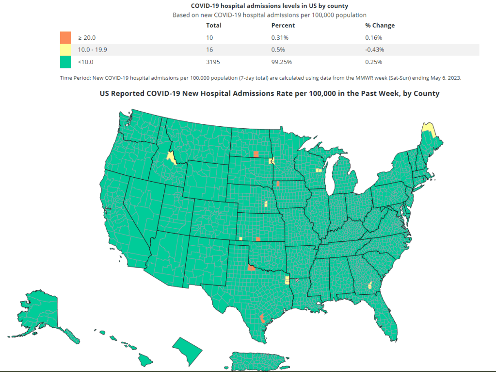
Instead, the CDC is now displaying data that shows some of COVID-19’s severe impacts— hospitalizations and deaths—without making it clear how widely the virus is still spreading. Its key metrics are new hospital admissions, currently-hospitalized patients, emergency room visits, and the percentage of recent deaths attributed to COVID-19. You can find these numbers at national and state levels in a revamped “trends” page, and at county levels in a “maps” page.
The “maps” page with county-level data has essentially replaced the CDC’s prior Community Level and Transmission Level page, where users were previously able to find COVID-19 case rates and test positivity rates by county. In fact, as of May 13, the URL to this maps page is still labeled as “cases” when you click into it from the main dashboard.
While these changes might be logical (given that case numbers are no longer available), I think the CDC’s design choices here are worth highlighting. By prioritizing hospitalizations and deaths, the CDC implicitly tells users of this dashboard that the virus should no longer be a concern for you unless you’re part of a fairly small minority of Americans at high risk of those severe outcomes.
But is that actually true, that COVID-19 is no longer a concern unless you’re going to go to the hospital? I personally wouldn’t agree. I’d prefer not to be out sick for a week or two, if I can avoid it. And I’d definitely like to avoid any long-term symptoms—or the long-term risks of heart problems, lung problems, diabetes, etc. that may come after a coronavirus infection.
These outcomes still persist after a mild COVID-19 case. But the current CDC data presentation makes it hard to see those potential outcomes, or your risk of getting that mild COVID-19 case. The agency still has some data that can help answer these questions (wastewater surveillance, variant surveillance, Long COVID survey results, etc.) but those numbers aren’t prioritized to the same degree as hospitalizations and deaths.
I’m sure the CDC data scientists behind this new dashboard are doing the best they can with the information they have available. Still, in this one journalist’s opinion, they could’ve done more to make it clear how dangerous—and how widely prevalent—COVID-19 still is.
For other dashboards that continue to provide updates, see my list from a few weeks ago. I also recommend looking at your state and local public health agencies to see what they’re doing in response to the PHE’s end.

Leave a comment