Category: Federal data

  • HHS releases long-awaited national profile reports

    HHS releases long-awaited national profile reports

    For months, public health advocates have called on the federal government to release in-depth data reports that are compiled internally by the White House Coronavirus Task Force.

    The reports include counts of COVID-19 cases, deaths, and tests, as well as test positivity calculations. In addition to state-level data, the reports feature county-level data and even data for individual metropolitan areas, color-coded according to risk levels for each region. The reports have also drawn on these data to provide specific recommendations for each state. They have been a key piece of the federal government’s support for governors and other state leaders—but they haven’t been shared with the public.

    Liz Essley Whyte and her colleagues at the Center for Public Integrity have obtained copies of many of these reports and made them publicly available. But the scattered PDFs—often posted for only a few states at a time—provided only small snapshots from the vast trove of data HHS was using behind the scenes.

    This past Friday, the Department of Health and Human Services (HHS) began releasing all national COVID-19 reports and the data behind them. Now officially called “COVID-19 Community Profile Reports,” the reports are expected to be released as PDFs and spreadsheets every day.

    I asked Liz Essley Whyte why this release—one that she’s spent months pushing for—is so important. Here’s what she said:

    This release has local data that is so important for helping people make daily decisions about what’s safe. It also gives us the same picture of the pandemic that our federal government does, allowing us to weigh its response. It’s data that was assembled with taxpayer dollars and that affects everyone’s lives, so it was past time for it to be made public. I’m very glad it’s out there now. I think if it’s pursuing full transparency the White House should also make public the policy recommendations it gives to states weekly in the governors’ reports, alongside this helpful data.

    Whyte has also provided a tour of the information available in these reports, specifically geared towards local journalists who might want to use them.

    Here’s my own tour, a.k.a. why I’m excited about this new dataset:

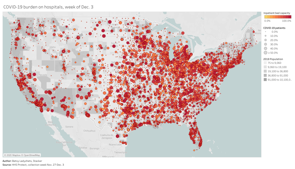
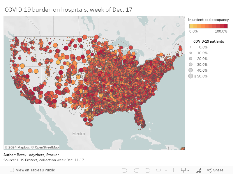
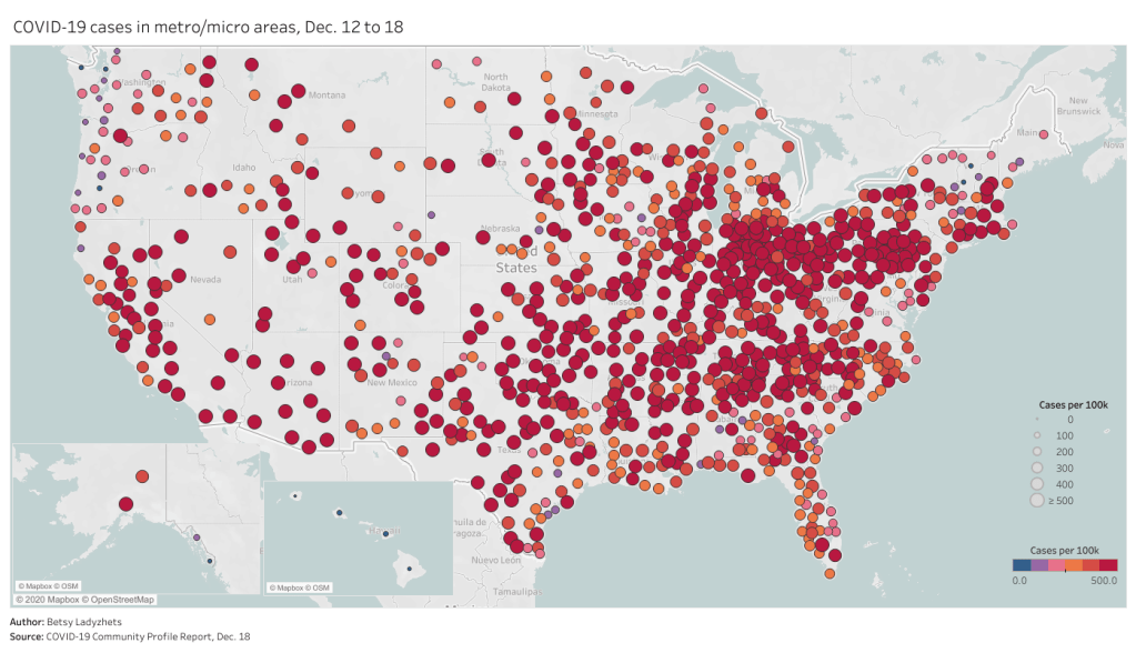
    • Data on metropolitan areas: Other sources were compiling state- and county-level data prior to Friday, but standardized data on how COVID-19 is impacting America’s cities were basically impossible to find. This new dataset includes information on over 900 metropolitan and micropolitan areas, making it much easier to compare outbreaks in urban centers.
    • Standardized data: One of the biggest challenges for COVID-19 data users has been a lack of consistency. Some states report every day of the week, some skip weekends. Some states report their tests using one unit, some report using another. Some states include antigen tests in their numbers, some don’t. And so on. But the HHS can smooth out these inconsistencies internally, as national testing laboratories and state public health departments are all required to report in the same way. What I’m saying is, this new report allows us to do something we haven’t been able to reliably do since the start of the pandemic: compare testing numbers across states.
    • Major metrics in one place: Before Friday, if I wanted case and death numbers by county, I’d go to the New York Times, while if I wanted testing numbers by county, I’d go to the Center for Medicare & Medicaid Services. The scattered nature of pandemic reporting has led researchers and journalists to cobble together stories from multiple disparate sources; now, we can get three major metrics in one easy place. (This data reporter loves to only have one Excel spreadsheet open at a time.)
    • Contextual data built in: Not only does this new dataset include several important metrics in one place, it also contextualizes those metrics with key demographic information. For each state, county, and metro area in the dataset, numbers such as the share of this region living without insurance and the share of the region over age 65 are included right next to that region’s COVID-19 metrics. Two indices that indicate the region’s demographic vulnerability to the virus are also included: the CDC’s Social Vulnerability Index and the Surgo Foundation’s COVID-19 Community Vulnerability Index. I covered both in my November 29 issue.
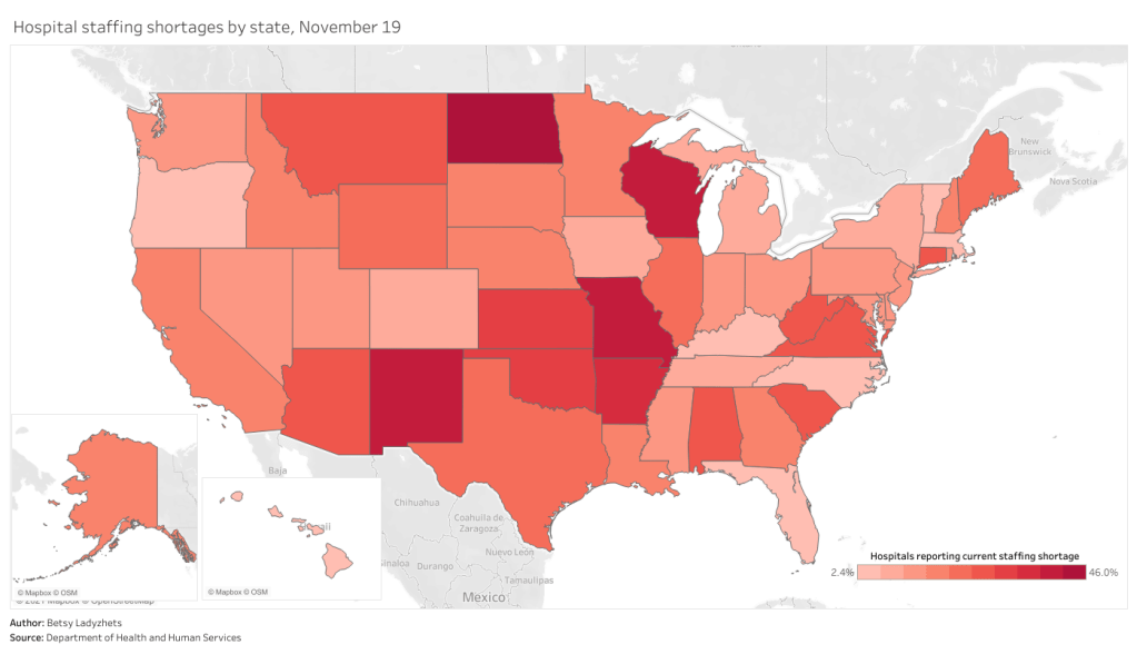
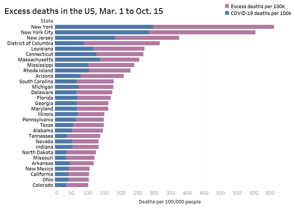
    • Rankings for policymakers: In addition to raw counts of cases, deaths, and tests, the Community Profile Reports include calculated values that make it easy for local leaders to see how their communities compare. The reports rank states according to their cases per 100,000 population, positivity rate (for PCR tests), hospital admissions, and other metrics. They highlight key cities that demand attention and aid, such as Phoenix, Arizona and Nashville, Tennessee. They even forecast death totals based on current case counts—a morbid metric, but a useful one nonetheless.
    • More transparency: Like the facility-level hospitalization dataset released last week, the Community Profile Reports signify that the HHS is finally stepping up to provide the American public with the information that informs key public health decisions. The absence of national data during this pandemic was never meant to be filled permanently by journalists or volunteer data-gatherers—the federal government is built for this work. Journalists are, instead, built to watch this work closely and hold it accountable.

    In the agency’s Friday press release, HHS states:

    HHS believes in the power of open data and transparency. By publicly posting the reports that our own response teams use and by having others outside of the federal response use the information, the data will only get better.

    As of Saturday night, the dataset has already been downloaded nearly 6,000 times. That’s nearly 6,000 people who can use these data and make them better—and the number will only grow.

  • Featured sources, Dec. 13

    These sources, along with all others featured in previous weeks, are included in the COVID-19 Data Dispatch resource list.

    • National report from the White House Coronavirus Task Force: The Center for Public Integrity, a nonprofit newsroom focused on investigations of democracy, has been periodically releasing reports of COVID-19 statistics intended for internal use by the White House Coronavirus Task Force and state governors. Reporters at the Center are often only able to obtain state-level reports, but last week, they released a national report including summary data and recommendations for all 50 states. The report is dated November 29.
    • Searchable database of PPP loans: On December 1, the Small Business Administration released extensive data on loans issued through the Paycheck Protection Program (PPP), including specific loan amounts and company names. Accountable.US, a nonpartisan watchdog group, has made this information available in an easy-to-navigate database. You can search for a specific business or filter by different geographic regions and industries.
    • Searchable database of federal COVID-19 purchases: Since March, ProPublica has tracked where federal government spending on the pandemic is going. The database represents $28 billion, 14,209 government contracts, and 6,832 individual vendors. Data can be sorted by spending categories, vendor types, and contract sizes.
    • COVID-19 Global Travel Restrictions and Airline Information: The Humanitarian Data Exchange is an international repository run by the United Nations Office for the Coordination of Humanitarian Affairs. One of the repository’s COVID-19 datasets displays travel restrictions and airline restrictions for nearly 300 jurisdictions, updated every day.
  • Federal data updates, Dec. 13

    Rounding out the week with a couple of updates on federal data, unrelated to hospitalizations and vaccines.

    • New app for testing data: The Centers for Disease Control & Prevention (CDC) have developed an app called SimpleReport, which allows COVID-19 test providers to quickly report data to their local public health departments. An assisted living center in Tucson, Arizona was the first to pilot the app this week. The center’s Community Director said this app helped her quickly file data that would otherwise need to be entered in three different places.
    • CMS proposes that providers build standard databases: This past Thursday, the Centers for Medicare & Medicaid Services (CMS) announced a new rule to streamline data sharing between the agency and individual healthcare providers. Under this rule, providers would need to build application programming interfaces, or APIs. APIs are essentially data-sharing systems that provide a standardized format for information. Such standardization, CMS claims, would make it easier for patients to get medical treatments and prescriptions authorized by Medicaid.
    • Bill to make federal court filings free passes the House: PACER, or Public Access to Court Electronic Records, is an antiquated federal database of court filings which journalists and other researchers must pay to use. It costs 10 cents a page to access court dockets and other documents through PACER—and since court documents can get long, that cost adds up. The Open Courts Act, a bill which would make PACER free to the public, passed in the House of Representatives this past week. It now heads to the Senate. This bill may not be directly COVID-related right now, but I anticipate that journalists will be covering COVID-19 lawsuits for years after the pandemic ends.
  • COVID-19 data for your local hospital

    COVID-19 data for your local hospital

    var divElement = document.getElementById(‘viz1608004219965’); var vizElement = divElement.getElementsByTagName(‘object’)[0]; if ( divElement.offsetWidth > 800 ) { vizElement.style.width=’100%’;vizElement.style.height=(divElement.offsetWidth*0.75)+’px’;} else if ( divElement.offsetWidth > 500 ) { vizElement.style.width=’100%’;vizElement.style.height=(divElement.offsetWidth*0.75)+’px’;} else { vizElement.style.width=’100%’;vizElement.style.height=’650px’;} var scriptElement = document.createElement(‘script’); scriptElement.src = ‘https://public.tableau.com/javascripts/api/viz_v1.js’; vizElement.parentNode.insertBefore(scriptElement, vizElement);

    When the Department of Health and Human Services (HHS) started reporting hospitalization data at the state level back in July, I wistfully told a friend that I wished the agency would report facility-level numbers. Another federal agency had recently started reporting this type of data for nursing homes, and I appreciated the flexibility and granularity with which I was able to analyze how the pandemic was impacting nursing home patients and staff. I wanted to see the pandemic’s impact on hospitals in the same way.

    At the time, I considered this a pipe dream. The HHS was already facing major challenges: implementing a new data pipeline across the country, navigating bureaucratic issues with state public health departments, and working with individual hospitals to help them report more accurately and more often. Plus, transparency issues and political scandals plagued the agency. Making more data public seemed to be the least of its priorities.

    But I’m happy to say that this week, my pipe dream came true. On Monday, the HHS published a new hospitalization dataset including capacity, new admissions, and other COVID-19-related numbers—for over 4,000 individual facilities across America.

    This is, as I put it in a COVID Tracking Project blog post analyzing the dataset, a big deal. Project lead Alexis Madrigal called it “probably the single most important data release that we’ve seen from the Federal government.” I, in somewhat less professional terms, texted my girlfriend:

    Please appreciate the level of self-control it took for me to not actually title this issue “HHS queen shit.”

    Let me explain why this new dataset is so exciting—not just for a nerd like me, but for any American following the pandemic. I’m drawing on a COVID Tracking Project blog post unpacking the dataset, to which I contributed some explanatory copy.

    • Hyperlocal data: At a time when hospitals are overwhelmed across the nation, it is incredibly useful to see precisely which hospitals are the worst off and how COVID-19 is impacting them. Data scientists can pinpoint specific patterns and connections between regions. National aid groups can determine where to send PPE and other supplies. Journalists can see which hospitals should be the focus of local stories. The stories that can be told with this dataset are endless.
    • Aggregating to different geographies: The individual facility is the most detailed possible level of reporting for COVID-19 hospitalizations. But this HHS dataset also includes the state, county, and ZIP code for each hospital, along with unique codes that identify hospitals in the Medicare and Medicaid system. The data for specific facilities can thus be combined to make comparisons on a variety of geographic levels. I tried out a county-level visualization, for example; some counties are not represented, but you can still see a much more granular picture of hospital capacity than you would in a state-level map.
    • Time series back to August: HHS didn’t just provide data on how hospitals are coping with COVID-19 right now. They provided a full time series going back to the first week of August, with data starting shortly after the HHS began collecting information from hospitals. These historical data allow researchers to make more detailed comparisons between the nation’s last major COVID-19 peak and our current outbreak. There are some reporting errors from hospitals in the early weeks of the dataset; COVID Tracking Project analysis has shown that these errors become less significant in the week of August 28.
    • Includes coverage details: The dataset includes fields that can help researchers check the quality of an individual hospital’s reporting. These fields, called “coverage” numbers, show the number of days in a given week on which data were reported. A value of six for total_adult_patients_hospitalized_confirmed_and_suspected_covid_7_day_coverage, for example, indicates that this hospital reported how many adult COVID-19 patients it was treating on six of seven days in the past week. Many hospitals are now reporting all major metrics on six or seven days a week—HHS has really stepped up to encourage this level of reporting in recent months. For more information on hospital reporting coverage, see HHS Protect.
    • Admissions broken out by age: The HHS began reporting hospital COVID-19 admissions, or new COVID-19 patients entering the hospital, at the state level in November. The new dataset includes this information, at the facility level, for every week going back until August, and breaks out those new patients by age group. You can see exactly who is coming to the hospital with COVID-19 in age brackets of 18-19, ten-year ranges from 20 to 79, and 80+. Several other metrics in the dataset are also broken out by adult and children patients.
    • New fields: This dataset reports counts of emergency department visits, including both total visits for any reason and visits specifically related to COVID-19. (The HHS data dictionary defines this as “meets suspected or confirmed definition or presents for COVID diagnostic testing.”) These figures allow researchers to calculate the share of emergency department visits at a given hospital that are COVID-related, a new metric that wasn’t available from previous HHS reporting.
    • Signifies major effort from the HHS: When it comes to reporting hospitalization data, this agency has come a long way from the errors and transparency questions of the summer. Last week, the COVID Tracking Project published an analysis finding that HHS counts of COVID-19 patients are now in close proximity to similar counts reported by state public health departments—signifying that the federal data may be a useful, reliable complement to state data. (I discussed this analysis in last week’s issue.) The new facility-level dataset indicates that HHS data scientists understand the needs of COVID-19 researchers and communicators, and are working to make important data public. I will continue to carefully watch this agency, as will many of my fellow reporters. But I can’t deny that this data release was a major step for transparency and trust.

    To get started with this dataset, you can zoom in to look at your community on this Tableau dashboard I made, visualizing the most recent week of data. (That most recent week of data reflects November 27 through December 3. As the dataset was first published last Monday, December 7, I’m anticipating an update tomorrow.)

    Or, if you’d like to see more technical details on how to use the dataset, check out this community FAQ page created by data journalists and researchers at Careset Systems, the University of Minnesota, COVID Exit Strategy, and others.

    Finally, for more exploration of the research possibilities I outlined above, you can read the COVID Tracking Project’s analysis. The post includes some pretty striking comparisons from summer outbreaks to now.

  • HHS’s hospitalization data are good, actually

    HHS’s hospitalization data are good, actually

    In July, the Department of Health and Human Services (HHS) took over collecting and reporting data on how COVID-19 is impacting America’s hospital systems. This takeover from the CDC—which had reported hospitalization data since the start of the pandemic—sparked a great deal of political and public health concern. Some healthcare experts worried that a technology switch would put undue burden on already-tired hospital workers, while others worried that the White House may influence the HHS’s data.

    Since that data responsibility switch, I’ve spent a lot of time with that HHS dataset. In August, I wrote a blog post for the COVID Tracking Project which compared HHS’s counts of hospitalized COVID-19 patients to the Project’s counts (compiled from states). At the time, my co-author Rebecca Glassman and I observed discrepancies between the datasets, which we attributed in part to differences in definitions and reporting pipelines. For example: some states only report those hospital patients whose cases of COVID-19 have been confirmed with PCR tests, while HHS reports all patients (including those with confirmed and suspected cases).

    I’ve covered the HHS hospitalization dataset several times in this newsletter since, including its investigation by journalists at ProPublica and Science Magazine and its expansion to include new metrics. The dataset has gone from a basic report of hospital capacity in every state to a comprehensive picture of how the pandemic is hitting hospitals. It includes breakdowns of patients with confirmed and suspected cases of COVID-19, patients in the intensive care unit (ICU), and patients who are adults and children. As of November, it also includes newly admitted patients and staffing shortages. At the same time, HHS officials have worked to resolve technical issues and get more hospitals reporting accurately in the system.

    A new analysis, published this past Friday by the COVID Tracking Project, highlights how reliable the HHS dataset has become. The analysis compares HHS’s counts of hospitalized COVID-19 patients to the Project’s counts, compiled from states. Unlike the analysis I worked on in August, however, this recent work benefits from HHS’s expanded metrics and more thorough documentation from both the federal agency and states. If a state reports only confirmed cases, for example, this number can now be compared directly to the corresponding count of confirmed cases from the HHS.

    Here’s how the two datasets line up, as of November 29:

    Line chart showing hospitalization data from state (CTP) and from HHS. When the correct definitions are used, and the HHS data offset by a single day, the two lines match almost exactly.
    The COVID Tracking Project and HHS counts of hospitalized patients closely match in September, October, and November.

    Since November 8, in fact, the two datasets are within two percent of each other when adjusting for definitional differences.

    The blog post also discusses how patient counts match in specific states. In 41 of 52 jurisdictions (including the District of Columbia and Puerto Rico), the two datasets are in close alignment. And even in the states where hospitalization numbers match less precisely, the two datasets generally follow the same trends. In other words: there may be differences in how the HHS and individual states are collecting and reporting their numbers, but both datasets tell the same story about how COVID-19 is impacting American hospitals.

    I recommend giving the full blog post a read, if you’d like all the nerdy details. Alexis Madrigal also wrote a great summary thread on Twitter:

    This new COVID Tracking project analysis comes several days after an investigation in Science Magazine called the HHS dataset into question. The investigation is based on a CDC comparison of these same two datasets which doesn’t account for the reporting differences I’ve discussed.

    Charles Piller, the author of this story, raises important questions about HHS’s transparency and the burden that its system places on hospitals. It’s true that the implementation of HHS’s new data reporting system was rolled out quickly, faced technical challenges, and caused a great deal of confusion for national reporters and local hospital administrators alike. The HHS dataset deserves the careful scrutiny it has received.

    But now that this careful scrutiny has been conducted—and the two datasets appear to tell the same story—I personally feel comfortable about using the HHS dataset in my reporting. In fact, I produced a Stacker story based on these data just last week: States with the highest COVID-19 hospitalization rates.

  • Federal data updates, Nov. 22

    America’s federal public health agencies are busy in the lead-up to Thanksgiving, as are the researchers and volunteer networks filling those agencies’ information gaps. Here are three major updates:

    • CDC’s COVID Data Tracker now reports more county-level data: Since it was first published in the spring, the CDC’s COVID-19 data dashboard has included cases and deaths by U.S. county, relying upon data compiled by USA Facts and verified by the agency. As of yesterday, the county dashboard now also reports total PCR tests and test positivity. Testing data have previously been available directly from the HHS (state-level) and the Center for Medicare & Medicaid Services (county-level), but the CDC dashboard is far more accessible. Users can select a specific county and see a variety of trends in cases, tests, and deaths. The data from this dashboard aren’t yet available for download; I’ll report back if this changes.
    • Pharmacies will be able to distribute COVID-19 vaccinesLast week, the HHS announced that the agency has set up partnerships with both national pharmacy chains and networks representing smaller pharmacies in order to broadly distribute COVID-19 vaccines as they become available. (Pfizer applied for Emergency Use Authorization this past Friday.) According to the HHS, these partnerships cover “approximately 60 percent of pharmacies throughout the 50 states, the District of Columbia, Puerto Rico, and the U.S. Virgin Islands.” The press release does not mention how these pharmacies will be plugged into their respective state vaccine registries.
    • How state COVID-19 dashboards are faringAlthough many states are reporting more COVID-19 data than they were last spring, their dashboards are overall still not conveying some key metrics, according to a new report from Resolve to Save Lives. This research group, a nongovernmental initiative run by the global health organization Vital Strategies, first reviewed state dashboards in July. (See my first issue for more details.) The new report—along with an interactive map—reflects improvements that states have made since the summer while highlighting what crucial public health information is still missing. Case investigation and contact tracing are two key areas where “data… remained largely unavailable.”
  • HHS releases data on new admissions, staffing shortages

    HHS releases data on new admissions, staffing shortages

    How many people in the U.S. are currently hospitalized with COVID-19? As of yesterday, 83,200.

    This question calls attention to the people deeply impacted by the pandemic—people in hospital beds, on ventilators, struggling to breathe. But it is also a deeply practical question. Public health experts and policymakers need to know where hospitals are becoming overwhelmed with patients in order to distribute supplies where they are most needed. Researchers and data nerds like myself, meanwhile, can use hospitalization metrics to track the pandemic’s impact on different communities: reported cases may be an unreliable metric, challenged by inadequate testing and uneven reporting guidelines, but it’s hard to miss a person in the hospital.

    Longtime readers may remember that this newsletter started because of hospitalization data. Back in July, when hospitalization data moved from the purview of the CDC to the HHS, I wanted to explain why these data are so important and how the change in control impacted the numbers themselves. In the months since, the HHS has increased both the number of hospitals reporting to its system and the volume of information that is publicly released about those hospitals.

    I’m returning to the topic now because the HHS has made two major upgrades to its hospitalization dataset in the past week: it now includes new admissions and staffing shortages for every state. The metrics are only available at the state level; I’m hoping that county- and even individual hospital-level numbers may be released in the coming weeks.

    New admissions are a useful metric because they provide a clear picture of where outbreaks are worsening, and by what degree. Patients may stay in the hospital (and be counted in a “current hospitalizations” figure) for weeks on end; isolating the number of new patients incoming allows public health researchers to see how the burden on hospitals is growing.

    Across the U.S., over 10,000 patients with confirmed cases of COVID-19 are now being admitted each day.

    New COVID-19 admissions rose from about 6,000 per day in late October to over 10,000 per day in mid-November. Full-size chart available here.

    Staffing shortages, meanwhile, are a useful metric because they demonstrate where in the country healthcare systems are hardest hit. The HHS specifically asks hospitals to report when their staffing shortages are critical, meaning that these facilities are in serious danger of being unable to operate as normal. Staffing shortages may be the result of healthcare workers feeling burnt out, quitting, or becoming sick with COVID-19 themselves.

    As of November 19, the most recent date these data are available, 18% of hospitals are currently facing a critical shortage—that’s about 1,100 out of the 6,100 hospitals reporting. 200 more hospitals report that they will be facing a critical shortage in the next week.

    In North Dakota, Wisconsin, Missouri, and New Mexico, over one third of hospitals are facing a critical staffing shortage. Full-size chart available here.

    Finally, here’s a look at the nation’s current hospital capacity—that is, how many hospital beds are currently occupied with sick people. As of November 19, about 600,000 of the nation’s 980,000 hospital beds are full (61%). 88,000 of those people have been diagnosed with COVID-19 (9%). These numbers will grow in the coming weeks as thousands of recently diagnosed Americans become sicker.

    Across the Midwest and South, several states have over three quarters of hospital beds occupied. Full-size chart available here.

    For more context on these hospitalization data and what they mean for the exhausted, terrified healthcare workers serving patients, check out:

  • What a President Biden could mean for COVID-19 data

    Last weekend, President-Elect Biden and Vice President-Elect Harris unveiled a Transition Plan. Their website covers detailed steps that the new administration intends to take for addressing COVID-19, climate change, economic recovery, and more.

    One item in the COVID-19 plan caught my attention immediately:

    Create the Nationwide Pandemic Dashboard that Americans can check in real-time to help them gauge whether local transmission is actively occurring in their ZIP codes. This information is critical to helping all individuals, but especially older Americans and others at high risk, understand what level of precaution to take.

    A nationwide pandemic dashboard? Standardizing information from all 50 states? Providing local data down to the ZIP code level? This is literally all I’ve wanted from federal COVID-19 data since February. If the Biden team provides a publish date for this dashboard, I will mark it on my calendar and eagerly count down the days.

    But, as you might imagine from reading my Source Callouts, I have a lot of thoughts on what types of organization, design, and documentation can make COVID-19 dashboards either easy to use—or frustratingly complex. Many other COVID Tracking Project volunteers, who have similarly been wading through state dashboards, have similar expertise. A group of data entry veterans, designers, science communication specialists, and other Project volunteers put together a set of recommendations for the dashboard that President-Elect Biden’s administration might build.

    You can read all the recommendations on the Project’s blog. Here are a few highlights:

    • Prioritize clarity, by putting the most important data points front and center.
    • Offer transparency, through accessible data definitions and methodologies as well as time series which allow users to see how metrics have changed over time.
    • Structure the dashboard with consistency, through the use of logical section headers, color schemes, and regular updates.
    • Provide absolute and per capita values for all major metrics.
    • Report different test types seperately, and provide both positives and totals to allow for accurate test positivity calculations.
    • Make the design inclusive, through providing access for different internet connection speeds, mobile use, and easily surfaced information (i.e. no hovering).
    • Provide annotations and disclaimers to help users understand caveats and complexities in the data.
    • Include data in the forms of chartssortable tables, and downloadable spreadsheets to allow for easy analysis.
    • Place sex, age, race/ethnicity, and other demographic data in context by comparing COVID-19 rates with the overall population.

    There’s a pretty big caveat to my dashboard excitement, though. In order for President-Elect Biden’s administration to put together a Nationwide Pandemic Dashboard, his team must first be able to access the nationwide pandemic data. So far, as President Trump has yet to concede the election, current Department of Health and Human Services (HHS) leadership are not able to communicate with their successors. POLITICO’S Adam Cancryn described the situation in a November 10 story:

    Biden’s HHS transition team is not yet allowed to have any contact with its agencies, including with officials at the center of the pandemic response like infectious disease expert Anthony Fauci and HHS testing czar Brett Giroir. It’s also barred from accessing nonpublic information or setting up government offices, limiting the new administration’s ability to get a full picture of the public health crisis that it’ll take responsibility for in just over two months.

    The separate coronavirus-specific squad has been held up as well, over concerns about how to structure it ahead of the formal start of the transition process and how willing the Trump administration will be to cooperate.

    The sooner top national politicians accept the election results, the sooner Biden’s COVID-19 team can get to work. That work includes data dashboards, ramping up testing, public health communication, and just about everything else we need to get the virus under control.

  • Visualizing COVID-19

    Visualizing COVID-19

    It seems like every publication, agency, and amateur researcher has gotten into COVID-19 visualizations in the past few months.

    I am certainly part of that trend; I’ve started learning Tableau since the pandemic started. But a recent Stacker story allowed me to pay homage to the real viz experts. I compiled 50 charts from public sources which show the impact COVID-19 has had on America and the world at large, including a few charts I made myself. The charts visualize case counts, mortality comparisons, economic indicators, outbreak sites, and more. Frequent readers of this newsletter might recognize a few of the sources I used.

    Here’s the story. If you’ve looked at nothing but election maps in the past few days, this might help pull you back to that other major crisis of 2020.

    One of the charts I produced for this story highlights excess deaths in 28 states, NYC, and DC.
  • Federal data source updates, Nov. 8

    As cases spike, the Department of Health and Human Services (HHS) is focusing on rapid testing as a means to control the pandemic. But data on this type of testing continue to be widely unavailable.

    • HHS funds new COVID-19 testsOn October 31, HHS and the Department of Defense announced a $12.7 million contract with InBios International, a Seattle-based diagnostic testing company. The contract aims to help InBios increase its production capacity for two COVID-19 tests: a rapid antigen test called the SCoV-2 Ag Detect Kit and an antibody test called the SCoV-2 Detect IgM/IgG Food & Drug Administration (FDA).
    • HHS distributes antigen tests to HBCUs: At the end of September, the Trump administration announced that Historically Black Colleges and Universities (HBCUs) would be one category of priority sites for the distribution of Abbott BinaxNOW antigen tests, of which the administration has purchased 150 million. This promise is now coming to fruition; HHS announced on October 31 that 389,000 BinaxNow tests have been distributed to 83 HBCUs in 24 states, at no cost to the schools. How these schools will use the tests and report their testing data, however, remains to be seen.
    • FDA reminds antigen test providers to use them properly: The FDA issued a letter to clinical laboratory staff and health care providers on November 3, reminding them that antigen tests may incur false positives when the instructions for these tests’ use are not correctly followed. FDA recommendations include using antigen tests for symptomatic individuals, handling tests correctly, and using PCR tests to confirm results in low incidence counties. As I’ve discussed in this newsletter before, incorrect use of antigen tests may lead to misleading results that waste clinical resources or instill false confidence in people who receive false negatives.
    • HHS needs better testing oversight and data: Two new articles in STAT News this past week have discussed COVID-19 test regulation and reporting. An investigation by Kathleen McLaughlin finds that laboratory developed tests, diagnostic tools developed by and for specific facilities, fall in a “regulatory gray area” which makes it easy for innacuracies to slip past the FDA and HHS. Meanwhile, an op-ed by OB-GYN Joia Crear-Perry points out the public health danger in allowing demographic data on testing to be lost when rapid tests are not incoporated into reporting pipelines.