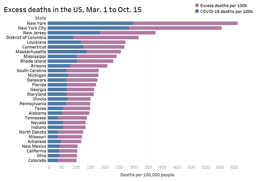
It seems like every publication, agency, and amateur researcher has gotten into COVID-19 visualizations in the past few months.
I am certainly part of that trend; I’ve started learning Tableau since the pandemic started. But a recent Stacker story allowed me to pay homage to the real viz experts. I compiled 50 charts from public sources which show the impact COVID-19 has had on America and the world at large, including a few charts I made myself. The charts visualize case counts, mortality comparisons, economic indicators, outbreak sites, and more. Frequent readers of this newsletter might recognize a few of the sources I used.
Here’s the story. If you’ve looked at nothing but election maps in the past few days, this might help pull you back to that other major crisis of 2020.


Leave a comment