For the journalists and communicators reading this: have you ever been interested in using a dataset to tell a story, but weren’t sure which tools to use or how to get started with the project? Or are you curious about how data journalists find datasets for their reporting, and turn those numbers into accessible, visual stories? Or are you an editor who sometimes works with data journalists and would like to better understand their tools and methods to improve your collaboration?
If any of this sounds familiar, you might be interested in a workshop that I will be running with The Open Notebook on October 31 that will cover reporting and producing data stories about science topics. For those unfamiliar with The Open Notebook, it’s a nonprofit site that provides excellent training and educational materials for science journalists, including articles, mentoring programs, a book, and workshops like this one. The workshop will build on an article I wrote for TONa couple of years ago.
The full description of the workshop is below. It will take place on October 31 from 3:30 to 5 PM Eastern time. Tickets are $125, though discounted tickets are also available for those who need them. Feel free to email me if you have any questions about the event!
Science writers are used to encountering data, whether we’re reading through dense scientific papers or trying to figure out what a statistic means for our readers. But sometimes, datasets themselves can be sources for stories—and they have led to some of the most widely read science stories of the last few years, from El Pais’ visualization of coronavirus spread to ProPublica’s investigation of burning sugar cane. Datasets can help us make complex topics accessible, visualize patterns from research, or even investigate instances of wrongdoing.
A science writer interested in pursuing stories like these could find a wide variety of resources to help them get started on a data project. But the growing data journalism field can be overwhelming: you might not be sure how to pick an initial project, which online course to try, which tools to use, or whether you need to learn how to code first. (Spoiler alert: you don’t!)
This 90-minute hands-on workshop from The Open Notebook, building on the instructor’s TON article about this topic, will provide a crash course in data reporting basics. It’s designed for science writers who are interested in pursuing data stories but aren’t quite sure how to get started, and for editors who are interested in working with writers on these stories.
You’ll get an introduction to all of the steps of reporting and producing a data story, from finding story ideas to editing and fact-checking. The workshop will include an interactive tutorial showcasing two common tools that you can start using immediately.
You will learn how to:
Recognize potential data stories on your beat Search for public datasets that you can use Use free tools for data analysis and visualization Work with a data team or independently as a freelancer Make your data stories accessible
Our final Diving into COVID-19 data workshop happened this week!
Ann Choi and Will Welch, two data reporters at THE CITY (a local, nonprofit newsroom in NYC) discussed making COVID-19 numbers accessible and meaningful for New Yorkers. Júlia Ledur, a graphics reporter at the Washington Post and former data visualization lead at the COVID Tracking Project, walked us through several visualization projects. And Christie Aschwanden, a freelance science journalist, discussed communicating uncertainty in COVID-19 reporting. Thank you to everyone who attended!
For those who couldn’t make it live, you can watch the recording of the session below. You can also check out the slides here. I’m also sharing a brief recap of the workshop below.
Making NYC data accessible
Ann Choi and Will Welch shared a few strategies they used to communicate COVID-19 data for a NYC audience.
First, Ann Choi walked through a few examples of THE CITY’s written articles, going from early uncertainty during a time of limited government guidance to a present focus on who is getting vaccinated.
One early story compares two socioeconomically similar neighborhoods in Queens, Flushing and Corona, which had different pandemic responses. For example, Flushing residents, many of whom are East Asian immigrants, did not need to be told to wear masks because they had past experience with these public health measures. Choi said she was inspired to do this comparison by thinking about how New York City measures up against Seoul, South Korea, where she has relatives. The cities have similarly-sized populations, though Seoul is much more dense; yet NYC has had over 29,000 COVID-19 deaths while Seoul has had fewer than 400.
A January story on vaccination rates emphasizes the “if”s by extrapolating out from NYC’s data. “If city residents were getting vaccinated at the statewide average,” Choi and Welch wrote, over 100,000 more city residents would already have gotten a shot. This tangible comparison emphasizes how the city is lagging behind.
A story on the Washington Heights Armory drew attention to vaccination disparities in the city. THE CITY reporter Josefa Velasquez went to this site and did what Choi called “very old-school data reporting,” talking to a sample of people waiting in line. Despite the vaccination site being touted by the governor as an example of a vaccination site in a predominantly Hispanic/Latino neighborhood, the majority of those Velasquez spoke to were white suburbanites. After this story was published, appointments at the Armory were restricted to prioritize NYC residents.
Other vaccination stories Choi’s worked on have drawn further distinctions between which neighborhoods were most impacted by the pandemic—and which neighborhoods are getting the most shots. ZIP code data released by the city allowed her to drill down into local patterns and find both examples of inequity and examples of how communities fought against it.
Will Welch then discussed THE CITY’s COVID-19 tracker, Coronavirus in New York City. It’s updated on a daily basis through a combination of scraping and hand data collection; the tracker includes data on cases, deaths, test positivity, vaccinations, and more.
“Our first iteration of this tracker was taking the data from the city and trying to put it into a more accessible format,” Welch said. City Hall emailed data out to reporters starting in mid-March, before developing a public dashboard.
Later in the spring, NYC began publishing data on a public GitHub, allowing Welch and Choi to evolve their tracker beyond simply making numbers easier to find. One example of complexity built into the tracker: NYC was one of the first jurisdictions to distinguish “confirmed” deaths (associated with positive tests) and “probable” deaths (associated with death certificates). At first, daily updates of these numbers led to confusion as probable deaths would sometimes be reassigned as “confirmed.” But when the city published a full time series on deaths, THE CITY was able to make their own time series graphic, showing the long-term arc of the pandemic.
Informed by watching this time series, Welch put together a graphic to show how early counts of COVID-19 fatalities in NYC by date of death are often incomplete. Deaths may be retroactively assigned to an earlier date of death after they were reported, which put some summer dates that Governor Cuomo bragged had seen “no new deaths” into a different light.
Welch additionally discussed how the tracker switched, in the summer, from relying on city data to relying on state data for testing numbers. State data were being used to calculate reopening indicators, and THE CITY wanted their tracker to display the information that was having the greatest impact on people’s lives. The publication also fought for the release of ZIP code level data, which were used for specific local policy restrictions starting in the fall.
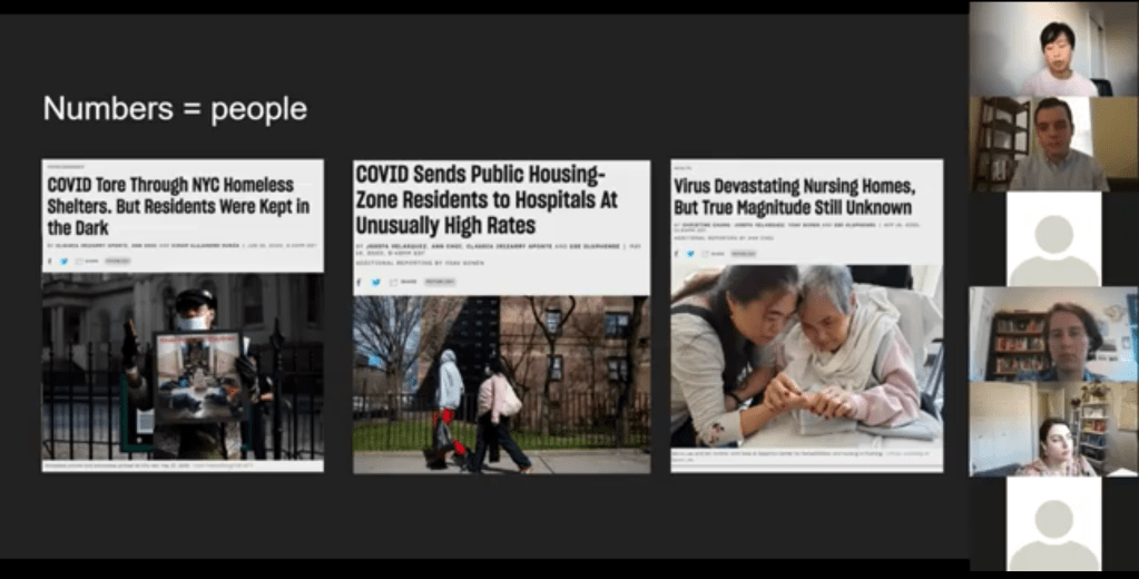
Pandemic impact on New Yorkers’ lives has been an enduring theme for THE CITY’s coverage over the past year. This ranges from mapping the test positivity numbers behind restrictions to highlighting the share of NYC residents that have gotten at least one dose of a vaccine. But one particularly notable project is Missing Them, a searchable memorial of New Yorkers whose lives have been lost to COVID-19. The memorial has compiled nearly 1,000 names so far, though this is less than 5% of the total number of lives lost.
“Behind every number, behind every case, there is a vulnerable person whose life was cut short,” Choi said. She expressed hope that reporters will take lessons from covering COVID-19 to other public health crises, and remember to tell the stories behind each data point.
Visualizing COVID-19 data
Júlia Ledur talked through several of her COVID-19 visualizations projects, including both graphics at the COVID Tracking Project and the Washington Post. She shared how her approach to visualizing these data has changed as the data have become increasingly complicated, now that we’re contending with many test types, vaccinations, and more.
Early COVID Tracking Project data, collected and visualized in March 2020.
A few examples:
An early graphic (above) from March 2020, calling attention to data gaps in the CDC’s reporting. The agency had reported far fewer COVID-19 tests than the COVID Tracking Project had compiled from states at that time.
A scrollytelling explainer that calls attention to just how complicated test positivity can get, by showing how this metric gets calculated.
Another test positivity post, this one focusing on inconsistencies between the state. This post uses a fictional character called Bob to show how Bob’s testing experience might be counted in three different ways.
Graphics explaining test per positive, another metric which may be used to show complications in COVID-19 testing—though, as Ledur said, this metric did not end up taking off in the same way that test positivity did.
Trading cards and other graphics exploring different test types, to accompany an explainer on how the tests compare. Ledur worked with CTP Science Communication lead Jessica Malaty Rivera to ensure her graphics were accurately representing the science of each test while keeping readers engaged.
Ledur also shared a few of her best practices for visualizing COVID-19 data:
Be clear about what you’re showing and what you’re not showing. Include clear labels, methodology, and specific notes on what you aren’t including.
Don’t avoid uncertainty. Instead, highlight it. Tell your audience what’s going on.
Add notes and/or annotations with caveats explaining data anomalies.
Put the data in context. Show how one point in time compares to others, or how one place compares to others.
Check your science. Work with those who have the right expertise to make sure your work is correctly reflecting the issue.
Have empathy. Put yourself in the shoes of your reader; think about what questions you might have, how you can answer them, and where you can’t answer them.
“You have an idea of what it’s like to be affected by this, because you certainly are,” Ledur said. Leaning into this experience as you communicate data, remembering how the numbers make you feel, will make your reporting better.
Addressing uncertainty
“This pandemic has been a time when the process of science has been on public display,” Christie Aschwanden said to start her talk. She called this period an incredible, but overwhelming opportunity to convey the process of science in an accurate way.
And forefront in the process of science is the idea of uncertainty. We might think numbers are neutral, Aschwanden said—“we measured this and therefore it’s true”—but in fact, they are subject to biases which must be communicated along with the numbers.
These biases are why political statements such as “we follow the science” may be harmful. “Science is a method of understanding, it’s not an answer,” Aschwanden said; we should prepare people to see how a number or a conclusion may change, so that when it inevitably does change, they don’t feel betrayed.
One high-profile example of this trend is mask-wearing. Public health experts such as Dr. Anthony Fauci said in early spring 2020 that masks were not necessary for the general public. This statement reflected scientific knowledge at the time—but when this knowledge changed as the virus’ tendency to spread through air became better understood, many Americans held up the change as evidence of a conspiracy.
This trend also occurs with medical treatments. Convalescent plasma, one COVID-19 treatment, held promise early on but has not seen benefits in more recent randomized control trials. It’s important to communicate the uncertainties and shortcomings of provisional studies, so that people don’t put all their hopes into a treatment that later is shown to be less viable.
“We need to get from this magic wand idea about science,” Aschwanden said. Science is not a singular path towards truth; it’s a “process of uncertainty reduction.” Pointing out and discussing the uncertainty, whether that’s through annotations on a chart or caveats in a news story, will help readers understand how decisions may change based on new evidence.
Here are Aschwanden’s tips for discussing scientific data with the public:
Emphasize that uncertainty is okay (a feature, not a bug)
Explain that knowledge is provisional
Promote openness to new evidence, even as we become more certain
Beware motivated reasoning and cognitive biases
Convey that data aren’t neutral
One article that effectively follows these guidelines is a story Aschwanden wrote in the fall for Scientific American. She walks readers through the data on COVID-19 deaths in order to debunk the rumor that death counts are inflated by doctors. The story uses three lines of evidence to explain that there’s a lot of uncertainty about the precise number of COVID-19 deaths, but that there’s not much uncertainty about the magnitude of these deaths. Aschwanden encourages any reporters working on COVID-19 coverage to join a free listserv run by the National Association of Science Writers, which she moderates. To join the list, send an email to nasw-COVID19mods@nasw.org with your name, email, and publication(s) that you are covering COVID-19 for, either on staff or freelance.
Liz Essley Whyte, an investigative reporter at the Center for Public Integrity, discussed her work bringing White House COVID-19 reports to the public before they were officially released. Erica Hensley, an independent health and data journalist based in Jackson, Mississippi, provided advice for navigating relationships with local public health officials based on her work reporting on COVID-19 in Mississippi. And Tom Meagher, a senior editor at The Marshall Project, described the communication and coordination work behind his newsroom’s yearlong tracker of COVID-19 in the U.S. prison system. Thank you to everyone who attended!
For those who couldn’t make it live, you can watch the recording of the session below. You can also check out the slides here. I’m also sharing a brief recap of the workshop in today’s issue.
The final workshop in our series, Communicating COVID-19 data, is coming up this coming Wednesday, March 3, from 4:30 to 6 PM ET. This session will feature freelance reporter Christie Aschwanden, The Washington Post’s Júlia Ledur, and THE CITY’s Ann Choi, and Will Welch discussing strategies for both written reporting and data visualization. If you aren’t registered for the series yet, you can sign up here.
Finding and navigating government data
Liz Essley Whyte started her talk by providing backstory on the White House COVID-19 reports.
In the middle of the summer, she said, a source gave her access to documents that the White House Coronavirus Task Force was sending out to governors—but wasn’t publishing publicly. The documents included detailed data on states, counties, and metro areas, along with recommendations for governors on how to mitigate the spread. Whyte published the documents to which she’d obtained access, marking the start of a months-long campaign from her and other journalists to get the reports posted on a government portal.
“Despite weeks of me asking the White House, why aren’t these public, they were never made public for a while,” Whyte said. She continued collecting the reports and publishing them; the historical reports are all available in DocumentCloud.
If you need to find some government data—such as private White House reports—there are a few basic questions that Whyte recommended you start with:
Who collects the data?
Who uses it?
Who has access to it?
Has anyone else found it or published it before?
What do you really want to find out? If you can’t get the data you really need, are there other datasets that could illuminate the situation?
While journalists often like to find fully original scoops, Whyte said, sometimes your best source for data could be another reporter. “There’s some really great datasets out there, especially in the health space, that people have maybe written one or two stories, but they have hundreds of stories in them.” So get creative and look for collaborators when there’s a source you really want to find.
She provided a few other ideas for obtaining government data: besides getting a leak from a source (which can be hard to do), you can scour government websites, ask public information officers what data are available behind their public website, contact other officials (such as those mentioned in a one-off legislative report), or file a FOIA. Third-party sources such as the COVID Tracking Project or The Accountability Project also may have useful repositories of public information, or could help you navigate to what you need. Even for-profit data collecting companies might let journalists use their work for free.
Once you have the data, talk to your contact person for the dataset and “make sure you fully understand it,” Whyte said. Ask: Who collected the data and how? How is it being used? What’s the update schedule? How complete is it? And other similar questions, until you’re sure you know how to best use the dataset. If a data dictionary is available, make sure to comb through it and ask all your term and methodology questions.
In some cases this year, Whyte has looked at document information and contacted people who are listed as a document’s author or modifier. These are often great sources, she said, who can provide context on data even if they aren’t able to speak on the record.
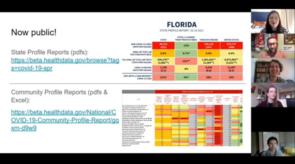
The White House COVID-19 reports that Whyte spent so much time chasing down this past summer are now public. The Trump’s administration started publishing the data behind these reports in December, and Biden’s administration has now started publishing the PDF reports themselves—albeit minus the recommendations to governors that previous iterations contained. Whyte provided a run-down of the reports on Twitter, which should be required reading for any local journalist who wants to get more in-depth with their pandemic coverage.
“I think they’re really great for local reporting because they break down all kinds of different metrics by state, county, and metro area,” she said. The reports notably make it easy for us to compare across jurisdictions, since the federal government has standardized all the data. And you can find story ideas in the data notes, such as seeing where a state or region had a data error. The CDD also wrote about these reports when they were first published.
Working with local gatekeepers to find data
Erica Hensley discussed a few lessons she learned from covering COVID-19 in Mississippi, where data availability has lagged some other states.
Local reporting, she said, provides journalists with a unique situation in which they’re directly relying on one local agency for news and data. She stressed the importance of building a relationship with agency representatives, helping them understand exactly what you’re looking for and why you need it.
“They’re [Mississippi’s public health agency] an under-resourced agency that was strapped for time to even address my request,” she said. Understanding on her part and a lot of back-and-forth helped her to eventually get those requests met.
Hensley also described how she worked to fill data gaps by doing her own analysis at Mississippi Today, a local nonprofit newsroom, then showed her work to the public health agency. For example, she used the total case numbers published by the state to calculate daily and weekly figures, and presented the data in a percent change map. This project helped Mississippi residents see where COVID-19 spread was progressing most intensely—but it also showed the state that this information was needed. She similarly calculated a test positivity rate; to this day, she said, state public health officials go to Mississippi Today’s website to see positivity rates, as these rates are not included on the state’s COVID-19 site.
When you can do some calculations yourself, Hensley said, do those—and focus your FOIA time on those data that are less readily available, such as names of schools and long-term care facilities that have faced outbreaks. Long-term care has been a big focus for her, as residents in these facilities tend to be more vulnerable.
Since Mississippi wasn’t releasing state long-term care data, she used federal data from the Centers for Medicare and Medicaid Services (CMS) and ProPublica to investigate the facilities. Matching up sites with high COVID-19 case counts and sites that had completed infection control training, Hensley found that the majority of long-term care facilities in the state had failed to adequately prepare for outbreaks. Her reporting revealed serious issues in the state.
Hensley advocates for local reporters to dig into long-term care stories; the CMS dataset has a lot of rich data, down to the individual facility level, that can be a springboard to stories about how facilities are (or aren’t) keeping their residents safe.
While Hensley stressed the importance of earning a local health department’s trust, she also said that health reporters need to be trusted by their colleagues. “A big part of my job early on, on top of collecting the data, was helping the newsroom understand how this applies to other local beats,” she explained. Reporters who serve as resources to each other will produce more interdisciplinary stores, and reporters who team up to request data will get the information out faster.
Building a massive system to track COVID-19 in prisons
Reporters at The Marshall Project have spent the past year tracking COVID-19 cases in U.S. prisons. Tom Meagher discussed how they did it, including a lot of external and internal communication.
After the newsroom went on lockdown, Meagher said, “Once of the first things we thought of was, prisons—being congregate living facilities—were going to be seriously affected by this pandemic.” But at first, the data they wanted simply didn’t exist.
To compile those data on COVID-19 in prisons, The Marshall Project’s team had to manage relationships with agencies in every state and D.C. They divided up all the states among their newsroom, and later worked with The Associated Press as well. At first, the reporters called every state and simply asked for numbers with no intention to publish them, in order to see if a compilation would be possible. This was easier said than done: “Prisons are not always the most transparent agencies to deal with,” Meagher said.
TMP reporters asked each agency three carefully-worded questions: How many people have been tested for the coronavirus? How many have tested positive? And how many have died? They wanted to get those numbers for both prison inmates and staff. Meagher and his colleague Katie Park had to do a lot of work to clean and standardize the numbers, which are often inconsistent across states.
The team made it clear to prison agencies that this wasn’t just a one-off ask—they came back with the same questions every week. Within a month, a lot of state agencies started setting up websites, which made data collection easier; but reporters still call and email every week in order to clarify data issues and fill in gaps. Meagher uses Google Sheets and Mail Merge to coordinate much of the data collection, cleaning, and outreach back to states with lingering questions.
The newsroom also uses a tool called Klaxon to monitor prison websites for changes and record screenshots, often useful for historical analysis. In one instance, TMP’s screenshots revealed that Texas’ justice system removed seven names from its list of prison deaths; they were able to use this evidence to advocate for names to be returned.
TMP’s data collection system is manual—or, primarily done by humans, not web scrapers. They opted for this route because prison data, like a lot of COVID-19 data, are messy and inconsistent. You might find that an agency switches its test units from people to specimens without warning, Meagher said, or fixes a historical error by removing a few cases from its total count. In these instances, a human reporter can quickly notice the problem and send a question out to the state agency.
“If we’ve learned anything from all of this, it’s that there’s a lot of different ways data can go wrong,” Meagher said. Even when public health officials are well-intentioned and questions are clearly asked, misunderstandings can still happen that lead to data errors down the line.
The goal of this dataset is really to give people insight into what’s happening—for prison inmates, for their families, and for advocates. Even agencies themselves, he said, are “eager to see how they’re doing compared to other states.” Since a similar dataset doesn’t exist on a federal level, states are using TMP’s to track their own progress, creating an incentive for them to report more accurately to begin with. These data are freely available online, including case and death numbers for every week since March. If you have questions, Meagher and his colleagues may serve as a resource for other reporters hoping to report on COVID-19 in the prison system.
Drew Armstrong, Bloomberg News‘s senior editor for health care, talked about his work on the publication’s Vaccine Tracker; and Arielle Levin Becker, director of communications and strategic initiatives for the Connecticut Health Foundation, discussed how to navigate COVID-19 race and ethnicity data. Thank you to everyone who attended—we had a great turnout!
For those who couldn’t make it live, you can watch the recording of the session below. You can also check out the slides here. I’m also sharing a brief recap of the workshop in today’s issue.
In next Wednesday’s workshop, we’ll discuss engaging COVID-19 data providers, featuring Liz Essley Whyte (Center for Public Integrity), Tom Meagher (The Marshall Project), and Erica Hensley (independent reporter from Mississippi). If you aren’t registered for the series yet, you can sign up here.
The Bloomberg Vaccine Tracker
In his presentation, Drew Armstrong provided a behind-the-scenes look at Bloomberg’s tracker and shared some advice on analyzing vaccine data more broadly.
“We attempt to capture every vaccine dose that’s reported for COVID-19, every single day, around the world,” he said. In addition to the tracker’s daily updates on vaccine doses distributed and administered, the site also includes information on vaccine contracts between companies and countries—allowing a window into future distribution.
All of the data on the tracker comes from public sources, largely national and state public health departments that share figures via their own dashboards, press conferences, and social media. Like other aspects of pandemic data, these figures can be pretty messy. Every country, and even every state, may have its own definition of an “administered dose” or a “vaccinated individual”—and these definitions are evolving as the rollout progresses.
Armstrong provided one example: Tennessee reports “number of people with 1 dose only” vs. “2 doses,” and moves people from the first category to the second after they receive that second dose. Maryland, on the other hand, reports total people who have received one and two doses; both totals are always growing. It’s difficult to make apples-to-apples comparisons when every jurisdiction is doing something different. If you can, Armstrong said, actually get on the phone with your local official and make sure you understand precisely what the terms on their vaccine reports mean. When the Johnson & Johnson vaccine (which only requires one dose) starts rolling out, this definitional landscape will only get more complicated.
As a result of this messy data landscape, figures for the Bloomberg Vaccine Tracker are compiled manually by a huge team, including reporters from every bureau of the publication. “You have to really get your hands dirty with this data to understand it,” Armstrong said.
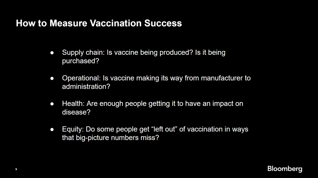
Armstrong also provided four ways for reporters to measure vaccination success. I’m including his slide here because I think it provides a good look at the multifaceted nature of vaccine data analysis and communication; your state might be vaccinating residents at a quick pace, but if the most vulnerable members of your community have been left out, you can’t fully call that rollout a success.
Slide from Drew Armstrong’s talk discussing the Bloomberg Vaccine Tracker.
On the equity front: Armstrong announced that the Bloomberg tracker now includes a demographic vertical. This tracker currently includes data from 27 states and two cities which are reporting vaccinations by race and/or ethnicity—you can check it out here. Bloomberg’s team is planning to update this tracker weekly, adding more states as their data become available.
Armstrong emphasized that he and his colleagues want their tracker to be a resource for other journalists, civic engagement, and other public health communication. “All of our DMs are open,” he said. (Or you can send feedback to the team through a public form.)
He also noted that reporting on these data—or even @-ing your governor on Twitter and asking them why the numbers aren’t better—is a useful way of actually making the data better. By letting public officials know that we’re looking at these numbers and noticing the gaps, we can put the pressure on for changes to be made.
Analyzing sources of race and ethnicity data
In her presentation, Arielle Levin Becker shared some strategies and resources for navigating a new data source—with a focus on demographic data.
“Data is incredibly important—and easy to misuse,” she said at the start of her talk. Vetting a source properly, she explained, can help you understand both how to properly use this source and how to address its limitations in your reporting.
Vetting questions to consider:
Who’s compiling this source?
Who’s funding it?
How transparent are they about their methods? Can you identify how it was compiled, or even track the chain of their methodology?
Do they disclose the limitations of the data?
Similarly to Armstrong, Levin Becker recommended reaching out to a source directly when you have questions. People who compile public data are often “very welcoming” about explaining their work, she said, and may be excited to help you better use their data.
Once you get to the analysis stage, Levin Becker suggested asking another round of questions, such as, “Do the numbers in this source match other numbers from similar sources?” and “How could I explain these numbers in plain English?” One particularly important question, she said, is: “What’s the denominator?” Does this analysis apply to everyone in a state or to a particular subset, like the over-65 population? As we’ve discussed before, denominators can be a particular challenge for COVID-19 school data—without enrollment numbers or clear data definitions, case numbers associated with schools are difficult to interpret.
Levin Becker honed in on age adjustment, a process that’s commonly used in health data analysis to compare outcomes for different populations. It’s kind-of a complicated statistical process, she said, but the basic idea is, you weight your data by the age distribution of a population. White populations tend to skew older than Black and Hispanic/Latino populations, for example; to compare these groups in a more equivalent way, a researcher might calculate what their disease rates would be if the different populations had the same age distribution.
Before the state of Connecticut started age-adjusting its COVID-19 death rates, Levin Becker said, the public health department was boasting that Hispanic/Latino residents of the state were less likely to die from the disease than white residents. But after doing an age adjustment, the state revealed that residents of color were actually at higher risk.
Slide from Arielle Levin Becker’s talk, showing how age adjustment can reveal health disparities. Chart is from the CT health department.
“The median age for a non-Hispanic white resident is 47 years,” Levin Becker said. “For a non-Hispanic Black resident, the median age is 34 years, and for a Hispanic resident, it’s 29 years.”
Finally, of course, there are many instances in which the lack of data is the story. There’s been a big focus on race and ethnicity data for COVID-19 vaccinations, but we’re also still missing data on other pandemic impacts. For example, the federal government and the vast majority of states don’t report COVID-19 tests by race and ethnicity. In a lot of cases, Levin Becker said, healthcare providers simply aren’t required to record the race and ethnicity of their patients—“it hasn’t been prioritized in health systems.”
When the COVID-19 pandemic is no longer an imminent crisis, she said, “keep poking at the questions of what’s being collected and how it’s used.” Continued advocacy by journalists and other communicators can keep the pressure on to improve our race and ethnicity healthcare data—and use it to reveal the disparities that must be fixed.
Related resources
A few links shared in the chat during this session: