Author: branersa

  • there might be a link between the Oxford-AstraZeneca vaccine and those blood clots after all

    AstraZeneca still isn’t out of the woods yet. In fact, the woods seem to be just getting deeper, and now I’m fairly certain it’s not me jinxing things.

    Last time we covered AstraZeneca’s blood clot woes, the European Medicines Agency (EMA) had said in a March 18 press conference that “[t]he committee… concluded that the vaccine is not associated with an increase in the overall risk of thromboembolic events or blood clots.” (Thrombosis just means blood clotting.)

    But this week, authorities had enough data to posit a possible connection between blood clots known as cerebral venous sinus thrombosis (CVST) and the Oxford-AstraZeneca vaccine. The EMA has now advised, as of April 7, that “that unusual blood clots with low blood platelets should be listed as very rare side effects of Vaxzevria (formerly COVID-19 Vaccine AstraZeneca).” They are still recommending its use given the gravity of the COVID-19 pandemic, but it’s another blow to the vaccine that held much of the world’s hopes in inoculating the entire population. A mechanism by which the vaccine is causing these thromboses has not been discovered.

    As of April 4, there had been 222 cases of abnormal thromboses in Britain and the European Economic Area after receiving the Oxford-AstraZeneca vaccine, according to the New York Times. This is out of about 34 million people being vaccinated, and they estimated that the frequency was about 1 in 100,000. In total, the EMA committee looked at “62 cases of cerebral venous sinus thrombosis and 24 cases of splanchnic vein thrombosis reported in the EU drug safety database (EudraVigilance) as of 22 March 2021, 18 of which were fatal.” 

    This made us wonder how this compares to the early reports of anaphylaxis (serious allergic reactions) in recipients of the Pfizer-BioNTech and Moderna mRNA vaccines. According to an early report from the CDC, there were 21 cases out of 1,893,360 Pfizer-BioNTech first doses, for a frequency of 11.1 cases per million, or about 1 in 90,000. A later JAMA paper reported updated rates of about 4.7 cases per million doses for Pfizer-BioNTech and 2.5 cases per million for Moderna. To make the scales easier to compare, this works out to about 1 in 213,000 and 1 in 400,000, respectively.

    Comparing 1 in 213,000 and 1 in 400,000 cases of anaphylaxis to 1 in 100,000 cases of serious blood clots, it makes sense why some authorities are starting to hit the brakes on the AstraZeneca vaccine. No deaths were reported with the anaphylaxis reactions, but out of the sample of thromboses that the EMA examined, 18 people died. Not only are the numbers worse, but anaphylaxis reactions can also be easier to prepare for. In that early CDC report, 71% of anaphylaxis reactions occurred within 15 minutes of vaccination. For this reason, vaccine clinics monitor you for about 15 minutes (mine sure did). That’s harder to do with blood clots, which take much longer than 15 minutes to manifest and can’t be treated with an EpiPen on the spot. 

    Again, this is definitely a blow for what’s still a very effective vaccine. But taking these precautions is how faith in vaccines is earned and kept. We hold vaccines to a high standard for a reason.

    More vaccine coverage

    • Sources and updates, November 12
      Sources and updates for the week of November 12 include new vaccination data, a rapid test receiving FDA approval, treatment guidelines, and more.
    • How is the CDC tracking the latest round of COVID-19 vaccines?
      Following the end of the federal public health emergency in May, the CDC has lost its authority to collect vaccination data from all state and local health agencies that keep immunization records. As a result, the CDC is no longer providing comprehensive vaccination numbers on its COVID-19 dashboards. But we still have some information about this year’s vaccination campaign, thanks to continued CDC efforts as well as reporting by other health agencies and research organizations.
    • Sources and updates, October 8
      Sources and updates for the week of October 8 include new papers about booster shot uptake, at-home tests, and Long COVID symptoms.
    • COVID source shout-out: Novavax’s booster is now available
      This week, the FDA authorized Novavax’s updated COVID-19 vaccine. Here’s why some people are excited to get Novavax’s vaccine this fall, as opposed to Pfizer’s or Moderna’s.
  • Pfizer for the whole pfamily

    Good news for people with kids: this week, Pfizer and BioNTech released results for their trial involving adolescents aged 12-15. In the trial, no participants who received the vaccine contracted symptomatic COVID-19 out of a total of 2,260 participants, marking an efficacy rate of 100%. (Remember in December the efficacy rate was 95% for adults.) 18 participants in the placebo group did get symptomatic COVID-19. Additionally, Dr. Fauci said in the April 2 White House COVID-19 briefing that, by the end of the year, there should be enough data to safely vaccinate children of any age. 

    The results are, obviously, fantastic. But there was a wrinkle in reporting said results; one that pointed to the dangers of communicating science via press release. Originally, as Dr. Natalie Dean pointed out on Twitter, there was some confusion over whether there were no cases in the vaccinated group at all, or whether there were just no symptomatic cases:

    This is pretty important as infections in this group tend to be asymptomatic. Apoorva Mandavilli, who broke the Pfizer story for the New York Times, clarified that she had been told that there were in fact no infections:

    Until someone pointed out that STAT had clarified that there were no symptomatic infections: 

    Mandavilli decided to triple check, and turns out:

    Basically, someone at Pfizer messed up and incorrectly said that there had been no infections in the vaccine group at all when they really meant that there were no symptomatic infections. It doesn’t look like they regularly tested participants who had gotten the vaccine vs participants who got the placebo. This sounds like splitting hairs, but precision matters when communicating the results of highly anticipated trials. “No infections” and “no symptomatic cases” are different results. It’s a blow to Pfizer’s credibility in their press releases, and it was probably at least really annoying for Mandavilli. 

    In the meantime, Johnson & Johnson has also begun a trial in adolescents, so hopefully whoever is running PR for them saw this Twitter thread (or is reading this article 👀) and will know to be more careful than the Pfizer guy was. 

    But for now, we can rejoice in what is still very promising data. You get a Pfizer! And you get a Pfizer! How about a Pfizer for the little one? EVERYBODY GETS A PFIZER! (Well, when it gets actually authorized for that age group.)

    Related posts

    • Sources and updates, November 12
      Sources and updates for the week of November 12 include new vaccination data, a rapid test receiving FDA approval, treatment guidelines, and more.
    • How is the CDC tracking the latest round of COVID-19 vaccines?
      Following the end of the federal public health emergency in May, the CDC has lost its authority to collect vaccination data from all state and local health agencies that keep immunization records. As a result, the CDC is no longer providing comprehensive vaccination numbers on its COVID-19 dashboards. But we still have some information about this year’s vaccination campaign, thanks to continued CDC efforts as well as reporting by other health agencies and research organizations.
    • Sources and updates, October 8
      Sources and updates for the week of October 8 include new papers about booster shot uptake, at-home tests, and Long COVID symptoms.
    • COVID source shout-out: Novavax’s booster is now available
      This week, the FDA authorized Novavax’s updated COVID-19 vaccine. Here’s why some people are excited to get Novavax’s vaccine this fall, as opposed to Pfizer’s or Moderna’s.
  • Stop me if you’ve heard this one: AstraZeneca is having vaccine issues

    Stop me if you’ve heard this one: AstraZeneca is having vaccine issues

    Remember when I said “we’ll see if anything else happens” in last week’s article on AstraZeneca’s issues? Well, I accept full responsibility for manifesting the chaos that happened earlier this week and I promise I won’t tempt fate again this time around. If you’re confused, as I certainly was, here’s just what the hell happened.

    On Monday, AstraZeneca released results from their Phase 3 trials in the United States, and they looked good: 79% efficacy against symptomatic disease, 100% efficacy against hospitalizations and deaths. This was certainly a welcome result for the company which is continuing to grapple with fallout from rare cases of blood clots that have been reported in some people after they got the vaccine, and gears started to turn to get EUA approval in the United States. (Even though, again, the U.S. just promised most of their supply to Canada and Mexico. Everyone wants FDA clout, I guess.)

    But on Tuesday, officials started to question the results. The results released on Monday had looked better than more recent results released elsewhere, one of which showed an overall efficacy of around 60%. Also, as Dr. Eric Topol pointed out, the data were fairly incomplete:

    Independent reviewers from the data and safety monitoring board sent “a harsh note” to AstraZeneca, according to Anthony Fauci, and sure enough, it soon became clear that AstraZeneca had released outdated (better) numbers instead of the real results from the trial, obfuscating how efficacious the vaccine actually was in the U.S. trial. 

    After all this, on Wednesday morning, AstraZeneca released the updated overall efficacy number: 76%. All that drama over docking three percentage points. (Though they did also complete the dataset, thus satisfying Dr. Topol and saving them more of his very pointed tweets. Thank you Dr. Topol.) 

    Dr. Ashish Jha sums it up pretty well:

    But Roxanne Khamsi sums it up even better:

    We’ll see if anything el—nope, I promised I wouldn’t.

    Related posts

    • Sources and updates, November 12
      Sources and updates for the week of November 12 include new vaccination data, a rapid test receiving FDA approval, treatment guidelines, and more.
    • How is the CDC tracking the latest round of COVID-19 vaccines?
      Following the end of the federal public health emergency in May, the CDC has lost its authority to collect vaccination data from all state and local health agencies that keep immunization records. As a result, the CDC is no longer providing comprehensive vaccination numbers on its COVID-19 dashboards. But we still have some information about this year’s vaccination campaign, thanks to continued CDC efforts as well as reporting by other health agencies and research organizations.
    • Sources and updates, October 8
      Sources and updates for the week of October 8 include new papers about booster shot uptake, at-home tests, and Long COVID symptoms.
    • COVID source shout-out: Novavax’s booster is now available
      This week, the FDA authorized Novavax’s updated COVID-19 vaccine. Here’s why some people are excited to get Novavax’s vaccine this fall, as opposed to Pfizer’s or Moderna’s.
  • What the hell is going on with the Oxford-AstraZeneca vaccine?

    What the hell is going on with the Oxford-AstraZeneca vaccine?

    The problem child of COVID-19 vaccines was back in the news this week. After South Africa suspended the Oxford-AstraZeneca vaccine’s use when it failed to slow the spread of the predominant B.1.351 variant, vaccination using this vaccine has been suspended and then resumed in many European countries following reports of blood clots in some people who received it. 

    According to a release from AstraZeneca, there have been 15 cases of deep vein thrombosis and 22 cases of pulmonary embolism in people who have gotten the vaccine, as of March 8. These are serious complications—seven of those people died. Countries that suspended the vaccine’s use include Spain, Italy, France, and Germany, among others. (Europe tends to act as more of a bloc than North America when it comes to vaccines. Consider: Canada has authorized use of the AstraZeneca vaccine while the US has literal fridges full of the stuff just sitting there waiting for approval.)

    Since the initial suspension, investigations have been launched and apparently concluded that there is no causative relationship between the vaccine and these symptoms. According to Emer Cooke, the executive director of the European Medicines Agency (EMA), in a press conference on March 18: “The committee… concluded that the vaccine is not associated with an increase in the overall risk of thromboembolic events or blood clots.”

    And, according to the WHO on March 17: “At this time, WHO considers that the benefits of the AstraZeneca vaccine outweigh its risks and recommends that vaccinations continue.” Europe has since started to resume vaccinating with the Oxford-AstraZeneca vaccine, starting with France, Germany, and Italy. (Except not in Finland, where they just suspended it again after two people got similar blood clots.)

    So all’s well that ends well right? Well, not necessarily. Besides that Finland wrinkle, some scientists and officials are concerned that this entire rigmarole could undermine public trust in the AstraZeneca vaccine. It’s worth noting that a tiny population experienced these effects out of the millions of people who have already gotten the vaccine. And blood clots are fairly common in the population; you’re going to expect some people to develop them just by sheer chance. But it’s also worth noting that these complications are serious, and rare among the age group that they were reported in. Not slowing down could have the same fear-inducing effect. As Shobita Parthasarathy says in her Slate column, “[T]his crisis isn’t about science at all. It’s about public trust, and scared citizens cannot be easily convinced by expertise that feels remote. Our solutions need to reflect that.”

    We’ll see if anything else happens. But in the meantime, the US has since promised to share its stockpile of the Oxford-AstraZeneca vaccine with Canada and Mexico, so it looks like it’s at least medium-steam ahead for now. 

    In summation:

    More vaccine posts

    • Sources and updates, November 12
      Sources and updates for the week of November 12 include new vaccination data, a rapid test receiving FDA approval, treatment guidelines, and more.
    • How is the CDC tracking the latest round of COVID-19 vaccines?
      Following the end of the federal public health emergency in May, the CDC has lost its authority to collect vaccination data from all state and local health agencies that keep immunization records. As a result, the CDC is no longer providing comprehensive vaccination numbers on its COVID-19 dashboards. But we still have some information about this year’s vaccination campaign, thanks to continued CDC efforts as well as reporting by other health agencies and research organizations.
    • Sources and updates, October 8
      Sources and updates for the week of October 8 include new papers about booster shot uptake, at-home tests, and Long COVID symptoms.
    • COVID source shout-out: Novavax’s booster is now available
      This week, the FDA authorized Novavax’s updated COVID-19 vaccine. Here’s why some people are excited to get Novavax’s vaccine this fall, as opposed to Pfizer’s or Moderna’s.
  • NYC variant looks like bad news

    In a press conference on Wednesday, NYC mayor Bill de Blasio confirmed that the recently identified NYC variant (since christened B-1526) is outpacing the original strain in spreading speed, and his senior advisor for Public Health, Dr. Jay Varma, said that these two variants combined account for 51% of all cases in the city.  This is coming from a preliminary analysis, and so far, they have not found that B-1526 is more deadly or that it may evade vaccine efficacy. However, it’s still worrying.

    It’s probably contributing to the relatively slower pace of decline in cases in NY versus the rest of the country: 

    And this comes when NYC is increasing indoor dining capacity to 50%, and when NY is going to scrap its rule on people from out of state having to quarantine on April 1. De Blasio has told New Yorkers to stay the course, but the people in charge (Andrew Cuomo) don’t seem to want to follow that advice.

  • Novavax releases optimistic trial results

    More good vaccine news this week: Novavax, the current candidate using a recombinant protein method, released results from trials in the United Kingdom and South Africa, and they look good. Here’s the breakdown:

    • 100% effective against hospitalization and death across all regions tested
    • 96.4% effective against symptomatic disease in the “original strain”
    • 86.3% effective against symptomatic B.1.1.7
    • 48.6% effective against symptomatic Covid-19 in South Africa (where B.1.351 is the predominant strain)

    It should be noted that the UK trial was a full phase 3, while the South African trial was a smaller phase 2b trial—so we have less information for South Africa. There’s also currently a 30,000-person trial happening in the United States and Mexico which should shed more light on what this vaccine can do. But for now, these results are super encouraging.

  • Global.health has gone public—what’s actually in the database?

    Global.health has gone public—what’s actually in the database?

    Last week, we included Global.health in our featured sources section. The initiative aims to document 10 million plus cases in one source. Instead of just listing numbers of positive cases and deaths, they collect individual cases and gather information about said case. What was their age range? Gender? When did symptoms develop? The dataset has room for more than 40 variables aside from just “tested positive.” While there are lots of dashboards and tracking sources, none collect detailed data about (anonymized!) individual cases.

    Collecting data like this is critical for understanding how epidemics spread, and an open repository could help researchers determine what the actual infection rate is or divine more information about lasting immunity. The set has been available to researchers for a while, but now it’s been released to the public. It might seem strange to release it now as it looks like cases are finally sustainably declining, but we’re still going to have to track COVID-19 even as everyone gets vaccinated. As one of the founders, Samuel Scarpino says, “COVID-19 is gonna become rare. It will fall back into the milieu of things that cause respiratory illness. As a result, we’re going to need higher-fidelity systems that are capturing lots of information and informing rapid public health response, identifying new variants and capturing information on their spread.”

    Since the data are now public,let’s take a look at what’s possible with this source.

    The first thing I discovered is that, predictably, the full dataset is just too big for Excel to open. I recently switched computers and I’m pretty sure this file was the death knell for my old one. You’re gonna need to either stick with their website or use something like Python or R to really sink your teeth in. Even just the website slowed down my new computer a lot, so beware. Elderly computers should probably be spared.

    Still, the website is very well designed and easy to navigate. You can have your data two ways: as a table with, at time of writing, more than 200,000 pages, or as a map where you can click on the country or region you want to look at, which will then direct you to a much smaller table. (All roads lead to tables, but the map function does make it a lot easier to navigate.)

    The country map is fairly self-explanatory—a deeper shade of blue means more cases— but the regional map also just looks very cool:

    Regional map.

    You can of course zoom in to your region of choice. My one quibble with the display is that I wish you could rotate your field of view, as sometimes the region behind a particularly tall spike can literally be overshadowed and thus be a little harder to access.

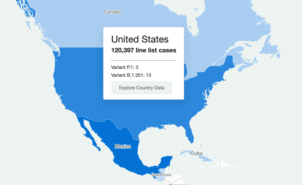
    Going through every part of this giant resource would take days, so I’m going to be focusing on the United States data. Here’s what I got when I clicked on it on the map:

    U.S. map.

    It should be understood that this is a sample of the U.S. data (same presumably goes for data in other countries.) Because this is line-list data, it’s supposed to be very granular—recent travel history, when a case became symptomatic, and so on. Data at this level of detail just aren’t available or possible to get for every case in the country (and even less so for the rest of the world.) So that should be remembered when working with this dataset. It’s extremely comprehensive, but not all-encompassing. (That being said, it is strange that there are P.1 cases recorded, but no B.1.1.7, which is much more common here.)

    So how granular are the data? When you’re directed to the table for that country, the table on the website has columns for:

    • Case Identification Number
    • Confirmation date (I assume this is confirmation that yes, this person is infected)
    • “Admin 1, Admin 2, and Admin 3” (short for “administrative areas” – for example, for a U.S. patient, 1 would be country, 2 would be state, and 3 would be county)
    • Country
    • Latitude and longitude (I assume of the hospital or of the lab where the case was identified)
    • Age
    • Gender
    • Outcome
    • Hospitalization date/period
    • Symptom onset
    • URL for the source

    Which is indeed pretty granular! It should be noted, however, that there are a lot of blank spots in the database. It has the capacity to be extremely comprehensive, but don’t go in expecting every single line item to have every detail. I’m not sure if this is going to improve as records are updated, but I suppose we’ll see.

    What can you do with these data? I loaded the full dataset into R to mess around with the data a bit. The disclaimer here is that I am by no means an R wizard. Another fair warning is that R will take a hot second to load everything up, but when you load up the full dataset there are a ton more columns for more data categories, like preexisting conditions. (That one seems important, why is it not on the more accessible website?)

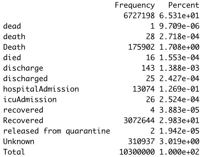
     I found that making some frequency tables was a good way to assess just how complete the data was for certain variables. Here’s a frequency table I made with the outcome values:

    Frequency table.

    The first thing I notice is just how many lines have a blank value for the outcome. (65% of them.) Again, a lot of these data are incomplete. The second thing is that there are a ton of synonyms for the same thing. A capitalization change will shunt a number to a completely different category, making it a little annoying to compile results, so you’ll have to tinker with it a little bit to make a clear graphic/graph/etc. The bar graph R spit out for this was unreadable because of all the categories.

    I tried another one for the gender demographics and the bar graph was actually readable this time. As expected, the percentage of lines with no data available was lower this time (19%) but still sizable.

    Bar graph showing gender availability.

    As I should have expected, I got a gigantic table when I tried it for ethnicity. But 75.49% of the lines were blank. 99.6568% were blank for occupation, which I was inspired to look at because occupational data are similarly barren for vaccination data as well. Somewhat predictably, and just as a check, cases by country had much fewer blank cells.Overall this is a really interesting resource, but there are a lot of blank spots that keep it from being the god of all datasets. I think asking any source to be 100% complete is a tall order given the circumstances, and this is still the only source out there of its kind and of its scale. I look forward to checking in again and seeing if those blank cells drop in number.

  • J&J vaccine authorized, VRBPAC has fantastic hold music

    Yesterday, the FDA gave the Janssen—did you know it’s pronounced yahn-sen? I didn’t—vaccine Emergency Use Authorization, allowing it to join the likes of Pfizer and Moderna in the exclusive club of vaccines that may now be distributed in the U.S. Welcome, Janssen. (As a total coincidence I’m wearing my shirt that just says “Vaccines!” on it as I write this.) But the addition of a new vaccine in circulation also brings data reporting questions with few easy answers. 

    I got to hear the VRBPAC (Vaccines and Related Biological Products Advisory Committee) hold music for the first time on Friday. As I am a full-time student, I couldn’t watch the entire meeting; thus, a lot of this coverage is aided by Helen Branswell and Matthew Herper’s liveblog on STAT News—thank you guys for saving me hours of video to sift through.

    The gist of the meeting is that of course it passed the committee vote. I’m pretty sure no one expected it wouldn’t. Katelyn Jetelina, who runs the Your Local Epidemiologist newsletter, certainly didn’t, especially because we knew beforehand that it was 100% effective in preventing hospitalizations and deaths

    However, I did find it interesting that the vote was unanimous—which I wasn’t expecting, given the pattern established by Pfizer and Moderna beforehand. Pfizer passed with 17 pro and 4 against (and 1 abstention); they did not explain their votes in that meeting but authorization for kids aged 16-17 was a sticking point. Moderna passed with 20 pro and 1 abstention; the question—“Based on the totality of scientific evidence available, do the benefits of the Moderna Covid-19 vaccine outweigh its risks for use in individuals 18 years of age and older?”—was worded too broadly, and the abstainer would have preferred to target authorization to high risk populations). 

    So what changed? Herper noted in the liveblog that the unanimous vote doesn’t necessarily mean this is a better vaccine than Pfizer or Moderna. It was more about panelists’ increased faith in the EUA process. Pfizer and Moderna have been EUA’d for a while and, per Patrick Moore of the University of Pittsburgh, “things are looking good.” Agreed! Now if we could just get it into more deltoids…

    But we’re not here for deltoids, we’re here for data. The J&J presentation basically reiterated what we knew with some key statistics: The big Phase 3 study enrolled more than 44,000 participants globally. Across the entire study, the protection efficacy against severe disease was 85%, and that’s including the U.S. and South Africa (important because of variant prevalence in the latter country). No one who got the vaccine was hospitalized or died due to COVID-19. The efficacy against moderate to severe disease was 72% in the US, and 66% across all countries studied. These numbers were similar across ages, comorbidity statuses, sexes, races, and ethnicities. In short: it works. 

    There is a lack of data in people aged 75 or older. Only 755 people (3.8% of all participants) in this age group received the vaccine in the ENSEMBLE trial, and the FDA noted that it’s hard to interpret such low numbers. As Branswell says in the STAT liveblog, the trial didn’t prove that the vaccine works in older individuals. However, the VRBPAC committee barely touched on this. Either way, it’s been approved for adults 18 and over, and there’s nothing in the recent communications that indicates adults 60 and over aren’t advised to get it. 

    There are data questions beyond the VRBPAC committee meeting, though.  Most vaccination dashboards are set up for a two-dose vaccine; they document how many people have gotten both shots and how many people have gotten just the first. So we don’t really know what’s going to happen when the Janssen vaccine becomes available—will that number factor into “people who have only gotten one dose?” Personally, I think the dashboards are going to have to change to “people who have partially completed dosing regimen” and “people who have completed the dosing regimen,” but knowing the states, it’ll likely be more complicated than that. Drew Armstrong, who runs Bloomberg’s Vaccine Tracker, mentioned in our CDD workshop last week that his team is already calling public health departments in order to discern how their reporting will change. 

    The question of how the dashboards will change gets more complicated when one considers a sticking point that actually was brought up in the committee meeting: just how many doses Janssen will eventually recommend. This particular petition was for a single dose vaccine. But Janssen has also been testing a two-dose regimen. Dr. Paul Offit, a member of the committee and a vaccine researcher, brought this up and raised a very important question: what if the two-dose regimen works better? What happens then? How is that going to be communicated to the public? How is that going to show up in the dashboards?

    It’s tricky. The response, for now, is that the two-dose trial is still double-blinded, and that right now we’re concerned with granting EUA to a single-dose vaccine. The possibility was raised that the two-dose regimen might be what Janssen presents for true-blue FDA authorization. But we’re not there yet. 

    However, to go back to our dashboard question, let’s entertain for a minute that Janssen sees that the two-dose regimen works demonstrably better than the single-dose regimen. I find it hard to believe that this will come before the single-dose vaccines have started to be administered—and documented in dashboards. What happens to the dashboards then? Even if we assume it’s changed by then to “completed vaccine regimen” vs “partially completed vaccine regimen,” does that mean everyone who got the Janssen vaccine before – and would be counted under “completed regimen”—would have to be moved to “partially completed regimen?” 

    The ending sentiment seemed to be that the two-dose questions are a bridge we should cross when we get to it. While I sort of agree, I do think it’s worth considering now when it comes to data ramifications. States should be thinking about how they’re going to document this so we’re not blindsided if Janssen and the FDA decide that you need two shots for maximum COVID protection. We have enough data problems as it is, why add more?

    Related posts

    • Sources and updates, November 12
      Sources and updates for the week of November 12 include new vaccination data, a rapid test receiving FDA approval, treatment guidelines, and more.
    • How is the CDC tracking the latest round of COVID-19 vaccines?
      Following the end of the federal public health emergency in May, the CDC has lost its authority to collect vaccination data from all state and local health agencies that keep immunization records. As a result, the CDC is no longer providing comprehensive vaccination numbers on its COVID-19 dashboards. But we still have some information about this year’s vaccination campaign, thanks to continued CDC efforts as well as reporting by other health agencies and research organizations.
    • Sources and updates, October 8
      Sources and updates for the week of October 8 include new papers about booster shot uptake, at-home tests, and Long COVID symptoms.
    • COVID source shout-out: Novavax’s booster is now available
      This week, the FDA authorized Novavax’s updated COVID-19 vaccine. Here’s why some people are excited to get Novavax’s vaccine this fall, as opposed to Pfizer’s or Moderna’s.
  • Next in vaccination data demands: some, oh god, just any occupational data

    Next in vaccination data demands: some, oh god, just any occupational data

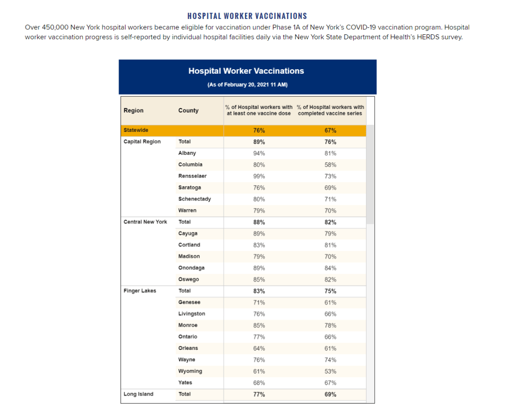
    New York state reports vaccine coverage among state hospital workers; this is the closest that any state gets to vaccination data by occupation.

    I was having a truly lovely evening, hot chocolate in hand, paging through the New York State vaccination dashboard until I realized one glaring absence: Why is there no occupational data for who is getting vaccinated? 

    This isn’t just a problem with the New York state dashboard. According to our updated annotations on state vaccination data sources, not a single one reports out vaccination by occupation. I suppose I shouldn’t ask for so much—only 36 states report vaccination by race and ethnicity, which I thought was the bare minimum—but I’m used to getting disappointment at this point. 

    Nihilism aside, here’s why that’s weird. Pretty much everyone is considering one’s occupation into whether they’re eligible for the vaccine or not—hell, that’s how this whole thing started after all. But now that we’ve moved beyond just health care workers getting vaccinated, the data hasn’t kept up. 

    For example, NYC has included “in-person college instructors” in eligibility for the vaccine since January 11. Wouldn’t it be nice to know just how many in-person professors have gotten vaccinated? It’d sure be helpful if Barnard ever decides to do in-person classes again. Or what about taxi drivers? Again in NYC, because that’s where I live, they became eligible for vaccination on February 2. From a personal standpoint, I’d like to know if I could send my taxi driver to the hospital if my mask slips.

    To be fair, we are seeing some occupation-adjacent data. First, a few sources group vaccinations by where the shots were given, like Massachusetts, or by provider type, like Utah. These include shots given in correctional facilities. While it’s not as good as just stating outright which occupations people getting vaccinated have, it could be used as a proxy for something similar. Additionally, New York tracks hospital worker vaccinations, but they don’t differentiate between physicians and other staff. Finally, long-term care facilities are going through a different program, so data for LTC employees usually gets its own category in a lot of states, like in New York again.

    But we shouldn’t be satisfied with proxies and incomplete data; I’ve realized my worth since drafting the title for this segment. I—no, we—deserve better. This is critical for understanding vaccine equity and how close we are to restoring “normalcy.” If we don’t know how many taxi drivers or how many college instructors are getting vaccinated, it’s going to be a lot harder to have conversations about when it’s safe to ride in a taxi or attend in-person classes. It’s going to be a lot harder to have conversations about which taxi drivers or which instructors are able to get vaccinated. It’s also important to see just how well pushing taxi drivers to the front of the line works in actually getting them vaccinated. We’ve lifted one barrier, but are there others that we’re missing? 

    It’s entirely possible that healthcare providers just aren’t used to collecting this kind of data. But it’s still necessary, and right now, it’s just another example of flying blind when we really shouldn’t be.

    Related posts

    • Sources and updates, November 12
      Sources and updates for the week of November 12 include new vaccination data, a rapid test receiving FDA approval, treatment guidelines, and more.
    • How is the CDC tracking the latest round of COVID-19 vaccines?
      Following the end of the federal public health emergency in May, the CDC has lost its authority to collect vaccination data from all state and local health agencies that keep immunization records. As a result, the CDC is no longer providing comprehensive vaccination numbers on its COVID-19 dashboards. But we still have some information about this year’s vaccination campaign, thanks to continued CDC efforts as well as reporting by other health agencies and research organizations.
    • Sources and updates, October 8
      Sources and updates for the week of October 8 include new papers about booster shot uptake, at-home tests, and Long COVID symptoms.
    • COVID source shout-out: Novavax’s booster is now available
      This week, the FDA authorized Novavax’s updated COVID-19 vaccine. Here’s why some people are excited to get Novavax’s vaccine this fall, as opposed to Pfizer’s or Moderna’s.
  • COVID source callout: Andrew Cuomo

    Usually when we do a COVID source callout, we’re putting our sights on a dashboard that’s actually five separate dashboards or a state that likes to surprise us when they update their dataset. This is to say that, usually, we don’t call out an actual source of coronavirus. 

    But that’s what New York Governor Andrew Cuomo apparently wants to be when he grows up, as he opened up limited indoor dining on February 12th for New York City, where Betsy and I both live. We talked last week about a frankly terrifying ProPublica article that warned about the dangers of reopening indoor dining and loosening guidelines in general, not only with variants on the rise, but with most people in the dark of just how on the rise they are. So why, dear god why, would you decide this is the time to LOOSEN restrictions? 

    Look, I can make a few guesses. As much as I think Cuomo is acting really really stupidly, I don’t think he’s an idiot. There’s definitely political and economic pressure, along with a court ruling in mid-January that said there was no “rational basis” for keeping things closed when hospitalizations and deaths are falling – this led to indoor dining resuming in most of the state

    But that court ruling did not affect New York City, or wedding capacity restrictions, which are also being loosened in March in the pursuit of “marital bliss.” This is just irresponsible; “marital bliss” isn’t worth it even when there isn’t a deadly pandemic, as Cuomo himself clearly knows. In the announcement, he suggested you could “propose on Valentine’s Day and then you can have the wedding ceremony March 15, up to 150 people. People will actually come to your wedding because you can tell them with the testing it will be safe.” Cuomo is not only about to open up the possibility for more serious supersreader events, he’s also about to rob every introvert of their best excuse for skipping Aunt Marsha’s wedding since she said she’d be serving roasted pangolin. Unforgivable. 

    So apparently the biggest city in the country can reopen indoor dining and have weddings on the horizon when, again, we don’t even know just how much these variants are going to screw us over. I knew Tom’s Restaurant was a dangerous game for my own health, but they’re about to seriously expand their blast radius.