Author: Betsy Ladyzhets

  • New reporting requirements for nursing homes, hospitals, labs

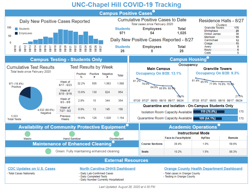
    This week’s Department of Health and Human Services (HHS) update is a little indirect, in that it’s actually a Centers for Medicare & Medicaid Services (CMS) update.

    Last Tuesday, CMS announced that nursing homes are required to test their staff and offer to test their residents when a COVID-19 outbreak occurs. Facilities that don’t test adequately can be fined. These new requirements follow the recent large-scale distribution of antigen tests to nursing homes, a move I’ve discussed in previous issues. It is still unclear, however, how exactly the results of all this testing will be reported. While the CMS COVID-19 dataset includes some new fields on testing this week, these are primarily yes/no fields, such as “Tested Asymptomatic Staff and/or Personnel Facility-Wide After a New Case.” Actual test counts are not yet reported.

    The new CMS directive is also notable in that it includes new reporting directives for hospitals and COVID-19 labs. Hospitals were already required to report their COVID-19 patients, PPE needs, and other metrics to HHS, but now they are extra required to report them:

    In March, Vice President Mike Pence sent a letter to all hospitals requesting that they provide the results of COVID-19 tests performed in their in-house laboratories to help better understand and track disease patterns. CMS’ new rules require such reporting of test results in order to ensure a more complete picture in the nationwide surveillance of COVID-19, as well as a more efficient allocation of PPE and other vital supplies. Hospitals will face possible termination of Medicare and Medicaid payment if unable to correct reporting deficiencies.

    Outside laboratories conducting COVID-19 tests can similarly face monetary penalties if they fail to report to HHS: CMS will impose a fine of $1,000 a day for the first day a lab fails to report and $500 for each subsequent day. I and other folks at the COVID Tracking Project will be watching carefully to see how this directive impacts the completeness and accuracy of HHS data.

  • COVID-19 K-12 data continue to be patchwork

    Since I reviewed COVID-19 data in public school systems last week, a few things have changed:

    • Alisha Morris’ crowd-sourced spreadsheet of COVID-19 cases, closures, and other reopening plan changes in K-12 schools has leveled up, thanks to collaboration with the National Education Association. Concerned students, parents, and teachers can now explore the data and report cases on a new NEA-run website. This NPR article explains more of the project’s background and findings.
    • Brown University and national education organizations are working together to track school pandemic responses. Their findings, planned to be released in a dashboard this September, will include: enrollment, poverty level, internet access, COVID-19 cases, and district opening status.
    • Duval County Public Schools, a district in Florida, was barred from reporting school-related COVID-19 cases by the county’s public health department. According to the Florida Times-Union, the county stated that the school district could not publish “school specific data related to COVID-19” without the state health department’s permission.
    • Meanwhile, in Kentucky: this state’s COVID-19 dashboard now includes both a K-12 school public health report and a college and university public health report. Both reports, published daily, include active cases, deaths, and other statistics.
  • How are colleges and universities reporting COVID-19 data?

    How are colleges and universities reporting COVID-19 data?

    Screenshot of UNC-Chapel Hill’s COVID-19 dashboard. The school has made headlines in the past two weeks for facing outbreaks almost immediately upon students’ return to campus.

    Across the country—and despite the warnings of numerous faculty members and public health leaders—colleges are reopening. Freshmen are returning to campus eager to meet their classmates, and upperclassmen are returning eager to see friends after months in their hometowns.

    Most college students will certainly do their best to wear masks, socially distance, and meet outdoors wherever possible. But it is inevitable that COVID-19 will hit campuses, and when it does, school leaders need to be prepared: not only with testing and tracing systems and room for students to self-isolate, but also with a robust data system that can let their communities know exactly what’s going on.

    For this issue, I surveyed the COVID-19 dashboards of 50 higher education institutions across the country. This analysis expands upon the work of Andy Thomason, an education journalist at the Chronicle of Higher Education who has been compiling dashboards on Twitter for the past two weeks:

    The 50 dashboards I examined include public and private schools in 26 states. The most heavily represented states are North Carolina (nine schools) and Massachusetts (4 schools). I plan on expanding this analysis to include all 82 schools currently on Andy Thomason’s list, as well as any other dashboards that I can find, but 50 seemed like a solid number to discuss for today’s issue.

    Rather than attempting to count the number of COVID-19 cases occurring at colleges and universities, I chose to focus on how schools are reporting: what COVID-19 metrics are they making public, and how often are these metrics updated? (If you’d like to see sheer case numbers, I recommend this dashboard by the New York Times, which includes counts from both public sources and additional NYT reporting.)

    Here’s the spreadsheet with my work. I encourage you to check it out for yourself, especially if you attend or have friends or family attending one of the schools on the list. But I’ll include some summary statistics here because, yeah, you’re probably skimming through this on Monday morning and have about 900 other things to do.

    • 41 schools report some form of cumulative COVID-19 cases that have occurred on campus, usually since the beginning of August. Most of these (29) separate out student and faculty/staff cases.
    • 24 schools report COVID-19 cases per day. 20 of these separate out student and faculty/staff daily cases.
    • 18 schools report active COVID-19 cases. Definitions for “active” vary, from cases identified in the past 14 days to all cases minus those which reportedly no longer need to isolate thanks to a negative test.
    • No schools report COVID-19 deaths. Thankfully, no school yet needs to.
    • 29 schools report cumulative COVID-19 tests. The majority of these (21) do not specify whether their test counts are reported in specimens, people, or some other unit.
    • No schools report antibody or antigen tests.
    • 23 schools report some form of test positivity. 4 schools report daily figures, 11 report weekly figures, and 8 others report some form of cumulative figure. (Test positivity over a range greater than 14 days is not particularly useful, as this metric is used to track testing capacity over time.)
    • 19 schools report counts of students and/or staff currently undergoing quarantine or isolation.
    • 19 schools update their dashboards daily, 6 update Monday through Friday, 15 update on a twice- or three times-weekly schedule, and 7 do not clearly state how often updates are made.

    And here are a couple of examples of notable dashboards:

    • Roger Williams University: This dashboard focuses on testing. It’s the only dashboard in my initial analysis to report tests in both “tests administered” (specimens) and “total participants” (people). It also comprehensively reports test wait times, which few schools are tracking.
    • University of Nevada at Reno: This school has less of a “dashboard” and more of a series of COVID-19 reports. Click into a given month to find one-line statements about new cases, sorted by day. No overall statistics are reported.
    • University of Wisconsin at Madison: This dashboard includes charts and a table that show total tests, positive tests, and percent positive by day. I’m a fan of the dashboard’s Data Notes section, which clearly defines all the dashboard’s terms and encourages users to reach out with questions.
    • University of Connecticut: UConn has five campus across the state, and each one gets its own section in this dashboard. The organization is very clean; it’s easy to navigate and compare campuses.
    • University of North Carolina at Chapel Hill: UNC-Chapel Hill gets a shout-out for being the only dashboard I analyzed to report COVID-19 cases by residence hall. The university’s overall COVID-19 response may have been a clusterfuck, but at least their dashboard gives students information to help them manage it.

  • COVID source callout: New Jersey

    COVID source callout: New Jersey

    New Jersey reports COVID-19 demographic data in three different places.

    First: there are confirmed case summary reports, released in PDF form. These reports include pie charts that break down COVID-19 cases, deaths, and hospitalizations according to race and ethnicity, age group, and gender. A case summary report was last released on July 30.

    Second: there is a “demographics” tab on New Jersey’s dashboard, which includes tables on COVID-19 deaths by race and ethnicity, age group, and underlying conditions. This tab currently lags the main dashboard significantly; the tables add up to about 11,000 deaths, while New Jersey has reported about 1,600 deaths total.

    And third: there is a “case and mortality summaries” tab on the dashboard, which replicates the format of the old PDF reports with some confusing navigation. (Two rows of tabs at the top, and another row of tabs at the bottom? Who designed this? Who hurt them?)

  • Featured sources, Aug. 23

    • COVID Care Map: Dave Luo, another COVID Tracking Project volunteer, also runs this volunteer effort to aggregate and clean public data on health care system capacity. The source has mapped capacity figures at the state, county, and individual facility levels, as well as other healthcare data from sources such as the Institute for Health Metrics and Evaluation (IHME).
    • Federal allocation of remdesivir: This public dataset from HHS shows how many cases of remdesivir, an antiviral drug which has become an important treatment option for COVID-19 patients, have been distributed to each state since early July. The dataset is cited in an NPR investigation which reports confusion and lack of transparency about how remdesivir distribution is decided.
    • The White House’s Red Zone Reports: Each week, the White House Coronavirus Task Force sends reports to U.S. governors about the state of the pandemic, including county-level data on cases and tests. The reports are not made public, but the Center for Public Integrity is collecting and releasing many of them. As of August 23, the Center’s document repository includes one report on all 50 states (from July 14) and 13 state-specific reports.
  • March for the dead, fight for the living

    Earlier this weekend, I attended a protest in New York City called, “March for the Dead.” The event sought to memorialize New Yorkers who died of COVID-19 and demand that the federal government better address the realities of this pandemic and protect vulnerable Americans.

    After a rally and a silent, candlelit march across the Brooklyn Bridge, the protest finished with a reading of names. Two organizers read the names of 1,709 New Yorkers whose lives were lost in this pandemic in front of a makeshift memorial comprised of candles and signs. The names came from a database compiled by local NYC publication THE CITY, the Columbia Journalism School, and the CUNY Craig Newmark Journalism School; they comprise only a small fraction (7.2%) of New Yorkers who have died due to COVID-19.

    (Disclaimer: one of the event’s organizers, Justin Hendrix, volunteers with me at the COVID Tracking Project.)

    While this newsletter is a journalism project, it felt fitting this week for me to share a few lines I wrote on the subway home after listening to the name reading. “March for the Dead” reminded me of the people behind the numbers I spend so much time compiling and analyzing—a reminder that I think anyone covering this pandemic sorely needs.

    how long would it take to read all the names?

    1,700 names in the city’s memorial. it took an hour, maybe, give or take.  i wasn’t really keeping track. i was listening to the names, the way they rang out in the open square. the way they fell heavy on the pavement, like drops of rain at the start of a thunderstorm. but this is not the start of a thunderstorm, of course. it’s a hurricane, and another hurricane, and a wildfire, and a tornado, and all of it preventable. the father of one of the readers, kept in a nursing home. grocery store clerks, cafe workers, nurses, and parents, siblings. so many pairs of names that rhyme. so many bodies in tiny apartments, bodies in shelters, bodies hooked up to breathing machines, gasping for every molecule of oxygen.

    this is not the start of a thunderstorm. it’s a hurricane, and we aren’t stopping it. an hour, perhaps, for 1,700 names. how long would it take, to read all 25,000 names of those who died in new york city? all 175,000 who died in america? all the thousands more who have not been counted yet? how long would it take to talk to the families and friends of the people who bore those names, to find out their favorite colors, what they ate for breakfast, what they were looking forward to this year? how long would it take to attend 175,000 funerals?

    this is a metric i can’t count. my back would crack under the weight. all i can do is sit in the square, sit quietly, and listen. and then i return to work, i keep counting the numbers i can count. i let them echo. 

  • No, hospitalization data isn’t switching back to the CDC

    I mean, it is. But not right now. Or is it?

    Last Thursday, the Wall Street Journal published an article headlined, “Troubled COVID-19 Data System Returning to CDC.” At first glance, the article reports that the tracking of COVID-19 hospitalization data is returning to the CDC’s charge after numerous concerns were raised about data accuracy and integrity under Department of Health and Human Services (HHS) control.

    Readers, I cannot lie: when I first saw this headline, I lay down on the floor of my apartment and cursed for several minutes. Why would they change it back, I thought. The HHS is already collecting data from more hospitals than the CDC did. It made sense with remdisivir distribution. Why make everyone go through another system switch.

    And then I got up, sent some incredulous messages in the COVID Tracking Project Slack server, and actually read the full article. What is actually happening, according to WSJ reporter Robbie Whelam, is this: the CDC is developing a new data system which will be more efficient for both hospitals and data users. After the new system is complete, the CDC will once again collect and report hospitalization data.

    “CDC is working with us right now to build a revolutionary new data system so it can be moved back to the CDC, and they can have that regular accountability with hospitals relevant to treatment and PPE,” Dr. Birx said, referring to personal protective equipment used by doctors and nurses.

    The article, however, fails to report any meaningful details about this new CDC data system. What is the proposed timeline for the system? What makes it “revolutionary?” Who is developing it? What new metrics will it collect? How will it address challenges that hospitals with fewer staff or lower technological capacity currently face in making daily reports? I could go on, but you get the idea.

    Also, there’s this insight, from POLITICO reporter Dan Diamond:

    Within a few hours, the WSJ had changed their headline to “COVID-19 Data Will Once Again Be Collected by CDC, in Policy Reversal.”

    It continues to be unclear when or how the HHS-back-to-CDC hospitalization data switch will occur, if it does occur. As COVID-19 Tracking Project lead Erin Kissane points out, federal IT development happens very slowly. It will likely be months before definitive information is available on the CDC’s new database.

    Meanwhile, the HHS is proceeding with its own new data system effort: an overhaul called the Modernizing Public Health Reporting and Surveillance projectPOLITICO reported this past Wednesday. The project plans to improve data technology and data quality at state and local public health departments over the next several years. It’s an ambitious initiative, considering that HHS is still working on fixing its hospital reporting:

    HHS says that 85 percent of the nation’s hospitals report daily — a mark that is improving, and that includes more metrics the government uses to allocate scarce resources during the pandemic, like the drug remdesivir. But federal officials say they receive only half of the required clinical information on average, a gap that could distort the scope of the pandemic and obscure who’s getting sick where.

    I may be optimistic, but I’m hoping that at least one of these new data systems will be ready to go before the next pandemic hits.

  • Data on schools reopening lag the actual reopening of schools

    Data on schools reopening lag the actual reopening of schools

    Reported COVID-19 cases in K-12 schools, compiled by Alisha Morris and other volunteers. Screenshot via Jon W.’s Tableau dashboard.

    As I wrote in my coverage of the congressional subcommittee hearing on national COVID-19 response a few weeks ago, everyone wants to reopen the schools.

    Politicians on both sides of the aisle, along with public health leaders such as the CDC’s Dr. Robert Redfield and NIAID’s Dr. Anthony Fauci, agree that returning to in-person learning is crucial for public health. Many children rely on food and health resources provided by schools. Parents rely on childcare. Without in-person schools, it is difficult for teachers and other mandated reporters to identify cases of child abuse. And all school students, from kindergarteners to college kids, are facing the mental health deterioration that comes from limited social interaction with their peers.

    But in deciding whether and how to return to in-person learning, school districts around the country are facing the same challenge that states faced early in the pandemic: they’re on their own. Some districts may have guidance from local government; in New York, for example, schools are allowed to reopen if they are located in an area with a under 5% of COVID-19 tests returning positive results. Every county in the state meets this guideline, and the state as a whole has had a positivity rate under 1% for weeks.

    Still, low community transmission does not indicate that a state is necessarily safe for reopening. Teachers in New York City have protested the city’s plan for school reopening, citing poor ventilation, no plan for regular testing, and other health concerns. Teachers in Detroit, outside of Phoenix, and other districts across the country are considering strikes. Earlier this week, the White House formally declared that teachers are essential workers—meaning they could continue working after exposure to COVID-19—which Randi Weingarten, president of the American Federation of Teachers, called a move to “threaten, bully, and coerce” teachers back into their unsafe classrooms. Meanwhile, many colleges and universities are planning to bring students from out of state into the communities around their campuses.

    As conversations on school reopening heighten at both national and local levels, a data journalist like myself has to ask: what data do we have on the topic? Is it possible to track how school reopening is impacting COVID-19 outbreaks, or vice versa?

    The answer is, as with any national question about COVID-19, the data are spotty. It’s possible to track cases and deaths at the county level, but no source comprehensively tracks testing at a level more local than the state. It is impossible to compare percent positivity rates—that crucial metric many districts are using to determine whether they can safely reopen—both broadly and precisely across the country.

    The best a data journalist can do is represented in this New York Times analysis. The Times pulled together county-level data from local public health departments and evaluated whether schools in each county could safely open based on new cases per 100,000 people and test positivity rates. Test positivity rates are difficult to standardize across states, however, because different states report their tests in different units. And, if you look closely at this story’s interactive map, you’ll find that some states—such as Ohio, New Hampshire, and Utah—are not reporting testing data at the county level at all.

    Still, some research projects and volunteer efforts are cropping up to document COVID-19 in schools as best they can. I will outline the data sources I’ve found here, and I invite readers to send me any similar sources that I’ve missed so that I can feature them in future issues.

    How schools are reopening

    • COVID-19 Testing in US Colleges: Sina Booeshaghi and Lior Pachter, two researchers from CalTech, put together a database documenting testing plans at over 500 colleges and universities throughout the U.S. The database is open for updates; anyone who would like to suggest an edit or contribute testing information on a new school can contact the researchers, whose emails are listed in the spreadsheet. Booeshaghi and Pachter wrote a paper on their findings, which is available in preprint form on medRxiv (it has not yet been reviewed by other scientists).
    • The College Crisis Initiative: Davidson College’s College Crisis Initiative (or C2i) maps out fall 2020 plans for about 3,000 colleges and universities. Clicking on a college in the interactive map leads users to see a brief description of the school’s opening policy, along with a link to the school’s website. Corrections may be submitted via a Google form.
    • District Budget Decisions: Edunomics Lab at Georgetown University has compiled a database of choices school districts are making about how to change their budgets and hiring during the COVID-19 pandemic. The database includes 302 districts at the time I send this newsletter; district choices are categorized as budget trimming, salary reductions, benefits adjustment, furloughs, and layoffs.

    Reporting COVID-19 in schools and districts

    • COVID-19 in Iowa: Iowa’s state dashboard includes a page which specifically allows users to check the test positivity rates in the state’s school districts. Click a school district in the table on the left, and the table on the right will automatically filter to show how testing is progressing in the counties encompassed by this district. So far, Iowa is the only state to make such data available in an accessible manner; other states should follow its lead.
    • NYT COVID-19 cases in colleges: Journalists at the New York Times surveyed public and private four-year colleges in late July. The analysis found at least 6,600 cases tied to 270 colleges since March. This dataset is not being actively updated, but it is an informative indicator of the schools that faced outbreaks in the spring and summer.
    • Individual school dashboards: Any large college or university that chooses to reopen, even in a partial capacity, must inform its students of COVID-19’s progress on campus. Some schools are communicating through regular emails, while others have put together school-specific dashboards for students, professors, and staff. Two examples of school dashboards can be found at Boston University and West Virginia University; at other schools, such as Georgia Tech, students have spun up their own dashboards based on school reports.

    Reopening gone wrong

    • K-12 school closures, quarantines, and/or deaths: Weeks ago, Alisha Morris, a theater teacher in Kansas, started compiling news reports on instances of COVID-19 causing schools to stall or alter reopening plans. Morris’ project grew into a national spreadsheet with hundreds of COVID-19 school case reports spanning every U.S. state. She now manages the sheet with other volunteers, and the sheet’s “Home” tab advertises a new site coming soon. You can explore the dataset through a Tableau dashboard created by one volunteer.

    Datasets under development

    • FinMango and Florida COVID Action collaboration: FinMango, a global nonprofit which has pivoted to help COVID-19 researchers, has partnered with Florida COVID Action, a data project led by whistleblower Rebekah Jones, to track COVID-19 cases in K-12 schools. The project, called the COVID Monitor, has already been compiling reports from media and members of the public since July. It includes about 1,300 schools with confirmed or reported COVID-19 cases so far, 200 of which are in the project’s home state of Florida.
    • ProPublica school reopening survey: A new initiative from ProPublica asks students, parents, educators, and staff to report on their schools’ reopening plans. Readers who might prefer to share information with ProPublica through more private means can get in touch on Signal or visit the publication’s tips page.
    • Nature university reopening survey: Similarly to ProPublica, Nature News is surveying its readers on their reopening experience. This survey specifically calls on research scientists to share how they will be teaching and if they agree with the approach their university has taken on reopening. Respondents who wish for more privacy can use Signal or WhatsApp.

  • Source callout: New Mexico

    Source callout: New Mexico

    New Mexico reports COVID-19 death demographics in a way that makes me suspect they have it out for us at the COVID Racial Data Tracker specifically.

    The state occasionally includes race and ethnicity information for deaths in its Modeling Updates, released once a week. I say “occasionally” because there is no rhyme or reason to when this key demographic information makes it into the update. And there is also no rhyme or reason to how these data are presented:

    This chart is from the Modeling Update released on June 9. Yes, you’re reading it right: those are percentages, expressed in a line chart. Some of the points don’t even have data labels.

    New Mexico’s newest Modeling Update, released this past Tuesday, has shown a slight improvement in the state’s data presentation: the percentages are now expressed in bar charts, and total deaths for each racial group are included below the graph. (See page 20 of the PDF.) Still, in order to present a complete picture of how COVID-19 is impacting minorities in New Mexico, the state must release these data regularly and include precise figures.

  • Featured sources, Aug. 16

    • Lost on the frontlineThis week, Kaiser Health News and The Guardian released an interactive database honoring American healthcare workers who have died during the COVID-19 pandemic. 167 workers are included in the database so far, and hundreds more are under investigation. Reading the names and stories of these workers is a small way to remember those we have lost.
    • The Long-Term Care COVID Tracker, by the COVID Tracking Project: Residents of nursing homes, assisted living facilities, and other long-term care facilities account for 43% of COVID-19 deaths in the U.S. A new dataset from the COVID Tracking Project compiles these sobering numbers from state public health departments. You can currently explore a snapshot of the data as of August 6; the full dataset will be released this coming week.
    • Household Pulse Survey by the U.S. Census: From the end of April through the end of July, the U.S. Census ran a survey program to collect data on how the COVID-19 pandemic impacted the lives of American residents. The survey results include questions on education, employment, food security, health, and housing. I looked at the survey’s final release for a Stacker story; you can see a few statistics and charts from that story here: