- COVID-19 Cutback Tracker: Researchers at the Tow Center for Digital Journalism at Columbia University have tracked layoffs, furloughs, closures, and other cutbacks to journalistic outlets since March 2020. Findings from the project were released this past Wednesday in a new tracker.
- We Rate Covid Dashboards: Two weeks ago, I analyzed college and university COVID-19 dashboards for my newsletter. This project from public health experts at Yale and Harvard, meanwhile, goes much further: the researchers have developed a rating scheme based on available metrics, legibility, update schedules, and more, and rated over 100 dashboards so far.
- GenderSci Lab’s US Gender/Sex Covid-19 Data Tracker: The GenderSci Lab, an interdisciplinary research project, is tracking COVID-19 by gender by compiling information from state reports. The tracker includes case counts, death counts, and mortality rates.
- COVIDcast: This dashboard, by the Delphi Group at Carnegie Mellon University, features interactive maps for a variety of COVID-19 indicators, including movement trends, doctors’ visits , and even test positivity based on antigen tests.
- 2019 baby name popularity: Okay, this one isn’t COVID-19 related. But as Stacker’s resident baby names expert, I feel obligated to inform my readers that, last week, the Social Security Administration finally released its counts of how many babies were given which names in 2019. (The annual update is usually released in March, but was delayed this year due to COVID-19 concerns.) Olivia has beat out Emma for the number one-ranked baby girl name, after Emma’s five years at the top. Personally, I always get a kick out of scrolling through the long tails to see what unique and creative names parents are using.
Author: Betsy Ladyzhets
-
Featured sources, Sept. 13
-
New York’s school COVID-19 dashboard looks incredible… but where is it?
I wrote in last week’s issue that New York state is launching a dashboard that will provide data on COVID-19 in public schools.
New York Governor Andrew Cuomo discussed this dashboard in his online briefing last Tuesday, September 8. (If you’d like to watch, start at about 18:00.) He explained that every school district is now required to report test and case numbers daily to New York’s Department of Health. Local public health departments and state labs performing testing are also required to report these numbers, so that the state department can cross-check against three different sources. Cases and tests will be published by school on the new dashboard, called the COVID Report Card.
In his briefing, Governor Cuomo showed a mockup of what the Report Card will look like. The available data includes positive cases by date, tests administered by the school (including test type, lab used, and test wait time), the school’s opening status (i.e. is it operating remotely, in person, or with a hybrid model), and the percentage of on-site students and staff who test positive.
This dataset promises to be much more complete than any other state’s reporting on COVID-19 in schools. But I haven’t been able to closely examine these data yet, because the dashboard has yet to come online.
According to reporting from Gothamist, state officials planned for the dashboard to begin showing data on September 9. As I send this newsletter on September 13, however, the dashboard provides only a message stating that the COVID Report Card will be live “when the reporting starts to come back.”
“The facts give people comfort,” Governor Cuomo said in his briefing. So, Governor, where are the facts? Where are the data? When will New York students, parents, and teachers be able to follow COVID-19 in their schools? My calls to Governor Cuomo’s office and the New York State Department of Health have as yet gone unanswered, and subsequent press releases have not issued updates on the status of these data.
I hope to return with an update on this dashboard next week. In the meantime, for a thorough look at why school COVID-19 data are so important and the barriers that such data collection has faced so far, I highly recommend this POLITICO feature by Biana Quilantan and Dan Goldberg.
-
County-level testing data from an unexpected source
On September 3, 2020, the Center for Medicare & Medicaid Services (CMS) posted a county-level testing dataset. The dataset specifically provides test positivity rates for every U.S. county, for the week of August 27 to September 2.
This is huge. It’s, like, I had to lie down after I saw it, huge. No federal health agency has posted county-level testing data since the pandemic started. Before September 3, if a journalist wanted to analyze testing data at any level more local than states, they would need to aggregate values from state and county public health departments and standardize them as best they could. The New York Times did just that for a dashboard on school reopening, as I discussed in a previous issue, but even the NYT’s data team was not able to find county-level values in some states. Now, with this new release, researchers and reporters can easily compare rates across the county and identify hotspot areas which need more testing support.
So Betsy, you might ask, why are you reporting on this new dataset now? It’s been over a week since the county-level data were published. Well, as is common with federal COVID-19 data releases, this dataset was so poorly publicized that almost nobody noticed it.
It didn’t merit a press release from CMS or the Department of Health and Human Services (HHS), and doesn’t even have its own data page: the dataset is posted towards the middle of this CMS page on COVID-19 in nursing homes:

Highlighting mine. The dataset’s release was, instead, brought to my attention thanks to a tweet by investigative reporter Liz Essley Whyte of the Center for Public Integrity:
In today’s issue, I’ll share my analysis of these data and answer, to the best of my ability, a couple of the questions that have come up about the dataset for me and my colleagues in the past few days.
Analyzing the data
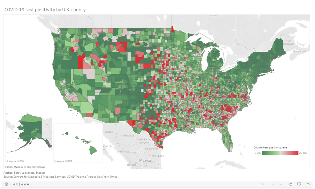
Last week, I put together two Stacker stories based on these data. The first includes two county-level Tableau visualizations; these dashboards allow you to scroll into the region or state of your choice and see county test positivity rates, how those county rates compare to overall state positivity rates (calculated based on COVID Tracking Project data for the same time period, August 27 to September 2), and recent case and death counts in each county, sourced from the New York Times’ COVID-19 data repository. You can also explore the dashboards directly here.
The second story takes a more traditional Stacker format: it organizes county test positivity rates by state, providing information on the five counties with the highest positivity rates in each. The story also includes overall state testing, case, and outcomes data from the COVId Tracking Project.
As a reminder, a test positivity rate refers to the percent of COVID-19 tests for a given population which have returned a positive result over a specific period of time. Here’s how I explained the metric for Stacker:
These positivity rates are typically reported for a short period of time, either one day or one week, and are used to reflect a region’s testing capacity over time. If a region has a higher positivity rate, that likely means either many people there have COVID-19, the region does not have enough testing available to accurately measure its outbreak, or both. If a region has a lower positivity rate, on the other hand, that likely means a large share of the population has access to testing, and the region is diagnosing a more accurate share of its infected residents.
Test positivity rates are often used as a key indicator of how well a particular region is controlling its COVID-19 outbreak. The World Health Organization (WHO) recommends a test positivity rate of 5% or lower. This figure, and a more lenient benchmark of 10%, have been adopted by school districts looking to reopen and states looking to restrict out-of-state visitors as a key threshold that must be met.
Which counties are faring the worst, according to this benchmark? Let’s take a look:
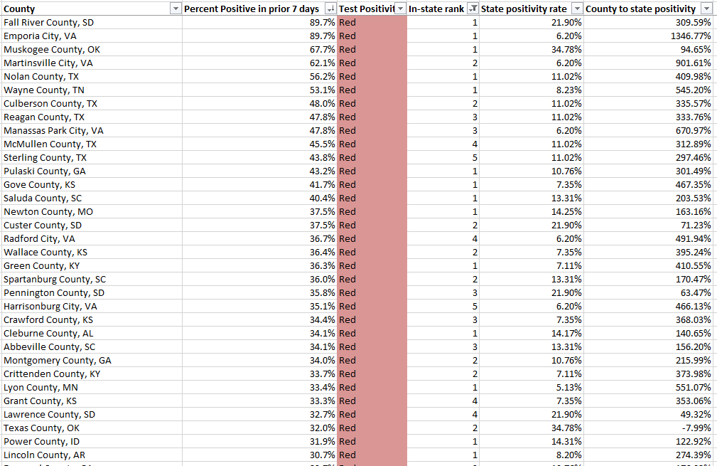
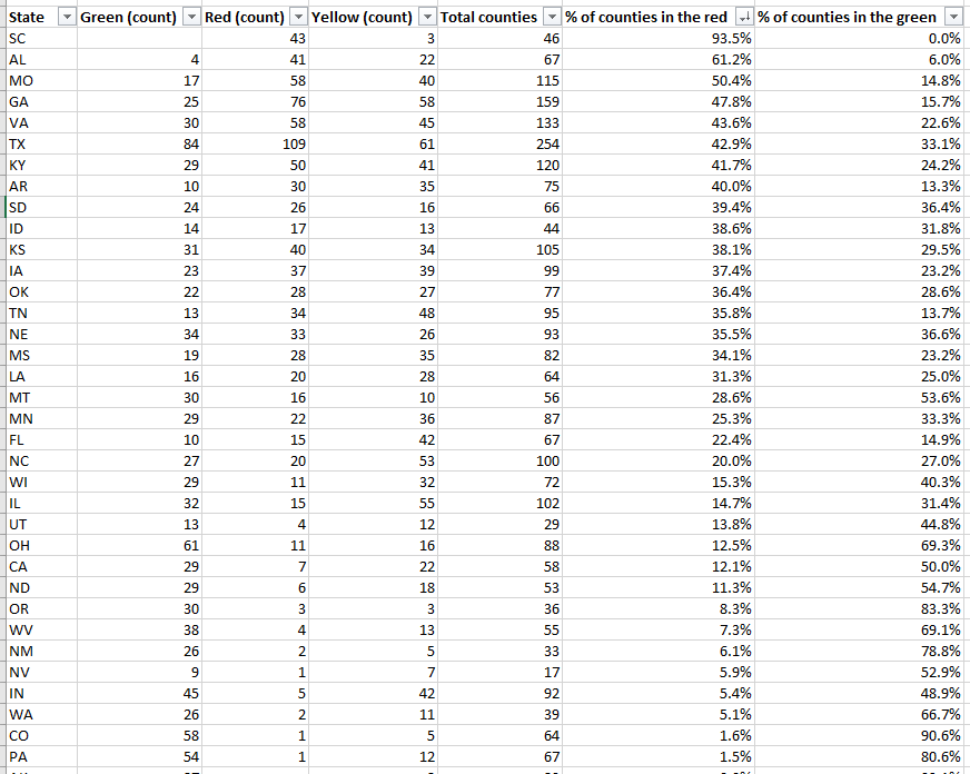
This screenshot includes the 33 U.S. counties with the highest positivity rates. I picked the top 33 to highlight here because their rates are over 30%—six times the WHO’s recommended rate. The overall average positivity rate across the U.S. is 7.7%, but some of these extremely high-rate counties are likely driving up that average. Note that two counties, one in South Dakota and one in Virginia, have positivity rates of almost 90%.
Overall, 1,259 counties are in what CMS refers to as the “Green” zone: their positivity rates are under 5%, or they have conducted fewer than 10 tests in the seven-day period represented by this dataset. 874 counties are in the “Yellow” zone, with positivity rates between 5% and 10%. 991 counties are in the “Red” zone, with positivity rates over 10%. South Carolina, Alabama, and Missouri have the highest shares of counties in the red, with 93.5%, 61.2%, and 50.4%, respectively:

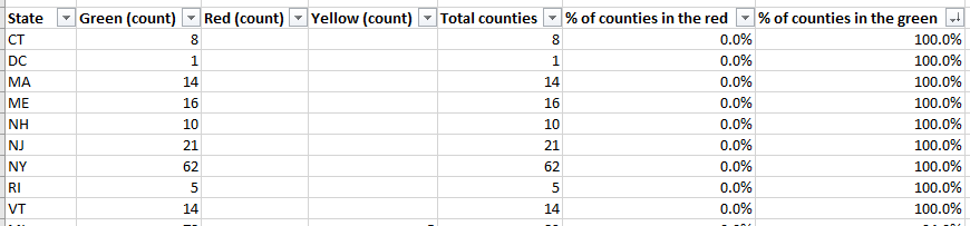
Meanwhile, eight states and the District of Columbia, largely in the northeast, have all of their counties in the green:

My Tableau visualizations of these data also include an interactive table, which you can use to examine the values for a particular state. The dashboards are set up so that any viewers can easily download the underlying data, and I am, as always, happy to share my cleaned dataset and/or answer questions from any reporters who would like to use these data in their own stories. The visualizations and methodology are also open for syndication through Stacker’s RSS feed—I can share more details on this if anyone is interested.
Answering questions about the data
Why is the CMS publishing this dataset? Why not the CDC or HHS overall?
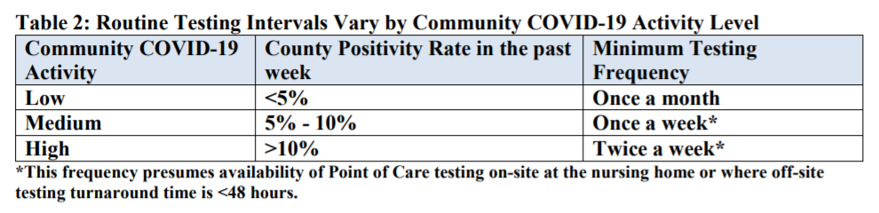
These test positivity rates were published as a reference for nursing home administrators, who are required to test their staff regularly based on the prevalence of COVID-19 in a facility’s area. A new guidance for nursing homes dated August 26 explains the minimum testing requirement: nursing homes in green counties must test all staff at least once a month, those in yellow counties must test at least once a week, and those in red counties must test at least twice a week.
It is important to note that facilities are only required to test staff, not residents. In fact, the guidance states that “routine testing of asymptomatic residents is not recommended,” though administrators may consider testing those residents who leave their facilities often.
Where did the data come from?
The CMS website does not clearly state a source for these data. Digging into the downloadable spreadsheet itself, however, reveals that the testing source is a “unified testing data set,” which is clarified in the sheet’s Documentation field as data reported by both state health departments and HHS:
COVID-19 Electronic Lab Reporting (CELR) state health department-reported data are used to describe county-level viral COVID-19 laboratory test (RT-PCR) result totals when information is available on patients’ county of residence or healthcare providers’ practice location. HHS Protect laboratory data (provided directly to Federal Government from public health labs, hospital labs, and commercial labs) are used otherwise.
What are the units?
As I discussed at length in last week’s newsletter, no testing data can be appropriately contextualized without knowing the underlying test type and units. This dataset reports positivity rates for PCR tests, in units of specimens (or, as the documentation calls them, “tests performed.”) HHS’s public PCR testing dataset similarly reports in units of specimens.
How are tests assigned to a county?
As is typical for federal datasets, not every field is exactly what it claims to be. The dataset’s documentation elaborates that test results may be assigned to the county where a. a patient lives, b. the patient’s healthcare provider facility is located, c. the provider that ordered the test is located, or d. the lab that performed the test is located. Most likely, the patient’s address is used preferentially, with these other options used in absence of such information. But the disparate possiblities lead me to recommend proceeding with caution in using this dataset for geographical comparisons—I would expect the positivity rates reported here to differ from the county-level positivity rates reported by a state or county health department, which might have a different documentation procedure.
How often will this dataset be updated?
Neither the CMS page nor the dataset’s documentation itself indicate an update schedule. A report from the American Health Care Association suggests that the file will be updated on the first and third Mondays of each month—so, maybe it will be updated on the 21st, or maybe it will be updated tomorrow. Or maybe it won’t be updated until October. I will simply have to keep checking the spreadsheet and see what happens.
Why won’t the dataset be updated every week, when nursing homes in yellow- and red-level counties are expected to test their staff at least once a week? Why is more public information about an update schedule not readily available? These are important questions which I cannot yet answer.
Why wasn’t this dataset publicized?
I really wish I could concretely answer this one. I tried submitting press requests and calling the CMS’ press line this past week; their mailbox, when I called on Friday, was full.
But here’s my best guess: this dataset is intended as a tool for nursing home facilities. In that intention, it serves a very practical purpose, letting administrators know how often they should test their staff. If CMS or HHS put out a major press release, and if an article was published in POLITICO or the Wall Street Journal, the public scrutiny and politically-driven conspiracy theorists which hounded HHS during the hospitalization data switch would return in full force. Nursing home administrators and staff have more pressing issues to worry about than becoming part of a national political story—namely, testing all of their staff and residents for the novel coronavirus.
Still, even for the sake of nursing homes, more information about this dataset is necessary to hold accountable both facilities and the federal agency that oversees them. How were nursing home administrators, the intended users of this dataset, notified of its existence? Will the CMS put out further notices to facilities when the data are updated? Is the CMS or HHS standing by to answer questions from nursing home staff about how to interpret testing data and set up a plan for regular screening tests?
For full accountability, it is important for journalists like myself to be able to access not only data, but also the methods and processes around its collection and use.
-
COVID source callout: South Carolina
It is not uncommon, as we increasingly realize that COVID-19 is not going away any time soon, for state public health departments to give their websites makeovers. Hastily-compiled pages and PDF reports have given way to complex dashboards, complete with interactive charts and color-coding.
These revamps can be helpful for users who would rather click through a menu than scroll through a report. But from a data collection perspective, it’s often challenging to go from a document or single page (where I could easily hit Ctrl+F to find a value) to a dashboard which requires clicking and searching through numerous popups.
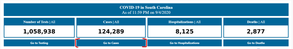
The most recent state to go through such a revision is South Carolina. In late August, the state released a new dashboard, called the County-Level Dashboard, and reorganized much of its information on COVID-19 demographics and other metrics.
In fact, when I first looked at South Carolina’s revised pages, I could not find any demographic data at all. This information used to be reported on a page marked “Demographic Data by Case”; now, that page goes to a dashboard on cases in South Carolina’s long-term care facilities. It wasn’t until I read through the public health department’s new Navigation Manual that I realized demographic data are now integrated on the county dashboard. If I click, for example, “Go to cases,” I’m brought to a page reporting case rates by county, age, race, ethnicity, and gender.

Demographic data ahoy! Via the South Carolina County Dashboard, September 6. To South Carolina’s credit, these new pages report demographic data in whole numbers, a more precise format than the percents of total cases and deaths released by many other states (and by SC itself before this reorganization). I also appreciate the addition of a Navigation Manual—such detailed instructions can help make a dashboard more accessible.
But I would advise any designers of state dashboard revamps to consider how to label figures more clearly from the get-go, so that journalists and state residents alike aren’t confused.
-
Featured sources, Sept. 6
- Colors of COVID: This Canadian project relies on public surveys to collect data on how COVID-19 is impacting marginalized communities in the country. The project plans to release quarterly reports with these survey results.
- America’s Health Rankings’ Senior Report: America’s Health Rankings has conducted annual reviews of health metrics in every U.S. state since 1990. The organization’s most recent Senior Report is over 100 pages of data on older Americans, including rankings of the healthiest states for seniors.
- The Long-Term Care COVID Tracker: I wrote in my August 16 newsletter that the COVID Tracking Project had released a snapshot of a new dataset compiling cases and deaths in nursing homes, assisted living facilities, and other long-term care facilities. As of this week, the full dataset is out, including historical data going back to May 21 and extensive notes on how each state is reporting this crucial information. Read more about it here.
- NIOSH-Approved N-95 Respirators: This CDC list includes thousands of surgical N-95 respirators approved by the National Institute for Occupational Safety and Health (NIOSH); it’s intended as a source for healthcare workers. As a recent article in Salon points out, the list includes over 600 valved models, despite recent guidances instructing the public to avoid valved masks.
-
My insights on COVID-19 data reporting
I recently had the honor of speaking to Bara Vaida, from the Association of Health Care Journalists (AHCJ), about my work at Stacker, the COVID Tracking Project, and this newsletter. The full interview is up on AHCJ’s site, but I wanted to highlight my answer to Bara’s question, “What would you say are the common mistakes that you see in how COVID-19 data is reported?”:
I think it is not contextualizing data appropriately. You have to explain what the data mean. For example, you can say a state’s positivity rate fell from one week to the next, but it is important to explain the numerator and the denominator ― the number of tests that were completed and how many of those tests were positive. And you have to explain that positivity rate in the context of what is happening in the state. Is the state actually doing more testing, or did it have to shut down testing centers because of a hurricane, causing both the number of tests and the number of positives to go down — this happened in Florida a few weeks ago. And also, don’t forget there are real people behind these numbers. It’s always important to remember that.
I also spoke to education reporter Alexander Russo for his recent column in Phi Delta Kappan. The article provides advice geared towards journalists covering COVID outbreaks in schools, but it’s also a useful primer for teachers, parents, and anyone else closely following school data.
-
Florida is no longer sending tests to Quest Diagnostics
This past Tuesday, the Florida Department of Health (DOH) announced that the department would stop working with Quest Diagnostics. Quest is one of the biggest COVID-19 test providers in the nation, with test centers and labs set up in many states. The company claimed in a statement to the Tampa Bay Times that it has “provided more COVID-19 testing on behalf of the citizens of Florida than any other laboratory.”
So, why is Florida’s DOH cutting ties? Quest Diagnostics failed to report the results of 75,000 tests to the state department in a timely manner. Most of these results were at least two weeks old, and some were as old as April. As all the old results were logged at once on Monday night, Florida’s test and case counts both shot up: nearly 4,000 of those tests were positive.
Such a reporting delay skews analysis of Florida’s testing capacity over time, especially as many of the backlogged tests were reportedly conducted during the peak of the state’s outbreak in June and July. This delay also likely means that, while the people tested with this batch of tests still received their results in a timely manner (according to Quest), contact tracers and other public health workers were unable to track or trace the nearly 4,000 Floridians who were diagnosed. Such an error may have led to many more cases.
According to Florida Governor Ron DeSantis, such an error is tantamount to violating state law:
“To drop this much unusable and stale data is irresponsible,” DeSantis said in a statement Tuesday. “I believe that Quest has abdicated their ability to perform a testing function in Florida that the people can be confident in. As such I am directing all executive agencies to sever their COVID-19 testing relationships with Quest effective immediately.”
But is cutting all ties with Quest the correct response? Florida’s testing capacity already is below recommended levels. According to the Harvard Global Health Institute, the state has conducted 124 tests per 100,000 people over the past week (August 30 to September 5), with a positivity rate of 13.2%. This per capita rate is far below the state’s suggested mitigation target of 662 tests per 100,000 people, and this test positivity rate is far above the recommended World Health Organization rate of 5%.
Florida will be able to send many of its tests to state-supported, public testing sites, the Tampa Bay Times reports. Still, this switch will take time and cause additional logistical hurdles at a time when Florida should not be putting the breaks on testing.
-
School data update, Sept. 6
Since last week’s issue, four more forms of official state reporting on COVID-19 in schools have come to my attention:
- New Hampshire is publishing school-associated case data, including active cases, recovered cases, and outbreak status (not clearly defined) on a page of the state’s dashboard, updated daily.
- Mississippi is publishing a weekly report on cases, quarantines, and outbreaks among students, teachers, and staff, aggregated by county. So far, the state has released reports on the weeks ending August 21 and August 28.
- Hawaii’s state Department of Education is publishing a page on COVID-19 in the school district, updated weekly. (Did you know that the entire state of Hawaii is comprised of one school district?)
- New York is launching a public dashboard on COVID-19 in schools; this dashboard will be available starting on September 9. So far, the page states that, “New York school districts will be required to provide the Department of Health with daily data on the number of people who have tested positive for COVID-19 beginning Tuesday, September 8th.” Last week, Mayor Bill de Blasio announced that classes in New York City would be delayed by two weeks to allow for more extensive safety precautions.
In addition, the nonprofit civic data initiative USAFacts has compiled a dataset of reopening plans in America’s 225 largest public school districts. The dataset classifies reopening plans as online, hybrid, in-person, or other, with information as of August 17.
Meanwhile, on the higher education front:
- Education reporter (and friend of this newsletter!) Benjy Renton has launched a dashboard keeping track of COVID-19 outbreaks on college and university campuses. The dashboard organizes outbreaks according to their alert level, based on new cases in the past week.
- I am continuing to monitor the COVID-19 metrics reported by college and university dashboards in my comparison spreadsheet. I haven’t had the chance to expand this analysis much in the past week, but it continues to be an ongoing project.
-
Three different units for COVID-19 tests

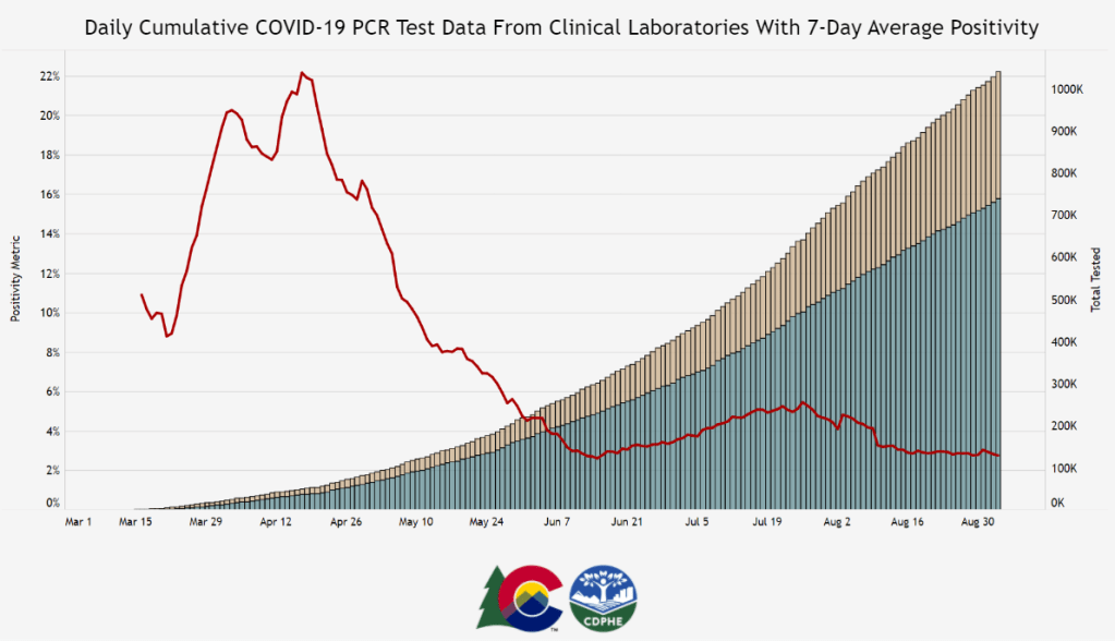
Colorado is one of six states currently reporting its testing in “test encounters,” a new metric that has appeared in recent weeks. Screenshot of Colorado’s dashboard taken on September 5. A few weeks ago, one of my coworkers at Stacker asked me: how many people in the U.S. have been tested for COVID-19?
This should be a simple question. We should have a national dataset, run by a national public health department, which tracks testing in a standardized manner and makes regular reports to the public. The Department of Health and Human Services (HHS) does run a national testing dataset, but this dataset only includes diagnostic, polymerase chain reaction (PCR) test results, is not deduplicated—a concept I’ll go into more later—and is not widely publicized or cited.
Meanwhile, 50 state public health departments report their local testing results in 50 different ways. Different departments have different practices for collecting and cleaning their test results, and beyond that, they report these results using different units, or the definitive magnitudes used to describe values.
You might remember how, in a high school science class, you’d get a point off your quiz for putting “feet” instead of “meters” next to an answer. Trying to keep track of units for COVID-19 data in the U.S. is like that, except every student in the class of 50 is putting down a slightly different unit, no teacher is grading the answers, and there’s a mob of angry observers right outside the classroom shouting about conspiracy theories.
Naturally, the COVID Tracking Project is keeping track anyway. In this issue, I’ll cite the Project’s work to explain the three major units that states are using to report their test results, including the benefits and drawbacks of each.
Much of this information is drawn from a COVID Tracking Project blog post by Data Quality Lead Kara Schechtman, published on August 13. I highly recommend reading the full post and checking out this testing info page if you want more technical details on testing units.
(Disclaimer: Although I volunteer for the COVID Tracking Project and have contributed to data quality work, this newsletter reflects only my own reporting and explanations based on public Project blog posts and documentation. I am not communicating on behalf of the Project in any way.)
Specimens versus people
Last spring, when the COVID Tracking Project’s data quality work started, state testing units fell into two main categories: specimens and people.
When a state reports its tests in specimens, their count describes the number of vials of human material, taken from a nose swab or saliva test, which are sent off to a lab and tested for the novel coronavirus. Counts in this unit reflect pure testing capacity: knowing the number of specimens tested can tell researchers and public health officials how many testing supplies and personnel are available. “Specimens tested” counts may thus be more precise on a day-to-day basis, which I would consider more useful for calculating a jurisdiction’s test positivity rate, that “positive tests divided by total tests” value which has become a crucial factor in determining where interstate travelers can go and which schools can reopen.
But “specimens tested” counts are difficult to translate into numbers of people. A person who got tested five times would be included in their state’s “specimens tested” count each time—and may even be included six, seven, or more times, as multiple specimens may be collected from the same person during one round of testing. For example, the nurse at CityMD might swab both sides of your nose. Including these double specimens as unique counts may artificially inflate a state’s testing numbers.
When a state reports its tests in people, on the other hand, their count describes the number of unique human beings who have been tested in that state. This type of count is useful for measuring demographic metrics, such as what share of the state’s population has been tested. In most cases, when states report population breakdowns of their testing counts, they do so in units of people; this is true for at least four of the six states which report testing by race and ethnicity, for example.
Reporting tests in units of people requires public health departments to do a process called deduplication: taking duplicate results out of the dataset. If a teacher in Wisconsin (one of the “people tested” states) got tested once back in April, once in June, and once this past week, the official compiling test results would delete those second two testing instances, and the state’s dataset would count that teacher only once.
The problem with such a reporting method is that, as tests become more widely available and many states ramp up their surveillance testing to prepare for school reopening, we want to know how many people are being tested now. As recent COVID Tracking Project weekly updates have noted, testing seems to be plateauing across the country. But in the states which report “people tested” rather than “specimens tested,” it is difficult to say whether fewer tests are actually taking place or the same people are getting tested multiple times, leading them to not be counted in recent weeks’ testing numbers.
Test encounters
So, COVID-19 testing counts need to reflect the numbers of people tested, to provide an accurate picture of who has access to testing and avoid double-counting when two specimens are taken from one person. But these counts also need to reflect test capacity over time, by allowing for accurate test positivity calculations to be made on a daily or weekly basis.
To solve this problem, the COVID Tracking Project is suggesting that states use a new unit: test encounters. The Project defines this unit as the number of people tested per day. As Kara Schechtman’s blog post explains, though this term may be new, it’s actually rather intuitive:
Although the phrase “testing encounters” is unfamiliar, its definition just describes the way we talk about how many times people have been “tested for COVID-19” in everyday life. If an individual had been tested once a week for a month, she would likely say she had been tested four times, even if she had been swabbed seven times (counted as seven tests if we count in specimens), and even though she is just one person (counted as one test if we count in unique people). In this case, that commonsense understanding is also best for the data.
To arrive at a “testing encounters” count, state public health departments would need to deduplicate multiple specimens from the same person, but only if those multiple specimens were taken on the same day. “Testing encounters” counts over time would accurately reflect a state’s testing capacity, without any artificial inflation of numbers. And, as a bonus, such counts would align with public understanding of what it’s like to get tested for COVID-19—making them easier for journalists like myself to explain to our readers.
What is your state doing?
The COVID Tracking Project currently reports total test encounters for five states—Colorado, Rhode Island, Virginia, New York, and Washington—along with the District of Columbia. Other states may report similar metrics, but have not yet been verified to match the Project’s definition.
You can find up-to-date information about which units are reported for each state on a new website page conveniently titled, “How We Report Total Tests.” The page notes that the Project prioritizes testing capacity in choosing which state counts to foreground in its public dataset:
Where we must choose a unit for total tests reporting, we are prioritizing units of test encounters and specimens above people—a change which we believe will provide the most useful measure of each jurisdiction’s testing capacity.
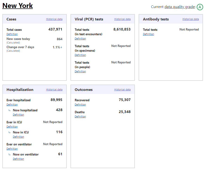
Also, if you’ve visited the COVID Tracking Project’s website recently, you might have noticed that the state data pages have seen a bit of a redesign, in order to make it clear exactly which units each state is using. Each state’s data presentation now includes all three units, with easy-to-click definition popups for each one:

Screenshot of the COVID Tracking Project page for New York. I recommend checking out your state’s page to see which units your public health department is using for COVID-19 tests, as well as any notes on major reporting changes (outlined below the state’s data boxes). You can read more about the site redesign here.
When my coworker asked me how many people in the U.S. have been tested for COVID-19, I wasn’t able to give him a precise answer. The lack of standards around testing units and deduplication methods, as well as the federal government’s failure to be a leader in this work, have made it difficult to comprehensively report on testing in America. But if people—and I mean readers like you, not just data nerds like me—make testing units part of their regular COVID-19 conversations, we can help raise awareness on this issue. We can push our local public health departments to standardize with each other, or at least get better about telling us exactly what they’re doing to give us the numbers they put up on dashboards every day.
-
Featured sources, Aug. 30
- Charity Nagivator: I just have one featured source this week, but it’s crucial. Charity Navigator is a database that compiles and evaluates charities based on their financial health and accountability. The database has detailed rankings and search capability, and when a crisis hits—such as the recent California wildfires or Hurricane Laura—they put together quick lists of organizations where any interested samaritans can help the cause.