Author: Betsy Ladyzhets

  • School data with denominators

    School data with denominators

    The COVID-19 School Response Dashboard has surveyed nearly 1,000 individual schools and districts on their enrollments, case counts, and COVID-19 mitigation strategies. Screenshot retrieved on October 3.

    The data sources on COVID-19 in U.S. K-12 schools vary widely, but most of them have one thing in common: they only report case counts.

    Texas rescinded school data this past week due to errors. Florida recently began publishing school reports—which list out cases by individual school while failing to provide cumulative totals. But a larger problem for these states and others is that, when case numbers are reported in isolation, there is no way to compare outbreaks at different locations.

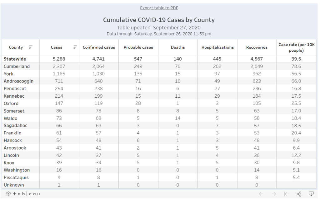
    Imagine, for example, that you only knew that Wisconsin had seen 18,000 cases in the past week, while Texas had seen 28,000. You would assume that Texas is currently in more dire straights, with more people infected. But adjust for population—divide those case numbers by the populations of both states—and you find that Texas has an infection rate of about 95 people per 100,000 Texans, while Wisconsin has a rate of about 303 people per 100,000, over three times higher. Texas is slowly recovering from its summer outbreak, while Wisconsin is an outbreak site of major national concern.

    In the case of school data, enrollment numbers are the key to these comparisons. Knowing how many students are infected in your district may be useful, but unless you know how many students are actually going into school buildings on a regular basis, it is difficult to translate the case numbers into actionable conclusions. The majority of states which report school COVID-19 data do not report such numbers, and even those that do may have incomplete data. New York’s dashboard, for example, currently reports 0 staff members in the New York City school district, which opened for in-person instruction last week.

    Volunteer datasets similarly focus on case numbers. The National Education Association School and Campus COVID-19 Reporting Site, built from the crowdsourced spreadsheet of Kansas high school teacher Alisha Morris, compiles case counts from news outlets and volunteer reports. The COVID Monitor, a school dashboard produced by Rebekah Jones’ Florida COVID Action project, combines news and volunteer reporting with state-reported numbers. Both of these efforts are incredibly comprehensive in documenting where COVID-19 is impacting students and teachers, but without enrollment numbers for the schools, it is difficult to use the data for meaningful comparison.

    Even the New York Times focuses on case counts. The Times’ review of school COVID-19 cases found extremely scattered public reporting, but the paper failed to include any denominators—not even the county case counts which this paper has been tracking since early in the pandemic. Alexander Russo, columnist at education journal Phi Delta Kappan and friend of this newsletter, recently commented on how such cases-only reporting may paint a misleading picture of the pandemic’s impact.

    Clearly, we need denominators for our case counts. And a new dataset is out to provide this crucial metric. Emily Oster, Professor of Economics and Public Policy at Brown University, collaborated with software company Qualtrics and several national education associations to build a COVID-19 school dashboard which focuses on case rates, not counts.

    This project sources data by directly surveying schools every two weeks, rather than relying on sporadic news and volunteer reports. And it includes information about school reopening plans and mitigation strategies, such as whether masks, increased ventilation, and symptom screenings are in use. As of the dataset’s most recent update (for the two-week period of September 14 to 27), 962 schools in 47 states are included. These schools report an average student infection rate (confirmed and suspected cases) of 0.62% and an average staff infection rate of 0.72%; both rates are up from 0.51% and 0.5%, respectively, in the previous two weeks. For more initial findings, see this NPR feature on the dashboard, published on September 23.

    I spoke to Oster this past Tuesday, only four days after the dashboard’s public release. She explained more detail about the project’s methodology and her future plans for tracking COVID-19 in schools. (This interview has been lightly edited and condensed for clarity.)


    Interview

    Betsy Ladyzhets: What is your background in data and education reporting? What have you been working on during the COVID-19 pandemic that led you to this dashboard?

    Emily Oster: I am, by training, an economist, so I have a lot of background in data analysis and some in data collection. But most of my work, virtually all of my work has been on health, not on education. I have written a couple of books on pregnancy and parenting, so I have this audience of parents. And during the pandemic, I was writing a lot about kids and COVID. And then that led me to be interested in issues around schools, and putting together this team to do the data collection for the dashboard.

    BL: Who else is on the team?

    EO: The partnership—the primary people who are doing the work and analysis—is Qualtrics, which is a tech company. And then, there are a number of educational association groups. The School Superintendents Association, the National Association of Elementary School Principals, the National Association of Secondary School Principals, that was the initial core team. Then, we’ve got a lot of distribution help from the charter school alliance, from a bunch of the independent schools associations. A lot of different educational groups have done distribution work.

    BL: How did you develop partnerships with these different education groups?

    EO: I had expressed in some public forum that I thought there should be more of this data collection, and someone from Qualtrics reached out and said, “We think there should be more of this, too. Maybe we can help.” And around this time, I was connected with a woman at the school superintendents association, who also said, “I think we should do this, maybe we can help.” Those were the two key pieces, and it came together from there.

    BL: Yeah, it’s good to have—it seems like a very useful partnership, that you have the tech expertise but also the people who are actually interacting with teachers and students.

    EO: Yeah. I think our biggest get for the dashboard, and what is potentially useful about it, is that we start at the school level. We know what the schools are doing. We’re in direct contact with them.

    BL: I know from poking around the dashboard and reading the NPR article that the way you’re gathering data is with that direct interface, surveying schools. Why did you choose this method as opposed to looking at news articles or compiling data from public sources?

    EO: It was really important for us to understand the context around school reopening before we asked about the COVID cases. We really wanted to know: how many kids do you have in school, are they actually in school or are they virtual, what kind of enrollment do you have? And also, what are you doing as mitigation? To come, ultimately, to understand what’s happening with cases, we really need to start by understanding, like, are you wearing masks? Are you distancing? Are you doing all of these things? So then, if we do see cases, we can go back and look and say okay, can we make any conclusions about which of these precautions are helping.

    In particular, these enrollment numbers give us the ability to say something about not just cases, but rates. To be able to say, this is the share of people that are infected. Which I think is a very important number, and arguably more important for decision-making, than counts.

    BL: Yeah, I was going to ask about that. Your dashboard, unlike a couple of other school COVID data projects, actually has denominators, so that you can compare case rates.

    EO: That’s our thing. That’s our whole pitch. We have denominators.

    BL: Why is it so important to have denominators?

    EO: I think the importance of denominators is, it tells you something about the actual risk of encountering someone with COVID… If you’re going to send your kid off to school, and if you’re going to send your kid to a school of 1,200 people, I think it is useful to understand—are there likely to be 100 kids in the building with COVID? Is there likely to be one kid in the building with COVID?

    And similarly, thinking about the risk to your kid, if your kid is going to be in the building for two weeks, what’s the average experience? Is there a ten percent chance they’re going to get the coronavirus over these two weeks? Is there a one percent chance? I think that that is the thing we should be making decisions on. We really need those denominators to get the rate.

    BL: Absolutely. Could you tell me more about how the surveys work? What questions you’re asking, and how often you’re collecting data?

    EO: There’s two different avenues for data collection… First, if you’re an individual school, then the way we’re collecting the data is that you enroll in a baseline survey on Qualtrics. We ask you about your enrollment, your opening model, what share of your kids are in person, how many staff you have, are they in person. And then, if you have in-person instruction, we ask you about masking and distancing, what you’re doing on those conventions. And then we ask maybe one or two demographic questions, like are you doing free or reduced-price lunch, or financial aid if it’s a private school.

    That [initial survey] is followed up every other week with a survey that is very short. It’s basically, how many confirmed and suspected cases do you have in students and staff, and then [we ask schools to] confirm their in-person enrollment, just to see if there have been large changes in the opening model.

    And then, on the district side, we’re asking all the same questions, but—in the case of the districts, there are a number where [superintendents] have said, “We’d like to enroll our entire school district in your thing, and we’re going to give you all of our data.” When we do that, we’re actually collecting the data internally in Excel. We send them an Excel sheet with their schools, they fill out that same information [as in the school survey], and then we come back again biweekly and ask them those same questions. It’s the same information, it’s just that rather than making them go through 25 versions of the same Qualtrics survey, we have it all in one.

    BL: What mechanisms do you have in place for flagging errors? I know that’s a concern with this kind of manual back and forth.

    EO: On the district side, there’s a cleaning procedure. When the surveys in, obviously we don’t change them, but we look them over. If there’s something that’s wrong, like the number of COVID cases is greater than the number of people, or they’ve reported three billion students enrolled, we go back to the district and ask, “Can you look at this?”

    Then, on the individual school side, there’s a bunch of validation built into the Qualtrics survey operation. And we have some procedures which we’re working on ramping up which are going to do a little bit of hand lookup, just to make sure that we’re getting valid data.

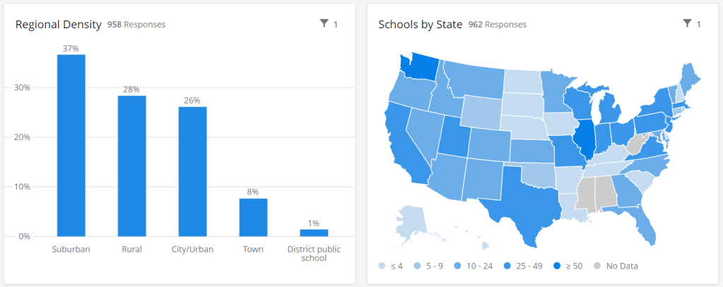
    BL: What is your sample of schools like so far? Is there a particular area, like any states or types of schools that you have more complete data so far, or any areas where you’re prioritizing in trying to get them to take the surveys?

    EO: We’re an equal opportunity prioritizer. We’ll take anybody. There are a few states where we have better representation of private schools, because [private school associations are involved in roll-out]. We have more schools in Washington than elsewhere.

    Particularly on the public school side, we’re very concerned about enrolling entire districts. That’s the easiest thing for us, it’s the most robust. It is also—we think it provides the most service to the district. And so we are spending a lot of time doing outreach to states and to districts, trying to get people to encourage their districts to enroll.

    BL: Another thing I’m curious about is testing. Just yesterday, the Trump administration announced that they’re going to deploy 150 million rapid antigen tests around the country, once they’re made by Abbott, and they’re going to focus on getting those tests to students and teachers. Is testing something that you’re thinking about tracking?

    EO: Yeah. We ask [the schools], are you doing any routine testing of anybody, and most them say they’re not. But I think it would be very interesting to incorporate. Part of my hope for this project is that, over time, as we get more people enrolled and we get more of a rhythm of reaching people routinely, that there will be questions we can add. We’ll potentially get to a place where we’ll say, “Okay, now, a bunch of districts are doing testing, let’s put that in.” And we’ll try to figure out, how common is that, and who’s doing it.

    BL: There are also states that are reporting COVID data in schools. I know New York has a dashboard, that’s pretty extensive, while other states report numbers by county or district or just overall. Is your project doing anything with those public data, or with other volunteer projects that track COVID in schools?

    EO: Not at the moment. I think that we are eager to—there are a number of states that have very good dashboards, and our goal, one of the things we are working on is, how can we basically pull that in? One of the issues is that most of those dashboards just report cases, and so in order to pull them into what we’re doing, we need to go behind this and say, okay, we need to go behind and actually figure out what the initial enrollments were.

    BL: Which states do you think are doing the best job so far?

    EO: I mean, New York’s is pretty good. Tennessee has a pretty good dashboard. South Carolina. There’s a few.

    BL: I know New York is one—I think it’s the only one that has both testing numbers and enrollment numbers. (Editor’s note: I checked; this is true.)

    EO: Exactly.

    BL: Last question: how do you expect the dashboard to be utilized in future research, and are you seeing any applications of it so far?

    EO: No, it’s literally been, like, four days. My guess is that we will see more—we’ll see some usage by districts, as they try to think about opening, that’s the first use case. Just districts that are opening, trying to think about what’s the right thing to do. My guess is that, in the long run, maybe we’ll see some research with this. That isn’t the goal of the project, but we’ll see.

    BL The focus is on helping districts compare to each other.

    EO: Exactly, yeah.


    Analysis

    I’m excited about this dashboard. First of all, it can’t be overstated: denominators are huge. Knowing that the estimated infection rate of K-12 students in the U.S. is under one percent is so much more useful from a decision-making standpoint than the actual number of cases.

    Second, the school survey model is a novel method with advantages for one specific group: the very schools included in this dataset. This dashboard is not particularly useful for me, a COVID-19 journalist, right now; its sample size is small, and the data are not currently available for download by outside users. (Oster told me that she is planning to set up a validation feature, so that she and other partners on this project can track how their data are being used.) But the school administrators who fill out the project’s biweekly surveys will be able to see COVID-19 trends for their students and staff, compared to trends at other schools across the country. They are essentially getting free consulting on their school reopening plans.

    I have one major concern, however. As Oster explained in our interview, the dashboard currently includes an abundance of private and charter schools in its sample, due to partnerships with private and charter school associations.

    According to Education Week, public schools made up 70% of American schools in 2017-2018. In Oster’s dashboard, these schools are 67% of the sample size, while private, charter, and religious schools make up the rest of the sample. At a glance, this seems fairly representative of the country’s school demographics. However, the average public school has far more students than the average private school; without seeing the actual enrollment numbers of the schools included in this dashboard, it is difficult to determine how balanced the dashboard’s sample truly is.

    In addition, the dataset’s sample so far shows a bias for suburban schools. The schools surveyed are 37% suburban, 28% rural, 26% urban, and 8% town. Suburban school districts tend to receive more funding than urban districts, and suburban districts are historically sites of school segregation. Finally, this dataset so far heavily represents private schools in Washington, with 106 schools, over 10% of the sample, coming from this state. West Virginia, Alabama, and Mississippi, all more rural states which rank in the bottom ten in U.S. News & World Report’s education rankings, are so far not represented at all.

    A recent New Yorker article by Alec MacGillis draws attention to the low-income students of color who may be left behind in this era of remote learning. Students whose parents and guardians need to continue working outside the home, or otherwise do not have the resources to support kids with an array of Zoom links and homework platforms, may lose a year of education if their schools don’t reopen—and yet these students and their families are more vulnerable to COVID-19 if they do go back in person.

    The schools which serve low-income minority communities are likely to need this dashboard more than any others. And yet these very schools may be left out of data collection, as their principals and superintendents may not have the bandwidth to fill out even the simplest survey. Extra effort could be needed to ensure that crucial schools are not left behind. The COVID-19 School Response Dashboard, and other future school data sources, must prioritize diversity in their data collection if they are to be truly complete.

  • COVID source callout: Maine

    COVID source callout: Maine

    I visited Maine this week, so it seems fitting to evaluate the state’s COVID-19 dashboard on my way home.

    Screenshot of Maine’s dashboard. Look at how clean this is!

    Maine was actually one of my favorite state dashboards for a while. Everything is on one page. A summary section at the top makes it easy to see all the most important numbers, and then there’s a tabbed panel with mini-pages on trends and demographic data. It’s all fairly easy to navigate, and although there was a period of a few weeks where Maine’s demographic data tab never loaded for me, I never held that against the state. Maine has a clear data timestamp, and it was also one of the first states to properly separate out PCR and antibody testing numbers.

    Now, however, Maine is lumping PCR and antigen tests. This means that counts of these two test are being combined in a single figure. Both PCR and antigen tests are diagnostic, but they have differing sensitivities and serve different purposes, and should be reported separately; to combine them may lead to inaccurate test positivity calculations and other issues. I expect this type of misleading reporting from, say, Florida or Rhode Island, but not from Maine. Be better, Maine!

  • Issue #10: reflecting and looking forward

    Issue #10: reflecting and looking forward

    Candid of me reading Hank Green’s new book (very good), beneath some fall foliage. It sure is great to go outside!

    I like to answer questions. I’m pretty good at explaining complicated topics, and when I don’t know the answer to something, I can help someone find it. These days, that tendency manifests in everyday conversations, whether it’s with my friend from high school or a Brooklyn dad whose campsite shares a firepit with my Airbnb. I make sure the person I’m talking to knows that I’m a science journalist, and I invite them to ask me their COVID-19 questions. I do my best to be clear about where I have expertise and where I don’t, and I try to point them to sources that will fill in my gaps.

    I want this newsletter to feel like one of those conversations. I started it when hospitalization data switched from the auspices of the Centers for Disease Control and Prevention (CDC) to the Department of Health and Human Services (HHS), and I realized how intensely political agendas were twisting public understanding of data in this pandemic. I wanted to answer my friends’ and family members’ questions, and I wanted to do it in a way that could also become a resource for other journalists.

    This is the newsletter’s tenth week. As I took a couple of days off to unplug, it seemed a fitting time to reflect on the project’s goals and on how I’d like to move forward.

    What should data reporting look like in a pandemic?

    This is a question I got over the weekend. How, exactly, have the CDC and the HHS failed in their data reporting since the novel coronavirus hit America back in January?

    The most important quality for a data source is transparency. Any figure will only be a one-dimensional reflection of reality; it’s impossible for figures to be fully accurate. But it is possible for sources to make public all of the decisions leading to those figures. Where did you get the data?  Whom did you survey?  Whom didn’t you survey?  What program did you use to compile the data, to clean it, to analyze it?  How did you decide which numbers to make public?  What equations did you use to arrive at your averages, your trendlines, your predictions?  And so on and so forth. Reliable data sources make information public, they make representatives of the analysis team available for questions, and they make announcements when a mistake has been identified.

    Transparency is especially important for COVID-19 data, as infection numbers drive everything from which states’ residents are required to quarantine for two weeks when they travel, to how many ICU beds at a local hospital must be ready for patients. Journalists like me need to know what data the government is using to make decisions and where those numbers are coming from so that we can hold the government accountable; but beyond that, readers like you need to know exactly what is happening in your communities and how you can mitigate your own personal risk levels.

    In my ideal data reporting scenario, representatives from the CDC or another HHS agency would be extremely public about all the COVID-19 data they’re collecting. It would publish these data in a public portal, yes, but this would be the bare minimum. This agency would publish a detailed methodology explaining how data are collected from labs, hospitals, and other clinical sites, and it would publish a detailed data dictionary written in easily accessible language.

    And, most importantly, the agency would hold regular public briefings. I’m envisioning something like Governor Cuomo’s PowerPoints, but led by the actual public health experts, and with substantial time for Q&A. Agency staff should also be available to answer questions from the public and direct them to resources, such as the CDC’s pages on childcare during COVID-19 or their local registry of test sites. Finally, it should go without saying that, in my ideal scenario, every state and local government would follow the same definitions and methodology for reporting data.

    Why am I doing this newsletter?

    The CDC now publishes a national dataset of COVID-19 cases and deaths, and the HHS publishes a national dataset of PCR tests. Did you know about them?  Have you seen any public briefings led by health experts about these data?  Even as I wrote up this description, I realized how deeply our federal government has failed at even the basics of data transparency.

    Neither the CDC nor HHS even published any testing data until MayMeanwhile, state and local public health agencies are largely left to their own devices, with some common definitions but few widely enforced standards. Florida publishes massive PDF reports, which fail to include the details of their calculations. Texas dropped a significant number of tests in August without clear explanation. Many states fail to report antigen test counts, leaving us with a black hole in national testing data.

    Research efforts and volunteer projects, such as Johns Hopkins’ COVID-19 Tracker and the COVID Tracking Project, have stepped in to fill the gap left by federal public health agencies. The COVID Tracking Project, for example, puts out daily tweets and weekly blog posts reporting on the state of COVID-19 in the U.S. I’m proud to be a small part of this vital communication effort, but I have to acknowledge that the Project does a tiny fraction of the work that an agency like the CDC would be able to mount.

    Personally, I feel a responsibility to learn everything I can about COVID-19 data, and share it with an audience that can help hold me accountable to my work. So, there it is: this newsletter exists to fill a communication gap. I want to tell you what state and federal agencies are doing—or aren’t doing—to provide data on how COVID-19 is impacting Americans. And I want to help you attain some data literacy along the way. I don’t have fancy PowerPoints like Cuomo or fancy graphics like the COVID Tracking Project (though my Tableau skills are improving!). But I can ask questions, and I can answer them. I hope you’re reading this because you find that useful, and I hope this project can become more useful as it grows.

    What’s next?

    America is moving into what may be a long winter, with schools open and the seasonal flu incoming. (If you haven’t yet, this is your reminder: get your flu shot!)  I’m in no position to hypothesize about second waves or vaccine deployment, but I do believe this pandemic will not go away any time soon.

    With that in mind, I’d like to settle in this newsletter for the long haul. And I can’t do it alone. In the coming months, I want this project to become more reader-focused. Here are a couple of ideas I have about how to make that happen; please reach out if you have others!

    • Reader-driven topics: Thus far, the subjects of this newsletter have been driven by whatever I am excited and/or angry about in a given week. I would like to broaden this to also include news items, data sources, and other topics that come from you.
    • Answering your questions: Is there a COVID-19 metric that you’ve seen in news articles, but aren’t sure you understand?  Is there a data collection process that you’d like to know more about?  Is there a seemingly-simple thing about the virus that you’ve been afraid to ask anywhere else?  Send me your COVID-19 questions, data or otherwise, and I will do my best to answer.
    • Collecting data sources: In the first nine weeks of this project, I’ve featured a lot of data sources, and the number will only grow as I continue. It might be helpful if I put all those sources together into one public spreadsheet to make a master resource, huh?  (I am a little embarrassed that I didn’t think of this one sooner.)  I’ll work on this spreadsheet, and share it with you all next week.
    • Events??  One of my goals with this project is data literacy, and I’d like to make that work a little more hands-on. I’m thinking about potential online workshops and collaborations with other organizations. I’m also looking into potential funding options for such events; there will hopefully be more news to come on this front in the coming weeks.
  • COVID source callout: Utah

    Utah was one of the first states to begin reporting antigen tests back in early August. The state is also one of only three to report an antigen testing time series, rather than simply the total number of tests conducted. However, the format in which Utah presents these data is… challenging.

    Rather than reporting daily antigen test counts—or daily PCR test counts, for that matter—in a table or downloadable spreadsheet, Utah requires users to hover over an interactive chart in an extremely precise fashion. Interactive charts are useful for visualizing data, but far from ideal for accessibility.

    Hot tip for anyone interacting with this chart: you can make your life easier by clicking “Compare data on hover,” toggling the chart to show all four of its daily data points at once. (Sad story: I did not learn this strategy until I’d already spent an hour carefully zooming in and around the chart to record all of Utah’s antigen test numbers.)

    In related news: keep an eye out for a COVID Tracking Project blog post on antigen testing, likely to be published in the coming week.

  • Featured sources, Sept. 20

    • Dear Pandemic: This source describes itself as “a website where bona fide nerdy girls post real info on COVID-19.” It operates as a well-organized FAQ page on the science of COVID-19, run by an all-female team of researchers and clinicians.
    • Mutual Aid Disaster Relief: This past spring saw an explosion of mutual aid groups across the country, as people helped their neighbors with food, medical supplies, and other needs in the absence of government-sponsored aid. These groups may no longer be in the spotlight, but as federal relief bills continue to stall, they still need support. Organizations like Mutual Aid Disaster Relief can help you find a mutual aid group in your area.
  • How to understand COVID-19 numbers

    OG readers may remember that, in my first issue, I praised a ProPublica article by Caroline Chen and Ash Ngu which explains how to navigate and interpret COVID-19 data. I was inspired by that article to write a similar piece for Stacker: How to understand COVID-19 case counts, positivity rates, and other numbers.”

    I drew on my experience managing Stacker’s COVID-19 coverage and volunteering for the COVID Tracking Project to explain common COVID-19 metrics, principles, and data sources. The story starts off pretty simple (differentiating between confirmed and probable COVID-19 cases), then delves into the complexities of reporting on testing, outcomes, and more. As a reader of this newsletter, you likely already know much of the information in the story, but it may be a good article to forward to friends and family members who don’t follow COVID-19 data quite so closely.

    (I also made a custom graphic for the “seven-day average cases” slide, which was a fun test of my burgeoning Tableau skills.)

  • School data update, Sept. 20

    • The CDC was busy last week. In addition to their vaccination playbook, the agency released indicators for COVID-19 in schools intended to help school administrators make decisions about the safety of in-person learning. The indicators provide a five-tier system, from “lowest risk of transmission” (under 5 cases per 100,000 people, under 3% test positivity) to “highest risk” (over 200 cases per 100,000 people, over 10% test positivity). It is unclear what utility these guidelines will have for the many school districts that have already started their fall semesters, but, uh, maybe New York City can use them?
    • Speaking of New York: the state’s dashboard on COVID-19 in schools that I described in last week’s issue is now live. Users can search for a specific school district, then view case and test numbers for that district’s students and staff. At least, they should be able to; many districts, including New York City, are not yet reporting data. (The NYC district page reports zeros for all values as of my sending this issue.)
    • Los Angeles Unified, the nation’s second-largest school district, is building its own dashboard, the Los Angeles Times reported last week. The district plans to open for in-person instruction in November or later, at which point all students and staff will be tested for COVID-19. Test results down to the classroom level will be available on a public dashboard.
    • Wisconsin journalists have stepped in to monitor COVID-19 outbreaks in schools, as the state has so far failed to report these data. A public dashboard available via the Milwaukee Journal Sentinel and the USA Today Network allows users to see case counts and resulting quarantine and cleaning actions at K-12 schools across the state. Wisconsin residents can submit additional cases through a Google form.
    • According to the COVID Monitor, states that report K-12 COVID-19 case counts now include: ArkansasHawaiiKentuckyLouisianaMississippiNew HampshireOhioSouth CarolinaSouth DakotaTennesseeTexas, and Utah. Some of these state reports are far more precise than others; Texas and Utah, for example, both report only total case counts. The COVID Monitor reports over 10,000 COVID-19 confirmed cases in K-12 schools as of September 20, with another 17,000 reported cases pending.
    • recent article in the Chronicle of Higher Education by Michael Vasquez explains common issues with reporting COVID-19 cases on college and university campuses: inconsistencies across school dashboards, administrations unwilling to report data, and other challenges.
  • County-level test data gets an update

    County-level test data gets an update

    I spent the bulk of last week’s issue unpacking a new testing dataset released by the Centers for Medicare & Medicaid Services which provides test positivity rates for U.S. counties. At that point, I had some unanswered questions, such as “When will the dataset next be updated?” and “Why didn’t CMS publicize these data?”

    The dataset was updated this past week—on Thursday, September 17, to be precise. So far, it appears that CMS is operating on a two-week update schedule (the dataset was first published on Thursday, September 3). The data themselves, however, lag this update by a week: the spreadsheet’s documentation states that these data are as of September 9.

    CMS has also changed their methodology since the dataset’s first publication. Rather than publishing 7-day average positivity rates for each county, the dataset now presents 14-day average positivity rates. I assume that the 14 days in question are August 27 through September 9, though this is not clearly stated in the documentation.

    This choice was reportedly made “in order to use a greater amount of data to calculate percent test positivity and improve the stability of values.” But does it come at the cost of more up-to-date data? If CMS’s future updates continue to include one-week-old data, this practice would be antithetical to the actual purpose of the dataset: letting nursing home administrators know what the current testing situation is in their county so that they can plan testing at their facility accordingly.

    Additional documentation and methodology updates include:

    • The dataset now includes raw testing totals for each county (aggregated over 14 days) and 14-day test rates per 100,000 population. Still, without total positive tests for the same time period, it is impossible to replicate the CMS’s positivity calculations.
    • As these data now reflect a 14-day period, counties with under 20 tests in the past 14 days are now classified as Green and do not have reported positivity rates.
    • Counties with low testing volume, but high positivity rates (over 10%), are now sometimes reassigned to Yellow or Green tiers based on “additional criteria.” CMS does not specify what these “additional criteria” may be.

    I’ve made updated versions of my county-level testing Tableau visualizations, including the new total test numbers:

    This chart is color-coded according to CMS’s test positivity classifications. As you can see, New England is entirely in the green, while parts of the South, Midwest, and West Coast are spottier.

    Finally: CMS has a long way to go on data accessibility. A friend who works as a web developer responded to last week’s newsletter explaining how unspecific hyperlinks can make life harder for blind users and other people who use screenreaders. Screenreaders can be set to read all the links on a page as a list, rather than reading them in-text, to give users an idea of their navigation options. But when all the links are attached to the same text, users won’t know what their options are. The CMS page that links to this test positivity dataset is a major offender: I counted seven links that are simply attached to the word “here.”

    This practice is challenging for sighted users as well—imagine skimming through a page, looking for links, and having to read the same paragraph four times because you see the words “click here” over and over. (This is my experience every time I check for updates to the test positivity dataset.)

    “This is literally a test item in our editor training, that’s how important it is,” my friend said. “And yet people still get it wrong. ALL THE TIME.”

    One would think an agency dedicated to Medicare and Medicaid services would be better at web accessibility. And yet.

  • The vaccines are coming

    The vaccines are coming

    Graphic of questionable quality via the CDC’s COVID-19 Vaccination Program Interim Playbook.

    If the title of this week’s newsletter sounds ominous, that’s because this situation feels ominous. While many scientific experts have pushed back against President Trump’s claims that a vaccine for the novel coronavirus will be available this October, state public health agencies have been instructed to prepare for vaccine distribution starting in November or December.

    Of course, the possibility of a COVID-19 vaccine before the end of 2020 is promising. The sooner healthcare workers and other essential workers can be inoculated, the better protected our healthcare system will be against future outbreaks. (And eventually, maybe, regular people like me will be able to attend concerts and fly out of the country again.) But considering the Center for Disease Control and Prevention (CDC)’s many missteps in both distributing and tracking COVID-19 tests this spring, I have a wealth of concerns about this federal agency’s ability to implement a national vaccination program.

    I’m far from the only person thinking about this. The release of the CDC’s interim playbook for vaccine distribution this past Wednesday, along with President Trump’s public contradiction of the vaccination timeline described by CDC Director Dr. Robert Redfield, has sparked conversations on whether America could have a vaccine ready this fall and, if we do, what it would take to safely distribute this technology to the people who need it most.

    In this issue, I will offer my takeaways on what the CDC’s playbook means for COVID-19 vaccination data, and a few key elements that I would like to see prioritized when public health agencies begin reporting on vaccinations.

    Data takeaways from the CDC playbook

    I’m not going to try to summarize the whole playbook here, because a. other journalists have already done a great job of this, and b. it would take up the whole newsletter. Here, I’m focusing specifically on what the CDC has told us about what vaccination data will be collected and how they will be reported.

    • We do not yet know which vaccines will be available, nor do we know vaccine volumes, timing, efficacy, or storage and handling requirements. It seems clear, however, that we should prepare for not just one COVID-19 vaccine but several, used in conjunction based on which vaccines are most readily available for a particular jurisdiction.
    • Vaccination will occur in three stages (as pictured in the above graphic). First, limited doses will go to critical populations, such as healthcare workers, other essential workers, and the medically vulnerable. Second, more doses will go to the remainder of those critical populations, and vaccine availability will open up to the general public. Finally, anyone who wants a vaccine will be able to get one.
    • “Critical populations,” as described by the CDC, basically include all groups who have been demonstrably more vulnerable to either contracting the virus or having a more severe case of COVID-19. The list ranges from healthcare workers, to racial and ethnic minorities, to long-term care facility residents, to people experiencing homelessness, to people who are under- or uninsured.
    • The vaccine will be free to all recipients.
    • Vaccine providers will include hospitals and pharmacies in the first phase, then should be expanded to clinics, workplaces, schools, community organizations, congregate living facilities, and more.
    • Most of the COVID-19 vaccines that may come on the market will require two doses, separated by 21 or 28 days. For each recipient, both doses will need to come from the same manufacturer.
    • Along with the vaccines themselves, the CDC will send supply kits to vaccine providers. The kits will include medical equipment, PPE, and—most notably for me—vaccination report cards. Medical staff are instructed to fill out these cards with a patient’s vaccine manufacturer, the date of their first dose, and the date by which they will need to complete their second dose. Staff and data systems should be prepared for patients to receive their two doses at two different locations.
    • All vaccine providers will be required to report data to the CDC on a daily basis. When someone gets a vaccine, their information will need to be reported within 24 hours. Reports will go to the CDC’s Immunization Information System (IIS).
    • The CDC has a long list of data fields that must be reported for every vaccination patient. You can read the full list here; I was glad to see that demographic fields such as race, ethnicity, and gender are included.
    • The CDC has set up a data transferring system, called the Immunization Gateway (or IZ Gateway), which vaccine providers can use to send their daily data reports. Can is the operative word here; as long as providers are sending in daily reports, they are permitted to use other systems. (Context: the IZ Gateway is an all-new system which some local public health agencies see as redundant to their existing vaccine trackers, POLITICO reported earlier this week.)
    • One resource linked in the playbook is a Data Quality Blueprint for immunization information systems. The blueprint prioritizes making vaccination information available, complete, valid, and timely.
    • Vaccine providers are also required to report “adverse events following immunization” or poor patient outcomes that occur after a vaccine is administered. These outcomes can be directly connected to the vaccine or unrelated; tracking them helps vaccine manufacturers detect new adverse consequences and keep an eye on existing side effects. Vaccine providers are required to report these adverse events to the Vaccine Adverse Event Reporting System (VAERS), which, for some reason, is separate from the CDC’s primary IIS.
    • Once COVID-19 vaccination begins, the CDC will report national vaccination data on a dashboard similar to the agency’s existing flu vaccination dashboard. According to the playbook, this dashboard will include estimates of the critical populations that will be prioritized for vaccination, locations of CDC-approved vaccine providers and their available supplies, and counts of how many vaccines have been administered.

    I have to clarify, though: all of the guidelines set up in the CDC’s playbook reflect what should happen when vaccines are implemented. It remains to be seen whether already underfunded and understaffed public health agencies, hospitals, and health clinics will be able to store, handle, and distribute multiple vaccine types at once, to say nothing of adapting to another new federal data system.

    My COVID-19 vaccination data wishlist

    This second section is inspired by an opinion piece in STAT, in which physicians and public health experts Luciana Borio and Jesse L. Goodman outline three necessary conditions for effective vaccine distribution. They argue that confidence around FDA decisions, robust safety monitoring, and equitable distribution of vaccines are all key to getting this country inoculated.

    The piece got me thinking: what would be my necessary conditions for effective vaccine data reporting? Here’s what I came up with; it amounts to a wishlist for available data at the federal, state, and local levels.

    • Unified data definitions, established well before the first reported vaccination. Counts of people who are now inoculated should be reported in the same way in every state, county, and city. Counts of people who have received only one dose, as well as those who have experienced adverse effects, should similarly be reported consistently.
    • No lumping of different vaccine types. Several vaccines will likely come on the market around the same time, and each one will have its own storage needs, procedures, and potential effects. While cumulative counts of how many people in a community have been vaccinated may be useful to track overall inoculation, it will be important for public health researchers and reporters to see exactly which vaccine types are being used where, and in what quantities.
    • Demographic data. When the COVID Racial Data Tracker began collecting data in April, only 10 states were reporting some form of COVID-19 race and ethnicity data. North Dakota, the last state to begin reporting such data, did not do so until August. Now that the scale of COVID-19’s disproportionate impact on racial and ethnic minorities is well documented, such a delay in demographic data reporting for vaccination would be unacceptable. The CDC and local public health agencies will reportedly prioritize minority communities in vaccination, and they must report demographic data so that reporters like myself can hold them accountable to that priority.
    • Vaccination counts for congregate facilities. The CDC specifically acknowledges that congregate facilities, from nursing homes to university dorms to homeless shelters, must be vaccination priorities. Just as we need demographic data to keep track of how minority communities are receiving vaccines, we need data on congregate facilities. And such data should be consistently reported from the first phase of vaccination, not added to dashboards sporadically and unevenly, as data on long-term care facilities have been reported so far.
    • Easily accessible resources on where to get vaccinated. The CDC’s vaccination dashboard will reportedly include locations of CDC-approved vaccine providers. But will it include each provider’s open hours? Whether the provider requires advance appointments or allows walk-ins? Whether the provider has bilingual staff? How many vaccines are available daily or weekly at the site? To be complete, a database of vaccine providers needs to answer all the questions that an average American would have about the vaccination experience. And such a database needs to be publicized widely, from Dr. Redfield all the way to local mayors and school principals.
  • COVID source callout: Texas

    Someday, I will write a parody stage play called “Waiting for Texas.” It will feature a squadron of diligent COVID Tracking Project volunteers, eagerly refreshing Texas’ COVID-19 dashboard, wondering if today, maybe, will be the day that the site updates by its promised time of 4 PM Central (5 PM Eastern).

    This past weekend, I was not so lucky. Texas’ data came late enough on Saturday that the Project decided to publish its daily update without this state. How late did it come? 6:30 PM Central, or 7:30 PM Eastern. I understand the procrastination, Texas (see: the sending time of this newsletter today), but a little heads up might be nice next time.