Author: Betsy Ladyzhets

  • Sources and updates, Nov. 1

    The sources listed here are included in my source list, along with all featured sources from past issues.

    • Detailed hospitalization data go unreportedA new story by NPR’s Pien Huang and Selena Simmons-Duffin reveals county-, city-, and individual hospital-level reports which the Department of Health and Human Services (HHS) circulates internally but does not post publicly. HHS’s public reports on hospital capacity only include data at the state level. According to Huang and Simmons-Duffin’s reporting, more local data and contextual information such as per capita calculations and time series would be incredibly useful for the public health experts who are trying to determine where aid is most needed. The NPR story also notes that hospital compliance is low: only 62% of U.S. hospitals had sent HHS all the required information in the week prior to October 30.
    • HHS Protect has expanded: For a few months now, the HHS Protect Public Data Hub has only hosted COVID-19 hospitalization data. But recently, the website expanded to include a section on national testing. Users can clearly see cumulative PCR testing numbers from the country, download the full dataset, and read documentation. This dataset has been publicly available on healthdata.gov since July, but through hosting it on the HHS Protect Public Data Hub, the agency has made it more easily accessible for Americans who are not data nerds like myself.
    • Daily testing needs: A new tool from the Brown School of Public Health helps users calculate how many tests are needed for key essential groups, both for the nation overall and state-by-state. The tool is intended for public health leaders and policymakers who are starting to scale up as antigen tests become more widely available. For example, New York would need 37,300 tests a day to screen all college and university students.
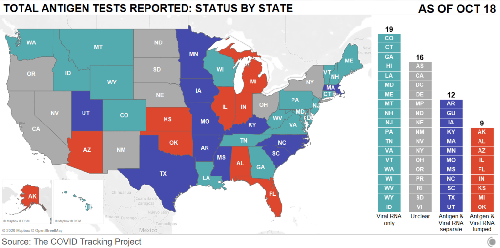
    • Pennsylvania’s antigen testsOn October 14, Pennsylvania started distributing antigen test kits to health centers, nursing homes, and other facilities throughout the state. The facilities receiving tests are reported by the state in weekly lists. I wanted to share this because it’s a great example of testing transparency; though if Pennsylvania adds antigen tests to their dashboard, their reporting will be even more comprehensive. For more information on why state antigen test reporting is important—and how states have failed at it so far—see my COVID Tracking Project blog post from last week.
    • COVID holiday FAQsEpidemiologists from Boston University, the University of Alabama, Birmingham, and the University of Miami have compiled their responses to common concerns around the holiday season. The questions included range from, “How do I talk to friends and family members about COVID and the holidays?” to, “Is it important to get my flu shot?” (P.S. It is. Get your flu shot.)
    • COVID-19 in ICE detention centers: Since March 24, researchers from the Vera Institute of Justice have been compiling data from Immigration and Customs Enforcement (ICE) on COVID-19 cases and testing in immigrant detention centers. The researchers note that ICE replaces previously reported numbers whenever its dataset is updated, making it difficult to track COVID-19 in these facilities over time.
    • Eviction LabResearchers fromPrinceton University compile data for this source by reviewing formal eviction records in 48 states and the District of Columbia. Although the source’s most recent state-level dataset is as of 2016, the group is also tracking COVID-19-related evictions in real time for a select group of cities. Houston, TX, at the top of the list, has seen over 13,000 new eviction filings since March.
    • HHS celebrity tracker: Here’s one more piece of HHS news, this one more lighthearted. This week, POLITICO’s Dan Diamond released an HHS document called the “PSA Celebrity Tracker,” which health officials were using to determine which of America’s favorite people may be useful in an ad campaign encouraging the nation to be less negative about COVID-19. (Here’s more context from POLITICO on the tracker.) Alec Baldwin, for example, is listed as a celebrity who appeals to the elderly, with the additional note: “interested but having a baby in a few weeks.” Lin-Manuel Miranda is listed as appealing to Asian-Americans, with the note: “No information regarding political affiliation.”
  • Answering readers’ COVID-19 questions

    Editor’s note, Jan. 3, 2021: On Nov. 1, 2020, I ran a Q&A thread on Substack in order to answer readers’ questions in the lead-up to the U.S. election.

    Thank you to everyone who asked questions in the thread today. I appreciated the chance to hear about your current COVID-19 concerns, and I got a few ideas for future issue topics. I hope that my answers were useful.

    Here’s one question which I wanted to broadcast to everyone:

    Ross asked: Hi Betsy—long time reader, first time asker. Have we seen significant spikes in COVID in connection with national holidays, or are spikes largely attributable to other factors? Should we be expecting a Thanksgiving spike? What about an election protest spike?

    My response: Thanks Ross, that’s a good question! First of all, I need to clarify that it’s really hard to find a causal association between case spikes and specific events in the U.S., because our contact tracing apparatus simply isn’t up to it in most places. We can’t conclusively find out how many people were infected at a given event or location unless we can test all of them and get those test results to a central location and adjust for confounding factors, like other events that people attended/traveling they did. There have been a few scientific studies that look for these associations (Stanford University researchers recently published a paper about Trump rallies, for example) but largely it is difficult to make these conclusions as events are ongoing.

    That being said, the COVID Tracking Project has noted case spikes in the South after Memorial Day, which occurred when many states were loosening lockdown orders. It’s important to note here that these kinds of case spikes are usually delayed; it takes a couple of weeks for people to notice symptoms and get tested (causing cases to spike), and then another week or two for hospitalizations to spike, and then another week or two after that for deaths to spike. (Caroline Chen has explained this lag for ProPublica.) But to answer your question of whether experts are expecting a Thanksgiving spike: yes, they definitely are. Here’s Fauci talking about it, from a couple of weeks ago.

    And as for protests—this is also difficult to say for sure, as it is difficult to even estimate how many people attend a protest, let alone to test and contact trace them all. But, to my knowledge, no protest has been a superspreader event so far. Health experts cite the fact that protests are usually outside and have high mask compliance as a possible reason why they have not proven to be as risky as, say, Trump rallies.

    And one more:

    Martha asked: Hi Betsy, In this time of pandemic fatigue, I am interested in rankings of reasonable activities to keep some economic sectors going without becoming part of the problem (i.e. infected). What are your favorite (or a favorite) source that ranks activities? Do you know of any detailed studies that gets at nuances (with my pod vs. with people not in my pod)?

    My response: Maryn McKenna has actually written a great story about COVID-19 risk charts, including the strengths and weaknesses of a couple of widely-cited resources. It has been a couple of months since this story, though, and since then, more interactive resources have popped up. One that I like is the microCOVID project, which estimates your risk based on your location, the number of people you’ll be seeing, mask types, and more. Another resource, which I’ve cited in the newsletter before, is Georgia Tech’s COVID-19 Event Risk Assessment Planning Tool. This tool is simpler, but it gets very precise about the risk levels in your state and county.

    I haven’t seen specific studies that get at the nuances of risk levels inside/outside of a pod, largely because I think this is a hard thing for epidemiologists to track. (America! Bad at contact tracing!) But I will say that it is important for you to be clear and realistic about who is in your pod. For example, I live with three roommates in Brooklyn. I sometimes visit my sister, who lives in Manhattan. Two of my roommates are commuting to their respective offices on reduced schedules. So, if one of my sister’s roommates tests positive for COVID-19, that means that, depending on the timing, I, and all of my roommates, and all of my roommates’ coworkers should consider that we may have been exposed. The bigger your pod, the more regular testing can help assuage these types of concerns.

    My comment sections are always open for questions about the week’s issue. Or, if you would like to use a less public platform, you can hit me up at betsy@coviddatadispatch.com.

  • COVID source callout: Iowa

    To the tune of “Iowa Stubborn” from Meredith Wilson’s The Music Man:

    And we’re so good at updating,
    We can shift our case count
    Twice every hour
    With no timestamp to make a dent.
    But we’ll give you our case counts,
    And demographics to go with it
    If you should love hovering over percents!

    So what the heck, you’re welcome,
    Glad to have you checking,
    Even though we may not ever mention it again.
    You really ought to give Iowa… a try.

    Parody lyrics aside, Iowa’s frequent dashboard updates are very impressive. But a little transparency about precisely when those updates occur would go a long way.

  • Featured sources, Oct. 25

    These sources have been added to the COVID-19 Data Dispatch resource list, along with all sources featured in previous weeks.

    • Missing in the Margins: Estimating the Scale of the COVID-19 Attendance Crisis: This new report by Bellwether Education Partners provides estimates and analysis of the students who have been unable to participate in virtual learning during the pandemic. While the state-by-state estimates and city profiles may be useful to local reporters, the overall numbers should shock us all: three million students, now left behind.
    • The Pandemic and ICE Use of Detainers in FY 2020: The Transactional Records Access Clearinghouse (or TRAC) at Syracuse University has collected data on U.S. immigration since 2006. The project’s most recent report describes the pandemic’s impact on Immigration and Customs Enforcement (ICE)’s practice of detaining individuals as a step for apprehending and deporting them.
    • COVID-19 Risk Levels DashboardThis dashboard by the Harvard Global Health Institute and other public health institutions now includes COVID-19 risk breakdowns at the congressional district level. Toggling back and forth between the county and congressional district options allows one to see that, when risk is calculated by county, a few regions of the U.S. are in the “green”; at the congressional district level, this is not true for a single area.
    • COVID-19 at the White House: VP Outbreak: The team behind a crowdsourced White House contact tracer (discussed in my October 4 issue) is now tracking cases connected to Vice President Mike Pence.
  • HHS changes may drive hospitalization reporting challenges

    This past week, the Department of Health and Human Services (HHS) opened up a new area of data reporting for hospitals around the country. In addition to their numbers of COVID-19 patients and supply needs, hospitals are now asked to report their numbers of influenza patients, including flu patients in the ICU and those diagnosed with both flu and COVID-19.

    The new reporting fields were announced in an HHS directive on October 6. They became “available for optional reporting” this past Monday, October 19; but HHS intends to make the flu data fields mandatory in the coming weeks. The move makes sense, broadly speaking—as public health experts worry about double flu and COVID-19 outbreaks putting incredible pressure on hospital systems, collecting data on both diseases at once can help the federal public health agencies quickly identify and get aid to the hospitals which are struggling.

    However, it seems likely that the new fields have caused both blips in HHS data and challenges for the state public health departments which rely upon HHS for their own hospitalization figures. As the COVID Tracking Project (and this newsletter) reported over the summer, any new reporting requirement is likely to strain hospitals which are understaffed or underprepared with their in-house data systems. Such challenges at the hospital level can cause delays and inaccuracies in the data reported at both state and federal levels.

    This week, the COVID Tracking Project’s weekly update called attention to gaps in COVID-19 hospitalization data reported by states. Missouri’s public health department specifically linked their hospitalization underreporting to “data changes from the US Department of Health and Human Services.” Five other states—Kansas, Wisconsin, Georgia, Alabama, and Florida—also reported significant decreases or partial updates to their hospitalization figures. These states didn’t specify reasons for their hospitalization data issues, but based on what I saw over the summer, I believe it is a reasonable hypothesis to connect them with HHS’s changing requirements.

    Jim Salter of the Associated Press built on the COVID Tracking Project’s observations by interviewing state public health department officials. He reported that, in Missouri, some hospitals lost access to HHS’s TeleTracking data portal:

    Missouri Hospital Association Senior Vice President Mary Becker said HHS recently implemented changes; some measures were removed from the portal, others were added or renamed. Some reporting hospitals were able to report using the new measures, but others were not, and as a result, the system crashed, she said.

    “This change is impacting hospitals across the country,” Becker said in an email. “Some states collect the data directly and may not yet be introducing the new measures to their processes. Missouri hospitals use TeleTracking and did not have control over the introduction of the changes to the template.”

    As the nation sets COVID-19 records and cases spike in the Midwest, the last thing that public health officials should be worrying about right now is inaccurate hospitalization data. And yet, here we are.

  • It is, once again, time to talk about antigen testing

    It is, once again, time to talk about antigen testing

    Long-term readers might remember that I devoted an issue to antigen testing back in August. Antigen tests are rapid, diagnostic COVID-19 tests that can be used much more quickly and cheaply than their polymerase chain reaction (PCR) counterparts. They don’t require samples to be sent out to laboratories, and some of these tests don’t even require specialized equipment; Abbott’s antigen test only takes a swab, a testing card, and a reagent, and results are available in 15 minutes.

    But these tests have lower sensitivity than PCR tests, meaning that they may miss identifying people who are actually infected with COVID-19 (what epidemiologists call false negatives). They’re also less accurate for asymptomatic patients. In order to carefully examine the potential applications of antigen testing, we need both clear public messaging on how the tests should be used, and accessible public data on how the tests are being used already. Right now, I’m not seeing much of either.

    When I first covered antigen testing in this newsletter, only three states were publishing antigen test data. Now, we’re up past ten states with clear antigen test totals, with more states reporting antigen positives or otherwise talking about these tests in their press releases and documentation. Pennsylvania, for example, announced that the governor’s office began distributing 250,000 antigen test kits on October 14.

    Meanwhile, antigen tests have become a major part of the national testing strategy. Six tests have received Emergency Use Authorization from the FDA. After Abbott’s antigen test was given this okay-to-distribute in late August, the White House quickly purchased 150 million tests and made plans to distribute them across the country. Context: the U.S. has done about 131 million total tests since the pandemic began, according to the COVID Tracking Project’s most recent count.

    Clearly, antigen testing is here—and beginning to scale up. But most states are ill-prepared to report the antigen tests going on in their jurisdictions, and federal public health agencies are barely reporting them at all.

    I’ve been closely investigating antigen test reporting for the past few weeks, along with my fellow COVID Tracking Project volunteers Quang Nguyen, Kara Schechtman, and others on the Data Quality team. Our analysis was published this past Monday. I highly recommend you give it a read—or, if you are a local reporter, I highly recommend that you use it to investigate antigen test reporting in your state.

    But if you just want a summary, you can check out this Twitter thread:

    And I’ve explained the two main takeaways below.

    First: state antigen test reporting is even less standardized than PCR test reporting. While twelve states and territories do report antigen test totals, nine are combining their antigen test counts with PCR test counts, which makes it difficult to analyze the use of either test type or accurately calculate test positivity rates. The reporting practices in sixteen other states are unclear. And even among those states with antigen test totals, many relegate their totals to obscure parts of their dashboards, fail to publish time series, report misleading test positivity rates, and engage in other practices which make the data difficult for the average dashboard user to interpret.

    Second: antigen tests reported by states likely represent significant undercounts. Data reporting inconsistences between the county and state levels in Texas, as well as a lack of test reporting from nursing homes, suggest that antigen tests confuse data pipelines. While on-site test processing is great for patients, it cuts out a lab provider which is set up to report all COVID-19 tests to a local health department. Antigen tests may thus be conducted quickly, then not reported. The most damning evidence for underreporting comes from data reported by test maker Quidel. Here’s how the post explains this:

    Data shared with Carnegie Mellon University by test maker Quidel revealed that between May 26 and October 9, 2020, more than 3 million of the company’s antigen tests were used in the United States. During that same period, US states reported less than half a million antigen tests in total. In Texas alone, Quidel reported 932,000 of its tests had been used, but the state reported only 143,000 antigen tests during that same period.

    Given that Quidel’s antigen test is one of six in use, the true number of antigen tests performed in the United States between late May and the end of September was likely much, much higher, meaning that only a small fraction are being reported by states.

    Again: this is for one of six tests in use. America’s current public health data network can’t even account for three million antigen tests—how will it account for 150 million?

    And, for some bonus reading, here’s context from the Associated Press about the antigen test reporting pipeline issue.

  • What I learned from my Science Writers session

    What I learned from my Science Writers session

    This week, I’ve gotta be honest, I’m pretty wiped. The Science Writers 2020 virtual conference was a full slate of sessions on diversity, climate change, and other important topics—on top of my usual Stacker workload. So, today’s issue provides a rundown of the session I led on the intersections between data journalism and science writing.

    The session I organized was called “Diving into the data: How data reporting can shape science stories.” Its goal was to introduce science writers to the world of data and to show them that this world is not a far-off inaccessible realm, but is rather a set of tools that they can add to their existing reporting skills.

    The session was only an hour long, but I packed in a lot of learning. First, I gave a brief introduction to data journalism and my four panelists introduced themselves. Then, I walked the attendees through a tutorial on Workbench, an online data journalism platform. Finally, panelists answered questions from the audience (and a couple of questions from me). The session itself was private to conference attendees, but many of the materials and topics we discussed are publicly available, hence my summarizing the experience for all of you.

    First, let me introduce the panelists (and recommend that you check out their work!):

    The Workbench tutorial that I walked through with attendees was one of two that I produced for The Open Notebook this year, in association with my instructional feature on data journalism for science writers. Both workflows are designed to give science writers (or anyone else interested in science data) some basic familiarity with common science data sources and with the steps of cleaning and analyzing a dataset. You can read more about the tutorials here. If you decide to try them out, I am available to answer any questions that you have—either about Workbench as a whole or the choices behind these two data workflows. Just hit me up on Twitter or at betsyladyzhets@gmail.com.

    I wasn’t able to take many notes during the session, of course, but if there’s one thing I know about science writers, it’s that they love to livetweet. (Conference organizers astutely requested that each session organizer pick out a hashtag for their event, to help keep the tweets organized. Mine was #DataForSciComm.)

    Here are two great threads you can read through for the highlights:

    Although some attendees had technical difficulties with Remo, Workbench, or both, I was glad to see that a few people did manage to follow the tutorial along to its final step: a bar chart showcasing American cities which have seen high particle pollution days in 2019.

    Finally, I’d like to share a few insights that I got from the panelists’ conversation during our Q&A. As an early-career journalist myself, I always jump at the chance to learn from those I admire in my field—and yes, okay, I did invite four of them to a panel partially in order to manufacture one of those opportunities. The conversation ranged from practical questions about software tools to more ethical questions, such as how journalists can ensure their stories are being led by their data, rather than the other way around.

    These are the main conclusions I took for my own work:

    • Use the simplest tool for the job, but make sure it does work for that job. I was surprised to hear all four panelists say that they primarily use Google Sheets for their data work, as I sometimes feel like I’m not a “real data journalist” due to my inexperience with coding. (I’m working on learning R, okay?) But they also acknowledged that simpler tools may cause problems, such as the massive reporting error recently seen by England’s public health department thanks to reliance on Microsoft Excel.
    • Fact-checking is vital. Data journalists must be transparent about both the sources they use and the steps they take in analysis, and fact-checkers should go through all of those steps before a big project is published—just as fact-checkers need to check every quote and assertion in a feature.
    • A newsroom’s biggest stories are often data stories. Many publications now are seeing their COVID-19 trackers or other large visualizations get the most attention from readers. Data stories can bring readers in and keep them engaged as they explore an interactive feature or look for updates to a tracker, which can often make them worth the extra time and resources that they take compared to more traditional stories.
    • There’s a data angle to every story. Sara Simon talked about building her own database for her Miss America project, and how this process prepared her for more thorough coverage when she actually attended a pageant. Sometimes, a data story is not based around an analysis or visualization; rather, building a dataset out of other information can help you see trends which inform a written story.
    • Collaboration is key. Duncan Geere talked about finding people whose strengths make up for your weaknesses, whether that is their knowledge of a coding language or their eye for design. Now, I’m thinking about what kind of collaborations I might be able to foster with this newsletter. (If you’re reading this and you have an idea, hit me up!)
    • COVID-19 data analysis requires time, caution, and really hard questions. Jessica Malaty Rivera talked about the intense editing and fact-checking process that goes into COVID Tracking Project work to ensure that blog posts and other materials are as accurate and transparent as possible. Hearing about this work from a more outside perspective stuck with me because it reminded me of my goals for this newsletter. Although I work solo here, I strive to ask the hard questions and lift up other projects and researchers that are excelling at accuracy and transparency work.

    If you attended the session, I hope you found it informative and not too fast-paced. If you didn’t, I hope this recap gave you an idea of how data journalism and science communication may work together to tell more complex and engaging stories.

  • Featured sources, Oct. 18

  • How did the Bachelorette test contestants?

    This week, for the first time since I was peer-pressured into watching the Bachelor franchise two-ish years ago, I listened to a recap podcast.

    To be clear, this was not your typical Bachelor franchise recap podcast. The hosts did not judge contestants on their attractiveness, nor did they speculate about the significance of the First Impression Rose. Instead, it was POLITICO’s Dan Diamond and Jeremy Siegel, discussing COVID-19 safety precautions and public health messaging as seen on The Bachelorette. They were inspired by this tweet, which apparently garnered more attention than Diamond had anticipated:

    They also talked about the NBA’s championship bubble. It was a pretty fun episode—highly recommend. But the episode got me thinking: neither this podcast nor the Bachelorette season premiere itself mentioned what kind of COVID-19 tests the contestants were taking, how often they were tested during the show, or any data from the show’s filming.

    As I explained last week, differentiation between the various COVID-19 tests now available is a major gap in American public health messaging. Everyone from White House staffers to the patients at my neighborhood clinic wants to be tested with the fastest option available, and they want to do it without going onto the FDA’s website and reading through every test’s Emergency Use Authorization (EUA). It’s crucial for anyone publicly talking about testing to get specific about what kind of tests they’re using and why—this type of messaging will help people make their own educated decisions.

    The Bachelorette had an opportunity to not only show average Americans the COVID-19 testing experience, but to also explain which tests are more useful for particular situations, and, yes, explain how to interpret some COVID-19 data. In interviews with Variety and The Hollywood Reporter, producers on the show described how contestants went through regular testing with the “full nasal test” and undertook quarantine measures. But first of all: the “full nasal test” could refer to one of about 40 nucleic acid and antigen tests which have received EUA, and second of all, talking in general terms about your show’s testing protocol makes it hard for a journalist like me, much less for an actual public health expert, to evaluate what you did. And, most importantly, it only gives the TV show’s millions of viewers a general idea of the options available to them when they need to get tested themselves.

    The best thing I could find on Bachelorette testing, through some pretty targeted Google searches, was a headline from the Nashville Scene reading: “The Bachelorette Recap: Testing Positive for Love.” Which, honestly? I’m glad someone used that joke.

    What I’m saying is, I want a Bachelorette COVID-19 dashboard. I want numbers of all the tests conducted, I want to know their manufacturers, I want a timeline of when the tests happened, and I want to know all of the test results. If anyone reading this has a contact at ABC… hook me up.

  • New, shareable graphics from the COVID Racial Data Tracker

    New, shareable graphics from the COVID Racial Data Tracker

    Twice a week, the COVID Tracking Project’s COVID Racial Data Tracker compiles and standardizes demographic data from every U.S. state and territory. I am intimately familiar with this work because I’m one of those volunteers. I watch the numbers tick up and, inevitably, paint a clear picture of how centuries of racism have left people of color more vulnerable to this pandemic.

    This week, the COVID Tracking Project’s web design team launched a new feature that makes our demographic data more accessible to readers. It’s called Infection and Mortality by Race and Ethnicity: simply click on a state or territory, and the feature will return a chart that compares COVID-19 cases and deaths to that region’s population.

    Here’s the chart for the U.S. as a whole:

    Adjusting case and death values by population makes it much easier to see disparity. For example, while Native Hawaiians and Pacific Islanders are a relatively small fraction of America’s population, they are much more likely to contract the novel coronavirus. Meanwhile, Black, Hispanic/Latino, and indigenous Americans are more likely to die of the disease.

    These charts are easy to share on Facebook, Twitter, and Instagram, and the graphics will be updated automatically when our data updates twice a week. Volunteers who work on this part of the Project are hoping that these charts can make it easier for people to draw attention to COVID-19 disparity in their communities, as well as to the data that are still missing in many states. For example, here’s me yelling about New York.

    Check out the chart for your state, and if you feel compelled, share it. We need people talking about these data in order to drive change. (Also: shout-out to product lead Neesha Wadhwa and other design folks working behind the scenes at the COVID Tracking Project who made these charts possible!)