Author: Betsy Ladyzhets

  • What a President Biden could mean for COVID-19 data

    Last weekend, President-Elect Biden and Vice President-Elect Harris unveiled a Transition Plan. Their website covers detailed steps that the new administration intends to take for addressing COVID-19, climate change, economic recovery, and more.

    One item in the COVID-19 plan caught my attention immediately:

    Create the Nationwide Pandemic Dashboard that Americans can check in real-time to help them gauge whether local transmission is actively occurring in their ZIP codes. This information is critical to helping all individuals, but especially older Americans and others at high risk, understand what level of precaution to take.

    A nationwide pandemic dashboard? Standardizing information from all 50 states? Providing local data down to the ZIP code level? This is literally all I’ve wanted from federal COVID-19 data since February. If the Biden team provides a publish date for this dashboard, I will mark it on my calendar and eagerly count down the days.

    But, as you might imagine from reading my Source Callouts, I have a lot of thoughts on what types of organization, design, and documentation can make COVID-19 dashboards either easy to use—or frustratingly complex. Many other COVID Tracking Project volunteers, who have similarly been wading through state dashboards, have similar expertise. A group of data entry veterans, designers, science communication specialists, and other Project volunteers put together a set of recommendations for the dashboard that President-Elect Biden’s administration might build.

    You can read all the recommendations on the Project’s blog. Here are a few highlights:

    • Prioritize clarity, by putting the most important data points front and center.
    • Offer transparency, through accessible data definitions and methodologies as well as time series which allow users to see how metrics have changed over time.
    • Structure the dashboard with consistency, through the use of logical section headers, color schemes, and regular updates.
    • Provide absolute and per capita values for all major metrics.
    • Report different test types seperately, and provide both positives and totals to allow for accurate test positivity calculations.
    • Make the design inclusive, through providing access for different internet connection speeds, mobile use, and easily surfaced information (i.e. no hovering).
    • Provide annotations and disclaimers to help users understand caveats and complexities in the data.
    • Include data in the forms of chartssortable tables, and downloadable spreadsheets to allow for easy analysis.
    • Place sex, age, race/ethnicity, and other demographic data in context by comparing COVID-19 rates with the overall population.

    There’s a pretty big caveat to my dashboard excitement, though. In order for President-Elect Biden’s administration to put together a Nationwide Pandemic Dashboard, his team must first be able to access the nationwide pandemic data. So far, as President Trump has yet to concede the election, current Department of Health and Human Services (HHS) leadership are not able to communicate with their successors. POLITICO’S Adam Cancryn described the situation in a November 10 story:

    Biden’s HHS transition team is not yet allowed to have any contact with its agencies, including with officials at the center of the pandemic response like infectious disease expert Anthony Fauci and HHS testing czar Brett Giroir. It’s also barred from accessing nonpublic information or setting up government offices, limiting the new administration’s ability to get a full picture of the public health crisis that it’ll take responsibility for in just over two months.

    The separate coronavirus-specific squad has been held up as well, over concerns about how to structure it ahead of the formal start of the transition process and how willing the Trump administration will be to cooperate.

    The sooner top national politicians accept the election results, the sooner Biden’s COVID-19 team can get to work. That work includes data dashboards, ramping up testing, public health communication, and just about everything else we need to get the virus under control.

  • How to think about vaccine results

    This past Monday, pharmaceutical company Pfizer announced preliminary clinical trial results for its COVID-19 vaccine. In an interim analysis of the vaccine’s phase 3 study, the vaccine was shown to be 90% effective in preventing COVID-19. In other words, based on the people in Pfizer’s study who have become diagnosed with COVID-19 so far, those who got vaccinated were 90% less likely to get sick compared with the people who did not.

    90% is an exciting number. The Food & Drug Administration (FDA) set a threshold of 50% effectiveness for COVID-19 vaccines to be authorized, and experts have been telling us for months that even a 60% or 70% effectiveness would still be incredibly useful in reducing infections across the population. Pfizer’s initial 90% rate blows those expectations out of the water.

    Plus, this effectiveness value bodes well for other vaccine candidates. Pfizer’s vaccine, developed through a partnership with German biotech BioNTech, uses a new vaccine technology based on synthetic messenger RNA, or mRNA; so does the vaccine developed by Moderna, which is also currently in clinical trials. (For more backstory on mRNA, BioNTech, and Moderna, I highly recommend Damian Garde’s feature in STAT News.)

    But we can’t get too excited. Pfizer reported its preliminary data not in a peer-reviewed scientific paper, but in a press release, and some key details about the company’s clinical trial are not yet public. I used information from STAT NewsKHN, and SciLine to compile a few key questions that should be in all of our minds as we think about this and future vaccine data releases.

    • What is the sample size? Or, how many people were involved in the trial, and how many of them were diagnosed with COVID-19? For Pfizer’s trial, this is a question we can answer: about 44,000 people are enrolled in the study, and the 90% effectiveness rate is based on results from 94 people who contracted COVID-19, the majority of whom did not receive a vaccine dose. This may seem like a tiny fraction of the participants, but many experts are cautiously optimistic in hoping the 90% rate will hold up for a larger group.
    • Who is included in the sample size? COVID-19 has disproportionately impacted the elderly, people of color, people with certain medical conditions, and other marginalized groups. It is thus crucial that a vaccine is effective for people in these groups—in other words, these people must be represented in the vaccine trial. Pfizer reports that 42% of the overall study participants have “diverse backgrounds,” but the specific backgrounds of the patients who got sick are unknown.
    • Does the vaccine work for severe cases? While the majority of people diagnosed with COVID-19 are able to survive the disease with mild symptoms in their own homes, the minority of people who become seriously ill constitute the pandemic’s massive loss, as well as its burden on our nation’s healthcare system. A vaccine that reduces the disease’s severity through boosting immune system defenses may be incredibly valuable, even if it does not entirely prevent infection.
    • Does the vaccine work for mild or asymptomatic cases? A vaccine that prevents mild cases would help keep COVID-19 spread at bay, even if this vaccine does not reduce the disease’s severity. Pfizer’s press release does not include any specifics on the 94 patients who were diagnosed with COVID-19; experts are hoping that such details may be revealed in a forthcoming scientific paper.
    • Does the vaccine have any adverse effects? In other words, is the vaccine safe? We all know that flu vaccines make our arms sore, and other vaccines can give us mild colds. These types of common effects are usually nothing to worry about, but vaccines may pose a more severe danger to a small fraction of the population; for example, one in every ten thousand patients might have an allergic reaction that sends them to the hospital. So far, Pfizer has not reported any severe effects of its vaccine, but the current clinical trial gives the company a much wider pool of people in which dangerous reactions might be observed.
    • What are the vaccine’s logistical needs? One dose or two? At what temperature does the vaccine need to be stored? How long can it be at room temperature before it needs to be administered? How many doses can be manufactured in a day, a week, a year? What’s the price tag? Pfizer has given preliminary answers to some of these questions (two doses, -70 degrees Celsius) but the company is finalizing its manufacturing and distribution strategies as it completes its clinical trial.

    Even when a vaccine is authorized by the FDA, distributing and tracking it poses a whole new set of questions. I’ve written about vaccine data before, and I expect that this will be a topic I cover in increasing detail during the months to come.

  • A new metric for conceptualizing cases

    A new metric for conceptualizing cases

    Last week, a new metric appeared in the COVID Tracking Project’s daily updates. Within days, this metric was also featured in my newsletterBenjy Renton’s Off the Silk RoadNew York Governor Andrew Cuomo’s Twitter accountNPR, and even the New York Times.

    Here’s how it works. You take the number of COVID-19 cases reported in the past week and divide the current U.S. population by that case number. There are variations; the metric may also be calculated for different time spans or smaller geographies, such as a specific U.S. state. But the standard calculation focuses on the nation, over the past week.

    For example: in the past week, one in 331 Americans has been diagnosed with COVID-19. If we extend that out to the past two weeks: one in 192 Americans has been diagnosed with COVID-19 since November 1.

    Here’s what it looks like by state (reflecting data from November 5 to 12):

    “1 in X” chart published in the COVID Tracking Project’s daily update on November 12.

    The biggest challenge that data journalists like me face right now is putting massive COVID-19 numbers into a context that readers may easily understand. I’ve used a variety of analogies, comparisons, and visualizations, but I like this number because it feels visceral. I’ve had lectures smaller than 331 people. I’ve been to protests ten times bigger. It’s a number of people that I can picture, a number of people that would fit in my neighborhood park.

    Among COVID Tracking Project volunteers, this metric is known as the Camberg Number—after Nicki Camberg, City Data Manager at the Project, who first shared it in Slack earlier in November. I asked her where she got the idea for this calculation and how she’s thinking about pandemic data during this terrifying surge.

    Here’s what she said:

    When thinking about COVID-19, the metrics we’ve been using have started to blur together and stop having the same impact after months of staring at them. What is the difference between 100,000 and 150,000 new cases? Well, obviously, 50,000 more cases, but I can’t conceptualize that, nor can most people. Numbers that high feel almost abstract and easy to ignore. I could feel myself starting to normalize these increasing case and hospitalization rates, and I had to figure out a way to stop that from happening. If I, someone who spends all day every day collecting, discussing, and working with COVID-19 data, was starting to get desensitized to the pandemic—what must it be like for the general public?

    I knew I had to find a way to make it more personally relatable, but also find a way to use the data I look at every day to better inform my own decisions. When I go to the grocery store, what is the probability that someone in the store with me tested positive? How many people in my grade currently have COVID? If my grandmother leaves her house, how many people does she have to interact with before it’s likely she was in the presence with someone who could infect her?

    The first time I calculated this number was November 5th. The US had just hit 116,000 new cases in a day, the second day in a row of record breaking cases and the start of a week of near-constant exponential increases. I calculated that roughly 1 in 3,000 Americans were diagnosed with COVID-19 that day, and I was shocked. 1 in 3,000 people? That number felt like a punch in the gut, and made me see the devastating effect of this pandemic more than any other statistic I’d heard for months. It gets even worse when this is applied to state or local levels (which one can do using the newly released CTP City Dataset), and it is genuinely devastating when done by race.

    From the feedback I’ve gotten, it seems like a lot of people are feeling the same way I am: jaded and exhausted after half a year of a never ending pandemic. Sometimes we need a shock to the system to realize that this is not normal, is not something that can be ignored. Until there is a vaccine, cases will only continue to spike with the holiday season unless we all choose to practice radical empathy and collectively do all we can to curb the spread of the virus.

  • National numbers, Nov. 15

    National numbers, Nov. 15

    In the past week (November 8 through 14), the U.S. reported about 990,000 cases, according to the COVID Tracking Project. This amounts to:

    • An average of 141,000 new cases each day (38% increase from the previous week)
    • 302 total new cases per 100,000 people
    • 1 in 331 Americans getting diagnosed with COVID-19
    • 3.4 times the total cases Canada has reported over the entire course of the pandemic
    Nationwide COVID-19 metrics published in the COVID Tracking Project’s daily update on November 14. Hospitalizations are up 24% from the previous Saturday.

    Cases continue to rise across the country; 38 states reported over 1,000 cases yesterday. The COVID Exit Strategy tracker now categorizes every state except for three as “uncontrolled spread,” and even Maine and Vermont are now “trending poorly.”

    America also saw:

    • 7,700 new COVID-19 deaths last week (2.4 per 100,000 people)
    • 69,000 people currently hospitalized with the disease, as of yesterday (24% increase from the previous week)

    So many people have been infected and become seriously ill in recent weeks that hospital systems are overwhelmed. Two new articles published this past Friday, by ProPublica’s Caroline Chen and The Atlantic’s Ed Yong, center the experiences of America’s stressed, scared, and exhausted healthcare workers. Both pieces give faces and voices to these immense numbers. If you read nothing else this weekend—even if you don’t read the rest of this newsletter—please read those two stories.

    I offered my own take on the current outbreak in a Twitter thread last Wednesday. This is the message I want to highlight:

    We already know what we need to do to get this nationwide outbreak under control. We did it in March. Stay home. Limit your activity and travel to the essentials. Shrink your circle of contacts. Take care of your neighbors. And, whenever you’re outside the house—wear a mask.

  • COVID source callout: Missouri

    COVID source callout: Missouri

    In some states, if you would like to see the numbers of COVID-19 cases and deaths for different racial and ethnic groups, you can simply look at tables clearly presented on the state’s public health dashboard.

    In Missouri, it is not so easy. Missouri presents its race and ethnicity data in pie charts, showing the percents of cases and deaths that are reported in each category. A lot of states use this type of pie chart presentation, as it draws attention to the most impacted groups. But pie charts have a significant drawback: smaller demographic groups, such as Native American/Alaska Native and Native Hawaiian/Pacific Islander, are relegated to tiny slices that are nearly impossible to see. These groups may be disproportionately impacted by COVID-19, but the pie chart makes them seem unimportant.

    Screenshot of Missouri’s demographic COVID-19 data tab, taken on November 8.

    It takes several rounds of hovering, recording percentages, and running calculations to determine COVID-19 case and death numbers for those smaller racial groups in Missouri. Demographic data should not be this complicated.

  • Featured source, Nov. 8

    This source, along with all others featured in previous weeks, is included in the COVID-19 Data Dispatch resource list.

    • Household Pulse Survey by the U.S. Census: I featured this source—a survey program run by the U.S. Census to determine how COVID-19 impacted the lives of American residents—back in August. The Census did an initial round of surveys from April through July. But the dataset was so widely used that the Census expanded it to a second round of surveys, from August through October. New data are now being released in two-week intervals.
  • Visualizing COVID-19

    Visualizing COVID-19

    It seems like every publication, agency, and amateur researcher has gotten into COVID-19 visualizations in the past few months.

    I am certainly part of that trend; I’ve started learning Tableau since the pandemic started. But a recent Stacker story allowed me to pay homage to the real viz experts. I compiled 50 charts from public sources which show the impact COVID-19 has had on America and the world at large, including a few charts I made myself. The charts visualize case counts, mortality comparisons, economic indicators, outbreak sites, and more. Frequent readers of this newsletter might recognize a few of the sources I used.

    Here’s the story. If you’ve looked at nothing but election maps in the past few days, this might help pull you back to that other major crisis of 2020.

    One of the charts I produced for this story highlights excess deaths in 28 states, NYC, and DC.
  • Federal data source updates, Nov. 8

    As cases spike, the Department of Health and Human Services (HHS) is focusing on rapid testing as a means to control the pandemic. But data on this type of testing continue to be widely unavailable.

    • HHS funds new COVID-19 testsOn October 31, HHS and the Department of Defense announced a $12.7 million contract with InBios International, a Seattle-based diagnostic testing company. The contract aims to help InBios increase its production capacity for two COVID-19 tests: a rapid antigen test called the SCoV-2 Ag Detect Kit and an antibody test called the SCoV-2 Detect IgM/IgG Food & Drug Administration (FDA).
    • HHS distributes antigen tests to HBCUs: At the end of September, the Trump administration announced that Historically Black Colleges and Universities (HBCUs) would be one category of priority sites for the distribution of Abbott BinaxNOW antigen tests, of which the administration has purchased 150 million. This promise is now coming to fruition; HHS announced on October 31 that 389,000 BinaxNow tests have been distributed to 83 HBCUs in 24 states, at no cost to the schools. How these schools will use the tests and report their testing data, however, remains to be seen.
    • FDA reminds antigen test providers to use them properly: The FDA issued a letter to clinical laboratory staff and health care providers on November 3, reminding them that antigen tests may incur false positives when the instructions for these tests’ use are not correctly followed. FDA recommendations include using antigen tests for symptomatic individuals, handling tests correctly, and using PCR tests to confirm results in low incidence counties. As I’ve discussed in this newsletter before, incorrect use of antigen tests may lead to misleading results that waste clinical resources or instill false confidence in people who receive false negatives.
    • HHS needs better testing oversight and data: Two new articles in STAT News this past week have discussed COVID-19 test regulation and reporting. An investigation by Kathleen McLaughlin finds that laboratory developed tests, diagnostic tools developed by and for specific facilities, fall in a “regulatory gray area” which makes it easy for innacuracies to slip past the FDA and HHS. Meanwhile, an op-ed by OB-GYN Joia Crear-Perry points out the public health danger in allowing demographic data on testing to be lost when rapid tests are not incoporated into reporting pipelines.
  • Your Thanksgiving could be a superspreading event

    Your Thanksgiving could be a superspreading event

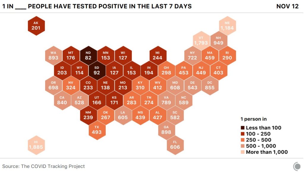
    Between 10% and 20% of people infected with COVID-19 are responsible for 80% of the virus’ spread.

    You might have seen this statistic before, but take a second to think about what it means. Imagine that one unlucky person at a crowded restaurant, infected with the novel coronavirus but not yet symptomatic enough that she has noticed, spreads the virus to ten others. Meanwhile, her ten coworkers, who all contracted the virus at the same time as she did, do not spread the virus to anyone else at all. This type of dispersal—what epidemiologists call a large value—introduces a level of randomness to COVID-19 spread which makes it difficult to track and protect against.

    But scientists are learning to better understand COVID-19 spread by keeping tabs on those instances where one person infects many, which they call superspreading events. While research continues about the underlying biology driving who is infectious and who isn’t, investigating the events in which people get infected can help us better understand how to protect ourselves and our communities.

    For more thorough explanations into the science of superspreading, I’d recommend you read Christie Aschwanden in Scientific AmericanZeynep Tufekci in The Atlantic, or Martin Enserink, Kai Kupferschmidt, and Nirja Desai with an incredible series of scrolly visualizations in Science Mag.

    Here, I’m focusing on the data around these events: how we identify them, what the data tell us so far, and why we should keep them in mind as temperatures drop and cases rise.

    How do we find superspreading events?

    The CDC defines a superspreading event as one in which “a few persons infect a larger number of secondary persons with whom they have contact.” This leaves a lot of room for interpretation, as different researchers have different thresholds for determining how many people must be involved. Depending on who you talk to, anything from a 500-person rally to your extended family’s Fourth of July gathering might fit the definition.

    So, when you see a sensationalist article claiming that some event caused superspreading, it is important to consider what definition was being used and how the given event was identified as one that fits.

    There are three ways superspreading events can be identified:

    • Continuous tracking of an outbreak site: This is the easiest way to find superspreading. You have a place with a lot of people—say, a nursing home, a prison, a college campus—and you watch how many cases erupt over time. This may be an easier means of finding events because local administrations or public authorities are conducting regular testing and making data public; meanwhile, the sites themselves may have large groups of people living and working in close quarters, which is a prime environment for virus spread. Scientists count these sites as superspreading events even though they are not “events” in the way we usually think of the word because this type of long-term superspreading can have the biggest impact. California’s San Quentin State Prison, for example, was ordered to reduce its prison population after over 2,000 prisoners tested positive.
    • Contact tracing: This strategy, in which public health officials contact individuals who test positive and ask them about their contacts to find other infected individuals, has not taken off in the U.S. as it has in other countries, which makes it harder for us to identify superspreading events. It works like this: if contact tracers find that one new case is a teacher at an elementary school, for example, they can call other teachers and school administrators to find out which other cases are connected to that location. Japan has famously avoided widespread lockdowns by employing a “cluster-busting” strategy in which officials contact-trace backwards from new cases in order to find how those people got infected, then tell other people at the spreading events to isolate. Scientists in Europe and the U.S. are now promoting this approach as our cases surge.
    • Scientific studies: This strategy of superspreading identification is perhaps the least consistent, but it gets the most press. Epidemiologists may use publicly available case data, cell phone tracking data, or other information to look for patterns in new cases after major events. Such studies may draw attention, as a working paper on the Sturgis, South Dakota motorcycle rally did in September, but it can be difficult for scientists to investigate events when they don’t have access to data on precisely which cases are connected and how. The Sturgis paper was criticized for making estimates based on unreliable data. A similar new paper on the COVID-19 impact of Trump rallies is currently undergoing peer review.

    Where do superspreading events happen?

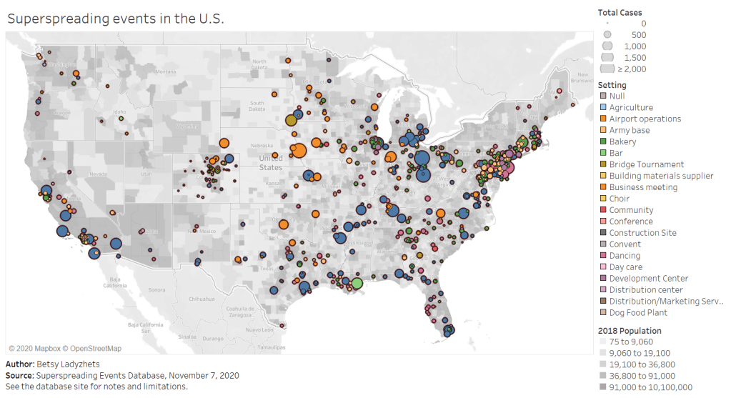
    Full-screen dashboard link.

    Independent researcher Koen Swinkels started a database to answer this question. The database is compiled from media reports, scientific papers, and public health dashboards, as well as volunteer reports. (You can submit an event through a form on the database’s site.)

    As of November 7, the database includes about 1,600 superspreading events, ranging from churches to dinner parties to meat processing plants. About 1,100 of these events took place in the U.S. For those American events, the most common superspreading settings by far are prisons (50,000 cases), rehabilitation/medical centers (27,000 cases), nursing homes (26,700 cases), meat processing plants (13,900 cases), and other medical centers (12,200 cases). Parts of the Northeast, West Coast, and South are heavily represented in the database, while other areas of the country have yet to see significant superspreading events logged.

    You can explore the map pictured above, as well as a bar chart which organizes superspreading settings by their COVID-19 case numbers, in a pair of interactive Tableau visualizations which I built based on this database.

    Swinkels emphasized in an email to me that the database is not at all representative of all COVID-19 superspreading events which have taken place, in America or around the world. “Hundreds of millions of people have been infected with SARS-CoV-2, while we have only about 200,000 cases linked to the 1,600 superspreading events in our database,” he said.

    He and other members of the team, including professors at the London School of Hygiene and Tropical Medicine, are currently compiling events from the most easily available public sources, which he admits is not a comprehensive strategy. Swinkels also noted that the events identified by public sources may be biased by where public health officials direct their focus, which can lead to settings that were closed in the spring or are now operating under restrictions being left out of this database and of superspreading research more broadly. The database is also biased by the team’s English-language familiarity; they are looking to find more events described in non-English language publications.

    What does this mean for the holidays?

    This newsletter topic was inspired by a reader question I got last week: Ross asked me how post-election gatherings and holiday celebrations might contribute to COVID-19 spikes.

    The evidence so far suggests that protests have not yet been a major cause of COVID-19 spikes. But “so far” is doing a lot of work in that sentence. While protests are generally outside and see high mask compliance, Swinkels explained, they tend to involve talking and singing in close contact, and instances of transportation and socialization around a protest might pose more risk. (Imagine, for example, shouting “FUCK TRUMP!” in a crowd of 500 with two friends, going to an outdoor bar together afterward, then each taking the bus home to three different parts of the city. That’s a lot of risk for one evening.)

    More research on protests is necessary to truly determine how much risk they might pose to the communities around them. And, as contact tracing apparatuses in different parts of the country scale up—slowly but surely—such research will get easier.

    Holiday celebrations, on the other hand, are a definitive cause for concern. These celebrations almost always occur indoors, involve talking and eating, and bring people together from disparate locations. Superspreader events also almost always occur indoors, may involve loud talking, and expand COVID-19 risk from one area to another. There’s a reason that Dr. Anthony Fauci’s daughters are not traveling home for Thanksgiving.

    I asked Koen what he’d learned from compiling and comparing hundreds of superspreader events. “Knowing more about where and when superspreading events occur can help you to avoid high-risk situations and live more freely in low-risk situations,” he said. He listed several key risk factors: indoors, poor ventilation, many people, close together, prolonged periods, loud vocalization (such as singing or shouting), and cold, dry air.

    He also highlighted the importance of understanding aerosol transmission. The six feet rule we’ve all come to know and flaunt is based on the dispersal of larger air particles, which don’t travel far from an infected person. But aerosols, which are smaller particles, are able to travel further and stay in the air longer—especially in indoor, poorly ventilated spaces. You can sit all the way across the room from Grandma while you eat, but if masks are off and all the windows are closed, it won’t make much difference. This FAQ document by aerosol scientists provides much more detail about how this type of COVID-19 spread works.

    I’m not going to tell you to avoid traveling for the holidays; I’m not a public health expert, I don’t have that authority. But I can give you this fact: your Thanksgiving could be a superspreading event. So could the train you take to get to your relatives’ house. So could the bar where you go for outdoor drinks a few days before traveling. In order to make it through this winter, we must all be aware of our risks and adjust our behavior accordingly.

  • National numbers, Nov. 8

    National numbers, Nov. 8

    In the past week (November 1 through 7), the U.S. reported about 715,000 new COVID-19 cases, according to the COVID Tracking Project. This amounts to:

    • An average of 102,000 new cases each day
    • 218 total new cases per 100,000 people
    • 1 in 460 Americans getting diagnosed with COVID-19
    • 2.7 times the total cases Canada has reported over the entire course of the pandemic

    While the Midwest is bearing the brunt of this recent surge, cases are rising across the country. 23 states broke their COVID-19 records in the past week, and the COVID Exit Strategy tracker currently categorizes almost every state as “trending poorly” or “uncontrolled spread.” Vermont and Hawaii are the only two exceptions.

    America also saw:

    • 6,900 new COVID-19 deaths last week (2.1 per 100,000 people)
    • 55,800 people currently hospitalized with the disease (as of November 7)

    There is no doubt that we’re seeing a third national surge, and we should not expect it to let up anytime soon. I recommend checking the COVID-19 Risk Levels Dashboard (by the Harvard Global Health Institute, Brown School of Public Health, et al.) for more detail on the current risk in your community.

    Nationwide COVID-19 metrics published in the COVID Tracking Project’s daily update on November 7. America broke its single-day new case record for the fourth day in a row.