Last week, a new metric appeared in the COVID Tracking Project’s daily updates. Within days, this metric was also featured in my newsletter, Benjy Renton’s Off the Silk Road, New York Governor Andrew Cuomo’s Twitter account, NPR, and even the New York Times.
Here’s how it works. You take the number of COVID-19 cases reported in the past week and divide the current U.S. population by that case number. There are variations; the metric may also be calculated for different time spans or smaller geographies, such as a specific U.S. state. But the standard calculation focuses on the nation, over the past week.
For example: in the past week, one in 331 Americans has been diagnosed with COVID-19. If we extend that out to the past two weeks: one in 192 Americans has been diagnosed with COVID-19 since November 1.
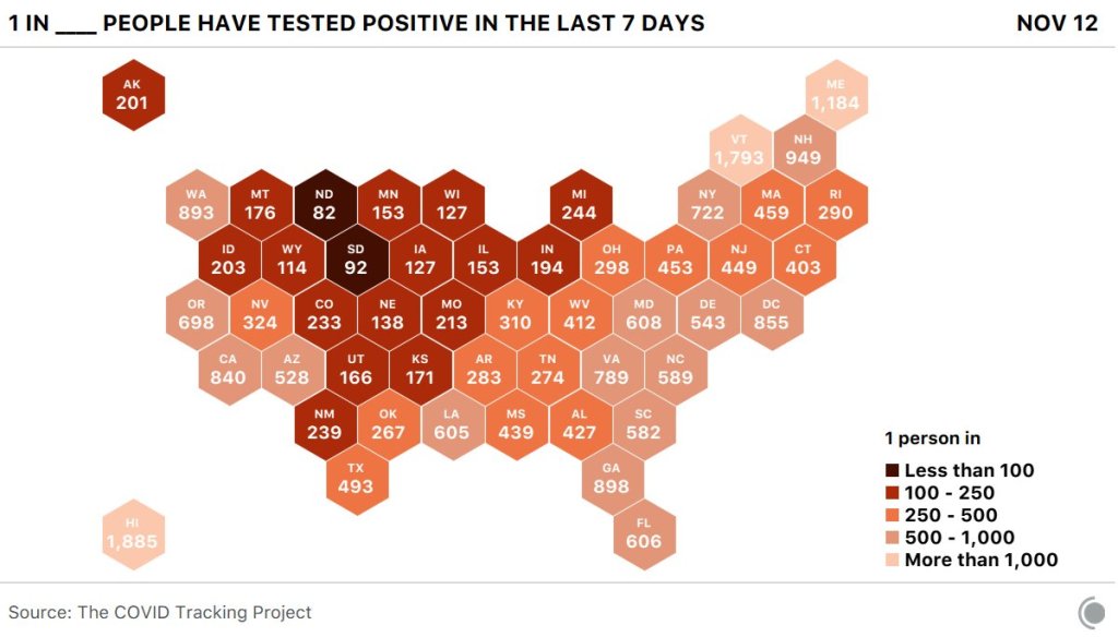
Here’s what it looks like by state (reflecting data from November 5 to 12):

The biggest challenge that data journalists like me face right now is putting massive COVID-19 numbers into a context that readers may easily understand. I’ve used a variety of analogies, comparisons, and visualizations, but I like this number because it feels visceral. I’ve had lectures smaller than 331 people. I’ve been to protests ten times bigger. It’s a number of people that I can picture, a number of people that would fit in my neighborhood park.
Among COVID Tracking Project volunteers, this metric is known as the Camberg Number—after Nicki Camberg, City Data Manager at the Project, who first shared it in Slack earlier in November. I asked her where she got the idea for this calculation and how she’s thinking about pandemic data during this terrifying surge.
Here’s what she said:
When thinking about COVID-19, the metrics we’ve been using have started to blur together and stop having the same impact after months of staring at them. What is the difference between 100,000 and 150,000 new cases? Well, obviously, 50,000 more cases, but I can’t conceptualize that, nor can most people. Numbers that high feel almost abstract and easy to ignore. I could feel myself starting to normalize these increasing case and hospitalization rates, and I had to figure out a way to stop that from happening. If I, someone who spends all day every day collecting, discussing, and working with COVID-19 data, was starting to get desensitized to the pandemic—what must it be like for the general public?
I knew I had to find a way to make it more personally relatable, but also find a way to use the data I look at every day to better inform my own decisions. When I go to the grocery store, what is the probability that someone in the store with me tested positive? How many people in my grade currently have COVID? If my grandmother leaves her house, how many people does she have to interact with before it’s likely she was in the presence with someone who could infect her?
The first time I calculated this number was November 5th. The US had just hit 116,000 new cases in a day, the second day in a row of record breaking cases and the start of a week of near-constant exponential increases. I calculated that roughly 1 in 3,000 Americans were diagnosed with COVID-19 that day, and I was shocked. 1 in 3,000 people? That number felt like a punch in the gut, and made me see the devastating effect of this pandemic more than any other statistic I’d heard for months. It gets even worse when this is applied to state or local levels (which one can do using the newly released CTP City Dataset), and it is genuinely devastating when done by race.
From the feedback I’ve gotten, it seems like a lot of people are feeling the same way I am: jaded and exhausted after half a year of a never ending pandemic. Sometimes we need a shock to the system to realize that this is not normal, is not something that can be ignored. Until there is a vaccine, cases will only continue to spike with the holiday season unless we all choose to practice radical empathy and collectively do all we can to curb the spread of the virus.

Leave a comment