Author: Betsy Ladyzhets

  • Featured sources, Dec. 6

    These sources, along with all others featured in previous weeks, are included in the COVID-19 Data Dispatch resource list. Please note that I took state school data sources out of this list because my COVID-19 state school data survey provides a more comprehensive view of these data.

    • Allocating Regeneron’s treatment: On November 21, Regeneron’s monoclonal antibody treatment received Emergency Use Authorization from the FDA. A new dataset from the HHS shows how this drug is being allocated to states and territories. For more information on the dataset, see HHS’s November 23 press release.
    • COVID-19 relief tracker: The Project on Government Oversight (POGO) has a new tracker which shows where COVID-19 relief funds from the federal government have been spent. The dashboard visualizes data from USAspending.gov, and is searchable by state, county, and ZIP code.
    • Census COVID-19 Demographic and Economic Resources: My coworker Diana Shishkina recently alerted me to a Census page which compiles and visualizes a great deal of data on how COVID-19 has impacted Americans. It includes data from weekly small business surveys, the Household Pulse Survey, and a wealth of other information.
  • HHS’s hospitalization data are good, actually

    HHS’s hospitalization data are good, actually

    In July, the Department of Health and Human Services (HHS) took over collecting and reporting data on how COVID-19 is impacting America’s hospital systems. This takeover from the CDC—which had reported hospitalization data since the start of the pandemic—sparked a great deal of political and public health concern. Some healthcare experts worried that a technology switch would put undue burden on already-tired hospital workers, while others worried that the White House may influence the HHS’s data.

    Since that data responsibility switch, I’ve spent a lot of time with that HHS dataset. In August, I wrote a blog post for the COVID Tracking Project which compared HHS’s counts of hospitalized COVID-19 patients to the Project’s counts (compiled from states). At the time, my co-author Rebecca Glassman and I observed discrepancies between the datasets, which we attributed in part to differences in definitions and reporting pipelines. For example: some states only report those hospital patients whose cases of COVID-19 have been confirmed with PCR tests, while HHS reports all patients (including those with confirmed and suspected cases).

    I’ve covered the HHS hospitalization dataset several times in this newsletter since, including its investigation by journalists at ProPublica and Science Magazine and its expansion to include new metrics. The dataset has gone from a basic report of hospital capacity in every state to a comprehensive picture of how the pandemic is hitting hospitals. It includes breakdowns of patients with confirmed and suspected cases of COVID-19, patients in the intensive care unit (ICU), and patients who are adults and children. As of November, it also includes newly admitted patients and staffing shortages. At the same time, HHS officials have worked to resolve technical issues and get more hospitals reporting accurately in the system.

    A new analysis, published this past Friday by the COVID Tracking Project, highlights how reliable the HHS dataset has become. The analysis compares HHS’s counts of hospitalized COVID-19 patients to the Project’s counts, compiled from states. Unlike the analysis I worked on in August, however, this recent work benefits from HHS’s expanded metrics and more thorough documentation from both the federal agency and states. If a state reports only confirmed cases, for example, this number can now be compared directly to the corresponding count of confirmed cases from the HHS.

    Here’s how the two datasets line up, as of November 29:

    Line chart showing hospitalization data from state (CTP) and from HHS. When the correct definitions are used, and the HHS data offset by a single day, the two lines match almost exactly.
    The COVID Tracking Project and HHS counts of hospitalized patients closely match in September, October, and November.

    Since November 8, in fact, the two datasets are within two percent of each other when adjusting for definitional differences.

    The blog post also discusses how patient counts match in specific states. In 41 of 52 jurisdictions (including the District of Columbia and Puerto Rico), the two datasets are in close alignment. And even in the states where hospitalization numbers match less precisely, the two datasets generally follow the same trends. In other words: there may be differences in how the HHS and individual states are collecting and reporting their numbers, but both datasets tell the same story about how COVID-19 is impacting American hospitals.

    I recommend giving the full blog post a read, if you’d like all the nerdy details. Alexis Madrigal also wrote a great summary thread on Twitter:

    This new COVID Tracking project analysis comes several days after an investigation in Science Magazine called the HHS dataset into question. The investigation is based on a CDC comparison of these same two datasets which doesn’t account for the reporting differences I’ve discussed.

    Charles Piller, the author of this story, raises important questions about HHS’s transparency and the burden that its system places on hospitals. It’s true that the implementation of HHS’s new data reporting system was rolled out quickly, faced technical challenges, and caused a great deal of confusion for national reporters and local hospital administrators alike. The HHS dataset deserves the careful scrutiny it has received.

    But now that this careful scrutiny has been conducted—and the two datasets appear to tell the same story—I personally feel comfortable about using the HHS dataset in my reporting. In fact, I produced a Stacker story based on these data just last week: States with the highest COVID-19 hospitalization rates.

  • Vaccine news: data and concerns on early distribution

    Vaccine news: data and concerns on early distribution

    Everyone in the science communication world is talking about COVID-19 vaccines right now. I’ve attended three vaccine webinars in the past week alone.

    We’re all gearing up for next Thursday, when the FDA’s Vaccines and Related Biological Products Advisory Committee will meet to discuss Emergency Use Authorization (EUA) for Pfizer and BioNTech’s vaccine. If the vaccine is authorized for distribution, doses will go out to every state within days. Meanwhile, Moderna’s vaccine continues to demonstrate promising results. Moderna has also applied for EUA; FDA’s committee will meet to discuss this candidate on December 17.

    Here are a few major data sources and issues that I’ll be watching as these vaccine candidates progress:

    • The CDC has recommended that the first available vaccine doses go to healthcare workers and residents of long-term care facilities (nursing homes, assisted living facilities, etc.) The agency did not specify how state and local governments should prioritize among these groups.
    • How many people are actually in those high-priority groups in each state? To answer that question, see the Vaccine Allocation Planner for COVID-19, a new data tool from the Surgo Foundation, Ariadne Labs, and other collaborators. For each state, the tool uses population estimates from the Census, the CDC, and other sources to show how many healthcare workers, first responders, teachers, people with severe health conditions, and other high-risk individuals will need to be vaccinated. The tool is automatically set to calculate each state’s available doses as a population-adjusted share of 10 million, but users can adjust it to see how different scenarios may play out.
    • How many vaccine doses are actually going to each state? To answer this question, see the new COVID-19 Vaccine Allocation Dashboard from Benjy Renton. Renton is compiling information from local news sources on dose distributions from Pfizer and Moderna’s early shipments. Remember that both of these vaccines require two doses per person. In Texas, for example, the first Pfizer shipment of 224,250 doses will allow about 11 in every 1,000 Texas to get vaccinated.
    • How will vaccination be tracked? The CDC has promised to set up a national dashboard similar to its flu registry, but until then, we must rely once again on state data. This CDC list of state immunization registries should be a useful starting point for any local reporters hoping to get a jump start on vaccine data. You’d better believe that I will be spending a lot of time with these registries in future issues.
    • The Kaiser Family Foundation is setting up a new dashboard to track public opinion on COVID-19 vaccines. This initiative, called the COVID Vaccine Monitor, will compile the results of regular focus groups and surveys on whether Americans plan to get vaccinated and why. The dashboard is not live yet, but you can learn more about it and hear past KFF findings in the foundation’s December 3 briefing. One notable statistic: 67% of Black adults are “not too confident” or “not at all confident” that vaccines will be distributed fairly, as of a KFF poll conducted in August-September.
    • For vaccine coverage outside the U.S., see this map of procurement data from the Launch & Scale Speedometer. This research group from the Duke Global Health Innovation Center has compiled the total vaccine doses purchased by over 30 nations. The dashboard also estimates the share of each nation’s population it could be able to cover with advanced vaccine purchases. Canada is highest on the scale at 601%; the nation’s extra doses will likely be donated to other countries.
    • STAT’s Helen Branswell has written a comprehensive feature on the vaccine-related challenges that lie ahead. Some of the big challenges: coordinating a speedy early rollout, overcoming vaccine distrust, distributing vaccine doses equitably, protecting vulnerable populations (such as pregnant women and children) on whom vaccine candidates have not yet been tested, and continuing to study additional vaccines once the first candidates to win EUA are rolled out.

    What questions do you have around COVID-19 vaccines?

    It’s time for our next brief reader survey, and this time, I want to hear your vaccine concerns. As this continues to be a major coverage topic for me, I’d like to be sure I’m prioritizing the needs of my readers in choosing specific vaccine-related issues and data sources to investigate.

    This is a one-question survey. A few reader responses (from those who indicate they’re comfortable with it) will be shared next week.

  • How are states reporting COVID-19 in schools?

    How are states reporting COVID-19 in schools?

    !function(){“use strict”;window.addEventListener(“message”,(function(a){if(void 0!==a.data[“datawrapper-height”])for(var e in a.data[“datawrapper-height”]){var t=document.getElementById(“datawrapper-chart-“+e)||document.querySelector(“iframe[src*=’”+e+”‘]”);t&&(t.style.height=a.data[“datawrapper-height”][e]+”px”)}}))}();

    Longtime readers might remember that, back in August, I surveyed the available data on how COVID-19 is impacting American schools.

    At the time, very few states were reporting school-specific data, even as school systems around the nation began to reopen for in-person instruction. In that early survey, I highlighted only Iowa as a state including district-level test positivity data on its COVID-19 dashboard. This dearth of data disappointed, but did not surprise me. There was no federal mandate for states, counties, or school districts to report such data, nor did the federal government compile such information.

    There is still no federal mandate for school COVID-19 data, despite pleas from politicians and educators alike. So, as school systems across the country close out their fall semesters amidst a growing outbreak and prepare for the spring, I decided to revisit my survey. I sought out to find how many schools are reporting on COVID-19 cases in their K-12 schools, which metrics they are reporting, and how often. To get started with this search, I used the COVID Monitor, a volunteer effort run by Rebekah Jones which is compiling K-12 case counts from government sources and news reports.

    Overall, many more states are providing school data now than in August. But the data are spotty and inconsistent; most states simply report case counts, making it difficult to contextualize school infections. (For more on why demoninators are important in analyzing school data, see my October 4 issue.)

    You can see the full results of my survey in this spreadsheet (embedded below). But here are a few key findings:

    • In total, 35 states report case counts in all public K-12 schools. 6 states report in an incomplete form, either not including all schools or not including specific case counts.
    • 9 states do not report school COVID-19 data at all. These states are: Alaska, California, Georgia, Nebraska, Nevada, New Mexico, Oklahoma, Pennsylvania, and Wyoming.
    • Most states update their school data either weekly or biweekly. Only 7 states update daily.
    • Most states do not report counts of deaths and hospitalizations which are connected to school COVID-19 outbreaks. Only 5 states report deaths (Colorado, Kansas, North Carolina, Kentucky, and Virginia), and only 1 state reports hospitalizations (Kansas).
    • Only 3 states report in-person enrollment numbers: New York, Massachusetts, and Texas.
    • New York is the only state to report counts of COVID-19 tests conducted for K-12 students and staff.

    And here are a couple of example states I’d like to highlight:

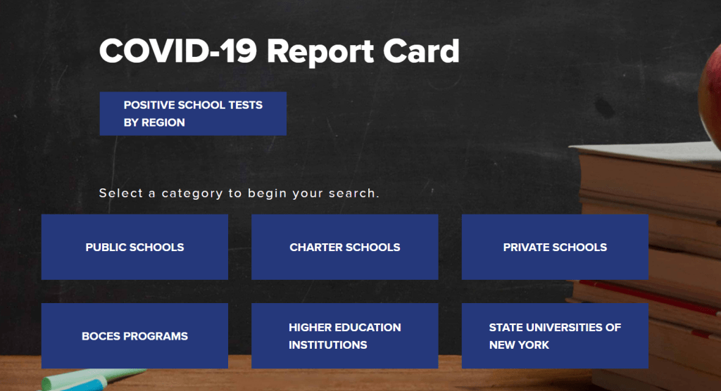
    • New York has the most complete school data by far, scoring 19 out of a possible 21 points on my index. Not only does the state report enrollment and total tests administered to students and staff, New York’s COVID-19 Report Card dashboard includes the test type (usually PCR) and lab each school is using. Test turnaround times are also reported for some schools. This dashboard should be a model for other states.
    • Indiana has a dashboard that I like because it is easy to find and navigate. You don’t have to search through PDFs or go to a separate dashboard—simply click on the “Schools” tab at the top of the state’s main COVID-19 data page, and you will see cumulative case counts and a distribution map. Clicking an individual school on the map will cause the dashboard to automatically filter. Indiana also reports race and ethnicity breakdowns for school cases, which I haven’t seen from any other state.
    • Texas provides detailed spreadsheets with case counts and on-campus enrollments for over 10,000 individual schools. The state reports new cases (in the past week), total cases, and the source of school-related infections (on campus, off campus, and unknown). The infection source data suggests that Texas is prioritizing schools in its contact tracing efforts.
    • Minnesota is one state which provides incomplete data. The state reports a list of school buildings which have seen 5 or more COVID-19 cases in students or staff during the past 28 days. Specific case counts are not provided, nor are specific dates on when these cases occurred. If I were a Minnesota parent at one of these listed schools, I’m not sure what I’d be able to do with this information beyond demand that my child stay home.

    As cases surge across the country, more children become infected, and school opening once again becomes a heated debate from New York City to North Dakota, it is vital that we know how much COVID-19 is actually spreading through classrooms. How can we decide if school opening is a risk to students, teachers, and staff if we don’t know how many students, teachers, and staff have actually gotten sick?

    Moreover, how can we understand the severity of this threat without enrollment or testing numbers? Reporting that a single school has seen three cases is like reporting that a single town has seen three cases; the number is worth very little if it cannot be compared to a broader population.

    Volunteer sources such as the COVID Monitor and Emily Oster’s COVID-19 School Response Dashboard are able to compile some information, but such work cannot compare to the systemic data collection efforts that national and state governments may undertake. If you live in one of those nine states that doesn’t report any school COVID-19 data, I suggest you get on the phone to your governor and ask why.

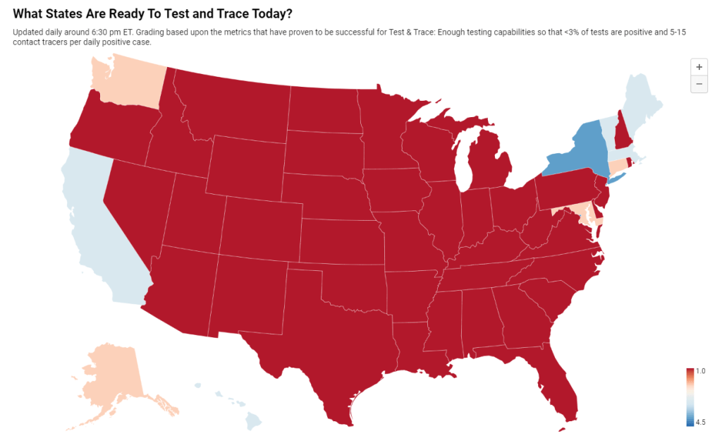
    Also, speaking of New York City, here’s an update to the 3% threshold I reported on last week:


    Here are the full results of my survey.

    To use this for your own analysis, make a copy of the public Google sheet.

  • National numbers, Dec. 6

    National numbers, Dec. 6

    In the past week (November 29 through December 5), the U.S. reported about 1.3 million new cases, according to the COVID Tracking Project. This amounts to:

    • An average of 186,000 new cases each day (16% increase from the previous week)
    • 297 total new cases for every 100,000 Americans
    • 1 in 252 Americans getting diagnosed with COVID-19 in the past week
    • 9% of the total cases the U.S. reported in the full course of the pandemic
    Chart of tests, cases, current hospitalizations, and deaths nationwide.
    Nationwide COVID-19 metrics published in the COVID Tracking Project’s daily update on December 5. The seven-day average for reported COVID-19 deaths is at an all-time high.

    More Americans are getting sick with COVID-19 now than ever before in the pandemic. And this outbreak isn’t isolated. Eleven states broke case records on Thursday, for example, including states in all major regions of the country.

    Last week, I warned you about data fluctuations which I expected to see thanks to the Thanksgiving holiday. America first reported fewer cases, deaths, and tests, as public health workers took a day or two off and data pipelines were interrupted. Then, the cases which were not reported over the holiday were added to the count belatedly, culminating in a record of 225,000 new cases on Friday.

    If you visit the COVID Tracking Project’s website, you’ll still see a warning notice about these Thanksgiving data disruptions. However, one key number tells us that the pandemic is, in fact, still getting more dire: more patients are getting admitted to the hospital than ever before.

    Last week, America saw:

    • Over 100,000 people now hospitalized with COVID-19 (it’s 101,200 as of yesterday, twice the number of patients at the beginning of November)
    • 15,000 new COVID-19 deaths (5 for every 100,000 people)

    To understand the impact of that hospitalization record, read Alexis Madrigal and Rob Meyer in The Atlantic:

    Many states have reported that their hospitals are running out of room and restricting which patients can be admitted. In South Dakota, a network of 37 hospitals reported sending more than 150 people home with oxygen tanks to keep beds open for even sicker patients. A hospital in Amarillo, Texas, reported that COVID-19 patients are waiting in the emergency room for beds to become available. Some patients in Laredo, Texas, were sent to hospitals in San Antonio—until that city stopped accepting transfers. Elsewhere in Texas, patients were sent to Oklahoma, but hospitals there have also tightened their admission criteria.

    Or, for one doctor’s perspective, read this thread from Dr. Esther Choo:

    Deaths are also rising. The deaths of 15,000 Americans were reported last week—the highest number of any week in the pandemic thus far. In fact, COVID-19 was the leading cause of death in America last week, according to the Institute for Health Metrics and Evaluation.

  • Featured sources, Nov. 29

    These sources, along with all others featured in previous weeks, are included in the COVID-19 Data Dispatch resource list.

    • Leading in Crisis briefs: A series of briefs from the Consortium for Policy Research in Education document how 120 principals in 19 states responded to COVID-19 in the spring. The briefs compile analyses, summaries, and recommendations on topics ranging from accountability during school closures to calm during a crisis.
    • COVID-19 in Congress: GovTrack.us. a project which normally documents bills and resolutions in the U.S. Congress, is currently tracking how COVID-19 has spread through the national legislature. The tracker currently includes 87 legislators who have entered quarantine, tested positive, or come into contact with someone who had been diagnosed with the disease.
    • COVID-19 Community Vulnerability Index: In the first vaccine section above, I discussed the CDC’s Social Vulnerability Index, which charts populations that are more vulnerable to health disasters. The Surgo Foundation’s COVID-19 Community Vulnerability Index builds on the CDC’s research with additional, COVID-specific metrics based on epidemiological and healthcare-related factors. I’ve produced two Stacker stories using this source: States with the populations most vulnerable to COVID-19 and Counties most vulnerable to COVID-19 in every state.
  • Gaps we see in COVID-19 data

    Last week, I asked readers to share what information or context gaps they see in COVID-19 coverage from other publications. Thank you to everyone who responded—these answers will be driving what I report on going forward.

    Here are a couple of responses I’d like to highlight:

    • Two readers discussed a need for more local data. State-level reporting can obscure COVID-19 patterns at the county level, while even county-level data can obscure differences between urban, suburban, and rural areas in the same county. Some states do report data at the ZIP code or Census tract level, but this is—as you can probably guess—very unstandardized and difficult to compare broadly. President-Elect Joe Biden promises a Nationwide Pandemic Dashboard with ZIP code-level data, though; hopefully we may see this granular information come January.
    • One reader discussed a need for data on how COVID-19 is impacting K-12 schools, suggesting a section in each week’s newsletter. I wrote about schools this week, but they are definitely a topic that demands more coverage, especially as K-12 districts and higher ed institutions alike begin planning how they will tackle the spring semester. Expect to see more school data in the coming weeks!
    • Another reader said, “I do not have a good idea of how many people are really affected by COVID-19.” How many people were hospitalized or had long-term health issues as a result of the disease, and how much did the disease cost these patients? COVID-19 long-haulers—those who have the disease for many months—are an increasing topic of data collection, and many long-haulers are even collecting data on themselves. I can certainly feature them in a future newsletter. But I believe many long-term impacts, ranging from lost income to excess deaths, will not be fully understood until years after the pandemic.
    • A reader who works as a local journalist discussed how they see other reporters “failing to fundamentally understand data and how it’s used.” They went on to add, “Make every journalist take a data class.” I couldn’t agree more with this sentiment. Journo readers, keep an eye out for more resources (and possibly even events) that could help you out along these lines.
  • We need better contact tracing data

    We need better contact tracing data

    Last week, New York Times reporter Apoorva Mandavilli questioned the scientific basis for recent public health guidance against small gatherings. Politicians and public health officials are telling us to cancel Thanksgiving dinners, she writes, but it’s difficult to find data that actually demonstrate a link between small gatherings and COVID-19 transmission.

    Mandavilli acknowledges that the majority of states do not collect or report detailed information on how their residents became infected with COVID-19. This type of information would come from contact tracing, in which public health workers call up COVID-19 patients to ask about their activities and close contacts. Contact tracing has been notoriously lacking in the U.S. due to limited resources and cultural pushback.

    I came to a similar conclusion about the contact tracing data deficiency in October, when I investigated the practice in this newsletter. Still, the data that are publicly available suggest that larger gatherings and congregate facilities are still the major sources of virus spread, as Mandavilli writes:

    But in states where a breakdown is available, long-term care facilities, food processing plants, prisons, health care settings, and restaurants and bars are still the leading sources of spread, the data suggest.

    The piece faced criticism for potentially undermining important guidances about the holidays. Even CDC Director Robert Redfield pushed back against it. When asked about this story on Fox News, he said, “From the data that we have, that the real driver now of this epidemic is not the public square… It’s really being driven by household gatherings.”

    For me, this distinction between Mandavilli’s story and Redfield’s statement underscores that either a.) the CDC has access to some contact tracing data that the rest of us don’t, or b.) nobody has access to complete contact tracing data, and public health officials are communicating the conclusions that seem more politically salient. I don’t love either outcome!

    The volunteer project Test and Trace compiles information on each state’s contact tracing efforts. Check out how your state is faring, and if you’re unsatisfied, contact your local politicians and ask them to do better.

  • COVID-19 school data remain sporadic

    COVID-19 school data remain sporadic

    On November 18, New York City mayor Bill de Blasio announced that the city’s schools would close until further notice. Students returned to remote learning, while restaurants and bars remain open—even indoor dining is permitted.

    This closure came because the city had passed a 3% positivity rate. 3% of all tests conducted in the city in the week leading up to November 18 had returned positive results, indicating to the NYC Department of Health and de Blasio that COVID-19 is spreading rampantly in the community. As a result—and as de Blasio had promised in September—the city’s schools had to close.

    But that 3% value is less straightforward than it first appears. In closing schools, de Blasio cited data collected by the NYC Department of Health, which counts new test results on the day that they are collected. The state of New York, however, which controls dining bans and other restrictions, counts new test results on the day that they are reported. Here’s how Joseph Goldstein and Jesse McKinley explain this discrepancy in the New York Times:

    So if an infected person goes to a clinic to have his nose swabbed on Monday, that sample is often delivered to a laboratory where it is tested. If those results are reported to the health authorities on Wednesday, the state and city would record it differently. The state would include it with Wednesday’s tally of new cases, while the city would add it to Monday’s column.

    Also, the state reports tests in units of test encounters while the city (appears to) report in units of people. (See my September 6 issue for details on these unit differences.) Also, the state includes antigen tests in its count, while the city only includes PCR tests. These small differences in test reporting methodologies can make a sizeable dent in the day-to-day numbers. On the day that Goldstein and McKinley’s piece was published, for example, the city reported an average test positivity rate of 3.09% while the state reported a rate of 2.54% for the city.

    Meanwhile, some public health experts have questioned why a test positivity rate would be even used in isolation. The CDC recommends using a combination of test positivity, new cases, and a school’s ability to mitigate virus spread through contact tracing and other efforts. But NYC became fixated on that 3% benchmark; when the benchmark was hit, the schools closed.

    Overall, the NYC schools discrepancy is indicative of an American education system that is still not collecting adequate data on how COVID-19 is impacting classrooms—much less using these data in a consistent manner. Science Magazine’s Gretchen Vogel and Jennifer Couzin-Frankel describe how a lack of data has made it difficult for school administrators and public health researchers alike to see where outbreaks are occurring. Conflicting scientific evidence on how children transmit the coronavirus hasn’t helped, either.

    Emily Oster, a Brown University economist whom I interviewed back in October, continues to run one of a few comprehensive data sources on COVID-19 in schools. Oster has faced criticism for her dashboard’s failure to include a diverse survey population and for speaking as an expert on school transmission when she doesn’t have a background in epidemiology. Still, CDC Director Robert Redfield recently cited this dashboard at a White House Coronavirus Task Force briefing—demonstrating the need for more complete and trustworthy data on the topic. The COVID Monitor, another volunteer dashboard led by former Florida official Rebekah Jones, covers over 240,000 K-12 schools but does not include testing or enrollment numbers.

    For me, at least, the NYC schools discrepancy has been a reminder to get back on the schools beat. Next week, I will be conducting a review of every state’s COVID-19 school data—including which metrics are reported and what benchmarks the state uses to declare schools open or closed. If there are other specific questions you’d like me to consider, shoot me an email or let me know in the comments.

  • Thinking about vaccine results (AstraZeneca redux)

    Thinking about vaccine results (AstraZeneca redux)

    Two weeks ago, after Pfizer announced its preliminary results, I posed a set of questions that can guide how you understand the details in COVID-19 vaccine press releases.

    I’m revisiting those questions now in the wake of AstraZeneca and the University of Oxford’s news. The 70% effectiveness rate announced last Monday is promising at first glance, but details about this vaccine’s clinical trials have puzzled epidemiologists. Here’s what to consider as we await more details on AstraZeneca and Oxford’s findings, drawing on reports from STAT NewsNature, and the New York Times.

    • What is the sample size? Or, how many people were involved in the trial, and how many of them were diagnosed with COVID-19? AstraZeneca’s Monday announcement reported results from ongoing trials in the United Kingdom and Brazil, which include about 11,400 participants. 131 patients in the trial have tested positive for COVID-19. But here’s where things get tricky: out of those 11,400 participants, about 2,700 were given a lower dose of vaccine in their first shot due to an error in the U.K. trial. The other 8,900 trial participants received a standard two shots, i.e. two full doses of the vaccine. So, that 70% effectiveness rate is actually the average of results from two groups. In patients who received two full doses, the vaccine was 62% effective, while in patients who received a half dose and full dose, the vaccine was 90% effective.
    • Wait, the vaccine worked better in a lower dose? Yes—or at least, that’s what the data tell us so far. The researchers who made that dosing error may have gotten lucky by giving patients an initial dose which better stimulated their immune systems to act against the coronavirus. Nature’s Ewen Callaway quotes immunologists who say a lower dose might more effectively turn on T cells—immune cells that support antibody production—or more quickly activate the immune system’s memory of the virus. Still, the effectiveness rates we’ve seen for this vaccine so far may have been skewed by a small trial size; AstraZeneca has not reported how many patients among the 131 diagnosed with COVID-19 received a half-dose of the vaccine as compared to two full doses. AstraZeneca and Oxford will continue to study both the half-dose and full-dose regimens, and the scientific community eagerly awaits more data (and more details on how these trials are operating).
    • Who is included in the sample size? Or, has this vaccine been tested on seniors, people of color, people with preexisting medical conditions that may garner worse COVID-19 outcomes, and other marginalized groups? In addition to their U.K. and Brazil trials, AstraZeneca and Oxford are conducting trials in the U.S., Japan, Russia, South Africa, Kenya, and Latin America with planned trials in other nations, including up to 60,000 total participants. AstraZeneca’s press release states that these global trials include “participants aged 18 years or over from diverse racial and geographic groups”; no further information on participant demographics is available.
    • Does the vaccine work for severe cases? Or, can this vaccine help reduce COVID-19’s severity by boosting immune system defenses for patients who may otherwise get seriously ill? So far, it seems possible: no patients in AstraZeneca and Oxford’s initial analysis group went to the hospital or otherwise reported severe illness. But more results are needed for a conclusion to be made.
    • Does the vaccine work for mild or asymptomatic cases? Or, can this vaccine prevent people from spreading COVID-19 even if they don’t cough, sneeze, or otherwise show symptoms? AstraZeneca and Oxford are more poised to answer this question than other potential vaccine makers because participants in the U.K. trial have routinely tested themselves for the coronavirus, regardless of if they exhibited any symptoms. Results so far show that yes, this vaccine may block COVID-19 transmission—but again, more data are needed from a wider study group.
    • Does the vaccine have any adverse effects? Or, what might happen to you when you get the shot? Pfizer has reported that a small number of patients got headaches or felt fatigued after receiving their shots; Moderna has reported similar side effects as well as fever and muscle pain. AstraZeneca and Oxford have yet to report side effects from their vaccine, but their ongoing global trials will give the researchers more opportunity to see and communicate possible small hazards of the vaccination experience.
    • What are the vaccine’s logistical needs? Like Pfizer and Moderna’s vaccine candidates, AstraZeneca and Oxford’s vaccine requires two doses given weeks apart. Unlike the other two candidates, this vaccine can be stored in a normal refrigerator for up to six months, making it much easier to distribute—particularly to remote and low-income areas. It’s also easier to mass-produce, and AstraZeneca will only be charging $3 to $4 a dose, making it cheaper for governments to buy in bulk. (The U.S. government has promised that COVID-19 vaccines will be free to all Americans.) More logistical needs for all three vaccine candidates will be finalized in the coming months.

    Meanwhile, in Russia, vaccine trial results have been reported after only 39 documented COVID-19 cases: