Author: Betsy Ladyzhets

  • All variant data are weeks old

    All variant data are weeks old

    It takes three to four weeks for data on a variant COVID-19 case to be made public. I have been quietly stressing out about this fact for about a month, since I learned it from Will Lee, VP of science at the genomics company Helix.

    I talked to Lee for a recent Science News piece on the drivers and demographic patterns of the U.S.’s April rise in COVID-19 cases. During our conversation, he shared many details of Helix’s coronavirus sequencing process; most of this information was too technical for me to include in my Science News story, but in the COVID-19 Data Dispatch, I can get as technical as I want.

    Here’s an excerpt from our interview, following my question: What is the turnaround time for sequencing? How does it compare to getting a PCR test result?

    It is much, much slower. The median time from collection to [PCR] results, it’s varied quite a bit over time, but I think right now, for many labs, it’s less than 48 hours. And so what we do is, after the test result is done—we’re only picking from positive tests, obviously, for sequencing—so we would select the sample, probably somewhere on the order of two to three days after the sample is collected, after the test result is reported.  From then, I’d say there’s probably seven to ten days before the sequencing result is available…

    What happens is, we do the [PCR] test result, we send it out for sequencing. The turnaround time for sequencing—I’d say in a good case, it’s in the seven to eight day timeframe, sometimes it’s longer than that. There’s an additional holdback on the data before we make it publicly available, because the CDC wants to make sure that public health agencies have time to act on the information first, if it turns out [the case is] someone in their jurisdiction who’s identified to have a variant of concern. That’s potentially another week, depending on how fast they [the local public health agency] act.

    And then there’s additionally a lag for when you submit to somewhere like GISAID, and however long it takes them to do their review process and publish it. You add it all together, and you end up with something like 3-4 weeks [from test sample collection to sequence publication].

    So, let’s recap. Here’s what it takes to sequence and report a coronavirus variant case:

    1. PCR test: 1-2 days
    2. The testing company selects the positive test sample for sequencing: 1-2 days
    3. Genomic sequencing takes place: 7-10 days
    4. Local public health department gets notified, uses the sequencing results for contact tracing: Up to one week
    5. Sequence is submitted to a public repository: Possibly another 1-2 weeks

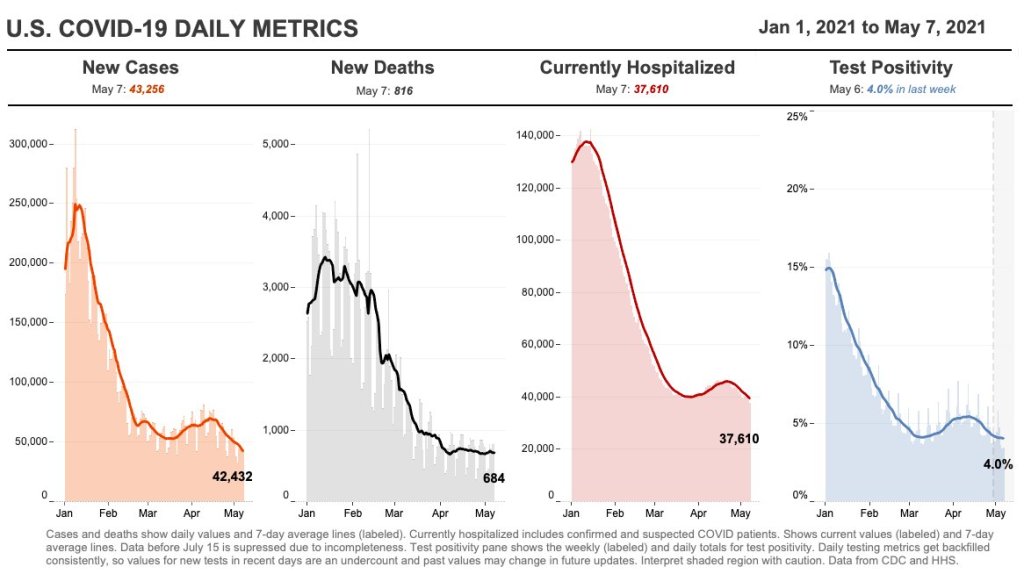
    When you add all this up, it’s no surprise that the most recent variant data on the CDC’s COVID Data Tracker are as of April 10, almost four weeks ago. I’m focusing on this process today because I believe the data lag is worth emphasizing. When you see a news report about B.1.1.7 or another variant, remember that the data took several weeks to get from test sample to newspaper.

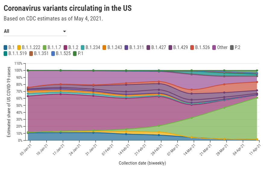
    In other words, when the CDC tells us that B.1.1.7 now makes up about 60% of new cases in the U.S., remember that this number is a snapshot from a month ago. The true number as of today, May 9, is likely far higher.

    My interview with Will Lee inspired me to look at lag times for other common variant data sources. Let’s compare:

    • CDC’s Variant Proportions page, data from the national genomic surveillance program: Lag of 2-4 weeks, depending on how far away one is from an update when checking the page. (The CDC updates this page every two weeks.)
    • Helix’s Surveillance Dashboard, data from the company’s testing sites: Lag of 3-4 weeks. As of May 8, Helix is reporting B.1.1.7 sequence data as of April 15 and SGTF data as of late April. (SGTF, or S gene target failure, is a coronavirus mutation which usually indicates that a case is B.1.1.7-caused.)
    • Nextstrain dashboard, data from GISAID: Lag of 1-2 weeks. When I looked at Nextstrain’s coronavirus page yesterday, the most recent available sample sequences were collected on May 1 and the global variant frequencies chart ended at April 27.
    • CoVariants dashboard, data from Nextstrain/GISAID: Lag of 2-4 weeks, depending on the country. As of May 8, CoVariants reports data from the week of April 19 for some countries with more robust sequencing programs (U.S., U.K., etc.) and data from the week of April 5 for others.

    Nextstrain and CoVariants, both of which are powered by the public sequence repository GISAID, have more recent data than the CDC—likely because academic labs can submit sequences to GISAID without waiting on public health departments. Helix has a lag similar to the CDC’s because its partnerships require the company to submit sequences to public health departments before releasing the information publicly. Some state public health departments report variant data of their own, but this is often done in press releases rather than regular dashboard updates.

    Now, bearing in mind that the variant data are all weeks old, what are the most recent variant numbers for the U.S.? And why should we be worried about these variants?

    Here’s a status check on the major variants I’m watching:

    • B.1.1.7 (first identified in the U.K.): Causing about 60% of cases nationwide as of April 10. Among the states where the CDC reports variant data, it’s most prevalent in Tennessee (74%), Michigan (71%), Minnesota (68%), Georgia (65%), and Florida (63%). This variant is concerning because it spreads a lot more easily than older coronavirus variants; estimates range from 40% to 70% more transmissible.
    • B.1.526 (first identified in New York City): Causing about 12% of cases nationwide as of April 10. This variant is also likely more transmissible, but a recent CDC report suggests that it does not lead to more severe disease or increased risk for vaccine breakthrough cases. B.1.526 has yet to be classified nationally as a variant of concern, so the CDC isn’t publishing state-by-state data for it. (But if you live in NYC, check out this Gothamist article for ZIP code-level prevalence data.)
    • B.1.427/B.1.429 (first identified in California): Causing about 6% of cases nationwide as of April 10. I suspect the pair may be getting outcompeted by B.1.1.7, as it was representing closer to 10% of cases in a previous CDC reporting period—it’s more transmissible than the wildtype coronavirus, but not as transmissible as B.1.1.7 . This variant pair is most prevalent in California (38%), Arizona (28%), and Colorado (24%).
    • P.1 (first identified in Brazil): Causing about 4% of cases nationwide as of April 10. This variant has been tied to surges in Brazil and other South American countries; it’s more transmissible, associated with a higher death rate, and can reinfect patients who already recovered from COVID-19. While it currently represents a fairly small share of U.S. cases, computational biologist Trevor Bedford recently pointed out that P.1. “has been undergoing more rapid logistic growth in frequency” compared to other variants.
    • B.1.351 (first identified in South Africa): Causing about 1% of cases nationwide as of April 10. Soon after it was identified last December, the COVID-19 vaccines were shown to be less effective against this variant. But “less effective,” for the mRNA vaccines, is still pretty damn effective, as this recent study from Qatar demonstrates.
    • B.1.617 (first identified in India): Not yet represented in CDC data, but it’s been identified in several U.S. states over the course of April and May. This variant is strongly tied to India’s recent surge. While you may see it called a “double variant” because it has mutations at two key coding sequences, B.1.617 doesn’t actually have double the transmission bump or double the severity of older coronavirus variants, as explained here by epidemiologist Katelyn Jetelina.

    It’s also worth emphasizing that genomic sequencing is still not conducted evenly across the country. The CDC releases state-by-state variant prevalence data for states which have submitted more than 300 coronavirus sequences in a four-week period. As of April 10, only half of the states have met this benchmark; many states in the Midwest and South still aren’t represented in the CDC’s data.

    I am considering adding a variant data annotations page to the CDD website, in order to more consistently keep track of all the different info sources on these lineages. Would you use this page? What information would you like to see there? Shoot me an email (betsy@coviddatadispatch.com) or leave a comment here on the website to let me know.

    More variant reporting

    • National numbers, May 9

      National numbers, May 9

      In the past week (May 1 through 6), the U.S. reported about 321,000 new cases, according to the CDC. This amounts to:

      • An average of 46,000 new cases each day
      • 98 total new cases for every 100,000 Americans
      • 13% fewer new cases than last week (April 24-30)
      Nationwide COVID-19 metrics as of May 7, sourcing data from the CDC and HHS. Posted on Twitter by Conor Kelly.

      Last week, America also saw:

      • 32,500 new COVID-19 patients admitted to hospitals (10 for every 100,000 people)
      • 4,600 new COVID-19 deaths (1.4 for every 100,000 people)
      • 59.6% of new cases in the country now B.1.1.7-caused (as of April 10)
      • An average of 2.0 million vaccinations per day (per Bloomberg)

      The rate of new cases continues to drop: this is the first time we’ve seen an average under 50,000 daily cases since early October, 2020. Nationally, fewer than one in one thousand Americans was diagnosed with COVID-19 last week. Still, even after a couple of weeks of declines, case rates in Michigan and other Northeastern and Midwestern states remain at a concerning level: over 100 new cases per 100,000 people. 

      Hospitalization and death numbers have remained fairly constant for the last month. Between 4,000 and 5,000 new COVID-19 patients are admitted to the hospital each day; as I discussed in this recent story for Science News, younger patients (under age 50) are making up a larger share of those hospitalized than this age group did in earlier periods of the pandemic.

      The demographic change is, of course, thanks to vaccination. While about 43% of American adults are now fully vaccinated, an impressive 71% of seniors (over age 65) are fully vaccinated—and 84% of seniors have received at least one dose, as of May 8. Still, we have many shots in arms to go before reaching President Biden’s new goal: one dose for at least 70% of Americans by July 4.

      A recent update to the Kaiser Family Foundation’s COVID-19 Vaccine Monitor shows how vaccine supply/demand tension is playing out across the country. Some states in the South and West with lower vaccinated shares of their populations are also administering new first doses at lower rates. In Mississippi, for example, only 41% of the population has received a first dose and the state is administering new first doses at a daily rate of 136 per 100,000. Overall, the U.S. is administering 2 million doses per day, way down from last month’s 3+ million peak.

      This past Wednesday, the Biden administration announced its support of waiving intellectual property rights for COVID-19 vaccines. The announcement garnered a lot of enthusiasm in the public health community, especially as cases continue to surge in India, other parts of Asia, and South America. But a lot of negotiations remain until vaccine technology can actually be shared with the world; if you’re looking for a detailed rundown, I recommend this issue of Geneva Health Files, a newsletter run by my former CUNY classmate Priti Patnaik.

    • COVID source shoutout: Unique vaccine metrics

      COVID source shoutout: Unique vaccine metrics

      Most states report some variation on the same COVID-19 vaccination metrics: doses allocated, doses administered, state residents who’ve been partially and fully vaccinated, and so on. But some states go beyond those basics.

      This week, I’m showing some appreciation for:

      • Washington D.C.: Reports numbers of District residents who have stuck to their second dose appointments. The dashboard’s “Adherence” tab includes those who are fully vaccinated, waiting on their second dose appointment, or more than a week overdue for that second dose appointment—both District-wide and by ward.
      • Idaho: Reports detailed data on state residents who have pre-registered for appointments. On the “Pre-registered residents” tab, you can see how many people have claimed their pre-registered appointments, as well as breakdowns of the pre-registered residents by county, age, and medical risk level.
      • Illinois: Reports both a count of unusable vaccine doses and information on vaccine breakthrough cases. The “unusable” vaccine doses count includes doses that have been discarded, dropped, or had some other issue in the storage and handling process. For vaccine breakthroughs, Illinois reports total patients hospitalized and died due to COVID-19 after vaccination.
      • New Hampshire: Reports counts of vaccine doses distributed and administered by individual vaccination sites, such as hospitals and public health networks. (New Hampshire includes vaccination data once a week in its COVID-19 news reports, usually on Thursdays. The state figures differ significantly from CDC-reported numbers, for as-yet-undetermined reasons.)

      As always, you can find the CDD’s full set of annotations on national and state vaccine data sources here.

    • Featured sources, May 2

      • AHCJ resource on COVID-19 vaccine results: The Association for Health Care Journalists has added a section to its Medical Studies repository for studies on how well COVID-19 vaccines protect against infection. Tara Haelle, AHCJ’s medical core topic leader, compiled the studies; “The list is not necessarily exhaustive, but it includes the studies I was able to track down so far,” she writes in a blog post about this update.
      • Colleges requiring COVID-19 vaccinations (Chronicle): A growing number of colleges and universities are aiming to protect their students, professors, and staff by requiring COVID-19 vaccinations for those coming to campus next fall. The Chronicle of Higher Education has identified 190 such institutions as of April 30, and is continually updating its list. (Note: You need to sign up with a free account to view the page.)
      • Post-COVID Care Centers: Post-COVID Care Centers, or PCCCs, are clinics where long COVID patients can receive treatment. They’re staffed by a growing group of multidisciplinary doctors and medical researchers seeking to understand this prolonged condition. The long COVID advocacy network Survivor Corps has compiled this database of PCCCs by state; 17 out of 50 states don’t yet have any such centers. (H/t Chelsea Cirruzzo, who has a great Twitter thread covering the recent House Energy & Commerce health committee hearing on long COVID.)
      • Excess deaths in the U.S. (Kieran Healy): Kieran Healy, sociology professor at Duke University, recently updated his chart gallery on excess deaths in the U.S. during 2020, using CDC data. All states saw significantly higher death rates in 2020 compared to 2015-2019 (except for North Carolina, which has incomplete data due to reporting delays). New York City has the highest death rate by far at over 30%.

    • HHS makes it easier to compare hospitalizations by age

      HHS makes it easier to compare hospitalizations by age

      Since mid-December, the Department of Health and Human Services has published a dataset on how the pandemic is impacting individual hospitals across the country. (You can read the CDD’s detailed description of that dataset here.) One of the most useful—and, in my opinion, most under-utilized—aspects of this facility dataset is that it provides COVID-19 hospital admissions broken out by age, allowing data users to discern which age groups are getting hardest hit by severe COVID-19 cases in different parts of the country.

      This week, the HHS made it much easier to do that analysis. The agency added hospital admissions by age to its state-level hospitalization dataset. Now, if you want to see a patient breakdown for your state, you can simply look at the state-level info already compiled by HHS data experts, rather than summing up numbers from the facility-level info yourself.

      Besides that convenience factor, there are two big advantages of the state-level info:

      • The state-level dataset is updated daily, while the facility-level dataset is updated weekly. More frequent data updates allow for more specific time series analysis.
      • Low patient numbers aren’t suppressed. In the facility-level dataset, patient numbers between 1 and 4 are suppressed with an error value (-999999) to protect patient privacy. In the age data, this happens at a lot of facilities, so it’s impossible for an outside data user to calculate accurate totals for a given city, county, or state. On the other hand, with HHS experts doing the aggregation in the state-level dataset, no values need to be obscured—basically, these state-level figures are much more accurate.

      The age groups in the state-level dataset match those available in the facility-level dataset: pediatric COVID-19 patients, patients age 18-19, patients in ten-year age ranges from 20 to 79, and patients age 80 or older. HHS also splits the patient counts into those who have confirmed COVID-19 cases (meaning their diagnosis is verified by a PCR test) and those who have suspected cases (meaning the patients have COVID-19 symptoms or a positive result on a non-PCR test.)

      You can find these new data in two places:

      Also, Conor Kelly, COVID Tracking Project volunteer and COVID-19 visualizer extraordinaire, has added these new data to his COVID-19 Tableau dashboard. (See “Hosp. Admissions Over Time,” then “Admissions by Age.”) Highly recommend checking out that dashboard and exploring the trends for your state.

      (Finally, it is possible I’m a little annoyed that the HHS made this lovely update immediately after I turned in an assignment in which I did this analysis the long way, with the facility-level dataset. Look out for that story early next week.)

      Related posts

      • National numbers, May 2

        National numbers, May 2

        In the past week (April 24 through 30), the U.S. reported about 368,000 new cases, according to the CDC. This amounts to:

        • An average of 53,000 new cases each day
        • 112 total new cases for every 100,000 Americans
        • 1 in 893 Americans getting diagnosed with COVID-19 in the past week
        • 16% fewer new cases than last week (April 17-23)
        Nationwide COVID-19 metrics as of April 30, sourcing data from the CDC and HHS. Posted on Twitter by Conor Kelly.

        Last week, America also saw:

        • 35,400 new COVID-19 patients admitted to hospitals (11 for every 100,000 people)
        • 4,400 new COVID-19 deaths (1.3 for every 100,000 people)
        • 59.2% of new cases in the country now B.1.1.7-caused (as of April 10)
        • An average of 2.55 million vaccinations per day (per Bloomberg)

        New cases are down for the second week in a row—good news after the 70,000-plus peak of mid-April. Still, 50,000-plus cases in a day is no good place to plateau, new hospital admissions remain over 5,000 a day, and vaccinations are slowing: the U.S. is now averaging about 2.6 million shots a day, down from 3.4 million a couple of weeks ago.

        As we discussed last week, the U.S. vaccination campaign has entered a phase in which supply is higher than demand. Even with Johnson & Johnson now back on the market, many of the people who were desperate to get their shots have already secured those doses, leaving public health experts and local leaders to figure out how to both lower access barriers and alleviate concerns in less vaccine-confident communities.

        The extra supply has enabled U.S. officials to say they can spare some doses that won’t be used here: 60 million AstraZeneca doses will go to India and other countries, after they undergo FDA review. Still, some experts are arguing that the U.S. could do far more by waiving patents for the COVID-19 vaccines—a move that Brazil’s senate just voted to make for its own country’s products on Friday. 

        There is one good piece of vaccine news this week, though: several states are closing their vaccine equity gaps, according to Bloomberg’s tracker. White vaccination rates are slowing more drastically than rates in minority populations, allowing those communities to catch up. “Since early February, Alabama, Louisiana, Maryland, Mississippi and North Carolina have narrowed their Black vaccination gaps most,” Bloomberg’s team reports.

        Meanwhile, the coronavirus variants just keep spreading. The CDC updated its variant proportions data this week, reporting that B.1.1.7 is now causing a clear majority of COVID-19 cases in the country (59%). Michigan, Minnesota, and Tennessee have B.1.1.7 proportions closer to 70%. B.1.1.7 also appears to be outcompeting the California variants (B.1.427/B.1.429) in parts of the West where those variants had previously dominated. Still, as we keep emphasizing, these data are several weeks old; this week’s CDC update includes figures as of April 10, and the true B.1.1.7 numbers are likely higher.

        Stay safe out there, readers, and help your communities get vaccinated.

      • COVID source shout-out: CDC’s vaccine blue

        COVID source shout-out: CDC’s vaccine blue

        As anyone who follows me on Twitter could likely tell you, I love to make fun of the CDC’s vaccination dashboard. The agency uses the color blue like it’s going out of style, with heatmap-style charts that range from teal to a dark, indigo shade for states that have administered the most vaccine doses relative to their populations.

        I have no problem with the color blue. But the CDC doesn’t always update its color categories in time with increasing vaccination rates, which can lead to charts like this:

        Or this:

        This week, the agency’s dedication to blue got even more intense, with this graphic shared in the White House COVID-19 briefing on Friday:

        Much as I love to make fun, though, I have to admit that I do love the vaccine blue. Or, more accurately, I love what the blue represents: a darker shade means more people getting vaccinated, more people protecting themselves and their communities from the coronavirus.

        Dr. Walensky tapped into this sentiment during Friday’s briefing, when she said: “Now that everyone is eligible to receive a vaccine, please help turn your county toward more protection and a darker shade of blue. The healthier our families are, the healthier we will be as a nation.”

        Dark blue! More vaccines! Let’s go! (Now, can we send some of our extra doses to India, please?)

      • Featured sources, April 25

        • NYT Prisons and Jails COVID-19 counts: This week, the New York Times published data from the newsroom’s effort tracking COVID-19 cases and deaths in U.S. prisons and jails. The data include both inmates and correctional officers, covering over 2,800 facilities. You can read more about the dataset in this Twitter thread.
        • RTI COVID-19 Data Insights Tool: This new data tool from RTI International provides county-level COVID-19 insights. The tool uses publicly available case data from Johns Hopkins and other sources to estimate infection risk, share of the population with some degree of immunity, and other metrics. You need to provide a name and email in order to access the tool.

      • The CDD was profiled by a Greek media lab

        The Incubator for Media Education and Development, or iMedD, is a nonprofit based in Athens, Greece that supports new practices, credibility, and transparency in international journalism. I was lucky enough to meet Kelly Kiki, a journalist and project manager at iMedD’s content production arm, at the NICAR conference earlier this year.

        Kelly has spent much of the past year compiling and reporting on Greek COVID-19 data; we found a lot of common ground in the challenges we have both faced, from discrepancies in regional numbers to a lack of data on cases in schools.

        After an international Zoom call and many emails, Kelly wrote a profile of my work at the COVID-19 Data Dispatch. The profile was published on iMedD Lab’s site earlier this week—you can read it in English or in Greek!

        The profile touches on why I started the CDD, how I compile each issue, and some of my thoughts on major COVID-19 data problems in the U.S.:

        Asked about the quality of pandemic data in the US at both federal and state level, Ladyzhets tells us that what she perceives as one of the biggest problems is the fact that “in this country, we are not actually dealing with one singular, standardized system. We’re instead dealing with 56 smaller systems (50 states and 6 territories). Each system has its own rules, its own reporting practices, its own data definitions. All the systems have been underfunded for decades and were given very little guidance from the federal government… You really see this lack of leadership and consistency everywhere, from the fact that some states reported their tests in units of specimens while others reported in units of people, to the fact that two states are still not reporting race and ethnicity data for their vaccinated residents, even now, four months into the vaccination effort”.

      • Community Profile Reports now have vaccination data

        Community Profile Reports now have vaccination data

        You can now get vaccination numbers for U.S. states, counties, and metropolitan areas in an easily downloadable format: the Community Profile Reports published daily by the Department of Health and Human Services (HHS). These reports are basically the HHS’s one-stop shop for COVID-19 data, including information on cases, deaths, PCR tests, hospitalizations—and now, vaccines. (Read more about the reports here.)

        For counties and metro areas, the reports just include numbers and percentages of people who have been fully vaccinated, reported for the overall population and the regions’ seniors (age 65+). For states, the reports include more comprehensive information that matches the data available at the CDC’s COVID Data Tracker.

        I visualized the county-level data, including both the overall and 65+ rates. I think this chart demonstrates how valuable it is for the public to have easy access to these data: you can see much more specific patterns reflecting which communities are ahead on vaccination and which still need to catch up.

        A COVID Tracking Project friend alerted me to this data news last Monday, April 19. When I dug back into the past couple weeks of Community Profile Reports, however, I found that the HHS started including vaccination data in these reports one week earlier, on April 12. As seems to be common for federal data updates, the new information wasn’t announced in press briefings or other standard lines of communication.

        Next, I would love to see the CDC make more granular demographic data available so that we can analyze these patterns with an equity lens. State-level or county-level vaccination rates by race and ethnicity would be huge.

        As a reminder, you can find the CDD’s annotations on all major U.S. national and state vaccine data sources here.

        More vaccine coverage

        • Sources and updates, November 12
          Sources and updates for the week of November 12 include new vaccination data, a rapid test receiving FDA approval, treatment guidelines, and more.
        • How is the CDC tracking the latest round of COVID-19 vaccines?
          Following the end of the federal public health emergency in May, the CDC has lost its authority to collect vaccination data from all state and local health agencies that keep immunization records. As a result, the CDC is no longer providing comprehensive vaccination numbers on its COVID-19 dashboards. But we still have some information about this year’s vaccination campaign, thanks to continued CDC efforts as well as reporting by other health agencies and research organizations.
        • Sources and updates, October 8
          Sources and updates for the week of October 8 include new papers about booster shot uptake, at-home tests, and Long COVID symptoms.
        • COVID source shout-out: Novavax’s booster is now available
          This week, the FDA authorized Novavax’s updated COVID-19 vaccine. Here’s why some people are excited to get Novavax’s vaccine this fall, as opposed to Pfizer’s or Moderna’s.