Author: Betsy Ladyzhets

  • The CDC needs to release state-by-state data on who’s getting vaccinated

    The CDC needs to release state-by-state data on who’s getting vaccinated

    For months, I’ve been calling on the CDC to release state-by-state demographic data on who is getting vaccinated. While the vast majority of states report this information themselves, the state data are completely unstandardized—making it difficult to perform comprehensive analyses or compare one state to another.

    “The vaccine data that individual states are publishing replicate the patchwork nature of the other state-level COVID-19 data our teams have been compiling,” COVID Tracking Project leaders Alice Goldfarb and Erin Kissane wrote in The Atlantic in January.

    While many more states are reporting vaccination demographics now than in January—Montana and Wyoming are the only two states that now fail to report vaccinations by race—the data continue to be patchwork and hard to analyze.

    Bloomberg has devoted a small team to analyzing and presenting these data in the publication’s U.S. Vaccine Demographics Tracker. But Bloomberg isn’t making their underlying data public, so other journalists and researchers are unable to build on this work. And really, it shouldn’t be on journalists to standardize from a fragmented state-by-state landscape—it should be the work of the CDC.

    That’s why I was thrilled when, this week, we finally got that data from the CDC. Well… sort-of.

    A team from KHN received CDC state-by-state demographic vaccination data via a public records request. This team—which includes Hannah Recht, Rachana Pradhan, and Lauren Weber—analyzed the CDC’s data and made their work public on GitHub.

    The data indicate that, despite promises from the White House to prioritize vulnerable communities in the vaccination campaign, a lot of inequities persist: “KHN’s analysis shows that only 22% of Black Americans have gotten a shot, and Black rates still trail those of whites in almost every state.”

    !function(){“use strict”;window.addEventListener(“message”,(function(a){if(void 0!==a.data[“datawrapper-height”])for(var e in a.data[“datawrapper-height”]){var t=document.getElementById(“datawrapper-chart-“+e)||document.querySelector(“iframe[src*=’”+e+”‘]”);t&&(t.style.height=a.data[“datawrapper-height”][e]+”px”)}}))}();

    In some states, white residents have been vaccinated at almost twice the rate of Black residents. In Iowa, for example, 15% of the Black population has received at least one dose—compared with 37% of the white population. Other states with high disparities include Florida, New Hampshire, Maine, Wisconsin, New Jersey, New York, Hawaii, and Connecticut.

    Hispanic/Latino vaccination rates also lag behind the rates for white residents in some states, but the disparities are not as drastic as those for the Black population. Nationwide, 22% of Black Americans have received at least one dose, compared to 33% of white Americans.

    Both Native Americans and Asian Americans have higher vaccination rates than the white population. Many tribes, in particular, have made dedicated efforts to promote vaccination.

    And another hopeful caveat: vaccination rates for minorities have improved in recent weeks as the rate for white Americans goes down. In the last two weeks, about half of first doses administered in the U.S. have gone to people of color. This includes about 24% of doses going to Hispanic/Latino Americans, 10% going to Black Americans, and 8% going to Asian Americans.

    The day after KHN’s analysis was published, Victoria Knight (another KHN reporter) asked CDC Director Dr. Rochelle Walensky whether the agency would add state-level race and ethnicity vaccination data to its dashboard.

    “We have been updating our website,” Dr. Walensky said in response. “I can’t say that it’s daily; I believe that it’s weekly.”

    And yet as of Sunday morning, May 23, state-by-state demographic data are nowhere to be found on the CDC’s site.

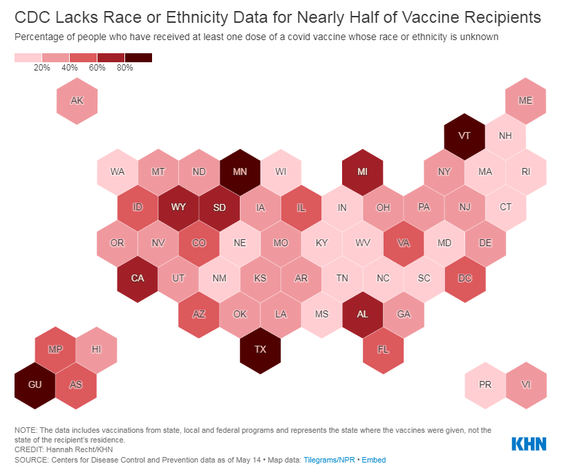
    Knight also asked what the CDC is doing to address the high number of vaccinations for which demographic details are unknown. Race/ethnicity data are missing for about 44% of vaccinated Americans, meaning that true disparities may be even starker.

    !function(){“use strict”;window.addEventListener(“message”,(function(a){if(void 0!==a.data[“datawrapper-height”])for(var e in a.data[“datawrapper-height”]){var t=document.getElementById(“datawrapper-chart-“+e)||document.querySelector(“iframe[src*=’”+e+”‘]”);t&&(t.style.height=a.data[“datawrapper-height”][e]+”px”)}}))}();

    In some states, that unknown percentage is much higher than 44%. Eight states “either refuse to provide race and ethnicity details to the CDC or are missing that information for more than 60% of people vaccinated,” according to KHN. These states are excluded from KHN’s analysis as a result: they are Alabama, California, Michigan, Minnesota, South Dakota, Texas, Vermont and Wyoming.

    Dr. Walensky told reporters the CDC is working with state and local public health departments to improve demographic reporting, but didn’t provide specifics.

    In order to continue improving vaccination rates for minority communities, the CDC needs to actually make all of the agency’s data public. If state-by-state demographic data were easily available, researchers and reporters like me could more easily identify both the success stories and the disappointments—and help the states that are lagging catch up. 

    As Hannah Recht put it on Twitter: “we should not have to keep FOIAing for CDC state-level data that they could just put online if they wanted to.”

    More vaccine reporting

    • Sources and updates, November 12
      Sources and updates for the week of November 12 include new vaccination data, a rapid test receiving FDA approval, treatment guidelines, and more.
    • How is the CDC tracking the latest round of COVID-19 vaccines?
      Following the end of the federal public health emergency in May, the CDC has lost its authority to collect vaccination data from all state and local health agencies that keep immunization records. As a result, the CDC is no longer providing comprehensive vaccination numbers on its COVID-19 dashboards. But we still have some information about this year’s vaccination campaign, thanks to continued CDC efforts as well as reporting by other health agencies and research organizations.
    • Sources and updates, October 8
      Sources and updates for the week of October 8 include new papers about booster shot uptake, at-home tests, and Long COVID symptoms.
    • COVID source shout-out: Novavax’s booster is now available
      This week, the FDA authorized Novavax’s updated COVID-19 vaccine. Here’s why some people are excited to get Novavax’s vaccine this fall, as opposed to Pfizer’s or Moderna’s.
    • COVID-19 vaccine issues: Stories from COVID-19 Data Dispatch readers across the U.S.
      Last week, I asked you, COVID-19 Data Dispatch readers, to send me your stories of challenges you experienced when trying to get this fall’s COVID-19 vaccines. I received 35 responses from readers across the country, demonstrating issues with insurance coverage, pharmacy logistics, and more.
  • How violence in Israel and Palestine is impacting COVID-19 rates

    How violence in Israel and Palestine is impacting COVID-19 rates

    As many Americans who lived through wildfire season, hurricane season, or the Texas winter storm know well: it’s hard to protect yourself in a pandemic when you’re dealing with another simultaneous disaster.

    And it is especially hard to protect yourself when you live in a region that’s cut off from resources and medical expertise—as is the case for people in Gaza and other Palestinian territories.

    In the past couple of weeks, violence in this region has shut down hospitals and prevented vaccine deliveries. Unvaccinated people have crowded into shelters in Gaza, while all testing and vaccination efforts have stalled.

    Gaza has also lost critical medical leadership in the recent violence: two senior doctors at  Al-Shifa Hospital, the largest hospital in the Gaza Strip, were killed in recent Israeli airstrikes. An early-morning attack on the al-Wehda district last Sunday killed Dr. Ayman Abu al-Ouf, head of internal medicine at the hospital, and Dr. Mooein Ahmad al-Aloul, a psychiatric neurologist, along with at least 30 others.

    Al Jazeera reports that “medical personnel remain in short supply” throughout the Palestinian territories, leaving people to instead rely on international aid groups for medical care. And constant air raids have limited medical care even further. One Israeli attack blocked the main road leading to Al-Shifa hospital, for example, and a Doctors Without Borders clinic was hit last weekend.

    “People are not daring to visit health facilities. We are fearing this will have a major negative impact,” Sacha Bootsma, an official from the World Health Organization, told the New York Times.

    About 5% of Palestinians have been vaccinated as of May 20. Most of those doses have come from COVAX, the global vaccine alliance, and shipments have faced logistical challenges in getting to Gaza through an Israeli blockade. The United Nations released a statement in January calling on Israel to “ensure swift and equitable access to COVID-19 vaccines for the Palestinian people under occupation,” but Israeli leaders have denied this responsibility.

    Israel, meanwhile, is largely protected against a COVID-19 surge. The country has been a global leader in vaccinations; by the end of February, over half of the population had received at least one dose. Now, almost two-thirds of the population are vaccinated.

    Cases in Israel have remained at low levels throughout the violence in recent weeks thanks to the vaccines. The country has seen fewer than 20 new cases per million people a day since mid-April. Palestine, meanwhile, faced a surge during March and April, with the territories’ highest COVID-19 case numbers yet.

    While reported case numbers in Palestine have dropped in recent weeks, this is more likely due to a lack of testing than an actual drop in infections. And the situation is not improving. Though Israeli and Palestinian forces have now formally reached a cease-fire, Israeli police have continued to attack Palestinians—including an attack against worshippers at al-Aqsa Mosque.

    Continued violence and lack of medical care for Palestinians may mean that the pandemic continues here long after it ends for Israel. As is true of all COVID-19 outbreaks, continued transmission may breed coronavirus variants that threaten the rest of the world.

    More international reporting

    • National numbers, May 23

      National numbers, May 23

      In the past week (May 15 through 21), the U.S. reported about 195,000 new cases, according to the CDC. This amounts to:

      • An average of 28,000 new cases each day
      • 59 total new cases for every 100,000 Americans
      • 19% fewer new cases than last week (May 8-14)
      Nationwide COVID-19 metrics as of May 21, sourcing data from the CDC and HHS. Posted on Twitter by Conor Kelly.

      Last week, America also saw:

      • 24,000 new COVID-19 patients admitted to hospitals (7.3 for every 100,000 people)
      • 3,500 new COVID-19 deaths (1.1 for every 100,000 people)
      • 66% of new cases in the country now B.1.1.7-caused (as of April 24)
      • An average of 1.9 million vaccinations per day (per Bloomberg)

      I’m starting to feel like a broken record in these updates—but in a good way. U.S. cases continue falling, with our seven-day average now at a level not seen since May 2020.

      Trends in COVID-19 deaths usually echo trends in cases with about a month’s delay. After several weeks of falling cases, the U.S. is now seeing fewer than 500 new COVID-19 deaths a day. This week, 24 states averaged fewer than one new death a day for every 100,000 residents.

      These states include California, Arizona, the Dakotas, and other states that made headlines in past months for their concerning outbreaks—yet another indication that the vaccines are working. Only three states (Michigan, Pennsylvania, and Alaska) saw over two deaths a day for every 100,000 people.

      Vaccinations continue at the slow, steady, 1.5-to-2 million a day pace we’ve seen for the past couple of weeks. About 61% of adults have had at least one dose, and almost half of adults are now fully vaccinated. Meanwhile, many kids in the 12 to 15 age range are taking advantage of their new eligibility: about 1.6 million have received at least one dose so far. 16% of the first doses administered in the last two weeks went to this population.

      Variant numbers haven’t been updated since last week. B.1.1.7 continues to be the dominant variant in the U.S., and other concerning variants (such as B.1.617 from India) continue to spread. But accumulating evidence suggests that the vaccines work well against all variants. Just yesterday, researchers in the U.K. reported 81% effectiveness against B.1.617, according to the Financial Times.

    • Source updates, May 16

      Two more important CDC data updates for this week:

      • Vaccine demographics, for the past 14 days and over time: This week, the CDC added a new category to its Vaccine Demographics page. Previously, the page allowed users to compare overall first dose and fully vaccinated rates for different race/ethnicity, age, and sex groups; now, you can also make those comparisons specifically for vaccinations in the last two weeks. For a time series view, check out the Vaccine Demographic Trends page, which shows vaccination rates over time—now available for race/ethnicity, sex, and age. The race/ethnicity view clearly shows that White and Asian Americans are getting vaccinated at higher rates than other groups.
      • Variant tracker “Nowcast”: Loyal CDD readers will already know that I love to drag the CDC for reporting their variant data with an enormous lag; often the most recent figures on the agency’s Variant Proportions page are a month old. Well, maybe somebody on their team is reading, because this week, the CDC added a new option to its variant dashboard that addresses this issue. Selecting “Nowcast On” (below the variant color bars) allows you to view prevalence estimates for the current week, in addition to the agency’s most recent week of data collection. A note below the dashboard explains that the “Nowcast” figures are based on modeling estimates that extrapolate from known proportions. For example, B.1.1.7 is known to cause 66% of U.S. cases as of April 24, but the “Nowcast” estimate puts it at 72% of cases as of May 8. This is actually pretty useful, thanks CDC!

    • Pfizer for the whole pfamily (now CDC-verified!)

      Pfizer for the whole pfamily (now CDC-verified!)

      In case you missed it amidst the mask discourse: Pfizer was already the “vaccine for cool people,” but this week, it formally became the vaccine for teens. The FDA announced on Monday that it was expanding the Emergency Use Authorization for this vaccine to include children ages 12 to 15, and the CDC followed this up with an official recommendation on Wednesday.

      As Sarah Braner reported when the Pfizer adolescent trial results were released: “In the trial, no participants who received the vaccine contracted symptomatic COVID-19 out of a total of 2,260 participants, marking an efficacy rate of 100%.” So, this formal endorsement was a pretty foregone conclusion, but it’s still good news for the 17 million children ages 12 to 15 in the country.

      Here are a couple more statistics about the 12-15 age group, via the Kaiser Family Foundation:

      • This group accounts for 5% of the U.S. population and 27% of the population under age 16.
      • Nearly half of children in this age group are people of color, including: 25% are Hispanic, 13% are Black, and 5% are Asian.
      • 36% of children in this age group live in a family with incomes below 200% of the Federal Poverty Level.
      Vaccination coverage for the population ages 12 and up, as of May 15. The darker blue a state is, the better its coverage.

      And speaking of adolescent data: on Friday, the CDC diversified its vaccine tracker. In addition to state-by-state views of vaccination coverage for the overall population, adult population, and senior population, the Tracker will now show you vaccination coverage for each state’s population over age 12. Nationwide, 56% of this group has had at least one dose and 44% is fully vaccinated.

      The Vaccinations County View page will show you coverage over age 12 by county, but these data aren’t yet available for easy download in the Community Profile Reports.

      The CDC’s demographic vaccination data, meanwhile, groups adolescents in with (already eligible) 16 to 18-year olds in an under 18 category—so we aren’t yet able to see precisely how many children in this age group are getting vaccinated. This may become a concerning data gap as schools may seek to use 12-15 vaccination rates as an indicator for reopening next fall.

      More vaccine coverage

      • Sources and updates, November 12
        Sources and updates for the week of November 12 include new vaccination data, a rapid test receiving FDA approval, treatment guidelines, and more.
      • How is the CDC tracking the latest round of COVID-19 vaccines?
        Following the end of the federal public health emergency in May, the CDC has lost its authority to collect vaccination data from all state and local health agencies that keep immunization records. As a result, the CDC is no longer providing comprehensive vaccination numbers on its COVID-19 dashboards. But we still have some information about this year’s vaccination campaign, thanks to continued CDC efforts as well as reporting by other health agencies and research organizations.
      • Sources and updates, October 8
        Sources and updates for the week of October 8 include new papers about booster shot uptake, at-home tests, and Long COVID symptoms.
      • COVID source shout-out: Novavax’s booster is now available
        This week, the FDA authorized Novavax’s updated COVID-19 vaccine. Here’s why some people are excited to get Novavax’s vaccine this fall, as opposed to Pfizer’s or Moderna’s.
    • The data behind the CDC’s new mask guidance

      The data behind the CDC’s new mask guidance

      This past Thursday, the CDC announced that, if you are fully vaccinated, the pandemic is basically over for you.

      The announcement surprised everyone—from my parents to COVID-19 scientists—because it appeared to come out of nowhere. Before this week, the CDC’s most recent guidance revisions included an acknowledgment that surface transmission of the coronavirus is very rare and a recommendation that masks might not be necessary outside; both of these conclusions were already well-known in the scientific community. In fact, STAT published an article last week in which Nicholas Florko suggests that the CDC’s COVID-19 messaging has been “overly cautious” and perhaps even “irrelevant for most Americans.”

      So, what led to the announcement on Thursday? The rest of this post will go over the CDC’s evidence for its guidance, taking the epidemiological perspective. Also, as two-thirds of Americans aren’t yet fully vaccinated, I’ll touch on another COVID-19 truism that has garnered some confusion lately: yes, you are significantly safer outside than you are inside.

      CDC graphic on COVID-19 safety, updated with the new mask guidance on Thursday.

      (I need to acknowledge, though, that a. there are certainly outside political and economic forces at play here, and b. the public health perspective on this guidance is far more complicated. For one perspective on the public health side, I recommend this Twitter thread by virologist Angela Rasmussen.)

      Our first category of evidence: the mRNA vaccines work really well. It’s no surprise that the Pfizer and Moderna vaccines are both exceptionally capable of protecting people against the coronavirus, but a couple of recent studies really hammer this home:

      • In this recent study from Israel, the Pfizer vaccine demonstrated 97% effectiveness against symptomatic cases and 86% effectiveness against asymptomatic cases among about 6,700 healthcare workers who were regularly tested for COVID-19.
      • According to this MMWR report from the CDC, the Pfizer and Moderna vaccines were 94% effective in preventing COVID-19 hospitalization for fully vaccinated seniors (over age 65), demonstrating how well the vaccines protect against severe disease. Plus, the vaccines were 64% effective in preventing hospitalization for partially vaccinated seniors.
      • Another MMWR report, released this past Friday, demonstrates that the mRNA vaccines were 94% effective at preventing symptomatic COVID-19 in U.S. healthcare workers. A single shot of Pfizer or Moderna ws 82% effective at preventing symptomatic COVID-19.
      • A study from the Cleveland Clinic, a medical research center based in Cleveland, Ohio, studied COVID-19 cases among its caregivers after vaccines were made available; the Clinic found that a whopping 99.7% of those workers who tested positive for COVID-19 had not been fully vaccinated. Only 0.3% were breakthrough cases. Meanwhile, 99.75% of COVID-19 patients that the Clinic treated during the study’s time frame were not fully vaccinated.
      • According to the CDC’s breakthrough case data, out of about 122 million fully vaccinated Americans, less than 1,400 people have been hospitalized or have died due to COVID-19. That’s 0.001%. (The CDC’s breakthrough reporting focuses on severe outcomes rather than cases, as these cases may be difficult to systematically identify outside of studies.)

      Second evidence category: the vaccines work against variants.

      • It’s important to note here that, when I say “vaccines work,” it’s not an all or nothing situation. A vaccine might protect you against severe COVID-19 disease or death (the primary goal), but not against an asymptomatic case that allows you to transmit the virus to someone else.
      • All the COVID-19 vaccines currently on the market protect us against severe COVID-19 disease and death—whether you’re infected with an older version of the coronavirus or with a variant. 
      • For a couple of the variants, that protection might not be quite as secure. Studies on B.1.351 (the variant first identified in South Africa), P.1 (identified in Brazil), and B.1.617 (identified in India) have all demonstrated lower vaccine effectiveness. But again, lower effectiveness here still means protection for the majority of people who get vaccinated.
      • And one big advantage of mRNA vaccine technology is, the Pfizer and Moderna vaccines may easily be adjusted to protect against particularly concerning variants. Moderna recently reported promising data for two booster shots designed to protect specifically against B.1.351 and P.1.
      • If you’d like a more detailed rundown of the vaccine v. variants battle, check out this article by STAT’s Andrew Joseph.

      Third evidence category: U.S. cases are way down.

      • As I noted in today’s National Numbers post: cases have dropped by 50% in the last month. And beyond that, cases have dropped from a peak of 250,000 new cases per day in January to under 40,000 new cases per day now.
      • During this time frame, most states did not impose lockdowns or other restrictions on the level of what we saw in spring 2020. So, these drops can primarily be attributed to the vaccines.
      • We still do not have much evidence showing how well the vaccines protect against asymptomatic transmission and infection, but the evidence we have so far is promising, as Apoorva Mandavilli explains in the New York Times. (One major study investigating this question in college students is currently underway.)
      • Still, the massive case drops—occurring even as B.1.1.7 and other more contagious variants spread through the country—indicate that the vaccines must be doing some work to stall coronavirus spread from one person to another. This supports the CDC’s argument that vaccinated Americans can take off their masks in public without worrying about spreading a latent coronavirus to someone else.

      Fourth evidence category: outdoor transmission is incredibly low.

      • Earlier this week, the New York Times’ David Leonhardt provided a compelling argument for why, though the CDC said “less than 10%” of COVID-19 transmission occurs outside, the true number is actually much lower. In fact, fewer than 1% (and possibly even fewer than 0.1%) of COVID-19 cases happen due to someone getting infected outside.
      • As I’ve previously reported, there is not a single recorded superspreading event that took place solely outside. This includes the large Black Lives Matter protests last summer. (A few superspreading events have both outdoor and indoor components.)
      • A new study from researchers at Drexel University specifically examined COVID-19 transmission in parks, and found no correlation between the number of people using a park and the number of COVID-19 cases in the surrounding ZIP code. The research suggests that you should feel safe at your local park, even if it seems a bit more crowded and less mask-adherent than it did a few months ago. I spoke to Franco Montalto and Bita Alizadehtazi, two authors on this study, who emphasized that “it’s important to get outside,” take advantage of the green infrastructure in your neighborhood, and feel safe while doing so.

      This evidence brings us to what The Atlantic’s Drew Thompson calls the “Two Commandments of COVID-19”:

      1. COVID-19 is an indoor aerosol disease.

      2. Vaccination protects you; more vaccinations protect everyone.

      Speaking just for myself: I am fully vaccinated, but I fully intend to keep wearing a mask in stores, on the subway, and even outside when I’m in a large crowd of people. This is partially because my state still has a mask mandate in place, but also because there are still a lot of people in my community who aren’t yet vaccinated—and I don’t want to pose a risk to them, no matter how small that risk may be. (In Brooklyn, where I live, 41% of the population has had at least one dose and 33% are fully vaccinated, according to city data.)

      Suffice it to say, the CDC makes recommendations about COVID-19 safety. It doesn’t issue requirements. I made a personal masking decision for myself, based on the community where I live; I hope this article helped you understand the science behind the guidance change so that you can do the same. And if you have questions—my inbox is always open.

      More vaccine coverage

      • Sources and updates, November 12
        Sources and updates for the week of November 12 include new vaccination data, a rapid test receiving FDA approval, treatment guidelines, and more.
      • How is the CDC tracking the latest round of COVID-19 vaccines?
        Following the end of the federal public health emergency in May, the CDC has lost its authority to collect vaccination data from all state and local health agencies that keep immunization records. As a result, the CDC is no longer providing comprehensive vaccination numbers on its COVID-19 dashboards. But we still have some information about this year’s vaccination campaign, thanks to continued CDC efforts as well as reporting by other health agencies and research organizations.
      • Sources and updates, October 8
        Sources and updates for the week of October 8 include new papers about booster shot uptake, at-home tests, and Long COVID symptoms.
      • COVID source shout-out: Novavax’s booster is now available
        This week, the FDA authorized Novavax’s updated COVID-19 vaccine. Here’s why some people are excited to get Novavax’s vaccine this fall, as opposed to Pfizer’s or Moderna’s.
      • COVID-19 vaccine issues: Stories from COVID-19 Data Dispatch readers across the U.S.
        Last week, I asked you, COVID-19 Data Dispatch readers, to send me your stories of challenges you experienced when trying to get this fall’s COVID-19 vaccines. I received 35 responses from readers across the country, demonstrating issues with insurance coverage, pharmacy logistics, and more.
    • National numbers, May 16

      National numbers, May 16

      In the past week (May 8 through 14), the U.S. reported about 248,000 new cases, according to the CDC. This amounts to:

      • An average of 35,000 new cases each day
      • 76 total new cases for every 100,000 Americans
      • 24% fewer new cases than last week (May 1-7)
      Nationwide COVID-19 metrics as of May 14, sourcing data from the CDC and HHS. Posted on Twitter by Conor Kelly.

      Last week, America also saw:

      • 28,300 new COVID-19 patients admitted to hospitals (8.6 for every 100,000 people)
      • 4,100 new COVID-19 deaths (1.3 for every 100,000 people)
      • 66% of new cases in the country now B.1.1.7-caused (as of April 24)
      • An average of 1.9 million vaccinations per day (per Bloomberg)

      COVID-19 case numbers continue to drop this week: the current U.S. average is about 35,000 new cases a day, a 50% drop from where we were a month ago. (We saw 70,000 new daily cases in the week ending April 16.) Daily cases have not been this low since early September, between the summer and fall/winter surges.

      Hospitalizations are also down: about 4,000 new COVID-19 patients were admitted each day this week, compared to about 5,500 a month ago. While this drop is not as dramatic as the drop in cases, it may actually be an indicator that hospitals are admitting and caring for patients with less severe illness—who may not have been admitted in, say, January. Regardless, the more beds a hospital has to spare, the better care it can provide. All states have inpatient bed occupancy rates at 80% or below except for Massachusetss and Rhode Island.

      The CDC updated its variant data this week with figures as of April 24. B.1.1.7 is causing two out of every three COVID-19 cases in the country, according to these data. After B.1.1.7, the most prevalent variant is B.1.526 (14%); this variant, first discovered in NYC, is still classified as a “variant of interest,” so state-by-state data are not available. P.1 also gaining ground: it now causes 5% of U.S. cases, with much higher values in some states (20% of Illinois cases, 11% of Massachusetts cases).

      Though these variants may be worrying, our continued case drop shows that the vaccines are beating them—more on that later. 37% of the overall U.S. population is now fully vaccinated, and 47% has had at least one dose. 

      But some states are doing much better than others. Only 26% of Mississippi’s population is fully vaccinated, compared to almost 50% in Connecticut and Maine. Racial inequities persist as well: Bloomberg reports that only 10 states have vaccinated at least a third of their Black and Hispanic populations, while over 30 states have vaccinated this share of their White and Asian populations.

      As the pace of vaccinations continues to slow (1.9 million per day, as of yesterday), these disparities must be addressed.

    • COVID source shout-out: TUSHY

      COVID source shout-out: TUSHY

      TUSHY is a bidet company. It’s gotten a lot of traction during the pandemic, as Americans suddenly working from home decided to upgrade their bathroom experiences. (This group includes me and my roommates.)

      Now, you might ask: Betsy, why are you featuring a bidet company as a COVID-19 data source? Because a special page on TUSHY’s website is reporting the share of Americans who have been fully vaccinated, with a (NSFW) framing: “Can We Eat Ass Yet?”

      The current answer is no—only 33% of the U.S. population has been fully vaccinated, according to this page. TUSHY staff are updating the page every weekday using CDC data.

      “The idea for “CanWeEatAssYet.com was born when COVID was blowing up in NYC,” says TUSHY’s founder Miki Agrawal. “NYC government sent out a message to all New Yorkers to not eat ass because it could spread COVID… and we wanted to create a funny site a la “IsMercuryInRetrograde.com” with a YES / NO answer specifically for eating ass, because with TUSHY bidet, we support clean ass and wanted to let people know when it was safe to partake in the activity.”

      That bright red “NO” may be switched to “YES” when 70% of the U.S. population has been fully vaccinated, but Agrawal says the team will “keep checking with the CDC regularly” to determine the perfect “ass-eating immunity” threshold. Now that’s creative science communication.

      Editor’s note: This is not sponsored content, I just think the page is really funny—and TUSHY’s marketing team was kind enough to reply to my email on short notice. Also, H/T Garbage Day.

    • Featured sources, May 9

      No new COVID-19 data sources caught my eye this week, so I dug into the archives for a couple of old favorites.

      • Household Pulse Survey by the U.S. Census (featured on 8/16/20): Starting at the end of April 2020, the U.S. Census has run a survey program to collect data on how the COVID-19 pandemic impacted the lives of American residents. The survey results include questions on education, employment, food security, health, and housing. The Census has now conducted three phases of this survey, going through April 2021.
      • Searchable database of federal COVID-19 purchases (featured on 12/13/20): Since March 2020, ProPublica has tracked where federal government spending on the pandemic is going. The database represents $38 billion, 17,734 government contracts, and 8,070 individual vendors as of May 7. Data can be sorted by spending categories, vendor types, and contract sizes.
      • COVID-19 diverse sources (featured on 3/28/21): NPR journalists from the organization’s Source of the Week project have compiled this database of COVID-19 experts from diverse backgrounds. The database is divided into 13 major categories, including virology, disease origin, health policy, racial/ethnic health disparities, and more.
      • HHS celebrity tracker (featured on 11/1/20): In late October, POLITICO’s Dan Diamond released an HHS document called the “PSA Celebrity Tracker,” which health officials were using to determine which of America’s favorite people may be useful in an ad campaign encouraging the nation to be less negative about COVID-19. (Here’s more context from POLITICO on the tracker.)

    • Five more things, May 9

      I couldn’t decide which of these news items to focus on for a short post this week, so I wrote blurbs for all five. This title and format are inspired by Rob Meyer’s Weekly Planet newsletter.

      1. HHS added vaccinations to its facility-level hospitalization dataset: Last week, I discussed the HHS’s addition of COVID-19 patient admissions by age to its state-level hospitalization dataset. This week, the HHS followed that up with new fields in its facility-level dataset, reflecting vaccinations among hospital staff and patients. You can find the dataset here and read more about the new fields in the FAQ here (starting on page 14). It’s crucial to note that these are optional fields, meaning hospitals can submit their other COVID-19 numbers without any vaccination reporting. Only about 3,200 of the total 5,000 facilities in the HHS dataset have opted in—so don’t sum these numbers to draw conclusions about your state or county. Still, this is the most detailed occupational data I’ve seen for the U.S. thus far.
      2. A new IHME analysis suggests the global COVID-19 death toll may be double reported counts: 3.3 million people have died from COVID-19 worldwide as of May 8, according to the World Health Organization. But a new modeling study from the University of Washington’s Institute for Health Metrics and Evaluation (IHME) suggests that the actual death number is 6.9 million. Under-testing and overburdened healthcare systems may contribute to reporting systems missing COVID-19 deaths, though the reasons—and the undercount’s magnitude—are different in each country. In the U.S., IHME estimates about 900,000 deaths, while the CDC counts 562,000. Read STAT’s Helen Branswell for more context on this study.
      3. The NYT published a dangerous misrepresentation of vaccine hesitancy (then quietly corrected it): A New York Times story on herd immunity garnered a lot of attention (and Twitter debate) earlier this week. One specific aspect of the story stuck out to some COVID-19 data experts, though: a U.S. map entitled, “Uneven Willingness to Get Vaccinated Could Affect Herd Immunity.” The map, based on HHS estimates, claims to display vaccine confidence at the county level. But the estimates are really more reflective of state averages, and moreover, the NYT originally double-counted the people who are strongly opposed to vaccines, leading to a map that made the U.S. look much more hesitant than it actually is. Biologist Carl Bergstrom has a thread detailing the issue, including original and corrected versions of the map.
      4. We still need better demographic data: A poignant article in The Atlantic from Ibram  Kendi calls attention to gaps in COVID-19 data collection that continue to loom large, more than a year into the pandemic. The story primarily discusses race and ethnicity data, citing the COVID Racial Data Tracker (which I worked on), but Kendi also highlights other underreported populations. For example: “The only available COVID-19 data on undocumented immigrants come from Immigration and Customs Enforcement detention centers.”
      5. NIH college student trial is having a hard time recruiting: If you, like me, have been curious about how that big NIH trial to study vaccine effectiveness in college students has progressed since it was announced last March, I recommend this story from U.S. News reporter Chelsea Cirruzzo. The study aimed to recruit 12,000 students at a select number of colleges, but because the vaccine rollout has progressed faster than expected, researchers are having a hard time finding not-yet-vaccinated students to enroll. (1,000 are enrolled so far.) Now, students at all higher ed institutions can join.