Author: Betsy Ladyzhets

  • BA.2 FAQ: What you should know about this Omicron offshoot

    BA.2 FAQ: What you should know about this Omicron offshoot

    BA.2 has become the dominant strain in Denmark, one of the countries that sounded the alarm about this Omicron offshoot. Chart via the Pandemic Prevention Institute, posted on Twitter on January 26.

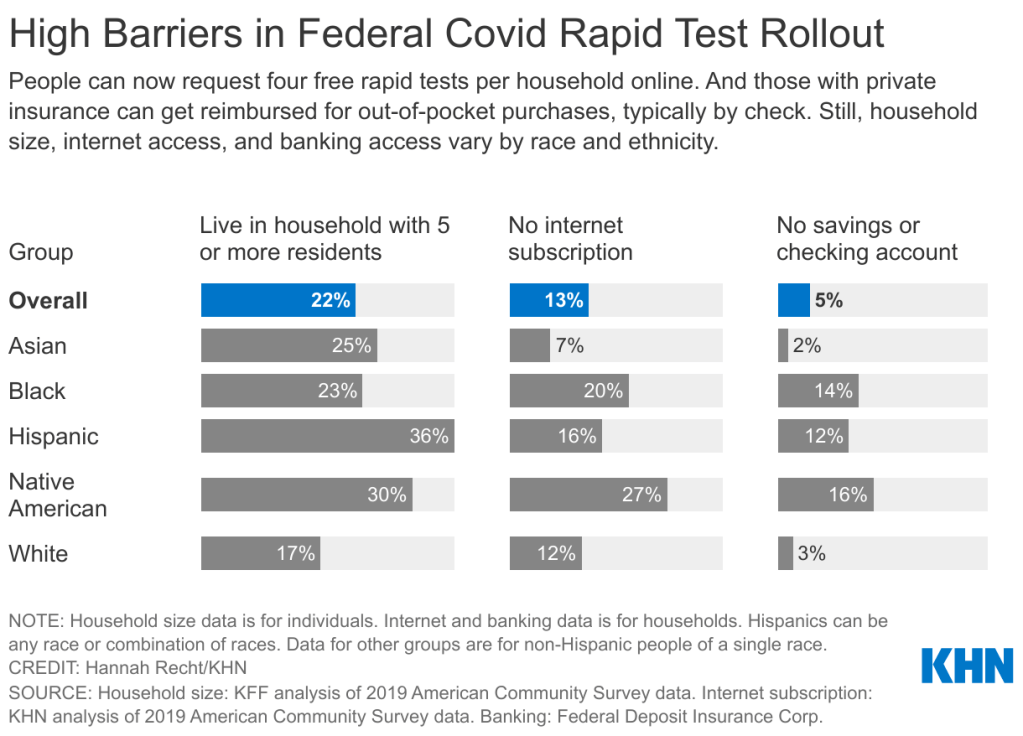
    An offshoot strain of the Omicron variant has been making headlines this week as it spreads rapidly in some European and Asian countries. While the strain, called BA.2 by virologists, has not yet been identified in the U.S. in large numbers, it’s already spreading here, too: scientists have picked it up in wastewater samples in some parts of the country.

    This strain clearly has a growth advantage over the original Omicron strain (also called BA.1), but it’s not cause for major concern at this point. Scientists are working to identify whether BA.2 has a higher capacity for breaking through immunity from past infection or vaccination; so far, early data suggest that it does not significantly differ from BA.1 on this front, though it may have a slight advantage.

    Here’s a brief FAQ on what we know about the strain so far.

    When and where did BA.2 emerge?

    I’ve been careful not to call BA.2 a “new strain” or a “new variant” here because it’s not actually new—at least, it’s not any newer than Omicron BA.1. When South African scientists first sounded the alarm about Omicron in late November 2021, BA.2 was already present among the country’s cases of this variant.

    In fact, a paper from South African scientists describing the Omicron wave in their country, published in Nature in early January, specifies that the earliest specimen of BA.2 was sampled on November 17; the earliest specimen of BA.1 was sampled on November 8. Around the same time, South African scientists also identified a third lineage, called BA.3—this one hasn’t yet become a cause for concern.

    Why are scientists concerned about BA.2?

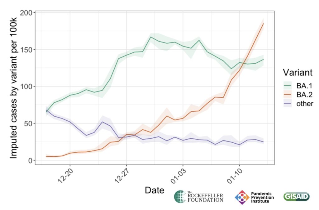
    In the past couple of weeks, epidemiologists have identified that BA.2 is spreading faster in some countries than BA.1, the original Omicron strain. This means BA.2 has what scientists call a “transmission advantage” over BA.1: it is capable of getting from person to person fast enough that it may be able to outcompete BA.1.

    For example, in Denmark, BA.2 became the dominant strain in mid-January, taking over from BA.1. The takeover has coincided with an additional increase in COVID-19 cases in the country after Denmark’s Omicron wave initially appeared to peak a couple of weeks ago—but it’s hard to determine whether this second increase is solely due to BA.2 or also connected to an announcement that Denmark will end its COVID-19 restrictions on February 1.

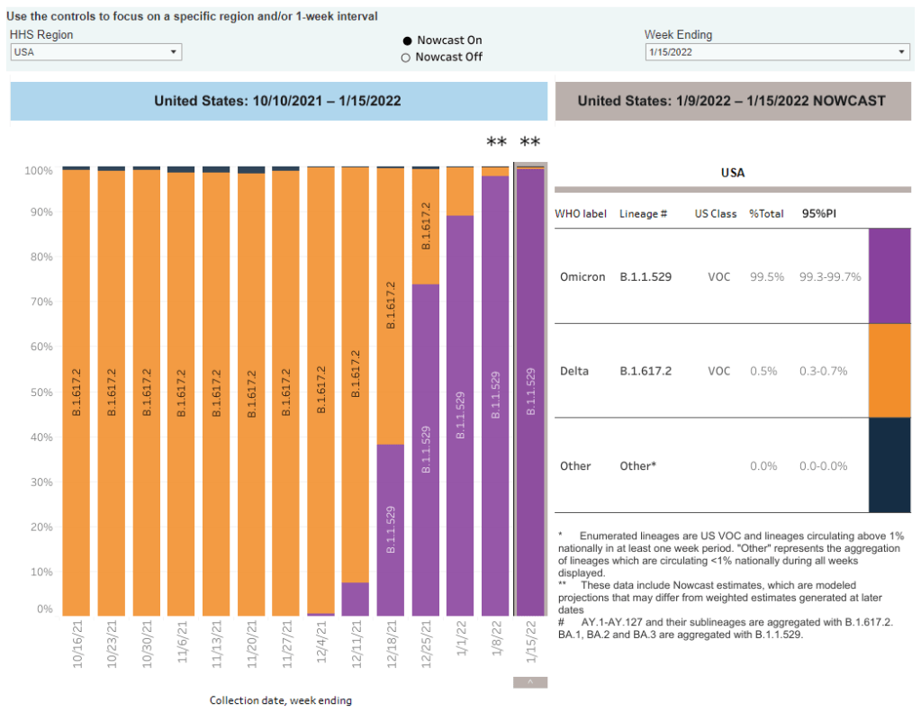
    This past week, the World Health Organization (WHO) announced that investigations into BA.2, including its potential virulence and ability to escape prior immunity, “should be prioritized independently (and comparatively) to BA.1.” The WHO has yet to designate BA.2 as a separate variant of concern from BA.1, however; at the moment, both strains are still included under the Omicron label.

    How does BA.2 compare to BA.1, the original Omicron strain?

    As I’ve explained in previous posts about the variant, Omicron has the most antigenic drift of any coronavirus variant identified thus far—meaning that it’s the most genetically different from the initial Wuhan version of the virus. Omicron BA.1 has about 60 mutations compared to the Wuhan strain, but BA.2 has even more: about 85 mutations, according to a recent Your Epidemiologist post.

    BA.2 is clearly more transmissible than BA.1, as we’ve seen from its rapid spread in countries including Denmark, the U.K., France, the Netherlands, India, and the Philippines. Scientists estimate that “BA.2 may be 30% to 35% more transmissible than BA.1,” STAT News reports.

    The question scientists hope to answer, then, is why BA.2 has this transmission advantage over BA.1. Do BA.2’s additional mutations lend it some adaptation in how it interacts with human cells, enabling faster spread? Or is BA.2 more capable of evading protection from past infection or vaccination compared to BA.1, leading it to cause more reinfections and breakthrough cases?

    While we don’t know the answers to these questions yet, early data are indicating that there’s no major difference in disease severity between BA.1 and BA.2. In other words, BA.2 isn’t more likely to cause severe symptoms.

    “There is no evidence that the BA.2 variant causes more disease, but it must be more contagious,” Danish Health Minister Magnus Heunicke said at a news conference last week, Reuters reported.

    Why do some articles call BA.2 a “stealth variant?”

    You might have seen some headlines referring to BA.2 as a “stealth variant” or a “stealth version of Omicron.” This is because of one major difference between BA.2 and BA.1: while BA.1 can be identified with a PCR test due to a key mutation that’s visible on PCR test results, BA.2 does not have this mutation.

    As a result, BA.2 can be more time-consuming for COVID-19 testing labs to identify: labs need to sequence a sample’s genome to identify this strain rather than simply look out for an indicator on a PCR test. It’s unclear how much of a difference this will make in the U.S.’s ability to track BA.2, however, as many labs across the country are already performing routine full-genome sequencing of coronavirus samples.

    How well do vaccines work against BA.2?

    So far, it seems like there is no significant difference in vaccine protection between BA.1 and BA.2, at least when it comes to severe symptoms—which makes sense, scientists say, given how well vaccines have worked against every major variant to emerge thus far.

    Early findings in this area come from the U.K., which designated BA.2 as a “Variant Under Investigation” (separate from BA.1) about a week and a half ago. This past Friday, the U.K.’s Health Security Agency released a report with information on BA.2, including how it compares to BA.1 or original Omicron.

    Overall, U.K. epidemiologist Meaghan Kall wrote in a Twitter thread summarizing the report, early evidence suggests that “BA.2 is no more immune evasive than Omicron,” though confidence in this statement is low. The report found that, for Brits who had received booster shots, vaccine effectiveness against symptomatic COVID-19 disease was 70% for BA.2 and 63% for BA.1. The confidence intervals on these effectiveness estimates overlapped, indicating that vaccines perform similarly against BA.2 and BA.1.

    When it comes to disease severity, Kall wrote, the U.K. doesn’t have enough data to compare BA.2 and BA.1; early data on this topic (suggesting BA.2 is not more severe) have come from Denmark and India.

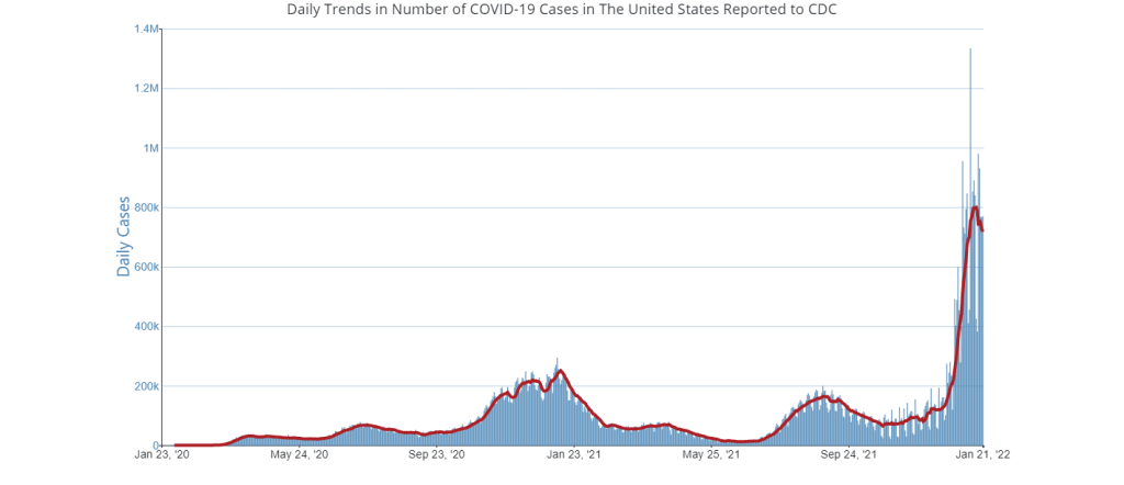
    How will BA.2 impact the U.S.’s COVID-19 trajectory?

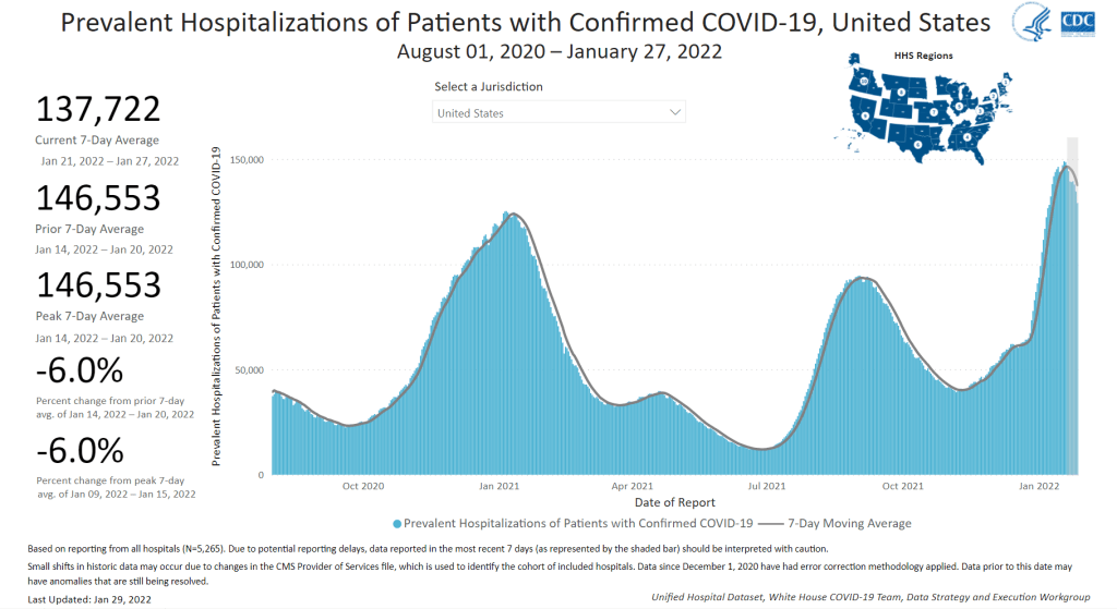
    BA.2 has already outcompeted BA.1 in some parts of Europe and Asia, and epidemiologists expect that countries like the U.K. and the U.S. could also follow this pattern—though it will likely be a longer, slower replacement process compared to the intense way Omicron pushed out Delta. A bigger unknown here is what effect this strain may have on case numbers, hospitalizations, and deaths.

    Countries and regions now passing the peaks of their Omicron BA.1 waves have extremely high levels of population immunity. As a result, people who are fully vaccinated with boosters and/or recently infected with Omicron BA.1 likely will have a lot of immune system protection against BA.2, though we don’t yet have good data on exactly how robust this protection is.

    So, could BA.2 cause the current downturn in U.S. COVID-19 cases to reverse? It’s possible, explains Andrew Joseph in a recent STAT News article. However, thanks to our high immunity levels, a further spike in cases could be “broadly limited to infections” rather than causing major increases in hospitalizations and deaths. In the coming weeks, we’ll get a better sense of how well prior Omicron infections protect against BA.2 and other key information that will inform our understanding of how this strain may change the country’s COVID-19 trajectory.

    Right now, COVID-19 experts are closely monitoring BA.2, but they’re not hugely concerned. As Dr. Jetelina put it in a recent Your Local Epidemiologist post, the bigger worry right now is that another variant could “pop out of nowhere” like Omicron did in November.

    More variant reporting

  • National numbers, January 30

    National numbers, January 30

    COVID-19 hospitalizations are on the decline nationwide, though they have not yet dropped as steeply as cases. Chart via the CDC, retrieved January 29.

    In the past week (January 22 through 28), the U.S. reported about 4.2 million new cases, according to the CDC. This amounts to:

    • An average of 597,000 new cases each day
    • 1,273 total new cases for every 100,000 Americans
    • One in 79 Americans testing positive for COVID-19
    • 20% fewer new cases than last week (January 15-21)

    Last week, America also saw:

    • 135,000 new COVID-19 patients admitted to hospitals (41 for every 100,000 people)
    • 16,000 new COVID-19 deaths (4.9 for every 100,000 people)
    • 100% of new cases are Omicron-caused (as of January 22)
    • An average of 600,000 vaccinations per day (per Bloomberg)

    Last week, COVID-19 case numbers started to indicate that the U.S.’s Omicron surge was turning a corner; this week, cases are clearly on the decline. National new case reports have dropped by about 24% in the past two weeks, from 784,000 new cases a day in mid-January to 597,000 new cases a day last week.

    COVID-19 hospitalizations are also on the decline, though this metric is not dropping as steeply: the number of patients hospitalized with confirmed COVID-19 nationwide went from nearly 150,000 in mid-January to 138,000 this past week, according to the CDC.

    Deaths, meanwhile, are still increasing, as trends in deaths tend to lag behind trends in cases by several weeks. Over 2,000 Americans died of COVID-19 each day last week, and the country is on track to reach 900,000 total deaths in early February (in the official count, anyway—the true death toll is likely much higher).

    Cases have been dropping in Northeast hotspots like New York, New Jersey, D.C., Maryland, and Delaware for several weeks now. In New York City, for example, the number of new COVID-19 cases last week was one-ninth the cases reported during the city’s Omicron peak in early January—though the city and state overall are still at case levels far above the CDC threshold for high transmission.

    At the same time, cases continue to increase in some Western states, including Montana, Idaho, and Washington. The states with the highest COVID-19 case rates per capita right now are Alaska, Oklahoma, Kentucky, North Dakota, and California; all reported about 2,000 new cases per 100,000 residents in the last week, according to the latest Community Profile Report.

    The Omicron surge has inspired many Americans to get vaccinated. About 75% of the U.S. population has now received at least one vaccine dose, per the CDC, and more than 40% of those fully vaccinated have received a booster shot. But vaccines are still unavailable for the youngest Americans, contributing to a rise in pediatric cases: in the week ending January 20, a record 1.1 million COVID-19 cases were reported among children.

  • COVID source callout: Underreported cases in prisons

    COVID source callout: Underreported cases in prisons

    In a recent story for FiveThirtyEight, I highlighted prisons and jails as one setting highly vulnerable to COVID-19 outbreaks during the Omicron surge. Similarly to nursing homes and other long-term care facilities, these places house high numbers of people in close quarters; and many inmates are older adults or have medical conditions that increase their risk of severe symptoms.

    Data collected by the UCLA Law COVID Behind Bars Data Project show that Omicron is, indeed, spreading incredibly fast in U.S. prisons. Some facilities have seen case increases over 1,000% in recent weeks.

    Despite these skyrocketing case numbers, the vast majority of state incarceration systems are not doing a good job of reporting COVID-19 cases right now. The UCLA project rates every state in a scorecard from A to F, based on the metrics its department of corrections makes available and a few key aspects of data quality.

    As of the most recent scorecard update in October 2021, the majority of states were rated F or D for their reporting on COVID-19 in the incarceration system—the lowest possible grades. It seems unlikely that the situation has improved, even as Omicron heightens the urgency of collecting and reporting data on cases in these highly vulnerable settings. Plus, many of these facilities are not offering vaccines to inmates or are failing to report vaccination data, according to The Marshall Project.

  • Featured sources, January 23

    • CDC dashboard adds booster shots to key pages: This week, the CDC added booster shot status to its COVID-19 dashboard page detailing the rates of lab-confirmed COVID-19 hospitalizations by vaccination status. According to the new chart (at the bottom of this page), in December, hospitalization rates were 49 times higher in unvaccinated adults over age 65 than in fully vaccinated and boosted adults in that age group. The CDC also added booster shot status to its COVID-19 Vaccination Equity page, with a chart showing booster shot rates according to race and ethnicity. Unsurprisingly, white and Asian Americans have the highest booster rates.
    • KFF: How Are Private Insurers Covering At-Home Rapid COVID Tests? A new report from the Kaiser Family Foundation compares rapid at-home test reimbursement policies for 13 major private insurers, as of mid-January 2022. According to the report, six insurers are currently offering direct coverage (meaning users don’t need to pay out of pocket for the tests), while seven offer reimbursement online, by mail, or by fax.
    • QCovid® risk calculator: This tool, commissioned by England’s Chief Medical Officer for use in the U.K. national healthcare system, helps potential COVID-19 patients estimate their risk for severe symptoms. The tool is meant for use by doctors and other medical professionals who are actively evaluating patients, but the website allows anyone to go through the risk questionnaire and see their status. (You just can’t use the results for anything beyond gaining information.)

  • FAQ: A refresher on test positivity rates

    FAQ: A refresher on test positivity rates

    Test positivity trends for New York City, calculated and reported by the city health agency. Chart retrieved on January 23.

    I’ve recently been getting a lot of questions about test positivity rates, both from COVID-19 Data Dispatch readers and from friends outside this project, which reminded me of just how confusing this pandemic metric can be. So, here’s a brief FAQ post about test positivity; if you have more questions, shoot me an email!

    What is a test positivity rate?

    A test positivity rate is calculated through simple division: the number of positive tests counted in a particular region or setting during a particular period of time, over the number of total tests (positive and negative) conducted during that same period.

    Where do test positivity rates come from?

    While the test positivity rate calculation may seem simple, matching together the right numbers for that numerator and denominator can get pretty tricky. This is because, at the federal level as well as at most state and local health departments, positive tests and total tests are reported through different systems.

    Positive tests—also known, more simply, as cases—are prioritized for reporting. This is because public health departments need to know how many cases they are currently dealing with for contact tracing, potential hospital utilization in the coming weeks, and other crucial health system reasons. If a health department is pressed for time during a surge or coming back from a holiday break, it will analyze and report out case data before going through total test data. Similarly, many labs report their positive tests to health agencies separately from (and earlier than) total tests.

    As a result, simply dividing the new cases reported on a particular day over the new tests reported that day often won’t give you an accurate test positivity figure. Instead, the data analysts that calculate these rates typically match up the dates that tests were conducted. So, instead of dividing “all cases reported on Tuesday” over “all tests reported on Tuesday,” you’d divide “all tests conducted on Tuesday that returned positive results” over “total tests conducted on Tuesday.” This calculation provides a more accurate picture of test positivity.

    Also, different states and localities might report tests using different units, like “tests conducted,” “people tested,” and “testing encounters”—making it difficult to compare test positivity rates across states. This was a larger problem earlier in the pandemic; I recommend reading this excellent COVID Tracking Project analysis post for more info on the issue.

    How do you know a test positivity figure is reliable?

    As I explained in a recent post about the John Hopkins University (JHU) dashboard, the test positivity rates that appear on national dashboards often are not reliable because they fail to take these timing issues into account. A dashboard like JHU’s, which automatically scrapes data from state health agencies, does not have the backend information about the dates tests were conducted needed to calculate accurate positivity rates.

    JHU recently changed its test positivity calculations to better address differing testing units across states. Still, as the team behind this dashboard explains in a blog post, a lack of standardization across how states report their testing data makes it difficult to calculate positivity rates that can be accurately compared between jurisdictions.

    For that reason, I tend to trust test positivity rates calculated by individual state and local health agencies over those calculated by large, aggregating dashboards. For example, the NYC health department reports its own test positivity rate and does so with a three-day lag, in order to allow time for matching testing dates to case dates.

    In addition, I would be wary of test positivity rates that are calculated for a longer period than one or two weeks. Test positivity, as a metric, is meant to be an indicator of the current situation in a state, region, or a specific setting like a university campus; when reported for a longer period (like a month) or cumulatively, this metric doesn’t tell you anything useful.

    If you’re looking for a national test positivity rate source, the HHS’s Community Profile Reports include these figures for states, counties, metro areas—albeit with some reporting delays and gaps in certain states.

    How do you interpret test positivity rate data?

    I find this explanation from the COVID Tracking Project very helpful:

    Test positivity can help us understand whether an area is doing enough tests to find its COVID-19 infections. The metric is widely used by local, state, and federal agencies to roughly gauge how well disease mitigation efforts are going. Put simply, when test positivity is high, it’s likely that not enough tests are being done and that most tests that are done are performed on symptomatic people. Both of these factors—insufficient testing and only testing people who feel sick—make it very likely that many cases are going undetected.

    What would we consider a “high” test positivity rate? The CDC threshold here is over 10%; such a positivity rate means that one in ten tests conducted are returning positive results, indicating a lot of symptomatic people are getting tested for COVID-19 and a lot of cases are going undetected. A region with a positivity rate over 10% should step up its testing efforts and encourage asymptomatic people to get tested for surveillance purposes.

    On the other end of the spectrum, 3% and 5% are commonly used as thresholds for low test positivity. The specific number might depend on an institution’s testing capacity; at a business that regularly tests all of its workers and is already looking for asymptomatic cases, a test positivity over 2% might already be cause for concern.

    Generally, though, if this number is under 5%, it’s a good indicator that the region or setting has high enough test capacity to identify asymptomatic cases—and the majority of cases are being caught.

  • Omicron updates: Where will these massive case numbers leave us?

    Omicron updates: Where will these massive case numbers leave us?

    Omicron went from 1% of U.S. cases to nearly 100% of cases in about six weeks. Chart via the CDC, retrieved January 23.

    Major news items for this week include the potential peak of the U.S.’s Omicron surge and real-world data from the CDC on how well booster shots work against this variant.

    • Omicron is now causing nearly 100% of new COVID-19 cases in the U.S. The latest CDC estimates of variant prevalence put Omicron at 99.5% of new cases in the U.S. as of January 15, with Delta causing the remaining 0.5% of cases. I have to say, it’s incredibly striking not only how quickly Omicron outcompeted Delta (it went from 1% of new cases to nearly 100% in just six weeks), but also how both of these highly contagious variants have dominated the country so thoroughly that they’re now the only two variants present here at all. For comparison, Alpha only got to 70% of cases at its peak. These trends show how drastically both Delta and Omicron changed the trajectory of the pandemic.
    • While the U.S. may be peaking, massive numbers of people are getting infected. As I noted in today’s National Numbers, America’s Omicron wave may have peaked this week, with the country’s massive case growth appearing to turn around. Computational biologist Trevor Bedford wrote a recent Twitter thread about this peak, pointing out that a huge share of the U.S. population was infected with Omicron in the past month: “between 18% and 23% of the country was infected by Omicron by Jan 17, with the large majority infected in a span of just ~4 weeks,” he hypothesized. By mid-February, Bedford says, this number could be “36%-46%.”

    • The high infection numbers may give us “a bit of a break from the Covid roller coaster.” With so many people infected in such a short time, Omicron will have a huge impact on the “immunological landscape” of the U.S, Helen Branswell explains in a recent article for STAT News. Millions will have immunity from a recent infection, vaccination, or both; and Omicron’s unique biology may mean that people who caught this variant will be protected from other strains. As a result, the end of this wave may lead into “a bit of a break” from COVID-19, Branswell writes, with low case numbers for a few weeks or months. It’s hard to say whether this “break” will constitute the end of the pandemic, though—we don’t know how long post-Omicron immunity lasts.
    • Rapid at-home tests work well at detecting Omicron, though they’re far from perfect. As I’ve noted in past issues, there have been some questions recently about how well rapid antigen tests work at identifying Omicron infections. In a recent Your Local Epidemiologist post, Dr. Katelyn Jetelina walked through the data from several recent studies on this topic. The highlights: rapid tests likely won’t work well in the very beginning of an infection, so wait to test until five days after an exposure; if you test positive, trust the result; test repeatedly for higher accuracy; and, if you have the tests, wait for two negative results before coming out of isolation.
    • New CDC wastewater report shows how early Omicron was spreading in the U.S. The CDC published a report this week sharing findings from wastewater surveillance systems in a few states and localities. (Wastewater surveillance means the states are regularly testing samples from sewage to identify coronavirus levels coming from residents’, well, waste.) In New York City, Omicron was first detected in wastewater on November 21, the weekend before Thanksgiving. In California, Colorado, and Houston, Texas, the variant was detected in late November or early December.
    • An additional booster shot may not be enough to completely prevent Omicron infection, a small Israeli study suggests. Israel was one of the first countries to offer third vaccine doses to its residents, and now it’s also one of the first countries offering fourth doses. A new study presents the impact of these shots among about 270 healthcare workers. The additional doses produced more antibodies in the patients, but “this is probably not enough for the Omicron,” one of the study’s authors told Reuters—at least when it comes to completely preventing infection.
    • But: booster shots still reduce chances of infection significantly, compared to people who are unvaccinated. Another new CDC report published this week compares COVID-19 cases among vaccinated, boosted, and unvaccinated people in 25 U.S. jurisdictions. In late December, after Omicron started spreading widely, adults who were unvaccinated had a five times higher risk of COVID-19 infection compared to those who were fully vaccinated with a booster shot, the CDC found.
    • Booster shots also have a huge impact on risks of severe symptoms and hospitalization. One more CDC report released this week: scientists analyzed the impact of booster shots on emergency department visits and other hospitalization metrics in ten states. When both Delta and Omicron were the dominant variants in the U.S., the CDC researchers found, third doses had 94% efficacy rates in protecting people against COVID-related emergency department visits, and 82% efficacy rates in protecting against urgent care visits. Efficacy against hospitalization was also over 90%. In short: if you’re eligible for your booster, go get it!
    • Booster shots of Pfizer and Moderna vaccines could be critical for countries that used other brands. Last week, I shared a report that found 22 million mRNA vaccine doses are needed as booster shots in low-income countries, to protect the world against Omicron. This past week, a new study in Nature supported this report: a group of scientists in Hong Kong found that Pfizer doses are safe and highly effective booster shots for people who initially received the Chinese CoronaVac vaccine. The authors suggest that mRNA vaccines should be used as boosters in countries that originally distributed CoronaVac.
    • New research identifies a mutation that may contribute to Omicron’s super-contagiousness. A new study from the National Institutes of Health (NIH) found that a mutation present in the Alpha and Delta variants allows the coronavirus to more easily bind to human cells. When the coronavirus binds more easily, it can spread faster within the body; this rapid multiplication helps the virus quickly spread outside the body as well, increasing contagiousness. Though this study was done before the Omicron variant emerged, Omicron has this same mutation, explained lead author Dr. Lawrence Tabak in a post for the NIH Director’s Blog.

    More variant reporting

  • CovidTests.gov early rollout raises equity concerns; where’s the data?

    CovidTests.gov early rollout raises equity concerns; where’s the data?

    The federal government’s policies aimed at helping Americans get free rapid tests are insufficient for many households including people of color. Graphic via KHN.

    This week, the U.S. government unveiled a new website where Americans can get free at-home COVID-19 tests. The site is hosted by the U.S. Postal Service (USPS)—which will also distribute the tests—and it’s been lauded for its straightforward navigation and ability to handle a high level of traffic, both of which are unusual with government sites.

    On Tuesday, the site went live early in “beta test” form before its formal launch on Wednesday. Within hours of it going live, public health experts were already raising equity concerns about the free test distribution program. To address these concerns, the federal government should release data on where the free tests go—including breakdowns by state, county, ZIP code, race and ethnicity, the tests’ delivery dates, and more.

    As the link to the testing order site was shared widely on social media, one thing quickly became clear: people who lived in high-density settings were at a disadvantage. Americans in traditional apartment buildings, houses split into multiple living spaces, dormitories, and other multi-unit dwellings attempted to order tests—only to get an error message stating someone at their address had ordered tests already.

    The USPS ordering page is set up to allow just one test order per address, to prevent people from abusing the free test program. But, despite having literally every address in the U.S. on file, the USPS apparently failed to account for many apartment buildings. Some apartment-dwellers were able to get around this issue by placing their apartment number on the first address line, removing “Apt” from the address, or otherwise adjusting how they filled out the form, but these tricks didn’t work for everyone.

    I myself ordered the free tests before I learned about these issues on Twitter; I later sheepishly texted the groupchat for my Brooklyn, seven-unit apartment building, preemptively apologizing in case I’d fucked up my neighbors’ chances of obtaining free tests. (Luckily, my building seemed to be unaffected by the USPS issue—one of my neighbors responded saying that she was able to order the tests without a problem.)

    This issue “stems from buildings not being registered as multi-unit complexes and affected only a ‘small percentage of orders,’” the USPS said in a statement to POLITICO. And people facing this issue as they order tests can file a service request with USPS or call the agency at 1-800-ASK-USPS, according to KHN.

    Still, a “small percentage of orders” could add up to millions of people living in multi-unit housing who were unable to obtain free tests, or would have to share just four tests among an apartment building’s worth of residents. Without more precise data, it’s hard to understand the scope of this problem.

    All the Twitter discourse about apartment buildings obscures another group that shouldn’t have to share a small number of tests among many people: large households. The USPS is sending just four tests in each order—not four testing kits, four individual tests. That’s not enough for a family of four to test themselves according to FDA recommendations (i.e. twice within two days) after a potential exposure; it’s certainly not enough for large families including five or more people.

    And minority communities are more likely to include such large households. According to a Kaiser Family Foundation analysis of Census data: “More than a third of Hispanic Americans plus about a quarter of Asian and Black Americans live in households with at least five residents…Only 17% of white Americans live in these larger groups.”

    Households in West coast states are also more likely to include five or more residents, according to a similar analysis from the University of North Carolina Chapel Hill’s Carolina Demography center. States with the highest shares of five or more resident households are: Utah (18.8%), California (13.7%), Hawaii (13.5%), Idaho (13.2%), and Alaska (12.9%). On the other hand, in some East coast states, under 7% of households include five or more residents.

    !function(){“use strict”;window.addEventListener(“message”,(function(e){if(void 0!==e.data[“datawrapper-height”]){var t=document.querySelectorAll(“iframe”);for(var a in e.data[“datawrapper-height”])for(var r=0;r<t.length;r++){if(t[r].contentWindow===e.source)t[r].style.height=e.data["datawrapper-height"][a]+"px"}}}))}();

    The USPS test distribution system also gave an advantage to Americans with internet access. At one point on Tuesday afternoon, the USPS order site was drawing more than half of all government website traffic, demonstrating its popularity with internet users—while people without internet were not yet able to order tests.

    As of Friday, those without internet access can order the free tests over the phone, at 1-800-232-0233. This phone line is open daily from 8 AM to midnight Eastern Time, according to NPR, and Americans can order in over 150 languages. The USPS website itself is available in English, Spanish, and Chinese.

    While this phone line is very helpful now, the delay between the website’s release (on Tuesday) and the phone line’s release (on Friday) means that Americans without internet may be behind in the queue for actually receiving their tests. Already, the federal government has said that people who ordered their tests may need to wait for weeks to receive their tests.

    Of course, as analysis from KHN has shown, Americans of color are less likely to have internet access than their white neighbors. 27% of Native Americans, 20% of Black Americans, and 16% of Hispanic Americans have no internet subscription, compared to 12% of white Americans.

    Finally, the USPS test distribution system leaves out one major group of vulnerable Americans: those who don’t have an address at all. Homeless people are particularly vulnerable to COVID-19: many outbreaks have occurred in shelters, and many of these people have health conditions that increase their risk of severe symptoms. The impact of COVID-19 among homeless Americans is not well understood due to a lack of data collection; still, we know enough to indicate free tests should be a priority for this group.

    The White House has said that equity will be a priority for the free rapid test rollout: each day, 20% of test shipments will go to people who live in highly vulnerable communities, as determined by the CDC’s Social Vulnerability Index. This index ranks ZIP codes according to the communities’ ability to recover from adverse health events, based on a number of social, environmental, and economic factors.

    This priority is nice to hear. But without data on the test rollout, it’ll be difficult to evaluate how well the federal government is living up to its promise of equitable test distribution. I’d like to see data on the free test distribution that goes to the same level of detail as the data on our vaccine distribution, if not even more granular.

    The data could include: tests distributed by state, county, and ZIP code; tests distributed to ZIP codes that rank highly on the Social Vulnerability Index; tests distributed by race, ethnicity, age, gender, and household size; dates that tests were ordered and delivered; tests delivered to single- and multi-unit buildings; and more.

    Unlike other COVID-19 metrics that are difficult to collect and report at the federal level, the federal government literally has all of this information already—they’re collecting the address of every person that orders tests! There is no excuse for the government not to make these data public.

    In short: USPS, where is your free rapid test distribution dashboard? I’m waiting.

  • National numbers, January 23

    National numbers, January 23

    Has Omicron peaked in the U.S.? Nationally, it seems possible, but the situation is more complicated at the state and local level. Chart via the CDC, retrieved on January 23.

    In the past week (January 15 through 21), the U.S. reported about 5.2 million new cases, according to the CDC. This amounts to:

    • An average of 745,000 new cases each day
    • 1,588 total new cases for every 100,000 Americans
    • One in 63 Americans testing positive for COVID-19
    • 5% fewer new cases than last week (January 8-14)

    Last week, America also saw:

    • 147,000 new COVID-19 patients admitted to hospitals (45 for every 100,000 people)
    • 12,200 new COVID-19 deaths (3.7 for every 100,000 people)
    • 100% of new cases are Omicron-caused (as of January 15)
    • An average of 300,000 vaccinations per day (per Bloomberg)

    Has Omicron peaked in the U.S.? Looking at the national data, you might think so: new COVID-19 cases in the U.S. have dropped 5% from 5.5 million last week to 5.2 million this past week. While those numbers are astronomically high compared to past pandemic waves, it’s encouraging to think that they might not get higher.

    Hospitalization data also seem to have reached a peak; while about 150,000 Americans are currently hospitalized with COVID-19, according to the HHS, this number is no longer rapidly increasing. Patient numbers are starting to decline in the states and cities that were first hit by Omicron.

    It’s too soon to say that we’re actually coming down on the other side of the Omicron curve, though. For one thing, as Dr. Katelyn Jetelina pointed out in a recent issue of Your Local Epidemiologist, holiday reporting and test capacity could be playing a role here.

    Last Monday was Martin Luther King Jr. Day, a federal holiday that many health agencies and test providers took off—though not a holiday on the reporting disruption level of Christmas or New Year’s. And tests are incredibly hard to find in some parts of the country, meaning that our current system simply isn’t catching a large number of COVID-19 cases. (Remember: most COVID-19 case counts do not include cases identified with at-home antigen tests.) In short, the current trend is encouraging, but we’ll have to see next week if it continues.

    While the national picture is hard to interpret, it’s clear that the Northeast states that dealt with Omicron first are now on the decline. In New York City, the case rate has been reduced by over a third, from 3,500 new cases per 100,000 in a week at the beginning of January to 1,000 new cases per 100,000 in the last week. Case rates are also going down in New Jersey, Maryland, D.C., Connecticut, and Massachusetts.

    At the same time, other parts of the country are still in the first half of their Omicron surges. Cases rose by over 40% from last week to this week in Wisconsin, Wyoming, Oklahoma, Idaho, Ohio, and New Mexico, according to the latest Community Profile Report. In fact, Wisconsin now has one of the highest per capita case rates in the country, at 2,800 new cases per 100,000 in the week ending January 19.

    A recent NBC News article explains that the urban regions first exposed to Omicron have higher vaccination rates and more available hospital beds, making them more prepared to weather the variant. But now, Omicron is beginning to reach rural parts of the country that are less vaccinated, less capable of taking on patients, and still reeling from Delta. For these communities, the next few weeks are bound to be rough.

  • COVID source callout: COVID-19 deaths in U.S. hospitals

    Readers active on COVID-19 Data Twitter may have seen this alarmist Tweet going around earlier this weekend. In this post, a writer (notably, one with no science, health, or data background) posted a screenshot showing that the Department of Health and Human Services (HHS) is no longer requiring hospitals to include COVID-19 deaths that occur at their facilities in their daily reports to the agency.

    This is not the end of U.S. COVID-19 death reporting, as the Tweet’s author insinuated. Primarily because: hospitals are not the primary source of COVID-19 death numbers. These statistics come from death certificates, which are processed by local health departments, coroners, and medical examiners; death certificate statistics are sent to state health departments, which in turn send the numbers to the CDC. The CDC is still reporting COVID-19 deaths with no disruptions, and, in fact, released a highly detailed new dataset on these deaths last month.

    For more explanation, see this thread by Erin Kissane (COVID Tracking Project co-founder) and this one from epidemiologist Justin Feldman. It’s particularly important to note here that, as Feldman points out, plenty of COVID-19 deaths don’t occur in hospitals! About one-third of COVID-19 deaths occurred outside these facilities in 2020.

    (Note: The Documenting COVID-19 project has written, in great detail, about how COVID-19 deaths are reported in our Uncounted series. See: this article at USA Today and this reporting recipe.)

    It is certainly worth asking why the HHS took in-hospital COVID-19 deaths off the list of required metrics for hospitals. This data field had some utility for researchers looking to identify COVID-19 mortality rates within these facilities—though, from what I could tell, nobody was looking at it very much before this weekend.

    But, again, this is not the end of COVID-19 death reporting! This is the HHS making one small change to a massive hospitalization dataset—which was primarily used for looking at other metrics—while the CDC’s death reporting continues as usual.

  • Featured sources, January 16

    • Post-Acute Sequelae of SARS-CoV-2 infections estimates and insights: Continuing with the Long COVID theme of this issue: I recently learned about this dashboard from the American Academy of Physical Medicine and Rehabilitation. It provides estimates of Long COVID cases in the U.S. based on case numbers from Johns Hopkins University and a model assuming that 30% of surviving COVID-19 cases will lead to long-term symptoms. The dashboard includes estimates of total Long COVID cases, cases over time, and cases by state.
    • Disease severity among hospitalized patients (CDC): The CDC added a new page to its COVID-19 dashboard this week, providing data on the shares of COVID-19 patients in U.S. hospitals who require intensive care and ventilation, and who die while at the hospital. The data come from the CDC’s hospitalization surveillance network and other federal hospital sources.
    • Vaccination dashboard annotations: This weekend, I updated my annotations page detailing how every U.S. state and several national sources track vaccinations. 39 states are now reporting some data on booster shots or third doses, I found, though most of them still aren’t providing demographic data reflecting the recipients of these additional doses.