- Coronavirus variant data from USA TODAY: The CDC doesn’t publish a time series of its counts of COVID-19 cases caused by variants. So, USA TODAY journalists have set up a program to scrape these data whenever the CDC publishes an update and store the data in a CSV, including variant counts for every U.S. state. The time series goes back to early January.
- Documenting COVID-19: This repository is one of several great resources brought to my attention during this past week’s NICAR conference. It’s a database of documents related to the pandemic, obtained through state open-records laws and the Freedom of Information Act (FOIA). 246 records are available as of February 26.
- VaccinateCA API: California readers, this one’s for you. The community-driven project VaccinateCA, aimed at helping Californians get vaccinated, has made its underlying data available for researchers. The API includes data on vaccination sites and their availability across the state.
Tag: vaccine distribution
-
Featured sources, March 7
-
Featured sources and federal data updates, Feb. 28
We’re sneaking a few more federal updates into the source section this week.
- CDC changed their methodology for state vaccination counts: Last Saturday, February 20, the CDC made two major changes to how it reports vaccination data. First, instead of simply reporting doses administered by federal agencies (the Department of Defense, Indian Health Services, etc.) as fully separate counts, the agency started reporting these doses in the states where they were administered. Second, the CDC started reporting vaccinations in the state where someone is counted as a resident, rather than where they received the shot. Both of these changes make state-reported counts and CDC-reported counts less directly comparable, since states typically don’t track federal agency doses and count doses based on where they were administered. You can read more about these changes on Bloomberg’s vaccine tracker methodology and analysis blog; Bloomberg is now using CDC data only to update its U.S. data.
- VaccineFinder is open for COVID-19 vaccines: As of Wednesday, Americans can use this national tool to find COVID-19 vaccine appointments. Just put in your ZIP code and select a radius (1 mile, 10 miles, 50 miles, etc.), and the tool will show you providers nearby. For each provider, the tool provides contact information—and, crucially, whether this location actually has vaccines in stock. Unlike many other federal dashboards, VaccineFinder isn’t a new tool; it was developed during the H1N1 flu outbreak in 2009. STAT’s Katie Palmer provides more history and context on the site here.
- Government Accountability Office may push for more data centralization: The Government Accountability Office (or GAO), a watchdog agency that does auditing and evaluations for Congress, has been investigating the federal government’s COVID-19 data collection—and is finding this collection “inconsistent and confusing,” according to a report by POLITICO’s Erin Banco. While the GAO’s report won’t be finalized and made public until March, the agency is expected to recommend that data should be more standardized. It could call for the CDC to make changes to its data collection on cases, deaths, and vaccines similar to how the HHS revamped collection for testing and hospitalization data in summer 2020. CDC officials are wary of these potential changes; it’ll definitely be a big data story to follow this spring.
- Global.health is ready for research: Back in January, I wrote about Global.health, a data science initiative aiming to bring anonymized case data to researchers on a global scale. The initiative’s COVID-19 dataset is now online, including over 10 million individual case records from dozens of countries. 10 million case records! Including demographic and outcomes data! If you’d like to better understand why this dataset is a pretty big deal, read this article in Nature or this one in STAT. I plan on digging into the dataset next week, and may devote more space to it in a future issue.
- NIH COVID-19 treatment guidelines: In one of the White House COVID-19 press briefings this week, Dr. Fauci referenced this National Institutes of Health (NIH) website intended to provide both physicians and researchers with the latest guidance on how to treat COVID-19 patients. The website acts as a living medical document, featuring an interactive table of contents and a text search tool. Follow @NIHCOVIDTxGuide on Twitter for updates.
- Burbio’s K-12 School Opening Tracker: Burbio, a digital platform for community events, is actively monitoring over 1,200 school districts to determine which schools are currently using virtual, in-person, and hybrid models. The sample size includes the 200 largest districts in the U.S. and other districts with a mix of sizes and geographies, in order to reflect local decision-making across the U.S. See more methodology details here.
- COVID-19’s impact on LGBTQ+ communities: The Journalist’s Resource at Harvard Kennedy School has compiled a list of recent research on how the coronavirus pandemic impacted LGBTQ+ Americans. In many cases, the pandemic furthered disproportionate poverty and poor health outcomes in this community; they shouldn’t be ignored in COVID-19 coverage.
- The Accountability Project: A repository of public data run by the Investigative Reporting Workshop, the Accountability Project reached 1 billion records last week. The Project includes several COVID-19-related datasets, including a dataset of Paycheck Protection Program loans and data on hospitals and nursing homes.
-
Next in vaccination data demands: some, oh god, just any occupational data

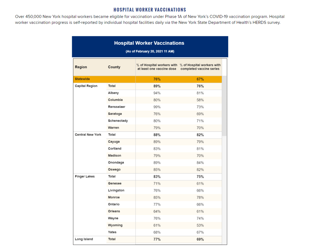
New York state reports vaccine coverage among state hospital workers; this is the closest that any state gets to vaccination data by occupation. I was having a truly lovely evening, hot chocolate in hand, paging through the New York State vaccination dashboard until I realized one glaring absence: Why is there no occupational data for who is getting vaccinated?
This isn’t just a problem with the New York state dashboard. According to our updated annotations on state vaccination data sources, not a single one reports out vaccination by occupation. I suppose I shouldn’t ask for so much—only 36 states report vaccination by race and ethnicity, which I thought was the bare minimum—but I’m used to getting disappointment at this point.
Nihilism aside, here’s why that’s weird. Pretty much everyone is considering one’s occupation into whether they’re eligible for the vaccine or not—hell, that’s how this whole thing started after all. But now that we’ve moved beyond just health care workers getting vaccinated, the data hasn’t kept up.
For example, NYC has included “in-person college instructors” in eligibility for the vaccine since January 11. Wouldn’t it be nice to know just how many in-person professors have gotten vaccinated? It’d sure be helpful if Barnard ever decides to do in-person classes again. Or what about taxi drivers? Again in NYC, because that’s where I live, they became eligible for vaccination on February 2. From a personal standpoint, I’d like to know if I could send my taxi driver to the hospital if my mask slips.
To be fair, we are seeing some occupation-adjacent data. First, a few sources group vaccinations by where the shots were given, like Massachusetts, or by provider type, like Utah. These include shots given in correctional facilities. While it’s not as good as just stating outright which occupations people getting vaccinated have, it could be used as a proxy for something similar. Additionally, New York tracks hospital worker vaccinations, but they don’t differentiate between physicians and other staff. Finally, long-term care facilities are going through a different program, so data for LTC employees usually gets its own category in a lot of states, like in New York again.
But we shouldn’t be satisfied with proxies and incomplete data; I’ve realized my worth since drafting the title for this segment. I—no, we—deserve better. This is critical for understanding vaccine equity and how close we are to restoring “normalcy.” If we don’t know how many taxi drivers or how many college instructors are getting vaccinated, it’s going to be a lot harder to have conversations about when it’s safe to ride in a taxi or attend in-person classes. It’s going to be a lot harder to have conversations about which taxi drivers or which instructors are able to get vaccinated. It’s also important to see just how well pushing taxi drivers to the front of the line works in actually getting them vaccinated. We’ve lifted one barrier, but are there others that we’re missing?
It’s entirely possible that healthcare providers just aren’t used to collecting this kind of data. But it’s still necessary, and right now, it’s just another example of flying blind when we really shouldn’t be.
Related posts
- Sources and updates, November 12Sources and updates for the week of November 12 include new vaccination data, a rapid test receiving FDA approval, treatment guidelines, and more.
- How is the CDC tracking the latest round of COVID-19 vaccines?Following the end of the federal public health emergency in May, the CDC has lost its authority to collect vaccination data from all state and local health agencies that keep immunization records. As a result, the CDC is no longer providing comprehensive vaccination numbers on its COVID-19 dashboards. But we still have some information about this year’s vaccination campaign, thanks to continued CDC efforts as well as reporting by other health agencies and research organizations.
- Sources and updates, October 8Sources and updates for the week of October 8 include new papers about booster shot uptake, at-home tests, and Long COVID symptoms.
- COVID source shout-out: Novavax’s booster is now availableThis week, the FDA authorized Novavax’s updated COVID-19 vaccine. Here’s why some people are excited to get Novavax’s vaccine this fall, as opposed to Pfizer’s or Moderna’s.
- Sources and updates, November 12
-
Diving into COVID-19 data #1: Workshop recap
Our first workshop happened this week!
Drew Armstrong, Bloomberg News‘s senior editor for health care, talked about his work on the publication’s Vaccine Tracker; and Arielle Levin Becker, director of communications and strategic initiatives for the Connecticut Health Foundation, discussed how to navigate COVID-19 race and ethnicity data. Thank you to everyone who attended—we had a great turnout!
For those who couldn’t make it live, you can watch the recording of the session below. You can also check out the slides here. I’m also sharing a brief recap of the workshop in today’s issue.
In next Wednesday’s workshop, we’ll discuss engaging COVID-19 data providers, featuring Liz Essley Whyte (Center for Public Integrity), Tom Meagher (The Marshall Project), and Erica Hensley (independent reporter from Mississippi). If you aren’t registered for the series yet, you can sign up here.
The Bloomberg Vaccine Tracker
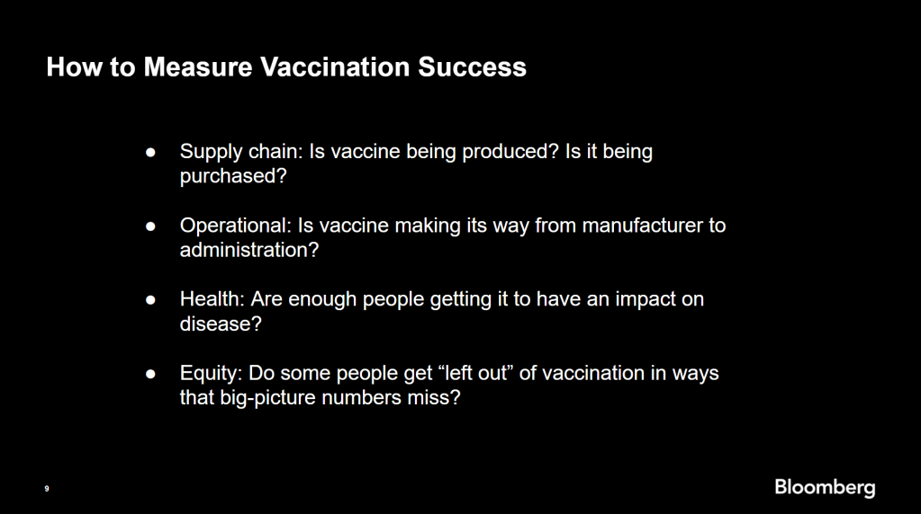
In his presentation, Drew Armstrong provided a behind-the-scenes look at Bloomberg’s tracker and shared some advice on analyzing vaccine data more broadly.
“We attempt to capture every vaccine dose that’s reported for COVID-19, every single day, around the world,” he said. In addition to the tracker’s daily updates on vaccine doses distributed and administered, the site also includes information on vaccine contracts between companies and countries—allowing a window into future distribution.
All of the data on the tracker comes from public sources, largely national and state public health departments that share figures via their own dashboards, press conferences, and social media. Like other aspects of pandemic data, these figures can be pretty messy. Every country, and even every state, may have its own definition of an “administered dose” or a “vaccinated individual”—and these definitions are evolving as the rollout progresses.
Armstrong provided one example: Tennessee reports “number of people with 1 dose only” vs. “2 doses,” and moves people from the first category to the second after they receive that second dose. Maryland, on the other hand, reports total people who have received one and two doses; both totals are always growing. It’s difficult to make apples-to-apples comparisons when every jurisdiction is doing something different. If you can, Armstrong said, actually get on the phone with your local official and make sure you understand precisely what the terms on their vaccine reports mean. When the Johnson & Johnson vaccine (which only requires one dose) starts rolling out, this definitional landscape will only get more complicated.
As a result of this messy data landscape, figures for the Bloomberg Vaccine Tracker are compiled manually by a huge team, including reporters from every bureau of the publication. “You have to really get your hands dirty with this data to understand it,” Armstrong said.
Armstrong also provided four ways for reporters to measure vaccination success. I’m including his slide here because I think it provides a good look at the multifaceted nature of vaccine data analysis and communication; your state might be vaccinating residents at a quick pace, but if the most vulnerable members of your community have been left out, you can’t fully call that rollout a success.

Slide from Drew Armstrong’s talk discussing the Bloomberg Vaccine Tracker. On the equity front: Armstrong announced that the Bloomberg tracker now includes a demographic vertical. This tracker currently includes data from 27 states and two cities which are reporting vaccinations by race and/or ethnicity—you can check it out here. Bloomberg’s team is planning to update this tracker weekly, adding more states as their data become available.
Armstrong emphasized that he and his colleagues want their tracker to be a resource for other journalists, civic engagement, and other public health communication. “All of our DMs are open,” he said. (Or you can send feedback to the team through a public form.)
He also noted that reporting on these data—or even @-ing your governor on Twitter and asking them why the numbers aren’t better—is a useful way of actually making the data better. By letting public officials know that we’re looking at these numbers and noticing the gaps, we can put the pressure on for changes to be made.
Analyzing sources of race and ethnicity data
In her presentation, Arielle Levin Becker shared some strategies and resources for navigating a new data source—with a focus on demographic data.
“Data is incredibly important—and easy to misuse,” she said at the start of her talk. Vetting a source properly, she explained, can help you understand both how to properly use this source and how to address its limitations in your reporting.
Vetting questions to consider:
- Who’s compiling this source?
- Who’s funding it?
- How transparent are they about their methods? Can you identify how it was compiled, or even track the chain of their methodology?
- Do they disclose the limitations of the data?
Similarly to Armstrong, Levin Becker recommended reaching out to a source directly when you have questions. People who compile public data are often “very welcoming” about explaining their work, she said, and may be excited to help you better use their data.
Once you get to the analysis stage, Levin Becker suggested asking another round of questions, such as, “Do the numbers in this source match other numbers from similar sources?” and “How could I explain these numbers in plain English?” One particularly important question, she said, is: “What’s the denominator?” Does this analysis apply to everyone in a state or to a particular subset, like the over-65 population? As we’ve discussed before, denominators can be a particular challenge for COVID-19 school data—without enrollment numbers or clear data definitions, case numbers associated with schools are difficult to interpret.
Levin Becker honed in on age adjustment, a process that’s commonly used in health data analysis to compare outcomes for different populations. It’s kind-of a complicated statistical process, she said, but the basic idea is, you weight your data by the age distribution of a population. White populations tend to skew older than Black and Hispanic/Latino populations, for example; to compare these groups in a more equivalent way, a researcher might calculate what their disease rates would be if the different populations had the same age distribution.
Before the state of Connecticut started age-adjusting its COVID-19 death rates, Levin Becker said, the public health department was boasting that Hispanic/Latino residents of the state were less likely to die from the disease than white residents. But after doing an age adjustment, the state revealed that residents of color were actually at higher risk.

Slide from Arielle Levin Becker’s talk, showing how age adjustment can reveal health disparities. Chart is from the CT health department. “The median age for a non-Hispanic white resident is 47 years,” Levin Becker said. “For a non-Hispanic Black resident, the median age is 34 years, and for a Hispanic resident, it’s 29 years.”
To put COVID-19 race and ethnicity data in context, Levin Becker recommended looking at other health data—particularly on preexisting conditions that might constitute higher risks for severe COVID-19. The Kaiser Family Foundation, Behavioral Risk Factor Surveillance System, and CDC life expectancy data by ZIP code are three sources she suggested reporters dig into.
Finally, of course, there are many instances in which the lack of data is the story. There’s been a big focus on race and ethnicity data for COVID-19 vaccinations, but we’re also still missing data on other pandemic impacts. For example, the federal government and the vast majority of states don’t report COVID-19 tests by race and ethnicity. In a lot of cases, Levin Becker said, healthcare providers simply aren’t required to record the race and ethnicity of their patients—“it hasn’t been prioritized in health systems.”
When the COVID-19 pandemic is no longer an imminent crisis, she said, “keep poking at the questions of what’s being collected and how it’s used.” Continued advocacy by journalists and other communicators can keep the pressure on to improve our race and ethnicity healthcare data—and use it to reveal the disparities that must be fixed.
Related resources
A few links shared in the chat during this session:
-
How to talk about COVID-19 vaccines
I wrote a tipsheet on covering COVID-19 vaccines for The Open Notebook. If you aren’t familiar with it, The Open Notebook is a nonprofit publication that acts as a living manual for science, health, and environmental writers by providing them with tools, resources, and behind-the-scenes looks into how stars in the field do their work.
My new piece provides tools and resources specifically for writers on the vaccine beat—both those who have been covering the pandemic for months and those who are now incorporating vaccine news into other aspects of their reporting. It’s kind-of sequel to a tipsheet that Scientific American EIC Laura Helmuth wrote back in March, when the pandemic was first exploding into the historic news story it is now. I interviewed several experienced COVID-19 reporters, and gathered their advice on navigating all the complications of vaccine communication. I also compiled a list of resources on COVID-19 vaccines (including a few data sources which COVID-19 Data Dispatch readers will recognize).
While the tipsheet is geared towards journalists, much of the advice I gathered also applies more broadly to anyone simply talking about vaccines—whether you’re walking your dad through his vaccination appointment or navigating a friend’s mistrust of the medical system.
Here are a couple of tips that I found particularly valuable. If they resonate with you, too—or if you have other suggestions to share—please let me know! You can reply to this email, leave a comment on the CDD website, or hit us up on Twitter.
- Put your numbers in context. When explaining the results of a vaccine trial or discussing dose administration numbers, pick your figures carefully and compare them to something a reader will understand. The best comparison is usually a human one: What does the number mean for an individual person and their community? One example that freelance journalist Maryn McKenna offers: If you’re saying that Operation Warp Speed has contracted 185 million vaccine doses, remind readers that there are about 255 million adults over 18 in the U.S., and the current vaccines on the market require two doses each.
- Get specific about immunity. One challenge of explaining how vaccines work, Sarah Zhang says, is conveying the different levels of immunity that they provide. “Biologically, immunity is not all or nothing,” she explains. Tell your readers what it means to be protected from symptoms, from infection, from transmission, from mild versus severe illness, from one variant more than another.
- Assign responsibility precisely. Since everyone is watching the vaccine rollout, Drew Armstrong says, journalists can “assume that there’s a deep interest in real and specific problems.” In other words: dig into the details. When you talk to a politician or public health official in your region, tell them exactly what the gap is in your knowledge, and demand that they give you specific answers. Such reporting can allow reporters to identify root problems rather than, say, allowing the governor of New York and the mayor of New York City to blame each other when doses in the city run out.
- Remember that some vaccine mistrust is reasonable. Nicholas St. Fleur and McKenna note that some groups that have been hit hardest by COVID-19, such as racial minorities and low-income communities, are also likely to have bad experiences with the U.S. medical system—in many cases, bad experiences that took place during the pandemic itself. “If you’re going to bring up the statistics [on hesitancy], then make sure your next sentence brings up the history,” St. Fleur says. This history includes the oft-cited Tuskegee Syphilis Study, yes, but it also includes the lives of people in the U.S. who have been unable to access the testing and treatment they needed in the past year due to racism that is still systemic in the healthcare system.
- Stay calm and keep your work in perspective. Just as vaccination—and the COVID-19 pandemic at large—is a deeply personal topic for many readers, it is a personal topic for many writers. But as communicators of science and health knowledge, we must remember the broader purpose of our work. We can’t let our own emotions drive our reporting. “The facts can be scary and dramatic enough—you don’t need to do more than that,” Armstrong says. André Biernath echoes that sentiment: “Breathe deeply, before you write something that could have a huge impact on public health.”
Read the full tipsheet here. It was also translated into Spanish by Rodrigo Pérez Ortega and Debbie Ponchner—you can read the translation here!
-
Next in vaccination data demands: More hyperlocal data

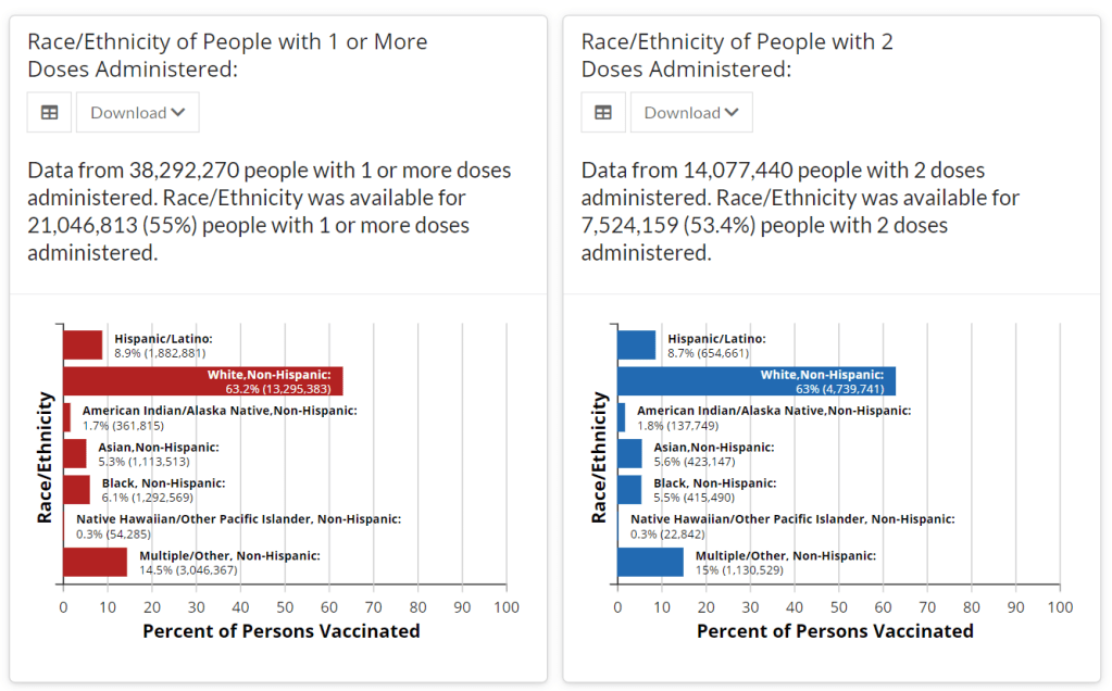
Demographic data released by the CDC; figures as of Feb. 14. The CDC continues to improve its vaccination reporting. The agency is now regularly reporting demographic data on its dashboard—including race, ethnicity, age, and sex. You can see counts for both U.S. residents who have received one and two doses. Like the rest of the CDC’s dashboard, the agency is updating these figures every day.
Advocates for greater equity in the vaccine rollout have pushed for such a data release for weeks. Meanwhile, more states than ever before are publishing their own demographic data: as of yesterday, we’re up to 33 states reporting race and/or ethnicity of vaccinated residents, 36 reporting age, and 32 reporting sex/gender.
But when it comes to tracking who’s getting vaccinated in America, we still have a long way to go. Now that demographic data are becoming more available at the federal and state levels, equity advocates are pushing for more local data—vaccinations by county, by town, by ZIP code.
New York City data reporter Ann Choi, for example, pointed out on Friday that this city has lagged behind cities such as Chicago and D.C. in releasing ZIP code-level vaccination data, which would allow researchers and journalists to see precisely which neighborhoods are getting more shots. And NYC ZIP codes are precise—I’m literally moving two blocks, but my ZIP code is changing.
(P.S. Ann will be speaking at the third workshop in the Diving into COVID-19 data series, on March 3, about her work at THE CITY!)
The Biden administration will soon start sending doses directly to Community Vaccination Centers, sites operated in partnership with existing community health clinics in an attempt to capitalize on existing connections that these clinics have in their neighborhoods. In order to judge the success of these clinics, we need data about their communities. Local data, demographic data, occupation data… the more complete picture that we can get, the better.
With more local data, we can do more stories like these:
- Across The South COVID-19 Vaccine Sites Missing From Black And Hispanic Neighborhoods (NPR)
- At This Early Stage of the COVID-19 Vaccine Roll-Out, Most Older Adults Have Not Yet Been Vaccinated As Supply Remains Limited (KFF)
- Covid-19 vaccination rates follow the money in states with the biggest wealth gaps, analysis shows (STAT)
Related posts
- Sources and updates, November 12Sources and updates for the week of November 12 include new vaccination data, a rapid test receiving FDA approval, treatment guidelines, and more.
- How is the CDC tracking the latest round of COVID-19 vaccines?Following the end of the federal public health emergency in May, the CDC has lost its authority to collect vaccination data from all state and local health agencies that keep immunization records. As a result, the CDC is no longer providing comprehensive vaccination numbers on its COVID-19 dashboards. But we still have some information about this year’s vaccination campaign, thanks to continued CDC efforts as well as reporting by other health agencies and research organizations.
- Sources and updates, October 8Sources and updates for the week of October 8 include new papers about booster shot uptake, at-home tests, and Long COVID symptoms.
- COVID source shout-out: Novavax’s booster is now availableThis week, the FDA authorized Novavax’s updated COVID-19 vaccine. Here’s why some people are excited to get Novavax’s vaccine this fall, as opposed to Pfizer’s or Moderna’s.
-
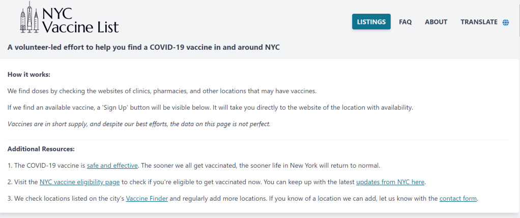
The volunteers working to make NYC vaccinations more accessible

Screenshot of the NYC Vaccine List homepage. When faced with entrenched disparities and a local government that doesn’t want to confront them, it can be difficult for singular individuals to step in and fill gaps. But the founders of NYC Vaccine List knew they could fill one specific gap: they built a better website for finding vaccination appointments.
The NYC Vaccine List website is simple—simpler than the official city site. Just go to the homepage, scroll past the instructions, and you’ll find a list of vaccine locations. For each location, the site clearly marks available appointments or, where this information can’t be automatically pulled in, provides a link to the location’s website and a note from the last NYC Vaccine List volunteer who checked it. When I checked it at about midnight this morning, Yankee Stadium appointments (for Bronx residents only) were at the top of the list.
I talked to Dan Benamy and Michael Kuznetsov, two of the founders of this project, over email last week; they told me more about how the NYC Vaccine List website works and their efforts to improve its functionality for all New Yorkers. This interview has been lightly edited and condensed for clarity.
Betsy Ladyzhets: I know the basics of the project’s methodology—you’re scraping the websites of different vaccination sites and compiling all the info in one place. But I’d like to know more about what running this site actually looks like on a day-to-day basis. What parts of the project are manual vs. automated? Are there regular hours that you work on updates?
NYC Vaccine List: The project is managed through a Discord chat server, which makes it possible for volunteers to communicate about certain topics in a group chat, as well as one-on-one when needed. Various responsibilities have been parcelled out to different volunteers based on their ability to help in different areas: maintaining the crawlers, calling to verify information that cannot be crawled, and reaching out to local organizations and press to help spread the word about the project. There are no fixed hours—as this is an all-volunteer effort, we fit this work in between our responsibilities to work and family. This means that it’s not that unusual for there to be work done well into the early hours of the morning!
BL: I saw on Twitter that you’re working on providing translations to make the site accessible in languages other than English. How is that going so far? Have you noticed any changes in the people using the site thanks to this change?
NYC VL: As of this week, the site can be translated on-demand using the “Language” button in the upper right hand corner of the site. We use the Google Translate widget, which is the same technology used by NYC.gov. The Google Translate widget is provided free-of-charge to COVID-related efforts. Our volunteers have reached out to friends and family to validate the translations, and received positive feedback that the translations make the site easier to use for a non-English speaker.
BL: So far, white New Yorkers are getting vaccinated at disproportionately high rates while Black and Latino New Yorkers are getting vaccinated at disproportionately low rates. What can the city do to make vaccination appointments more accessible for these groups? What role do you see your project playing in addressing this issue?
NYC VL: The social and epidemiological questions that come along with a mass vaccination effort are complex, and although we have volunteers that have experience in this realm, our organization is not in a position to make recommendations to the city. We hope to increase access to the vaccine by removing the burden of navigating dozens of websites and waiting for hours on hold in order to find a vaccine.
We have two simultaneous efforts that strive to make the site more equitable to all residents: First, we’ve prioritized technical fixes that make the site usable for non-English speakers, those with slow internet, those that cannot easily travel across the city, and those relying on screen-readers. Second, we’ve reached out to organizations around the city that directly work with underserved communities. In that outreach, we’ve made sure that the organizations are aware of our site, as well as that they have a direct line of communication back to us in case there is a way to improve the site for their communities and constituents.
BL: The city revamped its own vaccine portal recently; the updated site at least appears to be easier to use. Has this update impacted your project?
NYC VL: The new site is a big step in the right direction, and we’re thrilled to see it because it means more New Yorkers can easily find an appointment. First and foremost, the site should be usable for New Yorkers that visit it directly. Any challenges that we encounter while trying to visit it automatically are secondary, so we don’t have any gripes related to how the page is coded. We’re continuing our efforts to build a site that encompasses all available vaccine locations and appointments available to New Yorkers, which the new site does not yet do, and remain hopeful that the city will continue to make progress in this domain.
BL: What are your future plans for the project? Do you see yourselves keeping this going through future phases of vaccination?
NYC VL: At this point, we haven’t made future plans for the project. We’re energized by the short-term impact we’ve been able to make, and are hopeful that our project won’t be needed for much longer.
BL: What has been your favorite story so far of someone using the website to find an appointment?
NYC VL: We have a new favorite story every day, but one that came in a few minutes ago is top of mind: “Thank you. Thank you. Thank you. A lung transplant makes me a high-risk individual but the ways things are set up, my doctors could not help me get the vaccine. … NYC Vaccine List might literally be my lifesaver. I got my first shot yesterday, Feb. 3, after I spotted an opening on your site at 1:20 a.m. that morning. Thank you. Thank you. Thank you.”
Related posts
- Sources and updates, November 12Sources and updates for the week of November 12 include new vaccination data, a rapid test receiving FDA approval, treatment guidelines, and more.
- How is the CDC tracking the latest round of COVID-19 vaccines?Following the end of the federal public health emergency in May, the CDC has lost its authority to collect vaccination data from all state and local health agencies that keep immunization records. As a result, the CDC is no longer providing comprehensive vaccination numbers on its COVID-19 dashboards. But we still have some information about this year’s vaccination campaign, thanks to continued CDC efforts as well as reporting by other health agencies and research organizations.
- Sources and updates, October 8Sources and updates for the week of October 8 include new papers about booster shot uptake, at-home tests, and Long COVID symptoms.
- COVID source shout-out: Novavax’s booster is now availableThis week, the FDA authorized Novavax’s updated COVID-19 vaccine. Here’s why some people are excited to get Novavax’s vaccine this fall, as opposed to Pfizer’s or Moderna’s.
- Sources and updates, November 12
-
Featured sources, Jan. 31
- COVID-19 Neuro Databank: The National Institutes of Health has started a new database to keep track of neurological symptoms associated with COVID-19. The database will be fully anonymized, and it’ll be accessible for scientists who want to better understand neurological complications with the disease. For more information, see this press release from the NIH.
- Covid Performance Index: How do different countries rank in their management of the pandemic? This index, from think tank the Lowy Institute, attempts to answer that question by comparing infection rates, death rates, and testing for 98 countries with available data. New Zealand, Vietnam, and Taiwan are at the top of the list; the U.S. ranks #94.
- COVAX Global Supply Forecast: Another global data source is this report from COVAX, an initiative from the World Health Organization and Gavi, the Coalition for Epidemic Preparedness. The report provides summaries of the global vaccine supply, including both existing contracts and those under negotiation.
- OpenSky COVID-19 Flight Dataset: Martin Strohmeier, a computer scientist at Oxford University, and other collaborators have compiled a dataset of flight data related to the COVID-19 pandemic. According to a blog post published in late December, Strohmeier plans to update the dataset once a month.
-

Vaccinations so far are perpetuating existing inequity
Two weeks ago, I wrote that only 19 states were reporting vaccinations by race and/or ethnicity. This demographic information is key to evaluating the vaccine rollout: both government officials and watchdogs should be able to see how well this process is serving vulnerable populations. Without good data, we can’t see the true picture—making it harder to advocate for a more equitable system.
Demographic vaccine data has improved since then, but not by much. The federal government is still not reporting these data on a national level. 23 states are reporting some form of vaccinations by race and ethnicity—but the data are difficult to standardize, as every state is reporting slightly different demographic categories. Several states are reporting in percentages, rather than whole numbers, which makes the data less precise.
And a lack of federal standards for these data means it’s easy for states to change things up: Indiana, which started reporting vaccinations by race/ethnicity early in January, is now only reporting vaccinations by age and gender. New York City also reported demographic data for vaccinations in December, then removed the figures after disparities were revealed, according to Gothamist. (NYC’s demographic data are back, as of this morning, but they still show white residents getting vaccinated at disproportionately high rates compared to the city’s population.)
(For more detail on which states these are and how to navigate their vaccination data, see the COVID-19 Data Dispatch’s annotations.)
Meanwhile, the data we have so far continue to show significant disparities. In 23 states with available data, white Americans are being vaccinated at higher rates than Black Americans, a recent analysis by Kaiser Health News’ Hannah Recht and Lauren Weber found. This analysis followed a similar study that I cited two weeks ago—Recht and Weber write that “disparities haven’t significantly changed” with two more weeks and several more states reporting.
In all but six of the states Recht and Weber analysed, white residents had been vaccinated at double (or more) the rate of Black residents. In Pennsylvania, this rate rises to 4.2 times. Indiana reported white residents vaccinated at 2.6 times the rate of Black residents—before the state took these data off its dashboard. Polling from the Kaiser Family Foundation continues to show that Black Americans are more hesitant; 42% of those surveyed said they want to “wait and see” how the vaccines are working for others before getting a shot.
This vaccination news builds on the continued, deep strain that COVID-19 has placed on Black communities. Alice Goldfarb provided an update this week in an analysis post for the COVID Tracking Project. While the piece maps out disparities in COVID-19 cases for Black, Hispanic or Latino, and Indigenous populations in every state, Goldfarb also provides a stark comparison for the toll this pandemic has taken:
More Black Americans have died of COVID-19 since the pandemic began than there are names on the Vietnam Memorial. More Black or Latinx people have died than the number of people commemorated on the AIDS Memorial Quilt.
The urgency of fixing our vaccine system is clear. And politicians are starting to take note: Massachusetts Representative Ayanna Pressley and Senators Elizabeth Warren and Edward Markey called for better demographic data in a letter to the Department of Health and Human Services this week. They urged the department to better work with states, local public health departments, and labs to collect more data and publish it publicly.
In a statement to the Associated Press, Pressley says:
That which gets measured gets done, and the first step towards ensuring we are able to effectively address these disparities and direct lifesaving resources to our hardest-hit communities is for our government to collect and publish anonymized demographic data, including race and ethnicity, of vaccine recipients.
White Massachusetts residents are getting vaccinated at 1.4 times the rate of Black residents, according to KHN.
Dr. Marcella Nunez-Smith, the chair of Biden’s new COVID-19 equity task force, similarly discussed the need for better data and equitable vaccination at briefings this week. She mentioned leveraging existing data sources, removing barriers to vaccination in underserved communities, sharing ideas between states, and generally making vaccines more accessible, along with a vaccine communications campaign. But she didn’t go into many specifics.
The federal government may be able to make vaccine distribution more equitable, if it can provide the funding that state and local public health departments—along with health clinics, community centers, churches, and so many other possible vaccine providers—need right now. But one thing it can do is require race and ethnicity data, and make it standardized. We need that, like, a month ago.
More vaccination data updates
There were a couple of great features this week on problems with America’s vaccine data system(s), as well as updates to major sources. Here are the highlights:
- STAT’s Nicholas St. Fleur wrote about the struggle to find a vaccine appointment, highlighting a viral Twitter thread from intensive care physician Dr. Arghavan Salles. Convoluted online systems are simply not working for seniors and many other vulnerable populations.
- In another STAT piece, Mario Aguilar described vaccination data challenges in Utah as a microcosm of similar issues across the country. Even within this single state, he writes, some counties with robust IT already in place were able to adapt their tech for COVID-19 vaccination, while in others, exhausted healthcare workers must enter every data point by hand.
- KHN’s Rachana Pradhan and Fred Schulte describe how a lack of standards for race and ethnicity data collection have led some states to leave this field optional, while others aren’t tracking it at all. Similar problems persist for occupation data, which should be crucial when we’re supposedly prioritizing essential workers for earlier vaccination!
- Cat Ferguson at MIT Technology Review gives the full picture of Vaccine Administration Management System, or VAMS, a brand-new vaccine data system that the CDC commissioned for COVID-19 vaccination—and that is completely failing to do its job. Most states in the country have chosen not to use this free system, as it is difficult to use, arbitrarily cancels appointments, and confuses patients.
- A team from POLITICO laid out Biden’s journey to locate 20 million vaccine doses. The White House briefings were “short on details,” these authors claim, because behind the scenes, the Biden team was still struggling to get their hands on basic information that should’ve been communicated during the transition. Once doses are delivered to states, the state public health systems are fully responsible for tracking these doses until they are officially recorded as “administered”; this makes it difficult for the federal government to track the overall vaccine rollout.
- KFF has a new dashboard for its COVID-19 Vaccine Monitor, which is tracking public opinions of and responses to vaccines. The organization is also running a dashboard of state COVID-19 vaccine priorities, which makes it easy to compare strategies across states.
- Vaccine Finder, a tool developed at Boston Children’s Hospital which makes it easy for Americans to find vaccine providers in their communities, is partnering with Google Maps to “bring wider awareness and access to COVID-19 vaccines,” according to John Brownstein, Chief Innovation Officer at the hospital.
Related posts
- Sources and updates, November 12Sources and updates for the week of November 12 include new vaccination data, a rapid test receiving FDA approval, treatment guidelines, and more.
- How is the CDC tracking the latest round of COVID-19 vaccines?Following the end of the federal public health emergency in May, the CDC has lost its authority to collect vaccination data from all state and local health agencies that keep immunization records. As a result, the CDC is no longer providing comprehensive vaccination numbers on its COVID-19 dashboards. But we still have some information about this year’s vaccination campaign, thanks to continued CDC efforts as well as reporting by other health agencies and research organizations.
- Sources and updates, October 8Sources and updates for the week of October 8 include new papers about booster shot uptake, at-home tests, and Long COVID symptoms.
- COVID source shout-out: Novavax’s booster is now availableThis week, the FDA authorized Novavax’s updated COVID-19 vaccine. Here’s why some people are excited to get Novavax’s vaccine this fall, as opposed to Pfizer’s or Moderna’s.
-
Vaccination is a logistics problem
Earlier this week, I got a frantic email from my grandma. She wanted my help in finding a vaccination appointment. She’d talked to her primary care provider and looked at her state public health agency’s website, but wasn’t sure how to actually secure her own spot in line. She lives in California, which is still officially in Phase 1A (vaccinating healthcare workers and long-term care facility residents), but is allowing some providers to start vaccinating seniors and essential workers based on “available supply.”
My uncle did help my grandma get an appointment—one month from now and an hour’s drive away. Despite living in Berkeley, near several research universities, she’ll be heading to Palo Alto for her shots. I told her to keep a close eye on her county public health department’s website in case something becomes available there (which would be my advice to anyone else in this position), but I couldn’t guarantee that she’d be able to find an appointment any closer than the one she has now.
And she’s not alone: a lot of grandmas are having trouble getting vaccination appointments. In fact, recent survey data from the Kaiser Family Foundation suggests that the majority of American seniors “do not have enough information about when and where they will be able to get the vaccine.” Black, Hispanic, and low income adults also report not having enough information about vaccinations, according to KFF. The minority communities that continue to be heavily impacted by the pandemic are supposed to be first in line for vaccines, but barriers to information and technology—particularly to vaccine registration portals—are leaving them behind once again.
It would be easy to say the problem here is a lack of vaccine doses. But that’s not exactly it. The federal government is distributing millions of doses each week, and many of those doses are making it into arms: according to Bloomberg’s vaccine tracker, an average of 1.1 million shots were reported each day this past week. By sheer numbers, we are already on track to meet President Biden’s 100 million vaccinations in 100 days goal.
Our current problem is, in fact, a logistics one. It’s a build up of infrastructure failures, with all the weight falling on those underfunded local public health departments I mentioned in the previous section. Right now, these public health workers are trying to set up vaccination appointments, while also dealing with constantly-changing information from their state on how many doses they will get, while also stretching out a depleted budget, while also probably short on personnel because half of their staff quit or got COVID-19 in 2020, while also dealing with backlash from their communities, while also fielding endless calls from confused grandmas… and all of this while still testing, contact tracing, and communicating basic pandemic safety measures. Whew. I got tired just writing that sentence.
Some dimensions of this problem, such as the funding and lack of community trust, are years in the making. But there’s one piece the federal government may be able to solve soon, and it’s a data issue. The federal government is not giving states—and by extension, local public health agencies—enough lead time to coordinate their vaccine distribution. ProPublica reporters Caroline Chen, Isaac Arnsdorf and Ryan Gabrielson explained the situation in a detailed feature this week: unpredictable shipments at the national level mean that vaccine providers are unable to use up all of their shots in some weeks and cancelling appointments in others. The whole piece is worth reading, but I want to highlight the one quotation near the end:
Starting Wednesday, it will be up to the Biden administration to provide clear visibility for states, according to a member of the president-elect’s COVID-19 team, who asked not to be identified because he wasn’t authorized to speak on behalf of the new administration.
“The government can point at the manufacturer, but it’s like asking the [Defense Department], ‘How many planes do you have?’ and them saying, ‘I don’t know, ask Boeing,’” the person said.
Reporters at POLITICO similarly found that public health workers simply don’t trust the dose allocation system. While the Biden administration may want to ramp up vaccine production in order to vaccinate more Americans, this goal may be more easily achieved by ensuring vaccines are properly tracked. At every part of the vaccination pipeline, stakeholders should know how many doses they’re getting and when. Shipments should be predictable, and appointments should be easily managed, freeing up public health workers’ time to take on the important task of actually vaccinating people.
And there are still holes in our data on who’s getting vaccinated, too. Only 23 states are reporting vaccinations by race and ethnicity; this is an improvement from last week, but still a far cry from comprehensive data collection. Another ProPublica investigation, meanwhile, found that many states aren’t requiring providers to report vaccine doses that go wasted, making it difficult to see a comprehensive picture of the shots that get spoiled or thrown in the trash.
It also bears mentioning that Pfizer will now be shipping out fewer vaccine vials to account for the “surprise 6th dose” that providers are often able to get out of each vial—since Pfizer charges by the dose. It is unclear whether this reduction in dose availability will affect the rollout.
One piece of good news, on the vaccination data front: the CDC vaccination tracker stepped up its reporting to include weekend updates, as of yesterday. But the agency still isn’t reporting demographic data, comprehensive data on long-term care facilities, or even a time series of doses administered per day. Vaccination tracking has a long way to go.
Related posts
- Sources and updates, November 12Sources and updates for the week of November 12 include new vaccination data, a rapid test receiving FDA approval, treatment guidelines, and more.
- How is the CDC tracking the latest round of COVID-19 vaccines?Following the end of the federal public health emergency in May, the CDC has lost its authority to collect vaccination data from all state and local health agencies that keep immunization records. As a result, the CDC is no longer providing comprehensive vaccination numbers on its COVID-19 dashboards. But we still have some information about this year’s vaccination campaign, thanks to continued CDC efforts as well as reporting by other health agencies and research organizations.
- Sources and updates, October 8Sources and updates for the week of October 8 include new papers about booster shot uptake, at-home tests, and Long COVID symptoms.
- COVID source shout-out: Novavax’s booster is now availableThis week, the FDA authorized Novavax’s updated COVID-19 vaccine. Here’s why some people are excited to get Novavax’s vaccine this fall, as opposed to Pfizer’s or Moderna’s.
- Sources and updates, November 12

