Tag: vaccination data

  • Boosters for all adults: Why eligibility expanded, and what it means for you

    Boosters for all adults: Why eligibility expanded, and what it means for you

    As of November 20, almost 35 million Americans have received a booster shot. That number is likely to shoot up in the coming weeks with expanded eligibility. Chart via the CDC.

    On Friday morning, the FDA authorized booster shots of Pfizer’s and Moderna’s COVID-19 vaccines for all adults in the U.S., six months after their first two doses. The CDC’s vaccine advisory committee voted to support this expanded booster eligibility that afternoon, and CDC leadership signed off on it a few hours later.

    Although the Biden administration has supported boosters for all adults since August, this specific federal eligibility expansion was preceded by several state and local leaders. Prior to Friday, the governors of Colorado, New Mexico, California, and other states said that any adult living in their jurisdictions could go get a booster, even if they didn’t fit the current national criteria. New York City leaders made a similar announcement this past Monday.

    Perhaps spurred on by these state decisions, the FDA and CDC moved quite quickly to authorize booster shots for a larger group of Americans. The FDA was originally just considering the move for Pfizer’s vaccine, then added Moderna to the mix just this week (when Moderna sent in a formal application).

    And the CDC’s vaccine advisory committee meeting had somewhat less time for deliberation than this committee typically tends to take. As Helen Branswell wrote in STAT News:

    The meeting was called on such short notice — it was announced Tuesday — that only 13 of the committee’s members were able to attend. When the meeting went longer than scheduled, two members had to leave without voting.

    I discussed expanded booster shot eligibility this week in a FiveThirtyEight Chat with editor Chadwick Matlin and science writer Maggie Koerth. Today at the COVID-19 Data Dispatch, I’d like to expand on the ideas in that chat piece, and attempt to answer a couple of other questions.


    Why expand booster eligibility to all adults?

    The short answer here is 1) more compelling evidence that boosters provide additional protection against coronavirus infection and 2) cases are rising in the U.S., and boosters might help make the surge less severe. Also, so far, very few cases of severe side effects have been reported following booster shots.

    Since the last FDA and CDC booster shot deliberations, more evidence has rolled in showing their efficacy. One notable study, from the Imperial College of London, was published this past Wednesday; the report suggests that people who’ve received two COVID-19 vaccine doses are more than twice as likely to test positive than those who’ve received three doses.

    While the study hasn’t yet been peer-reviewed, it’s part of a long-running surveillance project in the U.K. that examines COVID-19 prevalence in the entire population—including all age groups and comparing those who received Pfizer and AstraZeneca vaccines. “What they found is very, very strong data showing that as soon as 7 days after a third COVID-19 vaccine dose, the risk of infection is cut in half when you look at the entire population,” wrote Dr. Jorge Caballero in a Twitter thread summarizing the study. 

    At the same time, cases are going up in the U.S.—appearing to indicate a new winter surge. It’s no coincidence that Colorado and New Mexico, two of the states that were among the first to expand booster eligibility to all adults, are also among the states with the highest COVID-19 case rates.

    When Delta hit Israel this past summer, the country started administering booster shots: first to seniors at the end of July, then for younger and younger age groups until all adults were able to get the shots. Data from the country’s national health agency suggest that these booster shots played a key role in driving down case numbers among both vaccinated and unvaccinated Israelis.

    Personally, I am still a bit skeptical that Israel’s drop in cases was thanks to booster shots alone, as the data don’t necessarily show causation. But for a lot of U.S. leaders, the Israeli data provide a compelling model: it seems like booster shots can potentially drive down a case surge. This fits nicely into the national strategy that the Biden administration has already been preaching for months, which I call “vaccinate out of the pandemic.”

    Here’s how I explained it in the FiveThirtyEight chat piece:

    Listening to the advisory-committee meetings, I noticed that there seems to be this tension between the scientific experts who want to make robust evidence-based decisions — and the sense that, here in the U.S., our overall pandemic strategy is basically “vaccinate our way out of the pandemic.” If we had better masking, distancing, contact tracing, ventilation, rapid tests and everything else, we would not need boosters to stop people’s mild cases. But we’re not doing a great job at any of those other things, so … we kinda need boosters.

    Maggie Koerth also pointed out that booster shots are also politically easier for a lot of leaders than some of the other COVID-19 strategies I mentioned. We already have the shots stockpiled, so it’s just a matter of telling people to go get them—unlike, say, expanding contact tracing, which would take a huge investment in hiring and training people.

    In addition, the eligibility expansion solves communication and logistics challenges: now, every adult in the U.S. can just go get a booster shot, once enough time has passed from their first two doses. Almost 90% of vaccinated Americans were eligible already, but a lot of people were confused about whether they fit the criteria; the situation became much simpler after Friday.

    Should you get a booster shot?

    If you’re over 65 or you have a health condition that makes you particularly vulnerable to severe COVID-19 symptoms, answering this question is easy: YES. Go get a booster shot, as soon as you’re able to do so.

    If you live or work in a setting that puts you at risk of contracting the coronavirus—or if you live or work in a setting with other people who are more vulnerable than you—then you also have a pretty solid argument towards getting a booster shot.

    Even if you’re very unlikely to have a severe case of COVID-19 thanks to your initial vaccination, a mild case could still disrupt your work, your household, and others in your community. A teacher with breakthrough COVID-19 might cause their classroom to shut down for a week, for example, while a parent with breakthrough COVID-19 may interrupt their kids’ lives if those kids are too young to be vaccinated themselves.

    For those who don’t fall into these categories (like me!), the situation is a bit more complicated. But after following all of the news this week, I’ve decided that it does make sense for me to get my booster shot.

    Here’s why: much as I wish that national leadership and my own local leaders in NYC were investing in other measures to control COVID-19 cases, I don’t foresee widespread mask mandates, rapid tests, contact tracing, or any other safety overhauls anytime soon. Instead, my public health leaders are asking me (and those around me) to get booster shots in order to potentially lower case rates. So, I’ll do my part to contribute to that “vaccinate out of the pandemic” strategy, though I don’t necessarily agree with it.

    It’s also important to note here that vaccinating the people who are still unvaccinated is much more important for lowering overall case counts—and for keeping people out of the hospital—than boosters. That includes kids in the 5 to 11 age group. As Maggie Koerth said in our chat:

    If you’re under 65 and you’re not immune compromised, it almost certainly matters more to get your kiddos vaxxed the first time than to get yourself a booster. That’s my parent-centric takeaway from all this reading.

    And, of course, to end the pandemic on a global scale, we need to get first and second doses to everyone in the world. Right now, booster shots are hindering global vaccination: according to the WHO, there are about six times more boosters administered daily in wealthy nations right now than there are first and second doses administered in low-income nations.

    The U.S. has already chosen to stockpile millions of doses for boosters, so refusing a booster shot on an individual level doesn’t have any impact on the global situation. But there are other options for people who want to take action about vaccine inequality: for example, you can contact your congressional representatives about the issue.

    What happens after a lot of Americans get booster shots?

    Someone asked me this question on Twitter earlier this week. Do booster shots lead to other loosening COVID-19 restrictions, or something else?

    It’s difficult to answer that right now, because the U.S. is still close to the beginning of our booster shot rollout. Within a couple of months—and millions more doses—we’ll have some data on whether booster shots here lead to a drop in cases, like what we saw in Israel. At the same time, many European countries are similarly offering booster shots to wide swaths of their populations; we can also watch what happens in those nations.

    The U.S. is still likely to face a case surge this holiday season, I think, simply due to cold weather combined with travel and gatherings. But perhaps booster shots will mean that hospitalizations don’t rise as much as cases do, or that a higher share of the cases are mild. We’ll have to see.

    Looking beyond this winter, we could see three shots become standard for COVID-19 vaccines. (Several other vaccines, such as HPV, are three-shot series.) We could also see annual boosters for COVID-19, similar to flu shots. More study of the booster shots’ effectiveness and of long-term COVID-19 immunity in general will help scientists figure this out.

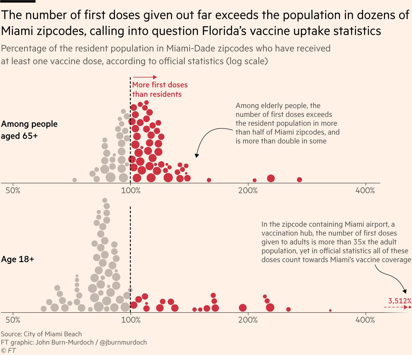
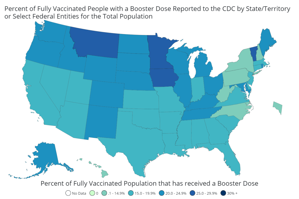
    Finally, I couldn’t end this post without pointing out the continued data gaps here. The U.S. is still not tracking breakthrough cases in any kind of comprehensive manner, and a lot of information is missing on who’s getting booster shots—the CDC and most states are not reporting demographic data on booster recipients.

    To quote Dr. Katelyn Jetelina from her recap of Friday’s CDC advisory committee meeting:

    And this is it. This [three small studies] is all the data the CDC presented today. Which is insane— the United States does not have a real-time, comprehensive picture of our vaccines, nor the number of breakthrough cases, nor who’s more likely to have a breakthrough case or not. I cannot emphasize enough of how detrimental this is to our public health response. Bad data produces (potentially) bad policy. We are flying blind.


    More vaccine reporting

  • Another COVID-19 endgame take

    Trevor Bedford, computational virologist at the Fred Hutchinson Cancer Research Center—and widely regarded expert on coronavirus variants—wrote a useful Twitter thread this week. In the thread, Bedford provides his take on the “COVID-19 endgame.” In other words, what will happen once the virus reaches endemic levels? (Endemic here meaning, the virus is still circulating but it’s not infecting enough people to cause major concern.)

    First of all, COVID-19 will become endemic in different places at different times, Bedford says. In the U.S., where over half the population is vaccinated, we’re closer to endemicity than other nations. 

    Then, endemicity itself will be a push-and-pull between two things: vaccination levels and the virus’ ability to spread through the population. The Delta variant—which is much more contagious than the original coronavirus—will need to be countered by a lot of vaccination. Bedford also suggests that immunity (from vaccination and prior infection) will likely drop at least somewhat from one year to the next, like what we see now for the flu.

    The U.S. will likely still see a lot of COVID-19 infections each year, Bedford says. They’ll likely be more common during a specific “season,” like how our flu season takes place in the fall and winter. Most infections will be “relatively mild,” he says, but with enough virus transmission, some people will get seriously ill.

    Overall, Bedford suggests that COVID-19 will become similar to the flu—not comparable to cancer or heart disease, he says, but “still a substantial public health burden.” And his estimates of annual deaths do not mention Long COVID, another dimension of the potential health burden that yearly COVID-19 outbreaks may cause.

    (We know that vaccination reduces Long COVID risk, but a lot of other information about this condition remains unknown.)

  • Unreliable population numbers hinder vaccination rate analysis

    Unreliable population numbers hinder vaccination rate analysis

    An excellent article in the Financial Times, published this past Monday, illuminates one major challenge of estimating a vaccine campaign’s success: population data are not always reliable. Health reporter Oliver Barnes and data reporter John Burn-Murdoch explain that, in several countries and smaller regions, inaccurate counts of how many people live in the region have led to vaccination rate estimates that make the area’s vaccine campaign look more successful—or less successful—than it really is.

    Why does this happen? It’s actually pretty challenging to get a precise count of how many people live somewhere. Think about the U.S. Census, for example: this program attempts to count every person living in the country, once every ten years. But it may miss people who don’t have a straightforward living situation (like college students, the incarcerated, and people living in shelters); it may have confusing messaging that discourages some people (like undocumented residents) from filling out the necessary form; and some people may simply choose not to give information to the government.

    When the Census is inaccurate, the inaccuracies ripple out to different government analyses—including analyses of how many people have been vaccinated. Here’s a quote from the Financial Times article:

    “The average person would be surprised that governments don’t know how many people are actually in the country,” said Stian Westlake, chief executive of the UK’s Royal Statistical Society. “But this great unknown can cause a whole host of data glitches, especially when responding to a health emergency.”

    The Financial Times provides several examples of these data glitches leading to incorrect vaccination estimates.

    • In England: Overestimates of the unvaccinated population, based on data from the U.K.’s Health Security Agency, suggest that case rates are lower among unvaccinated Brits than they actually are.
    • In several EU countries: Underestimates of the senior population lead to vaccination rates inaccurately suggesting that over 100% of certain age groups in Ireland, Portugal, and other countries have received at least one dose of a vaccine.
    • In Miami, Florida: A number of ZIP codes have senior vaccination rates that appear to be over 100% of seniors, due to retirees (who do not have permanent residence in Florida, and therefore aren’t counted in the state’s population) getting vaccinated in Miami during their winter vacations.
    Image
    Miami, Florida is a particularly egregious example of inaccurate vaccination rates. Chart shared on Twitter by John Burn-Murdoch.

    Incorrect vaccination rates can cause issues for public health agencies leading vaccine campaigns, the Financial Times reports. If you think you have vaccinated 100% of seniors in your county due to population underestimates, you likely aren’t looking out for the seniors who in fact remain unvaccinated—leaving those seniors still vulnerable to COVID-19.

    At the same time, data glitches can provide fodder for anti-vax groups. “Worst of all, anti-vaxxers and Covid deniers feed on the daylight between reality and the incomplete data we currently have as evidence of a grand conspiracy or bureaucratic incompetence,” Jennifer Nuzzo, epidemiologist Jennifer Nuzzo told the Financial Times.

    I recommend reading the Financial Times article in full. But you can also check out this Twitter thread from John Burn-Murdoch for more highlights:

  • COVID source callout: Booster shot trends

    COVID source callout: Booster shot trends

    It’s now been almost two months since the CDC approved third vaccine doses for patients with weakened immune systems—and over two weeks since the agency approved third Pfizer doses for patients with increased breakthrough case risk. Since August 13, the CDC’s dashboard says, about 7.3 million Americans have received a third dose.

    As I mentioned in today’s National Numbers post, these booster shots are obfuscating the country’s vaccination trends. Over one million people have been vaccinated every day for the past week, but roughly half of those people were getting their booster shots.

    One might think I am sourcing that daily booster shot number from the CDC dashboard, but no: it comes, as many key COVID-19 data updates do these days, from the Twitter account of White House COVID-19 Data Director Cyrus Shahpar. The CDC has yet to add any booster shot data to its dashboard beyond a total count of doses administered.

    Shahpar’s daily updates. Screenshot taken on October 9.

    Much as I appreciate Shahpar’s daily updates, I would like to see the agency add those daily booster shot counts to its dashboard. And why stop there? The CDC should also provide information on the demographics of those getting booster shots, such as age and race/ethnicity, as well as geographic trends.

    Notably, the New York Times has added a booster shot trendline to its vaccination dashboard; see the chart titled “New reported people vaccinated.” As I noted last week, 15 states have added booster shots to their vaccine dashboards and reports as well, including three states that are reporting demographic breakdowns. The CDC is behind the data reporting curve, as usual.

  • Our pandemic winter: Stories on what to expect

    This week, two of the outlets that I consider to be among the most reliable COVID-19 news sources published stories on our coming pandemic winter. Obviously, you should read both pieces in full, but here are my takeaways.

    The first story comes from The Atlantic’s science desk, with a triple-star byline including Katherine J. Wu, Ed Yong, and Sarah Zhang.

    This piece focuses on the changing role of vaccination in protecting the U.S. from COVID-19. After a few months of encouraging data, suggesting that vaccines could protect us against coronavirus infection and transmission, we are now back to using COVID-19 vaccines for their initial purpose: preventing severe disease and death. As we see higher numbers of breakthrough cases, we can take comfort in the fact that those cases will rarely lead to hospitalization or death. (Though the risk of Long COVID after vaccination is less known.)

    The Atlantic’s article also explains who is now most at risk of COVID-19, and how that risk may shift in the coming months. Right now, unvaccinated children face high risk, especially if they live in communities where most of the adults aren’t vaccinated. But that won’t always be the case:

    Relative risk will keep shifting, even if the virus somehow stops mutating and becomes a static threat. (It won’t.) Our immune systems’ memories of the coronavirus, for instance, could wane—possibly over the course of years, if immunization against similar viruses is a guide. People who are currently fully vaccinated may eventually need boosters. Infants who have never encountered the coronavirus will be born into the population, while people with immunity die. Even the vaccinated won’t all look the same: Some, including people who are moderately or severely immunocompromised, might never respond to the shots as well as others.

    At the end of the article, the writers touch on variants. Delta is now the world’s major concern, but future variants might develop new mutations and pose new dangers. Yet the writers say that any variant “can be stopped through the combined measures of vaccines, masks, distancing, and other measures that cut the conduits they need to travel.”

    The second “pandemic winter” story comes from ace STAT News reporter Helen Branswell. Branswell goes into more detail about potential variant scenarios, outlining what Delta may do and how other mutations may arise as the weather gets colder.

    Some modeling efforts suggest that COVID-19 case numbers may stay low once the Delta wave ends, Branswell reports, because the majority of Americans are now fully vaccinated or have some immunity from a prior infection. But if another dangerous variant comes along, we could be in trouble. Still, if cases go up again, we won’t see as many hospitalizations or deaths as we did last winter, thanks to the vaccines.

    I personally take comfort in this quotation from computational biologist Trevor Bedford:

    “It is likely that we’ll see some wave,” Bedford said. “I would like to think it’s very unlikely to be as big as it was last year.”

    Because Delta is causing the vast majority of the world’s COVID-19 cases right now, Branswell reports, future variants would likely arise from Delta. That could mean even more transmissibility or challenges to the human immune system. There’s a lot of uncertainty involved in trying to predict mutations, though. Branswell points out:

    Early in the pandemic, coronavirus experts confidently opined that this family of viruses mutates far more slowly than, say, influenza, and major changes weren’t likely to undermine efforts to control SARS-2. But no one alive had watched a new coronavirus cycle its way through hundreds of millions of people before.

    Branswell’s story also spends time explaining the potential pressures that COVID-19 could put on the healthcare system if combined with flu or other respiratory viruses. Healthcare workers may need to distinguish COVID-19 cases from flu cases, then treat both with similar equipment.

    The story makes a pretty good argument for getting your flu shot now, if it’s available to you. I got mine last week.

  • Featured sources, July 11

    • COVID-19 Vaccination Equity: A new page of the CDC’s COVID Data Tracker allows users to compare a county’s vaccination rate to its vulnerability, using the CDC Social Vulnerability Index—unless that county is in Texas or Hawaii. For more on the Social Vulnerability Index, see this CDD post. The interactive map employs a unique two-tone color scheme, about which my girlfriend (who has graphic design expertise) said, “The purple loses me a little.”
    • US COVID-19 Vaccination Tracking: If you’d like to scroll through a county-level vaccine dashboard that actually includes Texas, researchers from the Bansal Lab at Georgetown University have you covered. This dashboard includes data from state public health departments to supplement the CDC’s incomplete reporting. The Bansal Lab researchers also recently published a new analysis, identifying clusters of under-vaccinated counties that are likely to seed outbreaks; I wrote about this analysis for the Daily Mail.
    • The human genetic architecture of COVID-19: Since spring 2020, an international group of geneticists have worked to analyze DNA from COVID-19 patients. A major manuscript on these efforts was accepted to Nature and posted online last week (it’s still going through edits); see the supplementary information section for extensive genetic data. And for more backstory on the project, see this article by STAT’s Megan Molteni.
    • Nebraska’s COVID-19 dashboard: Is the latest to get discontinued, as part of the trend in states cutting down on their COVID-19 reporting (even though the pandemic is far from over). Unlike Florida, which recently switched from a dashboard to weekly reports, Nebraska is not promising any regular reporting schedule. A note on the public health agency’s website reads: “The State of Nebraska COVID-19 Dashboard is no longer available as of June 30, 2021. Any future updates regarding coronavirus will be provided in news releases and through other means.”

  • What’s up with Texas’ county-level vaccination data?

    What’s up with Texas’ county-level vaccination data?

    Vaccination rates by county, included in the July 8 HHS Community Profile report. Note the missing data for Texas.

    Anyone who’s tried to work with the federal government’s vaccination data has noticed this issue: there’s a Texas-shaped hole in the numbers.

    While the CDC and HHS report vaccination data for counties and metropolitan areas in the vast majority of states, data are missing for the entire state of Texas. Data are also incomplete for several other states, including Colorado, Nebraska, and Virginia.

    What’s up with Texas? A reporter friend recently asked me this question, inspiring me to look into the issue. There’s limited information directly on the CDC dashboard; a vague note in the Community Profile Reports simply notes that several states have “ ≤80% completeness reporting vaccinations by county,” including Texas at 0%—implying that the states, rather than the federal agency, is at fault.

    A great article by Houston Chronicle reporter Kirkland An dives into the precise issue. An cites a CDC page on county-level vaccination data reporting, which says that, “Texas provides data that are aggregated at the state level and cannot be stratified by county.” (I later realized that this page is linked in incredibly tiny text at the very bottom of the CDC’s dashboard—classic.) 

    Why is Texas providing state-level data? The answer, it turns out, lies with a unique state law:

    When asked about the lack of data, Douglas Loveday, a press officer with the Texas Department of State Health Services (DSHS), said, “State statute prevents us from sharing person-level immunization data.”

    Texas Health and Safety Code Sec. 161.0073 states that DSHS “may not release registry information to any individual or entity without the consent of the individual or the individual’s legally authorized representative.” There are exceptions to the rule, specifically reporting “non-identifying summary statistics.” But reporting individual records to the CDC, even if they have been stripped of identifying information, is not one of the exceptions granted by the code.

    In other words: almost every other state submits anonymous, line-level vaccination data to the CDC. Each line in the dataset represents one vaccinated individual, including their county of residence and other demographic information. The CDC aggregates this line-level information into the county-level statistics published on its dashboard. But Texas is prohibited from sending this type of individual data outside of the state without individual consent, so Texas is missing from the CDC data.

    Texas’ health agency does compile its own county-level vaccination data, which are available on the Texas COVID-19 vaccine dashboard. But most public health researchers (and journalists like yours truly) rely on the CDC’s standardized, national datasets—leaving Texas out of many important analyses on the vaccine rollout. 

    An reports that Texas’s agency does send the CDC aggregated county-level data; it’s just organized by vaccine provider, instead of by county of residence for vaccine recipients. The national agency is working with Texas to switch to county-of-residence reporting so that the state may appear in national datasets without breaking state law. Hopefully, that Texas-sized hole in the data may be filled soon.

    (It’s unclear whether similar efforts are underway for a Hawaii-sized hole in the same dataset; the CDC currently reports that Hawaii “does not provide CDC with county-of-residence information.”)

  • Featured sources, June 20

    • CDC adds more data on Delta: The CDC formally classified the Delta variant (B.1.617.2) as a Variant of Concern this week, and updated its Variant Proportions tracker page accordingly. This means data are now available on the variant’s state-by-state and regional prevalence—though the state-by-state figures are as of May 22 due to data lag.
    • AMA survey on doctor vaccinations: The American Medical Association (AMA) recently released survey data showing that 96% of U.S. physicians have been fully vaccinated against COVID-19, as of June 8. The 14-page report includes demographic data and other details.
    • Rural hospital closures: The North Carolina Rural Health Research Program at the University of North Carolina tracks hospitals in rural areas that close or otherwise stop providing in-patient care. The database includes 181 hospitals that have closed between 2005 and 2021, available in both an interactive map and a downloadable Excel file.
    • Health Security Net: This is a public repository including over 1,200 pandemic-related documents—research, hearings, government papers, and more—from the decades leading up to 2020, compiled by Georgetown’s Center for Global Health Science and Security. It’s built for scholars, journalists, and other researchers to analyze past and present responses to public health crises. 

  • Community Profile Reports now have vaccination data

    Community Profile Reports now have vaccination data

    You can now get vaccination numbers for U.S. states, counties, and metropolitan areas in an easily downloadable format: the Community Profile Reports published daily by the Department of Health and Human Services (HHS). These reports are basically the HHS’s one-stop shop for COVID-19 data, including information on cases, deaths, PCR tests, hospitalizations—and now, vaccines. (Read more about the reports here.)

    For counties and metro areas, the reports just include numbers and percentages of people who have been fully vaccinated, reported for the overall population and the regions’ seniors (age 65+). For states, the reports include more comprehensive information that matches the data available at the CDC’s COVID Data Tracker.

    I visualized the county-level data, including both the overall and 65+ rates. I think this chart demonstrates how valuable it is for the public to have easy access to these data: you can see much more specific patterns reflecting which communities are ahead on vaccination and which still need to catch up.

    A COVID Tracking Project friend alerted me to this data news last Monday, April 19. When I dug back into the past couple weeks of Community Profile Reports, however, I found that the HHS started including vaccination data in these reports one week earlier, on April 12. As seems to be common for federal data updates, the new information wasn’t announced in press briefings or other standard lines of communication.

    Next, I would love to see the CDC make more granular demographic data available so that we can analyze these patterns with an equity lens. State-level or county-level vaccination rates by race and ethnicity would be huge.

    As a reminder, you can find the CDD’s annotations on all major U.S. national and state vaccine data sources here.

    More vaccine coverage

    • Sources and updates, November 12
      Sources and updates for the week of November 12 include new vaccination data, a rapid test receiving FDA approval, treatment guidelines, and more.
    • How is the CDC tracking the latest round of COVID-19 vaccines?
      Following the end of the federal public health emergency in May, the CDC has lost its authority to collect vaccination data from all state and local health agencies that keep immunization records. As a result, the CDC is no longer providing comprehensive vaccination numbers on its COVID-19 dashboards. But we still have some information about this year’s vaccination campaign, thanks to continued CDC efforts as well as reporting by other health agencies and research organizations.
    • Sources and updates, October 8
      Sources and updates for the week of October 8 include new papers about booster shot uptake, at-home tests, and Long COVID symptoms.
    • COVID source shout-out: Novavax’s booster is now available
      This week, the FDA authorized Novavax’s updated COVID-19 vaccine. Here’s why some people are excited to get Novavax’s vaccine this fall, as opposed to Pfizer’s or Moderna’s.
  • CDC says 80% of teachers and childcare workers are vaccinated, fails to provide more specifics

    CDC says 80% of teachers and childcare workers are vaccinated, fails to provide more specifics

    This past Tuesday, April 6, the Centers for Disease Control and Prevention put out a press release that I found heartening, yet confusing.

    “Nearly 80 percent of teachers, school staff, and childcare workers receive at least one shot of COVID-19 vaccine,” the release proclaims. These vaccinations include “more than 2 million” people in these professions who received doses through the federal retail pharmacy program and “5-6 million” vaccinated through state programs, all of whom received shots before the end of March.

    This CDC release is exciting because occupational data—or, figures tying vaccination counts to the jobs of those who got vaccinated—have been few and far between. As I wrote last month, state and local health departments have been unprepared to track this type of data; even getting states to report the race and ethnicity of their vaccinated residents has been a struggle.

    While you may need to be a teacher or fit another essential worker category in order to get vaccinated in your state, your provider may require you to show some proof of eligibility without recording that eligibility status anywhere. Meanwhile, school districts and local public health departments might be wary of surveying their local teachers to see who’s been vaccinated. Madeline Will explains the issue in EdWeek:

    Yet many vaccination sites do not collect or report occupation data, and many districts are not tracking vaccination rates themselves. Some district leaders say they’re wary of asking employees if they’ve gotten vaccinated because they don’t want to run afoul of any privacy laws, although the U.S. Equal Employment Opportunity Commission has said that employers can ask whether employees have gotten a COVID-19 vaccine.

    This brings us to the question: how did the CDC get its 80% figure? The agency’s press release is frustratingly unspecific; it’s all of 282 words long, with just one paragraph devoted to what a data journalist like myself would call the methodology, or the explanation of where the data come from.

    Here’s that explanation:

    CDC, in collaboration with the Administration for Children and Families, the Department of Education, and our non-federal partners, conducted surveys of Pre-K-12 teachers, school staff, and childcare workers at the end of March. CDC received almost 13,000 responses from education staff and nearly 40,000 responses from childcare workers. The responses closely matched available national race/ethnicity and demographic data on this specific workforce.

    Let’s unpack this. The CDC worked with two other federal agencies to conduct a survey of this high-priority occupation group, including 13,000 school staff and 40,000 childcare workers. The agency then extrapolated the results of this 53,000-person survey to estimate that 80% of Americans in these occupations have been vaccinated overall. While the CDC doesn’t provide any detail on how workers were chosen for the survey, the press release notes that responses match demographic data for this workforce, indicating that agency researchers did collect race, ethnicity, and other demographic information for those they surveyed.

    So, here’s my big question: is the CDC planning to release more detailed results from this survey? And if not… why?

    As we’ve noted in past CDD issues, teacher vaccination can go a long way towards inspiring confidence in school reopening programs, in school staff and parents alike. And that confidence is needed right now: February results of the Department of Education’s school COVID-19 survey, released last week, demonstrate that even though the majority of U.S. schools are now offering in-person instruction, only about one-third of students are learning in the classroom full-time. (More on those findings via AP’s Collin Binkley.)

    If the CDC released results of this vaccination survey for individual states and demographic groups, local public health and school district leadership may be able to see how their populations compare and respond accordingly. If, say, Texas is vaccinating fewer teachers than New York, Governor Greg Abbott can make a speech telling his state to step it up.

    And those states where a higher share of teachers have been vaccinated can use the information to inform school opening plans. The CDC’s press release doesn’t specify what share of that 80% vaccinated represents partially versus fully vaccinated school and childcare workers (which would also be useful data!), but even a workforce that was partially vaccinated at the end of March may be ready for in-person work by the end of April.

    All this is to say: show your work, CDC! Give us more detailed data!

    It’s also important to note, though, that while teachers are in the spotlight, they aren’t the only occupation for whom vaccination data should be a priority. Many staff in long-term care facilities have been unwilling to get vaccinated even though it would be a highly protective measure for the seniors they care for, Liz Essley Whyte wrote in late March at The Center for Public Integrity.

    The federal program that partnered with pharmacy chains to get LTC residents and staff vaccinated is now winding down, Whyte reports, even though some states still have a lot of LTC workers left who need shots. In seven states and D.C., less than a third of staff are vaccinated.

    Whyte writes:

    Low vaccination rates among staff at these facilities mean that workers continue to have greater risk of contracting COVID-19 themselves or passing the virus to their patients, including residents who can’t be inoculated for medical reasons. Low staff uptake can also complicate nursing homes’ attempt to reopen their doors to visitors like Caldwell, who are striving for some sense of normalcy.

    The Centers for Medicare & Medicaid Services are hoping to improve data on this issue. This agency proposed a new rule this week that would require nursing homes to tell the CDC how many of their health care workers are vaccinated against COVID-19, POLITICO reported on Friday. This rule would enable the CMS to identify specific facilities that are faring poorly and take appropriate action. And, if such data are made public, it would be easier for both reporters and families of nursing home residents to push for more LTC worker vaccinations.

    Still, privacy concerns continue to be a barrier for more detailed vaccination data of all types. Some of the big pharmacy chains that are administering huge shares of shots are requiring vaccine recipients to share their emails or phone numbers when they register for an appointment—then saving that data to use for future marketing. Getting patient contact information is an easy way to ensure people actually show up for their appointments, but when it’s a private company collecting your phone number instead of your public health department, it’s understandable that people might be a bit concerned about giving any information away.

    More detailed data standards, along with communication between governments and vaccine providers, could have saved the U.S. from the patchwork of vaccination data we’re now facing. But instead, here we are. Asking the CDC to please send out a longer press release. Maybe with a state-by-state data table included.