- COVID-19 deaths that could’ve been prevented with vaccines: A new analysis from the Brown University School of Public Health suggests that almost 319,000 U.S. COVID-19 deaths could have been avoided if all adults had gotten vaccinated against the disease. This number differs significantly by state; there were 29,000 preventable COVID-19 deaths in Florida, compared to under 300 in Vermont. For more context on the analysis, see this article in NPR.
- CDC dashboard in Spanish: The CDC has translated its COVID-19 Data Tracker into Español. At a glance, the Spanish version appears to include all the major aspects of the tracker: cases, deaths, vaccinations, community transmission, variant prevalence, wastewater, etc. Of course, it would have been great if the agency could’ve devoted resources to this translation effort well below spring 2022, when the number of people looking to the agency for COVID-19 guidance is pretty low.
- CDC may lose access to COVID-19 data: According to reporting from POLITICO, the CDC and other national health agencies may no longer have the authority to require COVID-19 data reporting from states and individual health institutions if the Biden administration allows the country’s federal pandemic health emergency to end this summer. Such a change in authority could lead to the CDC (and numerous other researchers across the country) losing standardized datasets for COVID-19 hospitalizations, transmission in nursing homes, PCR testing, and other key metrics. Considering that hospitalizations are considered the most reliable metric right now, this could be a major blow.
- COVID-19 testing declines globally: Speaking of losing reliable data: this report from the Associated Press caught my eye. The story, by Laura Ungar, explains that the U.S. is not the only country to see a major decrease in reported COVID-19 tests (a.k.a. Lab-based PCR, not at-home rapid tests) in recent months. “Experts say testing has dropped by 70 to 90% worldwide from the first to the second quarter of this year,” Ungar writes, “the opposite of what they say should be happening with new omicron variants on the rise in places such as the United States and South Africa.”
- More promising data on Moderna kids’ vaccine: While Pfizer’s vaccine for children under five remains in development, Moderna continues to release data suggesting that this company is further ahead in providing protection for the youngest age group. This week, Moderna announced a half-dose of its vaccine provides a “strong immune response” in children ages six to 11; the announcement was backed up by a scientific study published in the New England Journal of Medicine (so, more rigorous than your typical press release). The FDA is currently evaluating a version of Moderna’s vaccine for children between ages six months and six years.
Tag: Testing
-
Sources and updates, May 15
-
Seroprevalence, incomplete data in the wake of the Omicron wave

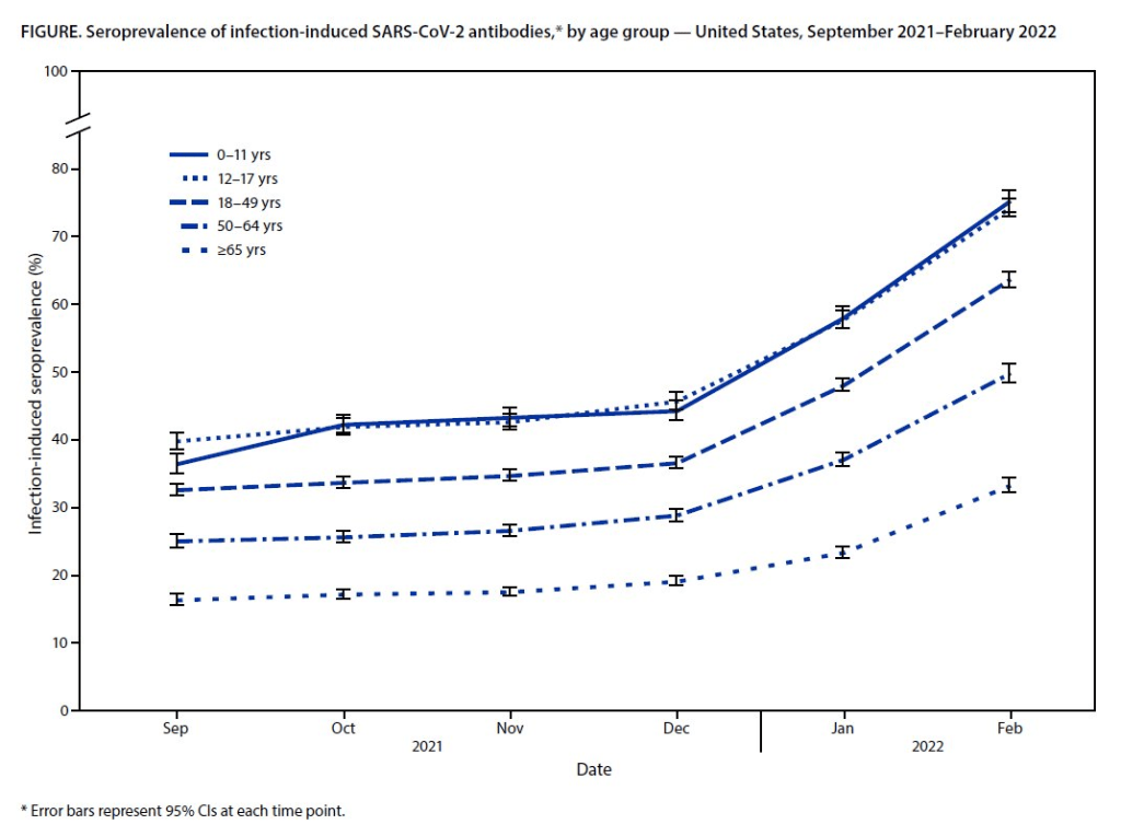
Almost 60% of Americans had antibodies from a prior COVID-19 case in February 2022, a CDC study found. This rate was even higher among young children and teenagers. More than half of Americans have some antibodies from a recent coronavirus infection, according to a new CDC report. The study was published Tuesday in the CDC’s Morbidity and Mortality Weekly Report (MMWR), accompanied by a press conference and other fanfare. To me, this report (and its publicity) reflects the CDC’s current lack of urgency around addressing the pandemic and its continued impacts.
The CDC regularly surveys COVID-19 antibody levels among the U.S. population, a metric that scientists call seroprevalence. For these surveys, the agency works with commercial laboratories to measure antibody rates from a nationally representative sample of Americans, with updates provided about once a month. The survey specifically looks at a type of antibody that develops in response to infection, not vaccination.
This most recent iteration of the survey, providing data from February 2022, is particularly notable: the CDC estimates that 58% of Americans had this immune system indicator of a recent COVID-19 infection, immediately after the nation’s massive Omicron wave. Not all of these people got COVID-19 during the Omicron wave, though, since some of these antibodies stem from earlier infections.
Other notable findings include:
- National seroprevalence increased from 34% in December 2021 to 58% in February 2022—the largest jump recorded in this survey—reflecting the Omicron wave’s impact.
- Children and teenagers had the highest antibody levels. For the 12 to 17 age group, seroprevalence went from 46% in December 2021 to 74% in February 2022.
There are some major caveats to this study, though, including:
- The imprecise nature of this antibody measurement. The type of antibody measured in this seroprevalence survey “stays positive for at least two years after infection,” CDC scientist Dr. Kristie Clarke said on the agency’s press call.
- Antibodies wane at different rates and levels for different people, so it’s unclear to what extent this 58% finding actually reflects the share of Americans who have gotten COVID-19 since spring 2020.
- Plus, some people infected by the coronavirus never seroconvert, meaning that they don’t develop antibodies at all (and thus wouldn’t show up in this study).
- While we know that the COVID-19 antibodies identified in this study confer some protection against new infections, it’s unclear how long that protection lasts or how it might hold up against new variants.
To me, this study (and the CDC’s choice to promote it with one of the agency’s infrequent press calls) exemplifies the Biden administration’s COVID-19 response right now.
As I listened to the press call, the CDC’s interpretation of this study was clear: more than half of Americans have some protection against COVID-19 from a prior infection, and many of those people also have protection against vaccination. Much of that protection applies specifically to Omicron and will likely help us avoid a crisis from BA.2, so it gives the U.S. additional reason to relax safety measures, the CDC suggested.
(Worth noting: the CDC still recommends vaccination and booster shots for anyone who had a previous coronavirus infection, including children. But that message is not getting across right now, as evidenced by our low booster shot uptake.)
When you ask for more specifics on that “protection” from prior infections, though, the CDC isn’t able to provide much information. Again, we don’t know how long the protection lasts or how it holds up against other variants. And we have no idea how many people had mild or asymptomatic COVID-19 cases, then did not seroconvert.
The CDC’s press call also failed to mention Long COVID, which is a risk from any COVID-19 case—no matter how mild. Some Long COVID researchers have also suggested that lack of seroconversion, or even a prior infection in general, may increase a patient’s future risk for prolonged symptoms the next time they get infected.
And, of course, the CDC report also exemplifies our current lack of surveillance. How many of those Omicron infections between December and February were actually caught by PCR testing and reported to the CDC? A small fraction. At the press call. Dr. Clarke mentioned an upcoming CDC study that estimates how many infections go uncounted for every one reported case:
In the Omicron period, we found that over that time period, the infection to case ratio was the highest that it’s been, at over three estimated infections per reported case. And that varied by region, so depending on which US census region the estimates were, you know, the ratios were higher or lower.
Surely that ratio is getting even higher now. To me, this forthcoming study, combined with the seroprevalence report, is a reminder that the cases we see in our datasets and dashboards are a very incomplete picture of actual coronavirus transmission in the U.S. And yet the CDC is using this incomplete picture to suggest we all relax, take our masks off, and forget about the pandemic.
More federal data
-
Sources and updates, April 24
- COVID-19 and public transportation: This week’s biggest COVID-19 news story was, without a doubt, a Florida judge striking down the U.S.’s mask mandate for public transportation (including airplanes, trains, buses, and terminals for all these transit methods). The federal justice department is appealing the decision, as the CDC has determined that masks are still necessary in these settings—at least, while the BA.2 surge is at large. Two good articles to read on this topic: Your Local Epidemiologist’s explanation of coronavirus transmission risk on planes, and Slate’s rundown of what this judge’s ruling could mean for future infectious disease outbreaks.
- Hospitalizations of young children during Omicron: A major study released in the CDC’s Morbidity and Mortality Weekly Report (MMWR) this week describes hospitalization rates among children ages five to 11, focusing on the Omicron wave in December through February. Findings include: about nine in ten of the children hospitalized during this period were unvaccinated, and hospitalization rates were twice in high in unvaccinated children compared to vaccinated children, demonstrating the importance of vaccination in the five to 11 age group.
- COVID-19 death rates by race and ethnicity: Another notable study published in MMWR this week: CDC researchers used provisional mortality data (based on death certificates) to study COVID-19 death rates among different racial and ethnic groups, comparing 2020 and 2021. Death rates for Hispanic, Black, and Native Americans were closer to the rates for white Americans in 2021 than they had been in 2020, the report found; this is likely tied to lower vaccination rates and, consequently, higher death rates in conservative and rural areas. For any reporters seeking to investigate these patterns in their regions, the Documenting COVID-19 project’s CDC mortality data repository includes county-level death data from the same source as this MMWR report.
- New CMS data on hospital and nursing home ownership: Nursing homes and other long-term care facilities have been under increased scrutiny during the pandemic, as COVID-19 revealed major flaws in facilities’ ability to care for vulnerable seniors, A series of new datasets from the Centers of Medicare & Medicaid Services (CMS) aims to enable more scrutiny: the datasets include changes of ownership for skilled nursing facilities and for hospitals. CMS plans to update these datasets on a quarterly basis, according to a press release about the new data.
- New funding for patient-led Long COVID research: The Patient-Led Research Collaborative (PLRC), a group of Long COVID patients that have produced leading research on their condition, announced this week that they’ve received $3 million in funding. This funding comes from Balvi, a fund for high-impact COVID-19 projects established by Ethereum co-creator Vitalik Buterin. PLRC announced that $2 million will go to start a pool of Long COVID research grants—to be awarded directly by patients—while the remaining $1 million will fund a series of PLRC-led studies. I look forward to reporting on the results of this research! (Also, related: this week, I updated the source list of Long COVID patients and experts willing to talk to reporters, which I compiled with Fiona Lowenstein.)
- FDA authorizes breathalyzer for COVID-19: The latest new COVID-19 test is a breathalyzer: this machine, developed by Texas-based diagnostics company InspectIR, analyzes chemicals in a person’s breath to quickly detect compounds signifying a coronavirus infection. This test can deliver results in just three minutes—even faster than an antigen test—but it needs to be performed in a medical setting; InspectIR is working on a version that could be hand-held, like breathalyzers for alcohol. Impressive as the technology is, this data reporter is asking: how will those test results get reported to public health agencies?
-

The CDC’s isolation guidance is not based on data

A study published in the CDC’s own journal indicated that about half of people infected with Omicron are still contagious 5-10 days after their isolation period starts. Chart via CDC MMWR. Maybe it’s because I’m a twenty-something living in the Northeast, but: quite a few of my friends have gotten COVID-19 in the last couple of weeks. The number of messages and social media posts I’m seeing about positive rapid tests isn’t at the level it was during the Omicron surge, but it’s notable enough to inspire today’s review of the CDC’s isolation guidance.
Remember how, in December, the CDC changed its recommendations for people who’d tested positive for COVID-19 to isolating for only five days instead of ten? And a bunch of experts were like, “Wait a second, I’m not sure if that’s sound science?” Well, studies since this guidance was changed have shown that, actually, a lot of people with COVID-19 are still contagious after five days. Yet the CDC has not revised its guidance at all.
(Also, to make sure we’re clear on the terms: isolation means avoiding all other human beings because you know that you have a contagious disease and don’t want to infect others. Quarantine means avoiding other humans because you might have the disease, due to close contact with someone who does or another reason for suspicion.)
The current CDC guidance still says that, if you test positive: “Stay home for 5 days and isolate from others in your home.” Yet, in recent weeks, I’ve had a couple of friends ask me: “Hey, so it’s been five days, but… I’m not sure I’m ready to rejoin society. Should I take a rapid test or something?”
Yes. The answer is yes. Let’s unpack this.
Studies indicating contagiousness after five days
As this NPR article on isolating with Omicron points out, the CDC guidance was “largely based on data from prior variants.” At the time of this five-day recommendation, in late December, scientists were still learning about how Omicron compared to Delta, Alpha, and so on, particularly examining the mechanisms for its faster spread and lower severity.
But now, almost four months later, we know more about Omicron. This version of the coronavirus, research suggests, is more capable of multiplying in the upper respiratory tract than other variants. People infected with Omicron are able to spread the virus within a shorter time compared to past strains, and they are able to spread it for a higher number of days—even if their symptoms are mild.
One study that demonstrates this pattern is a preprint describing Omicron infections among National Basketball Association (NBA) players, compared to cases earlier in 2021. Researchers at Harvard’s and Yale’s public health schools, along with other collaborators, compared 97 Omicron cases to 107 Delta cases. NBA players are a great study subject for this type of research, because their association mandates frequent testing (including multiple tests over the course of a player’s infection).
The big finding: five days after their Omicron infections started, about half of the basketball players were still testing positive with a PCR test—and showing significant viral load, indicating contagiousness. 25% were still contagious on day six, and 13% were still contagious on day seven. These patients also saw less of a consistent pattern in the time it took to reach their peak contagiousness than the players infected with Delta.
From the NPR article:
“For some people with omicron, it happens very, very fast. They turn positive and then they hit their peak very quickly. For others, it takes many days” – up to eight or even 10 days after turning positive, says the study’s senior author, Dr. Yonatan Grad, an associate professor of immunology and infectious diseases at the Harvard T.H. Chan School of Public Health.
While this NBA study is a preprint, other research has backed up its findings. One study from Japan, shared as a “preliminary report” in January, found that people infected with Omicron had the highest levels of viral RNA—indicating their highest levels of contagiousness—between three and six days after their symptoms started. The researchers saw a “marked decrease” in viral RNA only after ten days.
Another preprint, from researchers at the University of Chicago (and antigen test proponent Michael Mina), examined Omicron infections among healthcare workers at the university medical center. Out of 309 rapid antigen tests performed on 260 healthcare workers, 134 (or about 43%) were positive results received five to ten days after these workers started experiencing symptoms.
The highest test positivity rate for these workers, according to the study, was “among HCW returning for their first test on day 6 (58%).” In other words, more than half of the workers were still infectious six days after their infection began, even though the CDC guidance would’ve allowed them to return to work.
Later in February, a study in the CDC’s Morbidity and Mortality Weekly Report (MMWR)—or, the CDC’s own journal—shared similar results. The report, authored by CDC researchers and practitioners at a healthcare system in rural Alaska, looked at antigen test results from hundreds of infections reported to this health system during the Omicron wave.
The main finding: between five and nine days after patients were diagnosed with COVID-19, 54% (396 out of 729 patients) tested positive on rapid antigen tests. “Antigen tests might be a useful tool to guide recommendations for isolation after SARS-CoV-2 infection,” the authors wrote.
Following this, an early March preprint from researchers at Massachusetts General Hospital, MIT, Harvard, and other collaborators analyzed infections among 56 people during the Delta and Omicron waves. This study used viral cultures to examine contagiousness directly, rather than simply looking at test results.
Like past research, this study found that over half of patients (with both Omicron and Delta) were still contagious five days into their infections. About one-fourth were still contagious at day eight.
Guidance for people testing positive
All of the above studies suggest similar conclusions: about half of people infected with Omicron will still be contagious five days after their positive test results or the start of their symptoms, despite what the CDC’s guidance says. If you get infected with BA.2 in the coming surge, the best way to figure out whether you’re contagious after day five is by taking a rapid antigen test.
In fact, for the highest accuracy (and peace of mind), I’d recommend taking two antigen tests, two days in a row. If both are negative, then you’re probably good to return to society—but maybe don’t travel to visit an elderly relative just yet.
This two-rapid-test guidance comes from the U.K. Health Security Agency, which recommended in December that Brits could isolate for seven days instead of ten if they tested negative on days six and seven of their isolation. (The U.K.’s guidance has since become more lenient, but this is still a good rule for reference—more based in science than the CDC’s guidance.)
What else should you do if you test positive? Here are a few recommendations that I’ve been giving friends and family:
- Be prepared to isolate for a week or two, even if you may be able to leave isolation after a shorter period (with rapid tests).
- After leaving isolation, wear a good mask (i.e. an N95 or KN95) in all public spaces.
- Look into treatment options near you. The HHS has a database of publicly available COVID-19 therapeutics, while some localities (like New York City) have set up free delivery systems for these drugs.
- There’s also the HHS Test to Treat program, which allows people to get tested for COVID-19 and receive treatment in one pharmacy visit. This program has faced a pretty uneven rollout so far, though.
- Rest as much as possible, even if you have mild symptoms; patient advocates and researchers say that this reduces risk for developing Long COVID.
More testing data
-
Sources and updates, April 10
- Lessons learned from the non-superspreader Anime NYC convention: Last fall, one of the first Omicron cases detected in the U.S. was linked to the Anime NYC convention, a gathering of more than 50,000 fans. Many worried that the event had been a superspreader for this highly contagious variant, but an investigation from the CDC later found that, in fact, Omicron spread at the convention was minimal. My latest feature story for Science News unpacks what we can learn from this event about preventing infectious disease spread—not just COVID-19—at future large events. I am a big anime fan (and have actually attended previous iterations of Anime NYC!), so this was a very fun story for me; I hope you give it a read!
- States keep reducing their data reporting frequency: Last Sunday, I noted that Florida—one of the first states to shift from daily to weekly COVID-19 data updates—has now gone down to updating its data every other week. This is part of an increasing trend, writes Beth Blauer from the Johns Hopkins COVID-19 data team in a recent blog post. “As of March 30, only eight states and territories (AR, DE, MD, NJ, NY, PA, PR, and TX) report case data every day of the week,” Blauer says. And it seems unlikely that states will increase reporting frequencies again without a major change in public health funding or the state of the pandemic.
- Biden administration announces Long COVID task force: This week, the Biden administration issued a memo addressing the millions of Americans living with Long COVID. The administration is creating a new, interagency task force, with the goal of developing a “national research action plan” on Long COVID, as well as a report laying out services and resources that can be directed to people experiencing this condition. It’s worth noting that recent estimates from the U.K. indicate 1.7 million people in that country (or one in every 37 residents) are living with Long COVID; current numbers in the U.S. are unknown due to data gaps, but are likely on a similar scale, if not higher.
- New scientific data sharing site from the NIH: Not directly COVID-related, but an exciting new source: the National Institutes of Health (NIH) has created an online data repository for projects funded by and affiliated with the agency. The site currently includes over 100 datasets, including scientific data, genomic data, and clinical data; it also includes information on data management and sharing for researchers working on these projects. This press release from NIH has more info. (H/t Liz Essley Whyte.)
- Study indicates continued utility for COVID-19 testing in schools: During the Omicron surge, testing programs in a lot of schools collapsed, simply because institutions didn’t have enough resources to handle all of the students and staff getting sick. The surge led some schools to consider whether school testing programs are worth continuing at all. But a new study, released last week in The Lancet, suggests that yes, surveillance testing can still reduce transmission—even when schools are dealing with highly contagious variants. (Note that this was a modeling study, not a real-world trial.)
- Preprint shows interest in self-reporting antigen test results: Another interesting study released recently: researchers at the University of Massachusetts distributed three million free rapid, at-home antigen tests between April and October 2021, then studied how test recipients interacted with a digital app for ordering tests and logging results. About 8% of test recipients used the app, the researchers found; but more than 75% of those who used it did report their antigen test results to their state health agency. The results (which haven’t yet been peer-reviewed) suggest that, if institutions make it easy and accessible for people to self-report their test results, the reporting will happen.
-

All the U.S.’s COVID-19 metrics are flawed
This week, I had a big retrospective story published at FiveThirtyEight: I looked back at the major metrics that the U.S. has used to track COVID-19 over the past two years—and how our country’s fractured public health system hindered our use of each one.
The story is split into seven sections, which I will briefly summarize here:
- Case counts, January to March 2020: Early on in the pandemic, the U.S. had a very limited picture of COVID-19 cases due to our very limited testing: after rejecting a test made by the WHO, the CDC made its own test—which turned out to have contamination issues, further slowing down U.S. testing. In early March 2020, for example, the majority of cases in NYC were identified in hospitals, suggesting that official counts greatly underestimated the actual numbers of people infected.
- Tests administered, March to September 2020: Test availability improved after the first wave of cases, with organizations like the COVID Tracking Project keeping a close eye on the numbers. But there were a lot of challenges with the testing data (like different units across different states) and access issues for Americans with lower socioeconomic status.
- Hospitalizations, October to December 2020: By late 2020, many researchers and journalists were considering hospitalizations to be a more reliable COVID-19 metric than cases. But it took a long time for hospitalization data to become reliable on a national scale, as the HHS launched a new tracking system in the summer and then took months to work out kinks in this system.
- Vaccinations, January to June 2021: When the vaccination campaign started in late 2020, it was “tempting to forget about all other COVID-19 metrics,” I wrote in the story. But the U.S.’s fractured system for tracking vaccinations made it difficult to analyze how close different parts of the country were to prospective “herd immunity,” and distracted from other public health interventions that we still needed even as people got vaccinated.
- Breakthrough cases, July to November 2021: The Delta surge caused widespread infections in people who had been vaccinated, but the CDC—along with many state public health agencies—was not properly equipped to track these breakthrough cases. This challenge contributed to a lack of good U.S. data on vaccine effectiveness, which in turn contributed to confusion around the need for booster shots.
- Hospitalizations (again), December to January 2022: The Omicron surge introduced a need for more nuance in hospitalization data, as many experts asked whether COVID-19 patients admitted with Omicron were actually hospitalized for their COVID-19 symptoms or for other reasons. Nuanced data can be useful in analyzing a variant’s severity; but all COVID-related hospitalizations cause strain on the healthcare system regardless of their cause.
- New kinds of data going forward: In our post-Omicron world, a lot of public health agencies are shifting their data strategies to treat COVID-19 more like the flu: less tracking of individual cases, and more reliance on hospitalization data, along with newer sources like wastewater. At this point in the pandemic, we should be fortifying data systems “for future preparedness,” I wrote, rather than letting the systems we built up during the pandemic fall to the wayside.
I did a lot of reporting for this piece, including interviews with some of the U.S.’s foremost COVID-19 data experts and communicators. As long as the piece is, there were a lot of metrics (and issues with these metrics) that came up in these interviews that I wasn’t able to include in the final story—so I wanted to share some bonus material from my reporting here.
Long COVID:
As I’ve discussed in previous issues, the U.S. has done a terrible job of collecting data on Long COVID. The NIH estimates that this condition follows a significant share of coronavirus infections (between 10% and 30%), but we have limited information on its true prevalence, risk factors, and strategies for recovery.
Here’s Dr. Eric Topol, the prolific COVID-19 commentator and director of the Scripps Research Translational Institute, discussing this data problem:
[Long COVID has] been given very low priority, very little awareness and recognition. And we have very little data to show for it, because it hasn’t been taken seriously. But it’s a very serious matter.
We should have, early on, gotten at least a registry of people —a large sample, hundreds of thousands of people prospectively assessed, like is being done elsewhere [in the U.K. and other countries]. So that we could learn from them: how long the symptoms lasted, what are the symptoms, what are the triggers, what can be done to avoid it, the role of vaccines, the role of boosters, all this stuff. But we have nothing like that.
The NIH’s RECOVER initiative may answer some of these questions, but it will take months—if not years—for the U.S. to actually collect the comprehensive data on Long COVID that we should have started gathering when the condition first began gaining attention in 2020.
Demographic data:
In the testing section of the story, I mention that the U.S. doesn’t provide much demographic data describing who’s getting tested for COVID-19. There is actually a little-known provision in the CARES Act that requires COVID-19 testing providers to collect certain demographic data from all people who seek tests. But the provision is not enforced, and any data that are collected on this subject aren’t making it to most state COVID-19 dashboards, much less to the CDC’s public data dashboard.
Here’s Dr. Ellie Murray, an epidemiologist at the Boston University School of Public Health, discussing why this is an issue:
We don’t collect reason for seeking a test. We don’t collect age, race, ethnicity, occupation of people who seek a test. Those kinds of things could provide us with some really valuable information about who is getting tested, when, and why—that could help us figure out, what are the essential occupations where people are having a lot of exposures and therefore needing to get a lot of tests? Or are there occupations where we’re seeing a lot of people end up in hospital, who have those occupations, but they’re not getting tests, because actually, the test sites are nowhere near where they need to work, or they don’t have the time to get there before they close.
And so we don’t really know who is getting tested, and that, I think, is a bigger problem, than whether the numbers that are being tested tell us anything about the trajectory of COVID. Because we have case data, and hospitalization data, and death data to tell us about the trajectory. And the testing could really tell us more about exposure, and concern, and access—if we collected some more of this data around who is getting tested and why.
Test positivity:
Speaking of testing: another metric that I didn’t get into much in the story was test positivity. Test positivity—or, the share of COVID-19 tests that return a positive result—has been used from the CDC to local school districts as a key metric to determine safety levels. (For more on this metric, check out my FAQ post from this past January.)
But even when it’s calculated correctly, test positivity faces the same challenges as case data: namely, bias in who’s getting tested. Here’s Lauren Ancel Meyers, director of the University of Texas at Austin’s COVID-19 Modeling Consortium, explaining this:
Test positivity is just as fraught [as cases]. It’s just as difficult, because you need to know the numerator and the denominator—what’s influencing the numerator and the denominator? Who is going to get tested, who has access to tests? … It used to be, at the very beginning [of the pandemic], nobody could get a test who wanted a test. And now, today, everybody has a test in their medicine cabinet, and they don’t get reported when they test. It’s different issues that have ebbed and flowed throughout this period.
Often, if you’re a good data analyst or a modeler, and you have all the information, you can handle those kinds of biases. But the problem is, we don’t know the biases from day to day. And so even though there are statistical tools to deal with incomplete bias, without knowing what those biases are, it’s very hard to do reliable inference, and really hard to understand what’s actually going on.
Genetic surveillance:
Also related to testing: genetic surveillance for coronavirus variants of concern. Genetic surveillance is important because it can help identify new variants that may be more transmissible or more likely to evade protection from vaccines. It can additionally help track the qualities of concerning variants once they are identified (if variant data is linked to hospitalization data, vaccination data, and other metrics—which is not really happening in the U.S. right now.)
Our current genetic surveillance systems have a lot of gaps. Here’s Leo Wolansky, from the Rockefeller Foundation’s Pandemic Prevention Institute (PPI), discussing how his organization seeks to address these challenges:
[We’re trying to understand] where our blind spots are, and the bias that we might experience with a lot of health system reporting. One of the things that PPI has been doing is identifying centers of excellence in different parts of the world that can improve the sequencing of new cases in underrepresented countries. And so for example, we’ve provided quite a bit of support to the folks in South Africa that ultimately rang the alarm on Omicron.
We’re also doing this by actually trying to systematically assess countries’ capacity for this type of genomic surveillance. So thinking about, how many tests have been recorded? What’s that test positivity rate? Do we have confidence in the basic surveillance system of the country? And then, do we also see enough sequences, as well as sequencing facility data, to demonstrate that this country can sequence and just isn’t doing enough—or cannot sequence because it needs foundational investment in things like laboratories and devices. We’ve been mapping this capacity just to make sure that we understand where we should be investing as a global community.
The Pandemic Prevention Institute is taking a global perspective in thinking about data gaps. But these gaps also exist within the U.S., as is clear when one looks at the differences in published coronavirus sequences from state to state. Some states, like Wyoming, Vermont, and Colorado, have sequenced more than 10% of their cumulative cases, according to the CDC. Others, like Oklahoma, Iowa, and South Dakota, have sequenced fewer than 3%. These states need additional investment in order to thoroughly monitor coronavirus transmission among their residents.
Cohort studies:
In a cohort study, researchers follow a group of patients over time in order to collect long-term data on specific health conditions and/or the outside factors that influence them. The U.S. has set up a few cohort studies for COVID-19, but they haven’t been designed or utilized in a way that has actually provided much useful data—unlike cohort studies in some other countries. (The U.K., for example, has several ongoing cohort studies collecting information on COVID-19 symptoms, infections in schools, seroprevalence, and more.)
Here’s Dr. Ellie Murray explaining the lost potential of these studies in the U.S.:
There are a number of existing cohort studies that have been asked or who asked to pivot to collecting COVID information and therefore collecting long-term COVID information on their cohorts. But there doesn’t seem to be any kind of system to [determine], what are the questions we need answered about COVID from these kinds of studies? And how do we link up people who can answer those questions with the data that we’re collecting here, and making sure we’re collecting the right data? And if this study is going to answer these questions, and this one is going to answer those questions—or, here’s how we standardize those two cohorts so that we can pull them together into one big COVID cohort.
And so, we end up in this situation where, we don’t know what percent of people get Long COVID, even though we’ve been doing this for over two years. We don’t even really know, what are all the different symptoms that you can get from COVID? … There are all these questions that we could be sort-of systematically working our way through, getting answers and using them to inform our planning and our response. [In addition to having] standardized questions, you also need a centralized question, instead of just whatever question occurs to someone who happens to have the funding to do it.
Excess deaths:
Excess deaths measure the deaths that occur in a certain region, over a certain period of time, above the number of deaths that researchers expect to see in that region and time period based on modeling from past years’ data. Excess deaths are the COVID-19 metric with the longest lag time: it takes weeks from initial infection for someone to die of the disease, and can take weeks further for a death certificate to be incorporated into the public health system.
Once that death information is available, however, it can be used to show the true toll of the pandemic—analyzing not just direct COVID-19 deaths, but also those related to isolation, financial burden, and other indirect issues—as well as who has been hit the hardest.
Here’s Cecile Viboud, a staff scientist at the NIH who studies infectious disease mortality, discussing this metric:
We’ve been using the excess death approach for a long time. It comes from flu research, basically starting in 1875 in the U.K. And it was used quite a lot during the 1918 pandemic. It can be especially good in examining historical records where you don’t have lab confirmation—there was no testing ability back in those days…
So, I think it’s kind of natural to use it for a pandemic like COVID-19. Very early on, you could see how useful this method was, because there was so little testing done. In March and April 2020, you see substantial excess, even when you don’t see lab-confirmed deaths. There’s a disconnect there between the official stats, and then the excess mortality… [We can also study] the direct effect of COVID-19 versus the indirect effect of the pandemic, like how much interventions affected suicide, opioids, death, accidents, etc. The excess approach is also a good method to look at that.
Viboud also noted that excess deaths can be useful to compare different parts of the U.S. based on their COVID-19 safety measures. For example, one can analyze excess deaths in counties with low vaccination rates compared to those with high vaccination rates. This approach can identify the pandemic’s impact even when official death counts are low—an issue that the Documenting COVID-19 project has covered in-depth.
Again, you can read the full FiveThirtyEight story here!
More federal data
-

Why Utah’s innovative school COVID-19 testing program failed
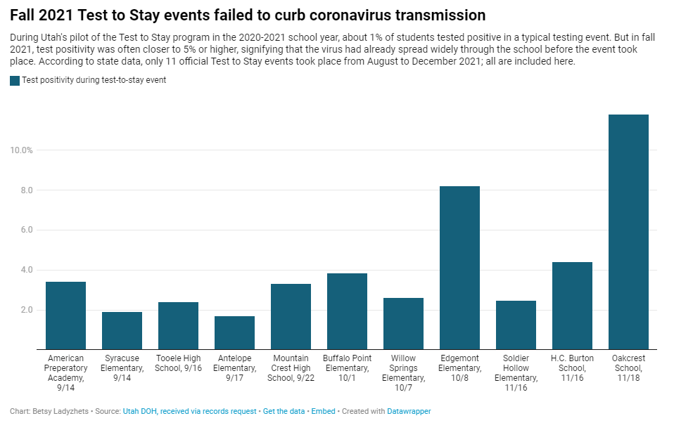
In fall 2021, testing events at Utah public schools failed to decrease coronavirus transmission. My latest story with the Documenting COVID-19 project is an investigation into Utah’s school COVID-19 testing program, in collaboration with the Salt Lake Tribune.
As longtime readers know, I have done a lot of reporting on school COVID-19 testing programs. I find these efforts to routinely test K-12 students fascinating, in part because of the unique potential for collaboration between school districts, health departments, and other community institutions—and also because of the immense challenges that arise when schools are asked to become health providers in a way we never would’ve considered before the pandemic.
Utah’s program caught my eye last year when I was reporting a story for Science News on the hurdles schools faced in setting up COVID-19 testing. This state was an early pioneer of Test to Stay, a strategy in which students must test negative to attend school after a potential exposure rather than going through a (potentially unnecessary) quarantine.
In Utah’s version of Test to Stay, once 1% of students tested positive for the virus, the entire school would go through a testing event. Students who tested negative could keep attending school without interruption, while those who tested positive (or those who refused to participate) could quarantine. The Utah health department tested out this program in the 2020-2021 school year, and it was so successful that a CDC MMWR boasted it had “saved over 100,000 days of in-person instruction.”
After that successful test, Utah’s state legislature codified the program into law for the 2021-2022 school year. But Test to Stay crashed and burned this past fall, even before the Omicron variant overwhelmed Utah’s test supplies.
Here’s why the program failed, according to our investigation:
- When putting Test to Stay into law, the Utah state legislature doubled the threshold for school cases that would trigger a testing event, from 1% to 2% of the student body. (Or from 15 to 30 students at smaller schools with under 1,500 students.) This higher threshold allowed COVID-19 to spread more widely before testing events took place, leading to higher case numbers when students were finally tested.
- Utah’s lawmakers also banned schools from requiring masks in fall 2021, leading to more transmission. Experts said the original program was intended to be paired with masks and other safety measures; it was not able to stand on its own.
- In the 2020-2021 school year, Test to Stay was paired with a second program called Test to Play: mandatory testing every two weeks for students on sports teams and in other extracurriculars. Without this regular testing in fall 2021, Utah schools had less capacity to identify school cases outside of voluntary and symptomatic tests—so it took longer for schools to reach the Test to Stay threshold.
- The Utah health department allowed individual schools and districts to request rapid tests for additional surveillance testing. Some administrators requested thousands of tests and made them regularly available to students and staff; others were entirely uninterested and did not encourage testing at their schools.
- Testing in schools has become increasingly polarized in recent months, like all other COVID-19 safety measures. One school administrator told me that he faced some vocal parents who felt “that their rights were being trampled on” by the testing program. Without high numbers of students opting in to get tested, testing programs are inherently less successful.
Even though the CDC endorsed Test to Stay as part of its official school COVID-19 guidance last December—citing Utah’s program as a key example—its future in the state is now uncertain. State lawmakers paused the program during the Omicron surge in January and have yet to revive it. At the same time, lawmakers have made it even harder for Utah schools to make their own decisions around safety measures.
What school districts and health departments should actually be doing, experts told me, is stock up on rapid tests now so that they’re ready to do mass testing in future surges. It’s unlikely that the Omicron wave will be our last, much as some Utah Republicans might want to pretend that’s the case.
You can read my full story at MuckRock’s site here (in a slightly longer version) or at the Salt Lake Tribune here (in a slightly shorter version). And the documents underlying this investigation are available on the Documenting COVID-19 site here.
More K-12 reporting
-
Five more things, February 27
Five additional news items from this week:
- The CDC is not publicly releasing a lot of its COVID-19 data. Last weekend, New York Times reporter Apoorva Mandavilli broke the news that the CDC has withheld a lot of its COVID-19 data from the public, including information on breakthrough cases, demographic data, and wastewater data. This news was honestly not surprising to me because it follows a pattern: the CDC doesn’t like to share information unless it can control the interpretations. But I appreciated the conversation brought on by this article, with public health experts saying they’d rather have imperfect data than a complete data void. (I agree!)
- BA.2 is definitely more transmissible than the original Omicron strain, but it does not appear to be significantly more severe or more capable of evading vaccines. Two recent posts, one in the New York Times COVID-19 updates page and one from Your Local Epidemiologist, share some updates on what scientists have learned about BA.2 in the past couple of weeks. In the U.S. and other countries with BA.2, this sublineage doesn’t seem to be causing a major rise in cases—at least so far.
- New CDC study shows the utility of rapid testing out of isolation. More than half of patients infected with the coronavirus tested positive on rapid antigen tests between five and nine days after their initial diagnosis or symptom onset, a new CDC report found. The report includes over 700 patients at a rural healthcare network in Alaska. These findings suggest that rapid testing out of isolation is a good way to avoid transmitting the virus to others, if one has the tests available.
- January saw record-high coronavirus infections in hospitals. POLITICO reporters analyzed hospitalization data from the Department of Health and Human Services (HHS), finding that: “More than 3,000 hospitalized patients each week in January had caught Covid sometime during their stay, more than any point of the pandemic.” This high number demonstrates Omicron’s high capacity to infect other people.
- Hong Kong’s surge shows the value of vaccinations. Hong Kong has been a global leader in keeping COVID-19 cases low throughout the pandemic, yet Omicron has tested this territory’s strategy—causing record cases and overwhelming hospitals. One major issue for Hong Kong has been low vaccination rates, particularly among the elderly, as people did not see the need to get vaccinated when cases in the territory were practically nonexistent.
-
Three more things, January 30
A couple of additional news items for this week:
- Two House Democrats called on the CDC to release more Long COVID data. This week, Rep. Ayanna Pressley (from Massachusetts) and Rep. Don Beyer (from Virginia) sent the CDC a letter insisting that the agency report estimates of Long COVID infection numbers, including demographic breakdowns by race, gender, and age. “Collecting and publishing robust, disaggregated demographic data will help us better understand this illness and ensure that we are targeting lifesaving resources to those who need them most,” said Rep. Pressley in a statement to the Washington Post. While studies that may, theoretically, help provide such data are in the works via the National Institutes of Health’s RECOVER consortium, the consortium has yet to release any results. Long COVID continues to represent one of the biggest COVID-19 data gaps in the U.S.
- We don’t know yet whether cannabis can treat COVID-19, despite promising early studies. Recent studies have shown that CBD, along with other products containing marijuana and hemp, has some capacity to block coronavirus spread in the body in lab-grown cells and in mice. The studies were quickly turned into sensationalist headlines, even though it’s too early to say whether these products could actually be used to treat COVID-19. An excellent STAT News article by Nicholas Florko and Andrew Joseph describes the studies and their limitations, as well as how these early reports of COVID-19 treatment potential are “adding to the FDA’s existing CBD headache” when it comes to regulating these products.
- Have you received your free at-home rapid tests from the USPS yet? Last week, I described the federal government’s effort to distribute at-home rapid tests to Americans free of charge, along with the equity issues that have come with this initiative so far. This week, I saw some reports on social media indicating that people have started receiving their tests! Have you gotten your tests yet? If you have, I would love to hear from you—in absence of formal data from the USPS, maybe we can do some informal data collection on test shipping times within the COVID-19 Data Dispatch community.
Note: this title and format are inspired by Rob Meyer’s Weekly Planet newsletter.
-
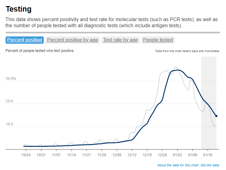
FAQ: A refresher on test positivity rates

Test positivity trends for New York City, calculated and reported by the city health agency. Chart retrieved on January 23. I’ve recently been getting a lot of questions about test positivity rates, both from COVID-19 Data Dispatch readers and from friends outside this project, which reminded me of just how confusing this pandemic metric can be. So, here’s a brief FAQ post about test positivity; if you have more questions, shoot me an email!
What is a test positivity rate?
A test positivity rate is calculated through simple division: the number of positive tests counted in a particular region or setting during a particular period of time, over the number of total tests (positive and negative) conducted during that same period.
Where do test positivity rates come from?
While the test positivity rate calculation may seem simple, matching together the right numbers for that numerator and denominator can get pretty tricky. This is because, at the federal level as well as at most state and local health departments, positive tests and total tests are reported through different systems.
Positive tests—also known, more simply, as cases—are prioritized for reporting. This is because public health departments need to know how many cases they are currently dealing with for contact tracing, potential hospital utilization in the coming weeks, and other crucial health system reasons. If a health department is pressed for time during a surge or coming back from a holiday break, it will analyze and report out case data before going through total test data. Similarly, many labs report their positive tests to health agencies separately from (and earlier than) total tests.
As a result, simply dividing the new cases reported on a particular day over the new tests reported that day often won’t give you an accurate test positivity figure. Instead, the data analysts that calculate these rates typically match up the dates that tests were conducted. So, instead of dividing “all cases reported on Tuesday” over “all tests reported on Tuesday,” you’d divide “all tests conducted on Tuesday that returned positive results” over “total tests conducted on Tuesday.” This calculation provides a more accurate picture of test positivity.
Also, different states and localities might report tests using different units, like “tests conducted,” “people tested,” and “testing encounters”—making it difficult to compare test positivity rates across states. This was a larger problem earlier in the pandemic; I recommend reading this excellent COVID Tracking Project analysis post for more info on the issue.
How do you know a test positivity figure is reliable?
As I explained in a recent post about the John Hopkins University (JHU) dashboard, the test positivity rates that appear on national dashboards often are not reliable because they fail to take these timing issues into account. A dashboard like JHU’s, which automatically scrapes data from state health agencies, does not have the backend information about the dates tests were conducted needed to calculate accurate positivity rates.
JHU recently changed its test positivity calculations to better address differing testing units across states. Still, as the team behind this dashboard explains in a blog post, a lack of standardization across how states report their testing data makes it difficult to calculate positivity rates that can be accurately compared between jurisdictions.
For that reason, I tend to trust test positivity rates calculated by individual state and local health agencies over those calculated by large, aggregating dashboards. For example, the NYC health department reports its own test positivity rate and does so with a three-day lag, in order to allow time for matching testing dates to case dates.
In addition, I would be wary of test positivity rates that are calculated for a longer period than one or two weeks. Test positivity, as a metric, is meant to be an indicator of the current situation in a state, region, or a specific setting like a university campus; when reported for a longer period (like a month) or cumulatively, this metric doesn’t tell you anything useful.
If you’re looking for a national test positivity rate source, the HHS’s Community Profile Reports include these figures for states, counties, metro areas—albeit with some reporting delays and gaps in certain states.
How do you interpret test positivity rate data?
I find this explanation from the COVID Tracking Project very helpful:
Test positivity can help us understand whether an area is doing enough tests to find its COVID-19 infections. The metric is widely used by local, state, and federal agencies to roughly gauge how well disease mitigation efforts are going. Put simply, when test positivity is high, it’s likely that not enough tests are being done and that most tests that are done are performed on symptomatic people. Both of these factors—insufficient testing and only testing people who feel sick—make it very likely that many cases are going undetected.
What would we consider a “high” test positivity rate? The CDC threshold here is over 10%; such a positivity rate means that one in ten tests conducted are returning positive results, indicating a lot of symptomatic people are getting tested for COVID-19 and a lot of cases are going undetected. A region with a positivity rate over 10% should step up its testing efforts and encourage asymptomatic people to get tested for surveillance purposes.
On the other end of the spectrum, 3% and 5% are commonly used as thresholds for low test positivity. The specific number might depend on an institution’s testing capacity; at a business that regularly tests all of its workers and is already looking for asymptomatic cases, a test positivity over 2% might already be cause for concern.
Generally, though, if this number is under 5%, it’s a good indicator that the region or setting has high enough test capacity to identify asymptomatic cases—and the majority of cases are being caught.
More posts on testing
