Tag: source shout-out

  • COVID source shout-out: Science Writers organizers

    This weekend, I’m attending the Science Writers conference in Memphis, Tennessee. I’ve been to a few journalism conferences in 2022, along with other larger events (theater performances, concerts, etc.), and Science Writers has the best COVID-19 safety protocols I have encountered so far.

    The event’s safety protocols include:

    • A vaccine requirement (which includes boosters);
    • Masks required indoors unless one is actively eating or drinking;
    • No eating or drinking in conference rooms (in other words, masks stay on);
    • Outdoor space for all meals and networking events;
    • Virtual options for people who did not wish to attend in person.

    I have particularly appreciated the outdoor space for meals. For me, it really takes the stress out of the networking to not worry about constantly keeping on a high-quality mask—because I know I’m in a well-ventilated, outdoor location.

    From talking to a couple of people in leadership of the National Association of Science Writers and Council for the Advancement of Science Writing (which jointly organize the conference), I’ve learned that committing to these safety measures wasn’t easy—so I wanted to convey my deep appreciation. Measures like these make it possible for higher-risk people to attend the event, while also demonstrating the values of our organizations.

    (For more information on COVID-safe events, see this feature story I wrote for Science News earlier in the year!)

  • COVID source shout-out: Bloomberg’s vaccine tracker

    Last week, the team behind Bloomberg’s COVID-19 vaccine tracker announced that the dashboard will stop updating on October 5.

    Drew Armstrong, senior health care editor and leader of the tracking effort, provided the motivations for this decision in an update post. New rounds of booster shots around the world, including bivalent shots in some countries, have made it harder to track and present data: “There are more categories of data to collect and fewer simple comparisons among the more than 100 countries we’ve been tracking,” Armstrong wrote.

    Armstrong also explained that the vaccine tracker has been a huge lift for Bloomberg, and the company is only able to put so many resources into a dashboard that really should be provided by government or academic institutions. (The COVID Tracking Project’s leaders said something similar when that project stopped data collection in spring 2021.)

    While I’m sad to see this tracker go, I understand the decision and remain very grateful for all the work that’s gone into it since vaccination campaigns started in winter 2020. Congratulations to all of the Bloomberg journalists who contributed to this valuable resource!

  • COVID source shout-out: Millions Missing protest

    COVID source shout-out: Millions Missing protest

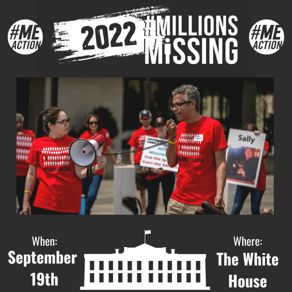
    Flyer for the Long COVID and ME/CFS-led protest, happening tomorrow at the White House. Image via ME Action.

    Tomorrow afternoon, patient-advocates living with Long COVID and other chronic diseases will be at the White House demanding that the federal government act urgently to address these conditions. ME Action, an advocacy group focused on myalgic encephalomyelitis or chronic fatigue syndrome (ME/CFS), is the leading organization behind the protest.

    The protest’s demands include nationwide education on ME/CFS and Long COVID, education specifically for doctors in diagnosing these conditions, funding for research and potential treatments, and economic support for patients.

    While the main event will take place in Washington, D.C., organizers are also encouraging people from other parts of the country to participate online. You can learn more about the event here. (I personally plan to watch and cover the protest remotely.)

    Patient advocacy around Long COVID and related conditions like ME/CFS has grown mostly remotely over the last two years, so it’s a major milestone for patient groups to converge on the White House in an event like this one. For any journalists interested in covering the protest, feel free to email or DM me for background info, connections to organizers, etc!

  • COVID source shout-out: Household Pulse Survey

    A lot of COVID-19 data sources have become decidedly less reliable since the beginning of 2022, through a combination of official case counts becoming poorer reflections of prevalence (thanks to less PCR testing) and fewer resources devoted to data tracking at public health departments from local agencies up to the CDC.

    But one federal source has remained fairly consistent: the Household Pulse Survey. This project, run by the Census in collaboration with a variety of other government agencies, started in spring 2020 as a way to track how the pandemic was impacting Americans’ daily lives. Every two weeks, government researchers randomly survey U.S. adults with questions ranging from their employment status to mental health. As of this summer, the Household Pulse Survey also includes data on Long COVID prevalence.

    For every question asked by the Household Pulse Survey, you can find results over time, by state, and for a variety of other demographics: race, ethnicity, age, gender, sexuality, etc. I appreciate that this source has continued measuring the pandemic’s impact, and I think journalists (myself included!) could be referencing it a lot more.

  • COVID source shout-out: the gasoline index?

    Two weeks ago, I reported that the Yankee Candle Index is once again predicting a major COVID-19 surge; in other words, an influx of online reviewers are complaining that they cannot smell their Yankee Candles. (Remember, loss of smell is a major COVID-19 symptom.)

    Well, this week, the Yankee Candle Index was joined by a new indicator: gasoline. Apparently, there’s a new TikTok trend in which users try to smell gasoline and find that it has no scent. I am not a TikTok user, so I learned about this from Twitter, but I agree with the COVID-19 commentators pointing out that this is likely a symptom of the BA.2/BA.2.12.1 surge.

    If about one in five New Yorkers got these Omicron subvariants within a two-week period, then that’s potentially a lot of people (in NYC, in the Northeast, or even nationwide) who have lost some sense of smell recently.

  • COVID source shout-out: The Yankee Candle Index

    It is a well-known pattern, at least on COVID-19 Media and Data Twitter, that new national surges of the virus are generally preceded by one nontraditional indicator: an increase in one-star Yankee Candle reviews in which users complain that they can’t smell their candles. Remember, a key COVID-19 symptom is loss of smell.

    Well, I regret to announce that this Yankee Candle Index is once again suggesting that a lot of COVID-19 is circulating in the U.S. right now:

    The Yankee Candle Index last suggested a spike in late December 2021, as Omicron was taking off nationwide. (At the time, I pointed readers to this SFGate article for more information; it’s still a helpful source if you’re unfamiliar with this index.)

  • COVID source shout-out: U.K. Long COVID estimates

    COVID source shout-out: U.K. Long COVID estimates

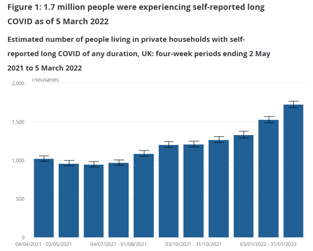
    About 1.7 million people in the U.K. were experiencing self-reported Long COVID as of early March, according to the U.K. Office of National Statistics.

    I spent a lot of time this weekend talking about the U.S.’s lack of Long COVID data, particularly our inability to answer such questions as, “How many Americans have Long COVID?” and, “What is the condition’s demographic breakdown?”

    In comparison, I pointed other journalists to reports from the U.K.’s Office for National Statistics. This office regularly surveys Brits on their Long COVID experiences, asking a representative sample of the population whether they are experiencing any long-term COVID-19 symptoms.

    The most recent report, published in early April, found that about 1.7 million people—or 2.7% of the U.K.—was “experiencing self-reported long COVID” (defined as symptoms persisting for four weeks or more after an initial infection). Imagine what the scale of Long COVID might be in the U.S.

    A new report is coming this week, on May 6.

  • COVID source shout-out: SCAN’s wastewater dashboard

    COVID source shout-out: SCAN’s wastewater dashboard

    For my recent wastewater data story, I’ve been looking at a lot of wastewater surveillance dashboards from different health agencies and research groups.

    One of my favorites is from Sewer Coronavirus Alert Network (SCAN), a project based out of Stanford University. The project started with sewershed sites in California but is now expanding to other parts of the country, I learned from Marlene Wolfe, an environmental scientist at Emory University who works on the project (and whom I interviewed for the story).

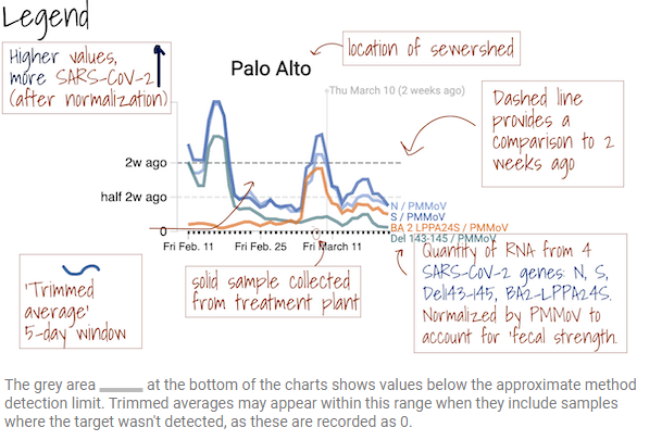
    The SCAN dashboard includes a detailed legend instructing users on how to view wastewater data.

    I like this dashboard because it does a good job of explaining exactly what users are looking at. On the top of the page, you see a legend walking you through the charts that appear below, along with a map showing the regions covered by these sewersheds.

    The charts themselves have built-in context for users seeking to interpret recent trends: you can see how current coronavirus levels compare to levels from two weeks ago. And you have the option to toggle between different timescales: four weeks, six weeks, 12 weeks, six months, a year, and all surveillance since fall 2020. Other parts of the dashboard allow users to look at data that have been smoothed and normalized, showing how interpretations of coronavirus levels in wastewater may change depending on the analysis method.

    In addition to the COVID-19 charts, the SCAN website also includes data on flu and RSV levels at sewershed sites, along with a detailed methodology section. I found this document describing different sources of variability in wastewater data particularly helpful, and linked out to it in my story.

    I hope to see the CDC’s wastewater dashboard one day become this extensive!

  • COVID source shout-out: Cyrus Shahpar

    The Twitter account of White House COVID-19 Data Director Dr. Cyrus Shahpar is, as I’ve said in the CDD before, an excellent source of updates on all things federal pandemic data. Shahpar shares daily updates of new vaccinations in the U.S., usually shortly before the CDC’s tracker updates. He also shares updated variant prevalence estimates, changes and additions to the CDC COVID-19 dashboard, and other data news.

    But this past Wednesday, Shahpar’s account took on a new purpose: tech support for the CDC’s dashboard. 

    Shahpar said he would “look into” an error with the dashboard’s formatting, after journalist Alexander Tin flagged the issue to him. It’s unclear whether Shahpar’s efforts directly led to the dashboard getting fixed, but it was indeed back to its normal appearance by the next morning.

  • COVID source shout-out: Hawaii

    As state leaders drop COVID-19 safety measures right and left, I wanted to give a shout-out to Hawaii: the one state that has kept its indoor mask mandate in place during this time. Gov. David Ige currently intends to keep the measure in place despite the CDC’s new guidance, according to local reports.

    Hawaii faces unique challenges during COVID-19 surges, since its island location makes it difficult for healthcare staff support to come in—or for patients to be transferred out of the state. These challenges have previously led Gov. Ige to call for tourists to avoid traveling to Hawaii, and to me, seem like good motivation for this state to keep cases low.

    Hawaii also has the second-lowest COVID-19 death rate, after Vermont—likely in part because of the state’s mask requirement and other safety measures.