Tag: Johns Hopkins

  • COVID-19 dashboards that haven’t shut down yet

    COVID-19 dashboards that haven’t shut down yet

    The Health Equity Tracker, run by the Morehouse School of Medicine’s Satcher Health Leadership Institute, is one of a few COVID-19 dashboards that is not shutting down at this time.

    We are in an era of dashboard shutdowns. Government agencies, research groups, and media organizations alike are winding down their COVID-19 reporting efforts. Some of these changes are directly tied to the end of the federal public health emergency in May, while others are more broadly attributed to shifting resources.

    In the last couple of weeks alone: the Johns Hopkins COVID-19 dashboard stopped collecting new data, the New York Times switched its COVID-19 tracker to show CDC data instead of compiling original information from states and counties, and the CDC itself announced that its COVID-19 data newsletter will end in May. The White House COVID-19 team will also be disbanded in May, according to reporting from the Washington Post.

    I haven’t done a comprehensive review of state and local COVID-19 dashboards, but I’m sure many of those are similarly shutting down, reporting less frequently, and reducing the types of data that they offer to the public. This is a trend I’ve been following since early last year, when state health departments started to declare COVID-19 was now “endemic” and didn’t require special monitoring resources, PCR testing infrastructure, etc. But it’s been accelerating in recent weeks, following the White House announcement about the end of the federal emergency.

    When explaining why their COVID-19 reporting efforts are ending, organizations often state that the disease is “no longer a major threat” or say that public interest in tracking COVID-19 has waned. I’m skeptical about both of those claims. First of all, we know that COVID-19 is still killing hundreds of Americans each week, with a majority of those being people who have had multiple vaccine doses. And we know that millions are facing activity limitations from Long COVID. As I wrote last month, the U.S. didn’t have a “mild” winter this year; we’re just getting better at ignoring COVID-19’s continued impacts.

    And second of all, I know there’s still an audience for this work—including many of the people who remain most vulnerable to COVID-19. Thank you to everyone who regularly reads this newsletter and blog, sends me questions, shares my work on social media, etc. for constantly validating that the interest is still here.

    With all of you great readers in mind, I’ve compiled this list of COVID-19 dashboards that I know haven’t yet shut down. The list is focused on national sources rather than state/local or international ones, in the interest of being most helpful to the majority of readers.

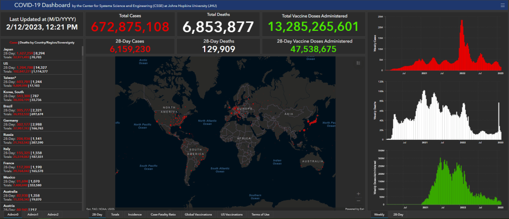
    • CDC COVID Data Tracker: The CDC’s COVID-19 dashboard is, of course, the primary source for federal data at this point in the pandemic. It provides weekly updates for most metrics (cases, hospitalizations, deaths, vaccinations, variant estimates, etc.); wastewater surveillance data are updated daily, with individual testing sites reporting on different cadences (usually about twice per week).
      Post-PHE update: Still active, but greatly changed. Cases and testing metrics are no longer available (with testing labs and state/local health agencies no longer required to report to the CDC), while other key metrics are updated less frequently or with more of a delay. See this post for more details.
    • Census Household Pulse Survey: Since early in the pandemic, the U.S. Census’ Household Pulse Survey has provided data on how COVID-19 impacted Americans’ day-to-day lives. This survey’s most recent iteration is scheduled for March through May 2023. The Census collaborates with other federal agencies on its surveys, including the CDC for Long COVID questions.
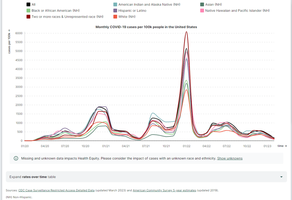
      Post-PHE update: The Pulse survey is typically conducted in two-month installments, with several weeks between each installment to adjust questions and process data. Its most recent installment ended in early May, and the next one has yet to be announced; we should know within the next month whether this data source is ending with the PHE or if it will continue.
    • Morehouse Health Equity Tracker: This project, from the Satcher Health Leadership Institute at the Morehouse School of Medicine, tracks COVID-19 metrics and a variety of other health conditions by race and ethnicity. The COVID-19 data are based on a CDC restricted access dataset; updates will continue “for as long as the CDC gives us data,” software engineer Josh Zarrabi said on Twitter this week.
      Post-PHE update: For COVID-19 data, this tracker utilizes a CDC dataset of cases with detailed demographic information, compiled from case reports sent to the CDC by state health agencies. The CDC dataset was last updated in April 2023, and it’s unclear whether it’ll be updated again (but my guess is it’ll end with the PHE). The Morehouse tracker includes plenty of other health metrics, though, so I expect this dashboard will be able to adjust to the CDC change.
    • APM Research Lab: This research organization, run by American Public Media, has several ongoing COVID-19 trackers. These include COVID-19 deaths by race and ethnicity (national and by state), vaccination rates (national and by state), and Minnesota-specific data, in collaboration with Minnesota Public Radio.
      Post-PHE update: APM is continuing to update its tracker; the most recent update to its COVID-19 deaths by race and ethnicity page occurred on May 17. Its staff will likely need to make some changes to their underlying data sources, since the CDC is now reporting COVID-19 deaths differently, but the basic metrics remain available.
    • Walgreens COVID-19 Index: Walgreens shares data from COVID-19 tests conducted at over 5,000 pharmacy locations nationwide. The tracker includes test positivity (national trends and state-by-state), variant prevalence, and positivity by vaccination status.
      Post-PHE update: Still active, with no change due to the PHE’s end.
    • COVIDcast by CMU Delphi: COVIDcast is a COVID-19 monitoring project by the Delphi Group at Carnegie Mellon University. The dashboard pulls in COVID-19 data from the CDC and other sources, such as Google search trends and antigen test positivity.
      Post-PHE update: No longer includes cases and deaths (which were pulled from the CDC), but still updating other metrics, including hospital admissions, symptom searches from Google trends, and COVID-related doctor visits.
    • Iowa COVID-19 Tracker: Despite its name, the Iowa COVID-19 Tracker displays data from across the country, sourced from the CDC. It’s run by Sara Anne Willette, a data expert based in Ames, Iowa. Willette frequently shares data updates on social media and streams on Twitch when updating her dashboard.
      Post-PHE update: Still active, but with some changes due to the new limitations in CDC data. Dashboard manager Sara Anne Willette shares frequent updates on Twitter about what she’s changing and why.
    • COVID-19 dashboard by Jason Salemi: This dashboard by University of South Florida epidemiologist Jason Salemi is another page displaying CDC data in somewhat-more-user-friendly visualizations. The dashboard is focused on Florida, but shares national state- and county-level data.
      Post-PHE update: Salemi shared on Twitter last week that he is currently assessing whether to keep the dashboard running or decomission the site.
    • Biobot Analytics: Biobot Analytics is the leading wastewater surveillance company in the U.S., tracking COVID-19 at hundreds of sewershed sites through its partnership with the CDC National Wastewater Surveillance System and independent Biobot Network. The dashboard has helpful national- and regional-level charts along with county-level data for sites in Biobot’s network.
      Post-PHE update: Still active, no changes due to the PHE’s end. In fact, Biobot continues to add more wastewater testing sites to its network.
    • WastewaterSCAN: WastewaterSCAN is another leading wastewater project, led by professors at Stanford and Emory Universities. The project started with sites in California, but has since expanded nationwide; it’s tracking several other common viruses in addition to COVID-19.
      Post-PHE update: Still active, similarly to Biobot’s dashboard.
    • For more wastewater data: Check out the COVID-19 Data Dispatch resource page with annotations on state and local dashboards.
    • KFF COVID-19 Vaccine Monitor: Since late 2020, the Kaiser Family Foundation has monitored American attitudes around COVID-19 vaccines and other pandemic issues. Updates were initially released monthly, but have become less frequent in the last year (the latest update was published on February 7, 2023).
      Post-PHE update: This KFF project appears to be ongoing, but at a lower frequency of updates; the most recent update is still February 2023. A newer KFF dashboard (tracking Medicaid enrollment and unwinding) is also receiving ongoing updates.
    • Axios-Ipsos COVID-19 polls: Axios has partnered with the polling firm Ipsos on regular polls tracking COVID-19 views and behaviors. The polling data are available in PDF reports and in spreadsheets from Roper. In 2023, Axios and Ipsos shifted their focus from COVID-19 to broader questions about public health, with a new series of quarterly polls.
      Post-PHE update: These two organizations will continue their new series of quarterly polls about public health, launched in early 2023. The most recent installment was posted this past week and includes questions about the PHE’s end, gun violence, opioids, and more.

    Have I missed any major data sources? Send me an email or comment below to let me know, and I’ll highlight it in a future issue.

    Editor’s note, April 2, 2023: This post has been updated with two additional dashboards (APM Research Lab and Walgreens), and additional information on the CDC’s wastewater surveillance dashboard.

    Editor’s note, May 21, 2023: This post has been updated with notes about changes impacting these dashboards due to the end of the federal public health emergency (PHE).

    More federal data

  • Two major COVID-19 trackers stop data collection

    Two major COVID-19 trackers stop data collection

    The Johns Hopkins COVID-19 dashboard, one of the most popular data sources of the pandemic, will shut down in March.

    This week, two major COVID-19 tracking efforts announced that they will stop collecting data. While the decisions make sense in light of reduced data availability these days, this news still feels like a signal that fewer institutions want to spend time and resources on pandemic tracking.

    The Johns Hopkins global dashboard and broader Coronavirus Resource Center is one of those shutting down. Its team plans to stop data collection and reporting on March 10, 2023. Johns Hopkins’ project was one of the very first COVID-19 trackers to come online in early 2020, filling a void when the CDC and other government agencies failed to provide the frequent, user-friendly updates people wanted.

    Lauren Gardner, a Johns Hopkins professor who helped run the project, told NPR that its end is “bittersweet” but that “it’s an appropriate time to move on.” Other countries, as well as individual states and counties in the U.S. that the project used as data sources, are now updating their COVID-19 numbers less frequently and less reliably.

    These reduced state and local updates are also one reason why the New York Times’ COVID-19 tracker will shut down, according to an update posted to the project’s GitHub repository this week. “As case and death reporting at the local level has become less frequent and comprehensive, the daily data we have been able to gather has become less useful for indicating real-time trends about the virus,” wrote NYT graphics editor Wilson Andrews.

    The NYT’s COVID-19 dashboard will still get updated, according to Andrews’ GitHub note, but it will rely on the CDC and other federal data sources rather than compiling its own data. Andrews shared several key links where readers can find federal data, including the CDC’s main dashboard, the White House Community Profile Reports, and data pulled from death certificates. (H/t to Nicki Camberg for flagging the NYT announcement!)

    It’s worth noting here that the COVID Tracking Project—for which I served as a volunteer—similarly pointed users to federal data sources when it shut down, nearly two years ago. Data from the CDC and HHS have improved significantly throughout the pandemic, to a point that these sources are likely more reliable than adding up numbers from individual states and localities. But federal data still suffer from case undercounting, lack of standardization (for some metrics), and other issues.

    For my own updates at the COVID-19 Data Dispatch, I mostly use CDC data, along with wastewater surveillance data from a couple of outside sources (Biobot, WastewaterSCAN). So I get why places like Johns Hopkins and the NYT would want to point people to these sources, rather than spending time collecting their own data.

    Even so, this feels like the end of an era for pandemic tracking: two giants of the field are shutting down. The announcements seem to suggest that people are no longer interested in learning about COVID-19 spread in their communities—even though, I can tell you from writing this newsletter, the audience is very much still present, and the work is very much still necessary.

    And in case it needs to be said: the COVID-19 Data Dispatch isn’t going anywhere.

  • FAQ: A refresher on test positivity rates

    FAQ: A refresher on test positivity rates

    Test positivity trends for New York City, calculated and reported by the city health agency. Chart retrieved on January 23.

    I’ve recently been getting a lot of questions about test positivity rates, both from COVID-19 Data Dispatch readers and from friends outside this project, which reminded me of just how confusing this pandemic metric can be. So, here’s a brief FAQ post about test positivity; if you have more questions, shoot me an email!

    What is a test positivity rate?

    A test positivity rate is calculated through simple division: the number of positive tests counted in a particular region or setting during a particular period of time, over the number of total tests (positive and negative) conducted during that same period.

    Where do test positivity rates come from?

    While the test positivity rate calculation may seem simple, matching together the right numbers for that numerator and denominator can get pretty tricky. This is because, at the federal level as well as at most state and local health departments, positive tests and total tests are reported through different systems.

    Positive tests—also known, more simply, as cases—are prioritized for reporting. This is because public health departments need to know how many cases they are currently dealing with for contact tracing, potential hospital utilization in the coming weeks, and other crucial health system reasons. If a health department is pressed for time during a surge or coming back from a holiday break, it will analyze and report out case data before going through total test data. Similarly, many labs report their positive tests to health agencies separately from (and earlier than) total tests.

    As a result, simply dividing the new cases reported on a particular day over the new tests reported that day often won’t give you an accurate test positivity figure. Instead, the data analysts that calculate these rates typically match up the dates that tests were conducted. So, instead of dividing “all cases reported on Tuesday” over “all tests reported on Tuesday,” you’d divide “all tests conducted on Tuesday that returned positive results” over “total tests conducted on Tuesday.” This calculation provides a more accurate picture of test positivity.

    Also, different states and localities might report tests using different units, like “tests conducted,” “people tested,” and “testing encounters”—making it difficult to compare test positivity rates across states. This was a larger problem earlier in the pandemic; I recommend reading this excellent COVID Tracking Project analysis post for more info on the issue.

    How do you know a test positivity figure is reliable?

    As I explained in a recent post about the John Hopkins University (JHU) dashboard, the test positivity rates that appear on national dashboards often are not reliable because they fail to take these timing issues into account. A dashboard like JHU’s, which automatically scrapes data from state health agencies, does not have the backend information about the dates tests were conducted needed to calculate accurate positivity rates.

    JHU recently changed its test positivity calculations to better address differing testing units across states. Still, as the team behind this dashboard explains in a blog post, a lack of standardization across how states report their testing data makes it difficult to calculate positivity rates that can be accurately compared between jurisdictions.

    For that reason, I tend to trust test positivity rates calculated by individual state and local health agencies over those calculated by large, aggregating dashboards. For example, the NYC health department reports its own test positivity rate and does so with a three-day lag, in order to allow time for matching testing dates to case dates.

    In addition, I would be wary of test positivity rates that are calculated for a longer period than one or two weeks. Test positivity, as a metric, is meant to be an indicator of the current situation in a state, region, or a specific setting like a university campus; when reported for a longer period (like a month) or cumulatively, this metric doesn’t tell you anything useful.

    If you’re looking for a national test positivity rate source, the HHS’s Community Profile Reports include these figures for states, counties, metro areas—albeit with some reporting delays and gaps in certain states.

    How do you interpret test positivity rate data?

    I find this explanation from the COVID Tracking Project very helpful:

    Test positivity can help us understand whether an area is doing enough tests to find its COVID-19 infections. The metric is widely used by local, state, and federal agencies to roughly gauge how well disease mitigation efforts are going. Put simply, when test positivity is high, it’s likely that not enough tests are being done and that most tests that are done are performed on symptomatic people. Both of these factors—insufficient testing and only testing people who feel sick—make it very likely that many cases are going undetected.

    What would we consider a “high” test positivity rate? The CDC threshold here is over 10%; such a positivity rate means that one in ten tests conducted are returning positive results, indicating a lot of symptomatic people are getting tested for COVID-19 and a lot of cases are going undetected. A region with a positivity rate over 10% should step up its testing efforts and encourage asymptomatic people to get tested for surveillance purposes.

    On the other end of the spectrum, 3% and 5% are commonly used as thresholds for low test positivity. The specific number might depend on an institution’s testing capacity; at a business that regularly tests all of its workers and is already looking for asymptomatic cases, a test positivity over 2% might already be cause for concern.

    Generally, though, if this number is under 5%, it’s a good indicator that the region or setting has high enough test capacity to identify asymptomatic cases—and the majority of cases are being caught.

  • COVID source callout: JHU positivity rates

    On Friday, a COVID-19 Data Dispatch reader asked for my help in interpreting a wildly high test positivity rate: 544% in Washington, D.C. The source of this rate, she said, was Johns Hopkins University (JHU)’s COVID-19 dashboard.

    Test positivity rates seem simple; they’re calculated by dividing the number of positive tests over the total tests reported in a particular place, over a particular period of time. But these rates can be hard to calculate accurately because positive tests—a.k.a. COVID-19 cases—are often reported on a different time scale from all (positive and negative) tests.

    If a health department is swamped with COVID-19 data—or if it’s coming off of a holiday break—it will prioritize analyzing and reporting the case numbers over other metrics, because case reporting is most important for public health measures like contact tracing. Similarly, some labs might send in positive test results before they send in negative test results. This can lead to something like 100 cases reported on a Monday, but the tests used to find those cases not getting reported until later in the week.

    States and localities that calculate their own positivity rates have systems to account for these time differences, usually by matching up the dates that tests took place. But JHU doesn’t do this, because JHU test positivity rates come from automatic data scrapes and calculations with none of the backend timing information that you’d need to actually determine an accurate positivity rate.

    In short, if you see a wildly high test positivity rate sourced from JHU’s dashboard, don’t trust it. Go look at the state, city, or county’s own COVID-19 data, or check the CDC dashboard instead.

    Also: I’d like to write more about test positivity next week, since this is such a confusing metric right now. If you have questions on this topic, send them my way!

  • Featured sources, May 23

    • GAO analysis of COVID-19 in nursing homes: The Government Accountability Office, an organization that does research and audits on behalf of Congress, has a new report out this week on the devastating COVID-19 outbreaks that took place in nursing homes. The GAO researched about 13,000 facilities, using CDC data from May 2020 to January 2021. 94% of the nursing homes in the study faced at least one COVID-19 outbreak, with the majority of outbreaks (85%) lasting five weeks or more.
    • Johns Hopkins Pandemic Data Initiative: The Johns Hopkins Coronavirus Resource Center is one of the most widely-cited sources of COVID-19 data, providing detailed and up-to-date information for both the U.S. and the world. But the resource center’s scientists “have struggled to work with COVID-19 data that is inconsistent, incomplete, and insufficient,” writes JHU data lead Beth Blauer in a blog post. A new section of the resource center will explore data inconsistencies and highlight possible solutions.
    • Excess deaths by U.S. county: Excess deaths, or those deaths that occur above a region’s past baseline, are a common metric for examining the true toll of COVID-19. In addition to reporting excess deaths by U.S. states and demographic categories, the CDC’s National Center for Health Statistics (NCHS) also reports this information by county. A group of researchers (Stokes et al.) recently analyzed these county-level data and found that U.S. COVID-19 deaths may be underestimated by about 20%; their findings were published this week in PLOS Medicine.
    • Vaccine consent laws by state: As the Pfizer vaccine is now available to children ages 12 to 15, a lot of teenagers out there may want to know if they can get vaccinated without parental permission. The site VaxTeen provides these kids with information on the consent laws in every state, as well as a guide for talking to your parents about vaccines and other resources. (H/T Robin Lloyd.)