In last week’s issue, I mentioned that I am thinking more about preparedness: how the U.S. can improve our capacity to respond to public health threats, future COVID-19 surges and beyond. This mindset shift was brought on, in part, by a recent story I worked on at the Documenting COVID-19 project: examining the vulnerabilities in Idaho’s hospitals as a case study of the U.S.’s decentralized healthcare system.
Last summer and fall, Idaho was completely overrun by the Delta variant. State leaders implemented crisis standards of care, a practice allowing hospitals to conserve their limited resources when they are becoming overwhelmed. All hospitals in Idaho were in crisis standards for weeks, with the northern Panhandle region remaining in this crisis mode for over 100 days.
During this time, Idaho hospitals sent out 6,300 patient transfers in the span of four months. With Audrey Dutton, my reporting partner at the Idaho Capital Sun (a nonprofit newsroom covering Idaho state government), I analyzed data from the Idaho health department that showed where these patients were transferred, as well as how the crisis period compared to previous months.
This map shows all patient transfers out of Idaho hospitals between April and November 2021. Chart by Betsy Ladyzhets, published in the Idaho Capital Sun and MuckRock.
Here are the major findings from our story (borrowing some text from my Twitter thread, linked above):
More than one in three transfers went to hospitals in neighboring states, with the highest numbers going to eastern Washington.
Transfers went as far as Seattle, Salt Lake City, San Francisco, Billings, and even Phoenix. Many of these trips required air ambulances, due to Idaho’s mountainous geography.
These transfers strained Washington hospitals. Dr. Dave Chen, chief medical officer at MultiCare Deaconess Hospital in Spokane—one Washington hospital that took on a lot of Idaho patients—told me that smaller, rural facilities in his area are all “competing for the same beds and resources,” whether these facilities are based in Washington or Idaho.
Workers at facilities in the northern Idaho region, which remained in crisis standards for over 100 days, described doubling patients up in ambulances, traveling for hours to find free beds, and taking EMS staff away from their normal duties for long trips.
Idaho is particularly vulnerable to transfer challenges: it has a lot of small rural hospitals without many ICU beds or specialized equipment, combined with geography that often requires an air ambulance rather than driving.
This story has implications beyond Idaho, as it shows the impact of America’s fractured health system. In our system, when hospitals in one state are in crisis, they cannot easily communicate with other hospitals that might be able to help them out—whether “communicating” means calling up hospital administrators to ask about free beds or sharing data about patient numbers and resources.
This is not just a COVID-19 problem. Consider what happens when a wildfire, hurricane, or other natural disaster hits. When hospitals in one area become overwhelmed, they should be able to easily reach out to other facilities—but our system makes this incredibly difficult.
One potential solution to this issue may be centralized transfer centers, which field calls from hospitals that need to send out their patients. Washington started such a transfer center during the pandemic, to great success: Dr. Steve Mitchell, who helps run the center, told me that it facilitated more than 3,500 patient transfers, mostly between summer 2021 and early 2022.
But there’s a kicker: Washington’s transfer center is funded by the state health department, and therefore it can only answer calls from Washington hospitals. If an Idaho hospital wants to transfer a patient into Washington, it has to call various Washington hospitals directly until finding a bed for that patient—a much more time- and resource-intensive process.
Look at how siloed our current system is! This is ridiculous! Clearly, we need transfer centers with regional—or even national—reach, coordinated by a national health agency. We also need more data sharing between hospitals, and better communication between facilities and EMS providers.
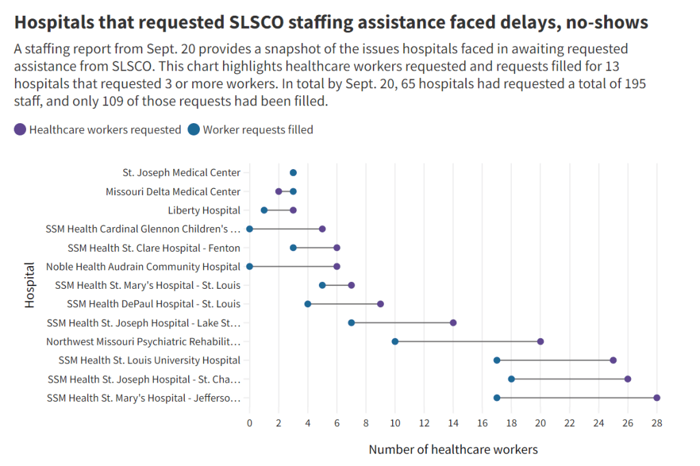
Early this week, I had a big story published in The Missouri Independent, as part of the Documenting COVID-19 project’s ongoing collaboration with that nonprofit newsroom. This piece goes in-depth on the Missouri health department’s contract with SLSCO, a Texas-based construction company that expanded to provide healthcare support during the pandemic.
While this was a local story, to me, the piece provides important insights about the type of support that is actually needed in U.S. hospitals right now: not temporary assistance, but long-term, structural change.
The Missouri agency hired SLSCO to provide two services, with a total contract of $30 million:
Provide staffing support (nurses, technicians, etc.) to hospitals across the state struggling in the wake of the Delta surge.
Set up, staff, and operate six monoclonal antibody infusion sites where Missourians infected with the coronavirus could easily access the treatment.
SLSCO made lofty promises to the Missouri health department, citing its ability to quickly send hundreds of workers to facilities that required assistance. But in fact, the hospital staffing assistance was marred by delays, no-shows, and high rates.
Here are a few paragraphs from the story:
Fewer hospitals signed on to receive staff than the Department of Health and Senior Services anticipated. Within the first few weeks, some hospitals faced no-shows, while the company’s hourly rates — up to $215 an hour for some nurses and $550 an hour for doctors — were too high for other hospitals to afford after state funds ran out, according to emails obtained by The Independent and the Documenting COVID-19 project through records requests. (Copies of SLS’ contract and emails between state agencies can be found here.)
“153 staff requested and only 10 deployed,” wrote Alex Tuttle, the governor’s legislative budget director, after receiving a staffing report early in the contract period. “Am I reading that right?”
From mid-August through November, just 206 staff were ultimately sent to 53 hospitals, said Lisa Cox, a spokeswoman for DHSS. The healthcare support had left by the time omicron hit in the winter.
The monoclonal antibody infusion sites were more successful; in fact, the Missouri health department ended up redirecting funding from the staffing support to the infusion sites. The six sites served a total of 3,688 patients over a two-month period.
However, the sites could have served a lot more patients: these clinics could have treated up to 136 patients each day but peaked at about 90, with numbers often much lower, according to my analysis of data from the health department. Due to these low numbers, the state of Missouri ended up spending more than $5,600 for each patient. One monoclonal antibody expert I talked to for the piece called this an “exorbitant” cost.
Now, I don’t mean to hate on monoclonal antibody treatments here—these drugs are truly a great way to boost the immune systems of COVID-19 patients who may be at higher risk for severe symptoms. Maggie Schaffer, a case management nurse who helped set up one of the infusion sites, told me that people who had this treatment typically are “feeling like a whole new person” within a day or two.
However, the treatments are very expensive and inefficient; one patient’s infusion appointment can take hours. The drugs themselves cost around $2,100 per dose, about 100 times as much as one vaccine. Health departments and facilities that offer monoclonal antibodies need to focus on getting the word out to patients so that these expensive supplies aren’t wasted.
At the same time, temporary healthcare staff can be great to help a facility out a surge—but they are not a long-term solution. In particular, nurses at a hospital may be frustrated by watching new staff come in from out of town and receive much higher pay rates; the “traveling nurse phenomenon,” as this is called, may contribute to burnout and staff leaving to go become traveling workers themselves.
What do hospitals actually need to do to address their staffing crisis? Here are a few ideas from Tener Veenema, a nursing expert focused on health systems a professor of nursing who researches health systems and emergency preparedness at Johns Hopkins’ Bloomberg School of Public Health:
Higher pay and assistance with education bills.
Regulations on things like work hours, the number of patients one nurse can be responsible for at once.
Mental health assistance that nurses are actually given time and space to access.
I’ll end the post with this quote from Veenema, which is also the last line of the story:
“If we don’t fix the toxic work environment, this issue of mandatory overtime, inadequate staffing levels, lack of time to access mental health resources,” Veenema said, “then you’re simply shooting more new nurses out of the cannon, but into the lake where they’re going to drown.”
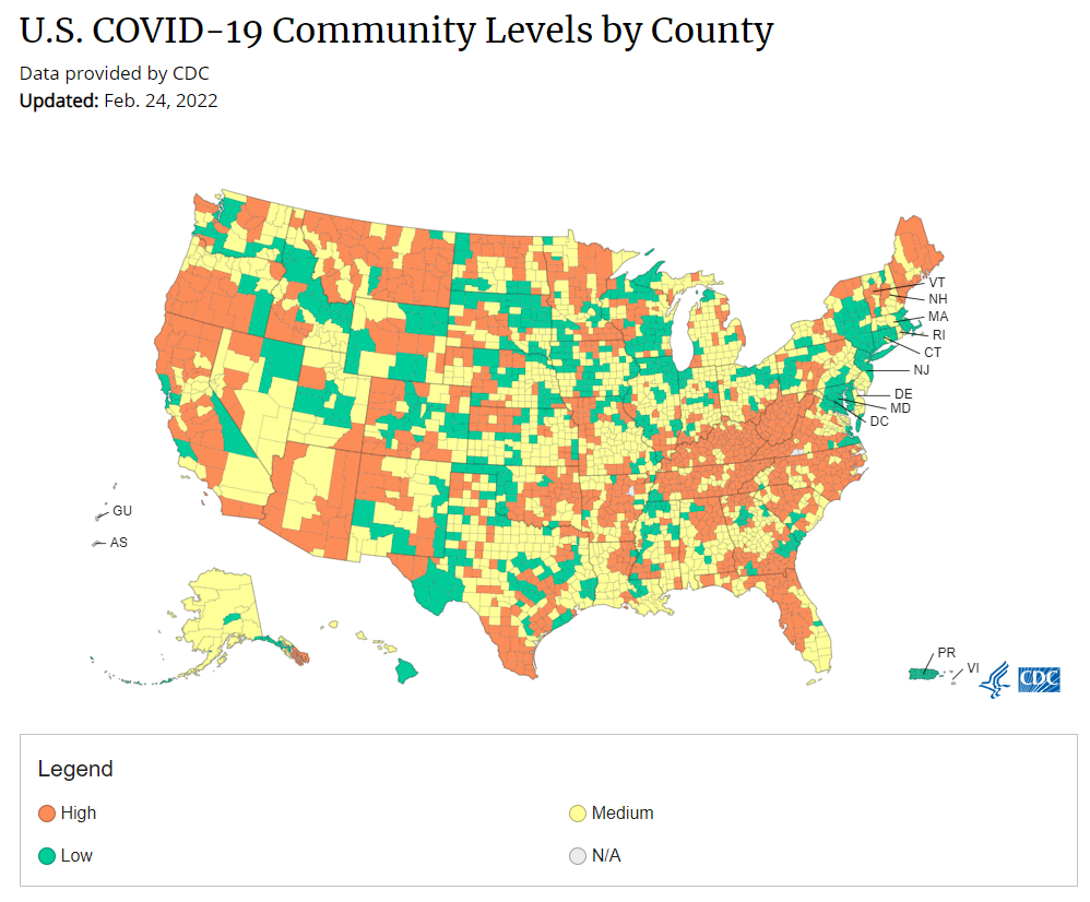
Under the new CDC guidance, about 70% of Americans live in counties where they can go unmasked in public. Chart via CDC.gov.
This past Friday, the CDC announced a major shift to its guidance for determining COVID-19 safety measures based on county-level community metrics. The new guidance is intended to replace COVID-19 thresholds that the agency developed last summer, during the Delta wave; here, the CDC is promoting a shift from using cases and test positivity for local decision-making to using metrics tied directly to the healthcare system.
This shift away from cases isn’t new: state health departments have been moving in this direction recently, as I wrote last week. Similarly, the CDC’s recommendation for when Americans should feel safe in taking off their masks aligns with recent guidance changes from state leaders.
The new guidance is essentially a lot more lenient when it comes to mask removal. Overnight, the U.S. goes from under 5% of counties in “low” or “moderate” transmission (under the old guidance) to over 60% of counties, representing 70% of the population, in a “low” or “medium” COVID-19 community level.
🚨🚨 the CDC has updated its guidance on using county-level COVID-19 metrics to drive recommended safety measures.
with the new guidance, we go from 82% of U.S. counties in "high" transmission (on the left) to only 37% of counties in high transmission (on the right). pic.twitter.com/Xz1Xj6FHDN
This shift will embolden more states, local health departments, and individual organizations to lift safety measures and change how they track COVID-19. In this post, I’ll unpack why I believe the CDC made certain choices with this new guidance, what critiques I’m seeing from public health experts, and some recommendations for thinking about your COVID-19 risk during this highly confusing pandemic era.
Rationale for the CDC’s new guidance
With this new framework, the CDC is essentially telling Americans to watch hospitalization numbers—not case numbers—as the most important metric to inform how hard COVID-19 is hitting their community. One piece of their logic is, I suspect, that case numbers are less reliable in this pandemic era than they have been since March 2020.
That lack of reliability largely stems from the rise of at-home rapid antigen tests, which gained popularity during the Omicron surge and are now largely unconstrained by supply issues. (For example: iHealth Labs, one major at-home test provider, now allows shoppers to buy up to 50 test kits per person, up from a limit of 10 during Omicron’s peak.)
Unlike PCR test results, which are systematically processed in labs and reported to public health agencies, at-home test results typically do not travel beyond a patient’s trash can. And while a few local jurisdictions (like D.C.) have given residents options to self-report their antigen tests, the majority have opted not to take on this challenge. As a result, current case numbers for almost everywhere in the U.S. are not very reflective of actual infections in the community.
In previous pandemic eras, researchers could use PCR test positivity as an indicator of how reliable case numbers might be for a particular jurisdiction: higher test positivity usually means that more cases are going unreported. But in the era of widespread rapid tests, test positivity is also less reliable, because rapid tests aren’t accounted for in the test positivity calculations either.
Case numbers do still have some utility, because people who have COVID-19 symptoms or need a test result to travel will continue seeking out PCR tests. The CDC guidance reflects this by keeping cases as one factor of its COVID-19 community level calculation. But cases are no longer the star of the show here.
Instead, the CDC is focusing on hospitalizations: specifically, new COVID-19 admissions per 100,000 people and the share of inpatient beds occupied by COVID-19 patients. New hospital admissions are a more reliable—and more timely—metric than the total number of patients hospitalized with COVID-19, because admissions reflect only the people coming in with symptoms that recently started, not the people who have been hospitalized for days or weeks.
The share of inpatient beds occupied by COVID-19 patients, meanwhile, reflects the strain that this disease is currently putting on a hospital system. The CDC is choosing to include all COVID-19 patients here, not only those who are hospitalized for COVID-specific symptoms (the correct choice, in my view). Agency director Dr. Rochelle Walensky gave a good explanation for this at a media briefing on Friday:
We are considering anybody in a hospital bed with COVID, regardless of the reason for admission, and the reason that we landed there is multifold. First, many jurisdictions can’t differentiate, so that was important for us to recognize and realize. Second, whether or not a patient is admitted with COVID or for COVID, they increase the hospital capacity and they’re resource intensive. They require an isolation bed. They require PPE. They probably require a higher staff ratio. And so they are more resource intensive and they do take a COVID bed potentially from someone else.
Interestingly, as well, as we have less and less COVID in certain communities, the amount of people who are coming into the hospital with COVID will necessarily decrease. We will not have as many people walking around asymptomatically because there will just be less disease out there. So increasingly, as we have less disease in the community, we anticipate that more of the people who are coming into the hospital are going to be coming in because of COVID.
And then finally, as we have even less disease in the community, we anticipate that not every hospital is going to screen every patient for COVID as they walk in the door, especially if we have less and less disease in the community. And when that happens, we won’t actually be able to differentiate. In fact, people who are coming in, who are tested will necessarily be coming in for COVID. So for all of those reasons, comprehensively, we decided to stay with anybody coming in with a COVID diagnosis.
Also, a note on wastewater: I’ve seen some commentators express surprise that the CDC didn’t include wastewater in its new guidance, as this sewage surveillance can be a useful leading indicator for COVID-19 that’s more reliable than cases. The problem here is, wastewater surveillance is not available in much of the country—just look at all the empty space on this map. To use wastewater for decisionmaking, a county or state needs to have enough wastewater collection sites actually collecting these data, and most states are not there yet.
Critiques of the new guidance
While hospitalizations are a more reliable COVID-19 metric than cases, especially in our rapid testing era, they come with a few major issues. First, hospitalizations are a lagging indicator, meaning that they start to rise a couple of weeks after a new surge has started. If we rely on hospitalizations as a signal to put mask requirements or other safety measures in place, those changes will come weeks delayed.
As Boston University epidemiologist Dr. Ellie Murray put it in a recent Twitter thread: “Using lagging indicators like hospitalizations could be okay for turning *off* precautions IF we are sure that no new surge has begun. But that means we need leading indicators, like infection surveillance to guide turning *on* precautions.”
The CDC seems to have forgotten the basics of infectious disease in making these new risk categories.
People infected with SARS-CoV-2 can transmit for days before they show symptoms, and for a week or more before they develop “severe disease”.
Another issue with relying heavily on this lagging indicator is, new COVID-19 safety measures may come too late to protect essential workers, children in schools, and others who face high risk of coronavirus exposure. “These high exposure populations get COVID first and most,” writes health policy expert Julia Raifman.
In other words, by the time case and hospitalization rates are high enough for a community to institute new safety measures under this new CDC guidance, those high-risk people are likely to be the ones already in the hospital. Raifman points to data from the U.S. Census’ Household Pulse Survey, showing that low-income workers were most likely to miss work for COVID-19 throughout last year.
Beyond this lagging indicator issue, another challenge with relying on hospitalizations is that, for many Americans, the hospitals that they might go to if they come down with severe COVID-19 are not located in their county. Plenty of counties, particularly in rural areas, don’t have hospitals! To deal with this, the CDC is actually using regional hospitalization figures, compiling statistics from multiple counties that rely on the same healthcare facilities.
University of South Florida epidemiologist Jason Salemi lays out this calculation in an excellent Twitter thread, linked below. While it makes sense that the CDC would need to use regional instead of local figures here, the agency is being pretty misleading by labeling this new guidance as county-level metrics when really, the metrics are not that localized.
The numerator is based on WHERE PEOPLE ARE ADMITTED.
The denominator is based on WHERE PEOPLE LIVE.
If you just look at FL, there are many counties that either do not report hospitalizations (NO HOSPITAL) or reported 0 in the past 7d.
There are more equity concerns embedded in the new CDC guidance as well. For counties with “low” or “medium” community COVID-19 levels, the CDC recommends that most Americans do not need to wear masks in public. But people who are immunocompromised or at high risk for severe disease should “talk to a healthcare provider” about the potential need to wear a mask indoors, stock up on rapid tests, or consider COVID-19 treatments.
For one thing, telling people, “talk to your doctor” is not a great public health strategy when one in four Americans do not have a primary care physician, and one in ten do not even have health insurance! For another thing, one-way masking among immunocompromised and otherwise high-risk people is also not a great strategy, because masks protect the people around a mask-wearer more than they protect the mask-wearer themselves. (I recommend this recent Slate piece on one-way masking for more on this topic.)
Many of my colleagues on here have eloquently explained their concerns with the new CDC guidelines, so I’ll just add that any guidelines that include “Talk with your provider.” when 25% of Americans don’t have a PCP and 10% are uninsured is inherently problematic.
It is also pretty unclear how the CDC landed on a case threshold for “low transmission” that is much higher in this new guidance than in the old guidance, as Dr. Katelyn Jetelina points out in a recent Your Local Epidemiologist post. If anything, honestly, I would expect that the CDC needs to lower its case threshold, given that current case numbers are not accounting for millions of rapid tests done across the country.
Finally, the new CDC guidance completely fails to account for Long COVID. Of course, it would be very difficult for the CDC to do this, since the U.S. basically isn’t tracking Long COVID in any comprehensive way. Still, overly focusing this new guidance on hospitalizations essentially ignores the fact that a “mild” COVID-19 case which does not lead to hospitalization can still cause major, long-term damage.
Which metrics you should follow right now
Here are my recommendations of COVID-19 metrics to watch in your area as you navigate risk in this confusing pandemic era.
Both the old and new CDC thresholds. While the CDC pushes its new guidance with a brand-new page on CDC.gov, community transmission metrics calculated under the old guidance are still available on the CDC’s COVID-19 dashboard. If you’re not feeling comfortable taking off your mask in public and want to wait until transmission is seriously low in your area, you can look at the old thresholds; though keep in mind that case data are seriously unreliable these days, for the reasons I explained above.
Remember that masks are useful beyond COVID-19. Not a metric, but an additional note about thinking through risk: masks reduce risk of infection for a lot of respiratory diseases! We had a record-low flu season last winter and many Americans have avoided colds for much of the pandemic, thanks in part to masking. Helen Branswell has a great article in STAT News that unpacks this further.
Wastewater data, if available to you. As I mentioned above, wastewater surveillance data are not available in much of the country. But if you live somewhere that this surveillance is happening, I highly recommend keeping an eye on those trends to watch for early warnings of future surges. You can look at the CDC dashboard or Biobot’s dashboard to see if your county is reporting wastewater data.
Vaccination levels. It makes sense that vaccination was not included in the CDC guidance, because vaccinated people can still spread highly contagious variants like Omicron. Still, more highly-vaccinated counties—particularly those with high vaccination rates for seniors—are likely to have less burden on their healthcare systems when a surge arises, so knowing the vaccination rate in your county can still be useful when thinking about your risk tolerance.
Rapid test availability. This is a bit more anecdotal rather than an actual data source, but: looking at rapid test availability in your local pharmacies may be another way to get a sense of community transmission in your area. Right now, these tests are easy to find in many places as case numbers drop; if finding these tests becomes more competitive again, it could be a signal that more people are getting sick or having exposures.
As always, if you have any questions or topics that you’d like me to tackle in this area, please reach out.
KFF updates COVID-19 vaccine monitor: The Kaiser Family Foundation released a new report in its COVID-19 vaccine polling project this week, marking over a year since the U.S.’s vaccine rollout began. Notable updates from this report include: people are worried about Omicron’s impact on the economy and healthcare system, less worried about its impact on them personally; vaccine uptake “inched up in January” with more people getting their first doses; and gaps in booster shot uptake echo early gaps in vaccine uptake, with white Americans getting boosted at higher rates than Black and Hispanic Americans.
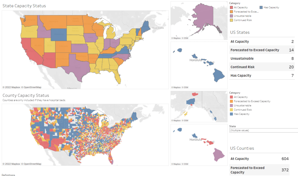
New version of the COVID-19 circuit breaker dashboard: A few weeks ago, I shared a dashboard from emergency physician Dr. Jeremy Faust and colleagues that estimates which U.S. states and counties are facing hospitals operating at unsustainable levels. The dashboard has now been updated, with help from Kristen Panthagani, Benjy Renton, Bill Hanage, and others; this new version includes hospital capacity and related metrics over time for states and counties, estimates of open beds, ICU-specific data, and more.
Biobot’s Nationwide Wastewater Monitoring Network: If you’re looking to monitor COVID-19 levels in U.S. wastewater, Biobot’s dashboard is a great source. The wastewater epidemiology company collects samples from water treatment facilities across the country; their dashboard includes both estimates of coronavirus levels in the U.S. overall and estimates for specific counties in which data are collected. The data are available for download on Github. (H/t Data Is Plural.)
Prisoners released in 2020, DOJ: A new report from the U.S. Department of Justice includes data on state and federal prisons during the COVID-19 pandemic. The number of inmates in these facilities declined about 15% from the end of 2019 to the end of 2020, according to this report. A large cause for this decline was overall disruption in the court system, not compassionate releases due to the pandemic: there was a 40% decrease in prison admissions from 2019 to 2020.
Companies requiring COVID-19 vaccinations: ChannelE2E, a news site covering the IT industry, has compiled this comprehensive list of major companies requiring their employees to get vaccinated. The list includes about 50 companies, and is regularly updated with links to news sources discussing policy changes. (H/t Al Tompkins’ COVID-19 newsletter.)
A record number of COVID-19 patients are now receiving care in U.S. hospitals, according to data from the Department of Health and Human Services (HHS). As of January 16, the agency reports that about 157,000 COVID-19 patients are currently hospitalized nationwide, and one in every five hospitalized Americans has been diagnosed with this disease.
The HHS also reports that about 78% of staffed hospital beds and 82% of ICU beds are currently occupied. These numbers, like the total COVID-19 patient figure, are higher than they have been at any other point during the pandemic.
Even so, reports from the doctors and other staff working in these hospitals—conveyed in the news and on social media—suggest that the HHS data don’t capture the current crisis. The federal data may be reported with delays and fail to capture the impact of staffing shortages, obscuring the fact that many regions and individual hospitals are currently operating at 100% capacity.
Dr. Jeremy Faust, an emergency physician at Brigham and Women’s Hospital and professor at Harvard Medical School, recently made this argument in Inside Medicine, his Bulletin newsletter. Last week, I shared Faust and colleagues’ circuit breaker dashboard, which extrapolates from both federal hospitalization figures and current case data to model hospital capacity in close-to-real-time. This week, Faust used that dashboard to show that the crisis inside hospitals is more dire than HHS numbers suggest.
He writes:
There seems to be a disconnect between the official data made available to the public and what’s happening on the ground. The reason for this is unacceptable delays in reporting. HHS and other agencies have always acknowledged that public reports on hospital capacity—for Covid-19 and all other conditions—actually reflect data that are 1-2 weeks old. But until now, such lags rarely mattered because most hospitals haven’t had to operate near or above 100% capacity routinely, even during the pandemic. Under normal circumstances, whether a hospital was 65% or 75% full does not make much of a difference, though as the numbers creep up, care can be compromised. And even in past moments when capacity was closer to 100%, a wave of Omicron-driven Covid-19 was not headed towards hospitals.
For example: on Monday, Faust wrote, his team’s circuit breaker dashboard showed that “every single county in Maryland appears to be over 100% capacity,” even though the HHS said that 87% of hospital beds were occupied in the state. Healthcare workers in Maryland backed up the claim that all counties were over 100% capacity, with personal accounts of higher-than-ever cases and hospitals going into crisis standards.
On Thursday, Faust shared an update: the circuit breaker dashboard, at that point, projected that hospitals in Arizona, California, Washington, and Wisconsin were approaching 100% capacity, if they weren’t at that point already. As of Saturday, California and Arizona are still projected to be at “at capacity,” according to the dashboard, while 14 other states ranging from Montana to South Carolina are “forecasted to exceed capacity” in coming days.
var divElement = document.getElementById(‘viz1642354079303’); var vizElement = divElement.getElementsByTagName(‘object’)[0]; if ( divElement.offsetWidth > 800 ) { vizElement.style.minWidth=’1087px’;vizElement.style.maxWidth=’100%’;vizElement.style.minHeight=’1736px’;vizElement.style.maxHeight=(divElement.offsetWidth*0.75)+’px’;} else if ( divElement.offsetWidth > 500 ) { vizElement.style.minWidth=’1087px’;vizElement.style.maxWidth=’100%’;vizElement.style.minHeight=’1736px’;vizElement.style.maxHeight=(divElement.offsetWidth*0.75)+’px’;} else { vizElement.style.width=’100%’;vizElement.style.height=’3027px’;} var scriptElement = document.createElement(‘script’); scriptElement.src = ‘https://public.tableau.com/javascripts/api/viz_v1.js’; vizElement.parentNode.insertBefore(scriptElement, vizElement);
From Faust’s descriptions and the accounts of healthcare workers he quotes, it’s also evident that determining between hospitalizations “with” COVID-19 and hospitalizations “from” COVID-19 is not a useful way to spend time and resources right now. Even if some of the COVID-19 patients currently in U.S. hospitals “happened to test positive” while seeking treatment for some other condition, these patients are still contributing to the intense pressure our healthcare system is under right now.
Plus, as Ed Yong explains in a recent article in The Atlantic describing this false patient divide, COVID-19 can worsen other conditions that at first seem unrelated:
The problem with splitting people into these two rough categories is that a lot of patients, including those with chronic illnesses, don’t fit neatly into either. COVID isn’t just a respiratory disease; it also affects other organ systems. It can make a weak heart beat erratically, turn a manageable case of diabetes into a severe one, or weaken a frail person to the point where they fall and break something. “If you’re on the margin of coming into the hospital, COVID tips you over,” Vineet Arora, a hospitalist at the University of Chicago Medicine, told me. In such cases, COVID might not be listed as a reason for admission, but the patient wouldn’t have been admitted were it not for COVID.
In short: Omicron might be a milder variant at the individual level—thanks to a combination of the variant’s inherent biology and protection from vaccines and prior infections—but at a systemic level, it’s devastating. And rather than asking hospitals to split their patients into “with” versus “from” numbers, we should be giving them the staff, supplies, and other support they need to get through this crisis.