Tag: HHS

  • COVID source shout-out: Community Profile Reports

    We’re now approaching almost a year since the Department of Health and Human Services (HHS) first started publicly releasing Community Profile Reports, massive documents containing COVID-19 data at the state, county, and metro area levels.

    These reports were originally compiled internally, starting in spring 2020, for meetings of Trump’s White House Coronavirus Task Force. Reporters such as Liz Essley Whyte at the Center for Public Integrity were able to obtain some of the documents, but they remained a mostly-secret trove of data until the HHS started publishing them publicly in late December.

    At the time, I wrote that I was excited about the public release because these reports contain a wealth of information in one place—including contextual data (such as population-adjusted case numbers and demographic information) and rankings for policy-makers built right into the Excel spreadsheets.

    Since then, I’ve relied on Community Profile Reports for weekly data updates in this newsletter, along with numerous other stories. While their update schedule has not remained regular, the reports continue to be a one-stop shop for everything from vaccination rates to hospitalization metrics.

    So, this Thanksgiving weekend, I’m thankful for the Community Profile Reports. According to the HHS site, they’ve been downloaded almost 100,000 times, and probably a solid 300 of those are me.

  • Featured sources, November 7

    • School Learning Modalities (HHS): Is that… could it be… comprehensive K-12 school COVID-19 data from the federal government?! Indeed: after over a year of calling out the government’s lack of data on this crucial topic, I was delighted to see the Department of Health and Human Services add a new dashboard to its COVID-19 data hub this week. The dashboard, produced in a collaboration between the CDC and the Department of Education, provides weekly updates on the learning status of school districts: in-person, hybrid, or remote. As of November 6, the dashboard included data for about 89% of students in 62% of districts. Next up, can we get some school case data?
    • When To Test (NIH): Earlier this year, the National Institutes of Health (NIH) supported production of an online tool aimed at helping schools, businesses, and other organizations develop routine COVID-19 testing programs. The tool, called When To Test, was updated this week with a new calculator aimed at individuals. Input some COVID-19 information (such as your location, vaccination status, and daily contacts), and the tool will help you determine whether to get tested. It could be useful for planning holiday gatherings!
    • COVID-19 Diagnostics Commons (ASU): Here’s another testing source, from Arizona State University. ASU researchers built a database of over 2,500 COVID-19 testing technologies that are available or going through the regulatory approval process around the world. You can search through the tests by regulatory status, diagnostic target, accuracy levels, and more.
    • Directory of federal government prime contractors: All businesses that contract with the federal government have until January 4, 2022 to ensure that all of their employees are vaccinated against COVID-19. This directory, from the U.S. Small Business Association, provides a comprehensive list of those contractors. You can see business names, what they do for the government, and more. (h/t Al Tompkins’ Covering COVID-19 newsletter.)

  • COVID source callout: Community Profile Report updates

    COVID source callout: Community Profile Report updates

    In recent weeks, several states have cut back on their COVID-19 data reporting frequency. Though, as I wrote on June 20, this isn’t a new phenomenon—some states have always skipped updating their data on weekends—the trend signifies that U.S. public health agencies are reallocating time and resources from their COVID-19 dashboards to other programs.

    One major federal data source has recently made a similar change. The Community Profile Reports, those extensive PDF reports and Excel files that contain everything from vaccination coverage to hospital capacity, are now published on Tuesdays and Fridays only. (Previously, these reports were posted every day.)

    Now, a lot of the data that one can find in the Community Profile Reports are also available from other sources—the CDC COVID Data Tracker, the CDC’s data portal, HHS Protect, etc. The main draw of these reports is that they compile so much info in one place, including data for counties and metro areas. I can understand why the HHS data team may want to cut down on their update schedule to free up resources for other projects. (More variant data, maybe?)

    But what really annoys me is, someone at the HHS appears to have… shuffled the order of download links on the Community Profile Report page? That “Attachments” section with all of the PDFs and Excel files going back to December used to be in chronological order, with the most recent files at the top. Now, the order is completely random.

    I shouldn’t have to Cntrl+F to the middle of the page to find the most recent report. Come on.

    Seriously, what is the order here?

  • Five more things, May 9

    I couldn’t decide which of these news items to focus on for a short post this week, so I wrote blurbs for all five. This title and format are inspired by Rob Meyer’s Weekly Planet newsletter.

    1. HHS added vaccinations to its facility-level hospitalization dataset: Last week, I discussed the HHS’s addition of COVID-19 patient admissions by age to its state-level hospitalization dataset. This week, the HHS followed that up with new fields in its facility-level dataset, reflecting vaccinations among hospital staff and patients. You can find the dataset here and read more about the new fields in the FAQ here (starting on page 14). It’s crucial to note that these are optional fields, meaning hospitals can submit their other COVID-19 numbers without any vaccination reporting. Only about 3,200 of the total 5,000 facilities in the HHS dataset have opted in—so don’t sum these numbers to draw conclusions about your state or county. Still, this is the most detailed occupational data I’ve seen for the U.S. thus far.
    2. A new IHME analysis suggests the global COVID-19 death toll may be double reported counts: 3.3 million people have died from COVID-19 worldwide as of May 8, according to the World Health Organization. But a new modeling study from the University of Washington’s Institute for Health Metrics and Evaluation (IHME) suggests that the actual death number is 6.9 million. Under-testing and overburdened healthcare systems may contribute to reporting systems missing COVID-19 deaths, though the reasons—and the undercount’s magnitude—are different in each country. In the U.S., IHME estimates about 900,000 deaths, while the CDC counts 562,000. Read STAT’s Helen Branswell for more context on this study.
    3. The NYT published a dangerous misrepresentation of vaccine hesitancy (then quietly corrected it): A New York Times story on herd immunity garnered a lot of attention (and Twitter debate) earlier this week. One specific aspect of the story stuck out to some COVID-19 data experts, though: a U.S. map entitled, “Uneven Willingness to Get Vaccinated Could Affect Herd Immunity.” The map, based on HHS estimates, claims to display vaccine confidence at the county level. But the estimates are really more reflective of state averages, and moreover, the NYT originally double-counted the people who are strongly opposed to vaccines, leading to a map that made the U.S. look much more hesitant than it actually is. Biologist Carl Bergstrom has a thread detailing the issue, including original and corrected versions of the map.
    4. We still need better demographic data: A poignant article in The Atlantic from Ibram  Kendi calls attention to gaps in COVID-19 data collection that continue to loom large, more than a year into the pandemic. The story primarily discusses race and ethnicity data, citing the COVID Racial Data Tracker (which I worked on), but Kendi also highlights other underreported populations. For example: “The only available COVID-19 data on undocumented immigrants come from Immigration and Customs Enforcement detention centers.”
    5. NIH college student trial is having a hard time recruiting: If you, like me, have been curious about how that big NIH trial to study vaccine effectiveness in college students has progressed since it was announced last March, I recommend this story from U.S. News reporter Chelsea Cirruzzo. The study aimed to recruit 12,000 students at a select number of colleges, but because the vaccine rollout has progressed faster than expected, researchers are having a hard time finding not-yet-vaccinated students to enroll. (1,000 are enrolled so far.) Now, students at all higher ed institutions can join.

  • HHS makes it easier to compare hospitalizations by age

    HHS makes it easier to compare hospitalizations by age

    Since mid-December, the Department of Health and Human Services has published a dataset on how the pandemic is impacting individual hospitals across the country. (You can read the CDD’s detailed description of that dataset here.) One of the most useful—and, in my opinion, most under-utilized—aspects of this facility dataset is that it provides COVID-19 hospital admissions broken out by age, allowing data users to discern which age groups are getting hardest hit by severe COVID-19 cases in different parts of the country.

    This week, the HHS made it much easier to do that analysis. The agency added hospital admissions by age to its state-level hospitalization dataset. Now, if you want to see a patient breakdown for your state, you can simply look at the state-level info already compiled by HHS data experts, rather than summing up numbers from the facility-level info yourself.

    Besides that convenience factor, there are two big advantages of the state-level info:

    • The state-level dataset is updated daily, while the facility-level dataset is updated weekly. More frequent data updates allow for more specific time series analysis.
    • Low patient numbers aren’t suppressed. In the facility-level dataset, patient numbers between 1 and 4 are suppressed with an error value (-999999) to protect patient privacy. In the age data, this happens at a lot of facilities, so it’s impossible for an outside data user to calculate accurate totals for a given city, county, or state. On the other hand, with HHS experts doing the aggregation in the state-level dataset, no values need to be obscured—basically, these state-level figures are much more accurate.

    The age groups in the state-level dataset match those available in the facility-level dataset: pediatric COVID-19 patients, patients age 18-19, patients in ten-year age ranges from 20 to 79, and patients age 80 or older. HHS also splits the patient counts into those who have confirmed COVID-19 cases (meaning their diagnosis is verified by a PCR test) and those who have suspected cases (meaning the patients have COVID-19 symptoms or a positive result on a non-PCR test.)

    You can find these new data in two places:

    Also, Conor Kelly, COVID Tracking Project volunteer and COVID-19 visualizer extraordinaire, has added these new data to his COVID-19 Tableau dashboard. (See “Hosp. Admissions Over Time,” then “Admissions by Age.”) Highly recommend checking out that dashboard and exploring the trends for your state.

    (Finally, it is possible I’m a little annoyed that the HHS made this lovely update immediately after I turned in an assignment in which I did this analysis the long way, with the facility-level dataset. Look out for that story early next week.)

    Related posts

    • Community Profile Reports now have vaccination data

      Community Profile Reports now have vaccination data

      You can now get vaccination numbers for U.S. states, counties, and metropolitan areas in an easily downloadable format: the Community Profile Reports published daily by the Department of Health and Human Services (HHS). These reports are basically the HHS’s one-stop shop for COVID-19 data, including information on cases, deaths, PCR tests, hospitalizations—and now, vaccines. (Read more about the reports here.)

      For counties and metro areas, the reports just include numbers and percentages of people who have been fully vaccinated, reported for the overall population and the regions’ seniors (age 65+). For states, the reports include more comprehensive information that matches the data available at the CDC’s COVID Data Tracker.

      I visualized the county-level data, including both the overall and 65+ rates. I think this chart demonstrates how valuable it is for the public to have easy access to these data: you can see much more specific patterns reflecting which communities are ahead on vaccination and which still need to catch up.

      A COVID Tracking Project friend alerted me to this data news last Monday, April 19. When I dug back into the past couple weeks of Community Profile Reports, however, I found that the HHS started including vaccination data in these reports one week earlier, on April 12. As seems to be common for federal data updates, the new information wasn’t announced in press briefings or other standard lines of communication.

      Next, I would love to see the CDC make more granular demographic data available so that we can analyze these patterns with an equity lens. State-level or county-level vaccination rates by race and ethnicity would be huge.

      As a reminder, you can find the CDD’s annotations on all major U.S. national and state vaccine data sources here.

      More vaccine coverage

      • Sources and updates, November 12
        Sources and updates for the week of November 12 include new vaccination data, a rapid test receiving FDA approval, treatment guidelines, and more.
      • How is the CDC tracking the latest round of COVID-19 vaccines?
        Following the end of the federal public health emergency in May, the CDC has lost its authority to collect vaccination data from all state and local health agencies that keep immunization records. As a result, the CDC is no longer providing comprehensive vaccination numbers on its COVID-19 dashboards. But we still have some information about this year’s vaccination campaign, thanks to continued CDC efforts as well as reporting by other health agencies and research organizations.
      • Sources and updates, October 8
        Sources and updates for the week of October 8 include new papers about booster shot uptake, at-home tests, and Long COVID symptoms.
      • COVID source shout-out: Novavax’s booster is now available
        This week, the FDA authorized Novavax’s updated COVID-19 vaccine. Here’s why some people are excited to get Novavax’s vaccine this fall, as opposed to Pfizer’s or Moderna’s.
    • Hey CDC, when dashboard?

      Hey CDC, when dashboard?

      As dedicated CDD readers may remember, one of President Biden’s big COVID-19 promises was the creation of a “Nationwide Pandemic Dashboard” that would be a central hub for all the information Americans needed to see how the pandemic was progressing in their communities.

      The Biden administration sees the CDC’s COVID Data Tracker as that dashboard and plans to continue improving it as time goes on, White House COVID-19 Data Director Cyrus Shahpar said in an interview with The Center for Public Integrity last month. But a new report from the Government Accountability Office suggests that the CDC’s tracker has a long way to go before it becomes the centralized system that Americans need.

      The Government Accountability Office, or GAO, is a federal watchdog agency that evaluates other federal agencies on behalf of Congress. Its full report, released last Wednesday, is over 500 pages of problems and recommendations, ranging from the Emergency Use Authorization process to health care for veterans.

      But, as COVID Tracking Project leader Erin Kissane pointed out on Twitter, there are some real data bangers starting in the appendix:

      Here are a few of those data bangers:

      • Recommending that the federal government provides more comprehensive data on who gets a COVID-19 vaccine. The GAO specifically wants to see more data on race and ethnicity, so that the public can gauge how well vaccination efforts are reaching more vulnerable demographic groups. The agency also notes the challenge of finding occupational data on vaccinations, something we’ve bemoaned before at the CDD.
      • Calling out the lack of public awareness for federal data. Some experts the GAO interviewed noted that “the public may be more aware of non-federal sources of data on COVID-19 indicators (e.g., the COVID Tracking Project, Johns Hopkins) than sources from the federal government,” in part because those non-federal sources started providing public data earlier in 2020. The federal agencies need to step up their communications game.
      • Stating the need for central access to federal data. The GAO describes how the HHS lacks a central, public-facing COVID-19 data website, while the CDC’s COVID Data Tracker fails to provide access to the full suite of information available from the HHS. Specific missing data pages include COVID-19 health indicators and vaccine adverse events.

      Overall, the GAO says, the agency recommends that “HHS make its different sources of publicly available COVID-19 data accessible from a centralized location on the internet.” One would think this is a pretty straightforward recommendation to follow, but HHS reportedly “neither agreed nor disagreed” with the assessment.

      While there’s a lot more to dig into from this report, it is only part of a long evaluation process to improve federal data collection and reporting. The new report is part of a GAO effort that started last March, reports POLITICO’s Sarah Owermohle:

      The latest report is part of nearly yearlong effort by GAO to track the federal pandemic response after a directive in the March 2020 CARES Act. The watchdog first called on CDC to “completely and consistently collect demographic data” including comprehensive results on long-term health outcomes across race and ethnicity, in September. It later criticized the government’s lack of “consistent and complete COVID-19 data” in a January report.

      I, for one, am excited to see what the GAO does next—and how the federal public health agencies respond.

    • HHS releases long-awaited national profile reports

      HHS releases long-awaited national profile reports

      For months, public health advocates have called on the federal government to release in-depth data reports that are compiled internally by the White House Coronavirus Task Force.

      The reports include counts of COVID-19 cases, deaths, and tests, as well as test positivity calculations. In addition to state-level data, the reports feature county-level data and even data for individual metropolitan areas, color-coded according to risk levels for each region. The reports have also drawn on these data to provide specific recommendations for each state. They have been a key piece of the federal government’s support for governors and other state leaders—but they haven’t been shared with the public.

      Liz Essley Whyte and her colleagues at the Center for Public Integrity have obtained copies of many of these reports and made them publicly available. But the scattered PDFs—often posted for only a few states at a time—provided only small snapshots from the vast trove of data HHS was using behind the scenes.

      This past Friday, the Department of Health and Human Services (HHS) began releasing all national COVID-19 reports and the data behind them. Now officially called “COVID-19 Community Profile Reports,” the reports are expected to be released as PDFs and spreadsheets every day.

      I asked Liz Essley Whyte why this release—one that she’s spent months pushing for—is so important. Here’s what she said:

      This release has local data that is so important for helping people make daily decisions about what’s safe. It also gives us the same picture of the pandemic that our federal government does, allowing us to weigh its response. It’s data that was assembled with taxpayer dollars and that affects everyone’s lives, so it was past time for it to be made public. I’m very glad it’s out there now. I think if it’s pursuing full transparency the White House should also make public the policy recommendations it gives to states weekly in the governors’ reports, alongside this helpful data.

      Whyte has also provided a tour of the information available in these reports, specifically geared towards local journalists who might want to use them.

      Here’s my own tour, a.k.a. why I’m excited about this new dataset:

      • Data on metropolitan areas: Other sources were compiling state- and county-level data prior to Friday, but standardized data on how COVID-19 is impacting America’s cities were basically impossible to find. This new dataset includes information on over 900 metropolitan and micropolitan areas, making it much easier to compare outbreaks in urban centers.
      • Standardized data: One of the biggest challenges for COVID-19 data users has been a lack of consistency. Some states report every day of the week, some skip weekends. Some states report their tests using one unit, some report using another. Some states include antigen tests in their numbers, some don’t. And so on. But the HHS can smooth out these inconsistencies internally, as national testing laboratories and state public health departments are all required to report in the same way. What I’m saying is, this new report allows us to do something we haven’t been able to reliably do since the start of the pandemic: compare testing numbers across states.
      • Major metrics in one place: Before Friday, if I wanted case and death numbers by county, I’d go to the New York Times, while if I wanted testing numbers by county, I’d go to the Center for Medicare & Medicaid Services. The scattered nature of pandemic reporting has led researchers and journalists to cobble together stories from multiple disparate sources; now, we can get three major metrics in one easy place. (This data reporter loves to only have one Excel spreadsheet open at a time.)
      • Contextual data built in: Not only does this new dataset include several important metrics in one place, it also contextualizes those metrics with key demographic information. For each state, county, and metro area in the dataset, numbers such as the share of this region living without insurance and the share of the region over age 65 are included right next to that region’s COVID-19 metrics. Two indices that indicate the region’s demographic vulnerability to the virus are also included: the CDC’s Social Vulnerability Index and the Surgo Foundation’s COVID-19 Community Vulnerability Index. I covered both in my November 29 issue.
      • Rankings for policymakers: In addition to raw counts of cases, deaths, and tests, the Community Profile Reports include calculated values that make it easy for local leaders to see how their communities compare. The reports rank states according to their cases per 100,000 population, positivity rate (for PCR tests), hospital admissions, and other metrics. They highlight key cities that demand attention and aid, such as Phoenix, Arizona and Nashville, Tennessee. They even forecast death totals based on current case counts—a morbid metric, but a useful one nonetheless.
      • More transparency: Like the facility-level hospitalization dataset released last week, the Community Profile Reports signify that the HHS is finally stepping up to provide the American public with the information that informs key public health decisions. The absence of national data during this pandemic was never meant to be filled permanently by journalists or volunteer data-gatherers—the federal government is built for this work. Journalists are, instead, built to watch this work closely and hold it accountable.

      In the agency’s Friday press release, HHS states:

      HHS believes in the power of open data and transparency. By publicly posting the reports that our own response teams use and by having others outside of the federal response use the information, the data will only get better.

      As of Saturday night, the dataset has already been downloaded nearly 6,000 times. That’s nearly 6,000 people who can use these data and make them better—and the number will only grow.

    • Federal data updates, Nov. 22

      America’s federal public health agencies are busy in the lead-up to Thanksgiving, as are the researchers and volunteer networks filling those agencies’ information gaps. Here are three major updates:

      • CDC’s COVID Data Tracker now reports more county-level data: Since it was first published in the spring, the CDC’s COVID-19 data dashboard has included cases and deaths by U.S. county, relying upon data compiled by USA Facts and verified by the agency. As of yesterday, the county dashboard now also reports total PCR tests and test positivity. Testing data have previously been available directly from the HHS (state-level) and the Center for Medicare & Medicaid Services (county-level), but the CDC dashboard is far more accessible. Users can select a specific county and see a variety of trends in cases, tests, and deaths. The data from this dashboard aren’t yet available for download; I’ll report back if this changes.
      • Pharmacies will be able to distribute COVID-19 vaccinesLast week, the HHS announced that the agency has set up partnerships with both national pharmacy chains and networks representing smaller pharmacies in order to broadly distribute COVID-19 vaccines as they become available. (Pfizer applied for Emergency Use Authorization this past Friday.) According to the HHS, these partnerships cover “approximately 60 percent of pharmacies throughout the 50 states, the District of Columbia, Puerto Rico, and the U.S. Virgin Islands.” The press release does not mention how these pharmacies will be plugged into their respective state vaccine registries.
      • How state COVID-19 dashboards are faringAlthough many states are reporting more COVID-19 data than they were last spring, their dashboards are overall still not conveying some key metrics, according to a new report from Resolve to Save Lives. This research group, a nongovernmental initiative run by the global health organization Vital Strategies, first reviewed state dashboards in July. (See my first issue for more details.) The new report—along with an interactive map—reflects improvements that states have made since the summer while highlighting what crucial public health information is still missing. Case investigation and contact tracing are two key areas where “data… remained largely unavailable.”
    • HHS releases data on new admissions, staffing shortages

      HHS releases data on new admissions, staffing shortages

      How many people in the U.S. are currently hospitalized with COVID-19? As of yesterday, 83,200.

      This question calls attention to the people deeply impacted by the pandemic—people in hospital beds, on ventilators, struggling to breathe. But it is also a deeply practical question. Public health experts and policymakers need to know where hospitals are becoming overwhelmed with patients in order to distribute supplies where they are most needed. Researchers and data nerds like myself, meanwhile, can use hospitalization metrics to track the pandemic’s impact on different communities: reported cases may be an unreliable metric, challenged by inadequate testing and uneven reporting guidelines, but it’s hard to miss a person in the hospital.

      Longtime readers may remember that this newsletter started because of hospitalization data. Back in July, when hospitalization data moved from the purview of the CDC to the HHS, I wanted to explain why these data are so important and how the change in control impacted the numbers themselves. In the months since, the HHS has increased both the number of hospitals reporting to its system and the volume of information that is publicly released about those hospitals.

      I’m returning to the topic now because the HHS has made two major upgrades to its hospitalization dataset in the past week: it now includes new admissions and staffing shortages for every state. The metrics are only available at the state level; I’m hoping that county- and even individual hospital-level numbers may be released in the coming weeks.

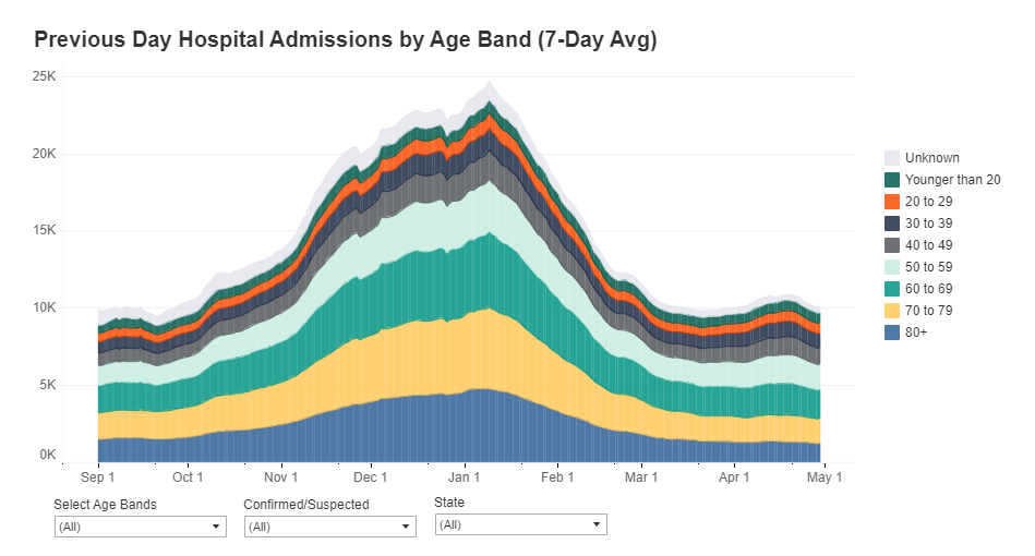
      New admissions are a useful metric because they provide a clear picture of where outbreaks are worsening, and by what degree. Patients may stay in the hospital (and be counted in a “current hospitalizations” figure) for weeks on end; isolating the number of new patients incoming allows public health researchers to see how the burden on hospitals is growing.

      Across the U.S., over 10,000 patients with confirmed cases of COVID-19 are now being admitted each day.

      New COVID-19 admissions rose from about 6,000 per day in late October to over 10,000 per day in mid-November. Full-size chart available here.

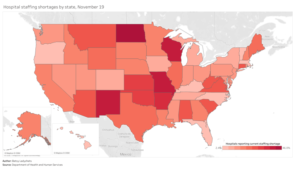
      Staffing shortages, meanwhile, are a useful metric because they demonstrate where in the country healthcare systems are hardest hit. The HHS specifically asks hospitals to report when their staffing shortages are critical, meaning that these facilities are in serious danger of being unable to operate as normal. Staffing shortages may be the result of healthcare workers feeling burnt out, quitting, or becoming sick with COVID-19 themselves.

      As of November 19, the most recent date these data are available, 18% of hospitals are currently facing a critical shortage—that’s about 1,100 out of the 6,100 hospitals reporting. 200 more hospitals report that they will be facing a critical shortage in the next week.

      In North Dakota, Wisconsin, Missouri, and New Mexico, over one third of hospitals are facing a critical staffing shortage. Full-size chart available here.

      Finally, here’s a look at the nation’s current hospital capacity—that is, how many hospital beds are currently occupied with sick people. As of November 19, about 600,000 of the nation’s 980,000 hospital beds are full (61%). 88,000 of those people have been diagnosed with COVID-19 (9%). These numbers will grow in the coming weeks as thousands of recently diagnosed Americans become sicker.

      Across the Midwest and South, several states have over three quarters of hospital beds occupied. Full-size chart available here.

      For more context on these hospitalization data and what they mean for the exhausted, terrified healthcare workers serving patients, check out: