Tag: HHS testing data

  • Potential data fragmentation when the federal COVID-19 public health emergency ends

    Potential data fragmentation when the federal COVID-19 public health emergency ends

    About half of U.S. states have D or F grades on their breakthrough case reporting, according to the Pandemic Prevention Institute and Pandemic Tracking Collective. Other metrics could be heading in this direction next year.

    COVID-19 is still a public health emergency. At the moment, this is true according to both the general definition of this term and official declarations by the federal government. But the latter could change in the coming months, likely leading to more fragmentation in U.S. COVID-19 data.

    A reader recently asked me about the federal government’s ability to compile and report COVID-19 data, using our new anonymous Google form. They asked: “Will the CDC at some point stop reporting COVID data even though it may still be circulating, or is it a required, reportable disease?”

    It’s difficult to predict what the CDC will do, as we’ve seen in the agency’s many twists and turns throughout the pandemic. That said, my best guess here is that the CDC will always provide COVID-19 data in some form; but the agency could be severely limited in data collection and reporting based on the disease’s federal status.

    The CDC’s authority

    One crucial thing to understand here is that the CDC does not actually have much power over state and local public health departments. It can issue guidance, request data, distribute funding, and so forth, but it isn’t able to require data collection in many circumstances.

    Here’s Marc Lipsitch, an epidemiologist at Harvard’s public health school and interim director of science at the CDC’s Center for Forecasting and Outbreak Analytics, explaining this dynamic. This quote is from an interview that I conducted back in May for my FiveThirtyEight story on the new center:

    Outside of a public health emergency, CDC has no authority to require states to share data. And even in an emergency, for example, if you look on the COVID Data Tracker, there are systems that have half the states or some of the states. That’s because those were the ones that were willing to share. And that is a very big handicap of doing good modeling and good tracking… Everything you’re trying to measure, for any decision, is better if you measure it in all the states.

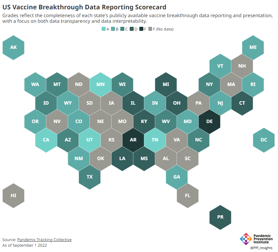
    Consider breakthrough cases as one example. According to the Pandemic Prevention Institute’s scorecard for breakthrough data reporting, about half of U.S. states have D or F grades, meaning that they are reporting zero or very limited data on post-vaccination COVID-19 cases. The number of states with failing grades has increased in recent months, as states reduce their COVID-19 data resources. As a result, federal agencies have an incomplete picture of vaccine effectiveness.

    Wastewater data is another example. While the CDC is able to compile data from all state and local public health departments with their own wastewater surveillance systems—and can pay Biobot to expand the surveillance network—the agency has no ability to actually require states to track COVID-19 through sewage. This lack of authority contributes to the CDC’s wastewater map still showing many empty spaces in states like Alabama and North Dakota.

    The COVID-19 public health emergency

    According to the Department of Health and Human Services (HHS), a federal public health emergency gives the HHS and CDC new funding for health measures and the authority to coordinate between states, among other expanded powers.

    During the COVID-19 pandemic, the federal emergency was specifically used to require data collection from state health departments and individual hospitals, POLITICO reported in May. According to POLITICO, the required data includes sources that have become key to our country’s ability to track the pandemic, such as:

    • PCR test results from state and local health departments;
    • Hospital capacity information from individual healthcare facilities;
    • COVID-19 patients admitted to hospitals;
    • COVID-19 cases, deaths, and vaccination status in nursing homes.

    The federal COVID-19 public health emergency is formally controlled by HHS Secretary Xavier Becerra. Becerra most recently renewed the emergency in July, with an expiration date in October. Health experts anticipate that it will be renewed again in October, because HHS has promised to give states a 60-day warning before the emergency expires and there’s been no warning for this fall. That leaves us with a new potential expiration date in January 2023.

    CDC officials are seeking to permanently expand the agency’s authority to include this data collection—with a particular priority on hospitalization data. But that hasn’t happened yet, to the best of my knowledge. So, what might happen to our data when the federal emergency ends?

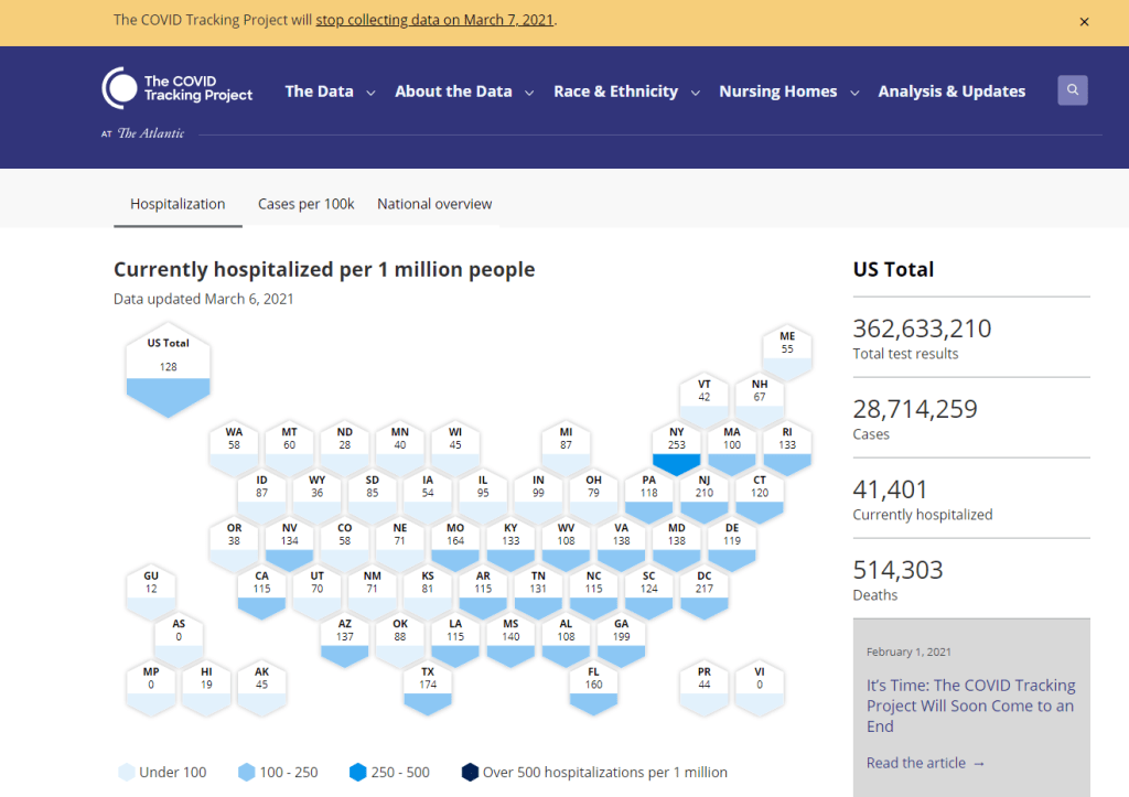
    Most likely, metrics that the CDC currently requires from states will become voluntary. As we see right now with breakthrough cases and wastewater data, some states will probably continue reporting while others will not. Our federal data will become much more piecemeal, a patchwork of reporting for important sources such as hospitalizations and lab test results.

    It’s important to note here that many states have already ended their own public health emergencies, following a trend that I covered back in February. Many of these states are now devoting fewer resources to free tests, contact tracing, case investigations, public data dashboards, and other data-related efforts than they were in prior phases of the pandemic. New York was the latest state to make such a declaration, with Governor Kathy Hochul letting her emergency powers expire last week.

    How the flu gets tracked

    COVID-minimizing officials and pundits love to compare “endemic” COVID-19 to the flu. This isn’t a great comparison for many reasons, but I do think it’s helpful to look at how flu is currently tracked in the U.S. in order to get a sense of how COVID-19 may be tracked in the future.

    The U.S. does not count every flu case; that kind of precise tracking on a large scale was actually a new innovation for COVID-19. Instead, the CDC relies on surveillance networks that estimate national flu cases based on targeted tracking.

    There are about 400 labs nationwide (including public health labs in all 50 states) participating in flu surveillance via the World Health Organization’s global program, processing flu tests and sequencing cases to track viral variants. Meanwhile, about 3,000 outpatient healthcare providers in the U.S. Outpatient Influenza-like Illness Surveillance Network provide the CDC with flu-related electronic health records. You can read more about both surveillance programs here.

    Sample CDC flu reporting from spring 2020. The agency provides estimates of flu activity rather than precise case numbers.

    The CDC reports data from these surveillance programs on a dashboard called FluView. As you can see, the CDC provides estimates about flu activity by state and by different demographic groups, but the data may not be very granular (eg. no estimates by county or metro area) and are provided with significant time delays.

    Other diseases are tracked similarly. For example, the CDC will track new outbreaks of foodborne illnesses like E. coli when they arise but does not attempt to log every infection. When researchers seek to understand the burden of different diseases, they often use hospital or insurance records rather than government data.

    One metric that I’d expect to remain unchanged when the COVID-19 emergency ends is deaths: the CDC’s National Center for Health Statistics (NCHS) comprehensively tracks all deaths through its death certificate system. But even provisional data from NCHS are reported with a delay of several weeks, with complete data unavailable for at least a year.

    Epidemiologists I’ve interviewed say that we should be inspired by COVID-19 to improve surveillance for other diseases, rather than allowing COVID-19 to fall into the flu model. Wastewater data could help with this; a lot of wastewater researchers (including those at Biobot) are already working on tracking flu and other diseases. But to truly improve surveillance, we need more sustained investment in public health at all levels—and more data collection authority for the CDC and HHS.

    More federal data

  • Goodnight, COVID Tracking Project

    Goodnight, COVID Tracking Project

    The COVID Tracking Project’s homepage on March 7, 2021.

    A couple of hours after I send today’s newsletter, I will do my final shift of data entry work on the COVID Tracking Project’s Testing and Outcomes dataset. Then, later in the evening, I will do my final shift on the COVID Racial Data Tracker. And then I will probably spend another hour or two bothering my fellow volunteers on Slack because I don’t want it to be over quite yet.

    In case you aren’t fully embroiled in the COVID-19 data world, here’s some context. Last spring, a few journalists and other data-watchers realized that the U.S.’s national public health agencies weren’t doing a very good job of reporting COVID-19 tests. Alexis Madrigal and Rob Meyer (of The Atlantic) compiled their own count from state public health agencies. Jeff Hammerbacher (of Related Sciences) had independently compiled his own count, also from state agencies. And, as the About page on the website goes: “The two efforts came together March 7 and made a call for volunteers, our managing editor, Erin Kissane joined up, and the COVID Tracking Project was born.”

    Now, one year after that formal beginning of the Project’s test-counting efforts, the team is ending data collection work. Erin Kissane and Alexis Madrigal provided some background for that decision in a blog published on February 1. I recommend reading the piece in full, if you haven’t yet, but the TL;DR is that a. this data collection work should be done by federal public health agencies, not a motley group of researchers and volunteers, and b. the federal agencies have greatly improved their own data collection and reporting efforts in recent months.

    The Project’s core Testing and Outcomes dataset formally ceases updates today, along with the Racial Data Tracker and Long-Term Care Data Tracker. But the Project has provided a lot of documentation and guidance for data users who want to keep tracking the pandemic, along with analysis that will be useful for months (if not years) to come. The rest of this post shares the highlights from those resources, along with a few personal reflections.

    Where to find your COVID-19 data now

    So, you’re a journalist who’s relied on the COVID Tracking Project’s tweets to illuminate pandemic trends for the past year. Or you’re a researcher who’s linked the Project’s API to your own tracking dashboard. Or you’re a concerned reader who’s checked up on your state regularly, watching the time series charts and annotations. Where do you go for your data now?

    Through a series of analysis posts and webinars over the past few weeks, Project staff have made their recommendation clear: go to the federal government. In recent months, the CDC and the HHS have built up data collection practices and public dashboards that make these data easier to work with.

    Here are a few highlights:

    • For daily updates at all geographic levels, use the Community Profile Reports. After months of private updates sent from the White House COVID-19 task force to governors, the data behind these in-depth reports were made public in December. The PDF reports themselves were made public in January, after Biden took office. The reports include detailed data on cases, deaths, tests, and hospitalizations for states, counties, and metropolitan areas. I’ve written more about the reports here.
    • For weekly updates, use the COVID Data Tracker Weekly Review. As I mentioned in a National Numbers post two weeks ago: the CDC is doing weekly updates now! These updates include reports on the national trends for cases, deaths, hospitalizations, vaccinations, and SARS-CoV-2 variants. They may be drier than CTP blog posts, but they’re full of data. You can also sign up to receive the updates as a newsletter, sent every Friday afternoon—the CDC has really moved into the 21st-century media landscape.
    • For state-specific updates, use the State Profile Reports. Similarly to the Community Profile Reports, these documents provide many major state-level metrics in one place, along with local data and color-coding to show areas of concern. They’re released weekly, and can be downloaded either state-by-state or in one massive federal doc.
    • For case and deaths data, use the CDC’s state-by-state dataset. This dataset compiles figures reported by states, territories, and other jurisdictions. It matches up pretty closely to CTP’s data, though there are some differences due to definitions that don’t match and other discrepancies; here’s an analysis post on cases, and here’s a post on deaths. You can also see these data in the CDC’s COVID Data Tracker and reports.
    • For testing data, use the HHS PCR testing time series. This dataset includes results of PCR tests from over 1,000 labs, hospitals, and other testing locations. Unlike CTP, the federal government can mandate how states report their tests, so this dataset is standardized in a way that the Project’s couldn’t be. Kara Schechtman has written more about where federal testing data come from and how to use them here. The HHS isn’t (yet) publishing comprehensive data on antibody or antigen tests, as these test types are even more difficult to standardize.
    • For hospitalization data, use the HHS hospitalization dataset. I’ve reported extensively on this dataset, as has CTP. After a rocky start in the summer, the HHS has shown that it can compile a lot of data points from a lot of hospitals, get them standardized, and make them public. HHS data for current hospitalizations are “usually within a few percentage points” of corresponding data reported by states themselves, says a recent CTP post on the subject. Find the state-level time series here and the facility-level dataset here.
    • For long-term care data, use the CMS nursing home dataset. The Centers for Medicare & Medicaid Services are responsible for overseeing all federally-funded nursing homes. Since last spring, this responsibility has included tracking COVID-19 in those nursing homes—including cases and deaths among residents and staff, along with equipment, testing availability, and other information. The CMS dataset accounts for fewer overall cases than CTP’s long-term care dataset because nursing homes only account for one type of long-term care facility. But, like any federal dataset, it’s more standardized and more detailed. Here’s an analysis post with more info.
    • For race and ethnicity data, there are a couple of options. The CDC’s COVID Data Tracker includes national figures on total cases and deaths by race and ethnicity—at least, for the 52% of cases and 74% of cases where demographic information is available. More detailed information (such as state-by-state data) is available on deaths by race and ethnicity via the CDC’s National Center for Health Statistics. A blog post with more information on substitutes for the COVID Racial Data Tracker is forthcoming.

    The COVID Tracking Project’s federal data webinars concluded this past Thursday with a session on race and ethnicity and long-term care facilities. Slides and recordings from these sessions haven’t been publicly posted yet, but you can look out for them on the Project’s website.
    Also, for the more technical data nerds among you: COVID Act Now has written up a Covid Tracking Migration Guide for users of the CTP API, and the Johns Hopkins Coronavirus Resource Center announced that it will begin providing state testing data.

    Analysis and update posts to re-read

    It took a lot of self control for me to not just link every single CTP article in here. But I’ll give you just a few of my favorites, listed in no particular order.

    What the COVID Tracking Project gave me

    I joined the COVID Tracking Project as a volunteer in early April, 2020. I actually searched back through my calendar to find exactly when I did a data entry training—it was Thursday, April 2.

    At the time, I wanted to better understand the numbers I kept seeing, in tweets and news stories and Cuomo’s powerpoints. But more than that, I wanted to do something. I sat, cooped up in my little Brooklyn apartment, listening to the endless sirens screaming by. I ran to the park and wanted to yell at every person I saw walking without a mask. I donated to mutual aid funds, but even that felt empty, almost impersonal.

    The Project put out a call for volunteers, and I thought, okay, data entry. I can do data entry. I can do spreadsheets. I know spreadsheets.

    Well, I know spreadsheets much better now, almost a year later. I know how to navigate through a state dashboard, find all its data definitions, and puzzle through its update time. But beyond all the technical stuff, volunteering for CTP gave me a sense of purpose and community. No matter how tired or angry the world made me feel, I knew that, for a few hours a week, I’d be contributing to something bigger than myself. My work played a small part in making data accessible, bringing information to a wider audience.

    Much ink has been spilled about how mutual aid groups have helped neighbors find each other, especially during that period of spring 2020 when everything seemed so bleak. I have seen the Project as another form of mutual aid. I’ve given countless hours to CTP over the past year in the form of data entry shifts, analysis, writing, and custom emojis—but those hours have also been given back to me, in everything from Tableau tricks to playlist recommendations. My fellow volunteers, the vast majority of whom I’ve never met in person, are my neighbors. We live in the same spreadsheets and Slack channels; we see the world in the same way. 

    I am beginning to understand how journalism, or something like journalism, can work when it is led by a community. By community, I mean: a group of people united in one mission. And by mission, I mean: bringing information to the public. Accessibility and accountability are common buzzwords right now, I think, but CTP approaches the truth of these principles, whether it’s by doing shifts through Christmas or by writing out detailed process notes on how to navigate Wyoming’s dashboard(s).

    I know why the Project’s data collection efforts are ending. The federal government can compile—and is compiling—data on a far more detailed and standardized level than a group of researchers and volunteers ever could. But I am grateful to have been part of this beautiful thing, so much bigger than myself. It is the bar by which I will measure every organization I join from here on out.

    If you’ve ever read the About page on the COVID-19 Data Dispatch website, you may have noticed a disclaimer stating that, while I volunteer for CTP, this publication is an entirely separate project that reflects my own reporting and explanations. This is true; I’m careful to keep this project distinct. But of course, the COVID-19 Data Dispatch has been influenced by what I’ve learned volunteering for CTP. I have attempted to carry forward those values, accessibility and accountability. I’ll keep carrying them forward. Feedback is always welcome.

    To all my neighbors in the CTP Slack: thank you. And to everyone who has followed the data: there is work still to be done.

    More federal data posts

    • HHS releases long-awaited national profile reports

      HHS releases long-awaited national profile reports

      For months, public health advocates have called on the federal government to release in-depth data reports that are compiled internally by the White House Coronavirus Task Force.

      The reports include counts of COVID-19 cases, deaths, and tests, as well as test positivity calculations. In addition to state-level data, the reports feature county-level data and even data for individual metropolitan areas, color-coded according to risk levels for each region. The reports have also drawn on these data to provide specific recommendations for each state. They have been a key piece of the federal government’s support for governors and other state leaders—but they haven’t been shared with the public.

      Liz Essley Whyte and her colleagues at the Center for Public Integrity have obtained copies of many of these reports and made them publicly available. But the scattered PDFs—often posted for only a few states at a time—provided only small snapshots from the vast trove of data HHS was using behind the scenes.

      This past Friday, the Department of Health and Human Services (HHS) began releasing all national COVID-19 reports and the data behind them. Now officially called “COVID-19 Community Profile Reports,” the reports are expected to be released as PDFs and spreadsheets every day.

      I asked Liz Essley Whyte why this release—one that she’s spent months pushing for—is so important. Here’s what she said:

      This release has local data that is so important for helping people make daily decisions about what’s safe. It also gives us the same picture of the pandemic that our federal government does, allowing us to weigh its response. It’s data that was assembled with taxpayer dollars and that affects everyone’s lives, so it was past time for it to be made public. I’m very glad it’s out there now. I think if it’s pursuing full transparency the White House should also make public the policy recommendations it gives to states weekly in the governors’ reports, alongside this helpful data.

      Whyte has also provided a tour of the information available in these reports, specifically geared towards local journalists who might want to use them.

      Here’s my own tour, a.k.a. why I’m excited about this new dataset:

      • Data on metropolitan areas: Other sources were compiling state- and county-level data prior to Friday, but standardized data on how COVID-19 is impacting America’s cities were basically impossible to find. This new dataset includes information on over 900 metropolitan and micropolitan areas, making it much easier to compare outbreaks in urban centers.
      • Standardized data: One of the biggest challenges for COVID-19 data users has been a lack of consistency. Some states report every day of the week, some skip weekends. Some states report their tests using one unit, some report using another. Some states include antigen tests in their numbers, some don’t. And so on. But the HHS can smooth out these inconsistencies internally, as national testing laboratories and state public health departments are all required to report in the same way. What I’m saying is, this new report allows us to do something we haven’t been able to reliably do since the start of the pandemic: compare testing numbers across states.
      • Major metrics in one place: Before Friday, if I wanted case and death numbers by county, I’d go to the New York Times, while if I wanted testing numbers by county, I’d go to the Center for Medicare & Medicaid Services. The scattered nature of pandemic reporting has led researchers and journalists to cobble together stories from multiple disparate sources; now, we can get three major metrics in one easy place. (This data reporter loves to only have one Excel spreadsheet open at a time.)
      • Contextual data built in: Not only does this new dataset include several important metrics in one place, it also contextualizes those metrics with key demographic information. For each state, county, and metro area in the dataset, numbers such as the share of this region living without insurance and the share of the region over age 65 are included right next to that region’s COVID-19 metrics. Two indices that indicate the region’s demographic vulnerability to the virus are also included: the CDC’s Social Vulnerability Index and the Surgo Foundation’s COVID-19 Community Vulnerability Index. I covered both in my November 29 issue.
      • Rankings for policymakers: In addition to raw counts of cases, deaths, and tests, the Community Profile Reports include calculated values that make it easy for local leaders to see how their communities compare. The reports rank states according to their cases per 100,000 population, positivity rate (for PCR tests), hospital admissions, and other metrics. They highlight key cities that demand attention and aid, such as Phoenix, Arizona and Nashville, Tennessee. They even forecast death totals based on current case counts—a morbid metric, but a useful one nonetheless.
      • More transparency: Like the facility-level hospitalization dataset released last week, the Community Profile Reports signify that the HHS is finally stepping up to provide the American public with the information that informs key public health decisions. The absence of national data during this pandemic was never meant to be filled permanently by journalists or volunteer data-gatherers—the federal government is built for this work. Journalists are, instead, built to watch this work closely and hold it accountable.

      In the agency’s Friday press release, HHS states:

      HHS believes in the power of open data and transparency. By publicly posting the reports that our own response teams use and by having others outside of the federal response use the information, the data will only get better.

      As of Saturday night, the dataset has already been downloaded nearly 6,000 times. That’s nearly 6,000 people who can use these data and make them better—and the number will only grow.

    • Sources and updates, Nov. 1

      The sources listed here are included in my source list, along with all featured sources from past issues.

      • Detailed hospitalization data go unreportedA new story by NPR’s Pien Huang and Selena Simmons-Duffin reveals county-, city-, and individual hospital-level reports which the Department of Health and Human Services (HHS) circulates internally but does not post publicly. HHS’s public reports on hospital capacity only include data at the state level. According to Huang and Simmons-Duffin’s reporting, more local data and contextual information such as per capita calculations and time series would be incredibly useful for the public health experts who are trying to determine where aid is most needed. The NPR story also notes that hospital compliance is low: only 62% of U.S. hospitals had sent HHS all the required information in the week prior to October 30.
      • HHS Protect has expanded: For a few months now, the HHS Protect Public Data Hub has only hosted COVID-19 hospitalization data. But recently, the website expanded to include a section on national testing. Users can clearly see cumulative PCR testing numbers from the country, download the full dataset, and read documentation. This dataset has been publicly available on healthdata.gov since July, but through hosting it on the HHS Protect Public Data Hub, the agency has made it more easily accessible for Americans who are not data nerds like myself.
      • Daily testing needs: A new tool from the Brown School of Public Health helps users calculate how many tests are needed for key essential groups, both for the nation overall and state-by-state. The tool is intended for public health leaders and policymakers who are starting to scale up as antigen tests become more widely available. For example, New York would need 37,300 tests a day to screen all college and university students.
      • Pennsylvania’s antigen testsOn October 14, Pennsylvania started distributing antigen test kits to health centers, nursing homes, and other facilities throughout the state. The facilities receiving tests are reported by the state in weekly lists. I wanted to share this because it’s a great example of testing transparency; though if Pennsylvania adds antigen tests to their dashboard, their reporting will be even more comprehensive. For more information on why state antigen test reporting is important—and how states have failed at it so far—see my COVID Tracking Project blog post from last week.
      • COVID holiday FAQsEpidemiologists from Boston University, the University of Alabama, Birmingham, and the University of Miami have compiled their responses to common concerns around the holiday season. The questions included range from, “How do I talk to friends and family members about COVID and the holidays?” to, “Is it important to get my flu shot?” (P.S. It is. Get your flu shot.)
      • COVID-19 in ICE detention centers: Since March 24, researchers from the Vera Institute of Justice have been compiling data from Immigration and Customs Enforcement (ICE) on COVID-19 cases and testing in immigrant detention centers. The researchers note that ICE replaces previously reported numbers whenever its dataset is updated, making it difficult to track COVID-19 in these facilities over time.
      • Eviction LabResearchers fromPrinceton University compile data for this source by reviewing formal eviction records in 48 states and the District of Columbia. Although the source’s most recent state-level dataset is as of 2016, the group is also tracking COVID-19-related evictions in real time for a select group of cities. Houston, TX, at the top of the list, has seen over 13,000 new eviction filings since March.
      • HHS celebrity tracker: Here’s one more piece of HHS news, this one more lighthearted. This week, POLITICO’s Dan Diamond released an HHS document called the “PSA Celebrity Tracker,” which health officials were using to determine which of America’s favorite people may be useful in an ad campaign encouraging the nation to be less negative about COVID-19. (Here’s more context from POLITICO on the tracker.) Alec Baldwin, for example, is listed as a celebrity who appeals to the elderly, with the additional note: “interested but having a baby in a few weeks.” Lin-Manuel Miranda is listed as appealing to Asian-Americans, with the note: “No information regarding political affiliation.”