As official COVID-19 case data become less and less reliable, wastewater surveillance can help provide a picture of where and how much the virus is spreading. This week, I put together a new COVID-19 Data Dispatch resource page that outlines major national, state, and local wastewater dashboards across the U.S.
Of course, wastewater surveillance is not capable of completely replacing clinical data. Wastewater testing is still pretty spotty across the country (though almost all states are now represented on the CDC’s dashboard), while scientists and public health officials are still working to determine how best to interpret and use these data; see my April FiveThirtyEight article for more on these challenges. There are also equity concerns around which communities have access to wastewater surveillance, as discussed in this recent paper from Colleen Naughton et al.
Still, if you live in a place where wastewater data are publicly available, I highly recommend keeping an eye on these numbers. Trends in wastewater data tend to closely match—or preempt—trends in case data, and wastewater testing includes everyone in a sewershed regardless of their access to (or interest in) getting a PCR test. This is one of the best COVID-19 indicators we have right now.
In the U.S., there are currently two main national wastewater dashboards:
CDC’s National Wastewater Surveillance System (NWSS) dashboard: This dashboard presents data from about 800 sewershed sites across the country, including both those managed by state and local health departments and those tested through the CDC’s contract with Biobot. Different data providers have different testing and analysis methods, which can make it difficult to interpret the information here on a national scale. But, if your state or county is represented on the dashboard, you can click into an individual site to see coronavirus trends. Historical data are available for download here.
Biobot Network dashboard: In addition to the company’s contract with the CDC, Biobot also tests wastewater at hundreds of sites across the country though its free Biobot Network, as well as through paid contracts with individual health departments and wastewater treatment plants. Biobot presents data from these non-CDC sites on its dashboard, updated weekly. One advantage of the Biobot dashboard over the CDC’s is that all Biobot sites are tested and analyzed with a uniform methodology, making the data easier to interpret. Data are available for download here.
My resource page also links out to COVIDPoops19, a dashboard summarizing wastewater monitoring efforts around the world. Run by researchers at the University of California Merced, this project links out to almost 150 public and academic wastewater sites. If you’re looking for wastewater surveillance in your area, this dashboard may be a good place to check.
At the smaller level, my page includes 17 statewide wastewater dashboards, seven at the local level (dedicated to a specific city or metropolitan area), and four at the regional level (representing multiple counties in a state).
While many more states are doing wastewater surveillance, the majority of state health departments have not yet developed their own dashboards—redirecting residents to the CDC NWSS site. Personally, I think some state-specific dashboards are much easier to navigate and interpret than the CDC’s, and would like to see more states produce their own. But I understand the resource limitations here.
Here are a few state and local dashboards I’d like to highlight:
Boston, Massachusetts: The Massachusetts Water Resources Authority’s dashboard is one of the oldest in the U.S., launched in spring 2020 through a partnership with Biobot. It’s fairly simple (presenting static images, not interactive dashboards), and easy to interpret, with charts showing long-term and short-term trends.
Colorado: Colorado’s dashboard follows a common format for presenting wastewater surveillance data: users are presented with a map of wastewater service areas, and can click into a specific area to see coronavirus trends for that sewershed. This state is also planning to expand wastewater testing to schools and other specific buildings, according to local reporting.
Maine: Maine’s wastewater “dashboard” is really a collection of PDF reports, posted for individual counties at regular intervals. The PDFs come directly from Biobot, which is running the state’s surveillance through a contract with the Maine CDC; I find it interesting to see the report format Biobot is using for its clients.
New York State: Researchers at Syracuse University, the State University of New York (SUNY), state departments of health and environmental conservation, and others collaborate on this wastewater surveillance project, which includes 54 counties and 90 treatment plants. Notably, the project does not include the five boroughs of New York City; the city has its own wastewater surveillance effort, but does not have its own dashboard. (NYC sites haven’t been updated on the CDC dashboard since April.)
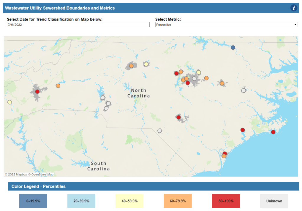
North Carolina: Similarly to Colorado’s, North Carolina’s wastewater dashboard allows users to click into specific sites for coronavirus trends. This dashboard also provides reported case trends for comparison and information about concentration percentiles, similar to the metrics used by the CDC. It also gives users a lot of information about where the data come from—good for transparency!
Twin Cities, Minnesota: The Metropolitan Council, a local agency in the Twin Cities, Minnesota metro area, has monitored COVID-19 in wastewater since early in the pandemic; I shared an interview with a lead scientist there in April. Recently, the Met Council added variant information to its dashboard, showing which versions of the virus are currently driving spread (BA.5 is taking the lead right now).
I know (from looking at the COVIDPoops19 dashboard) that my new resource page includes a small sample of academic and local wastewater sites; I chose to focus on those at the state level and for larger metro areas due to my own capacity. But if there’s another dashboard that you’d like to see added to the page, please reach out and let me know! I’ll try to keep it updated on a monthly cadence.
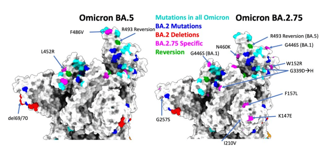
As if BA.4 and BA.5 aren’t already enough to worry about: some COVID-19 experts are sounding the alarm about BA.2.75, a new version of Omicron that evolved out of BA.2.
This subvariant was first identified in India in late May, and has now been reported in the U.K., Germany, and several other countries, according to the World Health Organization. Scientists are concerned because it has new spike protein mutations that could heighten its ability to bypass immunity from past infections or vaccinations—including, potentially, from BA.4 or BA.5.
— World Health Organization (WHO) (@WHO) July 5, 2022
At least three BA.2.75 cases have been reported in the U.S. so far, according to a Friday press release from the surveillance company Helix. Two of these cases were on the West Coast, in Washington and California. These cases are currently lumped in with other versions of BA.2 on the CDC dashboard.
The information on BA.2.75 is fairly preliminary at this point; the WHO is monitoring it as an additional lineage of Omicron, not a separate variant of concern, and watching for new data. It’s unclear how competitive it might be with BA.5, now dominant in the U.S., but is worth keeping an eye on. As Dr. Katelyn Jetelina points out in a recent issue of Your Local Epidemiologist, the spread of BA.2.75 could further complicate fall booster shot plans.
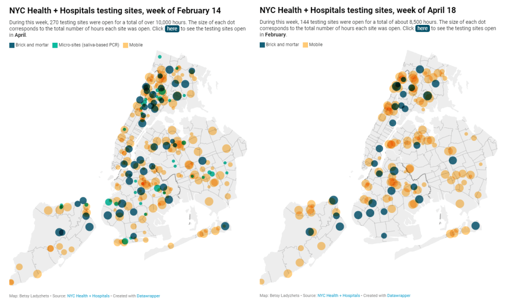
New York City has been closing PCR testing sites, even as the city faced a major Omicron resurgence this spring. This was the main finding from a story I wrote for Gothamist and WNYC (New York Public Radio), based on my analysis of public information on city-run testing sites.
While this was a local story, I think the trends I found—and the pushback that the piece received from city health officials—are pretty indicative of the national state of COVID-19 testing right now. Since the federal government ran out of funding to cover testing for Americans without health insurance in late March, private testing companies have started requiring insurance information and, in many cases, raising their prices.
At the same time, state and local health departments have closed their public PCR testing sites and directed people to use at-home rapid tests instead. New York City still has more accessible testing than most of the country, but my story showed how even here, getting tested is becoming more difficult—and less popular.
NYC has faced a major COVID-19 surge this spring — yet the city closed public testing sites and made it harder to get PCR results.
— betsy ladyzhets 📊 (@betsyladyzhets) July 5, 2022
Here are a few key statistics from the piece:
The number of public PCR testing sites run by NYC Health + Hospitals was cut in half between mid-February and mid-April.
The total hours that public testing sites were open decreased from over 10,000 during a week in February, to 8,500 during a week in April, to 7,500 in the last week of June.
Manhattan testing hours remained relatively constant (about 1,500 in each of the weeks I analyzed), while hours were cut in other boroughs.
The numbers of New Yorkers getting tested on a daily basis were similar in June 2021 and June 2022—even though reported case rates were about ten times higher this year.
New York City’s test positivity rate recently shot above 10%, and is now over 15%. It was closer to 1% at this time last year.
The NYC health department had some issues with my story. In fact, city health commissioner Dr. Ashwin Vasan posted a Twitter thread stating that it was “missing key information” and that the city actually has “more testing resources than ever.” But the “testing resources” he cites here are mostly at-home tests; PCR testing in NYC is both less accessible and less popular. A follow-up story that I coauthored with Nsikan Akpan, my editor at Gothamist/WNYC, further explains the situation in the city.
The decline in PCR testing is making it harder to understand where and how fast the coronavirus is spreading, both in the city and around the U.S. To explain the implications of this trend, here’s a short FAQ on how to think about testing during our current surge.
Why is PCR testing still important for individuals?
One of the city officials’ main responses to my story was that NYC has made it easy for people to get free at-home rapid tests, in place of PCR testing. The city has distributed more than 35 million at-home tests at hundreds of libraries and other community sites.
At-home tests certainly have advantages: they’re more convenient, with results back in 15 minutes. Turnaround times for PCR tests are generally pretty fast right now thanks to limited demand (usually under 48 hours, if not under 24 hours, in NYC), but that’s still a long wait compared to a rapid test. Rapid, at-home tests also provide a better indicator of contagiousness.
Still, PCR tests have continued utility because they remain the gold standard of accuracy: they’re able to identify a COVID-19 case with much smaller amounts of coronavirus present in someone’s respiratory tract than a rapid test. As a result, if you were recently exposed or are showing some mild symptoms—but testing negative on rapid tests—a PCR test could be valuable to provide a more reliable COVID-19 status.
PCR tests can also be helpful for documenting a COVID-19 case. While many doctors will take a rapid test positive as a clear indicator of an infection, some settings may require a PCR test—in which results are verified by the lab that processes the test. This can be particularly true for Long COVID clinics, health advocate JD Davids told me. So, if you tested positive on a rapid test but are concerned about Long COVID symptoms, a PCR test may be a helpful verification step.
Why is PCR testing still important for communities?
Rapid, at-home test results generally do not travel further than your trashcan, or maybe your phone camera. They don’t get reported to testing companies, or local public health departments, or the CDC—unlike PCR tests, which have established data pipelines for such reporting. Some jurisdictions do have options for residents to self-report rapid test results, but this self-reporting is generally a small fraction of the total tests conducted.
As a result, public health experts generally rely upon PCR testing data to understand patterns in COVID-19 spread. When less PCR testing takes place, these patterns become more difficult to interpret. For example, in the U.S. as a whole, around 100,000 new cases a day have been reported for the last several weeks; but we know that the true trend would likely be a lot more variable if we had data from rapid tests.
Also, as Brown University epidemiologist Dr. Jennifer Nuzzo pointed out when my editor Nsikan interviewed her for our follow-up story, PCR tests are necessary for tracking variants. A selection of PCR test samples get genetically sequenced; this doesn’t happen for rapid tests.
“It’s really important for us to stay ahead of what variants are circulating in our communities,” Nuzzo said, citing what society has already learned about different variants to date. “Some are more transmissible. Some have been more severe. We need to stay ahead of the virus, so that we can know when and how and if to change our strategy about how to control it.”
What’s the value of abundant local testing sites?
If PCR testing is less popular in this current phase of the pandemic, you might ask, why not just have a few central testing hubs in a place like NYC, and maintain testing capacity in a more efficient way? This seems to be the city’s response, to some extent: officials explained that some brick-and-mortar testing sites (mostly at NYC hospitals) are staying open, while the city’s fleet of mobile testing vans can move around as needed.
But for a lot of people, traveling outside their neighborhood to get a test or tracking down the right mobile van can be a major barrier to getting tested. This is especially true for essential workers and low-income New Yorkers—who are the people most in need of testing. Maintaining public testing throughout the city is a health equity issue.
And even if the testing capacity is technically maintained, location is important. Consider a region like South Brooklyn: Four brick-and-mortar testing sites scheduled to close in mid-July are all located in this area: 4002 Fort Hamilton, Bay Ridge, Bensonhurst and Midwood Pre-K.
It’s unclear whether mobile sites will move to South Brooklyn in response. Shrier said each closing site has “dedicated at-home test distribution sites” within one mile. But residents of Bay Ridge, Bensonhurst and other nearby neighborhoods may need to travel further to get a PCR test — or face high costs at private sites.
What data sources could replace information from PCR tests?
Dr. Denis Nash, an epidemiologist at the City University of New York whom I interviewed for the first NYC story, talked about two types of data that may be collected by a health agency tracking disease spread.
“There’s active surveillance and passive surveillance,” he said. “In active surveillance, the health department staff are actively going out and trying to ascertain how many cases there might be. They’re going to hospitals and to homes, looking for cases. And when you do that, you’re more likely to exhaustively find a high proportion of cases.” One example of active surveillance: a survey conducted by Nash and his team at CUNY in April and May, which indicated about 20% of New Yorkers may have had COVID-19 within a two-week period.
Meanwhile, passive surveillance “relies on healthcare providers and laboratories to voluntarily report their tests and cases to the health department,” Nash said. NYC and other health departments which receive much of their COVID-19 data—PCR test results, hospital admissions, etc.—from healthcare providers are exemplifying this passive approach.
As COVID-19 becomes less of a public concern and testing is less popular, health agencies should step up their active surveillance, Nash said. Wastewater can be another source of data that’s more active than PCR test results, since it reflects COVID-19 spread across a large population. (Unfortunately, in NYC, wastewater data is pretty inaccessible; that’s a topic for another time.)
What’s the best way to use at-home rapid tests?
Rapid test use can fall into three different categories. First, if you are trying to determine whether you’re actively contagious right before a gathering or seeing a high-risk person: take one test, as close in time to the event as possible. (For example, if I’m going to a large march in NYC, I plan to test myself a few minutes before heading to the subway.)
Second, if you had a recent COVID-19 exposure (or attended a high-risk event), test multiple times in succession—ideally at least twice in 48 hours. This testing process should start a couple of days after the exposure, because rapid tests aren’t accurate enough to pick up the infection right away. You could also use a single PCR test to serve the same purpose as multiple rapid tests.
And third, if you are isolating after a positive COVID-19 test, rapid tests can help identify when you’re no longer contagious and able to return to society. As I wrote in an earlier post, the CDC’s five-day isolation guidance is not actually backed up by data; testing out of isolation is much safer.
As always, if you have questions about testing or any other COVID-19 topic, my inbox is open.
Report on race and ethnicity data collection: Researchers at Boston University’s Center for Antiracist Research, who worked on collecting race and ethnicity data from states during the pandemic, have produced a report about the challenges of this work. I was a long-time volunteer for the COVID Tracking Project’s Racial Data Tracker, which became the first stage of a larger project for the BU center, and I’m glad to see this report highlight the issues with destandardized, incomplete data that I remember well.
Global impact of vaccines in 2021: In a new paper, published in The Lancet in late June, researchers at Imperial College London evaluate the lives saved by COVID-19 vaccines on a global scale during the first year that this technology was available. Vaccines prevented about 14 million COVID-19 deaths in 185 countries and territories, the researchers found. If global health initiatives like COVAX had met their goals, the lives saved could have been far greater.
COVID-19 spread from a cat: Scientists in Thailand have identified the first documented case of a human getting the coronavirus from a pet cat. In this case, the cat from a family going through isolation for COVID-19 infected a veterinarian who was caring for it; genetic analysis confirmed that three humans (father, son, and veterinarian) and the cat were infected with the same viral strain. While cases like this are likely rare, the documented transmission demonstrates why we need better tracking of COVID-19 in animals, as I noted last week.
Potential new approach for tracking variants: A new study in the Journal of Clinical Microbiology, funded by the National Institutes of Health, presents the potential for monitoring coronavirus variants through a PCR testing-based approach. Compared to the techniques labs currently use to track variants—which involve sequencing an entire viral genome—this new approach would be faster, cheaper, and could be performed by more labs. The researchers are eager to share their work “as a public health tool,” they said in an NIH press release.
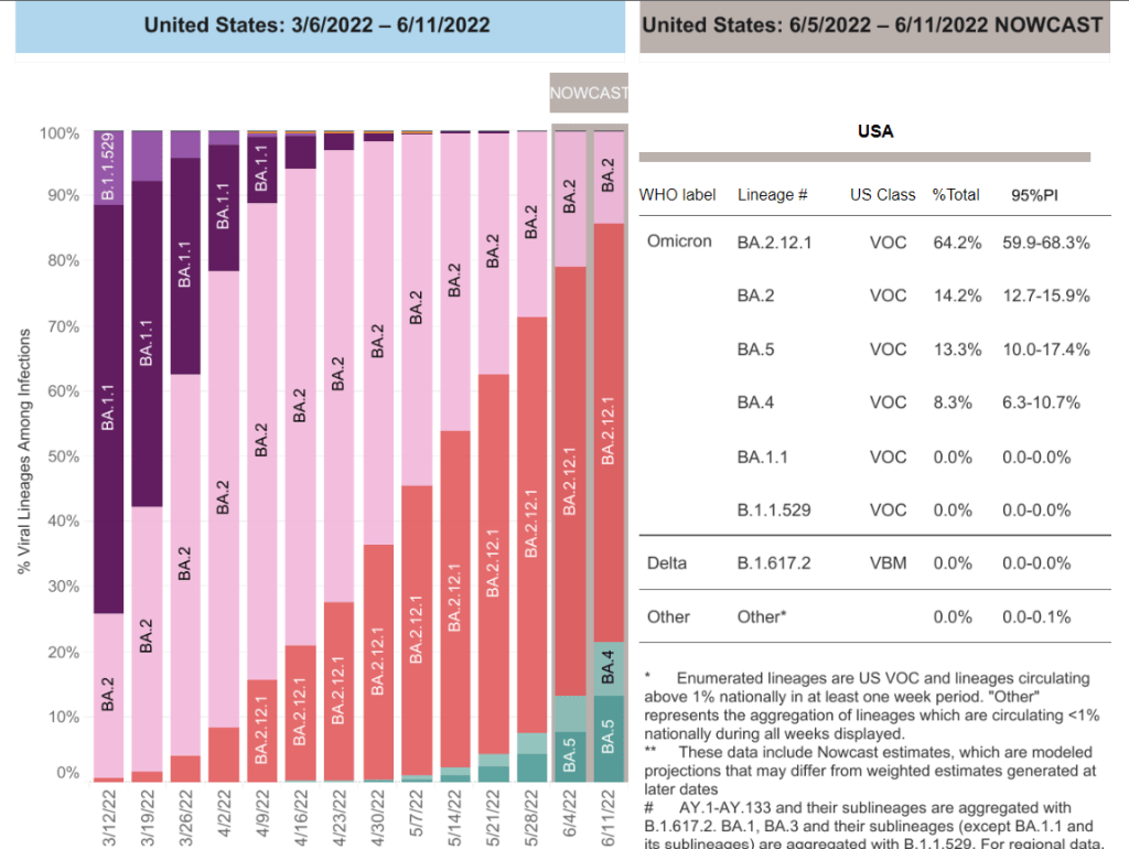
BA.4 and BA.5 caused more than 20% of new COVID-19 cases nationwide in the week ending June 11, according to CDC estimates.
This week, I had a new story published at TIME’s online news site, explaining what Omicron BA.4 and BA.5 could mean for COVID-19 trends in the U.S.
The story makes similar points to my FAQ post on these subvariants from earlier in June: basically, BA.4 and BA.5 have evolved to get around antibodies from a prior coronavirus infection or vaccination, and the U.S. is likely to see a lot of reinfections from these subvariants—even among people who already had BA.1 or BA.2 earlier this year. BA.2.12.1 has mutated in a similar way, leading experts to suspect that one of these subvariants (or all three) will dominate the next phase of the pandemic.
When I talked to variant experts for my TIME story, I asked them for their thoughts on surveillance. “Is it getting harder to identify and track new linages like BA.4 and BA.5 as fewer people use PCR tests and more use at-home tests?” I asked. “What improvements or shifts would you like to see in surveillance?”
All three experts I spoke to had different perspectives, which I found interesting—and worth sharing in the COVID-19 Data Dispatch, since I wasn’t able to include this (somewhat wonkier) information in my TIME story.
Here’s what they said:
Marc Johnson, a microbiology and immunology professor at the University of Missouri who leads the state’s wastewater surveillance program, thinks that expanding wastewater monitoring is the way to go (though he admitted his bias, as someone who works in this area). “Sewershed monitoring is a really good way to track variants going forward,” he said. “It gives you a comprehensive view without costing you hundreds of thousands of dollars… or without having to sequence a thousand people.”
Shishi Luo, associate director of bioinformatics and infectious diseases at Helix (a genomics and viral surveillance company), is thinking about how to ensure her company consistently receives enough PCR test samples to get useful data from sequencing. At the moment, pharmacies and community testing sites are still providing enough samples that Helix has sufficient information to track variants, she said. But, anticipating that those numbers may dwindle, Helix is connecting with urgent care clinics and hospitals that do diagnostic testing. “I think those places will continue to collect samples and perform qPCR tests,” she said.
Paul Bieniasz, a professor at Rockefeller University who studies viral evolution, thinks that the current levels of surveillance are sufficient—at least, when it comes to policymaking and updating vaccines. “I would like to keep surveillance at a level such that such that we can have a pretty accurate picture about what’s going on,” he said. But he wants to prioritize “the really important things”: namely, understanding changes to vaccine effectiveness, which treatments to use, and identifying a new “major antigenic shift” like the one that produced Omicron as soon as it occurs.
“But it can always be better,” he said. “The more intense the surveillance, the more sensitive it is, and the earlier you detect things that might be of concern in the future.”
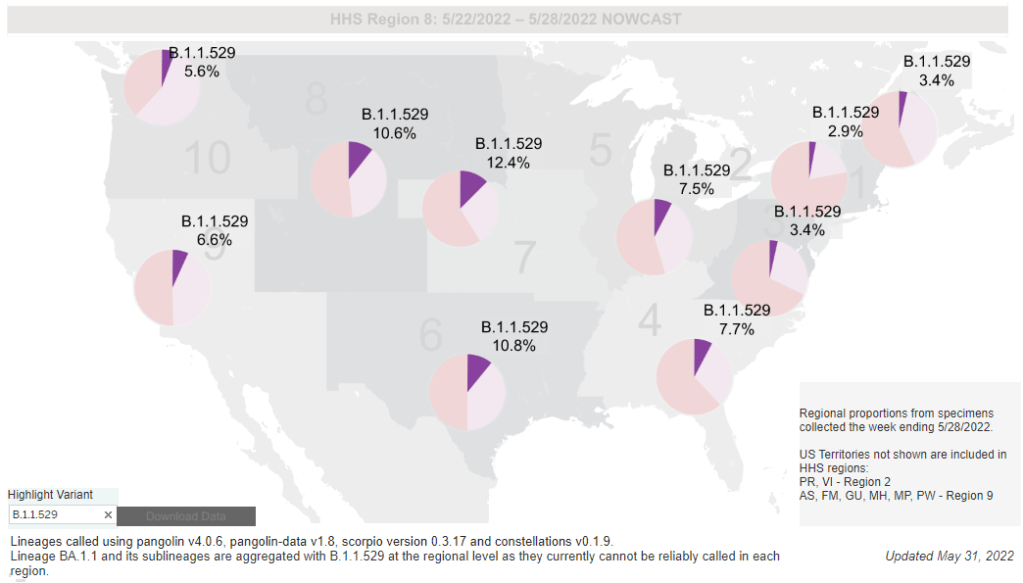
While the CDC is not yet reporting BA.4 and BA.5 separately, the subvariants are included in B.1.1.529; this grouping is driving increased transmission in some Midwestern and Southern states. Chart via the CDC variant dashboard.
America’s current COVID-19 surge is being driven by BA.2 and its sublineage BA.2.12.1. But there are other versions of Omicron out there to which we need to pay attention—namely, BA.4 and BA.5. Here’s a brief FAQ on these two subvariants, including why scientists are concerned about them and where they’re spreading in the U.S.
What are BA.4 and BA.5?
Remember how, when South African scientists first sounded the alarm about Omicron in November, they identified three subvariants—BA.1, BA.2, and BA.3? BA.1 first spread rapidly around the world, followed by BA.2.
Then, in the winter, South African scientists again identified new Omicron subvariants, called BA.4 and BA.5. These two variations split from the original Omicron lineage, and tend to be discussed together because they have similar mutations. (Specifically, they have identical spike protein mutations; this article discusses the mutations in more detail).
It’s important to note that, while South African scientists characterized these subvariants, they likely didn’t originate in the country. South Africa has a better variant surveillance system than many other countries, particularly compared to its neighbors, allowing the country’s scientists to quickly identify variants of concern. BA.4 and BA.5 also caused a new surge in South Africa, allowing for study of the subvariants’ performance.
Why are scientists concerned about these subvariants?
Early studies of BA.4 and BA.5 indicate that not only are these subvariants more transmissible than other forms of Omicron, they’re also more capable of bypassing immunity from prior infection or vaccination.
While the differences between BA.4/BA.5 and BA.1/BA.2 are less dramatic than the differences between the Omicron family and Delta, scientists hypothesize that there is still enough distinction between these two Omicron sub-groups that people who already had Omicron BA.1 or BA.2/BA.2.12.1 could potentially get reinfected by BA.4 or BA.5.
My guess based on this: BA.4/BA.5 escape, while not as dramatic as Omicron escape from vaccine or Delta immunity, is enough to cause trouble and lead to an infection wave. But not likely to cause much more severe disease than the previous wave, especially in vaccinated.
What are BA.4 and BA.5 doing in South Africa and other countries?
BA.4 and BA.5 have been detected in over 30 countries, according to CNN. But scientists have again focused on South Africa, as this country has better surveillance than many others—particularly as PCR testing declines around the world.
In South Africa, the BA.4/BA.5 wave that started in April has peaked and is now on the decline. Hospital admissions and deaths were lower in this recent wave than in the Omicron BA.1 wave in November and Decenter, largely thanks to high levels of immunity in the country. Still, the continued Omicron infections suggest that reinfection is a real concern for these subvariants.
Brief trip back into Covid data today:
Promising news from South Africa, where the BA.4 / BA.5 variant wave has passed quietly, with high levels of immunity meaning this wave has had little impact on rates of severe illness or death pic.twitter.com/C5W6iZzDLK
South Africa never really had a BA.2 wave, so BA.4 and BA.5 mostly competed with other Omicron lineages in that country. But in the U.K., which did face BA.2, recent data suggest that BA.4 and BA.5 have a growth advantage over even BA.2.12.1. In other words, BA.4 and BA.5 could potentially outcompete BA.2.12.1 to become the most transmissible Omicron subvariants yet.
What are BA.4 and BA.5 doing in the U.S.?
The subvariants are definitely here and spreading, but we have limited visibility into where and how much thanks to declined testing and surveillance. The CDC has yet to separate out BA.4 and BA.5 on its variant dashboard; according to White House COVID-19 Data Director Cyrus Shahpar, this is because the CDC has yet to identify these subvariants as causing 1% or more of new national cases in a given week.
Updated variant proportions just posted. BA.2.12.1 now estimated to be ~59% of specimens sequenced last week. BA.4 and BA.5 not yet meeting the 1%+ threshold to be listed separately https://t.co/YIeQkH8YmEpic.twitter.com/SsSyoVO5Gh
— Dr. Cyrus Shahpar Archived (@cyrusshahpar46) May 31, 2022
But the CDC does include BA.4 and BA.5 in its Omicron B.1.1.529 category, which has grown from causing 1% of new cases in the first week of May to causing 6% of new cases in the last week of the month. The number of cases sequenced in a week has dropped this spring compared to the first Omicron surge, leading me to wonder: are BA.4/BA.5 really causing fewer than 1% of new cases each, or do we just not have the data to detect them yet?
CDC data do show that the B.1.1.529 group (which includes BA.4/BA.5) is causing over 10% of new cases in the Plain States, Gulf Coast, and Mountain West—compared to under 5% in the Northeast, where BA.2.12.1 is more dominant. This data aligns with local reports of BA.4 and BA.5 spreading in wastewater in some Midwestern states that track variants in their sewage. For example, scientists at the Metropolitan Council in the Twin Cities recently said they expect BA.4 and BA.5 to “replace BA.2.12.1 as the dominant variants” in the next few weeks.
What could BA.4 and BA.5 mean for future COVID-19 trends in the U.S.?
As I noted above, data from the U.K. suggest that BA.4 and BA.5 could outcompete BA.2—and even BA.2.12.1—to become the dominant Omicron subvariants in the U.S. Early data from U.S. Omicron sequences are showing a similar pattern, reported variant expert Trevor Bedford in a recent Twitter thread.
“Focusing on the US, we see that BA.2.12.1 currently has a logistic growth rate of 0.05 per day, while BA.4 and BA.5 have logistic growth rates of 0.09 and 0.14 per day,” Bedford wrote. The country’s rising case counts can be mostly attributed to BA.2.12.1, he said, but BA.4 and BA.5 are clearly gaining ground. And, he noted, these two subvariants may be able to reinfect many people who already had BA.1 or BA.2.
Thus, we expect at least some portion of the BA.4 / BA.5 epidemics to be driven by increased vaccine breakthrough and increased reinfection relative to current BA.2 circulation. 12/12
In short: even more Omicron breakthrough infections and reinfections could be coming our way. Even if BA.2.12.1 transmission dips (as it seems to be doing in the Northeast), we could quickly see new outbreaks driven by BA.4 and BA.5—leading overall case numbers to plateau or rise again.
“For the summer, going into the winter, I expect these viruses to be out there at relatively high levels,” Dr. Alex Greninger from the University of Washington’s clinical virology lab told CNN. “Just the number of cases, the sheer disruptions of the workforce — It’s just a very high, high burden of disease.”
As cases rise in the U.S. and other parts of the world, Omicron subvariants are a continued culprit. Experts are watching closely to see if further mutations of the virus may become even more contagious, or may gain the ability to evade immunity from prior infections and vaccinations.
BA.4 and BA.5 in South Africa
When South African scientists sounded the alarm about Omicron in November, they identified three versions of the variant, called BA.1, BA.2, and BA.3. BA.1 first spread rapidly through South Africa and the rest of the world in December and January; BA.2 then outcompeted BA.1 to become the dominant strain globally.
Now, South African scientists are sounding the alarm again: this time about new Omicron lineages, dubbed BA.4 and BA.5. These two lineages have driven another new surge in the country, with both cases and hospital admissions rising sharply in recent weeks. The surge might be starting to slow, as of late this week, but it’s unclear if this trend will continue.
Sigal and his collaborators tested neutralizing antibodies—a commonly-studied aspect of immune system protection—from BA.1 against BA.4 and BA.5. They found that a BA.1 infection offered relatively limited protection against BA.4 and BA.5, especially if the person who had BA.1 was unvaccinated. “BA.4 and BA.5 have potential to result in a new infection wave,” the authors wrote.
This study is a preprint, not yet peer-reviewed. But it’s still a major warning sign for the U.S. and other countries: watch out for BA.4 and BA.5.
In New York and New Jersey, BA.2.12.1 is causing over 60% of new cases; it’s no coincidence that these states are also reporting some of the highest case and hospitalization rates in the country right now. New England, mid-Atlantic, South, and Midwest states are also seeing high proportions of BA.2.12.1.
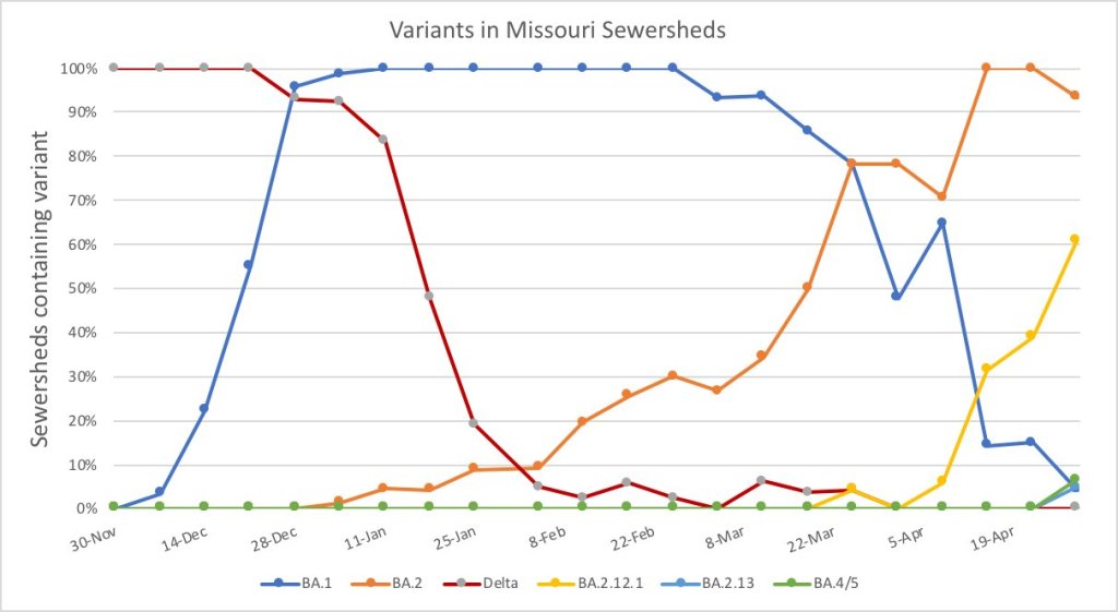
The CDC’s variant proportions estimates don’t yet include BA.4 and BA.5, but other reports suggest that these subvariants are already in the U.S. and starting to compete with our homegrown BA.2 lineages. Marc Johnson, a leading wastewater expert in Missouri, posted on Twitter yesterday that he’s seeing “a circus of Omicron sublineages” in his state, including BA.4 and BA.5.
So here is the latest Missouri sewershed data. It's a circus of Omicron sub-lineages. There are literally 5 strains competing against each other that each have a different residue at position 452. pic.twitter.com/T1CObdJdeD
Also worth noting: a new U.S. study (shared as a preprint last week) found that, actually, Omicron is not inherently less severe than other variants. In comparing hospitalization and mortality risks after accounting for vaccination and medical risk factors, the researchers behind this study found little difference between the Omicron wave and prior periods. While this study also has yet to be peer-reviewed, it doesn’t bode well for future Omicron-driven surges.
COVID-19 levels in waste—or, from our poop—have become an increasingly popular data source in the last couple of months (in this newsletter and for many other reporters and commentators), as PCR testing sites close and at-home tests become the norm. Wastewater can provide us with early warnings of rising transmission, and it includes COVID-19 infections from people who can’t or don’t want to get a PCR test.
But wastewater surveillance is very uneven across the country, as I’ve noted before. A lot of local health agencies, research groups, and utility companies are now trying to expand their COVID-19 monitoring in wastewater, but they face a lot of barriers. My reporting suggests that we are many months (and a lot of federal investment) out from having a national wastewater surveillance system that can actually replace case data as a reliable source for COVID-19 trends and a driver for public health action.
Wastewater surveillance is highly sensitive to changes in a community’s coronavirus transmission levels, particularly when those levels are low, as has been the case across the U.S. in recent weeks.
Every wastewater collection site is different, with unique environmental and demographic factors – such as weather patterns or popularity with tourists – that must be accounted for.
While the CDC has led some coordinated efforts through the National Wastewater Surveillance System (NWSS), wastewater sampling techniques overall aren’t standardized across the country, leading to major differences in data quality.
Sparsely populated, rural communities are particularly challenging to monitor, as their small sizes lead to even more heightened sensitivity in wastewater.
Wastewater data is hard to communicate, especially when public health officials themselves aren’t sure how to use it. The CDC’s NWSS dashboard is a prime example.
As bonus material in today’s COVID-19 Data Dispatch, I wanted to share one of the interviews I did for the story, which provides a good case study of the benefits and challenges of COVID-19 surveillance in wastewater.
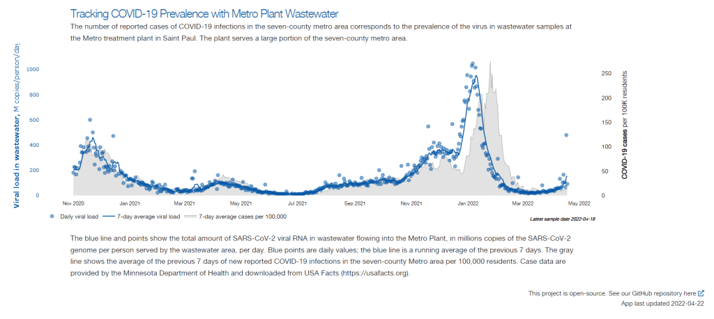
In this interview, I talked to Steve Balogh, a research scientist at the Metropolitan Council, a local agency in the Twin Cities, Minnesota metro area that manages the public water utility (along with public transportation and other services). Balogh and his colleagues started monitoring Twin Cities’ wastewater for COVID-19 in 2020, working with a research lab at the University of Minnesota.
Balogh gave me a detailed description of his team’s process for analyzing wastewater samples. Our conversation also touches on the learning curve that it takes to set up this surveillance, the differences between monitoring in urban and rural areas, and the dynamics at play when a wastewater plant suddenly becomes an important source for public health information. Later in the interview, Bonnie Kollodge, public relations manager at the Metropolitan Council, chimed in later to discuss the wastewater data’s media reception.
This interview has been lightly edited and condensed for clarity. Also, it’s worth noting that the interview was conducted in early April; since then, COVID-19 levels have started rising again in the Twin Cities metro area’s wastewater.
Betsy Ladyzhets: The first thing I wanted to ask about was, the backstory of sampling at the Metro Plant. I saw the dashboard goes back to November 2020, and I was wondering if that’s when you got started, and how that happened?
Steve Balogh: We actually started looking into it in April of 2020. And we contracted with Biobot at that time… But in May, their price went up, so we started looking for alternatives. Then, we started a partnership with people at the University of Minnesota Genomics Center, who know about measuring RNA in things.
At that point, we tried to figure out how to extract the RNA from our samples. They [University of Minnesota researchers] didn’t know anything about wastewater, but they knew everything about RNA. We know all about wastewater, but we don’t know anything about RNA. So it was a good match.
That summer, [the university researchers] started trying to do the extractions and it didn’t really work out so well… So we said, “Okay, we’re going to try this.” By September of 2020, we had built our own lab, and we were trying out our own extractions, based on what we were seeing in the literature, and all the preprints that were piling up. In October, basically we settled on [a sampling process] that worked. And by November 1, we were actually getting data.
BL: Yeah, that definitely aligns with what I’ve heard from some of the other scientists I’ve talked to who have worked on this, where it’s like, everybody was figuring [wastewater sampling methods] out on their own back in 2020.
SB: Yeah, it was on the fly. Papers were coming out daily, just about, with new ideas on how to do things. And we had, like, four different extraction methods that we wanted to look at, also looking at sludge, in addition to influent wastewater… Honestly, it was pretty much pure luck that we settled on [a method] that really, really worked.
We tried to get daily samples, and to put up numbers and see what [the data] looked like. And it actually did work—it actually tracked the reported caseload quite well. We figured, well, it must be working. We also did QA [quality assurance] in the lab, spiking the samples with known amounts of RNA, and trying to get that back. And all of that came back really well, too. So, we have a lot of confidence in our method.
BL: So that [QA] is like, you put in certain RNA, and then you check to make sure that it shows up in the sample?
SB: Exactly, yeah.
BL: What is your process for analyzing the samples and distinguishing those trends, like seeing how they match the case numbers?
SB: We do the extractions at our lab, with the samples from the Metro Plant. We take three milliliters of wastewater and we add 1.5 milliliters of something called Zymo DNA/RNA Shield, from a company in California called Zymo. That’s a buffer that stabilizes the RNA—it basically explodes whatever virus particles are in there, breaks them up, and then it stabilizes the RNA in the sample. So you can actually store those samples at room temperature for days, or maybe even weeks, because the RNA is stabilized.
Then, we put that treated sample through a two-step extraction process. The first step is, we put the whole thing into a Zymo III-P column, combined with 12 milliliters of pure ethanol, and run that through the column. This is a silica column, so the RNA in the sample binds to the silica. Then we wash it and elute that RNA in 200 microliters of water. And then we take that 200 microliters, and run it though the second stage, which is just a smaller silica column. The RNA that’s in that 200 microliters binds onto the smaller column, and then we wash it and elute that into 20 microliters.
Our total concentration is going from three milliliters of wastewater down to 20 microliters of pure water. That’s a concentration factor of 150. We figured that would work for pretty much most situations, and it’s turned out to be true.
Then, we store those samples at minus 80 degrees Celsius. Until we take them over weekly to the University of Minnesota, where they do droplet digital PCR, RT-PCR, to amplify and detect the RNA that’s in our samples. We started out just getting the total viral load back in November 2020. But then, in the early part of 2021 when Alpha showed up, we started doing variant analysis as well. We’re now also looking for specific mutations that distinguish the different variants of concern, like Alpha and Delta and Omicron.
BL: So, you take the samples every day, but then you bring them over [to the university] once a week, is that correct?
SB: That’s correct.
BL: When you’re getting that data, coming from the U of MN lab, what are you doing to interpret it? Or, in communicating the data on your dashboard, what are the considerations there?
SB: We work up the numbers and calculate a total load of the virus, or the particular variants, that’s coming into the plant. And then we basically put that up on the dashboard. There’s not a whole lot of interpretation or manipulation of the data—we’re simply importing the load, basically, of what we see coming into the plant. The load is the concentration that we’ve measured in the sample, times the total volume of wastewater coming into the plant.
We think that’s a sufficient normalization procedure for a large wastewater treatment plant. I know some groups are using other normalization techniques, but we think load is sufficient to tell us what’s happening out in our sewer shed.
BL: Yeah, that makes sense. I know this gets more complicated when you have smaller sites, but your sewer shed is serving a big population—
SB: Almost two million people. Yeah, it’s a big sewershed. If you had 50% of your population leaving during the day to go to work in the next community, that would be something that you might have to consider using other normalization techniques. But that just isn’t the case [in the Twin Cities]. We see a pretty steady signal here.
BL: Makes sense. Have you considered expanding to other sites? Or are is the plan to just stick with sampling at the main sewer ship location?
SB: We already have, actually. We operate nine different wastewater treatment plants in the seven-county metro area. And we’ve already expanded to three of those other sites, so we now have four total plants that we’re taking samples at and having them analyzed at the Genomic Center. It only started within the last month, so we don’t have quite the database to really start showing it on our dashboard yet. But when we do [have more data], our plan is to put that up [on the dashboard] as well.
BL: Do you have a sense of how much time it might take before you feel the data is useful enough to put on the dashboard?
SB: Part of the problem has been, all of these samples that we’re getting from these other plants, we’re just taking the entire sample over to the Genomics Center, and they’re doing the extractions. They’re using my extraction procedure, but they’re doing it in their lab. So, there was some learning curve for them to figure that out. And also to hire staff and come up to speed in terms of facility, and procedure, and people… Now, it’s been a few weeks, and I think they’re just about there [in getting a handle on the RNA extraction methods]. So, I think our data will start to shape up pretty quickly.
Another thing that may be keeping us, at this point, from showing the data is, nothing’s happening. We’re at this bottom [with low coronavirus levels in the wastewater] where everything just looks noisy, because nothing’s changing. But as soon as we start to go up, and if we get higher—the current position is just going to look like a flat line. But right now, people could look at it and say, “Well, that’s just junk.”
So, in that sense, we just don’t want to confuse matters and say, “Here’s a bunch of junk for you to look at. We want to put it into some context. And the context really is, when things start taking off, then you see, “Oh, it used to be very low. And now it’s very high.”
BL: That makes a lot of sense. Also, I hear you on the challenges of learning these methods. I was a biology major in school, and I worked in a lab, briefly, that did RNA extraction. And I remember how tricky it is, so I can envision the learning curve.
SB: Well, these are experts at the Genomics Center, they know what they’re doing. But I think even they have been surprised at how how robust the viral RNA is in wastewater. A lot of people at the beginning of this pandemic said, “You’ll never see it in wastewater. It’s RNA, RNA is very sensitive, it’ll break down.” But that just isn’t the case—the RNA is quite robust in wastewater, and the signal lasts for a long time. It has to last for many hours, for it to travel from the far end of our sewershed to get to us [at the treatment plant]. And then, even in the refrigerator, when you refrigerate just the raw sample, it’ll stay in a reasonable concentration without dropping too much for days.
BL: What has the reception to this work been from the public, the state health department, or from local media or other people who are using and watching the data?
SB: It’s been incredible. You can ask Bonnie more about it.
Bonnie Kollodge: It’s ginormous. I mean, it just has spread everywhere. I don’t even know the social spread, but I think somebody was tracking our impressions in print and online media… I think there were, like, 11 million impressions between January and the end of March. And we get lots of requests for Steve’s time, lots of requests for a daily accounting [of the data].
When we began this work, it really was out of public service—seeing that there’s a pandemic going on, and what can we do to help? That’s when they started developing this idea, then working with the Depratment of Health, which is really our state lead on this [COVID-19 response]. They came to rely heavily on our information, to compare it against what their test results were showing. Then, as people started to do home testing, that was a whole other factor. It was really wastewater that was taking the lead on showing what was happening with the virus and the variants…
Every week, we put an update online, and reporters go right to it, to determine how they’re gonna position [their COVID-19 updates]. Steve also provides, in addition to the data, a little narrative about what’s happening that helps reporters—some who are very conversant in data, but others who are not—it helps them it understand what we’re seeing.
BL: I can see how that would be helpful, especially if you’re releasing a week’s worth of data points at once. You sort-of have a mini trend to talk about.
BK: Yeah, and we send it to the governor’s office, and to the Health Department. They appreciate the transparency… They know what’s happening [with the virus], and can adapt.
BL: Right. And Bonnie, you mentioned something I wanted to ask more about, which is how the increased use of at-home tests and lower availability of PCR tests has increased the demand for wastewater data in the last few months, in particular. Now that you maybe have less reliable case data to compare against, has the thinking and interpreting the wastewater data shifted at all?
SB: I think we’ve actually had that statement from reporters. They’ve said, “We can’t trust the testing data anymore. And it’s going to be wastewater from here on out.”
BK: Just this week, there was a reporter who asked to get early results tomorrow. And he said, “This [wastewater data] is what I’m watching.” … The public has glommed on to this resource as a demonstration of what’s happening. And, like Steve said, it’s not a small sample. There are almost two million people served by this by this particular plant.
BL: From what I understand, part of what can be really helpful [with wastewater data] is when you have that longevity of data, as you all do. You have a year and a half of trends. And so when you see a new spike, it’s easier to compare to past numbers than for other parts of the country that are just starting their wastewater surveillance right now.
SB: Yeah. I think the other thing that has been really useful for our [state] department of health is, they’ve really appreciated the variant data that we have. That was really the first thing that got their attention… And we were giving them [variant] data ahead of time. The clinical tests were taking days or weeks to come back, and we could give them variant data the same week. So, that was the first thing that got our department of health here interested. But when they saw that we can track trends, they recognized that this has value at lower levels when testing goes away, basically.
BL: How would you want to see support from the federal government in expanding this wastewater work? Like you mentioned, getting it in more treatment plants, and any other resources that you feel would be helpful.
SB: Well, I think that’s underway, as we understand it, with the National Wastewater Surveillance System, NWSS. I think they’re funded through 2025, and I think the goal there is to basically sign up as many treatment plants as they can in the country.
Hopefully, that’s the beginning of something that is going to go beyond the pandemic, and give us a measure of community health in the future. Because wastewater is a community urine test, basically. It’s everybody contributing, and it can be useful for other pathogens and viruses in the future. So, yeah, [expanding that network] would be great. Let’s do it.
BL: Do you envision adding other viruses to the testing that you’re doing? Flu or RSV are ones that I’ve heard some folks are considering.
SB: Yeah, that would be something to do going forward for us. Though, it’s not clear how long we continue this work, just because these other projects are expanding, like the national project. And even our department of health here [in Minnesota] is talking about bringing this type of analysis into their own laboratory. Certainly going forward, long-term, that would be a goal for any work done here in Minnesota—to add those things to the menu of what we’re analyzing.
BL: Right. So you might be taking the samples to the Minnesota health department instead of the university, or something like that?
SB: Someday. Yeah, we just don’t know at this point.
BK: This is an evolving scinece. And this is not what we typically do—I mean, we do wastewater collection and treatment. So this [COVID-19 reporting] is a little outside of our regular parameters. But, like Steve and his superiors have been saying, this is an evolving science, so let’s see where this takes us, in terms of infectious disease.
It’s funny, when I go out and talk to people and say, “I work for the Met Council, and I help in communications with the wastewater analysis,” everybody knows what I’m talking about. It’s just so much out there. But I think that these things [testing for other diseases] are all being explored, and this has really opened up new possibilities.
SB: From the beginning, it’s just been a scramble. You don’t know what’s going to be coming. What I’m doing, a lot, is trying to get ourselves in a position so that, when the next variant of concern pops up, we have an assay that can measure it. There’s still a lot of unknowns about what’s going on, and everything’s new every day, just about.
A Poor People’s Pandemic Report: This new report, compiled by the Poor People’s Campaign (a national activist group that advocates for low-income Americans) as well as U.N. economists and other researchers, shows the pandemic’s disproportionate impacts by income levels. Overall, people in poorer counties died of COVID-19 at nearly twice the rate of those in richer counties, the report found. On this dashboard, users can see the correlations of COVID-19 death rates with income, population density, and other factors. This article from the Guardian includes more context on the findings.
SARS-CoV-2 in Animals: I recently learned about this dashboard while working on an upcoming Documenting COVID-19 story: the U.S. Department of Agriculture (USDA) reports on COVID-19 cases in animals, identified through both PCR and antibody tests. In addition to the case numbers, the dashboard includes announcements of notable cases and recent research in this area. It’s important to note that these numbers are likely undercounts, because the U.S. doesn’t actively monitor animals for COVID-19, unlike some other countries.
The Role of Wastewater Data in Pandemic Management: This new report from the Rockefeller Foundation examines how state and local public health agencies are using wastewater surveillance. The foundation surveyed 12 state and 194 local agencies, many of which have been monitoring wastewater for a year or more; this report includes findings on the populations served by wastewater surveillance, data used to make pandemic management decisions, barriers that agencies face for expanding their surveillance, and more.
GAO report on Wastewater Surveillance: Speaking of wastewater, the U.S. Government Accountability Office (GAO) also released a report on the monitoring tool this week. The GAO report provides an overview of how wastewater surveillance works and its potential for providing early warnings of outbreaks, along with challenges faced by agencies seeking to start testing their wastewater. From the report’s highlights: “the lack of national coordination and standardized methods pose challenges to wider adoption.”
Protection from vaccination and previous infection: A new study, published in the CDC MMWR this week, assesses the benefits of COVID-19 vaccination for people who had a prior infection. During the Omicron surge, the study shows, people who had been previously infected and vaccinated were less likely to be hospitalized due to a COVID-19 reinfection, compared to those who weren’t vaccinated. Vaccine effectiveness against hospitalization was 35% for those who had two doses, and 69% for those who had received a booster.
Pfizer seeks booster shot for 5-11 year olds: This week, Pfizer announced that it’s asking the FDA to authorize a booster shot for children in the 5 to 11 age group. The company cited new data showing that kids who got a booster shot six months after their primary series experienced a significant increase in antibodies that protect against COVID-19. These data have yet to be published in a scientific report or vetted by experts, though. Also, still no news on Pfizer’s vaccine for younger children (which could also require three doses).
Last fall, I wrote—both in the COVID-19 Data Dispatchand for FiveThirtyEight—that the U.S. did not have the data we needed to make informed decisions about booster shots. Several months later, we still don’t have the data we need, as questions about a potential BA.2 wave and other future variants abound. Discussions at a recent FDA advisory committee meeting made these data gaps clear.
Our country has a fractured public health system: every state health department has its own data systems for COVID-19 cases, vaccinations, and other metrics, and these data systems are often very difficult to link up with each other. This can make it difficult to answer questions about vaccine effectiveness, especially when you want to get specific about different age groups, preexisting conditions, or variants.
To quote from my November FiveThirtyEight story:
In the U.S., vaccine research is far more complicated. Rather than one singular, standardized system housing health care data, 50 different states have their own systems, along with hundreds of local health departments and thousands of hospitals. “In the U.S., everything is incredibly fragmented,” said Zoë McLaren, a health economist at the University of Maryland Baltimore County. “And so you get a very fragmented view of what’s going on in the country.”
For example, a database on who’s tested positive in a particular city might not be connected to a database that would reveal which of those patients was vaccinated. And that database, in turn, is probably not connected to health records showing which patients have a history of diabetes, heart disease or other conditions that make people more vulnerable to COVID-19.
Each database has its own data fields and definitions, making it difficult for researchers to integrate records from different sources. Even basic demographics such as age, sex, race and ethnicity may be logged differently from one database to the next, or they may simply be missing. The Centers for Disease Control and Prevention, for instance, is missing race and ethnicity information for 35 percent of COVID-19 cases as of Nov. 7.*
*As of April 9, the CDC is still missing race and ethnicity information for 35% of COVID-19 cases.
This past Wednesday, the FDA’s Vaccines and Related Biological Products Advisory Committee (VRBPAC) met to discuss the future of COVID-19 booster shots. Notably, this committee didn’t actually need to vote on anything, since the FDA and CDC had already authorized a second round of boosters for Americans over age 50 and immunocompromised people the week before.
When asked why the FDA hadn’t waited to hear from its advisory committee before making this authorization decision, vaccine regulator Peter Marks said that the agency had relied on data from the U.K. and Israel to demonstrate the need for more boosters—combined with concerns about a potential BA.2 wave. The FDA relied on data from the U.K. and Israel when making its booster decision in the fall, too; these countries, with centralized health systems and better-organized data, are much more equipped to track vaccine effectiveness than we are.
With that authorization of second boosters for certain groups already a done deal, the VRBPAC meeting this past Wednesday focused more on the information we need to make future booster decisions. Should we expect annual COVID-19 shots, like we do for the flu? What about shots that are designed to combat specific variants? A lot of this is up in the air right now, the meeting discussion indicated.
Also up in the air: will the FDA ever host a virtual VRBPAC meeting without intensive technical difficulties? The meeting had to pause for more than half an hour to sort out a livestream issue.
we can pull together extraordinary vaccines in under a year we can cook up oral antivirals that slash hospitalization and death rates by 90% we can manufacture great masks, and detect viral infections with 15-minute tests
we cannot get VRBPAC livestreams to work
— Katherine J. Wu, Ph.D. (@KatherineJWu) April 6, 2022
Here are some vaccine data questions that came up on Wednesday, drawing from my own notes on the meeting and the STAT News liveblog:
How much does protection from a booster shot wane over time? We know that booster shots increase an individual’s protection from a coronavirus infection, symptoms, hospitalization, and other severe outcomes; CDC data presented during the VRBPAC meeting showed that, during the Omicron surge, Americans who were boosted were much more protected than those with fewer doses. But we don’t have a great sense of how long these different types of protection last.
How much does booster shot protection wane for different age groups? Waning immunity has been a bigger problem among seniors and immunocompromised people, leading to the FDA’s decision on fourth doses for these groups. But what about other age groups? What about people with other conditions that make them vulnerable to COVID-19, like diabetes or kidney disease? This is less clear.
To what degree is waning immunity caused by new variants as opposed to fewer antibodies over time? This has been a big question during the Delta and Omicron surges, and it can be hard to answer because of all the confounding variables involved. In the U.S., it’s difficult to link up vaccine data and case data; tacking on metrics like which variant someone was infected with or how long ago they were vaccinated often isn’t possible—or if it is possible, it’s very complicated. (The U.K. does a better job of this.)
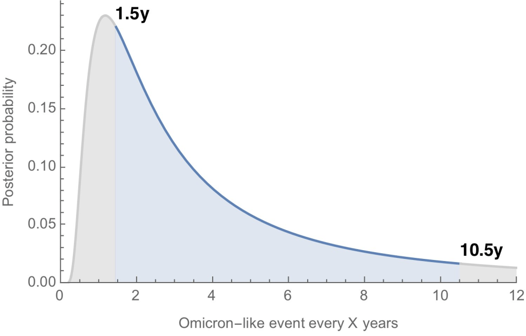
Where will the next variant of concern come from, and how much will it differ from past variants? Computational biologist Trevor Bedford gave a presentation to VRBPAC that attempted to answer this question. The short answer is, it’s hard to predict how often we’ll see new events like Omicron’s emergence, in which a new variant comes in that is extremely different from the variants that preceded it. Bedford’s analysis suggests that we could see “Omicron-like” events anywhere from every 1.5 years to every 10.5 years, and we should be prepared for anything on that spectrum. The coronavirus has evolved quite quickly in the last two years, Bedford said, and will likely continue to do so; though he expects some version of Omicron will be the main variant we’re dealing with for a while.
What will the seasonality of COVID-19 be? The global public health system has a well-established process for developing new flu vaccines, based on monitoring circulating flu strains in the lead-up to flu seasons in different parts of the world. Eventually, we will likely get to a similar place with COVID-19 (if annual vaccines become necessary! also an open question at the moment). But right now, the waxing and waning of surges caused by new variants and human behavior makes it difficult to identify the actual seasonality of COVID-19.
At what point do we say the vaccine isn’t working well enough? This question was asked by VRBPAC committee member Cody Meissner of Tufts University, during the discussion portion of the meeting. So far, the most common way to measure COVID-19 vaccine effectiveness in the lab is by testing antibodies generated by a vaccine against different forms of the coronavirus. But these studies don’t account for other parts of the immune system, like T cells, that garner more long-term protection than antibodies. We need a unified method for measuring vaccine effectiveness that takes different parts of the immune system into account, along with real-world data.
How might vaccine safety change over time? This question was brought up by Hayley Ganz of Stanford, another VRBPAC committee member. The CDC does have an extensive system for monitoring vaccine safety; data from that system should be readily available to the experts making booster shot decisions.
Today, I presented to @US_FDA VRBPAC with an overview of SARS-CoV-2 evolution up to this point and a brief perspective for what to expect going forward. Slides are here: https://t.co/QnzOctVCSN and my slot in the full recording is viewable here: https://t.co/n5rlgOvtEg. 1/13
Another thing I’m wondering about right now, personally, is how the U.S.’s shifting focus away from case data might make all of this more complicated. As public health agencies scale down case investigations and contact tracing—and more people test positive on at-home, rapid tests that are never reported to these agencies—we’re losing track of how many Americans are actually getting COVID-19. And breakthrough cases, which are more likely to be mild or asymptomatic, might also be more likely to go unreported.
So, how does the U.S. public health system study vaccine effectiveness in a comprehensive way if we simply aren’t logging many of our cases? Programs such as randomized surveillance testing and cohort studies might help, but outside of a few articles and Twitter conversations, I’m not seeing much discussion of these solutions.
Finally: a few friends and relatives over age 50 have asked me about when (or whether) to get another booster shot, given all of the uncertainties I laid out above. If you’re in the same position, here are a couple of resources that might help: