Tag: Florida

  • COVID source callout: CDC Community Levels

    COVID source callout: CDC Community Levels

    (Useless) Community Levels on the left; (useful) Community Transmission Levels on the right. Charts via the CDC.

    Anyone who’s been regularly reading the COVID-19 Data Dispatch for the last few weeks can probably tell that I think the CDC’s Community Levels are pretty useless. I was critical of these new metrics when the agency changed its guidance from the old Community Transmission Levels back in February. And during the BA.2 surge, I’ve pointed out how the CDC’s Community Levels map makes it look like the U.S. is doing fine at managing COVID-19 when, in fact, we are doing anything but.

    If you need a refresher, here are a few of the problems with the Community Levels:

    • The guidance overly uses hospitalization metrics; while these metrics (especially hospital admissions) are very reliable in showing COVID-19’s impact on the healthcare system, they lag behind actual infections and completely ignore Long COVID.
    • Hospitalizations are actually a regional metric, not a county-level metric (since plenty of U.S. counties do not have hospitals). As a result, the CDC’s Community Levels calculations are confusing and difficult to replicate in some places.
    • Thresholds in the Community Levels system, already using lagging indicators, are set very high—to the point that, by the time a county reaches the high level, its healthcare system is already in big trouble.
    • The CDC does not recommend universal masking until a county reaches the high level; it only recommends one-way masking for vulnerable people, which we know doesn’t really work, at lower levels.

    Essentially, these Community Levels are so lenient that many state and local leaders have taken the guidance as an excuse to avoid instituting new COVID-19 safety measures during the BA.2 surge. In Philadelphia, business owners even cited the CDC’s lenient guidance when suing the city for instituting a new indoor mask mandate.

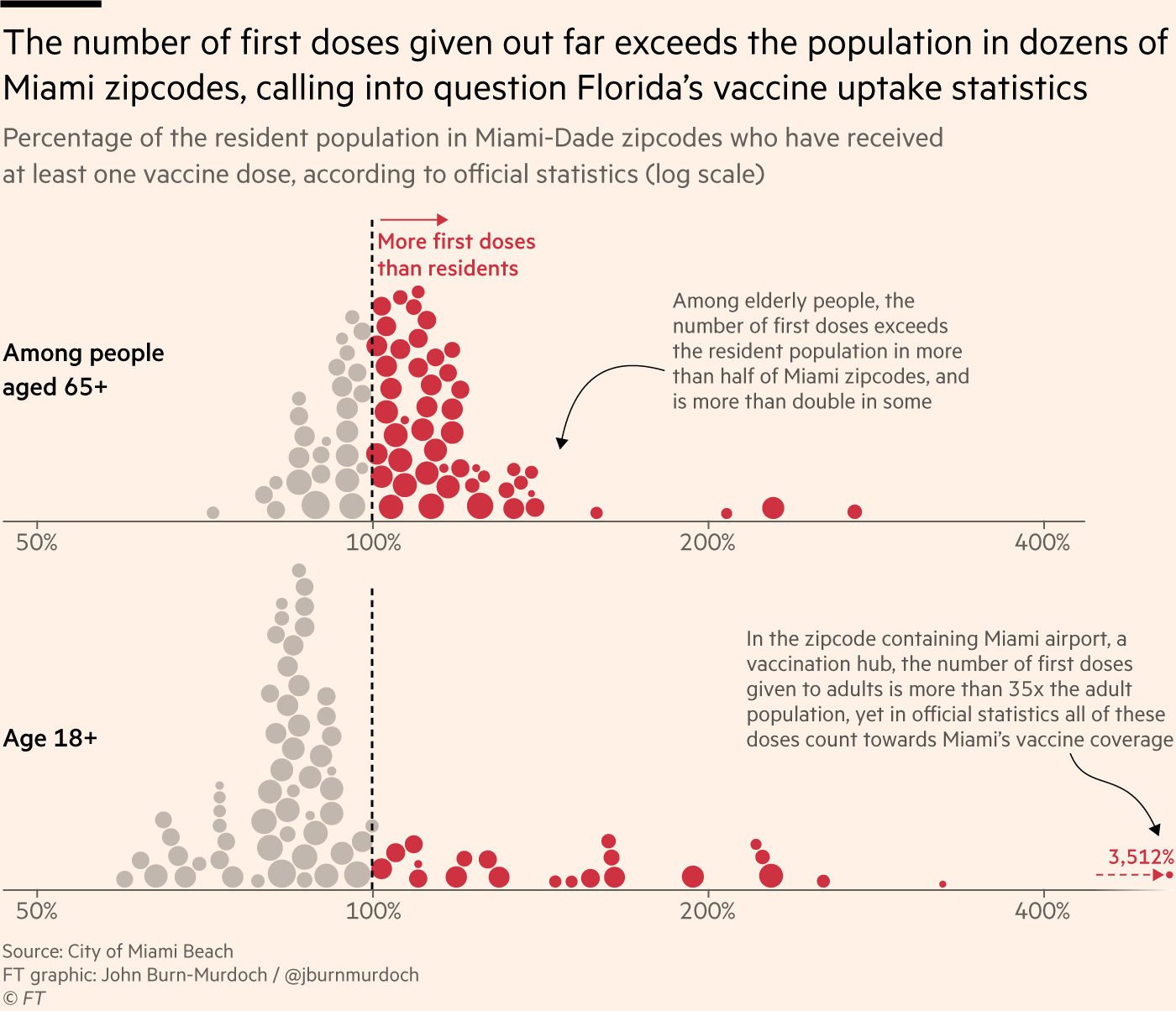
    Moreover, as revealed by a recent article in the Tampa Bay Times, it appears that the CDC is not even consistent with its calculations of these Community Levels. The agency labeled three Florida counties as at medium COVID-19 risk, even though they met all the criteria for high risk, due to a data reporting issue from the Florida state health department.

    To quote from the article: “A public health tool isn’t useful if it can be undone by a single data issue, said University of South Florida virologist Michael Teng.”

    Reminder, you can still see the CDC’s old Community Transmission Level guidance (which is somewhat more useful for determining one’s actual COVID-19 risk) on the agency’s COVID-19 data portal. Just click the dropdown menu on the county view tab and select Community Transmission Levels.

  • COVID source callout: Florida, again

    Last summer, Florida was one of the first states to decommission its daily COVID-19 dashboard and replace it with far-less-detailed weekly reports. Many other states have followed Florida’s lead in the last few months, making their reporting less frequent and cutting down on some metrics like cases and testing.

    But that’s not enough for Florida! The state recently switched from weekly COVID-19 reports to reports every other week—making it even more difficult for reporters, researchers, and others in the state to follow their local COVID-19 trends. Florida additionally stopped reporting cases in non-state residents, which is pretty notable for one of the country’s biggest tourism hotspots.

    Of course, Florida is still reporting some COVID-19 data daily to the federal government, as all states are required to do. But this doesn’t bode well for the future of state data reporting.

  • Unreliable population numbers hinder vaccination rate analysis

    Unreliable population numbers hinder vaccination rate analysis

    An excellent article in the Financial Times, published this past Monday, illuminates one major challenge of estimating a vaccine campaign’s success: population data are not always reliable. Health reporter Oliver Barnes and data reporter John Burn-Murdoch explain that, in several countries and smaller regions, inaccurate counts of how many people live in the region have led to vaccination rate estimates that make the area’s vaccine campaign look more successful—or less successful—than it really is.

    Why does this happen? It’s actually pretty challenging to get a precise count of how many people live somewhere. Think about the U.S. Census, for example: this program attempts to count every person living in the country, once every ten years. But it may miss people who don’t have a straightforward living situation (like college students, the incarcerated, and people living in shelters); it may have confusing messaging that discourages some people (like undocumented residents) from filling out the necessary form; and some people may simply choose not to give information to the government.

    When the Census is inaccurate, the inaccuracies ripple out to different government analyses—including analyses of how many people have been vaccinated. Here’s a quote from the Financial Times article:

    “The average person would be surprised that governments don’t know how many people are actually in the country,” said Stian Westlake, chief executive of the UK’s Royal Statistical Society. “But this great unknown can cause a whole host of data glitches, especially when responding to a health emergency.”

    The Financial Times provides several examples of these data glitches leading to incorrect vaccination estimates.

    • In England: Overestimates of the unvaccinated population, based on data from the U.K.’s Health Security Agency, suggest that case rates are lower among unvaccinated Brits than they actually are.
    • In several EU countries: Underestimates of the senior population lead to vaccination rates inaccurately suggesting that over 100% of certain age groups in Ireland, Portugal, and other countries have received at least one dose of a vaccine.
    • In Miami, Florida: A number of ZIP codes have senior vaccination rates that appear to be over 100% of seniors, due to retirees (who do not have permanent residence in Florida, and therefore aren’t counted in the state’s population) getting vaccinated in Miami during their winter vacations.
    Image
    Miami, Florida is a particularly egregious example of inaccurate vaccination rates. Chart shared on Twitter by John Burn-Murdoch.

    Incorrect vaccination rates can cause issues for public health agencies leading vaccine campaigns, the Financial Times reports. If you think you have vaccinated 100% of seniors in your county due to population underestimates, you likely aren’t looking out for the seniors who in fact remain unvaccinated—leaving those seniors still vulnerable to COVID-19.

    At the same time, data glitches can provide fodder for anti-vax groups. “Worst of all, anti-vaxxers and Covid deniers feed on the daylight between reality and the incomplete data we currently have as evidence of a grand conspiracy or bureaucratic incompetence,” Jennifer Nuzzo, epidemiologist Jennifer Nuzzo told the Financial Times.

    I recommend reading the Financial Times article in full. But you can also check out this Twitter thread from John Burn-Murdoch for more highlights:

  • States scale down COVID-19 reporting frequency

    States scale down COVID-19 reporting frequency

    State reporting frequencies, via NPR.

    Two weeks ago, I reported that Florida had made a big change to its COVID-19 data reporting: the state switched from daily updates to weekly updates. Previously, Florida had maintained a dashboard and released detailed PDF reports each day; now, the state releases PDF reports once a week on Fridays.

    Other states are making similar changes. Only about half of states update their COVID-19 data every day, NPR reported last week. Florida is the only state to cut back to only one update a week, but several others now skip updating on weekends or otherwise reduce their reporting load.

    It’s important to note, however, that these changes are not all new. There have always been states that skipped updating—or published limited updates—on weekends, going back to spring 2020. And, for a long time, Kansas was the least-frequent-reporting state: for many months, it’s only published updates on Mondays, Wednesdays, and Fridays. More states started skipping weekends earlier in 2021, though, at the same time as many state public health agencies were spinning up vaccination dashboards in addition to their existing COVID-19 reporting systems. 

    When states do not update their data every day, journalists and researchers are less able to precisely track COVID-19 developments and identify trends. John Hopkins’ Beth Blauer compared this challenge to viewing a photo in low resolution instead of high resolution: it’s harder to see a pattern when you’re not getting as much detail.

    Even for those states that do publish updates every day, though, there are still challenges inherent in interpreting data that naturally fluctuate over the course of a week. New York might update its COVID-19 data every day, for example, but some test sites in New York are closed on weekends—leading to natural dips in testing and case numbers on those days, followed by higher numbers in the middle of the week. COVID Tracking Project volunteer Hannah Hoffman has written about this phenomenon in detail.

    Still, even as states start to skip days or make their reporting less precise, the CDC and HHS continue to update their national COVID-19 datasets daily. There are admittedly many discrepancies between federal and state data—in large part because of the lack of federal leadership early in the pandemic—but the federal data are now highly standardized and reliable at a level that would be incredibly difficult to get from states. This is why I personally choose to use the CDC’s dashboard for COVID-19 Data Dispatch weekly updates, rather than JHU or another source that aggregates from states.

    It’s also important to acknowledge that state public health agencies have been chronically underfunded for decades before the pandemic hit—and daily data updates have been a huge timesuck for many of these agencies. If scaling down COVID-19 dashboard updates frees up some personnel and resources for a state like Alabama or South Dakota to redirect into vaccination programs, that, to me, seems worthwhile.

  • COVID source callout: Florida’s schedule change

    The Florida public health agency is stalling daily updates to its COVID-19 dashboard, cases, and vaccine reports. Instead, the department will post weekly reports on Fridays, the Miami Herald reports.

    The new reports will only include Florida residents, discounting any non-residents who become infected in the state. Florida is also no longer publishing reports on COVID-19 in schools, long-term care facilities, and prisons. Instead, the weekly reports will include more vaccination data.

    When asked about the reason for this change, the Miami Herald reports, the health department cited high vaccination numbers for Florida residents and a low test positivity rate. But that doesn’t mean the pandemic is over—especially for the state’s minority residents, who have been vaccinated at a lower rate than white Floridians.

    I will be watching with trepidation to see if any other states follow Florida’s lead in the coming weeks.

  • COVID-19 data whistleblower Rebekah Jones gets arrested, tests positive

    Late Sunday, January 17, COVID-19 data scientist Rebekah Jones turned herself in to Florida Law Enforcement authorities. The charge against her, according to a press release from the Florida Department of Law Enforcement (FDLE) on the 18th, is “one count of offenses against users of computers, computer systems, computer networks and electronic devices”. She allegedly hacked a government communication system and sent an authorized message urging workers to “[s]peak up before another 17,000 are dead.” 

    She was released on the 18th with a bond of $2,500, and is allowed to have internet access—but is not allowed to access the Florida Department of Health website—until her trial. According to her attorney, she tested positive for COVID-19 before her release. The main dashboard for her project, Florida Covid Action, is still updating as of 6:44 PM on January 22nd, and The COVID Monitor (her tracker of COVID-19 cases in schools) appears to still be active as well. 

    Earlier in December, Jones faced a police break-in as police raided her house to search for evidence that she had illegally accessed government data. They seized her phone and computer, and pointed guns at her and her children. Jones denies all charges, and she sued the FDLE for “violat[ing] her rights under the First, Fourth, and Fourteenth Amendments”, along with “terroriz[ing]” her family.

    Jones was fired from her government job in May 2020, in what she claims was retaliation for her refusal to manipulate data in order to make it look like Florida was in a better position to reopen than it actually was. Since her firing, she has maintained two ongoing COVID-19 data projects: Florida Covid Action uses open-source information as an alternative general dashboard, and The Covid Monitor tracks K-12 school data nationwide. (We’ve used their dashboard before in our schools coverage.)  

    It is unclear when Jones’ next court appearance will be. For now, she has been cleared to return to her home in Maryland, where she moved out of fear for her family’s safety. 

    We’re covering her story because whether the allegations against her prove true or not, Florida leadership and law enforcement clearly consider Jones a threat. And no matter the outcome of the trial, her story forces us to question the state of Florida’s commitment to unaltered, accurate data. 

  • Florida data scientist faces police break-in

    Florida data scientist faces police break-in

    In May, Rebekah Jones was fired from the Florida Department of Health. As a specialist in geographic information systems (GIS), she worked on the department’s COVID-19 dashboard; she claims that she was fired because she refused to manipulate data to look like Florida was in a better spot for reopening. After her firing, Jones started her own, independent Florida dashboard which includes more open information and methodology details. She also started the COVID Monitor, a school data tracking project which I have cited in previous newsletters.

    This past Monday, Florida state police raided Jones’ home. They seized her computer, which she had been using to update her Florida state and school data dashboards. They also pointed guns at her and her children.

    The Florida Department of Law Enforcement issued a search warrant against Jones, who is suspected of hacking into the state Emergency Response Team’s communications and sending an unauthorized message. Jones has stated that she believes this action was actually an attempt to silence her. She has been a vocal critic of Florida Governor Ron DeSantis and his mishandling of the pandemic in her state, as well as of school reopenings across the country.

    Whether the police raid was due to legitimate hacking concerns or political motivation, there should be no excuse for this type of violence:

    Thanks to this tweet—which quickly went viral—the raid against Jones became a national story. She’s appeared on several news networks and garnered sympathy from science communication leaders. Ron Filipkowski, a Florida attorney who was a longtime member of a committee to appoint judges in the state, resigned from his post in protest of this raid.

    The nation watched this spring and summer as journalists faced police violence while covering Black Lives Matter protests. Journalists were tear-gassed, shoved, and arrested, but continued to do their jobs. Like many of those journalists, Jones is dedicated to her data and her view of public accountability. Both of her dashboards have continued to update since Monday.

  • Florida is no longer sending tests to Quest Diagnostics

    This past Tuesday, the Florida Department of Health (DOH) announced that the department would stop working with Quest Diagnostics. Quest is one of the biggest COVID-19 test providers in the nation, with test centers and labs set up in many states. The company claimed in a statement to the Tampa Bay Times that it has “provided more COVID-19 testing on behalf of the citizens of Florida than any other laboratory.”

    So, why is Florida’s DOH cutting ties? Quest Diagnostics failed to report the results of 75,000 tests to the state department in a timely manner. Most of these results were at least two weeks old, and some were as old as April. As all the old results were logged at once on Monday night, Florida’s test and case counts both shot up: nearly 4,000 of those tests were positive.

    Such a reporting delay skews analysis of Florida’s testing capacity over time, especially as many of the backlogged tests were reportedly conducted during the peak of the state’s outbreak in June and July. This delay also likely means that, while the people tested with this batch of tests still received their results in a timely manner (according to Quest), contact tracers and other public health workers were unable to track or trace the nearly 4,000 Floridians who were diagnosed. Such an error may have led to many more cases.

    According to Florida Governor Ron DeSantis, such an error is tantamount to violating state law:

    “To drop this much unusable and stale data is irresponsible,” DeSantis said in a statement Tuesday. “I believe that Quest has abdicated their ability to perform a testing function in Florida that the people can be confident in. As such I am directing all executive agencies to sever their COVID-19 testing relationships with Quest effective immediately.”

    But is cutting all ties with Quest the correct response? Florida’s testing capacity already is below recommended levels. According to the Harvard Global Health Institute, the state has conducted 124 tests per 100,000 people over the past week (August 30 to September 5), with a positivity rate of 13.2%. This per capita rate is far below the state’s suggested mitigation target of 662 tests per 100,000 people, and this test positivity rate is far above the recommended World Health Organization rate of 5%.

    Florida will be able to send many of its tests to state-supported, public testing sites, the Tampa Bay Times reports. Still, this switch will take time and cause additional logistical hurdles at a time when Florida should not be putting the breaks on testing.

  • COVID Source Callout: Florida

    Analyzing COVID-19 data in Florida is like wading through a swamp with rocks in your backpack while wearing a hazmat suit and being shouted at by a hundred people who all think they can go faster than you.

    There are so many problems with Florida’s data, that when Rebecca Glassman and Olivier Lacan, another CTP volunteer, tried to draft a short blog post about what was wrong, they ended up writing about 3,000 words. Florida reports a test positivity rate without publishing the underlying numbers for their calculation, making it impossible for researchers to check the figures. Florida doesn’t report probable cases and deaths, which is recommended by the CDC. Florida is mixing its PCR and antigen test results (and likely including both in its test positivity rate. Florida fails to alert people using its COVID-19 website and dashboard when the state faces data issues. Florida literally fired a scientist at its public health department who refused to manipulate the state’s data.

    But hey, at least their daily PDF reports are under 1,000 pages now.