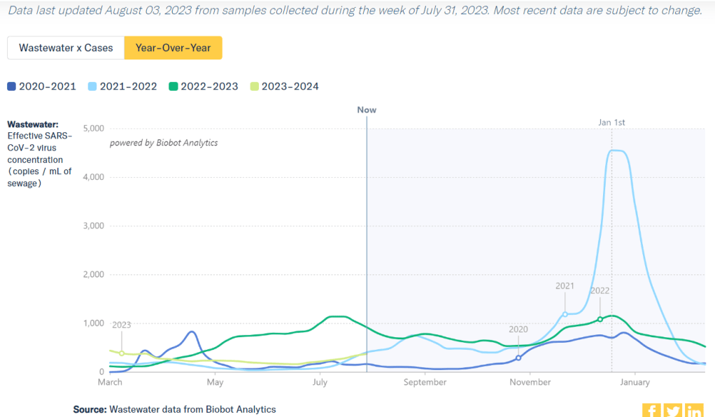
Current coronavirus levels in wastewater are close to the summer 2021 Delta surge, according to Biobot.
COVID-19 metrics have been on the rise in the U.S. for about a month now, indicating that we’re experiencing a summer surge. This is pretty unsurprising for many public health experts, as the country has experienced increased transmission during the last three summers.
Unlike past years, though, this summer’s surge comes after the end of the federal public health emergency. We now have less data than ever to follow COVID-19 trends, combined with less access to health measures than ever.
We’re also dealing with continued minimization of the problem. Coverage of the current surge in mainstream media sources tends to downplay any concerns, suggesting that hospitalizations are low (even though those data are delayed), or that masking isn’t necessary (even though this tool works best as a preventative measure), or that all infections are now mild (even though Long COVID remains a risk for any case). The People’s CDC offers more critique here.
Despite these challenges, enough information is out there that anyone committed to safety can keep up with COVID-19 news and protect themselves. Unfortunately, this practice now requires much more individual effort—a far cry from the collective measures that we took back in 2020. But we still have opportunities to show leadership, by sharing information and resources with our communities.
Here are a few things I’m doing in the current surge, and recommendations to consider sharing:
Assume all data are delayed and undercounted. COVID-19 data sources are sparser than ever, so the trends we see are likely to be small reflections of larger issues. Biobot’s wastewater dashboard, for example, provides results from a sample of sewersheds across the U.S.; the same increases are likely happening in places where we aren’t tracking them.
Watch your local wastewater numbers. Despite the uneven coverage of wastewater surveillance, this is still the best tool for advanced warnings on COVID-19 now that case data are no longer available. If your city or county doesn’t have a wastewater testing site, you can likely find a nearby one to follow for trends. See the CDD’s resource page for links to dashboards.
Stock up on high-quality masks. N95s and KN95s are really necessary to protect yourself from the ever-evolving Omicron variants. There are a lot of places to buy these online; Project N95 is my personal favorite, as you can get masks directly from their manufacturers and contribute to mask donations for less-resourced communities.
Consider a higher-value respirator for riskier activities. If you’re traveling or going to a higher-risk event this summer, a reusable respirator might be helpful. I wrote more about why I bought one in this post last summer.
Stock up on rapid tests. Most health insurance plans no longer cover these (following the end of the federal health emergency), but some local governments are still giving them out for free in public spaces, like libraries in NYC. You might also buy tests in bulk online. I personally use iHealth Labs, because they sell packs of five tests that are easy to bring while traveling and frequently run sales.
Make a plan for isolation/quarantine. In case you or a member of your household gets sick, it can be helpful to have an advance plan on where you might isolate, how to keep air clean in shared spaces, where to get Paxlovid, etc. Your Local Epidemiologist has more tips on how to deal with a positive test.
Share information and resources. Surveys have suggested that many Americans would mask and take other public health measures during surges, but those people might not know about the current rise in transmission. Sharing information with your community (along with masks, rapid tests, and other tools, if you have surplus) can help broaden safety measures.
Remember why you’re taking precautions. During increased social pressures against COVID-19 safety, I personally find it helpful to remember why I find these behaviors important. Some reasons are selfish (for example, taking a week or two off work would be difficult) while others are more philosophical (such as a dedication to the principles of broader public health)—but all of them are valuable.
If you have questions or additional suggestions, please share them below.
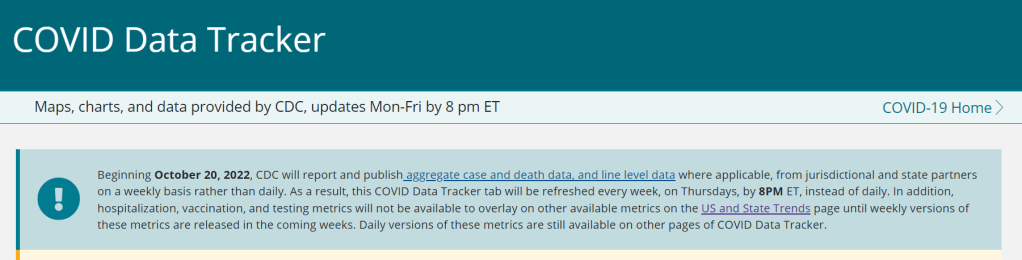
As of this week, the CDC has switched to reporting COVID-19 cases and deaths on a weekly basis.
As of this Thursday, the CDC is updating COVID-19 case and death data every week instead of every day. Here are some thoughts on interpreting COVID-19 data in the wake of this change, citing an article I recently wrote for The Atlantic.
To me, the CDC’s shift to weekly updates feels like the end of an era for tracking COVID-19. While I understand the change, considering both our less-complete case information and other data analysis needs for the agency, I can’t help but wish we had a national public health agency with enough resources to continue providing us with frequent, reliable information on this ongoing pandemic. After all, shouldn’t that be the CDC’s job?
The CDC has clearly deprioritized two major metrics (cases and deaths) that used to be the first places people looked to see the pandemic’s impact on their communities. Instead, the agency now points us to hospitalization metrics, variant surveillance, and wastewater—all metrics that are certainly useful, but may be harder for the average user to interpret.
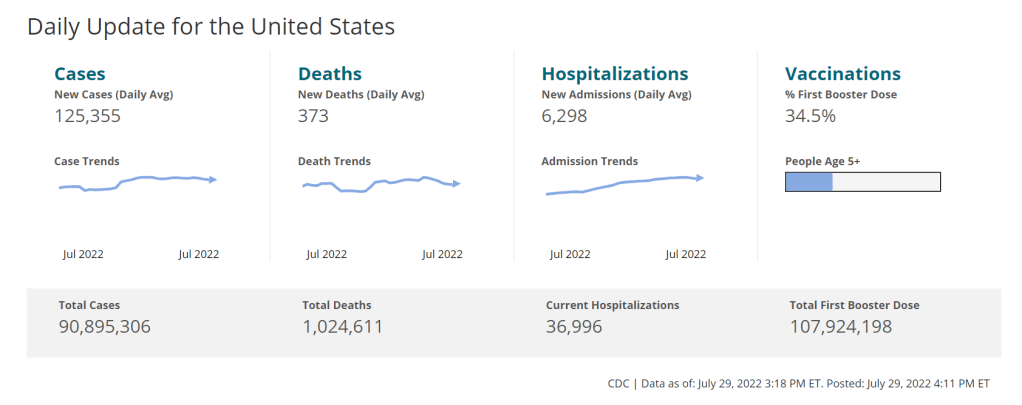
And even the case data we do have are quite unreliable at this point, as PCR tests become less and less accessible compared to rapid tests. Case numbers may be underreported by twenty times or more; it’s difficult to even get a good estimate of how far off the numbers are. Public communications like the CDC’s “Weekly Review” report fail to acknowledge this problem, and the agency does not appear to be making any effort to determine the true infection rates right now.
Through its current data communication choices, the CDC seems to be saying, “If you still care about keeping track of COVID-19, you’re on your own.” Even though we are likely heading for a fall surge and many people need to keep track of this disease in order to keep their communities safe.
In absence of useful information from our public health leaders, it falls on us to survey the best available data sources and help others interpret them. My article in The Atlantic takes on this question, focusing on wastewater surveillance and population surveys as particularly useful sources we should consider right now.
Interpreting wastewater data
Wastewater data, unlike case data, don’t require people to actively go out and get tested: if their public sewer system is getting sampled for COVID-19, they will automatically be included in the data. You can look for wastewater surveillance in your area on Biobot’s dashboard, the CDC’s dashboard, or other state and local dashboards, depending on where you live. (I have a list of state dashboards here.)
But interpreting wastewater data can be pretty different from interpreting case data. Here are a couple of key tips for approaching this source, based on my interview with Biobot president and cofounder Newsha Ghaeli:
Look at “directionality” and “magnitude.” “Directionality” means whether viral levels are going up or down, and “magnitude” means how they compare with earlier points in the pandemic. To quote from the story: “A 10 percent uptick when levels are low is less concerning than a 10 percent uptick when the virus is already spreading widely.”
If you do not have public wastewater data for your county, data from a neighboring county still provides useful info. When we talked, Ghaeli gave the example of a New York City resident looking at data from New Jersey or Connecticut counties neighboring the city: as people from these areas commute into NYC, a surge in one place could quickly drive a surge in the other.
Wastewater data are not a perfect proxy for infections. Scientists are still learning about how to best use this newer surveillance tool. Unlike clinical metrics (like cases), wastewater data can differ based on local environmental factors, and it often takes a long time for researchers to build useful interpretations of their communities. (See my past FiveThirtyEight story for more detail on this.)
These data can’t tell you who is getting sick. To comprehensively answer demographic questions, we need to actively survey people in our communities and ask them about their experiences with COVID-19. (See the story for more about how this works.)
Other interpretation tips
Beyond looking at wastewater data, here are a couple of tips I received from experts for readers seeking to watch their local COVID-19 numbers this fall:
“Look as local as you can,” said Pandemic Prevention Initiative expert Sam Scarpino. In other words, if you can find data for your individual county or even ZIP code, go there.
Consider local events and behavior, Scarpino said. Quoting from the story: “If a popular community event or holiday happened recently, low case numbers might need to be taken with a grain of salt.”
I also wanted to give a quick shout-out here to the People’s CDC, a volunteer science communication and advocacy organization. If you’re looking for more thoughtful analysis of national COVID-19 data, their weekly “weather reports” are a really helpful and accessible source. The organization also provides resources to help people push for more COVID-19 safety measures in their communities.
“People do want layers of protection, they do want to keep themselves in each other safe from COVID,” said Mary Jirmanus Saba, a geographer and volunteer with the People’s CDC whom I interviewed (with a couple of other volunteers) for my story. The weather reports and other similar initiatives help the organization’s followers “see that we really are there for each other,” she said.
On July 26, 2020, I sent out the first COVID-19 Data Dispatch newsletter. In the two years since that day, I have sent newsletters (and published blog posts) every Sunday, with no breaks. I’ve posted from vacations, over holidays, and on days when I was exhausted or approaching burnout.
While this schedule has felt punishing at times, I’m proud of it. The coronavirus doesn’t care about holiday schedules, after all, and I enjoy maintaining regular updates for the readers relying on this publication as a key source of COVID-19 news. (Also, not many writers can say they’re more consistent than the CDC.)
But even I have to admit that two years without breaks is a long time. When I’m scrambling to send out an issue every Sunday, it’s difficult to reflect on key questions, like, “Is my current posting format meeting readers’ needs?” and, “What does helpful COVID-19 coverage look like right now?” I wouldn’t call myself burned out, but at a few points in the last few months, I have felt like I’m operating on autopilot: writing around 3,000 words every weekend because it’s my routine, without evaluating how I might improve that routine.
This is a rather longwinded way of announcing that I’m about to take a break from the COVID-19 Data Dispatch. August 2022 will be a brief hiatus: over the next four weeks, I won’t write any newsletters or blog posts. I’m also taking this month off of freelancing and working fewer hours at my part-time job, making it basically the longest vacation I’ve had since graduating college.
I plan to use this time to reflect on this project’s future, including potential format and content changes that might make it easier for me to maintain long-term. I’m also going to reflect on some potential CDD side projects—more resources, events, even a podcast idea?—that I haven’t had the bandwidth to pursue while producing weekly issues.
Readers: if you have any feedback for me, please reach out! I would love to hear from you about the topics and formats you’d find helpful at this point in the pandemic.
I also wanted to share some tips for keeping track of COVID-19 data while this publication is on a break, as I’m very aware that we are still in an active surge across the country. (This post is also responding to a reader question that I received from a fellow data reporter last week, after I announced this upcoming break in the newsletter.)
Look at multiple data sources or metrics.
COVID-19 case data, once our best window into the virus’ spread, are becoming much less reliable thanks to a decline in PCR testing. Other singular metrics have their own flaws: hospitalization numbers often lump together patients admitted for severe COVID-19 symptoms with those who tested positive while admitted for other reasons; wastewater data are unevenly reported across the country and can be hard to interpret; death data lag significantly behind transmission trends, and so on.
As a result, it’s important to check a few different metrics rather than relying on just one. For example, you might notice that my “National numbers” posts these days typically cite cases, hospital admissions, and wastewater together to identify national trends.
Similarly, if I were trying to identify what’s going on in New York City, where I live, I would likely look at: case and test positivity data from the city health department, cases in public schools (which include positive at-home test results) compiled by the department of education, and wastewater data from Biobot, focusing on the northeast region and counties in the greater NYC area.
Case rates are still useful, if we acknowledge that they are undercounts.
Hospitalization rates are useful, particularly new hospital admissions.
The CDC’s old transmission level guidance is still actually pretty helpful for guiding health policies, especially for vulnerable populations.
Look at wastewater surveillance, if it’s available in your area.
The COVID Cast dashboard, from Carnegie Mellon University’s Delphi Group, is another helpful source.
Look at multi-week trends.
Just as you don’t want to rely on a single metric, you shouldn’t look at only one week of data. (Looking at just one or two days at a time is an even worse idea.) This has always been a good rule for interpreting COVID-19 numbers, but it’s even more true now, as many public health departments have fewer resources devoted to tracking COVID-19—and may take more time to compile data for a given day or week.
For example, the New York City health department’s daily updates to its COVID-19 dashboard frequently include changes to case numbers for prior days, in addition to new data for the past day. Experts call this “backdating”: in a data update on a Friday, new cases might be dated back to other days earlier in the week, changing broader trends.
Keep in mind data reporting schedules.
You especially need to be wary of backdating when there’s a holiday or some other interruption in reporting. For this reason, it’s important to keep track of reporting schedules: know when a health department is and is not updating their data, and interpret the data accordingly.
The biggest example of this is that most state and local health departments—and the CDC itself—are no longer updating COVID-19 data on weekends. In most places, every Saturday and Sunday is now essentially a mini-holiday, with numbers from those days incorporated into backdated updates on Mondays. (And then edited in further backdated updates on later weekdays.)
When I volunteered at the COVID Tracking Project, we regularly observed lower COVID-19 numbers on weekends, followed by increases towards the middle of the week when states “caught up” on cases that they didn’t report over the weekend. You can read more about this trend here; I suspect it has only become more pronounced as more places take weekends off.
Acknowledge uncertainty in the data.
This is the most important recommendation I can give you. Every COVID-19 number you see comes with a margin of error. Sometimes, we can approximate that margin of error: for example, we can estimate how far official COVID-19 death statistics might be off by looking at excess deaths. Sometimes, we really can’t: estimates of how far official case numbers might be off range from a factor of three to a factor of thirty.
As a result, it’s often helpful to look at trends in the data, rather than trying to approximate exactly how many people in your town or county have COVID-19 right now. Is transmission trending up or down? Are you at high risk of encountering the coronavirus if you go to a large gathering? These questions can still be answered, but the answers will never be as precise as we’d like.
Follow leaders from your local healthcare system.
To augment official data sources, I often find it helpful to see what people in healthcare settings are saying about COVID-19 trends. Experts like Dr. Craig Spencer (who works in an ER in NYC) and Dr. Bob Wachter (who leads the University of California San Francisco’s department of medicine) frequently share updates about what they’re seeing in their practices. This kind of anecdotal evidence can help back up trends in case or hospitalization data.
In a similar vein, you can look to essential workers in your community, like teachers and food service workers, as early indicators for transmission trends. If NYC teachers and parents are talking about more cases in their schools, for example, I know COVID-19 spread is increasing—because schools are often sources for transmission in the broader community.
Keep your goals in mind.
As you monitor COVID-19 numbers, it’s important to remember why this information is valuable. What are you using the numbers for? Are you making choices about when to put a mask on, or when to rapid test before a gathering? Are there high-risk people in your family or your broader social network whom you’re trying to protect? Or, if you’re a journalist, what questions are you trying to help your readers answer?
Keeping track of COVID-19 data and news can feel like a large burden, especially when it seems like so many people have entirely forgotten about the pandemic. I always find it helpful to remember why I do this: to stay informed about this ongoing health crisis, and to keep others in my community safe.