This Tuesday, March 7, will mark two years since the COVID Tracking Project stopped collecting data. For readers who might not know, I was a long-time volunteer for the Project; my early newsletters referenced it so frequently that I added a disclaimer to my “About” page clarifying that the COVID-19 Data Dispatch is a separate, personal endeavor.
I got to catch up with a few fellow COVID Tracking Project alums at the NICAR conference this past weekend, which led me to some reflection on the care and comradery that shaped CTP. The Project was a massive effort to provide U.S. COVID-19 data that would help people understand pandemic trends during a confusing, scary time. But it was also a place of collective learning, innovation, friendship, and so many Slack threads.
I have seen the Project as another form of mutual aid. I’ve given countless hours to CTP over the past year in the form of data entry shifts, analysis, writing, and custom emojis—but those hours have also been given back to me, in everything from Tableau tricks to playlist recommendations. My fellow volunteers, the vast majority of whom I’ve never met in person, are my neighbors. We live in the same spreadsheets and Slack channels; we see the world in the same way.
That final day of data collection feels like it was just yesterday, and also like more than two years have passed. Sometimes, I miss those earlier days of the pandemic, when covering COVID-19 felt like an “all hands on deck” top priority. The beat is lonelier these days, of course. (And I probably don’t have to tell you how few people were wearing masks at NICAR, even among those who used to report on COVID-19.)
Even so, CTP was a model for a newer, better, more collaborative form of data journalism. I hope the COVID-19 Data Dispatch can remain a vestige of those efforts, for as long as it’s necessary.
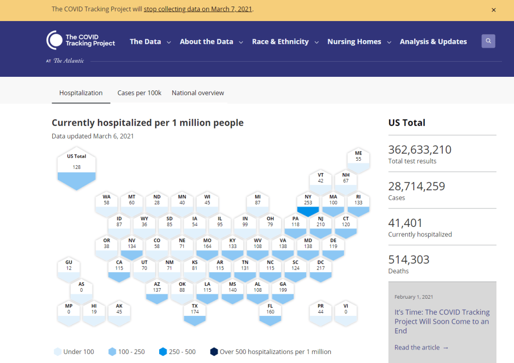
The COVID Tracking Project’s homepage on March 7, 2021.
A couple of hours after I send today’s newsletter, I will do my final shift of data entry work on the COVID Tracking Project’s Testing and Outcomes dataset. Then, later in the evening, I will do my final shift on the COVID Racial Data Tracker. And then I will probably spend another hour or two bothering my fellow volunteers on Slack because I don’t want it to be over quite yet.
In case you aren’t fully embroiled in the COVID-19 data world, here’s some context. Last spring, a few journalists and other data-watchers realized that the U.S.’s national public health agencies weren’t doing a very good job of reporting COVID-19 tests. Alexis Madrigal and Rob Meyer (of The Atlantic) compiled their own count from state public health agencies. Jeff Hammerbacher (of Related Sciences) had independently compiled his own count, also from state agencies. And, as the About page on the website goes: “The two efforts came together March 7 and made a call for volunteers, our managing editor, Erin Kissane joined up, and the COVID Tracking Project was born.”
Now, one year after that formal beginning of the Project’s test-counting efforts, the team is ending data collection work. Erin Kissane and Alexis Madrigal provided some background for that decision in a blog published on February 1. I recommend reading the piece in full, if you haven’t yet, but the TL;DR is that a. this data collection work should be done by federal public health agencies, not a motley group of researchers and volunteers, and b. the federal agencies have greatly improved their own data collection and reporting efforts in recent months.
The Project’s core Testing and Outcomes dataset formally ceases updates today, along with the Racial Data Tracker and Long-Term Care Data Tracker. But the Project has provided a lot of documentation and guidance for data users who want to keep tracking the pandemic, along with analysis that will be useful for months (if not years) to come. The rest of this post shares the highlights from those resources, along with a few personal reflections.
Where to find your COVID-19 data now
So, you’re a journalist who’s relied on the COVID Tracking Project’s tweets to illuminate pandemic trends for the past year. Or you’re a researcher who’s linked the Project’s API to your own tracking dashboard. Or you’re a concerned reader who’s checked up on your state regularly, watching the time series charts and annotations. Where do you go for your data now?
Through a series of analysis posts and webinars over the past few weeks, Project staff have made their recommendation clear: go to the federal government. In recent months, the CDC and the HHS have built up data collection practices and public dashboards that make these data easier to work with.
Here are a few highlights:
For daily updates at all geographic levels, use the Community Profile Reports. After months of private updates sent from the White House COVID-19 task force to governors, the data behind these in-depth reports were made public in December. The PDF reports themselves were made public in January, after Biden took office. The reports include detailed data on cases, deaths, tests, and hospitalizations for states, counties, and metropolitan areas. I’ve written more about the reports here.
For weekly updates, use the COVID Data Tracker Weekly Review. As I mentioned in a National Numbers post two weeks ago: the CDC is doing weekly updates now! These updates include reports on the national trends for cases, deaths, hospitalizations, vaccinations, and SARS-CoV-2 variants. They may be drier than CTP blog posts, but they’re full of data. You can also sign up to receive the updates as a newsletter, sent every Friday afternoon—the CDC has really moved into the 21st-century media landscape.
For state-specific updates, use the State Profile Reports. Similarly to the Community Profile Reports, these documents provide many major state-level metrics in one place, along with local data and color-coding to show areas of concern. They’re released weekly, and can be downloaded either state-by-state or in one massive federal doc.
For case and deaths data, use the CDC’s state-by-state dataset. This dataset compiles figures reported by states, territories, and other jurisdictions. It matches up pretty closely to CTP’s data, though there are some differences due to definitions that don’t match and other discrepancies; here’s an analysis post on cases, and here’s a post on deaths. You can also see these data in the CDC’s COVID Data Tracker and reports.
For testing data, use the HHS PCR testing time series. This dataset includes results of PCR tests from over 1,000 labs, hospitals, and other testing locations. Unlike CTP, the federal government can mandate how states report their tests, so this dataset is standardized in a way that the Project’s couldn’t be. Kara Schechtman has written more about where federal testing data come from and how to use them here. The HHS isn’t (yet) publishing comprehensive data on antibody or antigen tests, as these test types are even more difficult to standardize.
For hospitalization data, use the HHS hospitalization dataset. I’ve reported extensively on this dataset, as has CTP. After a rocky start in the summer, the HHS has shown that it can compile a lot of data points from a lot of hospitals, get them standardized, and make them public. HHS data for current hospitalizations are “usually within a few percentage points” of corresponding data reported by states themselves, says a recent CTP post on the subject. Find the state-level time series here and the facility-level dataset here.
For long-term care data, use the CMS nursing home dataset. The Centers for Medicare & Medicaid Services are responsible for overseeing all federally-funded nursing homes. Since last spring, this responsibility has included tracking COVID-19 in those nursing homes—including cases and deaths among residents and staff, along with equipment, testing availability, and other information. The CMS dataset accounts for fewer overall cases than CTP’s long-term care dataset because nursing homes only account for one type of long-term care facility. But, like any federal dataset, it’s more standardized and more detailed. Here’s an analysis post with more info.
For race and ethnicity data, there are a couple of options. The CDC’s COVID Data Tracker includes national figures on total cases and deaths by race and ethnicity—at least, for the 52% of cases and 74% of cases where demographic information is available. More detailed information (such as state-by-state data) is available on deaths by race and ethnicity via the CDC’s National Center for Health Statistics. A blog post with more information on substitutes for the COVID Racial Data Tracker is forthcoming.
The COVID Tracking Project’s federal data webinars concluded this past Thursday with a session on race and ethnicity and long-term care facilities. Slides and recordings from these sessions haven’t been publicly posted yet, but you can look out for them on the Project’s website. Also, for the more technical data nerds among you: COVID Act Now has written up a Covid Tracking Migration Guide for users of the CTP API, and the Johns Hopkins Coronavirus Resource Center announced that it will begin providing state testing data.
Analysis and update posts to re-read
It took a lot of self control for me to not just link every single CTP article in here. But I’ll give you just a few of my favorites, listed in no particular order.
Test Positivity in the US Is a Mess (Oct. 8): This piece was one of my “20 best COVID-19 data stories of 2020.” To repeat what I wrote then: “Out of the many informative blog posts produced by the COVID Tracking Project since last spring, this is the one I’ve shared most widely. Project Lead Erin Kissane and Science Communication Lead Jessica Malaty Rivera clearly explain how COVID-19 test positivity—what should be a simple metric, the share of tests conducted in a given region that return a positive result—can be calculated in several different ways.”
Daily COVID-19 Data Is About to Get Weird (Nov. 24): I probably linked to this piece in newsletters once a week from the end of November until early January. Erin Kissane clearly explains the patterns around holiday data and how to interpret them—an explanation that continues to prove useful, as we saw a kind-of holiday reporting pattern take place after winter storms hit the South.
The “Good” Metric Is Pretty Bad: Why It’s Hard to Count the People Who Have Recovered from COVID-19 (Jan. 13): The “recovered” number that many states publish is even more inconsistent than other metrics. Some states use hospital discharges to calculate this number, while others simply re-categorize cases as “recovered” if a worse outcome hasn’t occurred in a designated timeframe. All definitions exclude long haulers, who face symptoms months after getting sick.
Counting COVID-19 Tests: How States Do It, How We Do It, and What’s Changing (Aug. 13): You know how the federal testing dataset is more standardized than what CTP can do? This is because there are three (3!) different units for COVID-19 test reporting, and every state does something slightly different. Kara Schechtman gets into all of the weeds here.
What We’ve Learned About the HHS’s Hospitalization Data (Dec. 4): I love this post because it says, in no uncertain terms, look, we did all this analysis, and we’re telling you, you can trust the HHS hospitalization data now. It’s an early indication of CTP recognizing increased transparency from the federal agency, weeks before the facility-level dataset would be released.
Florida’s COVID-19 Data: What We Know, What’s Wrong, and What’s Missing (July 8): This one is essentially a feature-length, detailed, clearly written callout post for the state of Florida. Many of the issues described in this post have now been resolved, but one of the most important developments occurred just days after it was published: Florida started publishing a count of current COVID-19 patients.
The State of State Antigen Test Reporting (Oct. 19): I co-wrote this one with Quang Nguyen. The post explains what we know about antigen tests, those useful-for-surveillance-but-pesky-for-data rapid tests, and calls attention to potential underreporting.
I joined the COVID Tracking Project as a volunteer in early April, 2020. I actually searched back through my calendar to find exactly when I did a data entry training—it was Thursday, April 2.
At the time, I wanted to better understand the numbers I kept seeing, in tweets and news stories and Cuomo’s powerpoints. But more than that, I wanted to do something. I sat, cooped up in my little Brooklyn apartment, listening to the endless sirens screaming by. I ran to the park and wanted to yell at every person I saw walking without a mask. I donated to mutual aid funds, but even that felt empty, almost impersonal.
The Project put out a call for volunteers, and I thought, okay, data entry. I can do data entry. I can do spreadsheets. I know spreadsheets.
Well, I know spreadsheets much better now, almost a year later. I know how to navigate through a state dashboard, find all its data definitions, and puzzle through its update time. But beyond all the technical stuff, volunteering for CTP gave me a sense of purpose and community. No matter how tired or angry the world made me feel, I knew that, for a few hours a week, I’d be contributing to something bigger than myself. My work played a small part in making data accessible, bringing information to a wider audience.
Much ink has been spilled about how mutual aid groups have helped neighbors find each other, especially during that period of spring 2020 when everything seemed so bleak. I have seen the Project as another form of mutual aid. I’ve given countless hours to CTP over the past year in the form of data entry shifts, analysis, writing, and custom emojis—but those hours have also been given back to me, in everything from Tableau tricks to playlist recommendations. My fellow volunteers, the vast majority of whom I’ve never met in person, are my neighbors. We live in the same spreadsheets and Slack channels; we see the world in the same way.
I am beginning to understand how journalism, or something like journalism, can work when it is led by a community. By community, I mean: a group of people united in one mission. And by mission, I mean: bringing information to the public. Accessibility and accountability are common buzzwords right now, I think, but CTP approaches the truth of these principles, whether it’s by doing shifts through Christmas or by writing out detailed process notes on how to navigate Wyoming’s dashboard(s).
I know why the Project’s data collection efforts are ending. The federal government can compile—and is compiling—data on a far more detailed and standardized level than a group of researchers and volunteers ever could. But I am grateful to have been part of this beautiful thing, so much bigger than myself. It is the bar by which I will measure every organization I join from here on out.
If you’ve ever read the About page on the COVID-19 Data Dispatch website, you may have noticed a disclaimer stating that, while I volunteer for CTP, this publication is an entirely separate project that reflects my own reporting and explanations. This is true; I’m careful to keep this project distinct. But of course, the COVID-19 Data Dispatch has been influenced by what I’ve learned volunteering for CTP. I have attempted to carry forward those values, accessibility and accountability. I’ll keep carrying them forward. Feedback is always welcome.
To all my neighbors in the CTP Slack: thank you. And to everyone who has followed the data: there is work still to be done.
This past Monday, the COVID Tracking Project announced that it will soon close its operations. The Project will release its final update on March 7; then, after two more months of documentation, analysis, and archival work, it will close out in May.
“We didn’t come to this decision easily, but we have believed from the very beginning of the project that the work of compiling, publishing, and analyzing COVID-19 data for the US properly belongs to federal public health agencies,” the Project leads explain in a Tweet thread announcing the decision. “The CDC and HHS are now publishing data that is much more comparable to the figures we have been compiling from states since last spring.”
I’ve been volunteering for the COVID Tracking Project since early April 2020, and I have a lot of feelings about what that experience has meant to me. I’ll probably write a longer post about it on March 7 (which is, coincidentally enough, a Sunday). But for now, I’d like to say an enormous thank you to the staffers and volunteers who have worked to keep the Project going. It’s been an honor to contribute to this collective public service with all of you.
In July, the Department of Health and Human Services (HHS) took over collecting and reporting data on how COVID-19 is impacting America’s hospital systems. This takeover from the CDC—which had reported hospitalization data since the start of the pandemic—sparked a great deal of political and public health concern. Some healthcare experts worried that a technology switch would put undue burden on already-tired hospital workers, while others worried that the White House may influence the HHS’s data.
Since that data responsibility switch, I’ve spent a lot of time with that HHS dataset. In August, I wrote a blog post for the COVID Tracking Project which compared HHS’s counts of hospitalized COVID-19 patients to the Project’s counts (compiled from states). At the time, my co-author Rebecca Glassman and I observed discrepancies between the datasets, which we attributed in part to differences in definitions and reporting pipelines. For example: some states only report those hospital patients whose cases of COVID-19 have been confirmed with PCR tests, while HHS reports all patients (including those with confirmed and suspected cases).
I’ve covered the HHS hospitalization dataset several times in this newsletter since, including its investigation by journalists at ProPublica and Science Magazine and its expansion to include new metrics. The dataset has gone from a basic report of hospital capacity in every state to a comprehensive picture of how the pandemic is hitting hospitals. It includes breakdowns of patients with confirmed and suspected cases of COVID-19, patients in the intensive care unit (ICU), and patients who are adults and children. As of November, it also includes newly admitted patients and staffing shortages. At the same time, HHS officials have worked to resolve technical issues and get more hospitals reporting accurately in the system.
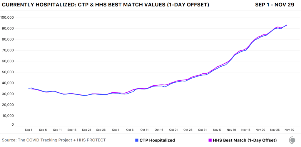
A new analysis, published this past Friday by the COVID Tracking Project, highlights how reliable the HHS dataset has become. The analysis compares HHS’s counts of hospitalized COVID-19 patients to the Project’s counts, compiled from states. Unlike the analysis I worked on in August, however, this recent work benefits from HHS’s expanded metrics and more thorough documentation from both the federal agency and states. If a state reports only confirmed cases, for example, this number can now be compared directly to the corresponding count of confirmed cases from the HHS.
Here’s how the two datasets line up, as of November 29:
The COVID Tracking Project and HHS counts of hospitalized patients closely match in September, October, and November.
Since November 8, in fact, the two datasets are within two percent of each other when adjusting for definitional differences.
The blog post also discusses how patient counts match in specific states. In 41 of 52 jurisdictions (including the District of Columbia and Puerto Rico), the two datasets are in close alignment. And even in the states where hospitalization numbers match less precisely, the two datasets generally follow the same trends. In other words: there may be differences in how the HHS and individual states are collecting and reporting their numbers, but both datasets tell the same story about how COVID-19 is impacting American hospitals.
I recommend giving the full blog post a read, if you’d like all the nerdy details. Alexis Madrigal also wrote a great summary thread on Twitter:
This new COVID Tracking project analysis comes several days after an investigation in Science Magazine called the HHS dataset into question. The investigation is based on a CDC comparison of these same two datasets which doesn’t account for the reporting differences I’ve discussed.
Charles Piller, the author of this story, raises important questions about HHS’s transparency and the burden that its system places on hospitals. It’s true that the implementation of HHS’s new data reporting system was rolled out quickly, faced technical challenges, and caused a great deal of confusion for national reporters and local hospital administrators alike. The HHS dataset deserves the careful scrutiny it has received.
But now that this careful scrutiny has been conducted—and the two datasets appear to tell the same story—I personally feel comfortable about using the HHS dataset in my reporting. In fact, I produced a Stacker story based on these data just last week: States with the highest COVID-19 hospitalization rates.