- State-by-state vaccination trends from the CDC: The CDC’s COVID Data Tracker has a new feature, added on July 29: you can now see vaccination trends for every state. On the Vaccination Trends page, use the “Select a Location” dropdown menu to pick a specific state or territory, then check out day-by-day numbers and rolling averages for doses administered and people newly vaccinated in that region. You can also download the state’s time series data from a table underneath the chart.
- COVID-19 Vaccine Breakthrough Cases: Data from the States (KFF): Looking to see how your state reports vaccine breakthrough cases? The Kaiser Family Foundation has you covered with this dashboard, including data and annotations from every state that reports breakthroughs. This resource was published on July 30; it’s unclear whether KFF intends to update it in the coming weeks.
- Poverty and Access to Internet, by County: Internet access has been a major issue during the pandemic as workplaces and schools have gone remote. This newly-updated dataset from the HHS Agency for Healthcare Research and Quality provides information on internet and cellular access in every U.S. county from 2014 to 2018.
Tag: CDC vaccination dashboard
-
Featured sources, August 1
-
What’s up with Texas’ county-level vaccination data?

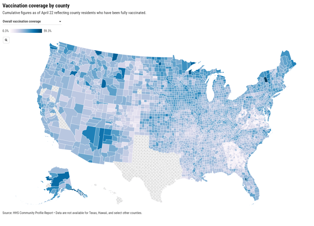
Vaccination rates by county, included in the July 8 HHS Community Profile report. Note the missing data for Texas. Anyone who’s tried to work with the federal government’s vaccination data has noticed this issue: there’s a Texas-shaped hole in the numbers.
While the CDC and HHS report vaccination data for counties and metropolitan areas in the vast majority of states, data are missing for the entire state of Texas. Data are also incomplete for several other states, including Colorado, Nebraska, and Virginia.
What’s up with Texas? A reporter friend recently asked me this question, inspiring me to look into the issue. There’s limited information directly on the CDC dashboard; a vague note in the Community Profile Reports simply notes that several states have “ ≤80% completeness reporting vaccinations by county,” including Texas at 0%—implying that the states, rather than the federal agency, is at fault.
A great article by Houston Chronicle reporter Kirkland An dives into the precise issue. An cites a CDC page on county-level vaccination data reporting, which says that, “Texas provides data that are aggregated at the state level and cannot be stratified by county.” (I later realized that this page is linked in incredibly tiny text at the very bottom of the CDC’s dashboard—classic.)
Why is Texas providing state-level data? The answer, it turns out, lies with a unique state law:
When asked about the lack of data, Douglas Loveday, a press officer with the Texas Department of State Health Services (DSHS), said, “State statute prevents us from sharing person-level immunization data.”
Texas Health and Safety Code Sec. 161.0073 states that DSHS “may not release registry information to any individual or entity without the consent of the individual or the individual’s legally authorized representative.” There are exceptions to the rule, specifically reporting “non-identifying summary statistics.” But reporting individual records to the CDC, even if they have been stripped of identifying information, is not one of the exceptions granted by the code.
In other words: almost every other state submits anonymous, line-level vaccination data to the CDC. Each line in the dataset represents one vaccinated individual, including their county of residence and other demographic information. The CDC aggregates this line-level information into the county-level statistics published on its dashboard. But Texas is prohibited from sending this type of individual data outside of the state without individual consent, so Texas is missing from the CDC data.
Texas’ health agency does compile its own county-level vaccination data, which are available on the Texas COVID-19 vaccine dashboard. But most public health researchers (and journalists like yours truly) rely on the CDC’s standardized, national datasets—leaving Texas out of many important analyses on the vaccine rollout.
An reports that Texas’s agency does send the CDC aggregated county-level data; it’s just organized by vaccine provider, instead of by county of residence for vaccine recipients. The national agency is working with Texas to switch to county-of-residence reporting so that the state may appear in national datasets without breaking state law. Hopefully, that Texas-sized hole in the data may be filled soon.
(It’s unclear whether similar efforts are underway for a Hawaii-sized hole in the same dataset; the CDC currently reports that Hawaii “does not provide CDC with county-of-residence information.”)
-
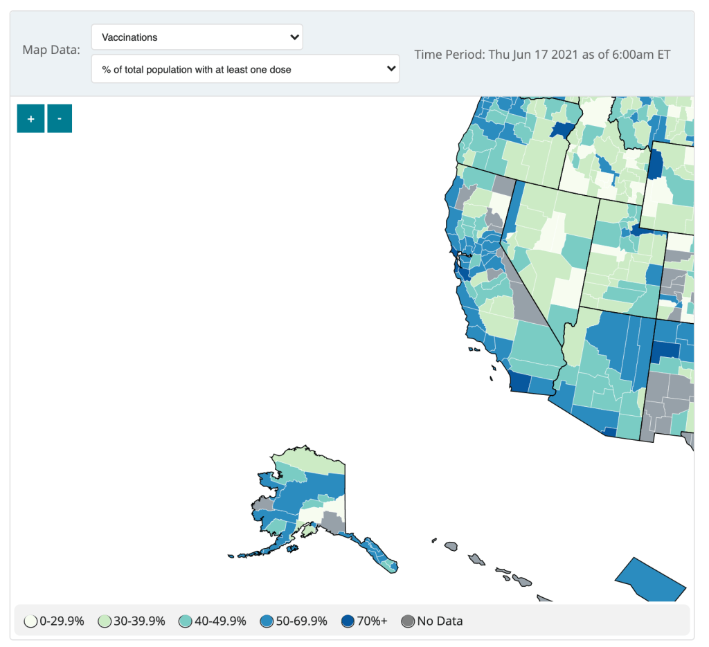
COVID source call-out: CDC’s county vaccination map
The CDC updated the County View page of its COVID Data Tracker this week, now allowing users to see vaccination coverage maps reflecting the population that has received at least one dose. (Previously, only fully vaccinated coverage maps were available.)
The map does paint a stark picture of vaccination disparities in the U.S., with the Northeast and West coast notably darker blue than parts of the South and Midwest. However, the CDC’s UI leaves much to be desired.
Try hitting the plus icon to zoom in, for example. You’ll land somewhere in the Pacific Ocean, with no way of dragging the map to an actual populated area. Then, when you zoom out, you stay in the Pacific, and the U.S. map gets even smaller.
The CDC zooms you into the Pacific. The best way to actually zoom in, I’ve found, is by clicking on an individual county or selecting a region with the drop-down menus above the map. Not exactly intuitive, CDC!
(Thank you to my friend/CDD reader Charlotte for suggesting this callout.)
-
Featured sources, June 13
- COVID-19 Vaccine Rollout across US Congressional Districts: This dashboard, from the Harvard Center for Population and Development Studies, breaks down the U.S. vaccine rollout by a geography I haven’t yet seen: Congressional districts. The interactive maps highlight the partisan nature of this vaccine rollout—as POLITICO reporters pointed out in an article citing the tracker, “All but one of the 39 congressional districts where at least 60 percent of residents have received a coronavirus shot are represented by Democrats.”
- Vaccination time series from the CDC: The CDC’s vaccine dashboard doesn’t allow users to download time series data (i.e. vaccinations by day), but now, you can find this information on the agency’s data portal. The dataset includes county-level vaccine administrations and coverage rates going back to December 13, 2020.
- Methodology changes for Bloomberg’s COVID-19 Vaccine Tracker: Bloomberg’s vaccine tracker is one of the most widely cited in the U.S., and for good reason—it’s incredibly comprehensive, compiling data from every country with an active vaccine rollout (and, in the early weeks of the rollout, from every U.S. state). After months of collecting data by hand, the Bloomberg team is now starting to automate their data collection, Health Editor Drew Armstrong announced this week. Many countries and the WHO are now providing stable enough data sources that such a change is possible.
- Fiscal accountability for COVID-19 responses: The International Budget Partnership, a global nonprofit working to improve government budgets, has produced a report and interactive website analyzing accountability measures that international governments have—and have not—implemented as part of emergency COVID-19 responses. Notably, out of 120 countries surveyed, none have “substantive” accountability and only four have “adequate” accountability. (H/t Data Is Plural.)
- COVID-19 risk levels for kid-related activities: This one isn’t a data source, per se, but I thought readers might find it helpful. A team of epidemiologists, immunologists, and public health scientists—including Katelyn Jetelina of Your Local Epidemiologist—compiled this detailed guide for families with unvaccinated children. The guide aims to help parents and families navigate their risk levels this summer.
-

COVID source callout: CDC’s vaccinations by age data
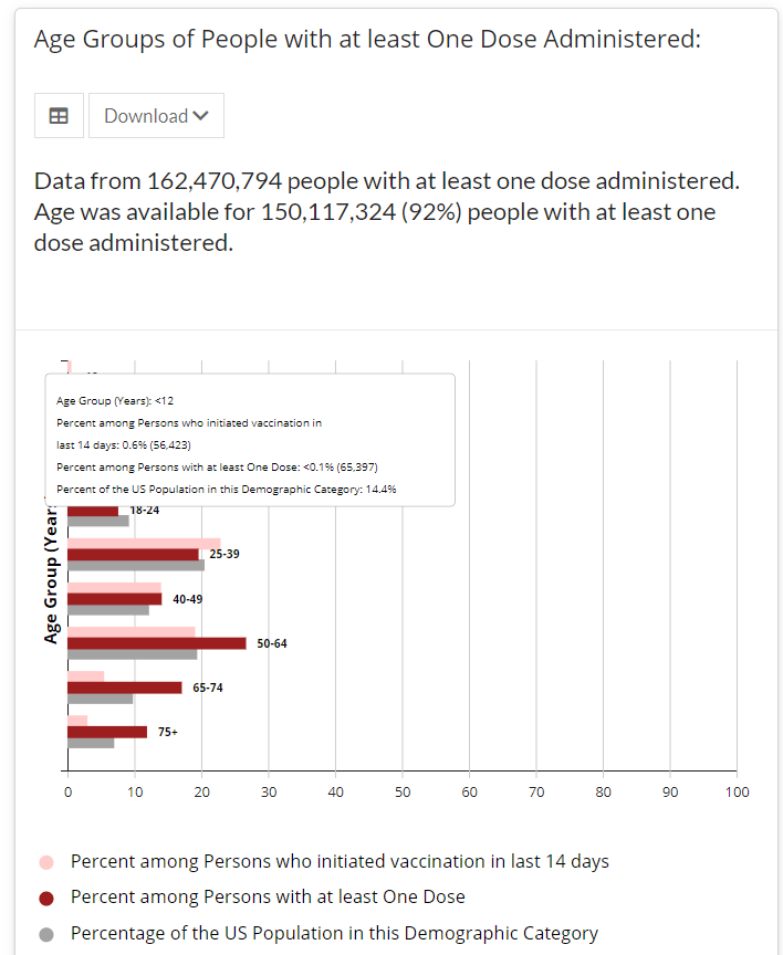
Screenshot of the CDC’s vaccine dashboard, showing about 65,000 first dose vaccinations for children under age 12. When I sent out last week’s issue, the CDC’s Vaccination Demographics page was grouping newly eligible 12 to 15-year-olds in with 16 to 17-year-olds. Now, the agency’s age reporting has diversified a bit: you can find separate vaccination numbers for children ages 16 to 17, 12 to 15, and under 12.
Wait… under 12?
That’s right. The CDC reports that about 65,000 children under age 12 have received at least one vaccine dose as of May 22, even though this age group is not yet eligible for any of the vaccines on the market.
Where did this number come from? The CDC’s page doesn’t offer any explanations, but possibilities may include:
- Pfizer and Moderna are currently running clinical trials for the under-12 population, and children in these trials may have been entered into vaccination records.
- Errors in the data pipeline—maybe some kids in the 12 to 15 age group were logged as under 12 instead, or some birthdays were input incorrectly.
But the Pfizer and Moderna trials have enrolled only 12,000 under-12 participants total. That leaves over 50,000 vaccinations that we can’t explain—it’s a pretty big number to attribute to data errors.
If anyone from the CDC is reading this and can tell me what’s up… my email is betsy@coviddatadispatch.com.
-

COVID source shout-out: CDC’s vaccine blue
As anyone who follows me on Twitter could likely tell you, I love to make fun of the CDC’s vaccination dashboard. The agency uses the color blue like it’s going out of style, with heatmap-style charts that range from teal to a dark, indigo shade for states that have administered the most vaccine doses relative to their populations.
I have no problem with the color blue. But the CDC doesn’t always update its color categories in time with increasing vaccination rates, which can lead to charts like this:
Or this:
This week, the agency’s dedication to blue got even more intense, with this graphic shared in the White House COVID-19 briefing on Friday:
Much as I love to make fun, though, I have to admit that I do love the vaccine blue. Or, more accurately, I love what the blue represents: a darker shade means more people getting vaccinated, more people protecting themselves and their communities from the coronavirus.
Dr. Walensky tapped into this sentiment during Friday’s briefing, when she said: “Now that everyone is eligible to receive a vaccine, please help turn your county toward more protection and a darker shade of blue. The healthier our families are, the healthier we will be as a nation.”
Dark blue! More vaccines! Let’s go! (Now, can we send some of our extra doses to India, please?)
-
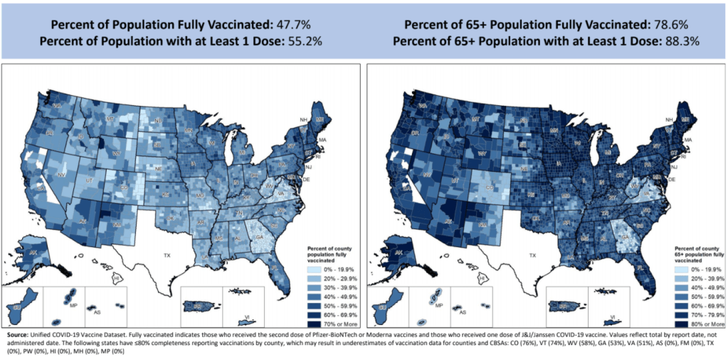
Community Profile Reports now have vaccination data
You can now get vaccination numbers for U.S. states, counties, and metropolitan areas in an easily downloadable format: the Community Profile Reports published daily by the Department of Health and Human Services (HHS). These reports are basically the HHS’s one-stop shop for COVID-19 data, including information on cases, deaths, PCR tests, hospitalizations—and now, vaccines. (Read more about the reports here.)
For counties and metro areas, the reports just include numbers and percentages of people who have been fully vaccinated, reported for the overall population and the regions’ seniors (age 65+). For states, the reports include more comprehensive information that matches the data available at the CDC’s COVID Data Tracker.
I visualized the county-level data, including both the overall and 65+ rates. I think this chart demonstrates how valuable it is for the public to have easy access to these data: you can see much more specific patterns reflecting which communities are ahead on vaccination and which still need to catch up.
A COVID Tracking Project friend alerted me to this data news last Monday, April 19. When I dug back into the past couple weeks of Community Profile Reports, however, I found that the HHS started including vaccination data in these reports one week earlier, on April 12. As seems to be common for federal data updates, the new information wasn’t announced in press briefings or other standard lines of communication.
Next, I would love to see the CDC make more granular demographic data available so that we can analyze these patterns with an equity lens. State-level or county-level vaccination rates by race and ethnicity would be huge.
As a reminder, you can find the CDD’s annotations on all major U.S. national and state vaccine data sources here.
More vaccine coverage
- Sources and updates, November 12Sources and updates for the week of November 12 include new vaccination data, a rapid test receiving FDA approval, treatment guidelines, and more.
- How is the CDC tracking the latest round of COVID-19 vaccines?Following the end of the federal public health emergency in May, the CDC has lost its authority to collect vaccination data from all state and local health agencies that keep immunization records. As a result, the CDC is no longer providing comprehensive vaccination numbers on its COVID-19 dashboards. But we still have some information about this year’s vaccination campaign, thanks to continued CDC efforts as well as reporting by other health agencies and research organizations.
- Sources and updates, October 8Sources and updates for the week of October 8 include new papers about booster shot uptake, at-home tests, and Long COVID symptoms.
- COVID source shout-out: Novavax’s booster is now availableThis week, the FDA authorized Novavax’s updated COVID-19 vaccine. Here’s why some people are excited to get Novavax’s vaccine this fall, as opposed to Pfizer’s or Moderna’s.
- Sources and updates, November 12
-
New, more local data from the CDC
The CDC made two major updates to its COVID-19 data this week.
First: On Tuesday, the agency published a new dataset with more granular information on COVID-19 cases. Like previous case surveillance datasets, this new source compiles cases shared with the CDC, along with anonymized information on their symptoms, underlying medical conditions, race/ethnicity, and other variables. The new dataset is notable because it includes detailed geographic data, going down to the county level.
After months of no state-by-state demographic data from the federal government, we now have county-by-county demographic data. This is a pretty big deal! It’s also a pretty big dataset; it includes about 22 million cases (out of a total 30 million U.S. cases to date).
Of those 22 million cases, race is available for about 13 million cases (58%) and ethnicity is available for about 10 million cases (47%). The dataset will be updated monthly, so we may see better completion with further updates. I haven’t had time to do much detailed analysis of the new dataset yet (hell, I haven’t even managed to get it to load on my computer), but I’m excited to dive into it for future issues.
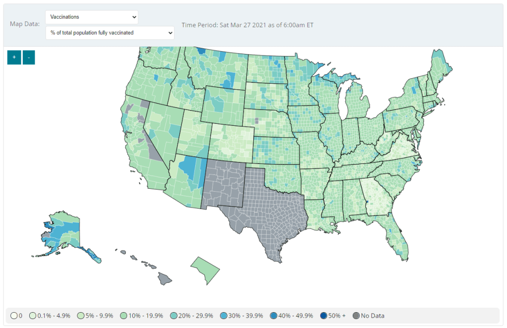
Second: Vaccination data at the county level are now available on the CDC’s COVID Data Tracker, as of Friday. No, not in the vaccinations section—you need to go to the County View section, then select “Vaccinations” in the dropdown menu. Click on a specific county (or select it using dropdown menus), and you’ll be able to see data for that county.

County-level vaccination data from the CDC. Screenshot taken on March 27. At the moment, only three data points are available: total fully vaccinated population, fully vaccinated population over age 18, and fully vaccinated population over age 65. Also, data are missing for Texas, New Mexico, and select other counties. Still, this a great start for more standardized vaccination data at the national level. (Can we get more demographic data next?)
These county-level vaccination data aren’t downloadable directly from the CDC’s tracker, but the COVID Tracking Project is archiving the data at the Project’s public GitHub. The New York TImes has also built an interactive map with the data, which you can find on their vaccine tracker.
It’s worth noting that I found out about both of these updates via tweets from the White House COVID-19 Data Director, Cyrus Shahpar. I’m on both the CDC’s press list and the White House press list, and I watch nearly every White House COVID-19 press briefing, so it seems a little odd that I’m getting the news from Twitter.
(Not that I don’t love Cyrus’ daily tweets! I just wonder about the PR strategy here. Also, Cyrus, if you’re reading this, that interview request I sent back in January still stands.)
-
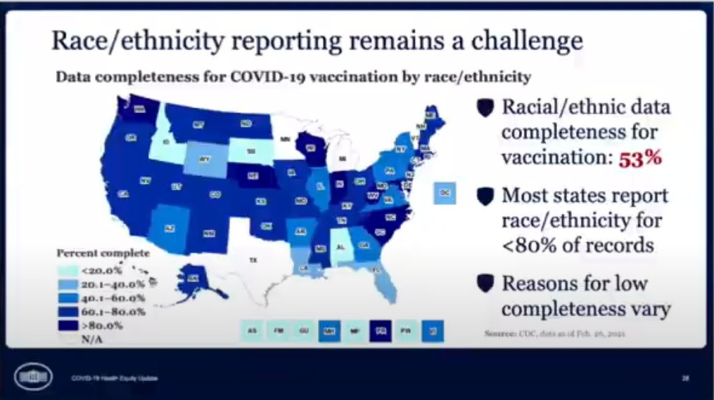
COVID source callout: CDC race/ethnicity data
In the White House COVID-19 briefing this past Monday, equity task force director Dr. Marcella Nunez-Smith showed, for one fleeting minute, a slide on completeness of state-by-state data on vaccinations by race and ethnicity. The slide pointed out that racial/ethnic data was only available for 53% of vaccinations, and most states report these data for fewer than 80% of records.
Still, though, this slide demonstrated that the CDC does have access to these crucial data. As we’ve discussed in past issues, while many states (45 plus DC) are now reporting vaccinations by race/ethnicity, huge inconsistencies in state reporting practices make these data difficult to compare. It is properly the job of the CDC to standardize these data and make them public.
The CDC is actually under scrutiny right now from the HHS inspector general for failing to collect and report complete COVID-19 race/ethnicity data. You can read POLITICO for more detail here; suffice it to say, I’m excited to see the results of this investigation.
Also, while we’re at it, let’s publicly shame the five states that are not yet reporting vaccinations by race/ethnicity on their own dashboards. Get it together, Hawaii, Montana, New Hampshire, South Dakota, and Wyoming!
-
Featured sources and federal data updates, Feb. 28
We’re sneaking a few more federal updates into the source section this week.
- CDC changed their methodology for state vaccination counts: Last Saturday, February 20, the CDC made two major changes to how it reports vaccination data. First, instead of simply reporting doses administered by federal agencies (the Department of Defense, Indian Health Services, etc.) as fully separate counts, the agency started reporting these doses in the states where they were administered. Second, the CDC started reporting vaccinations in the state where someone is counted as a resident, rather than where they received the shot. Both of these changes make state-reported counts and CDC-reported counts less directly comparable, since states typically don’t track federal agency doses and count doses based on where they were administered. You can read more about these changes on Bloomberg’s vaccine tracker methodology and analysis blog; Bloomberg is now using CDC data only to update its U.S. data.
- VaccineFinder is open for COVID-19 vaccines: As of Wednesday, Americans can use this national tool to find COVID-19 vaccine appointments. Just put in your ZIP code and select a radius (1 mile, 10 miles, 50 miles, etc.), and the tool will show you providers nearby. For each provider, the tool provides contact information—and, crucially, whether this location actually has vaccines in stock. Unlike many other federal dashboards, VaccineFinder isn’t a new tool; it was developed during the H1N1 flu outbreak in 2009. STAT’s Katie Palmer provides more history and context on the site here.
- Government Accountability Office may push for more data centralization: The Government Accountability Office (or GAO), a watchdog agency that does auditing and evaluations for Congress, has been investigating the federal government’s COVID-19 data collection—and is finding this collection “inconsistent and confusing,” according to a report by POLITICO’s Erin Banco. While the GAO’s report won’t be finalized and made public until March, the agency is expected to recommend that data should be more standardized. It could call for the CDC to make changes to its data collection on cases, deaths, and vaccines similar to how the HHS revamped collection for testing and hospitalization data in summer 2020. CDC officials are wary of these potential changes; it’ll definitely be a big data story to follow this spring.
- Global.health is ready for research: Back in January, I wrote about Global.health, a data science initiative aiming to bring anonymized case data to researchers on a global scale. The initiative’s COVID-19 dataset is now online, including over 10 million individual case records from dozens of countries. 10 million case records! Including demographic and outcomes data! If you’d like to better understand why this dataset is a pretty big deal, read this article in Nature or this one in STAT. I plan on digging into the dataset next week, and may devote more space to it in a future issue.
- NIH COVID-19 treatment guidelines: In one of the White House COVID-19 press briefings this week, Dr. Fauci referenced this National Institutes of Health (NIH) website intended to provide both physicians and researchers with the latest guidance on how to treat COVID-19 patients. The website acts as a living medical document, featuring an interactive table of contents and a text search tool. Follow @NIHCOVIDTxGuide on Twitter for updates.
- Burbio’s K-12 School Opening Tracker: Burbio, a digital platform for community events, is actively monitoring over 1,200 school districts to determine which schools are currently using virtual, in-person, and hybrid models. The sample size includes the 200 largest districts in the U.S. and other districts with a mix of sizes and geographies, in order to reflect local decision-making across the U.S. See more methodology details here.
- COVID-19’s impact on LGBTQ+ communities: The Journalist’s Resource at Harvard Kennedy School has compiled a list of recent research on how the coronavirus pandemic impacted LGBTQ+ Americans. In many cases, the pandemic furthered disproportionate poverty and poor health outcomes in this community; they shouldn’t be ignored in COVID-19 coverage.
- The Accountability Project: A repository of public data run by the Investigative Reporting Workshop, the Accountability Project reached 1 billion records last week. The Project includes several COVID-19-related datasets, including a dataset of Paycheck Protection Program loans and data on hospitals and nursing homes.


