- Free at-home tests from the federal government: The Department of Health and Human Services (HHS) and U.S. Postal Service are restarting their program offering free COVID-19 rapid, at-home tests. Starting tomorrow, every U.S. household will be able to order four more tests at covidtests.gov. HHS also announced that it’s buying about 200 million further rapid tests from major manufacturers, paying a total of $600 million to twelve companies. Of course, four tests per household is pretty minimal when you consider all the exposures people are likely to have this fall and winter—but it’s still helpful to see the federal government acknowledge a continued need for testing.
- New grants support Long COVID clinics: The HHS and Agency for Healthcare Research and Quality (AHRQ) also announced a new grant program for clinics focused on Long COVID, aiming to make care for this condition more broadly accessible to underserved communities. Nine clinics across the country have received $1 million each, with the opportunity to renew their grants over the next five years. (At least, that’s my interpretation of the HHS press release, which says $45 million in total is allocated to this program.) This is a pretty significant announcement, as it marks the first time that the federal government is specifically funding Long COVID care; funding has previously gone to RECOVER and other research projects.
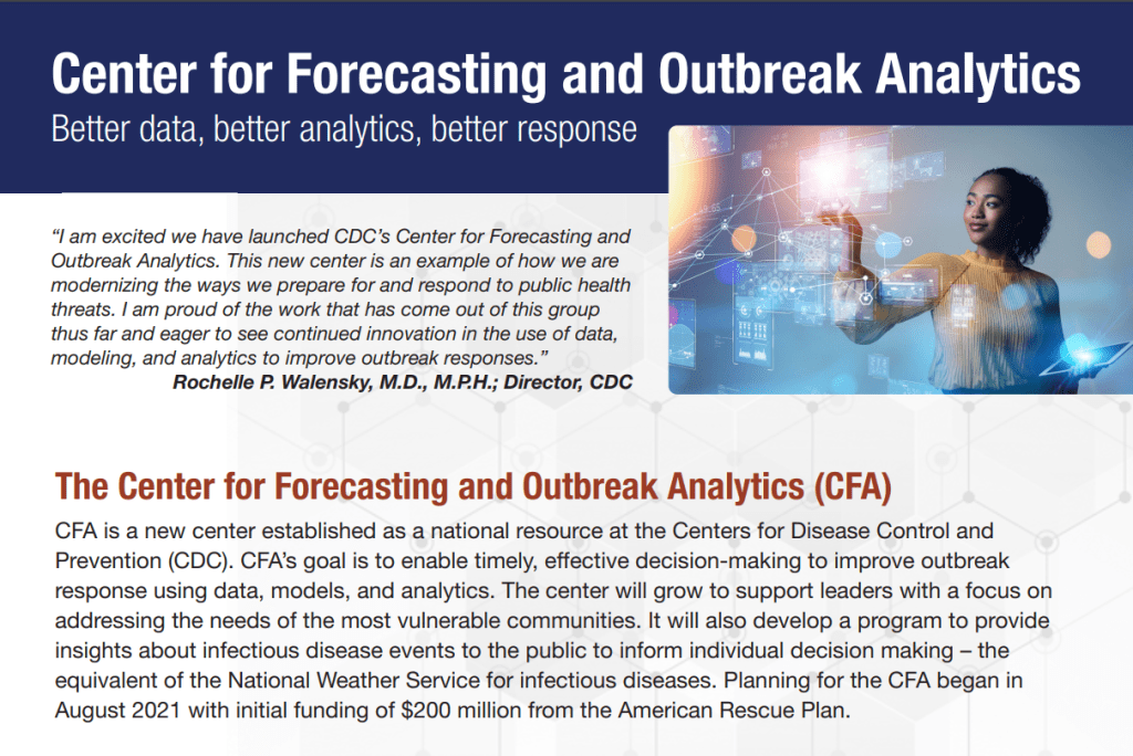
- CDC announces new disease modeling network: One more federal announcement: the CDC’s Center for Forecasting and Outbreak Analytics has established a new program to improve the country’s disease surveillance, working with research institutions across the country. The CDC has awarded $262.5 million of funding to the thirteen institutions participating in this program, which it’s calling the Outbreak Analytics and Disease Modeling Network. These institutions will develop new surveillance tools, test them in small-scale projects, and scale up the successful options to broader public health systems. For more context on the CDC’s forecasting center, see my story for FiveThirtyEight last year.
- Testing wildlife for COVID-19: Speaking of surveillance: researchers at universities and public agencies are collaborating on new projects aiming to better understand how COVID-19 is spreading and evolving among wild animals. One project, at Purdue University, is focused on developing a test to better detect SARS-CoV-2 among wild animals. A second project, at Penn State University, is focused on increased monitoring, with plans to test 58 different wildlife species and identify sources of transmission from animals to humans. Both projects received grants from the U.S. Department of Agriculture and involve collaboration with state environmental agencies.
- Paxlovid access falls along socioeconomic lines: A new study, published this week in JAMA Network Open, examines disparities in getting Paxlovid. Researchers at the National Institutes of Health analyzed public data on Paxlovid availability as of May 2023. Counties with higher poverty, less health insurance coverage, and other markers of high socioeconomic vulnerability had significantly less access to Paxlovid than better-off counties, the scientists found. Meanwhile, a separate study (also in JAMA Network Open last week) found that Paxlovid and another antiviral treatment, made by Merck, both remain very effective in reducing severe COVID-19 symptoms. Improving access to these treatments should be a top priority for the public health system.
- Undercounted COVID-19 cases in Africa: One more study that caught my attention this week: researchers at York University in Canada developed a mathematical model to assess how many people actually got COVID-19 in 54 African countries during the first months of the pandemic. Overall, only 5% of cases in these countries were actually reported, the researchers found, with a range of reporting from 30% in Libya to under 1% in São Tomé and Príncipe. A majority of cases in these countries were asymptomatic, the models suggested, indicating many people may not have realized they were infected. The study shows “a clear need for improved reporting and surveillance systems” in African countries, the authors wrote.
Tag: CDC Center for Forecasting and Outbreak Analytics
-
Sources and updates, September 24
-
Sources and updates, May 21
- New funding from CDC’s forecasting center: The CDC’s Center for Forecasting and Analytics (CFA) announced a new funding opportunity for state and local health agencies to develop new disease modeling tools. CFA is a relatively new center itself; it launched last year with the goal of modernizing the U.S.’s disease forecasting capacities (see my FiveThirtyEight article about the center for more details). This funding opportunity will, I expect, enable the CFA’s growing staff to work directly with health agencies on advancing analytical methods. I look forward to seeing the results of those projects.
- Experts argue to keep masks in healthcare: A new commentary article, published this week in the Annals of Internal Medicine, argues in favor of keeping mask requirements in healthcare settings. The experts (from the National Institutes of Health and George Washington University) point to real-world experience, suggesting transmission between patients and healthcare workers is less likely when everyone is wearing a mask, preferably one of high quality. This article coincides with an advocacy campaign to keep masks in healthcare, including virtual and in-person actions across the U.S.
- CDC releases provisional drug overdose data for 2022: The CDC’s National Center for Health Statistics has released overdose data for 2022, reporting that nearly 110,000 Americans died of overdoses for the second year in a row. Overdoses have leveled off from 2021, but the 2022 data still represent a sharp increase from pre-pandemic trends. Some states in the South and West Coast (such as Texas, Oklahoma, Wyoming, Washington) saw the sharpest increases from 2021 to 2022, according to the CDC. These data are all preliminary and will be updated later in the year.
- Pediatric COVID-19 boosters could save school days: A new modeling study, published this week in JAMA Network Open, suggests that the U.S. could have seen about 10,000 fewer kids hospitalized with COVID-19 and 5.5 million fewer school days lost during the 2022-2023 respiratory virus season, if kids received booster shots in large numbers. The researchers arrived at these estimates through a model that simulated COVID-19 booster vaccination rates at similar levels to annual flu vaccination in kids. Future booster campaigns should focus on children in addition to older adults, the authors argue.
- RSV vaccine for infants moves ahead: Speaking of pediatric vaccinations: the FDA’s vaccine advisory committee met last week to discuss a new vaccine candidate from Pfizer, which would protect infants from RSV. Unlike most pediatric vaccines, this shot would be delivered to pregnant parents in order to protect their babies at birth. While the FDA’s advisors endorsed the vaccine for its effectiveness, some committee members expressed concerns over safety. Helen Branswell at STAT has more details.
-
Sources and updates, September 4

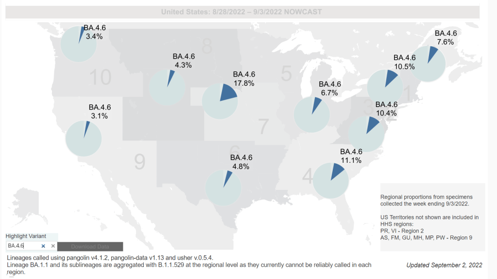
Omicron BA.4.6, a newer version of BA.4, is currently more prevalent in the Midwest than other regions of the country. Chart via the CDC, retrieved September 4. - Slow rise of BA.4.6 is worth watching: As I mentioned in today’s National Numbers post, a newer subvariant labeled BA.4.6 is gaining ground over other versions of Omicron in the U.S. BA.4.6 evolved from BA.4, and has an additional mutation in the virus’ spike protein that enables it to bypass protection from prior infections. It’s unclear whether BA.4.6 will be able to fully outcompete BA.5, which is currently causing the vast majority of U.S. COVID-19 cases—these two strains are similar enough that the competition may go slowly. So far, the subvariant has been more prevalent in the Midwest than other regions of the country, according to CDC data. Also worth watching: BA.2.75, a subvariant that is dominating some European countries but hasn’t shown up significantly in the U.S. yet.
- Up to 4 million people may be out of work due to Long COVID: Last week, policy research organization the Brookings Institute published a new report discussing the massive impacts Long COVID is having on America’s labor force. The report utilizes recent data from the Household Pulse Survey (released in June) estimating Long COVID prevalence, in conjunction with research on how many long-haulers might be out of work due to their condition. The results: between two and four million Americans potentially lost their jobs (or are working significantly less) due to Long COVID, costing at least $170 billion a year in lost wages. Even the low ends of these estimates are staggering.
- U.S. life expectancy declined again in 2021: Americans born in 2021 may expect to live for 76 years on average, according to the CDC’s National Vital Statistics System. This is the lowest life expectancy has been since 1996. CDC researchers attribute the sharp decline in the last two years to the pandemic and drug overdose deaths. Disparities in life expectancy have also increased: Native Americans born in 2021 may expect to live only 65 years on average and Black Americans may expect to live 71 years, compared to 76 years for white Americans.
- Biobot expands wastewater surveillance for opioid tracking: In the last couple of months, we’ve seen wastewater used to track monkeypox and polio, in addition to COVID-19—suggesting the technology’s capacity for broader public health surveillance. This week, leading wastewater company Biobot announced a new initiative to track opioid use and other high-risk substance use through a similar platform to its current COVID-19 efforts. Tracking the opioid crisis was actually the original focus for Biobot’s founders pre-pandemic, so it’s notable to see the company expanding in this direction now.
- New technical report on monkeypox outbreak: Speaking of monkeypox, the CDC recently released a detailed report on how the disease has spread through the U.S. and other countries. It’s a new reporting format for the CDC, with the agency releasing data more rapidly than it might have in a scientific study—possibly emulating the U.K. Health Security Agency’s Technical Briefings. Notably, the CDC Center for Forecasting and Outbreak Analytics, the agency’s new modeling center, was a key contributor to the report. Former CFA leader Caitlin Rivers shared key findings from the report here. (And for more on CFA, see this story I wrote for FiveThirtyEight in June.)
-
Unpacking U.S. data gaps and lack of public health action with Jason Salemi

The CDC’s Community Level guidance contributes to current inaction on COVID-19 in the U.S. Image by Jason Salemi, from his June 10 Twitter thread. In April, the CDC launched a new center called the Center for Forecasting and Outbreak Analytics (or CFA). The new center aims to develop models of COVID-19 and other infectious diseases, while also helping public health agencies and individual Americans act on the information. One of CFA’s lead scientists compared it to the National Weather Service.
But the problem is—as I discussed in a new story for FiveThirtyEight—the CFA currently does not have the data it needs to accomplish its goals. Among the challenges this new center is facing:
- COVID-19 case data are becoming increasingly unreliable as PCR testing is less accessible and more people use at-home tests;
- Hospitalization data are more reliable, but lag behind actual infections and may soon be unavailable in their current, comprehensive format;
- Wastewater surveillance and other promising sources are not yet ready to replace clinical datasets;
- A slow hiring process, as the center aims to bring on 100 scientists and communicators;
- The CDC’s limited authority over state and local health agencies, and over the public.
At the COVID-19 Data Dispatch today, I’m sharing one of the interviews I did for the FiveThirtyEight story. I talked to Jason Salemi, an epidemiologist at the University of South Florida College of Public Health, whom you may know from his excellent dashboard and Twitter threads providing detailed COVID-19 updates.
While Salemi isn’t focused specifically on forecasting, he has a lot of insight about interpreting COVID-19 data and using the data for public health decisions. And I think he shares my frustration about the lack of safety measures that are being implemented across the U.S. at this dangerous point in the pandemic.
For context, this interview took place about one month ago, while BA.2/BA.2.12.1 were driving a surge in the Northeast but hadn’t quite hit other parts of the country yet. This interview has been lightly edited and condensed for clarity.
Betsy Ladyzhets: I wanted to start by asking, what do you see as the current state of trying to keep track of COVID in the United States? Like, what are some of the metrics that you’re looking at right now? What are some challenges that you’re facing as we deal with case numbers becoming less reliable?
Jason Salemi: Definitely the case numbers issue. Throughout the entire pandemic, we all know that the case numbers that we learn about when somebody actually tests positive and that information gets recorded somewhere, reported to a State Department of Health and ultimately to the CDC, that’s always underestimated the true number of infections that’s been circulating in the population. Obviously, very early in the pandemic, that was really, really bad—we were mostly picking up people as they were getting sick and landing in the hospital. But as testing expanded, obviously, we did a much better job of being able to gauge what was happening with true infections by relying on the reported case numbers.
However, during Omicron, and especially with the increased use of at-home testing—a lot of those at-home tests, if the person tested positive, were not making their way into a system that would actually get translated into the officially reported numbers. And negative at-home test results—those are definitely not making their way to public health agencies. I think in some jurisdictions, you were finding that 30%, 40% of all testing was actually antigen testing, and a significant portion of those were the at-home antigen test.
More recently, I think the official numbers that we hear about on a daily basis in terms of official COVID-19 cases, is becoming an increased undercount of the true number of infections that are circulating. Which is pretty striking, considering how much we’ve seen the numbers go up in the past few weeks. So, relying on officially reported cases does mean a lot less. But I still do believe that if you’re looking at—not necessarily where the numbers are exactly, but the trends in the numbers, how those numbers are changing over time—you can at least get a good feel for whether or not things are getting better or worse, even by using the COVID-19 case numbers.
Now, when you supplement that with things like wastewater numbers, data that are not biased by people taking advantage of testing or how they test, the wastewater numbers are maybe a better gauge for truer trends in the amount of viral spread. But again, even with wastewater numbers, two big things about those: number one is, it’s certainly not available, at least not that I can tell, for a lot of jurisdictions throughout the United States… It’s not available consistently across the country.
And number two, there’s nothing in those wastewater numbers where you actually can gauge: okay, this is the actual level of infection. What it helps us to do is, it’s a leading-edge indicator, where early on, we can say, “Oh, wow, we see an increase, a pretty pronounced increase in a particular area over time.” And hopefully, if we were doing things proactively, we could use those data to then implement some sort of concerted mitigation. So, this issue has become more of a challenge. But in many communities, we still can rely on how case numbers are changing over time to loosely gauge transmission rates.
Then, of course, a lot of people say, “It’s all about the hospitalization data, let’s utilize that.” Although I’d always love more metrics included in that [hospitalization] data set, it is something that, for some time now, we actually have consistently measured, at the national level, for every single state. You can get down to the hospital level, in some cases, and even by age group. We can have a decent understanding of how many people are being hospitalized with COVID 19. The nice thing about that is the consistency, and the fact that this [hospitalization dataset] is available everywhere, and we therefore have a decent resource that is capable of picking up indicators of more severe illness.
But there are a lot of problems with the hospitalization data: namely, it’s a lagging indicator. Ultimately, if we were to rely exclusively on COVID-19 hospitalization rates and hospital capacity issues—those indicators lag new infections, often by five to seven days, at least. So, by the time we see those particular metrics rise, we will have lost valuable time to prevent morbidity and mortality. That’s the big [problem].
The other thing is, there’s a lot of legitimacy to when people say, “Well, if a person went to the hospital for a non-COVID-19 related issue, and they just happened to test positive, they may not have been hospitalized because of COVID-19.” I think most are using the term “incidental.” Again, the numbers are not perfect. And when community transmission is as pronounced as it has been during many phases of Omicron, I think we do have a lot of situations where a lot of people are not being hospitalized because of COVID-19. But they are testing positive.
For example, Jackson Health System in Florida was Tweeting out every day during the Omicron phase. And they would say—giving hypothetical numbers here—“We’ve got 250 people who are hospitalized, and that are positive for COVID-19. Of those 250 people, 51% were hospitalized for non-COVID-related reasons.” Some areas would give you more specifics, they would also break down by vaccinated versus unvaccinated. You get a lot of more rich, detailed data from some areas, but obviously, that’s not consistent across the country. In fact, I think it’s pretty rare.
BL: Yeah, that point about hospitalizations being a lagging indicator is definitely something I want to highlight the story. And it seems very complicated, because I have heard from a couple of the modeling experts I’ve talked to that if you look at something like hospital admissions, specifically, that is less lagging. But still, overall, if you think about, like you were saying, trying to prevent more people from getting sick—even by the time you just see more hospital admissions, that’s still bad. You’ve still lost your chance to put in new mask measures, or whatever the case may be.
JS: Oh, absolutely. And, you know, if we really were in a state right now, where getting infected really did no damage to people, it never caused any severe illness, we would obviously care less about transmission levels. Although you could always use the argument that the more we let COVID-19 circulate, the more likely it is that new variants will emerge with potentially more dangerous characteristics. So, even if it wasn’t causing a lot of severe illness, you’ve always got that aspect of it.
But we are certainly not yet at a stage in which we can say [getting infected does no damage]—even though for the average individual Omicron is less severe when we compare it to something like Delta. But we paid a steep price in many areas in the United States to get the infection-acquired immunity and vaccine-acquired immunity that seems to be blunting the effects of Omicron. Right now, that’s why we’re not seeing the rise in hospitalization rates as steep as the rise in case rates.
But we are still seeing people getting hospitalized, an increasing number of people over the past couple of months. We’re not yet in a position where COVID-19 is not causing any damage. And we’re largely ignoring things like Long COVID. Just because somebody doesn’t get hospitalized, that doesn’t mean that [the virus is] still not causing a decrease in the quality of life for many people, and a decreased quality of life that can linger for some time.
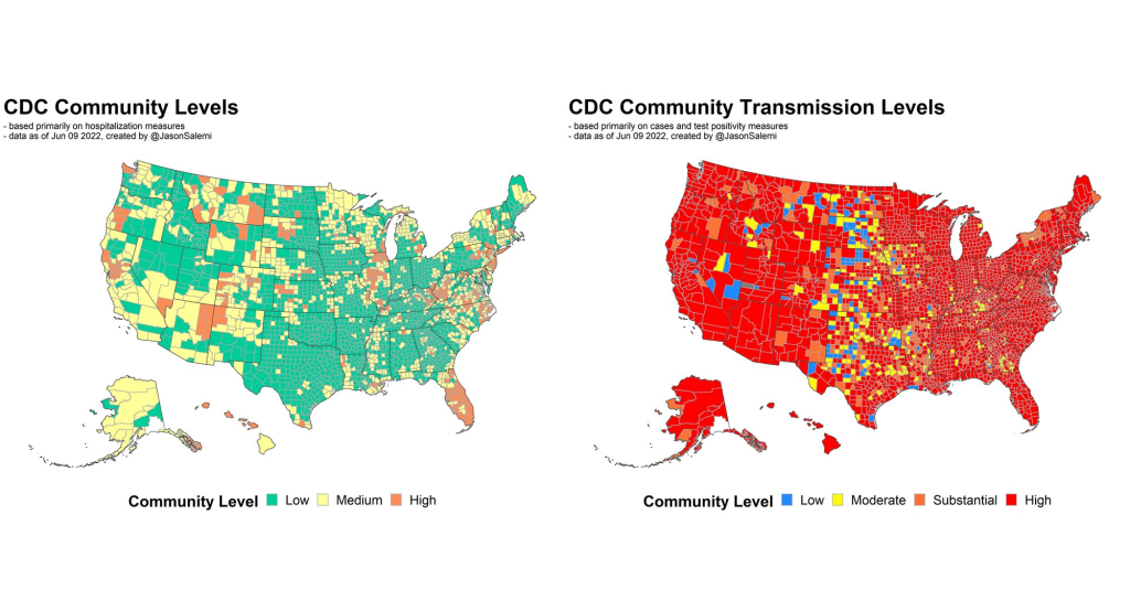
BL: Yeah, definitely. And then, another issue with hospitalization data that I wanted to ask you about, because I know you’ve looked at this, is the fact that if you’re using these county risk levels, or community levels, whatever the CDC is calling them—not every county has a hospital. So really, this is data at a somewhat larger regional level. I’m wondering if you could explain why this is an important distinction.
JS: Yeah. And you know, this is not at all a criticism, this is kind-of the nature of the beast, so to speak. There are a lot of communities where—I’ll use Florida, because I’m most familiar with Florida, as an example. We have got a major health care system in Alachua County, which is really not a big county in Florida, not even in the top 20 largest counties. But it is a major area where a lot of people from surrounding smaller counties, like a nine- or ten-county catchment area, if they were to get really sick, that’s where they’re most likely going for treatment. And so, if you have a metric that is based on hospitalization rates, and you don’t have a hospital, obviously, you can no longer really provide a county-level indicator. It has to be more regional. And so you see a lot of variation in how the CDC has to now go from the county level to what they call health services areas.
These [health service areas] are established groupings. In these regions, the overwhelming majority of people in these locations are going to a hospital in the broader health service area. And so it’s confusing, I think, to people: with this newer CDC metric, they wonder, “How is it that there’s no hospital in my county or the county next to me, yet you’re giving me a county-level risk measure that is supposed to be based primarily on hospitalization data?”
And again, I think, some of the nuances of the metric get lost on people… Hospitalization data comes from a broader region [than cases], and there’s a lot of variation. There are some counties that are standalone, like Manatee County in Florida, so there is no health service area, it’s just one county for all measures. But there are some others where more than 15 counties that feed into that health service area. So again, for some people in some communities, I can understand where it’s just confusing and frustrating as to, “What does this risk level really mean, for me and the people that live near me, since the catchment region is so much larger?” This is not a right or a wrong, I understand why CDC does it the way that they do it if they’re trying to get a hospitalization-based measure. But it’s just challenging for people to digest.
BL: Yeah, it’s challenging on that communications front. With the previous transmission levels, you could just kind-of look at the case rate and the positivity rate and be like, “Okay, I get where this is coming from.” But yeah, now it’s a little trickier. Another thing on this topic: I saw a report from POLITICO this morning that is suggesting, basically, if the National Public Health Emergency gets ended this summer, then the CDC might lose its ability to require states or hospitals to actually report the hospitalization data that is basically our best source right now. So, what would the implications be if that happens in a few months?
(Editor’s note: After this interview, the Biden administration extended the public health emergency beyond July 15. But it’s unclear how many more times the emergency will be extended.)
JS: I’d say pretty significant implications. Look, I’ve tried to give credit where credit is due, like the gains made with improving the federal hospitalization data. I’ve also been a critic when I feel as though we are missing key data sources or data elements. An example is the hospitalization data not having race and ethnicity information, I feel like that’s a big component that would be meaningful.
But even with its limitations, the hospitalization data have been a very, very, very important tool for us to be able to report what’s happening in communities. And obviously, nobody wants to fly blind as it pertains to the pandemic. So if we don’t have uniform reporting from all of these states and jurisdictions, then we have to rely on the willingness of leaders at each state or community level to make similar information available, and to report that information in a timely and consistent manner.
Right now, we are fortunate that we continue to get the hospitalization data updated on a daily basis. And so yeah, that would obviously be a big loss if it were—it’s one thing to not have it required. But if states chose not to report that information, which certainly some states would choose not to… it would be a big loss, depending on what states choose to do to keep the population informed.
Because, to be honest, when we get this national data, it’s a gut reaction that we want to compare states on everything—on death rates, on case rates, on hospitalization rates. To me, this can be a huge mistake. One of the obvious reasons that everybody talks about is age differences, right? Some states have a much higher percentage of older people. But it’s not just age that makes state comparisons difficult. It’s weather, and racial and ethnic distribution, and the job industries in which people can work, population density. So, I don’t really care too much about national-level data being used primarily to make state comparisons and inferences that can be misguided.
But to have consistently reported information across the country, again, is important for us to be able to make more responsible decisions even at the local level. I would hope if that happens [losing the national dataset], we would still have states and cities and counties and communities and all these different geospatial areas continuing to report, collect, and make available to the public meaningful information in a timely manner so we can make responsible decisions.
BL: Yeah, that makes sense. And I know that question of authority and like, what can and can’t you require the states to do, is a large issue for the CDC. I was able to talk to Mark Lipsitch yesterday, he’s one of the scientists who’s working on this new forecasting center. And one challenge he mentioned to me is that the CDC really doesn’t have the authority that it would like to in terms of requiring data reporting. They can’t require every state to start doing wastewater surveillance, they can’t require every state to report vaccine effectiveness data or breakthrough cases. And to me, that just seems like a massive hurdle that they face in trying to do this kind of long-term improvement of infectious disease forecasting.
JS: Yeah—and it’s not just the ability, it’s also having the will. I’ve collaborated with some truly amazing scientists from the CDC for a very long time on a myriad of different initiatives, and I have little doubt that they will compile a team of experts that can analyze meaningful metrics to generate what I imagine will be a wealth of data on where we’re going in the pandemic. But it’s not just about analytic proficiency. I did read on their [CFA’s] site that their stated goal is to enable timely, effective decision-making to improve outbreak response. But how are we going to utilize those data to make recommendations? What outcomes are they going to emphasize? What communities are we thinking about when we make those recommendations?
A lot of people talk about the measures we use, and which ones are best, and how we collect the data, and the validity, and the sophistication of the approaches that we use to either nowcast or forecast into the future. But to me, it’s also the way in which we operationalize those measures for public health recommendations. That’s where a lot of the talk is now about the measures being utilized by CDC. So whether it’s their four-level community transmission measure, or that newer three-level measure that’s based mainly on hospitalization data—how we’re using that to make recommendations, it says something about what the agencies who establish those boundaries are willing to accept.
For example, I was just looking at some data again, when I did that thread this morning. The highest level on the community transmission metric, that used to indicate 100 cases or more per 100,000 people over the most recent seven-day window. Right now, based on the data that I just ran, we’ve got 105 counties in the United States with a population of at least 250,000—not just small counties, but large ones—that have a low community level [the CDC’s more recent metrics], the lowest possible, but they have a transmission level that is higher than that 100 per 100,000 threshold.
And more importantly, we’ve got 28 counties—again, with a population of 250,000 or more—that are classified as medium level. That is a level with no recommendations for mask-wearing in public indoor settings. And those 28 counties have a case rate that is more than triple the threshold for high transmission, that’s 300 per 100,000, over the past seven days. You expect that medium level to change to high in the not-to-distant future for many of these areas.
So again, it’s one thing to collect the metrics and have skilled analysis. But what we do with those measures and that analysis, is just as meaningful. And what does it mean, if we have an area that has really pronounced transmission—and we know in the past, that pronounced transmission means that the virus is going to be exceedingly good at finding vulnerable populations—and we’re not having any meaningful population-based recommendations…
When I looked, some of these counties were at like 400 per 100,000 [cases in a week], four times the threshold for the high transmission level [under the old CDC guidance], and they’re still not at a level where we’re supporting or recommending mask-wearing in public indoor settings. That’s pretty shocking. And I think that’s why anecdotally, now, even in my area, I’m just hearing about more and more people daily, that are not able to come to work. A lot of people are getting infected. And you’re seeing that in the rising numbers.
BL: Absolutely. I mean, isn’t the threshold for moving from low to medium under the new community levels 200 new cases per 100,000 [per week, regardless of hospitalization numbers]?
JS: Yeah, right. So even if you had no rise in hospitalizations, you can have a progression to the medium level. But that is now twice what the highest transmission threshold used to be. And again, I’m looking at counties that are in that medium level that now have almost twice even that newer threshold.
We’re not yet in a situation where COVID is not causing any severe illness whatsoever. We’re ignoring a lot of the ramifications of Long COVID, we’re ignoring the fact that, when community spread has gotten so pronounced, you tend to have the virus easily, efficiently finding the most vulnerable people in those communities and still inflicting damage.
I just feel like we’re missing an opportunity. We’re not talking about shutdowns, we’re talking about simple measures that we can put in place and recommend to people to try and balance having, normal living with putting reasonable but important precautions in place. Because that ultimately will prevent a lot of morbidity and mortality. And I feel like that’s maybe the big missed opportunity right now.
So, I’d be excited to see a new forecasting center come out of the CDC. They are very adept scientists. But it’s ultimately, what do we do? What do we do with the data that emerges out of that center? And what recommendations, simple recommendations, do we end up giving to the public based on those analyses?
BL: I totally agree. One of the new center’s focuses is that they want to hire a bunch of science communicators to think about these things. But still, I guess I’m a little skeptical about how much they’re gonna really be able to have an impact here, when we’re already at such a polarized position in the pandemic.
JS: Yeah, it’s not that any of this is easy. No matter what you do, you’re going to upset a whole lot of people nowadays. I speak strictly from a scientist’s perspective. And I really do get all sides of this equation, like the businesses and the very real toll that the pandemic has taken on people. And so it is, no matter what you do, there is a balance that you have to achieve.
But when I start to see—again, I’m going more from what has transpired specifically in Florida. And a lot of the talk this time last year, after we had the availability of vaccines, things were looking great for Florida. Numbers were really low. And that was pretty much throughout the United States, we had the vaccines, though we still heard a lot about protecting the most vulnerable, the oldest in our communities. And even as the cases started to rise, during Delta, it was like, well, just protect the vulnerable.
But again, when community transmission gets that pronounced, the virus will continue to find the most vulnerable. And it ended up inflicting by far the largest death toll in Florida than we’ve had at any point in the pandemic, after vaccines were available for a long period of time. And that included a significant percentage of people who were not seniors. So, it’s tough, but still, people’s livelihood and lives are on the line when we’re talking about COVID.
More federal data
-
Sources and updates, June 5

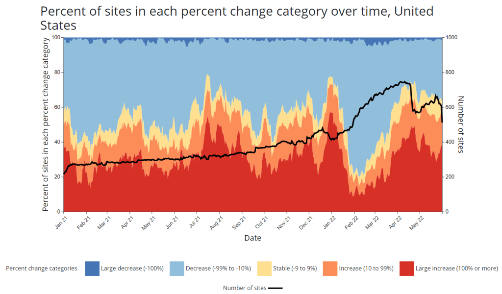
A new chart that the CDC added to its COVID-19 wastewater dashboard this week. - CDC adds new chart to wastewater dashboard: This week, the CDC updated its National Wastewater Surveillance System (NWSS) dashboard with a new chart that aims to summarize the overall picture of coronavirus trends in the country’s sewers. The chart shows the percentage of NWSS sites that have reported their coronavirus concentrations decreasing, staying stable, and increasing over two-week periods; it also shows the overall number of sites with recent data. (This number dropped when NWSS switched contractors, though it has ticked back up in recent weeks as Biobot onboards sites.) Of course, the sites included in NWSS represent a small fraction of the U.S. population, and different locations are using different analysis methods which may be difficult to summarize. But the new chart is still a helpful way to see national trends from the surveillance network.
- Preprint suggests 30x scale of case underreporting: Last week, researchers from the City University of New York (CUNY) shared striking results from a study in which they’d surveyed about 1,000 New York City residents about their COVID-19 status during two weeks of the BA.2/BA.2.12.1 surge. The sample was designed to represent the broader city population, and residents could self-report positive test results on both PCR and at-home rapid tests as well as possible symptoms and contact with infected people. About 22% of the survey respondents had a coronavirus infection during the study period (April 23 to May 8), the researchers found. The study hasn’t been peer-reviewed and should be interpreted with caution, but still: it could indicate that one in five New Yorkers got COVID-19 within two weeks. Official case counts were 30 times lower, the researchers found, reflecting massive underreporting; and NYC has more access to PCR testing than many other places.
- CDC study demonstrates disproportionate COVID-19 impact on Native Americans: One study from the CDC’s Morbidity and Mortality Weekly Report (MMWR) that caught my attention this week: researchers in Alaska (at the state’s health agency and tribal health institutions) examined COVID-19 rates for the state’s indigenous population. They found that the age-adjusted COVID-19 case rate among Native Americans/Alaska Natives was about twice as high as the rate among white people living in Alaska, and the death rate was about three times higher. Many indigenous people in Alaska live in rural, remote areas, some inaccessible by car, which heightens the challenges of accessing healthcare.
- Native American life expectancy fell during the pandemic: Another related preprint: researchers at Virginia Commonwealth University, the University of Colorado Boulder, and the Urban Institute have produced multiple studies examining how life expectancy changed during the pandemic. In general, COVID-19 led to massive decreases in life expectancy across the board; but the latest update from this group showed that Native Americans were particularly hard-hit. Native American life expectancy dropped by 4.7 years, compared to a 2.1 drop for the white American population. Steven Woolf, corresponding author, discussed the study in a Q&A with Virginia Commonwealth University. (H/t Andrew Stokes.)
- Higher burden of COVID-19 in developing countries: And one more notable new study, published this week in BMJ Global Health: a group of researchers at institutions in the U.S., Australia, Brazil, and other countries conducted an in-depth review of global COVID-19 serology data to estimate the disease’s true infection and fatality rates across the world. The researchers found that infection fatality rates (i.e. the share of infected people who die of COVID-19) were much higher in developing/low-income countries than in developed/high-income countries, in some cases up to three times higher. “The results are, in a word, depressing,” lead author Gideon Meyerowitz-Katz wrote in a Twitter thread discussing the study.
- New job posting at CDC forecasting center: The CDC’s new Center for Forecasting and Outbreak Analytics, formally launched in April, has posted a job opening for (at least one?) data scientist. Considering that the center plans to hire 100 scientists and science communicators, this singular posting is likely just one of many more opportunities to come.
-
CDC launches new pandemic forecasting center

The CDC’s new Center for Forecasting and Outbreak Analytics (CFA) intends to modernize the country’s ability to predict disease outbreaks. Image via the CDC. This week, the CDC introduced a new team focused on modeling infectious diseases, called the Center for Forecasting and Outbreak Analytics (or CFA). The agency aims to hire about 100 scientists and communicators for the center; they’ll currently focus on COVID-19, but will expand to other diseases in the future.
“We think of ourselves like the National Weather Service, but for infectious diseases,” Caitlin Rivers, the new center’s associate director for science, told the Washington Post.
This idea of forecasting infectious diseases like the weather was a major theme of an event that the White House hosted last Tuesday, timed with the introduction of the CDC’s new center. This event, a three-hour summit, featured speeches from the administration’s COVID-19 response leaders (Dr. Ashish Jha, Dr. Rochelle Walensky, etc.), as well as panels bringing together the scientists who have joined CFA so far, healthcare leaders, and public health workers from around the country.
I watched the event on a livestream, and kept a running Twitter thread of key points:
As discussed at the summit and on CFA’s new website, this center has three main functions:
- Predict: A team of disease modelers, epidemiologists, and data scientists will establish methods for forecasting disease spread and severity, in collaboration with state and local leaders.
- Inform: A team of science communicators will share information from the Predict team’s modeling efforts with public health officials and with the public, ensuring that this information is actionable.
- Innovate: In addition to its in-house analysis and communication, CFA will fund research and development to drive better data collection and forecasting strategies.
According to the CDC, CFA has already awarded $26 million in funding to “academic institutions and federal partners” working on forecasting methods, as part of this “innovate” priority. Neither CFA’s website nor the summit provided any indication of what these institutions are or what they’re working on; I wrote to the CDC’s media team asking for more information, and have yet to hear back from them.
At last Tuesday’s summit, it was nice to hear health officials from the local to the federal levels describe COVID-19 data issues that I’ve been writing about for two years. These included: the need for more timely data on issues like new variants and vaccine effectiveness; the need for more demographic data that can inform health equity priorities; the need for more coordination (and standardization) between different state and local health agencies; and the need for actionable data that are communicated in a way people outside science and health settings can understand.
But for all this discussion of the problems with America’s current health data systems, the event included very little indication of potential solutions. For instance, as Bloomberg health editor Drew Armstrong pointed out, nobody mentioned that many of our problems would be solved with a national healthcare system, following the lead of the U.K.—whose data we’ve relied on throughout the pandemic.
Moreover, Tuesday’s event was very rushed: each panel was just half an hour long, with only a few minutes for each expert panelist to make their points and barely any time for questions. I would’ve loved to hear entire keynote speeches from people like Dr. Anne Zink, director of Alaska’s public health agency, and Dr. Loretta Christensen, chief medical officer for the Indian Health Service. But they were relegated to brief comments.
It almost felt like the Biden administration had taken a couple of hours in their schedule to appease the science and health experts who wanted to see some acknowledgment of the COVID-19 data issues—and then went right back to downplaying the pandemic. (Also not lost on me: this same day, administration officials were “weighing the political risks” of appealing the blocked travel mask mandate.)
I would love to be proven wrong, and to see this new CDC center usher in an era of standardized, actionable infectious disease data and modeling across the country. But right now, I’m not very optimistic.
More federal data
