National report from the White House Coronavirus Task Force: The Center for Public Integrity, a nonprofit newsroom focused on investigations of democracy, has been periodically releasing reports of COVID-19 statistics intended for internal use by the White House Coronavirus Task Force and state governors. Reporters at the Center are often only able to obtain state-level reports, but last week, they released a national report including summary data and recommendations for all 50 states. The report is dated November 29.
Searchable database of PPP loans: On December 1, the Small Business Administration released extensive data on loans issued through the Paycheck Protection Program (PPP), including specific loan amounts and company names. Accountable.US, a nonpartisan watchdog group, has made this information available in an easy-to-navigate database. You can search for a specific business or filter by different geographic regions and industries.
Searchable database of federal COVID-19 purchases: Since March, ProPublica has tracked where federal government spending on the pandemic is going. The database represents $28 billion, 14,209 government contracts, and 6,832 individual vendors. Data can be sorted by spending categories, vendor types, and contract sizes.
COVID-19 Global Travel Restrictions and Airline Information: The Humanitarian Data Exchange is an international repository run by the United Nations Office for the Coordination of Humanitarian Affairs. One of the repository’s COVID-19 datasets displays travel restrictions and airline restrictions for nearly 300 jurisdictions, updated every day.
Rounding out the week with a couple of updates on federal data, unrelated to hospitalizations and vaccines.
New app for testing data: The Centers for Disease Control & Prevention (CDC) have developed an app called SimpleReport, which allows COVID-19 test providers to quickly report data to their local public health departments. An assisted living center in Tucson, Arizona was the first to pilot the app this week. The center’s Community Director said this app helped her quickly file data that would otherwise need to be entered in three different places.
CMS proposes that providers build standard databases: This past Thursday, the Centers for Medicare & Medicaid Services (CMS) announced a new rule to streamline data sharing between the agency and individual healthcare providers. Under this rule, providers would need to build application programming interfaces, or APIs. APIs are essentially data-sharing systems that provide a standardized format for information. Such standardization, CMS claims, would make it easier for patients to get medical treatments and prescriptions authorized by Medicaid.
Bill to make federal court filings free passes the House: PACER, or Public Access to Court Electronic Records, is an antiquated federal database of court filings which journalists and other researchers must pay to use. It costs 10 cents a page to access court dockets and other documents through PACER—and since court documents can get long, that cost adds up. The Open Courts Act, a bill which would make PACER free to the public, passed in the House of Representatives this past week. It now heads to the Senate. This bill may not be directly COVID-related right now, but I anticipate that journalists will be covering COVID-19 lawsuits for years after the pandemic ends.
In May, Rebekah Jones was fired from the Florida Department of Health. As a specialist in geographic information systems (GIS), she worked on the department’s COVID-19 dashboard; she claims that she was fired because she refused to manipulate data to look like Florida was in a better spot for reopening. After her firing, Jones started her own, independent Florida dashboard which includes more open information and methodology details. She also started the COVID Monitor, a school data tracking project which I have cited in previous newsletters.
This past Monday, Florida state police raided Jones’ home. They seized her computer, which she had been using to update her Florida state and school data dashboards. They also pointed guns at her and her children.
The Florida Department of Law Enforcement issued a search warrant against Jones, who is suspected of hacking into the state Emergency Response Team’s communications and sending an unauthorized message. Jones has stated that she believes this action was actually an attempt to silence her. She has been a vocal critic of Florida Governor Ron DeSantis and his mishandling of the pandemic in her state, as well as of school reopenings across the country.
Whether the police raid was due to legitimate hacking concerns or political motivation, there should be no excuse for this type of violence:
1/ There will be no update today.
At 8:30 am this morning, state police came into my house and took all my hardware and tech.
They were serving a warrant on my computer after DOH filed a complaint.
Thanks to this tweet—which quickly went viral—the raid against Jones became a national story. She’s appeared on several news networks and garnered sympathy from science communication leaders. Ron Filipkowski, a Florida attorney who was a longtime member of a committee to appoint judges in the state, resigned from his post in protest of this raid.
The nation watched this spring and summer as journalists faced police violence while covering Black Lives Matter protests. Journalists were tear-gassed, shoved, and arrested, but continued to do their jobs. Like many of those journalists, Jones is dedicated to her data and her view of public accountability. Both of her dashboards have continued to update since Monday.
This past Friday, the Food & Drug Administration (FDA) officially issued Emergency Use Authorization for America’s first COVID-19 vaccine. This is a monumental achievement. One year ago, no Americans had even heard of the novel coronavirus; now, the federal government is beginning to ship out vaccine doses for our frontline healthcare workers.
But as excitement builds, so do concerns about the nation’s capacity to deploy vaccine doses to all who need them. The Atlantic’s Sarah Zhang wrote this week that we are entering a phase of “vaccine purgatory,” in which a myriad of challenges could delay the country’s path to herd immunity. Already, four states are claiming that they will be unable to start administering vaccinations until January, while several other states have deferred the decision about who gets a shot first to healthcare providers. While the CDC has issued guidances, many logistics are left up to states—the same type of fractured system which has prevented America from getting its testing under control.
True to my beat, I am most concerned about vaccine data. Earlier this week, the New York Times’s Sheryl Gay Stolberg reported that some states are refusing to report vaccination data to the CDC.
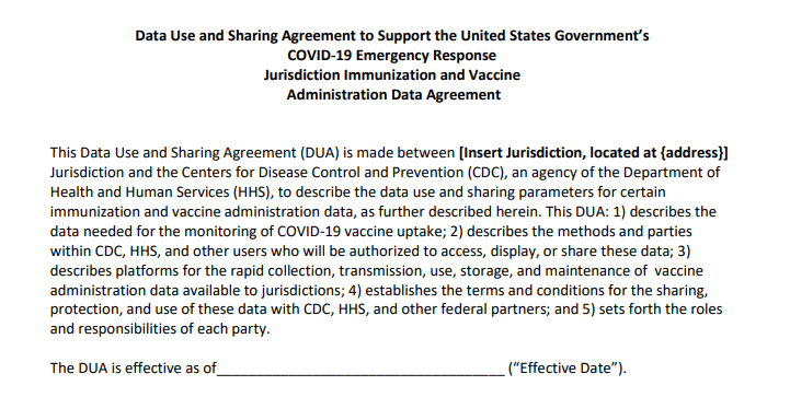
Historically, each state has tracked vaccinations independently, through Immunization Information Systems (or IIS). While the CDC does report some national immunization information, such as its flu vaccination dashboard, this information typically comes from outside surveys and is not reported in real-time. Of course, this won’t do for COVID-19. To build up a national system, the CDC has asked every state to sign a Data Use and Sharing Agreement promising to send vaccination counts and associated demographic data to the CDC.
It seems simple, right? But according to Stolberg’s reporting, the CDC has asked states to send personal information—such as names, birth dates, ethnicities, and home addresses—for each vaccine recipient. While demographic information should be tracked for COVID-19 vaccines in order to monitor equity in distribution, there is no need for the CDC to collect such specific information as names or home addresses. In fact, such a practice both discourages people from getting vaccinated and discourages states from cooperating with the federal public health agency.
Stolberg quotes an official from Minnesota who is concerned about privacy:
In Minnesota, officials are refusing to report any identifying details to the C.D.C., but they will submit “de-identified doses-administered data” on a daily basis once the vaccine campaigns begin.
“This is a new activity for us, as we don’t typically report this level of detail on this frequency to the federal government,” Doug Schultz, a spokesman for the Minnesota Department of Health, said in an email. He added, “We will not be reporting name, ZIP code, race, ethnicity or address.”
States which refuse to send personal data to the federal government may still report anonymous demographic information, such as the races and ethnicities of individuals who get vaccinated, on state-level dashboards. But it seems increasingly likely that vaccination data will face the same challenges as testing data: with every state deciding on a different reporting practice, it could be difficult to standardize and answer basic questions at the national level.
The CDC has developed a new smartphone app called v-safe (yes, in all lowercase), which will use texts and surveys to check in on vaccine recipients after they get their shots. The app will be optional, but CDC officials are hoping it can be a crucial piece of vaccine safety monitoring.
Google News is teaming up with the Australian Science Media Centre to build a COVID-19 Vaccine Media Hub and support fact-checking research. The hub will provide research updates and access to scientific expertise; it will first launch in the U.K., then become available in other countries.
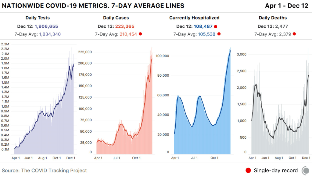
In the past week (December 6 through 12), the U.S. reported about 1.6 million new cases, according to the COVID Tracking Project. This amounts to:
An average of 228,000 new cases each day (23% increase from the previous week)
487 total new cases for every 100,000 Americans
1 in 205 Americans getting diagnosed with COVID-19 in the past week
44% of the total cases reported across the globe this week, according to the World Health Organization
Nationwide COVID-19 metrics published in the COVID Tracking Project’s daily update on December 12. Seven-day averages for cases, deaths, and hospitalizations are all at all-time highs.
In the month of November, one in 74 Americans was diagnosed with COVID-19. This terrible rise in cases has already put enormous strain on the nation’s healthcare system, and the outbreak is not slowing down. One in 131 Americans was diagnosed with COVID-19 in the first 12 days of December alone.
108,500 people now hospitalized with COVID-19 (33.1 for every 100,000 people)
17,300 new COVID-19 deaths (5.3 for every 100,000 people)
In last Sunday’s issue, I reported that 15,000 deaths in one week marked a national record; this week, we saw 2,000 more. How do you think about numbers this big? You could compare the pandemic to 9/11, Pearl Harbor, and other American tragedies, but even this practice minimizes the fact that a day of 3,000 deaths is only one day in a year of mass suffering.
var divElement = document.getElementById(‘viz1608004219965’); var vizElement = divElement.getElementsByTagName(‘object’)[0]; if ( divElement.offsetWidth > 800 ) { vizElement.style.width=’100%’;vizElement.style.height=(divElement.offsetWidth*0.75)+’px’;} else if ( divElement.offsetWidth > 500 ) { vizElement.style.width=’100%’;vizElement.style.height=(divElement.offsetWidth*0.75)+’px’;} else { vizElement.style.width=’100%’;vizElement.style.height=’650px’;} var scriptElement = document.createElement(‘script’); scriptElement.src = ‘https://public.tableau.com/javascripts/api/viz_v1.js’; vizElement.parentNode.insertBefore(scriptElement, vizElement);
When the Department of Health and Human Services (HHS) started reporting hospitalization data at the state level back in July, I wistfully told a friend that I wished the agency would report facility-level numbers. Another federal agency had recently started reporting this type of data for nursing homes, and I appreciated the flexibility and granularity with which I was able to analyze how the pandemic was impacting nursing home patients and staff. I wanted to see the pandemic’s impact on hospitals in the same way.
At the time, I considered this a pipe dream. The HHS was already facing major challenges: implementing a new data pipeline across the country, navigating bureaucratic issues with state public health departments, and working with individual hospitals to help them report more accurately and more often. Plus, transparency issues and political scandals plagued the agency. Making more data public seemed to be the least of its priorities.
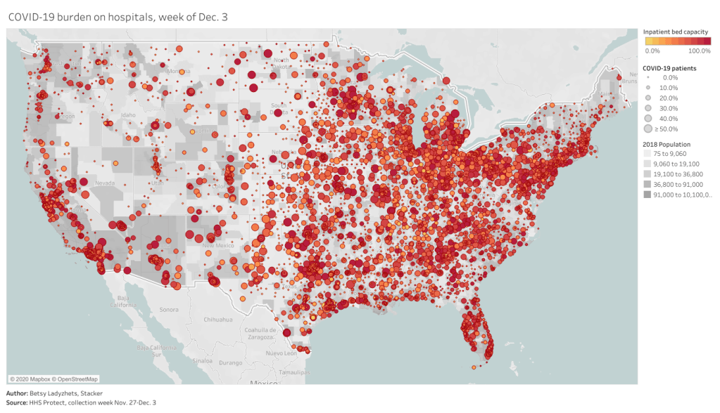
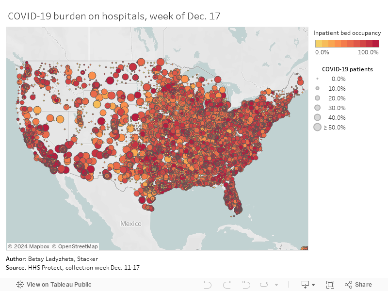
But I’m happy to say that this week, my pipe dream came true. On Monday, the HHS published a new hospitalization dataset including capacity, new admissions, and other COVID-19-related numbers—for over 4,000 individual facilities across America.
This is, as I put it in a COVID Tracking Project blog post analyzing the dataset, a big deal. Project lead Alexis Madrigal called it “probably the single most important data release that we’ve seen from the Federal government.” I, in somewhat less professional terms, texted my girlfriend:
Please appreciate the level of self-control it took for me to not actually title this issue “HHS queen shit.”
Let me explain why this new dataset is so exciting—not just for a nerd like me, but for any American following the pandemic. I’m drawing on a COVID Tracking Project blog post unpacking the dataset, to which I contributed some explanatory copy.
Hyperlocal data: At a time when hospitals are overwhelmed across the nation, it is incredibly useful to see precisely which hospitals are the worst off and how COVID-19 is impacting them. Data scientists can pinpoint specific patterns and connections between regions. National aid groups can determine where to send PPE and other supplies. Journalists can see which hospitals should be the focus of local stories. The stories that can be told with this dataset are endless.
Aggregating to different geographies: The individual facility is the most detailed possible level of reporting for COVID-19 hospitalizations. But this HHS dataset also includes the state, county, and ZIP code for each hospital, along with unique codes that identify hospitals in the Medicare and Medicaid system. The data for specific facilities can thus be combined to make comparisons on a variety of geographic levels. I tried out a county-level visualization, for example; some counties are not represented, but you can still see a much more granular picture of hospital capacity than you would in a state-level map.
Time series back to August: HHS didn’t just provide data on how hospitals are coping with COVID-19 right now. They provided a full time series going back to the first week of August, with data starting shortly after the HHS began collecting information from hospitals. These historical data allow researchers to make more detailed comparisons between the nation’s last major COVID-19 peak and our current outbreak. There are some reporting errors from hospitals in the early weeks of the dataset; COVID Tracking Project analysis has shown that these errors become less significant in the week of August 28.
Includes coverage details: The dataset includes fields that can help researchers check the quality of an individual hospital’s reporting. These fields, called “coverage” numbers, show the number of days in a given week on which data were reported. A value of six for total_adult_patients_hospitalized_confirmed_and_suspected_covid_7_day_coverage, for example, indicates that this hospital reported how many adult COVID-19 patients it was treating on six of seven days in the past week. Many hospitals are now reporting all major metrics on six or seven days a week—HHS has really stepped up to encourage this level of reporting in recent months. For more information on hospital reporting coverage, see HHS Protect.
Admissions broken out by age: The HHS began reporting hospital COVID-19 admissions, or new COVID-19 patients entering the hospital, at the state level in November. The new dataset includes this information, at the facility level, for every week going back until August, and breaks out those new patients by age group. You can see exactly who is coming to the hospital with COVID-19 in age brackets of 18-19, ten-year ranges from 20 to 79, and 80+. Several other metrics in the dataset are also broken out by adult and children patients.
New fields: This dataset reports counts of emergency department visits, including both total visits for any reason and visits specifically related to COVID-19. (The HHS data dictionary defines this as “meets suspected or confirmed definition or presents for COVID diagnostic testing.”) These figures allow researchers to calculate the share of emergency department visits at a given hospital that are COVID-related, a new metric that wasn’t available from previous HHS reporting.
Signifies major effort from the HHS: When it comes to reporting hospitalization data, this agency has come a long way from the errors and transparency questions of the summer. Last week, the COVID Tracking Project published an analysis finding that HHS counts of COVID-19 patients are now in close proximity to similar counts reported by state public health departments—signifying that the federal data may be a useful, reliable complement to state data. (I discussed this analysis in last week’s issue.) The new facility-level dataset indicates that HHS data scientists understand the needs of COVID-19 researchers and communicators, and are working to make important data public. I will continue to carefully watch this agency, as will many of my fellow reporters. But I can’t deny that this data release was a major step for transparency and trust.
To get started with this dataset, you can zoom in to look at your community on this Tableau dashboard I made, visualizing the most recent week of data. (That most recent week of data reflects November 27 through December 3. As the dataset was first published last Monday, December 7, I’m anticipating an update tomorrow.)
Or, if you’d like to see more technical details on how to use the dataset, check out this community FAQ page created by data journalists and researchers at Careset Systems, the University of Minnesota, COVID Exit Strategy, and others.
Finally, for more exploration of the research possibilities I outlined above, you can read the COVID Tracking Project’s analysis. The post includes some pretty striking comparisons from summer outbreaks to now.
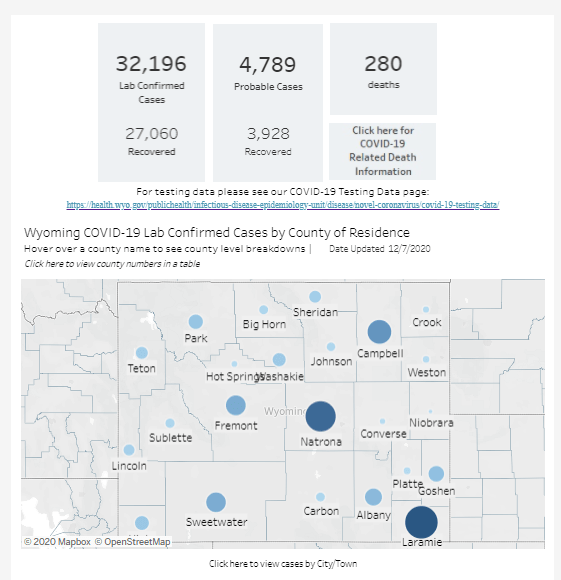
Look, I like Wyoming’s COVID-19 dashboard. I like that it’s not actually one dashboard, but five dashboards—one for cases, one for deaths, one for tests, one for hospitals, one for county-level data—each of which has its own update schedule. I like that I need to hover over bars and download crosstabs in order to obtain precise figures. I like that sometimes the percentages add up to 100% and sometimes they don’t.
I find it charming to need five or six tabs open every time I check the state. It’s a nice challenge. Those states that include all their data on one page, they make things too easy!
Allocating Regeneron’s treatment: On November 21, Regeneron’s monoclonal antibody treatment received Emergency Use Authorization from the FDA. A new dataset from the HHS shows how this drug is being allocated to states and territories. For more information on the dataset, see HHS’s November 23 press release.
COVID-19 relief tracker: The Project on Government Oversight (POGO) has a new tracker which shows where COVID-19 relief funds from the federal government have been spent. The dashboard visualizes data from USAspending.gov, and is searchable by state, county, and ZIP code.
Census COVID-19 Demographic and Economic Resources: My coworker Diana Shishkina recently alerted me to a Census page which compiles and visualizes a great deal of data on how COVID-19 has impacted Americans. It includes data from weekly small business surveys, the Household Pulse Survey, and a wealth of other information.
In July, the Department of Health and Human Services (HHS) took over collecting and reporting data on how COVID-19 is impacting America’s hospital systems. This takeover from the CDC—which had reported hospitalization data since the start of the pandemic—sparked a great deal of political and public health concern. Some healthcare experts worried that a technology switch would put undue burden on already-tired hospital workers, while others worried that the White House may influence the HHS’s data.
Since that data responsibility switch, I’ve spent a lot of time with that HHS dataset. In August, I wrote a blog post for the COVID Tracking Project which compared HHS’s counts of hospitalized COVID-19 patients to the Project’s counts (compiled from states). At the time, my co-author Rebecca Glassman and I observed discrepancies between the datasets, which we attributed in part to differences in definitions and reporting pipelines. For example: some states only report those hospital patients whose cases of COVID-19 have been confirmed with PCR tests, while HHS reports all patients (including those with confirmed and suspected cases).
I’ve covered the HHS hospitalization dataset several times in this newsletter since, including its investigation by journalists at ProPublica and Science Magazine and its expansion to include new metrics. The dataset has gone from a basic report of hospital capacity in every state to a comprehensive picture of how the pandemic is hitting hospitals. It includes breakdowns of patients with confirmed and suspected cases of COVID-19, patients in the intensive care unit (ICU), and patients who are adults and children. As of November, it also includes newly admitted patients and staffing shortages. At the same time, HHS officials have worked to resolve technical issues and get more hospitals reporting accurately in the system.
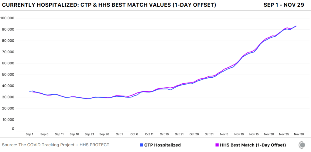
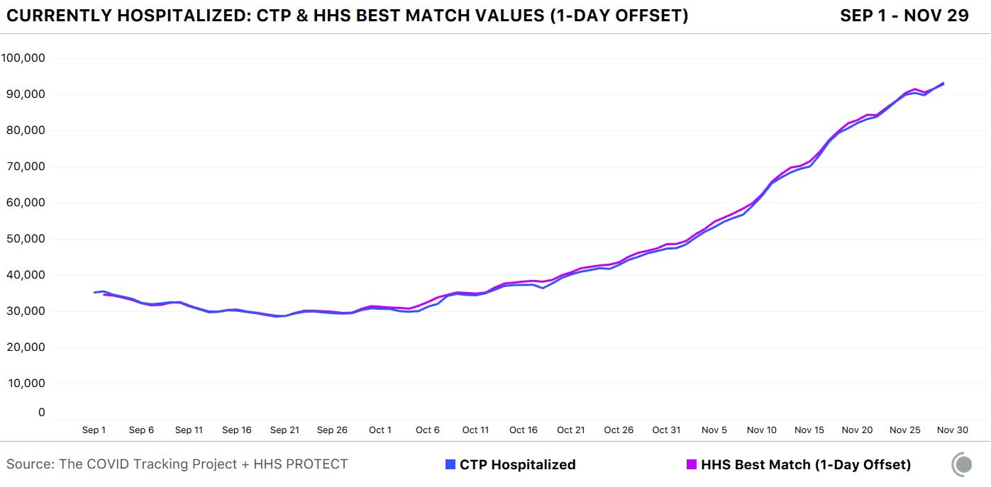
A new analysis, published this past Friday by the COVID Tracking Project, highlights how reliable the HHS dataset has become. The analysis compares HHS’s counts of hospitalized COVID-19 patients to the Project’s counts, compiled from states. Unlike the analysis I worked on in August, however, this recent work benefits from HHS’s expanded metrics and more thorough documentation from both the federal agency and states. If a state reports only confirmed cases, for example, this number can now be compared directly to the corresponding count of confirmed cases from the HHS.
Here’s how the two datasets line up, as of November 29:
The COVID Tracking Project and HHS counts of hospitalized patients closely match in September, October, and November.
Since November 8, in fact, the two datasets are within two percent of each other when adjusting for definitional differences.
The blog post also discusses how patient counts match in specific states. In 41 of 52 jurisdictions (including the District of Columbia and Puerto Rico), the two datasets are in close alignment. And even in the states where hospitalization numbers match less precisely, the two datasets generally follow the same trends. In other words: there may be differences in how the HHS and individual states are collecting and reporting their numbers, but both datasets tell the same story about how COVID-19 is impacting American hospitals.
I recommend giving the full blog post a read, if you’d like all the nerdy details. Alexis Madrigal also wrote a great summary thread on Twitter:
This new COVID Tracking project analysis comes several days after an investigation in Science Magazine called the HHS dataset into question. The investigation is based on a CDC comparison of these same two datasets which doesn’t account for the reporting differences I’ve discussed.
Charles Piller, the author of this story, raises important questions about HHS’s transparency and the burden that its system places on hospitals. It’s true that the implementation of HHS’s new data reporting system was rolled out quickly, faced technical challenges, and caused a great deal of confusion for national reporters and local hospital administrators alike. The HHS dataset deserves the careful scrutiny it has received.
But now that this careful scrutiny has been conducted—and the two datasets appear to tell the same story—I personally feel comfortable about using the HHS dataset in my reporting. In fact, I produced a Stacker story based on these data just last week: States with the highest COVID-19 hospitalization rates.
Everyone in the science communication world is talking about COVID-19 vaccines right now. I’ve attended three vaccine webinars in the past week alone.
We’re all gearing up for next Thursday, when the FDA’s Vaccines and Related Biological Products Advisory Committee will meet to discuss Emergency Use Authorization (EUA) for Pfizer and BioNTech’s vaccine. If the vaccine is authorized for distribution, doses will go out to every state within days. Meanwhile, Moderna’s vaccine continues to demonstrate promising results. Moderna has also applied for EUA; FDA’s committee will meet to discuss this candidate on December 17.
Here are a few major data sources and issues that I’ll be watching as these vaccine candidates progress:
The CDC has recommended that the first available vaccine dosesgo to healthcare workers and residents of long-term care facilities (nursing homes, assisted living facilities, etc.) The agency did not specify how state and local governments should prioritize among these groups.
How many people are actually in those high-priority groups in each state? To answer that question, see the Vaccine Allocation Planner for COVID-19, a new data tool from the Surgo Foundation, Ariadne Labs, and other collaborators. For each state, the tool uses population estimates from the Census, the CDC, and other sources to show how many healthcare workers, first responders, teachers, people with severe health conditions, and other high-risk individuals will need to be vaccinated. The tool is automatically set to calculate each state’s available doses as a population-adjusted share of 10 million, but users can adjust it to see how different scenarios may play out.
How many vaccine doses are actually going to each state? To answer this question, see the new COVID-19 Vaccine Allocation Dashboard from Benjy Renton. Renton is compiling information from local news sources on dose distributions from Pfizer and Moderna’s early shipments. Remember that both of these vaccines require two doses per person. In Texas, for example, the first Pfizer shipment of 224,250 doses will allow about 11 in every 1,000 Texas to get vaccinated.
How will vaccination be tracked? The CDC has promised to set up a national dashboard similar to its flu registry, but until then, we must rely once again on state data. This CDC list of state immunization registries should be a useful starting point for any local reporters hoping to get a jump start on vaccine data. You’d better believe that I will be spending a lot of time with these registries in future issues.
The Kaiser Family Foundation is setting up a new dashboard to track public opinion on COVID-19 vaccines. This initiative, called the COVID Vaccine Monitor, will compile the results of regular focus groups and surveys on whether Americans plan to get vaccinated and why. The dashboard is not live yet, but you can learn more about it and hear past KFF findings in the foundation’s December 3 briefing. One notable statistic: 67% of Black adults are “not too confident” or “not at all confident” that vaccines will be distributed fairly, as of a KFF poll conducted in August-September.
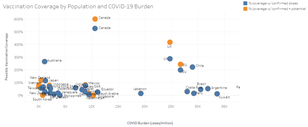
For vaccine coverage outside the U.S., see this map of procurement data from the Launch & Scale Speedometer. This research group from the Duke Global Health Innovation Center has compiled the total vaccine doses purchased by over 30 nations. The dashboard also estimates the share of each nation’s population it could be able to cover with advanced vaccine purchases. Canada is highest on the scale at 601%; the nation’s extra doses will likely be donated to other countries.
STAT’s Helen Branswell has written a comprehensive feature on the vaccine-related challenges that lie ahead. Some of the big challenges: coordinating a speedy early rollout, overcoming vaccine distrust, distributing vaccine doses equitably, protecting vulnerable populations (such as pregnant women and children) on whom vaccine candidates have not yet been tested, and continuing to study additional vaccines once the first candidates to win EUA are rolled out.
What questions do you have around COVID-19 vaccines?
It’s time for our next brief reader survey, and this time, I want to hear your vaccine concerns. As this continues to be a major coverage topic for me, I’d like to be sure I’m prioritizing the needs of my readers in choosing specific vaccine-related issues and data sources to investigate.
This is a one-question survey. A few reader responses (from those who indicate they’re comfortable with it) will be shared next week.